Boldman Week 3

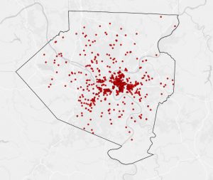
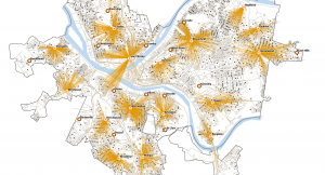
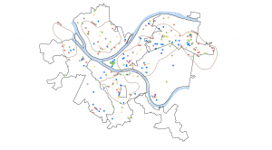
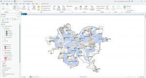
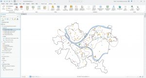
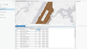
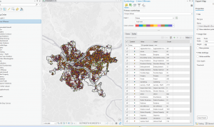
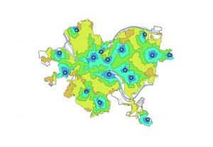
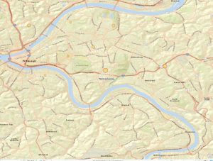
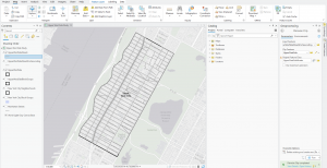
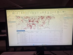
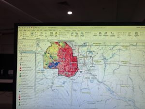
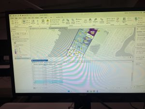
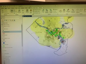
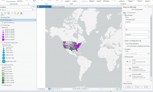
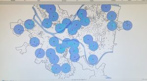
Map density shows distinctive patterns, clearly making locations easier to find. 


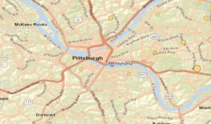
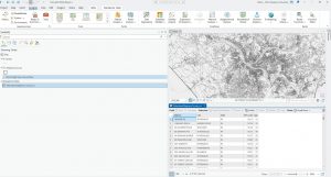
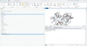
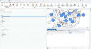
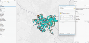
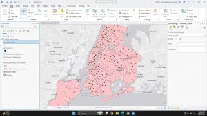
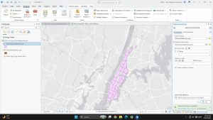
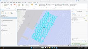
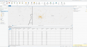
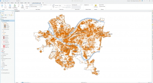
Map 1 shows the locations of businesses individually


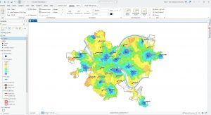
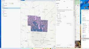
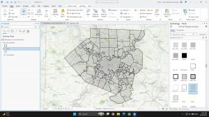
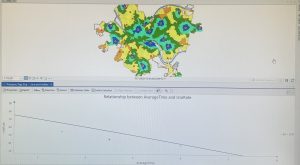
This is the density surface showing the concentration of  where businesses are in the specific area


You can map defined areas in multiple ways using GIS. Dot maps present individual locations or things and each dot can represent a specific number of features. The dots are placed randomly and aren’t the most precise data. Dots packed closely together are more densely populated than dots scattered far from each other. Dot maps are useful when many features can be clumped or grouped and shown in a defined area to keep the map easy to read.  Maps created and shown as density surfaces are done using raster methods to provide detailed information. Each cell in the layer gets a value and based on the overall values in the defined area, the density is determined. A density surface is created from individual locations or linear features. Choosing either of these methods works depending on what data is given and how specific the information needs to be presented. 


In GIS, to create a density surface, start by inputting a search radius for a neighborhood to be defined. GIS totals the individual feature values and divides by the neighborhood area based on the radius. Cells are typically between 10 and 100 cells per density unit. Cell size determines how fine a pattern appears and smaller cells will appear smoother and take more time to process. Bigger cells take less time to process data but are coarser-looking and have a higher chance of losing patterns in the process. Search radius can result in how general the patterns can appear. With a larger search radius, GIS generalizes the patterns and considers more features. 


Two methods are used to calculate cell values. The simple method is to only count the features included in the search radius with a value. The result is a series of rings that overlap each other. The second method is more complicated but provides a clear, precise density surface. Every cell in the layer is counted and given a value, resulting in a smoother, more generalized density surface. Density surfaces are represented either as colors or contours. Graduated colors are used to clearly show patterns and distinguish each density value and contour lines connect points of equal density on top of the map. Using contour lines, equal points of interval have to be applied in order for the lines to be spaced and readable. 
Chapter 5

     Knowing what is happening inside the map makes it easier to understand where action needs to be taken. This allows people who are reading and analyzing the map to compare areas to each other and see where there is more or less of something. Determining how many areas are being analyzed is important because it determines how many features are being looked for. Single areas may include fewer features and broader topics and is the preferred method if there is only one focus topic. Studying multiple areas at once is usually because features are being compared across a region.  GIS can provide information in list, count or summary form of features shown in a specific area. Analysts can create a summarized list of features in a specific area and it is mostly used to focus on the number of features in one or more areas or to select specific features in the area and GIS checks the location of each feature to and ensure it isn’t in the area. Another method of finding the features inside of a map is overlaying the areas and features by combining the area and features into one layer and then comparing to another area. 


     GIS can also be used to create reports of selected features. When a radius is set inside of a single area, GIS can provide a total count of specific features selected inside of the radius. GIS can also provide the frequency when given a range of values of features inside the area, displayed as a table.  The table can be represented as a bar or pie graph and summarized data. Summarized data can be created by categories or values and being as specific as possible and noting the variations in areas that can be tricky for GIS software to differentiate while summarizing data. 

     Summarized data can be compared between two areas based on the particular statistics or results. Tables can be created and merged together per area and some GIS softwares can even automatically do this. Tables can be created into bar charts which creates a visualization to compare real time data of two or more areas.

Chapter 6

 Chapter 6 focuses on how GIS can be used to find activity within a specific radius of a feature. This is a useful tool for map makers because it provides information about the area where the feature is located. Travel range is useful information because, within the radius, it defines what area is good for a specific feature. Travel range is another factor by which distance can be measured to and from a location. Measuring distance using travel can be measured by cost or distance. Defining features by distance or travel can expose other sources in the neighboring areas, and in this case distance is measured using straight lines.
    Before analysis, GIS needs to know whether the distance is being measured on a flat plane or using the curvature of the Earth. As the map maker, small areas such as cities are mostly accurate if the distance is measured on a flat plane. On the other hand, using the geodesic method for larger regions is more accurate and will display correctly on the outer layer of the Earth. Using data found using the travel range or radius to find activity within the neighboring area of a location, GIS provides a list, count, or summary of statistics based on attributes depending on the purpose of the map. Once at least one or more distances are found, inclusive rings are useful to continue expanding the total amount of increase as the distance increases. Using the same distance, distinct bands can be useful when comparing distance to another characteristic.
There are three ways to find what’s nearby:
  • Straight-line distance – Using specified sources and distance, GIS finds the area and surrounding features within the distance. This method is used primarily when boundaries are a set parameter, or there is a set distance around a feature.
  • Distance or cost over a network – Specific source locations and distance or travel cost along linear features. GIS uses this approach for finding what’s within a travel distance or cost of a location.
  • Cost over surface – You specify the location of the source features and travel cost. This approach is good for calculating overland travel cost. GIS creates a new layer showing travel costs with a range of distances.

Robinson Week 2

Chapter 1:

The first chapter discusses a general introduction to GIS analysis. A multi-step process when it comes to viewing the relationships and patterns between multiple features. It starts with framing a question to determine what information is needed. Who it will be used for and how also comes into play. Which is really important. Once the information is gathered, we need to understand the data. Using certain data types and features will help us better determine which method to use. What approach should be used? That depends entirely on the question and how the results will be used (Remember this: “Who it will be used for and how… ”). After that, we need to process that data and look at the results. Then display them in various ways (charts, tables, maps, etc.).

There are many types of geographic features.  They play a role in our analysis process. Discrete features represent precise locations, whether the feature is there or not (ex: legal boundaries or barriers). Continuous phenomena (like rainfall or temperature) can be measured anywhere, with no gaps. Data represented by density or counts of multiple features  shown in a given area. For example, the number of parks or schools in a place. These features can be shown in 2 ways. By a vector model, as a row contained in a table with x, y coordinates. Their features are represented as lines or events. The other way is the raster model, where features are shown as a group of cells that create layers. (Vectors remind me of C++, which is used to alter arrays in a data set.)

The features in question have values attributed to them. Some include categories that help organize and group similar data together. Ranks assert the importance of multiple factors or provide a direct measurement when it is hard to capture. These are noncontinuous values. Counts give us the total numbers. On the other hand, amounts are quantifiable associations within features. Ratios can show us the connection between 2 numbers. They are divided by another one for each feature present. The last 3 are known as continuous values. We put these values into data tables to help us characterize and summarize data. 3 operators are used for tables. They are selecting (assigning values), calculating (pretty self-explanatory), and summarizing (summing specific traits to get data).


Chapter 2:

In the last chapter, we got a general introduction and learned some GIS concepts. This part of the book focuses on mapping: deciding, preparing, making, and analyzing a map. Describing how certain features on maps can be used to show patterns of correlation. Note that it should always represent the intended audience. (You don’t want to make a map representing customer data and show it to a bunch of zoologists.) 

Each feature needs a coordinate and a code to assign a type (one or more categories). Groups of features with similar characteristics are called categories. To map (features) them, we simply draw them, represented by a marker. The same applies to categories, but with colors or patterns. The downside is that users are limited to seven. The reason why is that most people can’t differentiate 7 patterns or colors on a map. This has something to do with our cognitive ability to recognize patterns. (This topic interested me; I spent some time looking into it.) If a person tries to use more than that, it’ll make the map harder for the user to read. It is recommended to try to group these together. 

We can combine them in various ways. Assigning a code, using a linked table, or assigning categories by using symbols.  All this data is stored in a table, including the description of the shape you gave it. (Which I found was cool.) When mapping features, they have to be the right size for viewers to visualize the categories. Scaling also plays an important role, as long as the map’s characteristics are defined and easy to view. Symbols and lines, including line width, have their own criteria for user visibility. Text labels can also help distinguish categories. Using distinguishable landmarks like rivers, roads, buildings, and more can make a map unique.

Chapter 3:

The last chapter focused on mapping where things are. This chapter discusses why mapping the most and least of the datasets can show correlations between locations. Including the features that help put everything together. A potential map should include the following features: discrete features, represented by lines or symbols; continuous phenomena, shown with 3-D perspective (view), colors, or contours. Or data summarization; displaying category amounts by shading in a given area. 

To plot this data, it must be given a quantity. Some include continuous or noncontinuous data. (These types were discussed in chapter 1 but also mentioned in this chapter.) Once the quantities are given. It’s time to either group them together with continuous data. Or plot them individually with the usage of ranks. You can group similar values with their features, or manually create groups under certain conditions. You can do this using standard classification schemes based on how the data is laid out. 

There are 4 common types. Natural breaks indicate jumps in values when data is not evenly distributed. Quantile, in which each class is used and has the same number of features. Equal interval, showing the gap between the highest and lowest values in every class. The last type is standard deviation, where it adds or subtracts the standard deviation from the mean. This creates the class breaks. With all this data at hand, it’s time to create a map. Using graduated symbols, colors, charts, contours, or even 3d perspectives to display our data. Each has its use cases, upsides, and downsides. (This includes the use of standard classification schemes.) As long as the data matches the visual map. We can easily compare and contrast different areas within it. For example, we can see where certain parts of a map contain lacking, concentrated, or scattered values.

Elliott Week 4

Mitchell, Chp. 4

Chapter four described mapping density, which is symbols on a map marking the density of a given set of data. The purpose of this is to highlight where the highest or lowest density of the targeted set of data is. An example of this could be a construction crew viewing a city map with red dots marking every pothole within the city’s sidewalks and streets. Utilizing GIS mapping to view where the highest density of potholes in the area are, the construction crew could make the choice of where their next road replacement should be based on deductive reasoning. This example demonstrates how mapping density of a data variable can be utilized for tracking disease, weather patterns, public transportation, etc. This form of data display has infinite uses and is extremely simple and self explainable. Learning about the various cells and calculations needed for situations requiring density values surprised me. These calculations are crucial because there are several parameters that can affect how the GIS calculates the density surfaces. The factors that affect the GIS calculations are: cell size, which determines how coarse or smooth the patterns in the GIS map will be. In order to have a smooth surface, you must create more and smaller cells, which in turn demands more on your computer, like processing and storage space, which slows down the processing time for making the map. A coarser map looks rougher because of the larger cells however, with bigger and fewer cells the less strain on your computer while processing. Search radius is the maximum distance setting of a data point, which also affects the GIS system similarly to cell size. The larger the search radius, the more generic the patterns are, and the smaller the more detailed. The calculation method uses two different methods to determine cell size. The simpler method only calculates the features within the search radius of a data cell, whereas the more complex method uses a mathematical function to expand on complex features closer to the center of the cell, not just within the search radius. The last factor that affects the GIS calculations is units, which is the unit of measurement required for the mapping density of the GIS map. These factors all play crucial roles for the desired accuracy required for each map.
 

Mitchell, Chp. 5

The next chapter, chapter five, describes mapping what is inside a given area. This can be done to monitor what may be happening in an area, prepare for a predicted outcome, analyze data within an area, and more. In order to find out what’s inside a set area, a boundary line is drawn and data points within the area are displayed. In Andy Mitchell’s textbook (chp.5) they show the following image:

Andy Mitchell, 2020, pg. 144) This image demonstrates GIS mapping what tree species are inside a selected area in order to view where certain tree species prefer. This image helped me understand what this chapter of the book was described by displaying a real world example of how this information could be used such as a log company looking for specific tree species, a conservation group looking for native and diverse wooded habitat and tree species, a township looking for water patterns in the area based on which trees prefer which area, and etc. In order to actually determine what is inside, there are three ways of finding it out. The three ways are drawing areas and features, selecting the features inside the area, and overlapping the areas and features. Drawing areas and fields is good for finding out if features are inside or outside an area however is quick and easy for visuals but lacks information about the inside features. Selecting the features inside the area is good for getting a list or summary of features inside an area however, it does not tell you what is inside each of several areas. The last method, overlapping the areas and features, is good at finding out which features are inside which areas and summarizing how many or how much by area, however, it requires a significant amount more processing and strain on your computer. In summary, these methods have their strengths and weaknesses, and each is used for separate features and utilizations.


Mitchell, Chp. 6

Chapter five discussed ‌mapping inside an area, chapter 6, however, discusses mapping finding what is nearby an area. Finding what is nearby can be crucial for finding out what is happening in a given distance and finding out what is within traveling range. There are two measurements in GIS when it comes to measuring distance: one is distance, and one is cost. Distance is obviously how far from point A to B, but cost is how much time it would cost. An example of cost over distance might be the national park rescue service that may only have to hike 4 miles to get to someone, but they have a high time cost of climbing over the mountain and across the river. Time is money and is one the biggest expenses, so measuring the time commitment aids in accurately reflecting in the GIS mapping. The three ways of finding out what’s nearby is straight-line distance, distance or cost over a network, and cost over a surface. Straight-line distance is exactly how far from point A to B in a straight line and is good at setting a boundary and measuring the distance of one point to another. Distance or cost over a network accounts for linear features and adds a cost of time besides distance, and is good for finding what is within travel distance as well as cost. The final method, cost over a surface, specifies the location and travel cost, and people primarily utilize it for over-landing off primary roads. These methods all have their own uses, and not one fits all. They each are utilized in various situations, such as when I gave an example of the NP rescue service they would use cost over surface. Furthermore, users frequently add buffers and boundaries to create a zone around given features. This addition helps measure cost and distance, ensuring an accurate measurement.


Dahlstrom Week 3

Chapter 4

In this chapter, I learned about another way to map data through GIS called mapping by density. You should map by density when you are looking for patterns of individual features or mapping with areas of different sizes because it allows you to see where features are concentrated. There are two ways of mapping density: by defined area and by density surface. 

You should map by defined area if you want to compare areas with defined borders. Although GIS can calculate the density of each area for you, it is important to ensure all feature units match. Shaded fill maps or dot maps are common ways to display density maps defined by area. If you want to see the concentration of points or line features, however, you should map by density surface. When mapping by density surface, there are several parameters that affect how GIS calculates density surface. Cell size determines how coarse or fine the patterns will appear and search radius affects how generalized the patterns in surface density will be. The two ways GIS can calculate the density are the simple method and the weighted method. Overall, I learned how to efficiently create an effective density map through the use of GIS.

Key Concepts/Definitions

Shaded fill map: Uses a range of colors to display density. Density is treated as a ratio. Density value applies for the entire polygon, the actual density at a specific location may vary.

Dot Density Map: Each dot represents a specified number of locations. The dots are randomly distributed, so they do not represent the actual feature locations. The closer together the dots are, the higher density of features in that area. 

Simple Calculation Method: Counts only the features within the search radius of each cell. Results in a series of rings that overlap each other.

Weighted Calculation Method: Gives more mathematical weight to the features closer to the center of the cell. Every cell in the layer is counted and assigned a value. Results in a smoother, more generalized density surface.

Chapter 5

This chapter introduced me to all of the information I needed to know about mapping what’s inside. This type of mapping is used to monitor what is occurring inside of an area or to compare several areas based on what’s inside each. GIS can find out whether an individual feature is inside an area, list all the features inside an area, find out the number of features in an area, or get a summary of what’s inside a boundary based on a feature attribute.

The three ways of mapping what’s inside include drawing areas and features, selecting features inside of an area, and overlaying the areas and features. When creating these maps, it is important to use symbols, boundaries, labels, and colors to help distinguish or emphasize visual aspects of the map. I have found this detail to be emphasized throughout the book. Although the first two methods seemed pretty straight forward to me, overlaying the areas and features proved to be more complicated. When you are overlaying and have discrete features, you can use the same analysis as in geographical selection or you can summarize by area. When you are overlaying and have continuous features, however, you use the vector or raster model. Additionally, when overlaying you may end up with slivers. To offset them, you should merge them into one of the larger adjacent areas. When analyzing the results of these maps, you should use the summary statistics such as counts, frequency, sum, average, median, or standard deviation.
Key Concepts/Definitions

Drawing Areas and Features: Creates a map showing the boundaries and features. Good for the visual approach of seeing whether one or more features are inside or outside a singular area.

Selecting Features Inside of an Area: Specifies the area and layer containing features. GIS selects a subset of features inside the area. Good for getting a list or summary of features inside a single area and finding what’s in a given distance of a feature.

Overlaying the Areas and Features: GIS combines the area and the features to create a new layer with attributes of both or compares two layers to calculate the summary statistics of each. Good for finding which features are in several areas or how much of something is in one or more areas.

Slivers: Borders that are slightly offset.

Chapter 6

In this chapter, I was introduced to the concept of mapping what’s nearby. This type of mapping was particularly interesting to me because I recognized its use in many different fields. Mapping what’s nearby identifies the area and the features inside that are affected by a certain event and determines if an area is suitable for a specific use. Data in mapping what’s nearby is measured using distance or cost. Cost, also known as travel costs, could be the amount of time, money, or energy expended. Before mapping, you should decide whether the map would be suitable for the planar or geodesic method and if you should use inclusive rings or distinct bands. To map what’s nearby, you can measure a straight line distance, distance or cost over a network, or cost over a surface. When measuring distance with a straight line, there are several methods that can be used such as creating a buffer, selecting features within a distance, distance between feature to feature, and creating a distance surface. Distance or cost over a network consists of the measurement of segments in geographic networks within the travel parameters. Lastly, calculating cost over a geographic surface shows the rate of change in distance or cost from the feature. The method you use depends on the data and how you intend to portray the map. Overall, throughout this book, I learned that many of these different maps have the same principles behind them. Knowing how to properly differentiate each type of map, utilize coloring, identify features or categories, define boundaries, and analyze summary statistics are all factors in creating effective maps in GIS.
Key Concepts/Definitions

Straight-line Distance: Use for defining an area of influence around a feature, creating a boundary, or selecting features within a distance. Measures distance. 

Distance or Cost Over a Network: Use for measuring travel over a fixed infrastructure. Measures distance or travel costs.

Cost Over a Surface: Use for measuring overland travel and calculating how much area is within the travel range. Measures travel costs.

Planar Method: When you are assuming the earth’s surface is flat. Area of interest is relatively small.

Geodesic method: When you take the curvature of earth into account. Area of interest encompasses a large region.

Inclusive rings: Show how the total amount of features increases as the distance increases. Distinct bands: Show the differences between feature amounts and different distances.

Week 3 Beard

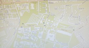
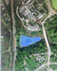
Chapter 4 gives us an insight into how mapping density can really create a map, as well as help viewers understand what topics are being presented. Mapping density can be very helpful due to the ways you can present it on a map. For example, the different shades on a map can help show how dense something is. Depending on what you are mapping, the patterns from the densities can be different. These differences help create more accurate areas on maps. Throughout the chapter, I was able to see the big differences between the dot density maps, the shaded density maps, and the more thermal-looking maps. There are definitely certain ones that are better to use than others; for example, if there were so many samples that you couldn’t see the data you are looking for, a dot map wouldn’t work (a shaded map would be better). One thing that really surprised me was that the larger the search radius, the more generalized the patterns in the density surface will be. For some reason, this just seems like it should be the opposite. I imagined that the smaller the area, the easier it would be to map and make it more general due to the fact that there isn’t going to be a lot of differences. After looking at the maps, though, that helped me understand why bigger is better for this type of map. Another important thing for maps is units. To make sure the map is proper, you have to have the right units to make it more specific to what data you are using.
Key Terms:

  • Mapping Density: shows where the highest concentration of the feature is
  • Two ways of mapping density:
    • A defined area: by using something like a dot map, we can see how high densities are by the amount of dots (use for data already summarized by area)
    • By density surface (use for individual locations, sample points, or lines)
  • A dot density map: area based on a total count or amount and specified by how much each dot represents.
  • Density Surface: good for showing where point or line features are concentrated.
  • Higher density: darker marks
  • Lower density: Lighter marks ( light maps)


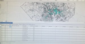
Chapter 5 presents the ideas of what is actually inside a map, and why the information plotted is important. Making sure we map certain things in certain areas is important because it can help society grow and improve. One good thing about using different ways of mapping an area is that it can give you more information than you initially expected. If you were to draw a map a certain way, you could see the difference between the inside of the area and the outside of the area. One thing that is nice about GIS is that you get to decide the area and the layer containing the certain thing you are looking for, while GIS gives you a subset of features inside the area. One thing that I thought was cool was the overlapping features in areas. This is very useful as it can help you see the differences between inside your area and outside, which I was talking about before. It can help with finding features in several areas or also finding out how much of something is in an area. When making a map, it is good to ask yourself these questions. What it is good for, what types of features are you going to include, and what trade-offs are you getting from making this map. One thing that is good about this is that you can see from making an initial map if you need a single or multiple. In multiple areas, it can be hard to see certain things as well; to fix this, you can shade certain things you are looking for, or fill it with a pattern, or draw a boundary around the area. There are a lot of things to do, so it is nice to pick whatever will stick out the most to you.
Key Terms:

How to Analyze certain maps:

  • Single Area:
    • A service area around a central facility (fire response area)
    • A buffer that defines a distance around some feature (a stream)
    • An administrative or natural boundary (police beat, parcel of land)
    • An area you draw manually (a proposed sales territory)
  • Multiple Areas:
    • Contiguous (zipcodes/watersheds)
    • Disjunction (state parks)
  • Discrete features: unique, identifiable features.
  • Comparing methods:
    • Drawing areas and features:
      • What is it good for: finding out whether features are inside or outside an area.
      • Types of features: locations, lines, areas, surfaces
      • Trade-offs: quick and easy, but visual only, so you can’t get information about the features inside
    • Selecting the features inside the area:
      • What is it good for: getting a list or summary of features inside an area
      • Types of features: locations, lines, and areas
      • Trade-offs: good for getting info about what’s inside a single area, but does not tell you what’s in each of several areas (only all areas together)
    • Overlaying the areas and features: 
      • What is it good for: finding out which features are inside which areas, and summarizing how many or how much by area
      • Types of features: Locations, Lines, Areas. and Surfaces
      • Trade-offs: Good for finding and displaying what’s within each of several areas, but requires more processing


Chapter 6 helps explain how to see what is nearby in the maps that are created. GIS is helpful in letting us find out what is occurring within a set distance of a feature, as well as being able to find out what is within traveling range. Knowing what is within a travel range is good for helping to delineate areas that are suitable for a specific use. Some things that we use to see what is nearby are looking at straight-line distance, measuring distance or cost over a network, or measuring cost over a surface. When using the measurement of straight-line distance, that would be due to an area of influence. Before we are able to see what is near, we have to know other important aspects, which we talked about in past chapters. Each method for finding what is nearby is different, so when you are deciding which one to use, you need to look at what is being measured. If it is a quick estimate of travel range, then it would be straight-line distance. If you were measuring travel over a fixed infrastructure, then it would be cost or distance over a network. Finally, if you were to be measuring overland travel, then you would use cost over a surface, and all of these have their pros and cons. To use these techniques, you would have to use a buffer, and with this you can use as many buffers as you need to get all the features that should be in the map.


Key Terms:

  • Traveling Range: is measured using distance, time, or cost
  • The Planar Method: is appropriate when your area of interest is relatively small
  • Inclusive Rings: are useful for finding out how the total amount increases as the distance increases
  • Distinct Bands: are useful if you want to compare distance to other characteristics.
  • Information that is needed from the analysis:
    • Do you need a list, count, or summary?
    • How many distance or cost ranges do you need?
  • Three ways of finding what’s nearby:
    • Straight-line distance
      • Use for: Defining an area of influence around a feature, and creating a boundary or selecting features within the distance.
      • Surrounding features: Locations, Lines, Areas
      • Measure: Distance
      • Pros: Relatively quick and easy
      • Cons: Only gives a rough approximation of travel distance
    • Cost over a surface
      • Use for: Measuring overland travel and calculating how much area is within the travel range
      • Surrounding features: continuous raster surface
      • Measure: Cost
      • Pros: Lets you combine several layers to measure overland travel cost
      • Cons: Requires some data preparation to build the cost surface
    • Distance or cost over a network
      • Use for: measuring travel over a fixed infrastructure
      • Surrounding features: Locations, Lines
      • Measure: Distance or cost
      • Pros: Gives more precise travel distance/cost over a network
      • Cons: Requires an accurate network layer
  • Selecting features near several sources:
    • First, select and tag features within the distance of the first source
    • Secondly, select and tag the features within the distance of the second source
    • Thirdly, select the features within the distance of both sources

Agrawal Week 2

Chapter 1 introduces GIS analysis as the process of examining geographic patterns and relationships to answer questions and make better decisions. The part that stood out to me was that GIS analysis should begin with a clearly defined question. Before working with the software, we need to understand what we are trying to discover, what data will be required, and how the results will be used. The general process involves framing the question, understanding the data, choosing an appropriate method, processing the data, and examining the results. This reminded me of data analytics because having more data or more advanced software does not automatically produce a useful conclusion if the original question is unclear. The chapter distinguishes among three types of geographic features. Discrete features exist at identifiable locations and can be represented as points, lines, or areas, such as businesses, roads, and property boundaries. Continuous phenomena can be measured throughout an entire area and do not have empty spaces between observations. Elevation and temperature are examples. Data summarized by area represent totals, averages, or other measurements within defined boundaries such as ZIP codes or census tracts. These features can be represented using vector or raster models. A vector model stores locations using coordinates and represents features with points, lines, and polygons. A raster model divides an area into a grid of cells, with each cell holding a value. Raster seems especially useful for continuous data, although the selected cell size can affect how much detail the map preserves. The chapter also explains geographic attributes, including categories, ranks, counts, amounts, and ratios. One question I had is how analysts decide when a raster cell size is too large and begins hiding important variations in the data. Overall, this chapter showed me that GIS analysis is not simply creating a map; it is a structured way of connecting spatial data to a specific problem.

Chapter 2 focuses on one of the most basic geographic questions: where are features located? A location map may appear simple, but it can reveal clusters, gaps, and relationships that may be difficult to notice in a table. For example, mapping customers can help a business recognize where its market is concentrated, while mapping crimes by type can help a police department examine whether certain crimes occur in similar areas. The purpose of the analysis determines whether we should map every feature, only one type, or several categories. Another important idea is that the map must be designed for its intended audience. A detailed zoning map might be appropriate for planners examining individual land-use classifications, while a general audience may only need broader categories such as residential, commercial, and industrial. Reference features like roads, lakes, or administrative boundaries can help readers understand the location, but they should remain visually muted so that they do not compete with the actual subject of the map. The chapter recommends limiting a map to approximately seven categories because readers may struggle to distinguish too many symbols or colors. More detailed categories can be grouped into broader ones, although this decision must be made carefully. Grouping makes a map easier to interpret, but it can also remove differences that may be important to the analysis. Similar categories should generally use related colors, while clearly different categories need visually distinct symbols. I found it interesting that even the choice between color and shape affects how easily readers can recognize a pattern. This makes GIS partly an analytical process and partly a communication process. My question is whether the seven-category guideline still applies to an interactive map, where users can filter layers or click individual features for additional details. I would assume an interactive map can hold more categories, but the initial display still needs to remain simple enough to understand.

Chapter 3 moves from showing where features exist to comparing their quantities. Mapping the most and least can reveal concentrations, extremes, and general trends. However, the type of quantity being mapped matters. Counts and amounts represent raw numbers, such as the number of people or total sales in an area. Ratios compare two quantities and include proportions, averages, and densities. Ranks place features in order rather than showing their exact measured values. The distinction between raw counts and ratios was especially important to me. If counties with very different populations are compared using only the number of crimes, the most populated counties may appear to have the greatest crime problem simply because more people live there. Mapping crimes per person would provide a more meaningful comparison. Therefore, when data are summarized within areas of unequal size or population, ratios can prevent the map from creating a misleading impression. The chapter also introduces classes, which group numerical values into ranges. Four common classification schemes are natural breaks, quantile, equal interval, and standard deviation. Natural breaks create classes around patterns or gaps found in the data. Quantile places approximately the same number of features in every class. Equal interval divides the entire value range into equally sized sections. Standard deviation shows how far values fall above or below the mean. Each method emphasizes something different, meaning that the same dataset can appear to tell different stories depending on the classification used. Outliers also require attention because one unusually high or low value can compress the other observations into only a few classes. This chapter made me realize that a map is not automatically objective just because it uses numerical data. Decisions about normalization, classification, colors, and class ranges all influence its message. My main question is how an analyst determines which classification method is the most honest when more than one method produces a reasonable but noticeably different pattern.

Robinson Week 1

*GEOG 291 Quiz completed*

Introduction:

My name is Darren Robinson, born and raised in Columbus, Ohio. Currently taking my first semester at OWU after completing the Associate of Science program at CSCC (Columbus State Community College). I’ve always had a curious mind and a love of learning. During college, I took filler courses in history and science, which made me fall in love with the subjects even more. Outside of college, I enjoy watching a lot of informational content on YouTube (examples: Biographics, CPG Grey, PBS Eons, h0ser, Real Science, Kurzgesagt, and more) and being outside, walking around parks and trails, and enjoying the scenery.

About the reading:

Reading Shuurman Chapter 1 has been an interesting read. This section discusses what made GIS so successful. It can be implemented in various fields for many purposes. Its origins trace back to McHarg (a landscape architect), who wanted to lay out a highway route for suburban development in 1961. Learning about the first computerized cartography system and its usefulness in describing certain data in a given area. Understanding the arguments about the introductory principles of GIS and the scholarly domain of GIScience. With the importance of understanding visual data and why it matters. (Delved into a rabbit hole learning about this topic specifically.)

Before reading this, my knowledge of what GIS is was very little to none. After reading this text, I understand some of the concepts, history, background, and wide-scale integration. It’s a system about as old as my father (for context, he’s 64). Another thing in the text caught my attention. The Quantitative Revolution was one of them, and it led me down another rabbit hole of research into the subject. It was a period in the 1950s and 60s that shifted geography toward a more systematic methodology. This, combined with newer computer technologies, played an important role in developing tools used not only to examine data but also to display it.

This plays a big role in GIS; these programs create maps and models that we interpret based on given information (raw data). The text talks about the use of visual information as “a seemingly ‘unscientific’ method.” This is truly not the case. Shuurman mentions that humans understand visual information (compared to text) better. Why can visual information be processed better than words? To sum it up, a large part of our brain is used for visual processing. Homo sapiens evolved to conceptualize visual patterns before written language came into play. Finally, reading requires more brain power compared to looking at an image. Geographic Information Systems rely on this. They have a complex history, but the products they’ve produced are important for the modern world

Application 1:

One of the applications GIS can be used for to help asses habitat quality due to human intervention. In this case, resource extraction.

Source: Remote Sensing of Forest Structural Changes Due to the Recent Boom of Unconventional Shale Gas Extraction Activities in Appalachian Ohio, by Yang Liu (2021)  (https://www.mdpi.com/2072-4292/13/8/1453)

Remote Sensing of Forest Structural Changes Due to the Recent Boom of Unconventional Shale Gas Extraction Activities in Appalachian Ohio

Application 2:

Another way GIS can be used to help asses which districts need more funding for social services. Based on median income and poverty levels.

Holbrooks Week 2

Chapter 1: Introducing GIS Analysis

The introduction of this chapter explains well the many different ways that GIS can be used. I appreciate the layout for formulating a research question, as it reminds me of our previous class together, where we created TPGs. 

This chapter also discusses discrete features, where a feature is either present or absent; continuous phenomena, which blanket the entire area of focus; and summarized data, which counts the density within a specific area of a feature. I never knew these terms before, and did not realize there was such a concrete definition/method for each of these measurements. I liked learning that both the vector and raster models can be used to plot any type of feature. Discrete features are typically mapped with vectors, which makes the most sense to me as well. (I would have assumed that discrete features can only be plotted by vector models.) 

Page 14 says, “All map projections distort the shapes of the features being displayed, as well as measurements of area, distance, and direction. In general, if you’re mapping a relatively small area, such as a town or county, this distortion is negligible. It may be more of a concern if you’re mapping a large area such as a state, country, or the entire world, because the curvature of the Earth comes into play.” I find this interesting… what is the exact amount of distortion that happens at each scale size? Where should that line be drawn when an area becomes ‘too big’ to attempt a map projection? 

I liked the refresher about proportions and densities, as well. Proportions show you what part of a total each value is, and densities show the distribution of that feature across a certain area. I’ve seen ratios and ranks on maps before, but have never really understood what they meant well until learning about proportions and densities. I’m excited to learn more about density specifically in chapter 4. I also learned that calculating is far simpler than I imagined, and allows you to assign values directly to each feature for what you’d like to learn/discover. Also, looking at the figures included for summarization helped me a lot to understand the concept and what it is we’re actually doing. 

Chapter 2: Mapping Where Things Are

Throughout the beginning of this section, I enjoyed learning about the ways that mapping and being able to recognize patterns are important for understanding how things got to be the way they are. I understand now that being able to compare these patterns to other variables or areas helps us to further understand the first pattern we’re concerned about. I enjoyed learning that with GIS we can toggle these features or categories to focus on specific features/patterns. 

The section “What GIS does” for mapping really helped my understanding of what the program does to actually capture a feature that may not be as simple as a single dot. Linear features, for example, are a series of coordinate pairs that are then connected by drawn lines. Or, for parcels/pieces of land, the lines are then connected or filled in with a color or pattern. Though short, I like how this section gave me the perfect amount of background information to better understand the process that’s going on as I input the data. 

Similarly, “What the GIS does” for mapping by category helped me to picture how I’ll be completing the work in the program before even doing it. I now get that assigning a specific value (or, I think of it as a ‘code’) will be stored separately from the characteristics of symbols I specified to draw for each value. I can envision displaying the features and the GIS working to look up the symbol for each feature/rule and display/draw that feature on the map separately. “Grouping Categories” also made it much easier to envision how the features will be categorized in a broad or umbrella-type sense, and the figure on page 41 helped me to identify how they’d be displayed on the map. I like that we have so many abilities through GIS to look at extremely finite or niche details, yet also compare those features to broad patterns across an area or to somewhere completely different. This chapter was very helpful in solidifying my understanding of what the program is actually doing as we input data. 

Chapter 3: Mapping the Most and Least

As I stated for chapter 1, I enjoyed learning more about ratios and proportions. I tend to struggle with math and statistics, specifically. I appreciate how the reading gives really understandable examples for each of these topics, and, again, really helps me to envision and prepare for the work we’ll be doing in the desktop program. For example, on page 60, Mitchell says, “Proportions show you what part of a whole each quantity represents. To calculate a proportion, you divide quantities that use the same measure. For example, dividing the number of 18- to 29-year-olds in each tract by the total population of each tract gives you the proportion of people aged 18 to 29 in each tract.” This step-by-step guide and example format, along with the figures showing how that will look on a map and index/key, was a great review in ratios for me. 

In my writing for chapter 2, I also discussed how seeing the different ways things can be categorized and compared, from big to small, solidified my understanding of Grouping Categories and how they’ll appear on the map in our work. In chapter 3, the section “Creating Classes” built on this information and discussed how we’ll actually be assigning the values their own symbol and/or grouping the values into classes. ‘Creating classes manually,’ ‘Using standard classification schemes’, ‘comparing standard classification schemes,’ and ‘Dealing with outliers’ were the most helpful in giving me a basis of the different classification processes and how finite they get. Some are detailed and will be better understood after I’ve gone into the program and practiced, but I really appreciated this baseline understanding that I got through these sections. Many of the others were very understandable, like ‘Deciding on how many classes’ or ‘Making the classes easier to read,’ but still were nice to read through and feel confident going into next week’s computer lab work. I’m looking forward to actually getting into the program and seeing these processes through with unique data!

Hutto Week 2

CHAPTER 1

In Chapter 1 of The Ensri Guide to GIS Analysis, Mitchell introduces us to various common practices and techniques used to represent the geographic features of a GIS map, which I was not familiar with prior to reading of this chapter. Mitchell starts by introducing us to two common types of models that planners or researchers in general use: Vector and Raster models. Vector modeling uses points, lines, outlines, closed polygons, and other geometric objects to represent various geographic features of a map. For example, roads, rivers, and streams may be represented using outlines, while residential, commercial, and industrial buildings or the boundaries of these zones could use closed polygon shapes to represent these objects on a map. When thinking of how local law enforcement chooses to organize the various crime statistics in an area, categories, which Mitchell also introduces us to in this chapter, can be used to represent the various types of crime committed within an area using points; for example, types of crimes committed and the exact coordinates of the crime could include burglaries, traffic crimes, murder, etc. Mitchell in this chapter also introduces us to Raster models, which use a matrix of cells in a continuous space to represent, for example, the temperature across a State or the United States. When using a Raster model to represent large plots of land, Mitchell also expands on the use of categories with Raster models which assists with organizing to make better sense of data; for example, a geographer may choose to represent the different types of levels of a mountainous geographic area such as Alaska, and so, a geographer could choose to represent the level of each mountain using categories and then a raster model to show the variations of levels of mountains within the selected region.

CHAPTER 2

In Chapter 2 of The Esri Guide to Analysis, Mitchell further discusses the features that were being touched on in the previous chapter, while also touching on the application of those features in mapping, for example, various crime statistics such as burglary, traffic crimes, etc., or residential, commercial, and industrial zones in planning. Mitchell states that generally, when using categories to define the details of certain objects and features of scale within a map, he discusses that, with mapping vegetation as an example, it is difficult for viewers to distinguish the important aspects of the map if you have small contiguous features and large contiguous features if you are using a raster model. He provides a solution, suggesting that when mapping, to map each category equal weight to others. Mitchell also states that when using categories to map out specific zones for a municipality, in general, you should not use more than seven types of categories or else, visually, it could be difficult to comprehend the map and which details are important and needed and which details are better left out which my question to that would be when would it be appropriate to have seven or more categories when it would make a significant difference to the information that whoever is viewing the map?

CHAPTER 3

In Chapter 3 of The Esri Guide to Analysis, Mitchell introduces us to classes, charts, as well as classification schemes. When mapping quantities, Mitchell recommends assigning each individual value its own symbol or by grouping them in classes. When presenting quantities in a map, there is also a tradeoff between presenting values accurately and generalizing values to see the map. One example Mitchell provides is a map showing the poverty rate of counties or districts where each county or district is represented with a different shade which represents a different percentage range. When discussing how to get the classification scheme, I found this section of the chapter to be the most difficult and confusing since it covers several mathematical approaches to grouping schemes. The four schemes that Mitchell touches on in this chapter are natural breaks, quantile, equal interval, and standard deviation. From what I understand from the reading, Natural breaks isolate outliers in the highest and lowest class by emphasizing the jumps in values and somehow that translates to darker shades, and from the example, this somehow translates into a different shade of the map. Overall when touching on classification scheme, Mitchell doesn’t do a good job of elaborating on how the values from the chart translates into a different shade and I would likely reread the chapter or seek elsewhere for a better understanding of the statistical classification method behind how it translates into a visual map.


Bruner Week 2

Chapter 1

This first chapter was mostly about the logistics of GIS. This included the different types of things that GIS maps can show, including where things are, density, change, and others. However, it cannot be useful if you do not know what question you are trying to answer with data and how you plan to represent your data, what data you actually need to gather and how precise it needs to be, and which features you plan to represent in your map.

This chapter also went into the different ways geographic features can be mapped out through different systems, like vector and raster models, and discrete, continuous, and features summarized by area within those models.

Discrete Features:

  • Can show a pinpointed location and has no “grey area”
  • Things like physical barriers or legal boundaries could be shown this way.

Continuous Features:

  • Shows features that occur within the entire selected area
  • Value shown can be determined at any location within the “selected area”
  • Can either be the entire map, or an area closed by a boundary within a map
  • Values are grouped together simply by being more similar to each other than not

Features Summarized by Area:

  • Shows density of features in an area
  • Would apply to the entire area
  • Value shown is an average rather than several pinpointed values shown at their respective locations.

I am still unsure about exactly how vector models work. From what I have gathered, they are points placed manually by coordinate rather than by GIS like with raster models, but I am not sure what exactly they are outside of knowing the difference between them and raster models.

In addition to the basics of map features, information on a map can be shown through categories, ranks (both non-continuous), counts, amounts, and ratios (all continuous). Which of these that are used can completely determine what type of analysis is possible using the map created.

Another concept discussed was how to work with the visual data by selecting, calculating, or summarizing it through the GIS software.

Chapter 2

Chapter 2 spent a lot of time exploring how to actually set a map up to reflect what it is intended to show. It described different ways of using patterns to show correlation. Categories can be split up simply or split several times so that one location can be part of multiple different categories to make its label more specific. They can also be completely separated into 2 maps if they get too cluttered on one. They say the maximum number of categories on one map should be 7. It is also important to note that while more information can get into more specifics than less, it is much easier for a general audience to notice trends on a simpler map. It is then good to find a happy medium where the map can be just specific enough without making the information difficult to decipher. When putting attention into these things, trends on your map can show where attention or action is needed in an area.

This chapter also went a bit into how the GIS handles different inputs of data to make them visually make sense. When you place a point, it can store that value as an (x,y) coordinate, and it can assign points to multiple subsets, as I mentioned in the paragraph prior, to allow information about locations more specific. This can be done using multiple symbols, like using colors for one category and shapes for the other.

Colors and shapes can also be strategically used to make your map more visually friendly. Colors that are close together can help to show subcategories that are similar to one another, but if there are too many categories, it can be hard to see the differences between colors that are very close to one another. In order to figure out what color system is best, sometimes it is helpful to understand the type of place you are mapping.

Chapter 3

This last chapter went into maps using different types of quantitative data, as most data in GIS tends to not be qualitative. It compared the effects that raw numbers, ratios, proportions, densities, and ranks had on maps, as well as continuous and categorical classes. Most of the time, with continuous measurements, the GIS software would sort them into classes using one of 5 methods. Which one of these that is chosen to be used, as a common theme, completely depends on what you are doing with your map and what you want it to show.

The GIS can sort continuous data with:

Natural Breaks: creating categories based on natural breaks in the data

-good for unevenly distributed data, because it goes by clusters rather than values alone

-hard to compare with other maps because it is a case-by-case system

Quantile: equal number of features for each class

-good for comparing areas of the same size and mapping evenly distributed values

-can determine position of features among others

-some values can become a skew for classes and recognizing patterns

Equal Interval: equal range of values in every class

-every class is an equal ratio to one another

-good for continuous data

-there may be classes that don’t have any features at all in them because of the sort of “disregard” for the actual numbers

Standard Deviation:

-good for seeing features relative to an average, but doesn’t show the actual numbers, just their relativity to this number

-outliers can really skew the overall picture of the data

You could also create classes manually, but I think this has the possibility of creating bias in your data if you were expecting a specific result. However, this method could also easily cater to getting rid of outlier effects on data.

This chapter also went a bit into specific ways that concentration of data can be shown, including graduated symbols and colors, charts, contours, and 3D views. It also described situations where all of these would be best, but as always, it depends on your data and the picture you are trying to create for a desired audience. The goal is to find patterns where concentration is.