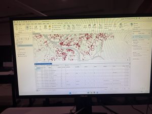
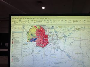
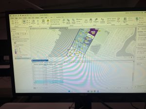
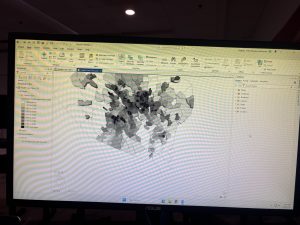
Agrawal – Week 3

Chapter 4: Mapping Density

Chapter 4 explains why mapping density is more useful than mapping totals. Density is the concentration of features or values within a uniform unit of area, such as people per square mile. This matters when areas being compared are different sizes: a large county may have more people, while a smaller county may actually be more crowded. Before making the map, we need to decide whether we are mapping feature density (the number of locations, such as businesses) or feature-value density, such as the employees at those businesses.

There are two main methods. The first is mapping density by a defined area, such as a county, ZIP code, or census tract. GIS divides the count or value by the polygon’s area, and the result can be shown through shaded areas or a dot-density map. In a dot-density map, each dot represents a set amount, but the dots usually do not show exact locations. Choose dot value and size carefully so they show the pattern rather than hide it. One weakness is that a single density value applies to the whole polygon, even though density may vary within it.

The second method is creating a density surface, a raster layer in which each cell receives a value based on nearby features. Cell size controls how fine or coarse the pattern appears, while search radius determines the size of the neighborhood used in the calculation. A larger radius creates a smoother pattern; a smaller radius reveals more local variation. I found it interesting that these choices can change the story the same data tells. This made me think about lottery retailers: mapping store locations would show retailer density, while weighting stores by sales would show a different pattern. My question is: how do analysts select a cell size and search radius that reveal the pattern without exaggerating it?

Chapter 5: Finding What’s Inside

Chapter 5 focuses on finding what is inside an area. This analysis can monitor one area or compare several, such as determining which properties fall within a floodplain or how many incidents occurred inside each police district. Before starting, we must identify whether the features are discrete or continuous. Discrete features are separate and identifiable, such as buildings, roads, or crime locations. Continuous features vary across a surface, such as elevation or rainfall. We also need to decide whether the result should be a list, a count, or a statistical summary, and whether to include partially contained features.

The chapter describes three methods. Drawing the area and features together is simple and fast because it visually shows what is inside, but it produces little analytical information. Selecting features inside an area creates a subset you can list or summarize, which works well for a single area. Overlaying creates a new layer containing attributes from both the area and feature layers. It takes more processing but is most useful for comparing multiple areas or calculating how much of a feature falls inside each one. A buffer, an area created at a specified distance around a feature, can also serve as the analysis boundary.

GIS can then calculate counts, frequencies, sums, averages, medians, and standard deviations. Count is the total number of features, while frequency is the number in each category. Because I am used to working with tables, overlaying reminded me of joining datasets, except the match is based on location instead of a common ID. One point I found important is that the analyst’s definition of “inside” can change the result. For example, should a property count as flood-prone if only a tiny corner overlaps the floodplain? My question is: what rule should be used for partial overlaps, and how should that decision be explained so the map does not mislead the audience?

Chapter 6: Finding What’s Nearby

Chapter 6 explains how GIS finds what is nearby, but “nearby” does not always mean the shortest straight-line distance. It can be defined by distance or travel cost. Cost can mean time, money, fuel, effort, or another difficulty. This analysis can show how quickly a fire station can reach a neighborhood or which customers are within a store’s service area. First, we decide whether to measure proximity outward from a feature or by travel to it, whether we need a list, count, or summary, and how many distance ranges to show.

The chapter describes three methods. Straight-line distance is the shortest direct distance between features and is useful for making buffers or selecting everything within a fixed radius. Planar distance works for smaller study areas, while geodesic distance accounts for the Earth’s curvature across large regions. Distance or cost over a network follows connected features such as streets. A network contains edges, junctions, and turns, and you can assign an impedance to each part, such as travel time. Cost over a geographic surface uses raster cells to represent movement difficulty. Hills, forests, water, or other barriers can make a location costly to reach even when it looks close.

Results can be displayed as a single range, inclusive rings, or distinct bands. Inclusive rings show cumulative totals within increasing distances, while distinct bands separate features into each interval. A spider diagram connects a source to nearby features with lines. This chapter made me think about traveling between Delaware and Cleveland: straight-line distance tells me little compared with roads, bus connections, waiting time, and actual cost. I liked this chapter because it shows that proximity is really about accessibility, not just miles. My question is: when traffic, weather, or road closures change constantly, how often must network costs be updated for the analysis to remain reliable?

Agrawal Week 2

Chapter 1 introduces GIS analysis as the process of examining geographic patterns and relationships to answer questions and make better decisions. The part that stood out to me was that GIS analysis should begin with a clearly defined question. Before working with the software, we need to understand what we are trying to discover, what data will be required, and how the results will be used. The general process involves framing the question, understanding the data, choosing an appropriate method, processing the data, and examining the results. This reminded me of data analytics because having more data or more advanced software does not automatically produce a useful conclusion if the original question is unclear. The chapter distinguishes among three types of geographic features. Discrete features exist at identifiable locations and can be represented as points, lines, or areas, such as businesses, roads, and property boundaries. Continuous phenomena can be measured throughout an entire area and do not have empty spaces between observations. Elevation and temperature are examples. Data summarized by area represent totals, averages, or other measurements within defined boundaries such as ZIP codes or census tracts. These features can be represented using vector or raster models. A vector model stores locations using coordinates and represents features with points, lines, and polygons. A raster model divides an area into a grid of cells, with each cell holding a value. Raster seems especially useful for continuous data, although the selected cell size can affect how much detail the map preserves. The chapter also explains geographic attributes, including categories, ranks, counts, amounts, and ratios. One question I had is how analysts decide when a raster cell size is too large and begins hiding important variations in the data. Overall, this chapter showed me that GIS analysis is not simply creating a map; it is a structured way of connecting spatial data to a specific problem.

Chapter 2 focuses on one of the most basic geographic questions: where are features located? A location map may appear simple, but it can reveal clusters, gaps, and relationships that may be difficult to notice in a table. For example, mapping customers can help a business recognize where its market is concentrated, while mapping crimes by type can help a police department examine whether certain crimes occur in similar areas. The purpose of the analysis determines whether we should map every feature, only one type, or several categories. Another important idea is that the map must be designed for its intended audience. A detailed zoning map might be appropriate for planners examining individual land-use classifications, while a general audience may only need broader categories such as residential, commercial, and industrial. Reference features like roads, lakes, or administrative boundaries can help readers understand the location, but they should remain visually muted so that they do not compete with the actual subject of the map. The chapter recommends limiting a map to approximately seven categories because readers may struggle to distinguish too many symbols or colors. More detailed categories can be grouped into broader ones, although this decision must be made carefully. Grouping makes a map easier to interpret, but it can also remove differences that may be important to the analysis. Similar categories should generally use related colors, while clearly different categories need visually distinct symbols. I found it interesting that even the choice between color and shape affects how easily readers can recognize a pattern. This makes GIS partly an analytical process and partly a communication process. My question is whether the seven-category guideline still applies to an interactive map, where users can filter layers or click individual features for additional details. I would assume an interactive map can hold more categories, but the initial display still needs to remain simple enough to understand.

Chapter 3 moves from showing where features exist to comparing their quantities. Mapping the most and least can reveal concentrations, extremes, and general trends. However, the type of quantity being mapped matters. Counts and amounts represent raw numbers, such as the number of people or total sales in an area. Ratios compare two quantities and include proportions, averages, and densities. Ranks place features in order rather than showing their exact measured values. The distinction between raw counts and ratios was especially important to me. If counties with very different populations are compared using only the number of crimes, the most populated counties may appear to have the greatest crime problem simply because more people live there. Mapping crimes per person would provide a more meaningful comparison. Therefore, when data are summarized within areas of unequal size or population, ratios can prevent the map from creating a misleading impression. The chapter also introduces classes, which group numerical values into ranges. Four common classification schemes are natural breaks, quantile, equal interval, and standard deviation. Natural breaks create classes around patterns or gaps found in the data. Quantile places approximately the same number of features in every class. Equal interval divides the entire value range into equally sized sections. Standard deviation shows how far values fall above or below the mean. Each method emphasizes something different, meaning that the same dataset can appear to tell different stories depending on the classification used. Outliers also require attention because one unusually high or low value can compress the other observations into only a few classes. This chapter made me realize that a map is not automatically objective just because it uses numerical data. Decisions about normalization, classification, colors, and class ranges all influence its message. My main question is how an analyst determines which classification method is the most honest when more than one method produces a reasonable but noticeably different pattern.

Agrawal Week 1

** I reviewed the course syllabus and schedule and completed the GEOG 291 quiz. My photo is attached below.

Introduction

Hi, my name is Radhika Agrawal, and I am a senior at Ohio Wesleyan University. I am pursuing degrees in Quantitative Economics, Computer Science, and Data Analytics. I am interested in data analysis, business intelligence, and using data to understand real-world problems. I decided to take GEOG 291 because I want to add geospatial analysis and ArcGIS Pro to my technical skills. I am interested in learning how location-based data can be used in transportation, consumer behavior, economic development, and public-sector decision-making.

Schuurman Chapter 1

Before reading this chapter, I mainly thought GIS was software used to create maps. However, this chapter explained that GIS is much broader than that. It can mean Geographic Information Systems, which includes the software, hardware, data, and tools, but it can also mean Geographic Information Science. GIScience focuses more on how geographic information is collected, represented, analyzed, and understood.

I found the history of GIS interesting. Ian McHarg used transparent sheets with different layers, such as land use, forests, houses, and roads, to find the best location for a highway. He did this without a computer, but the same idea of layering information is still an important part of GIS today. Computers have made it much easier to combine many layers and study the relationships between them.

The chapter also explained the difference between mapping and spatial analysis. A map displays information, while spatial analysis can help us discover new information and answer questions. For example, John Snow mapped cholera cases and water pumps in London. The pattern on the map helped connect the outbreak to a particular water pump. This showed me how visualizing data can make patterns much easier to understand than looking at numbers in a table.

I was also surprised by how often GIS is used in everyday life. It is used in transportation, agriculture, healthcare, business, utilities, government services, and even deciding where stores should open. Many people benefit from GIS without realizing that it is being used.

One important point from the chapter is that GIS results are not automatically perfect or unbiased. Analysts make decisions about what data to collect, how to create categories, where to draw boundaries, and what to display. These choices can affect the final results. Overall, this chapter helped me understand that GIS is not just about making maps. It is a powerful way to analyze real-world problems, but it must also be used carefully and responsibly.

ChatGPT GIS Applications

1. Transportation Safety and Crash Analysis

GIS is widely used by transportation agencies to identify dangerous roads and intersections. Crash records can be placed on a map over road-network layers. Analysts can then identify crash clusters, compare accident frequency and severity, and study factors such as traffic volume, road design, weather, and nearby intersections. Transportation agencies can use this information to decide where improvements such as traffic signals, crosswalks, lighting, or redesigned intersections are most needed. The Federal Highway Administration explains that GIS-based crash applications often combine maps, dashboards, graphs, and filters. This allows agencies to find high-crash areas and make better roadway-safety decisions. I find this application interesting because it combines data analytics with transportation planning and can directly improve public safety.

Source: https://www.gis.fhwa.dot.gov/reports/Using_GIS_for_Crash_Location_and_Analysis_at_State_DOTs_June2022.pdf

2. Public Health and Healthcare Accessibility

GIS can also help public-health agencies understand how health conditions and access to services differ across locations. The CDC’s PLACES interactive map displays measures such as obesity, physical inactivity, health-insurance coverage, disabilities, and other health outcomes at different geographic levels. Analysts can combine this information with the locations of hospitals, clinics, transportation routes, and demographic data. This analysis can identify communities experiencing poor health outcomes or limited access to healthcare. Public officials can then use the results to decide where clinics, outreach programs, transportation assistance, or other resources are most needed. I find this application interesting because it shows how geographic and demographic data can support fairer resource allocation and policy decisions.

Map: https://www.cdc.gov/places/tools/interactive-map-tool.html