Jan Week 4

Preface

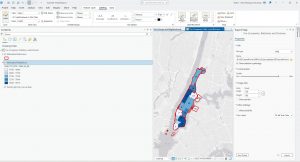
The book covers ArcGIS Pro (desktop), ArcGIS Online (web maps), Living Atlas (ready made data), StoryMaps, and Dashboards. It has three parts: using maps then  preparing data and analyzing it. Note: I have no Windows PC, so I ran ArcGIS Pro in Windows 11 through Parallels on my MacBook.

Chapter 1: Introducing ArcGIS

  • I already knew most of the terminologies from previous readings but doing hands on work with them made much big of a difference compared to seeing screen shots or reading about them.
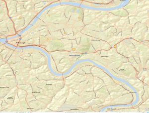
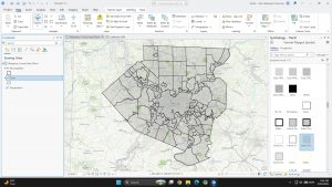
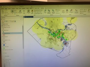
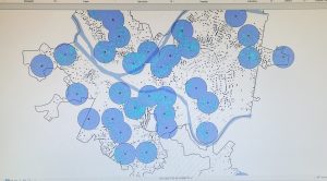
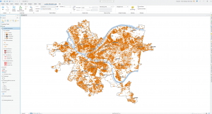
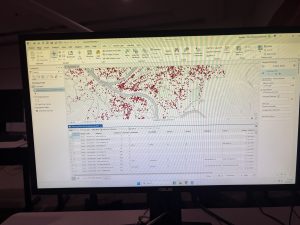
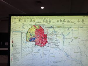
  • Subsidized FQHC clinics cluster in dense, poor parts of Pittsburgh, while urgent care clinics sit in the suburbs.
  • The 3D scene shows population density far better than shades of gray.

Question: How do planners decide reachable distane for people without cars?

Chapter 2: Map Design

  • The subject gets bright colors, and context gets gray.
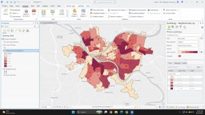
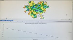
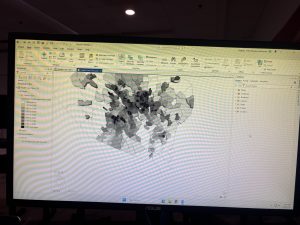
  • My quantile choropleth breaks (830 to 11,595) get wider at the top, so the data is skewed.
  • The dot density map shows two groups (under 18 and over 60) on one map.
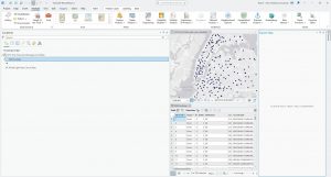
  • Fixed a broken data source (the red “!”) using Repair Data Source.


Question: Can quantile classes mislead when a few values are much larger than the rest?

Chapter 3: Maps for End Users

  • Built a two map layout of arts employment and wages by state.
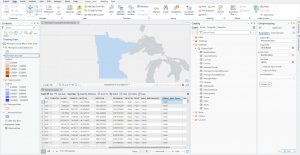
  • The bar chart shows California (290k) and New York (200k) far ahead in arts jobs.
  • I’ll finish the online parts (sharing, StoryMaps, Dashboards) and follow up.


Question: Is employment per 1,000 people a fairer comparison than total jobs?

Redman Week 4

Preface: The preface of this book explains that ArcGIS Online is a service that allows for making, analyzing, and sharing interactive maps. In part one of this book, users learn how to work with existing ArcGIS maps and how to navigate maps and data. Readers also learn how to use cartographic principles to symbolize a range of map types, build map layouts, and use ArcGIS storymaps to present results. Part two introduces the usage of real data to prepare for use. In part 3, the book focuses on analyzing spatial data and maps to solve problems. Buffers, service areas, facility locations, and data clustering will be used to analyze spatial relationships. Raster GIS and ModelBuilder will be used for analyzing demand for services. Lastly, readers use 3D GIS in the context of city planning. 


Part One: Using, Making, and Sharing Maps:


Chapter 1: 

In this chapter, an existing map is used. It has the locations of urgent health-care clinics in Allegheny county, PA. There are both federally qualified health centers that provide subsidized healthcare, and nonsubsidized clinics. The purpose is to be familiarized with how the software works and to analyze both clinic types to determine if they are sited in appropriate locations. 

Terminology:

  • Feature class: building block for displaying geographic features. Feature classes are vector data with corresponding attributes for each feature. 
    • Clinics: line feature. Has centerlines for all streets in the county.
    • Municipality: polygon feature class that has boundaries for all municipalities in the county.
  • Raster dataset: major type of spatial data. It is an image made up of pixels so small that you cannot see individual ones. If it is encoded with geographic coordinates, it can be used as a layer in a map. 
  • File geodatabase: folder that stores feature classes, raster datasets, and other data files. 
  • Project: file that contains maps

Tutorial: 

The tutorial was very helpful in learning how to navigate the map. It showed how to:

  • Get an overview of ArcGIS Pro
    • Set up a project
    • Add an d remove basemaps
    • Turn layers on and off
    • Reorder feature classes in the contents pane
    • Examine the catalog pane and open and export a map layout
  • Navigate ArcGIS Pro
    • Use a popup window
    • Zoom in to a raster feature class
    • Use bookmarks
    • Search for a feature
  • Work with attribute data
    • Open a table
    • Work with fields view of an attribute table
    • Select records and features of a map feature class
    • Obtain summary statistics using a tool
  • Symbolize maps
    • Symbolize feature classes
    • Label a feature class
    • add/remove feature classes
    • View and navigate scenes

Overall, I learned a lot in this chapter about how to navigate GIS. So far, it is a very interesting application and seems very user-friendly. I was able to follow all of the instructions provided even though I have never attempted to navigate a map site like this.

Chapter 2:

This chapter explains map design, specifically, how to design and symbolize thematic maps. Thematic maps help to solve and investigate problems. Thematic maps are composed of subject layers placed in spatial context of other layers. When deciding on layers for thematic maps, you should consider two things. The first is what layers are required to represent the subject, and the second is deciding on spatial context layers needed to orient users to recognize locations. Vector layers are used for subjects of thematic maps because of a large amount of data. This chapter focuses on cartographic skills and principles on symbology using several vector-based thematic maps. 
Tutorial: for this chapter, it shows how to:

  • Symbolize qualitative attributes
    • Display polygons using a single symbol
    • Display polygons using unique value symbols
  • Label features and configuring popups
    • Change label properties
    • Remove duplicate labels
    • Manage popups
  • Filter with definition queries
    • Create a definition query
    • Symbolize figure and ground features
  • Create choropleth maps for qualitative attributes
    • Create a choropleth map of households receiving food stamps
    • Extrude a 3D choropleth map
  • Display data using graduated and proportional point symbols
    • Create a map of graduated size points
    • Normalize population maps with custom scales
    • Create a choropleth map with normalized population and custom scale 
    • Import symbology and use swipe to compare features 
  • Create dot density maps
    • Set visibility ranges 
    • Set visibility range for labels and feature layers

I learned a lot in this chapter about thematic maps and different displays of them. It was very informative on scaling and labeling.


Chapter 3: 

This chapter shows how to share maps with people who do not have skills with maps besides navigation. This chapter teaches how to provide maps in many different formats. Formats include reports, slides, posters, or static maps for websites created from map data, online interactive maps, interactive online purports and presentations, and interactive online dashboards. 

Tutorial: this chapter shows how to:

  • Build layouts and charts
    • Create a layout and add maps to it
    • Resize and place maps
    • Add guides and snap maps to the guides
    • Insert legends
    • Insert text
    • Create charts
  • Share maps online
    • Set properties for online sharing
    • Share maps in ArcGIS online
    • Use map viewer in ArcGIS online
    • Change the style of a layer
    • Configure pop-ups
  • Create a story and a briefing in ArcGIS StoryMaps
    • Create a story
    • Add blocks for the introduction
    • Add a sidecar block with a mao
    • Add content for the left panel of the map
    • Enable navigation
    • Add credits
    • Preview and publish map
    • Create a briefing
  • Create a dashboard in ArcGIS Dashboards
    • Create a dashboard and add a map element
    • Add a table element
    • Adjust table
    • Add serial (bar) chart
    • Add interactions to the dashboard
    • Finish the dashboard

This chapter was very different from the last two chapters as it shows ways to display the information to other people who do not know how to use GIS. The tutorial made it very easy to organize charts and align the graphics in a way that is easy to read.


McMahon Week 4

Chapter 1:

For chapter 1, I was able to navigate through the software by looking at the contents table and the different categories on the top of the screen. On the map, I was able to analyze density population,  areas of poverty, clinics, and other aspects of the urban area. The step by step process was somewhat helpful, but there were many times when I got lost or couldn’t find the section it was asking us to locate.  On this chapter however, I learned how to organize features alphabetically in the different tables. It was interesting to locate the different clinics on the map and see what was around, including the population density and poverty rates within that area. I also found it interesting to move the icons and symbols around to make the map more readable. I thought I was able to book mark pretty well throughout the instructions of the chapter.

Key words: Attribute tables, input tables, population density

Chapter2:

Within chapter 2, there were many steps that included changing symbols and labeling the properties. The section in 2-2 was a bit confusing because I couldn’t find the drop down labels and continue the steps, but I noticed the images within the chapter and I thought it was interesting how the area could be split into categories. I thought that 2-4 was interesting because it showed how the incorporate a 3D map instead of looking at the 2D map and this helped to look at density of a population. Throughout the chapter, showed techniques to show different features of the same layer in the same map. I was able to use graduated symbols to show the density of food bands and soup kitchens in the area from the chapter and then I was also able to organize male and female population receiving food stamps. I was a little confused on what the source fields and target fields were from this chapter and what those represented. From 2-7 I was able to understand how the make a dot density map and analyze it. Lastly, for 2-8, I was able to label parts of the map, however I don’t think I was labeling correctly  because I couldn’t find where the last step was. However I understand the importance of scaling the map

Key words and concepts: Creating a definition query, visibility ranges

Chapter 3:

From chapter three, I thought it was interesting to do the story board with adding headings and content. I thought this chapter was interesting since we had to complete more downloads and we used our maps to make graphs. Some steps I struggled with, like downloading the picture to my ArchGis account, but when I figured it out it was nice to have my maps in a place to refer to. I thought it was helpful to change the last map into a pie chart and a graph.

Key words: Dashboard, bulleted list, heading

Hutto Week 4

Chapter 1

Chapter one introduces us to various features of ArcGIS, which include basemaps, Population density, as well as 3d models and how to export map layouts.  For population density, in the tutorial we were given a map of Allegheny County, Pennsylvania, which shows the location of Urgent Care Clinics and FQHC clinics, which are clinics that receive federal funding for their operation and services.  Using population density, we were able to compare the relationship between areas of higher poverty and community access using census tracts to either an Urgent Care Clinic or an FQHC clinic, and I found that urban areas (in the middle of Allegheny) have a higher poverty rate and therefore also have access to more FQHC clinics than rural or suburban areas of Allegheny.  Using 3d layers, you are also able to see this relationship and which areas have a higher poverty rate than others.


Chapter 2 

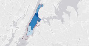
Chapter two introduces us to labels for polygons in land use and water layers which I found helpful. Using the labeling feature inside the labeling tab of ArcGIS, I was able to label each individual neighborhoods inside of individual landuse such as Commercial, Residential, and Manufacturing zones Tutorial 2.4 also teaches us how to create choropleth maps as well as see a histogram visualization of the choropleth. In Tutorial 2.4, we created a choropleth and anaylized the relationship between individual burroughs in New York City and households over the age of 60 receiving food stamps and found that Northern and Southern burroughs have a higher concentration of those over the age of 60 receiving food stamps than those in eastern and lower western Burroughs of New York City.


Chapter 3

Chapter three covers the uses of ArcGIS Online, which allows us to map, share, and analyze the maps that we create on desktop through a web browser. This chapter also introduces us to the creation of map legends in layout exports. In the Layout Exports tab, we were able to display the two different maps we created: the first map at the top shows Arts employment per 1000 population and the annual average wages, while the bottom map shows Arts employment and annual wages. Legends were created for both maps, and using the ruler and guide features, I was able to insert the legends into the layout export so that the display is clean. Map sharing to ArcGIS Online also allows us to interact with each map through the web browser using interactive features.

Boldman Week 4

Chapter 1

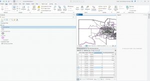
Chapter 1 introduced some of the commonly used tools for representing data in GIS. Symbology is used to represent specific layers or areas on a map and helps make different features easier to identify. In this chapter, I learned how to change the type of symbol used to represent different features on a map. I also learned how to label features such as cities, parks, healthcare centers, and other locations. These tools helped me better understand how data can be organized and displayed in a way that makes a map easier to read and understand. Map features can be sorted by their attributes, making it easier to find specific types of data. When locations are deselected, GIS removes the symbol for that location from the map. This allows map viewers to save time by using the attribute table to quickly find and select specific data.
Chapter 2

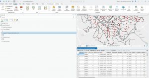
In this chapter, I learned different ways to manage large amounts of data efficiently and organize it more effectively on a map. I learned how to use definition queries and apply SQL logic to create specific filters that target certain points of data. This showed me that GIS can be used to analyze not only entire populations but also specific age groups or other characteristics within a population. One example I practiced was creating a filter to identify people over the age of 60 who receive food stamps. I then limited the layers on the map so that this specific data appeared as the top layer. This helped me better understand how GIS can focus on specific groups within larger datasets and display information clearly and organizedly.
Chapter 3

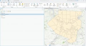
Chapter three provides a fundamental skill for GIS work. This chapter focuses on specific layouts for distributing and publishing maps. I learned how to add map data to a web map form and create legends with specific data points. This allowed me to take a copy of an interactive map and copy it to ArcGIS StoryMaps. StoryMaps is software that reminded me of making a website because of the elements that could be added and the different templates I could work with.

Montana week 4

Tutorial

Chapter 1


In the first chapter of the tutorial a massive amount of information was presented. Many aspects of how you can interact with various panels in the GIS and various display elements were explored. All of our work centered around Alleghany county PA and the urgent care availability and type of urgent care as it relates to other factors (ex:pop density, total pop per area, etc.) while also including other features like roads and rivers.

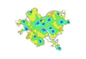
This map rendering focuses on the two different types of healthcare facilities in the county. The green dots(subsidized FQHC clinics)  and their subsequent buffers are concentrated in the areas where poverty is most likely to occur. The Urgent Care Clinics(unsubsidized are located primarily in the suburbs where poverty is less common.

At the very end of the 1st tutorial we got to turn the map into a 3d model based on population density. You can see the same concentration in the center of the county but now with more variable range since it can be displayed in height.


Chapter 2


Chapter 2 had a huge emphasis on the symbology feature when you would right click one of the terms in the contents page. It focused on ways that you could display and scale data.
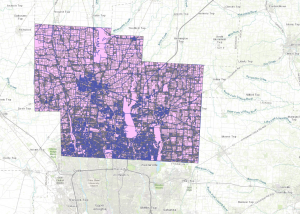
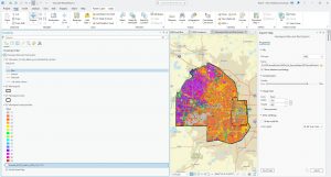
This image used the display by dot density symbology to show the population of individuals receiving food stamps over the age of 60(red) and individuals under the age of 18(blue)

Another cool thing this chapter looked at was at what scales do we have various names for places to come up. I got confused a couple of times on this one because things were taking a while to show up because they were appearing at similar layers and on a pretty huge scale.
Chapter 3

This chapter had a focus on the cross compatibility between the ArcGIS pro application and the online version where documents made in the pro version are made more accessible and user friendly. The system for editing your maps in the online version is much simpler but as a result lacks the ability to do complex tasks. The first part of chapter 3 also demonstrated how to include legends onto existing maps and how to show two maps at once for comparison.

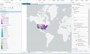
This first image is of a map made in the GIS that was then transferred to StoryMaps to be viewed. A brief introduction and summary of the map was included as well as the necessary citations and their usages.

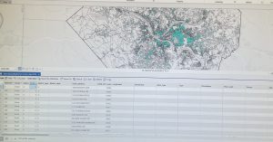
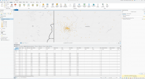
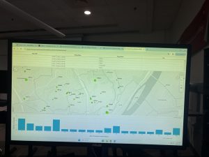
This last image is a dataset and map that was transferred from ArcGIS pro to the online GIS. Using the Dashboard utility we could make a simple table and corresponding charts.

Robinson Week 4

Chapter 1:

Before the start of this chapter, I thought using GIS was going to be pretty straightforward. The setup process was pretty easy. When I finally opened and ran the program, it looked pretty intimidating. So many buttons, sections, and menus to click through. One common thing I kept running into was the book’s broad directions when it came to finding menus. That made finding them a bit difficult. It took a good minute to get used to everything. Overall, I thought the workflow was fun, even though it was challenging to use, especially at first. The first chapter covered a few things, from the introduction to the GIS program to working with 3d3Daps. This chapter also covered some of the topics mentioned in the Mitchell book. Some of the included terms were classes, features, maps, etc. Part 1 was just a general overview of the program, understanding some of the basic concepts of it. The next section showed us how to navigate the program, which did help trying to move around the app program a bit easier. The next section had us working with attribute data, which lets the user search for features on a map and find necessary information. Section 6 had us symbolizing maps, turning raw data into visual information that everyone can see. This section was the most interesting because it involved setting up the overall map. I was trying to get all these bits and pieces to come together and turn them into a final product. One thing I was toying with for a good minute was the 3-d maps. After doing the labs for Chapter I, I felt generally really excited about learning to use these new programs. I look forward to the rest of the chapter and what it could offer down the line.

Chapter 2:

Chapter 2, just like Chapter 1, still felt like moving into a new world. Throughout the process, I was still trying to get used to the menus. Knowing where to find things, which sections they are in, etc. Chapter 2 goes into more detail about designing a map. A good chunk of the information on how to make a good map (depending on the data you’re presenting) was talked about previously. That gave me a decent understanding of what to expect in this chapter. Chapter 1 had us symbolizing qualitative attributes, learning how to symbolize features based on their code. The next section, my favorite section so far, was labeling features and how to configure pop-ups. Finding out what pop-ups are in GIS caught me a bit off guard. Regardless, it was one of the easiest sections of the chapter. Section 3 was the most interesting one, showing us how to filter information by defining queries. The next one discussed how to make choropleth (I’d never heard this word before) maps for quantitative attributes, but this section was the most enjoyable. Section 5 made us create maps with dot-to-scale references and gradients. Making dot density maps was the most interesting, and I spent maybe 30 minutes toying around with some of the features. Just to see what the end result would look like. My attitude toward GIS changed by the end of chapter 2. Searching through menus has gotten easier (the book was hit or miss), making the process of going through these labs much quicker. When working through this chapter, I started clicking through the menus more, trying to figure out each one’s function. Most of that time was spent working on section 3. Regardless, I had a fun time working with this chapter, and everything that I had to do in it.

Chapter 3:

Chapter 2, just like Chapter 1, still felt like moving into a new world. Throughout the process, I was still trying to get used to the menus. Knowing where to find things, which sections they are in, etc. Chapter 2 goes into more detail about designing a map. A good chunk of the information on how to make a good map (depending on the data you’re presenting) was talked about previously. That gave me a decent understanding of what to expect in this chapter. Chapter 1 had us symbolizing qualitative attributes, learning how to symbolize features based on their code. The next section, my favorite section so far, was labeling features and how to configure pop-ups. Finding out what pop-ups are in GIS caught me a bit off guard. Regardless, it was one of the easiest sections of the chapter. Section 3 was the most interesting one, showing us how to filter information by defining queries. The next one discussed how to make choropleth (I’d never heard this word before) maps for quantitative attributes, but this section was the most enjoyable. Section 5 made us create maps with dot-to-scale references and gradients. Making dot density maps was the most interesting, and I spent maybe 30 minutes toying around with some of the features. Just to see what the end result would look like. My attitude toward GIS changed by the end of chapter 2. Searching through menus has gotten easier (the book was hit or miss), making the process of going through these labs much quicker. When working through this chapter, I started clicking through the menus more, trying to figure out each one’s function. Most of that time was spent working on section 3. Regardless, I had a fun time working with this chapter, and everything that I had to do in it.

Meyst Week 4

Chapter One

Chapter One was fairly easy to parse and understand, and aligned fairly accurately to my predictions on the chapter’s difficulty. It took me around 2 hours to complete, and centered mainly Pennsylvania and one of its major cities, Pittsburgh. Having driven through Pennsylvania and by extension Pittsburgh, I found this activity fairly interesting in understanding the economic status of Pittsburgh and simultaneously learning the beginning parts of GIS technology. At the very beginning, while completing the initial tutorials, I found remembering the prompts and commands fairly difficult. By the end of the chapter, I was far more comfortable and familiar with the software, which assisted me in later chapters.

Chapter Two

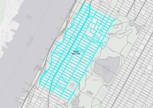
While still fairly easy to understand and manage, Chapter Two was progressively more difficult than Chapter One. Once again, this chapter included interesting economic background to a city I have personally visited (the past two summers, I have gotten to travel to NYC! Very fun!), so this chapter was quite interesting to me. The most difficult part of this chapter was the Your Turn sections; I found myself revisiting the previous section’s instructions very frequently, especially the 2D-3D map portion. Additionally, reading the unlabelled data sets was a challenge, especially with data sets with similar names like U18FHHFOOD or U18MHHFOOD.

Chapter Three

Chapter Three was easily the most difficult chapter, switching between the ARCGIS Pro app and the ARCGIS website. I found the assignments on the ARCGIS website itself were fairly straightforward, but some parts of the tutorial in the ARCGIS Pro app were quite difficult, especially the first tutorial. Creating a story map was mostly just copy-pasting from the PDF provided, so was very easy to do.


Week 4 Grennell

Chapter 1:

I thought that chapter one started off really hard because I didn’t really know where any of the buttons were. The book also didn’t make it any easier since there weren’t exact directions on where to actually find what I was looking for. However, after I actually found what I was looking for, the directions were pretty straightforward and easy to understand. One question I had for this chapter was it wanted me to make a bookmark of the new map that I made/altered and I wasnt able too, did anyone actually figure out how to do it?

Chapter 2:

Chapter 2 made a lot more sense; however, I wasn’t ready for it to have eight separate parts.  I was thankful that a few of them were really short, only about like 8 steps overall. I found this chapter to be a lot more straightforward; the readings showed some step-by-step pictures that helped lead me in the right direction.  One question I had about this chapter was when it wanted me to lable, I wanted to know if anyone else was confused at first because it wanted you to lable the map but it didnt really show/tell me how? I was kinda expected to just know how to do it.

Chapter 3:

Chapter 3 was throwing me for a loop the entire time, well, not the whole time. 3.1 made a lot of sense and was pretty straightforward; however, 3.2 and 3.4 were probably the most confusing things I had to do. I think what confused me the most was when it wanted me to go to 3.3 and copy/paste a summary for something, then it told me I couldn’t share it because something with that title had already been shared before (not sure if this happened to just me or everyone, but I was confused). As for 3.4, I was just confused the entire time; the steps weren’t very understandable since they didn’t give an image to look at. It might have also been hard because it was asking me to do something that I’ve never done (in the other tutorials), it was just something completely new. It also kept starting the tutorials with “log in to ArcGIS,” which was confusing, but maybe they assumed I wasn’t already logged in.

Bruner Week 4

Chapter 1

Chapter 1 mostly explored the basics on how to use the program. I was taught how to navigate it on a basic level and what the different buttons did, essentially.

A couple different things this chapter had me do included:

– Observing vector vs. raster layers, and how raster layers have visible pixels, and the vector rivers are smooth

– 

– Exploring highlighting specific features to make them stand out, or to look into data connected to the feature

  • Creating and looking at labels

– Looking at 3D data, and how it really helps to show density visually, more than color alone.


Chapter 2

Chapter 2 explored different ways of presenting and examining data in a map. We explored things like use of different colors, different shapes for features, showing different labels and features at different levels of zooming, all to make the map more visually presentable and easy to look at.

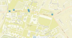
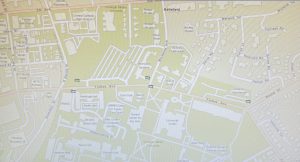
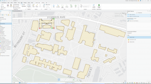
This is a simple example of some data showing up when you zoom in, but not when the map is zoomed out, so that it looks less cluttered.

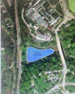
And here, even more zoomed in, we can see the text, but no longer the dots.

We also looked at ways to compare different sets of data without switching maps, with the compare slider. I liked that.

Chapter 3

Chapter 3 explored ways to present our data. We dove into ArcGIS Online and made a document of maps, charts that could be used for research, a story, a briefing, and a dashboard. We also learned how to share maps from the program to the online system.

The document:

More work with Layers at different levels of zoom, but with fun pop-ups that are so fun:

Some tables/charts made in ArcGIS Online:

And some of the posts created (with templates):


Overall, these 3 first chapters served as a great introduction on how to use the program and I feel as though I am comfortable enough to work on a real project in the near future, once I get more used to all of the features of the GIS.