Chapter 7
In this chapter, I learned all about the different methods of digitizing. I first was introduced to the process of moving, rotating, splitting, and adding more vertices to polygons on a map. Although this process was simple, I appreciated that it led to a cleaner look and allowed the polygons to stand as a more accurate representation of the locations on the map. The next tutorial focused on adding and deleting a polygon feature class. Although I did not have any problems with the guided tutorial, I struggled with the “your turn” section. After a while of retracing my steps, I eventually figured out that I forgot to change the feature class I was adding to point instead of polygon. This meant that I wasn’t allowed to use the correct symbology or data format. Sometimes I wish in situations like these the chapter would give us links for previous instructions or reminders if we forgot how to do a process. I then learned about the steps of how to smooth polygons. This process further contributed to a more professional looking map. The last tutorial taught me how to use the georeference and transformation tool on polygons. I found this section to be the hardest in this chapter because there were many steps that had to be performed correctly in order for the function to work. For example, I had trouble with the transform polygon feature. When setting the output coordinate system for one of the feature classes, I accidentally changed the wrong one. This meant that I could not link the layers to each other because they did not have corresponding coordinate systems. This mistake emphasized the importance of making sure to follow and pay attention to the little things when working with GIS.
Chapter 8
Chapter 8 focused on the definition and the process of geocoding. Geocoding takes data in the form of text, such as street addresses or zip codes, and plots them as geographic coordinates on a map. Although there are components that are applied in order to make this process as accurate as possible, there are still some problems that come with geocoding. One issue is that there are often misspellings, abbreviations, or omissions of names causing confusion when matching the sources to reference data. GIS combats this by calculating a percent accuracy of each source through the subtraction of points for each problem that occurred. Although there is no way to truly judge if matches are correct, this process is able to review some of the nonmatched sources and incorrect matches to improve the reliability of geocoding for the many organizations that rely on it today.
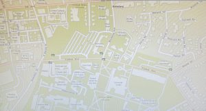
The first tutorial introduced me to how to geocode data using zip codes. This included the process of building a zip code locator, establishing geocode addresses, and rematching data. This type of mapping would be extremely useful in seeing where the majority of an organization or event population resides. The second tutorial walked me through a similar process, but this time I geocoded data for street addresses. For me, this chapter was probably the simplest and quickest one so far. Although there were not that many tutorials to work on, the chapter introduced a large amount of necessary background information about geocoding.
Key Concepts/Definitions
Geocoding: GIS process that matches location fields in tabular data to corresponding fields in existing feature classes to map the tabular data.
Chapter 9
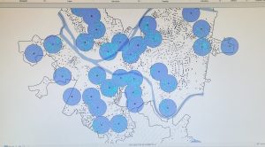
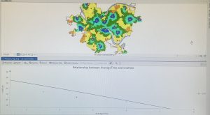
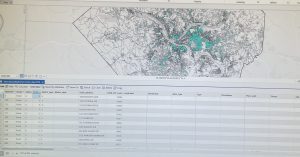
This chapter marked the beginning of the last section of the book: applying advanced GIS technologies. It focused on the idea that even when you have the right dataset for a subject, sometimes visualization of spatial data is needed to answer questions and solve problems. The chapter covered four different spatial analysis methods that included buffers, service areas, facility location models, and clustering. Buffers are generally used to find what’s near a feature or to see how many people are located within a specified distance of a feature. The buffer map was my favorite way to visualize data from this chapter. To me, this method provided the most accurate visual representation of the differing spatial data. Service areas are like buffers but instead of distance from a feature, it is based on travel over a network. The facility location model uses Network Analyst to find the best locations for new features such as facilities. This map was interesting to look at because the representation of the data was presented in a way I have not seen before. Lastly, the clustering method focuses on the ability to identify clusters of data points that are closer to each other but distant from other clusters. Although I was able to complete this section, my results were not exactly lining up with the tutorials. I was getting all of the same numbers for frequency and mean, but my cluster ids did not match. As a result, my symbology for the groups also did not match. I do not know if this is a problem that happened on my end or if it was just the fact that ArcGIS Pro is now on a slightly different version than the book I currently use.
Key Concepts/Definitions
Buffer: A polygon surrounding map features of a feature class.