Savannah Domenech Week 2

Mitchell Chapter 1:

Key concept and definitions:

GIS analysis: The steps that are taken to find geographic patterns in a dataset and to find relationships between features.

Types of features (discrete, continuous, summarized by area): Discrete features can be pinpointed. Continuous features blanket the entire area and usually start off as a series of points which are then interpolated. Features summarized by area have a data value applied to the entire area which represents the sum or density of certain individual features within that area.

Interpolation: When GIS assigns values to areas in between points to create continuous phenomena.

Vector model: Every feature is a point, line, or polygon and a row of data in the attribute table. It uses coordinate data. Discrete features, continuous features, and features summarized by area are represented using the vector model.

Raster model: Every feature is a matrix of cells in continuous space; the size of the cells can be adjusted (too large and data is lost, too small and it takes a long time to process and doesn’t add additional precision to the map). Continuous features and numeric values are represented using the raster model. 

Map projections: They allow data to be viewed on a globe which is transformed to be a flat surface. Different map projections distort area, distance, and direction differently. 

Notes:

  • Making maps is in effect analysis. Models (with many layers) also are analyses
  • The steps to analysis are: frame the question (be specific!), understand your data (figure out what you have and might need so you can get the information you want), choose a method (there are faster, less precise ways and slower, more precise ways), process the data in GIS, and look at the results (which can be a map, a table, or a chart)
  • The types of attribute values include categories, ranks, counts, amount, and ratios
  • A purpose of GIS analysis is to find why things are where they are and how things are related
  • I learned my first little bit about raster data and the raster model


Mitchell Chapter 2:

Key concept and definitions:

Subset: Only using certain attributes of a larger data set (for example, theft is a subset of crime).

Distributions: Features that are clustered are likely to be near other features, features that are uniform are less likely to be near other features, and features that are random have the same likelihood to be at any given location.

Notes:

  • Many patterns can be determined just by mapping a phenomena
  • It is important to consider your audience, medium, and purpose when mapping
  • You can map more specifically or generally depending on your purpose; the goal is to make patterns easy to see
  • Single codes can indicate both major type and subtype (for example, codes 500 to 599 are burglary and each number in between is a specific type of burglary)
  • You shouldn’t display more than seven categories on a single map
  • A general rule of thumb is to use less categories when zoomed out on an area, however when you are zoomed in on an area you can use more categories
  • There are trade-offs in mapping; using fewer categories can make a map and patterns easier for the audience to understand but information is lost by reducing or condensing numerous categories into fewer categories
  • Three methods of grouping categories are: assigning a general code to each more detailed record in the database, creating a linked table that matches detailed codes to general codes, and assigning the same symbology to certain detailed records to visually create a more general map. The first two involve using the Attribute Table and the last one is more artificial and involves using classification
  • It’s harder to distinguish shapes than colors
  • Since it can be different to distinguish narrow line colors, consider using different thicknesses or patterns (dotted, dashed, etc.) for lines
  • Mapping reference features can be important as it gives people a visual bearing at what they are looking at. This should be done using non-dominant colors


Mitchell Chapter 3:

Key concept and definitions:

Counts and Amounts: Counts are the number of features on a map and amounts are the values attributed to each feature on a map. Both show total numbers and can be used with discrete or continuous phenomena.

Ratios: It is formed by dividing one quantity by another. They are useful when summarizing by area and will typically be averages, proportions, or densities.

Ranks: It is a relative ordering system rather than a measured one.

Classes: It is grouping values into groups so values that fall into a certain break are a part of one group and values that fall into a different break are part of another group . Counts, amounts, and ratios are usually grouped into classes.

Classification schemes (natural breaks, quantile, equal interval, and standard deviation): Natural breaks emphasize differences in values. Quantile schemes put an equal amount of values into each class. Equal interval schemes form classes with equal ranges. Standard deviation schemes form classes based on how values vary from the mean. 

Notes:

  • Discrete phenomena can be represented using graduated symbols (points and lines), graduated colors (areas), or sometimes 3D perspectives (all)
  • Continuous phenomena (areas) can be represented using graduated colors, contours, or 3D perspectives
  • Features summarized by area can be represented using shading
  • Features with similar values should be in the same class and there should be as great as a difference possible between classes
  • Most people can determine up to seven colors on a map
  • Reds and oranges attract the most attention and blues and greens the least
  • Some ways of dealing with outliers include: putting each outlier in its own class, grouping outliers into one class, grouping outliers with the next closest class, or denoting them using a special symbol
  • Circles are the most distinguishable graduated symbol
  • You can use charts to show more information on a map, but don’t show more than five categories on a chart and don’t map more than thirty features
  • Contour lines are used to show the rate of change for a spatially continuous phenomenon (like pressure lines)
  • 3D perspectives have three parameters: viewer’s location, vertical exaggeration, and location of light source


Mitchell Chapter 4:

Key concept and definitions:

Cell size: It determines how fine (smaller cells) or coarse (larger cells) patterns will be. Cells are square and in general there should be between 10 and 100 cells per density unit.

Search radius: The larger the radius the more generalized the patterns. 

Calculation method (simple and weighted): The simple method only counts features within the search radius so that each cell has the potential to have a ring around it. The weighted method emphasizes features more near the center of a cell and results in a smoother, more generalized surface. 

Units: If areal units are different from cell units the values are extrapolated.

Centroids: Center points.

Notes:

  • Density maps show you where the highest concentration of features are
  • Density can be mapped using a dot map, by calculating the density for each area, or by using density surfaces
  • Dots on density dot maps are distributed randomly throughout the area they correlate to
  • Dot maps are good for giving a quick sense of a specific area’s density
  • On dot maps, dots are often displayed based on smaller areas but the boundaries of larger areas are typically visually shown
  • Density area maps should use a range of color values with one or two hues
  • Density surfaces are usually created as a raster layer, are good at showing where points and lines are concentrated, and can be created using graduated colors (using shades of a single color) or contours
  • Density surfaces are created by defining a search radius around each cell center and then GIS calculates how many features or values that cell radius contains and divides it by area or another value
  • Just because there is a high density portrayed on the map does not mean there are actually any features in that cell; this is the result of a search radius that is picking up other features
  • Density surface maps were the most confusing thing for me in these four chapters
Lee Leonard-Week one

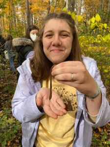
Howdy! I’m Lisa Leonard (I prefer to go by Lee) and I’m a senior studying Zoology and Environmental sciences. I’m from Cambridge, OH. I’m taking this class because I realized I do not know much about GIS and wish to comprehend the program ArcGIS and other GIS-oriented things. I did an REU over the summer involving long term ecological research (Also drought legacies and how plant-soil feedback loops react when a stress variable is added in) and one thing my mentor recommended to me was learning how to work with GIS, so I’m here today. My interests in zoology and environmental sciences are biological indicators, specifically invertebrates, and lichen. I also like to study anthropogenic activity.

lover of annelids <3

I think one thing I heavily appreciated about the readings is the diversity in disciplines. It heavily emphasized that it wasn’t just used in geography, but rather spread across multiple fields. I personally never knew that those outside of the natural science bubble could have a use for GIS, so when I read that GIS was quite literally all around us (From getting your morning cup of Joe to organ donation), it blew my mind. I liked this chapter a lot because honestly I’ve stayed away from GIS because it seemed too complex, but now that I’m reading more about it I feel less intimidated? Stay tuned. It’s a nice dip your toes into the subject chapter in a way. I think it was more cooler seeing the figures than reading about it (i.e. Figure 1.4: Cholera in London in 1854) because that was before GIS was even computerized!

I looked into the different forms of GIS used at the place I did my REU at and found a lot of different images that I didn’t even know existed! Attached is a link to the W.K. Kellogg Biological Station’s Long Term Ecological Research site, where they have various scales of data, from soil to the roads in Kalamazoo county. (https://lter.kbs.msu.edu/data/gis-data/) Try not to click metadata because it has a more coding set up but please look at the images if possible! (The soil one looked so cool!)


For my research, I chose a paper called ‘A GIS-based method of lake eutrophication’, which was a fairly tough read honestly. While it isn’t 100% my preference, I felt it was significant to discuss eutrophication from a GIS sense because eutrophication is a form of anthropogenic activity caused by an overload of various nutrients leaking into waterways (this is usually caused by agricultural practices) and causing a decline in fairly sensitive organisms, such as amphibians. This paper doesn’t shine any light on our poor slimy amphibian friends, but rather discussing a variety of physical, chemical, and biological indicators. (Phytoplankton was the biological! I assume because some species do super swell under stressful conditions, while other species are extremely sensitive to eutrophic environments.) This study took place in a body of water, called ‘Lake Chao’, located in China with HIGH levels of eutrophication. These high levels have impacted the population around them socioeconomically, ecologically, and even caused the population to have some pretty intense health effects. The main GIS aspect these focused on in the results was a lot of spatial distribution, and what areas of the lake were heavily impacted and what parts were not. They actually said that the eutrophication levels and the genuine conditions of the lake were not too far off from each other. However, there is no distinct indicator or parameter that can be evaluated in a simple fashion when it comes to a body of water, but if we put multiple different indicators together to create a distinct evaluation of a lake assessment. I think this paper had a lot of complexity to it and frankly, the photo I’m attaching below from the paper seems intense to even explain

One fragment of figure 3 from the paper. It went from a-f and seemed to be explaining the trophic state index on a spatial scale? This was with the various indicators but holy moly I feel violently humbled.

Source:

Xu, F.-L., Tao, S., Dawson, R. W., & Li, B.-G. (2001, October 30). A GIS-based method of Lake Eutrophication Assessment. Ecological Modelling. Retrieved August 28, 2022, from https://www.sciencedirect.com/science/article/pii/S030438000100374X

This was from a journal called Ecological Modeling.

I also looked into the use of GIS with lichen and was not disappointed with what I found. Air in urban environments isn’t really good in terms of quality, and lichen is a great biological indicator to look at when understanding air quality. In this study they also used moss because lichen and moss both are great at absorbing things, making them great candidates for indicating toxicity in the air. In the article, there was a map (figure 4) showing agglomerations of lichen and moss (Used a high for higher concentrations in different areas) It was so cool to see it because I didn’t really expect GIS to include such microscale pieces of nature. I wonder if there is GIS data on every ant in Michigan. That’s so crazy to me. It also showed a wind rose in figure 2, which showed direction and speed of wind as well as the concentrations of toxins in the air. I think it’s awesome how GIS can have different ways of expressing data like how R can too (or scientists making graphs and different forms of data in general.)

Source:

Długosz-Lisiecka, M., & Wróbel, J. (2014, September 24). Use of moss and lichen species to identify 210po-contaminated regions. Environmental Science: Processes & Impacts. Retrieved August 28, 2022, from https://pubs.rsc.org/en/content/articlelanding/2014/em/c4em00366g/unauth

(If you happen to look at this, on the right there is a yellow bar that lets you see the whole paper.)


Week 1 Blog Post (Nathan Sturgill)

  • Hello, my name is Nathan Sturgill but I prefer to be called Will (my middle name). I am a senior this year and I am a double major in Environmental Studies and Geography. I am from Portsmouth, Ohio, which is in Scioto County (roughly the southern tip of Ohio). My interests include skiing, golf, and wakeboarding. This will be my second class with Dr. Krygier, and I am looking forward to having a great semester! I plan on becoming the remote sensing lab student manager for the year. I also live in one of the fraternities here on campus with a great group of guys. My goal for this class is to become more skilled with GIS and to have a better understanding of the history behind GIS. 

  • 2. Reading Schuurman chapter 1 was very helpful in understanding the origins of what makes up GIS. GIS consists of two specific uses which are making maps and analyzing data. I had no idea there was such a debate in the GIS community as to what really makes up GIS and which of the uses is the real identity of GIS. GIS is viewed by some to be just a tool or application that is used for creating visual representations of maps and mapping data. Many others it is viewed as being an analysis of spatial data that includes creating visual maps with many different layers and factors besides just a basic cartographic map. The debate between the two was also referred to as GIS as in Geographic Information Systems and GIS as in Geographic Information Science. I thought that the most interesting difference between the two meanings for GIS was how the chapter articulated the difference. The chapter states that the science in GIS asks the question of how versus the system in GIS is where the spatial entities are. I had never thought about the difference in GIS or had even known if there was a difference in what GIS meant to the Geography community. I also thought that how the chapter explained what visual representation can mean to people when analyzing data was very interesting in that many people do not realize how they interpret visual representation compared to numerical data and cartography.


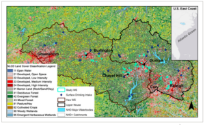
  1. I searched “GIS application urban expansion” and the first article that caught my attention was Characterizing and classifying urban watersheds with compositional and structural attributes. This article caught my attention because I have always been interested in urban expansion and how it affects the natural environment around us, and how we as humans contribute towards the degradation of natural environments via urbanization. This article explains the distribution of land cover, topography, infrastructure, and topography across a certain region in North Carolina. This article explains the rapid growth of urban expansion in the Southeastern region of the United States and how it affects the natural environment of the area using GIS to measure this effect. The article states that development threatens water resources in the region which in turn threatens water resources and further development of the area. This is fascinating to me because it explains how the region has suffered with poor water quality due to urbanization and the continued growth of urban communities in the area. 

  • This figure represents the study area of the region and how the area is affected by urban expansion compared to the surface water resources shown in blue dots. 

https://onlinelibrary.wiley.com/doi/full/10.1002/hyp.14339


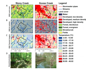
  • Another article I found under “GIS application urban expansion” mentioned streams in urban heat islands and the variability in temporal and spatial temperatures. This article examines how streams that drain urban heat islands are warmer due to urban air temperatures and ground temperatures, and paved impervious surfaces that the stream may run across. This article really interested me because it shows one of the main negative consequences (using GIS to do so) of urban expansion and what urban expansion can really do to the environment. The article also explains how urban heat islands are created and how they differ in temperature from rural, and forested areas. The main reason urban areas tend to have higher temperatures than rural and forested areas is because impervious surfaces used to create infrastructure as well as a lack of natural vegetation in the area which decreases the cooling effect for the area. 

  • This figure represents a comparison between a rural area and an urban area in North Carolina.  Stony Creek being the rural area and Goose Creek being the urban area.  The biggest difference between these two is the obvious difference in temperature for the two regions. We can also see how the forested area directly correlates with a lower temperature of the area observed, and how the urban area directly correlates to a higher temperature recorded for the area. We are able to tell this correlation between areas and temperatures because of the GIS application that is used here to observe and take these measurements.
  • https://www.journals.uchicago.edu/doi/full/10.1899/12-046.1

Abbey S- Week 1

Hello! My name is Abbey Setlik and I’m a senior Zoology Major. I’m originally from Herndon, Virginia.  I’m taking this class to better understand how GIS works since it seems to be a valuable tool for future jobs. This summer I worked in Dr. Wolverton’s lab and helped move my siblings into college. They are quadruplets so it was pretty busy. I am interested in field biology and wildlife rehabilitation.

I liked how the reading focused on how GIS is used in many different practices. As someone who is not very familiar with GIS, I was confused about the difference between spatial and geographical analysis. The author also explained how there were two ways to approach GIS: “where” spatial entities are and “how” we encode spatial entities. I believe, as someone interested in scientific research, that the question of “how” is more relevant to my field, but I can see how both might be applicable. I personally think that GIScience is more interesting that GISystems. From my understanding, GIScience interprets and questions the data generated by GISystems?

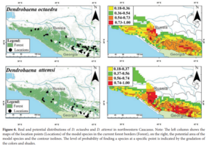
I found a study that looked at the earthworm population in northwestern Caucasus using GIS. The study wanted to see whether the two species of earthworm preferred different forest locations, whether they were confined to different areas in any way and the general distribution of the two species across the study area. GIS came in handy especially when it came to answering the last question. The results of this study found that both species of earthworm inhabited all of the different types of forests, with the population the most abundant in coniferous-deciduous forests, and the least abundant in pine forests.

GIS was used to visualize the distribution of both species of earthworm.

GERASKINA, ANNA and SHEVCHENKO, NICOLAI (2019) “Spatial distribution of the epigeic species of earthworms Dendrobaena octaedra and D. attemsi (Oligochaeta: Lumbricidae) in the forest belt of the northwestern Caucasus,” Turkish Journal of Zoology: Vol. 43: No. 5, Article 7. https://doi.org/10.3906/zoo-1902-31

I also found records that utilized GIS to look at wildlife-highway relationships. I remember reading that cicada numbers have drastically decreased due to pavement blocking their way to surface ground, so I found it cool that GIS was mentioned to analyze similar phenomena. The program aimed to reduce animal collisions and work with the land when creating roads. GIS was used specifically to pinpoint critical areas that needed to be changed in order to reach the goal of conservation. (Smith, Harris, Mazzotti, 1999)

Abby Charlton – Week One

I’m Abby. I am a sophomore, and I am majoring in geography and environmental studies. I hail from Granville, Ohio, which is about an hour straight east of Delaware, but on campus I live in the treehouse! For some fun facts, I love animals, and I will talk about my pets endlessly if given the opportunity, and I love to bake, so if you need bread recipes, you can come find me. I also help run Ohio Wesleyan’s chapter of the Food Recovery Network, so if you want to join, let me know 🙂

The Schuurman article was interesting. I had no idea that the basics of GIS were such a hot debate. I knew from prior classes the application of GIS software has its controversies, but I didn’t realize that professionals still debate whether or not it is simply a way to visualize data or if it’s actually more than this. Furthermore, I also didn’t know that GISystems and GIScience were separate areas. While my knowledge of GIS is limited, I assumed that when geographers used GIS software, they were analyzing the data as well. It’s interesting that systems only focuses on the technical aspects of mapping.

The article is also interesting because it shows just how prevalent GIS is in every field now. Schuurman mentioned disease tracking and predicting, traffic problems, farming techniques, and public resources, all of which are remarkably different fields.

In my own research, I focused on the impact that GIS could have on natural disaster response. With the population increasing, an increasing urban density, and an increase in climate-changed caused storms, it is more important than ever to have precautionary efforts to mitigate these disasters. One such plan is run by civil engineers in Chittagong, Bangladesh, in which they mapped out locations of hospitals and other shelters in the city and implemented them into a map in order to help citizens find the nearest help/safety during earthquakes and floods.

http://103.99.128.19:8080/xmlui/bitstream/handle/123456789/252/A%20GIS-BASED%20ANALYSIS%20ON%20%e2%80%9cEMERGENCY%20DISASTER%20RESPONSE%e2%80%9d.pdf?sequence=1&isAllowed=y

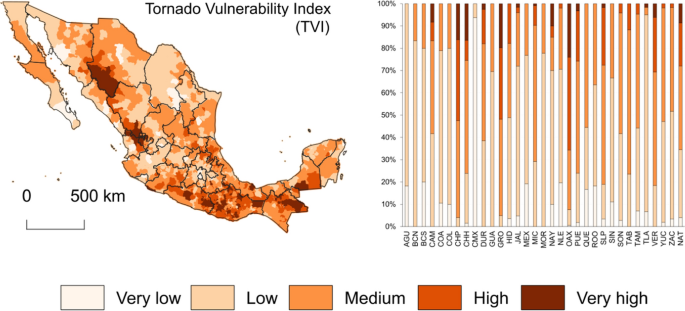
Another article I found is about tornado risk in Mexico. It was stated that tornadoes are a relatively common phenomenon in Mexico, yet this danger was not studied or really reported. In the article, scientists gathered information on the locations of inclement weather and compared it to social aspects of the same areas, such as structural characteristics, healthcare of the area,  and age and mobility. Together, scientists used these comparisons to make a hazard index for the territories of Mexico. In this case, GIS was used to better understand the impact that tornadoes could have on different areas of Mexico.

figure 5

https://link.springer.com/article/10.1007/s11069-022-05438-0

Jocelyn Weaver Week 1

About me 😎

My name is Jocelyn Weaver and I am an environmental science and geography major with a botany minor. I am from Hudson Ohio which is around Cleveland. I am a junior and on the track team on campus (I throw javelin). I like hiking and being outdoors, my favorite food is mashed potatoes, and I am on the student Envs board. I am excited to learn more about GIS and use it potentially in a future career.    


Comments on Chapters 1: GIS: Short introduction

-It is true, when I tell people I do research involving GIS, most people do not know what that stands for

-Interesting how the idea of overlaying came around in 1962 and was the original idea for GIS basis

-The article brings up multiple angles in which GIS is looked at by different people and how people categorize it like wether its quantitative analysis or an extension of mapping which is an interesting concept

-It interesting all the ways GIS can be used and applied, which people do not regularly think about like farmers and what you eat and where it comes from and how to get to your local supermarket

-Never heard the term “leap-frogging” before and the example of people in sub Saharan Africa never having a landline but having cellphones now


An urban storm-inundation simulation method based on GIS by Shanghong Zhang and Baozhu Pan

I looked up GIS storm water management and multiple articles came up using GIS and other data sources to predict and map land to show where storm overflow water would go. This article specifically talks of a new method USISM to simulate urban storm inundation. Due to urbanization and other human factors flooding is more frequent. To be able to find inundation quickly an urban storm-inundation simulation method (USISM) based on GIS is proposed. GIS technology is used to find depressions in the land and other data such as digital elevation model (DEM) to obtain flow order of the depressions.


Arc StormSurge: Integrating Hurricane Storm Surge Modeling and GIS by Celso M. Ferreira, Francisco Olivera, and Jennifer L. Irish

Arc storm surge is a a GIS application that models data involving hurricane waves, surge models, simulating waves nearshore, and wave models and hydrodynamic models. This program involves pre and post processing tools to help spatial data and numerical modeling. Hurricanes cause immense costal flooding and damages and which these prediction models will be able to understand the events of a simulated hurricane storm surge. Details are in the caption following the image

Citation

Zhang, Shanghong, and Baozhu Pan. “An urban storm-inundation simulation method based on GIS.” Journal of hydrology 517 (2014): 260-268.

Ferreira, Celso M., Francisco Olivera, and Jennifer L. Irish. “Arc StormSurge: Integrating hurricane storm surge modeling and GIS.” JAWRA Journal of the American Water Resources Association 50.1 (2014): 219-233.

Savannah Domenech Week 1

  1. A basic introduction to you with a glossy 8.5×11 photograph

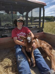
I am Savannah Domenech and I’m from the Greater Rochester Area in New York (in particular Webster, NY). I am an Environmental Studies and Geography major. This is my third semester of having Dr. Krygier as a professor in a row. A fun fact about me is I wanted to be a firefighter growing up (and still do have some interest in doing it as a volunteer perhaps one day). I have other fun facts too, like I carried two brand new baby calves this summer; they were heavier than I thought! Below is Caramel, born in the early afternoon of June 28th. 

2. Read Schuurman ch. 1 (PDF) & include a few comments, thoughts, etc.

  • GIS sure has a lot of uses from Starbucks store planting to epidemiological identification. One use that stood out to me (as I was a farming intern this summer) was using GIS to determine why a certain area of a crop field is not doing well. I also did not realize GIS is used to plan out garbage truck routes
  • Overall, the chapter suggests that the two main uses of GIS are making maps and analyzing data
  • The article raises the good point that GIS is overshadowing other valid and useful data collection and visualizing methods (like qualitative human geography methods and radar). Honestly, when I thought about radar I thought about how radar could be translated into GIS, not that radar can be its own separate entity
  • I also learned that GIS can stand for Geographical Information Science as well as Geographical Information Systems. Systems is more of the final product while Science is the behind the scenes work and algorithms that deeply influences the final product. I really liked what the chapter said: that Systems is “‘where’ spatial entities are or might be” and that Science is “‘how’ we encode spatial entities… and the repercussions of different methods of analysis on answers to geographical questions.” But I agree with the chapter when it says there is a fuzzy boundary between the two
  • Before reading this chapter I thought that GIS was primarily for interactive mapping, I did not really consider its other uses
  • Something important to keep in mind is that layer overlay is the basis for spatial analysis. In addition, the difference between mapping and spatial analysis is that mapping propositions geographical data in a visual form and does not create more information while spatial analysis extracts information from spatial data. In particular, computers are excellent in solving spatial questions and performing spatial analysis. With this in mind, one thing I am curious about is the delineation between spatial and geographical data
  • I did not realize GIS’ origins were so debated and complex
  • I think the point the chapter makes about the necessity of understanding the question (and what data is appropriate to that question) you are proposing is essential. If this is not done right the map’s purpose can easily become muddled or the data could be not applicable to the question
  • The chapter also rehashed an important concept from GEOG 112: that images (such as maps) have power and that maps allow the data to be visualized in a much better sense than just looking at a huge chart of data (like my South Carolina maps I made in GEOG 112). Furthermore, the chapter points out that while maps help us to see patterns, spatial analysis allows us to be more precise about those patterns
  • Also, reemphasized from GEOG 112 is that classification scheme breaks and polygon areas can deeply affect the visual meaning of a map but often most people do not consider why they were chosen and how they correspond to the creator’s interpretation of the data. We need to think about the underlying assumptions that we contribute to our maps, such as symbology, but also consider the underlying assumptions written into the code of GIS
  • I also learned through this chapter that GIS can be used to predict future events


3. Use Google and Google Scholar to look into a few GIS application areas: search for “GIS Application” and different keywords, based on your personal interest: wolf telemetry, LGBT, carnivorous plants, hate groups, crime, sewers, crowdsourcing, etc.). Include, in the blog posting, information on two applications with at least one map or image and a source or two. 

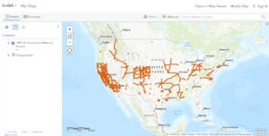
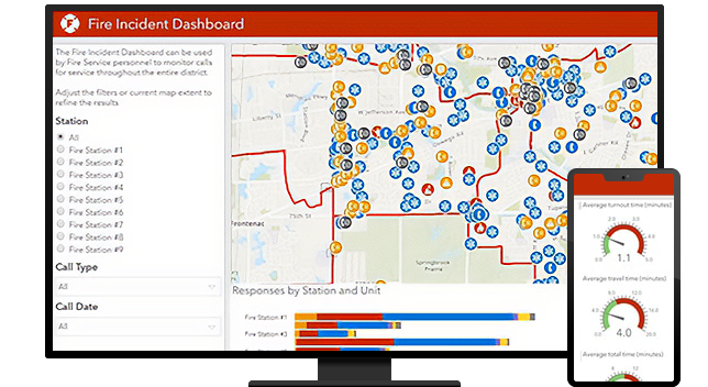
Fire Operations | Incident Command Software & Reporting Using GIS

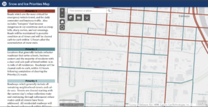
  • Finally, I wanted to look into GIS applications for the City of Delaware. One GIS application I found was the City of Delaware’s Snow Priority Map which is important because now students can know why (and also which) roads are and are not cleared quickly. 


AJ Week 1

Hi! My name is AJ Lashway, I’m a senior Zoology, Environmental Science, and English (Creative Writing) major. I’m living in BMH this year with a couple friends as well as my cat Jesper! I’m taking this class to try and better understand GIS since it keeps on coming up in my classes and jobs that I’m looking into for after school. I work for the athletic department, so if you go to any field hockey, soccer, or lacrosse games you’ll most likely be hearing my voice over the speakers for announcements 🙂

The Schuurman reading was very interesting, I had no idea there were/are essentially two different factors in GIS (GISystems versus GIScience). The argument as to whether the program is meant to just plot the data or be used to further analyze was very interesting. The reluctance to switch from hand-drawn cartography was surprising as well. With how far technology has come, it seems obvious to let a program take care of all of the monotonous work, but the manpower originally needed to work programs like GIS must’ve made it seem like more trouble than it was worth.

I found an article using GIS to visualize the distribution of native versus invasive species of fishes in the US. By using GIS, they were able to clearly pick out the fact that non-native fish tend to cluster closer to the east and west coast, while natives are primarily in the midwest. This would’ve been more difficult to conceptualize had they just been looking at a table full of numbers.

(Holcombe, T., Stohlgren, T. J., & Jarnevich, C. (2007). Invasive species management and research using GIS.)

GIS is also often applied in urban/city management. The City of Delaware uses CityWorks, which is a program that utilizes GIS in order to view a myriad of projects across the city. This includes access to all of the storm drain information (inlets and outlets), hydrant status, as well as the locations of any active work. Many cities are moving towards developing maps and models that display a broad range of demographics, rather than just basic aspects involved in planning (Hamilton et al., 2005).