Robinson Week 1

*GEOG 291 Quiz completed*

Introduction:

My name is Darren Robinson, born and raised in Columbus, Ohio. Currently taking my first semester at OWU after completing the Associate of Science program at CSCC (Columbus State Community College). I’ve always had a curious mind and a love of learning. During college, I took filler courses in history and science, which made me fall in love with the subjects even more. Outside of college, I enjoy watching a lot of informational content on YouTube (examples: Biographics, CPG Grey, PBS Eons, h0ser, Real Science, Kurzgesagt, and more) and being outside, walking around parks and trails, and enjoying the scenery.

About the reading:

Reading Shuurman Chapter 1 has been an interesting read. This section discusses what made GIS so successful. It can be implemented in various fields for many purposes. Its origins trace back to McHarg (a landscape architect), who wanted to lay out a highway route for suburban development in 1961. Learning about the first computerized cartography system and its usefulness in describing certain data in a given area. Understanding the arguments about the introductory principles of GIS and the scholarly domain of GIScience. With the importance of understanding visual data and why it matters. (Delved into a rabbit hole learning about this topic specifically.)

Before reading this, my knowledge of what GIS is was very little to none. After reading this text, I understand some of the concepts, history, background, and wide-scale integration. It’s a system about as old as my father (for context, he’s 64). Another thing in the text caught my attention. The Quantitative Revolution was one of them, and it led me down another rabbit hole of research into the subject. It was a period in the 1950s and 60s that shifted geography toward a more systematic methodology. This, combined with newer computer technologies, played an important role in developing tools used not only to examine data but also to display it.

This plays a big role in GIS; these programs create maps and models that we interpret based on given information (raw data). The text talks about the use of visual information as “a seemingly ‘unscientific’ method.” This is truly not the case. Shuurman mentions that humans understand visual information (compared to text) better. Why can visual information be processed better than words? To sum it up, a large part of our brain is used for visual processing. Homo sapiens evolved to conceptualize visual patterns before written language came into play. Finally, reading requires more brain power compared to looking at an image. Geographic Information Systems rely on this. They have a complex history, but the products they’ve produced are important for the modern world

Application 1:

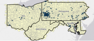
One of the applications GIS can be used for to help asses habitat quality due to human intervention. In this case, resource extraction.

Source: Remote Sensing of Forest Structural Changes Due to the Recent Boom of Unconventional Shale Gas Extraction Activities in Appalachian Ohio, by Yang Liu (2021)  (https://www.mdpi.com/2072-4292/13/8/1453)

Remote Sensing of Forest Structural Changes Due to the Recent Boom of Unconventional Shale Gas Extraction Activities in Appalachian Ohio

Application 2:

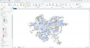
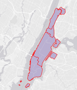
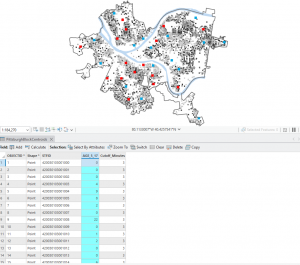
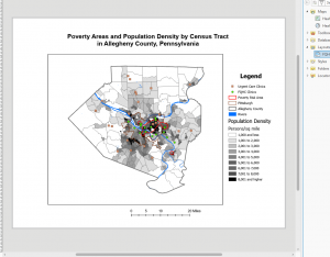
Another way GIS can be used to help asses which districts need more funding for social services. Based on median income and poverty levels.

Holbrooks Week 2

Chapter 1: Introducing GIS Analysis

The introduction of this chapter explains well the many different ways that GIS can be used. I appreciate the layout for formulating a research question, as it reminds me of our previous class together, where we created TPGs. 

This chapter also discusses discrete features, where a feature is either present or absent; continuous phenomena, which blanket the entire area of focus; and summarized data, which counts the density within a specific area of a feature. I never knew these terms before, and did not realize there was such a concrete definition/method for each of these measurements. I liked learning that both the vector and raster models can be used to plot any type of feature. Discrete features are typically mapped with vectors, which makes the most sense to me as well. (I would have assumed that discrete features can only be plotted by vector models.) 

Page 14 says, “All map projections distort the shapes of the features being displayed, as well as measurements of area, distance, and direction. In general, if you’re mapping a relatively small area, such as a town or county, this distortion is negligible. It may be more of a concern if you’re mapping a large area such as a state, country, or the entire world, because the curvature of the Earth comes into play.” I find this interesting… what is the exact amount of distortion that happens at each scale size? Where should that line be drawn when an area becomes ‘too big’ to attempt a map projection? 

I liked the refresher about proportions and densities, as well. Proportions show you what part of a total each value is, and densities show the distribution of that feature across a certain area. I’ve seen ratios and ranks on maps before, but have never really understood what they meant well until learning about proportions and densities. I’m excited to learn more about density specifically in chapter 4. I also learned that calculating is far simpler than I imagined, and allows you to assign values directly to each feature for what you’d like to learn/discover. Also, looking at the figures included for summarization helped me a lot to understand the concept and what it is we’re actually doing. 

Chapter 2: Mapping Where Things Are

Throughout the beginning of this section, I enjoyed learning about the ways that mapping and being able to recognize patterns are important for understanding how things got to be the way they are. I understand now that being able to compare these patterns to other variables or areas helps us to further understand the first pattern we’re concerned about. I enjoyed learning that with GIS we can toggle these features or categories to focus on specific features/patterns. 

The section “What GIS does” for mapping really helped my understanding of what the program does to actually capture a feature that may not be as simple as a single dot. Linear features, for example, are a series of coordinate pairs that are then connected by drawn lines. Or, for parcels/pieces of land, the lines are then connected or filled in with a color or pattern. Though short, I like how this section gave me the perfect amount of background information to better understand the process that’s going on as I input the data. 

Similarly, “What the GIS does” for mapping by category helped me to picture how I’ll be completing the work in the program before even doing it. I now get that assigning a specific value (or, I think of it as a ‘code’) will be stored separately from the characteristics of symbols I specified to draw for each value. I can envision displaying the features and the GIS working to look up the symbol for each feature/rule and display/draw that feature on the map separately. “Grouping Categories” also made it much easier to envision how the features will be categorized in a broad or umbrella-type sense, and the figure on page 41 helped me to identify how they’d be displayed on the map. I like that we have so many abilities through GIS to look at extremely finite or niche details, yet also compare those features to broad patterns across an area or to somewhere completely different. This chapter was very helpful in solidifying my understanding of what the program is actually doing as we input data. 

Chapter 3: Mapping the Most and Least

As I stated for chapter 1, I enjoyed learning more about ratios and proportions. I tend to struggle with math and statistics, specifically. I appreciate how the reading gives really understandable examples for each of these topics, and, again, really helps me to envision and prepare for the work we’ll be doing in the desktop program. For example, on page 60, Mitchell says, “Proportions show you what part of a whole each quantity represents. To calculate a proportion, you divide quantities that use the same measure. For example, dividing the number of 18- to 29-year-olds in each tract by the total population of each tract gives you the proportion of people aged 18 to 29 in each tract.” This step-by-step guide and example format, along with the figures showing how that will look on a map and index/key, was a great review in ratios for me. 

In my writing for chapter 2, I also discussed how seeing the different ways things can be categorized and compared, from big to small, solidified my understanding of Grouping Categories and how they’ll appear on the map in our work. In chapter 3, the section “Creating Classes” built on this information and discussed how we’ll actually be assigning the values their own symbol and/or grouping the values into classes. ‘Creating classes manually,’ ‘Using standard classification schemes’, ‘comparing standard classification schemes,’ and ‘Dealing with outliers’ were the most helpful in giving me a basis of the different classification processes and how finite they get. Some are detailed and will be better understood after I’ve gone into the program and practiced, but I really appreciated this baseline understanding that I got through these sections. Many of the others were very understandable, like ‘Deciding on how many classes’ or ‘Making the classes easier to read,’ but still were nice to read through and feel confident going into next week’s computer lab work. I’m looking forward to actually getting into the program and seeing these processes through with unique data!

Hutto Week 2

CHAPTER 1

In Chapter 1 of The Ensri Guide to GIS Analysis, Mitchell introduces us to various common practices and techniques used to represent the geographic features of a GIS map, which I was not familiar with prior to reading of this chapter. Mitchell starts by introducing us to two common types of models that planners or researchers in general use: Vector and Raster models. Vector modeling uses points, lines, outlines, closed polygons, and other geometric objects to represent various geographic features of a map. For example, roads, rivers, and streams may be represented using outlines, while residential, commercial, and industrial buildings or the boundaries of these zones could use closed polygon shapes to represent these objects on a map. When thinking of how local law enforcement chooses to organize the various crime statistics in an area, categories, which Mitchell also introduces us to in this chapter, can be used to represent the various types of crime committed within an area using points; for example, types of crimes committed and the exact coordinates of the crime could include burglaries, traffic crimes, murder, etc. Mitchell in this chapter also introduces us to Raster models, which use a matrix of cells in a continuous space to represent, for example, the temperature across a State or the United States. When using a Raster model to represent large plots of land, Mitchell also expands on the use of categories with Raster models which assists with organizing to make better sense of data; for example, a geographer may choose to represent the different types of levels of a mountainous geographic area such as Alaska, and so, a geographer could choose to represent the level of each mountain using categories and then a raster model to show the variations of levels of mountains within the selected region.

CHAPTER 2

In Chapter 2 of The Esri Guide to Analysis, Mitchell further discusses the features that were being touched on in the previous chapter, while also touching on the application of those features in mapping, for example, various crime statistics such as burglary, traffic crimes, etc., or residential, commercial, and industrial zones in planning. Mitchell states that generally, when using categories to define the details of certain objects and features of scale within a map, he discusses that, with mapping vegetation as an example, it is difficult for viewers to distinguish the important aspects of the map if you have small contiguous features and large contiguous features if you are using a raster model. He provides a solution, suggesting that when mapping, to map each category equal weight to others. Mitchell also states that when using categories to map out specific zones for a municipality, in general, you should not use more than seven types of categories or else, visually, it could be difficult to comprehend the map and which details are important and needed and which details are better left out which my question to that would be when would it be appropriate to have seven or more categories when it would make a significant difference to the information that whoever is viewing the map?

CHAPTER 3

In Chapter 3 of The Esri Guide to Analysis, Mitchell introduces us to classes, charts, as well as classification schemes. When mapping quantities, Mitchell recommends assigning each individual value its own symbol or by grouping them in classes. When presenting quantities in a map, there is also a tradeoff between presenting values accurately and generalizing values to see the map. One example Mitchell provides is a map showing the poverty rate of counties or districts where each county or district is represented with a different shade which represents a different percentage range. When discussing how to get the classification scheme, I found this section of the chapter to be the most difficult and confusing since it covers several mathematical approaches to grouping schemes. The four schemes that Mitchell touches on in this chapter are natural breaks, quantile, equal interval, and standard deviation. From what I understand from the reading, Natural breaks isolate outliers in the highest and lowest class by emphasizing the jumps in values and somehow that translates to darker shades, and from the example, this somehow translates into a different shade of the map. Overall when touching on classification scheme, Mitchell doesn’t do a good job of elaborating on how the values from the chart translates into a different shade and I would likely reread the chapter or seek elsewhere for a better understanding of the statistical classification method behind how it translates into a visual map.


Bruner Week 2

Chapter 1

This first chapter was mostly about the logistics of GIS. This included the different types of things that GIS maps can show, including where things are, density, change, and others. However, it cannot be useful if you do not know what question you are trying to answer with data and how you plan to represent your data, what data you actually need to gather and how precise it needs to be, and which features you plan to represent in your map.

This chapter also went into the different ways geographic features can be mapped out through different systems, like vector and raster models, and discrete, continuous, and features summarized by area within those models.

Discrete Features:

  • Can show a pinpointed location and has no “grey area”
  • Things like physical barriers or legal boundaries could be shown this way.

Continuous Features:

  • Shows features that occur within the entire selected area
  • Value shown can be determined at any location within the “selected area”
  • Can either be the entire map, or an area closed by a boundary within a map
  • Values are grouped together simply by being more similar to each other than not

Features Summarized by Area:

  • Shows density of features in an area
  • Would apply to the entire area
  • Value shown is an average rather than several pinpointed values shown at their respective locations.

I am still unsure about exactly how vector models work. From what I have gathered, they are points placed manually by coordinate rather than by GIS like with raster models, but I am not sure what exactly they are outside of knowing the difference between them and raster models.

In addition to the basics of map features, information on a map can be shown through categories, ranks (both non-continuous), counts, amounts, and ratios (all continuous). Which of these that are used can completely determine what type of analysis is possible using the map created.

Another concept discussed was how to work with the visual data by selecting, calculating, or summarizing it through the GIS software.

Chapter 2

Chapter 2 spent a lot of time exploring how to actually set a map up to reflect what it is intended to show. It described different ways of using patterns to show correlation. Categories can be split up simply or split several times so that one location can be part of multiple different categories to make its label more specific. They can also be completely separated into 2 maps if they get too cluttered on one. They say the maximum number of categories on one map should be 7. It is also important to note that while more information can get into more specifics than less, it is much easier for a general audience to notice trends on a simpler map. It is then good to find a happy medium where the map can be just specific enough without making the information difficult to decipher. When putting attention into these things, trends on your map can show where attention or action is needed in an area.

This chapter also went a bit into how the GIS handles different inputs of data to make them visually make sense. When you place a point, it can store that value as an (x,y) coordinate, and it can assign points to multiple subsets, as I mentioned in the paragraph prior, to allow information about locations more specific. This can be done using multiple symbols, like using colors for one category and shapes for the other.

Colors and shapes can also be strategically used to make your map more visually friendly. Colors that are close together can help to show subcategories that are similar to one another, but if there are too many categories, it can be hard to see the differences between colors that are very close to one another. In order to figure out what color system is best, sometimes it is helpful to understand the type of place you are mapping.

Chapter 3

This last chapter went into maps using different types of quantitative data, as most data in GIS tends to not be qualitative. It compared the effects that raw numbers, ratios, proportions, densities, and ranks had on maps, as well as continuous and categorical classes. Most of the time, with continuous measurements, the GIS software would sort them into classes using one of 5 methods. Which one of these that is chosen to be used, as a common theme, completely depends on what you are doing with your map and what you want it to show.

The GIS can sort continuous data with:

Natural Breaks: creating categories based on natural breaks in the data

-good for unevenly distributed data, because it goes by clusters rather than values alone

-hard to compare with other maps because it is a case-by-case system

Quantile: equal number of features for each class

-good for comparing areas of the same size and mapping evenly distributed values

-can determine position of features among others

-some values can become a skew for classes and recognizing patterns

Equal Interval: equal range of values in every class

-every class is an equal ratio to one another

-good for continuous data

-there may be classes that don’t have any features at all in them because of the sort of “disregard” for the actual numbers

Standard Deviation:

-good for seeing features relative to an average, but doesn’t show the actual numbers, just their relativity to this number

-outliers can really skew the overall picture of the data

You could also create classes manually, but I think this has the possibility of creating bias in your data if you were expecting a specific result. However, this method could also easily cater to getting rid of outlier effects on data.

This chapter also went a bit into specific ways that concentration of data can be shown, including graduated symbols and colors, charts, contours, and 3D views. It also described situations where all of these would be best, but as always, it depends on your data and the picture you are trying to create for a desired audience. The goal is to find patterns where concentration is.


Parks Week 2

Chapter 1:

In chapter 1, some of the base information of GIS and data used for it were discussed. The general process for using GIS is detailed at the start of the chapter. The steps included were framing your question, understanding your data, choosing a method, processing your data, and looking at the results. These steps are important for ensuring that you are approaching your analysis correctly and choosing the right methods. The chapter also details the different types of geographic features: discrete features, continuous phenomena, and features summarized by area. Discrete features are where the presence of a feature can be determined at a specific pinpointed location. Continuous phenomena blanket the entire map and can be enclosed by boundaries. Features summarized by area get a count or density of features within an area’s boundaries. A lot of data is like this, but does not have precise location details. The differentiation between geographic features is important for determining how to analyze the data. Geographic features can either be vector or raster. For vector features, each feature is a row in a table and feature shapes are defined by x,y locations. Vectors are used for discrete features, data summarized by area, and continuous categories. For raster features, the features are represented by a matrix of cells in continuous space. Rasters are used for continuous categories and continuous numeric values. They can also be used for discrete features when layering. The chapter also discussed how geographic features can have different attributes. These attributes included categories, ranks, counts, and ratios. At the end, the chapter detailed how to work with tables when using GIS. Subsets of data are selected to work with or assign attributes values to. Attribute values are calculated to assign ranks, ratios, or averages. The attribute values can be summarized to get statistics. Overall, I felt that this chapter did a good job covering the basics of understanding geographic data usage in GIS.

Chapter 2:

Chapter 2 introduced some of the information needed to make quality maps. First, you need to decide what to map. Different maps require different types of information and different amounts of information, so you must decide what is right for the map you are trying to make. Considering how you will use the map will help you make this decision. To prepare your data to be mapped you have to make sure that the necessary geographic coordinates and categories are assigned. If the data come from the GIS database, then coordinates are likely to already be assigned. You can map a single type of feature or map by categories. When mapping by categories you can choose to group the categories. If you have more than seven categories, it is recommended that you group them into broader categories. However, grouping categories can change how the data is perceived by the reader, so be careful with how you group them. There are several ways you can group categories in the data. These include using two different codes to represent categories and subcategories, joining a detailed code to a general code after, and assigning symbols to various detailed categories that comprise each general category. When using symbols it is important to do it effectively. Use a single symbol for each individual location, but do not overcrowd the map. For linear symbols, using width and pattern differences are helpful for differentiating the symbols. You should also make the symbols for similar categories shades of the same color. If you are printing the map make the symbols larger and keep in mind that printers usually have better resolution than screen displays. It was also discussed in this chapter that adding reference features, like recognizable landmarks and roads, can help orient the reader. Adding relevant features, like adding store locations if you are mapping customers, can help add context to the map. Map reference features should be displayed in pale colors. When analyzing the patterns on your map, you may need to zoom in or out to see patterns, so keep that in mind when sizing the map. This chapter helped me understand important factors when making maps, especially in regards to using categories and symbols.

Chapter 3:

Chapter 3 discussed more important factors in creating maps, with a focus on quantities, classes, and map styles. It was again discussed how it is important to understand the goal of your map before making it. You need to consider what kind of data you are mapping. Are your data discrete features, continuous phenomena, data summarized by area? Understanding this helps you decide how to display the data. You should also consider if you are using the map to explore patterns or if you are presenting the data. When exploring you should show more detail to find patterns, but when presenting the map use generalized data to reveal patterns. There are several ways that quantities can be used in displaying data in maps. You can use counts, the actual numbers, or amounts, the total of value, to display discrete features or continuous phenomena, but not for summarizing by area. You can use ratios to show the relationship between two categories to even out differences between large and small areas to map more accurately when summarizing by area. Ranks can be used to put features in order from high to low and show relative values instead of measured values, which is  useful when direct measures are difficult. You can use classes to display your data in a way that is easier for viewers to understand. There are several classification schemes that can be used. These include natural breaks, which find patterns inherent in your data, quantiles, which compare areas of roughly same size, equal intervals, which use equal intervals to appeal to a nontechnical audience, and standard deviation, which shows if features are above or below average. Each of these schemes have their own advantages and disadvantages, so it is important to consider carefully which best fits the needs of your data. It is recommended that you only use 4-5 classes in your display. This chapter also discussed important choices needed in making the maps. Different types of data need to be displayed in different ways. Maps of discrete locations and lines should use graduated symbols, charts, or 3D views. Maps or discrete areas or data summarized by area should use graduated colors, charts, or 3D views. Maps of continuous phenomena should use graduated colors, contour lines, or 3D views. There are several things to consider when using these displays, like colors, sizes, intervals, and perspective, so care should be taken to make these decisions. Effectively displaying your data allows for patterns to be found most efficiently. I found this chapter to be helpful in understanding how the seemingly small features of maps can have a big impact on how they are interpreted.


Meyst Week 2

Chapter One

Mitchell begins by framing the process of GIS analysis similar to that of the scientific method: First with asking a question, then researching and compiling and presenting data in a digestible format based on the type of data presented. I find this similarity very interesting, yet explainable, as GIS analysis and GIS as a software is based heavily in the environmental sciences, especially geography. Additionally, Mitchell highlights multiple careers that could benefit from or currently use GIS technology, even if they are not associated with the environmental sciences. Careers such as criminology, law (Mitchell highlights how GIS data could be included in court cases), and development all use or could benefit from GIS technology or analysis. In the next section, I learned of discrete features on maps, which include color-coding, shapes, etc. to highlight and present a certain feature of the map, such as streams. Continuous phenomena, another new term to me, are phenomena that can be measured anywhere, such as precipitation. Features summarized by area are used to show density of something in an area, such as population density. All of these are reliant on either of two ways to represent geographic features: Vector models, which rely on the x,y coordinates of a feature to shape out the features. The other, raster models, use cells to shade in and represent a feature, and layer on one another to represent intersecting features. A disadvantage of raster models is that larger cells lead to a loss in detail, so some may choose to make the pixel size of the cell smaller for more detail. Additionally, since map projections are distorted by the curvature of the Earth, mapping larger areas such as states, countries, or continents means that this distortion needs to be taken into account, while with mapping smaller areas, this distortion is negligible.

Chapter Two

When deciding what to map, Mitchell highlights two questions that should be taken into account for GIS analysis. First, what information do you need from the analysis? This will largely differ on a case to case basis, as Mitchell highlights with the examples of police mapping crime rates or a retailer mapping their audience and where they live in order to place the most effective advertisements. Second, how will you use the map? Audience should be heavily considered, especially for factors such as the amount of detail for the map, labels, whether to include reference locations such as streets and landmarks, size of the final planned map, etc. I find these thorough steps in analysis interesting from a professional standpoint, as the process of deciding what to map varies heavily between tasks and audience, in comparison to other forms of measuring data like composition analysis in soil science or raw data in the aforementioned case of crime rates. Additionally, this section highlights both the scientific and communication skills required for GIS analysis, as researching and understanding your audience is incredibly important to conduct a thorough GIS analysis, as Mitchell notes. In the next section of Mitchell’s introduction to GIS and GIS analysis, we learn about preparing data to be used in mapping. I find it interesting that some of the data is hierarchical, and how hierarchies are assumed in the data. Additionally, in the following section, the rule of seven categories to best show data points is very interesting to me, as I originally thought that far more categories would be feasible given that categories are not similar colors. However, thinking back to GIS-made maps that I’ve used for research and for simplifying my thoughts, most maps were not as complex as the zoning map Mitchell uses as an example, and grouped some categories together, even if the audience was scholars and researchers.

Chapter Three

Mitchell starts this chapter reflecting on terms from the first chapter: discrete features, continuous phenomena, or data summarized by area. With additional knowledge from the previous chapters, the context of data types and different forms of quantification are mentioned, allowing the reader to understand these previously learned concepts in context. Following this tie-in to previous chapters, the reader is presented with different ways to present map data in a graduated format; with symbols, shading, etc. in order to analyze patterns in the data in addition to mapping discrete features. This section helped me better understand the content of the chapters in a visual way, highlighting the intersection between discrete features and data analysis in Chapter 2. A new concept in this chapter is types of quantities: counts and amounts, ratios, and ranks. Counts and amounts is the raw data mapped directly, such as the number of restaurants in an area, or the population sightings for a species. Given that the data is placed as points on the map, I assume that counts and amounts quantities only work on smaller amounts of data unless the points of gradation are grouped together in areas of high concentration. Ratios and ranks are less direct forms of quantitative data, ratios being based off of the data in relation to another factor, such as the ratio of schools to children, while ranks put the data into gradual tiers of severity, assigning a shade to each level. Thinking back to maps I have seen both inside and outside of an academic context, I have seen all of these forms of data presentation on maps. Interestingly, I have noticed that in an academic setting, I have seen quantitative data presented more through ratios and ranks, while when presenting data to the general public, counts and amounts are more widely used.

Grennell Week 2

Personal summary/Comments

Chapter 1 – Introducing GIS analysis 

Chapter one explains what GIS analysis is and helps us understand what geographic features/attributes are.  For example, the chapter starts by stating that “GIS analysis is a process for looking at geographic patterns in your data and at relationships between features”.  Which is basically saying that, from the layered maps or the collection of maps used to actually do GIS, it’s just an analysis of that data that helps find some sort of correlation to make the data make sense.  That’s what I got, at least; it then goes into talking about what I assume are the steps for GIS analysis.

Step one – Framing your question: this step covers the fundamentals of what you’re actually asking or what you’re trying to prove/show; in the reading, they used “Where were most of the burglaries last month”?  It also states that you should try to be as specific as possible and approach the question with different methodologies depending on what you’re actually asking and how you think it can be resolved.

Step two – Understand your data: this step tells you that, to understand your data, you need to know what’s missing and how to acquire it; the chapter mentions that sometimes one method of looking at data will only get you so far. Which means sometimes you’ll need to either approach it with a different method or gather new layers to help map out the issue.

Step three – Choose a method: the chapter states that there are almost always 2 -3 methods to obtain information. (However, it doesn’t really give you any methods to help you get an actual idea of said methods. Which is a little disappointing)  It then tells you that the same method won’t always be useful; it’s up to the person whether or not they believe said method is viable.

Step four – Look at results: basically states that you interpret the data to help it make sense

Step five – Look at the results: This step states that the results can come in all sorts of ways. Such as maps, charts, or tables. The reason for this is that some questions are just better explained in different expressions than others.

Chapter 2 – Why Map Where Things Are

Based on the title of this chapter, you can assume it was primarily about mapping and why things are mapped. As for the overall objective of this chapter, it was to explain the importance of mapping things, what exactly your mapping is, and preparing/analyzing your patterns/data. The chapter starts by explaining the importance. “Mapping where things are can show you where you need to take action.” In this instance, they go back to their original question of burglary locations or just overall crimes. They then explain that by mapping out said crimes, they are able to create police routes to monitor the areas with higher crime rates. This tied into “what to map” because in this example they wanted to lower crime rates, so they mapped out all the areas with crime, not just some but all crime. They then created a patrol route.

I assumed this is kinda how cops created their routes (not sure if this is even an actual real-life thing or just an example), but it makes sense that this is how they would do it. (Once again, if this is actually how they make their patrols). I also had no clue that GIS could be used for things like this, well not until last week when I officially found out what GIS is.

In the reading, it also talks about categorizing, such as color-coding specified areas so you know what’s where. However, in the reading, they specifically mentioned 3 options.

Option one – Assign a general code to each record in the database, like RUR (Rural) and RES (Residential)

Option two – Create a linked table to match detailed codes with general codes. This one kinda confused me; it showed a picture with RUR (Rural) and RES (Residential) as general codes and some other letters/ numbers as general codes

Option three – Assign categories on the fly by specific symbols (this is the one where everything is color-coded)

Chapter 3 – Mapping the Most and Least

As the title states, this chapter primarily talks about mapping both the most and the least of your specified target. The reason for this is that it allows you to gauge the relationships between them. If you were to only map the most or high end, everything would look relatively bad or good, depending on the topic. (The same effect on the inverse)

In the reading, it uses mapping both the most and least to effectively track past and ongoing events. One example of this in the chapter they talk about is average annual precipitation. They track both the most and least to help make a gradient of color (dark blue = more rain while light blue = less rain). Now, the reason I chose this one specifically is that this is exactly what you see every day on the news; if you watch a weather channel, they’re going to show the amounts of rainfall, both the most and the least. This helps prove that it’s an effective measure.

Let’s say they focused on the most, and you got rained on because it didn’t make the cut; I know  I’d be annoyed.  So it makes sense that you should include both the most and the least.


Jan Week 2

“Into to GIS Analysis”

GIS analysis finds patterns and relationships in spatial data to solve real world problems. The workflow follows a five steps process: find & define your specific question, understand your data, choose a method, process it, evaluate the result & lastly form a conclusion. Some important terms in the chapter:

  1. Feature types: Discrete (points, lines, polygons), Continuous (gapless surfaces like elevation), or Area (zip codes, census tracts).
  2. Data models: Vector (coordinate based) or Raster (cell based). 
  3. Attributes: Categories, Ranks, Counts/Amounts, or Ratios.

GIS work involves but is not limited to; querying, calculating, and summarizing tables. Stuff depends on matching these three components listed above in the correct manner such as relating the right data model with the right attribute both according to your question. Hence, before I start any analysis I will understand my question foremost and then move onto deciding things because that lone thing can make it or break it. 

“Mapping Where Things Are”

Mapping locations shows distribution, clustering, and dispersion. Data need be prepped first with accurate coordinates and clean category codes. Like the question was the most important thing in the first chapter, your data means just as much here. Three key things again: 

  1. You can map one feature type, isolate a subset, or map multiple categories to show relationships and hierarchy.
  2. People can only reliably tell apart about seven colors or patterns so anything past that needs grouping.
  3. Symbology rules:
    • Color beats shape for points
    • Vary line width for networks
    • Keep reference layers muted (light-gray basemaps) so context doesn’t fight the data

When we start to build a map most of us just wish to add more and more things, add in more features, add in more information, yes I concede more information might be better but most of the time it is simplicity and visual hierarchy instead which decide whether a map actually works or not and that seven category limit is the hard ceiling. For anything public facing I’ll group categories aggressively and stick to minimal basemaps so the real data stands out.

“Mapping the Most and Least”

Mapping quantities compares places to show trends and concentrations. The big rule: when areas are unequal in size, use ratios (averages, proportions, densities), never raw counts, or the pattern is misleading.

  1. Classifications:
    • Natural Breaks: clustered data
    • Quantile: equal features per class
    • Equal Interval: identical value ranges
    • Standard Deviation: distance from the mean
  2. Outliers be handled or they compress everything else into one class.
  3. Display options: graduated symbols, graduated colors, pie/bar charts, contours.

The classification we pick completely changes the story the map tells, and raw counts should never go on variable-sized polygons. 

Redman week 2

Chapter 1:

The chapter starts by explaining that GIS analysis is a process for looking at geographic patterns in data and relationships between features. The data may either be simple or complex. The process for performing an analysis includes five steps. The first step is to frame a question. To analyze something, you need to know the information that you want to find, and this requires forming a question. The second step is to understand the data to be able to determine what method to use. Third is choosing the method. Some methods are less time consuming than others, but only provide a basic understanding, and the methods that take longer produce more in-depth results. The fourth step in processing data and performing the steps in GIS. Finally, the results will be produced as a map, chart, or something similar. 

Understanding geographic features is an important part of GIS. There are three different types of features that can be used. Discrete features are used for discrete locations and lines, and location is able to be pinpointed. Continuous phenomena are precipitation or temperature and can be found or measured anywhere. It blankets the entire area of mapping. Features summarized by area represent density of features within boundaries.

There are two ways to represent geographic features. The first is a vector model, which includes features (discrete locations, events, lines, and areas). The second model is a raster, which is a matrix of cells. It is important to have the same map projection and coordinate systems to ensure accurate results. 

It is important to understand geographic attributes to determine the type of analysis you want to do. There are five attributes. Categories are represented by numeric codes or text. Ranks are used for when direct measures are difficult. Ranks are relative, so it is not exact. Counts and amounts show total numbers. Ratios show the relationship between two categories. Categories and ranks are continuous, counts, amounts, and ratios are not.

Working with data tables is important for GIS analysis. Three common operations are selecting, calculating, and summarizing.

Chapter 2: 

This chapter starts with explaining that mapping where things are can show where action is needed. This can eventually show causes for certain patterns, such as a concentrated area for crime rate. 

In order to decide what to map, you need to know the information that you are trying to gain from the map, and how the map will be used. The information needed for a map can differ depending on the end goal. Some maps are used to determine a concentration of something, others can be used for discreet locations. Determining how the map will be used can be determined by the audience and issue being addressed. 

Preparing the data requires assigning geographic coordinates and assigning category values. 

To actually make the map, you put the information into GIS. the features can either be displayed in a layer as a single type or categories. In a single type, only one symbol is used. This can show patterns. Mapping by category uses multiple symbols and can provide a more detailed understanding. This allows for displaying features by type, how many categories there are, which features are mapped, the map scale, how categories are grouped, and which symbols are used. It also allows for reference features such as major roads/highways and landmarks. 

If the map produced presents the information clearly, patterns in the data can be seen. If it is a single category, features can be clustered, uniform, or randomly distributed. Patterns can begin to provide explanations for why things are where they are. While this can provide a visual example, to determine if the patterns are significant, statistics are required to quantify the relationships between features.


Chapter 3:

In GIS, people map the most and least to see the relationship between places. Mapping features based on quantities can provide extra information in concentration. For this mapping. You need to map the patterns of features with similar values. 

Knowing the types of features that you are mapping is important to know how to present the quantities to see patterns on the map. This can include discrete features, continuous phenomena, or data summarized by area. 

When making a map, the purpose of the map is important to know how to present the information. To map the most and least, understanding quantities is important to be able to assign features.

Once the quantities are determined, they can be represented by assigning each value its own symbol, or grouping the values into classes. Mapping quantities requires a balance between accuracy and being able to be able to see patterns on a map by generalization of values. Counts, amounts, and ratios are grouped into classes. 

Mapping individual values presents an accurate picture of the data, but may make it harder to read the map. Classes can make the map much easier to read. For making classes, they can be created manually or by using a standard classification scheme. Classification schemes include: natural breaks, quantile, equal interval, and standard deviation. It is important to be able to choose the best one for the information you have. 

Once the data has been effectively classified, the next step is making the map. Make sure that only important data is used to ensure easy comprehension by readers. GIS provides these options for creating maps to show quantities: graduated symbols, graduated colors, charts, contours, and 3D perspective views. 

  • Graduated symbols: map discrete locations, lines, or areas
  • Graduated colors: map discrete areas, data summarized by are, continuous phenomena
  • Charts: data summarized by area, discrete locations, or areas
  • Contour lines: show rate of change in values across area for spatially continuous phenomena
  • 3D perspective views: continuous phenomena to help visualize surface

Montana Week 2

Chapter 1

The first chapter introduces us to many of the essential techniques used in mapping and display of geographic features. Beginning with the first section you realize that it is paramount that you be specific in defining the geographic features you want to display and their corresponding attributes. Next we examine the choices one must make when deciding the way you want to gather/ display the information in question. In terms of display we are presented with the ideas of vector or rather format that have different levels of scalability with the vector option being adapted to a wide range of scales the rather methods looses sharpness at smaller scales but is perhaps more adept at showing the blend between to regions. We also have ways of defining the data we aim to present/analyze. Very distinctly data can be modeled discretely while regions with similar conditions or qualities are modeled continuously. Lastly they can be summarized by areas where specific points are given greater importance by being defined to a distinct geographic location.


I find some confusion about how lines might be drawn with individual points. What sort of software might be used to generate points on a line or are the points created by hand to model larger phenomena?


What advantages might the Rather method have at a smaller scale. Would it be easier to demonstrate the pervading category within a cell using the rather model as opposed to showing the distinctive line used by the vector model?


Each feature displayed on the map is given different attributes which are not shown on the map but rather in the table of information but ultimately determine how each feature is represented. Geographic borders remain constant between different features.


Chapter 2

The text states “ The GIS reads these and assigns geographic coordinates.” This got me thinking. Are all GIS the same or do some have different capabilities and handicaps?


This chapter of the textbook seems to be more focused on what the GIS is capable of and is less focused on the specific geographic features and their attached attributes that the user implements into the GIS. It also dived into the aesthetics of mapmaking and gave some helpful tips on styling, shaping and color coding of various features as well as how you can make maps more simplified through multiple levels of map complexity. One essential point that I got from this part of the textbook is that your map should aspire to be readable by everyone but should also be helpful to experts in whatever subject they aim to map.


There was also some focus on what to display to convey information best to the reader. I am wondering if there will be a greater emphasis on what to include and not include in your map in one of the coming sections ex: what things not to input into your map to make it seem unprofessional(clip art, 3d graphics etc).


I thought it was interesting that the maximum number of colors you should include was 7. I hadn’t thought about mapmaking that way psychologically but it does make sense. Is there some fluctuation in this where people can comprehend more than 7 shades? It is also sometimes necessary to use more than 7 shades. How can you make this more user friendly?


Chapter 3

The idea of summarizing data from most to least seems somewhat elementary to me. Would it not be better to explain how these things are programmed into a map?


I think the distinction between count and amount is an important distinction to make but I feel like the words are so similar would other more technical terminology make definitions seem more distinct example #categories paired with amount, etc..


The 3D modelling looks complex and I had not thought about the use of a light source to create shadows and how the positioning of that light source might create a very different visual.


This chapter focused on display of variables and mapping things from most to least. It examined the different ways you can choose to group numbers or ways that you can have the GIS automatically separate numbers into different classes using things like natural breaks. It then talked about some more ways to distinguish between these different classes you have made, For example: using line width when showing quality of stream health etc. and introduced charts to show categorical data internal to the area on the GIS. The chapter also gave a very helpful breakdown of the advantages and disadvantages of different types of display styles which I thought was really nice and simplified the earlier knowledge well and provided basis for comparison.