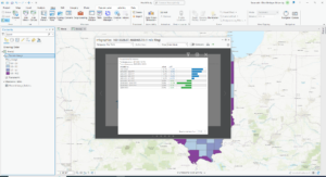
Taking this idea from Savannah and linking a pdf with all of my work from those first 5 chapters.
Month: September 2022
Week 5 Savannah Domenech
Week 5 Work – Savannah Domenech
I hog up much less room this way. Click the text above to view my Week 5 work.
Abbey S Week 4
Chapter 1:
- GIS is composed of 5 parts: hardware, software, data, procedures, and people
- Can be used to map relationships, patterns, and trends in addition to simple cartography
- Interesting how GIS has been around since the 60’s. I wonder how difficult it was to use it back then
- Point, line, polygon data = vector data
- Features of same type = layers
- Raster= digital surface
- Attributes= in depth data
- Don’t be like me and do the exercises in the classic map view, and then get confused as to why everything looks different


Chapter 2:
Exercise 2A
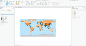
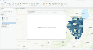
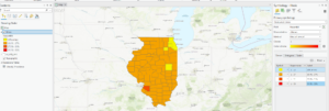
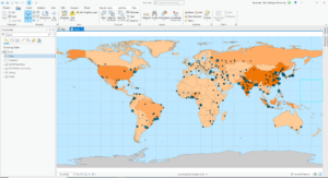
- PM concentrations are highest in Africa
- To restore contents, go the ‘View’ and select contents
- Geoprocessing toolbox is right next to contents
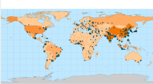
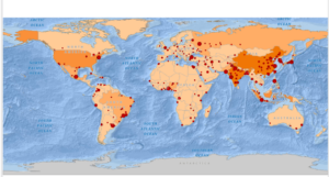
- Shanghai has the largest population
Exercise 2B
- Symbology= the way GIS features are displayed on a map
- The distance between San Antonio and Toronto is 1,440.32 mi

Exercise 2C
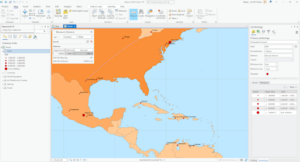
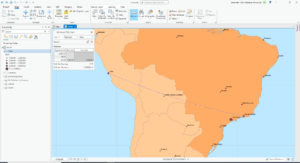
- The highest building is 339.8 ft
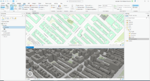
- Extrusion= stretching flat 2D features vertically to appear 3D
- This was cool- I felt like I was playing the Sims lol

Chapter 3
Exercise 3A
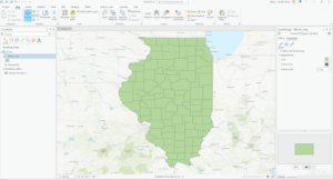
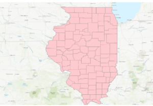
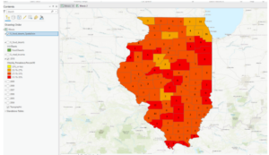
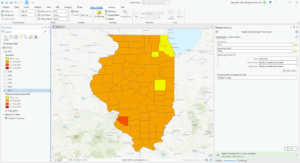
- The field name that indicates the state within the which the county features are located is called STATE_NAME
- 10575 residents of Wayne county are between 22-29 yrs
- Definition query: limit visible counties to only in Illinois, but source data will not change
- Clip: Select data based on layer of boundary (However, Illinois boundary not defined)
- Select and export: select counties in Illinois and export to new dataset
Exercise 3B
- Columns= fields
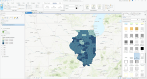
- There are six years of data represented
- Graduated colors= features are assigned a color that represents a quantity
- Classification methods:
- Manual interval classification
- Modify classification breaks manually with manual intervals
- Equal interval classification
- Range of data is equally divided by the number of classes chosen
- Defined Interval Classification
- Similar to equal interval, but define interval size to determine class number
- Quantile classification
- All classes have same number of features
- Natural breaks classification
- Based on natural groupings inherent in the data
- Geometric interval classification
- Creates class breaks that are based on class intervals with a geometric series
- Standard deviation classification
- Creates classes according to a number of standard deviation classifications
- Manual interval classification
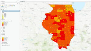
- I did not see a clear correlation between income and 2010 obesity rates
Exercise 3C
- I was not able to retrieve the infographics even though I was signed in to ArcGIS online 🙁
Exercise 3 dimension
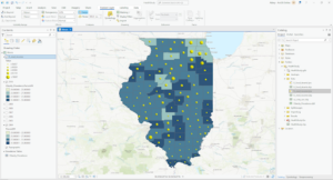
- There are 4 food deserts in Knox county
- Spatial join= define spatial relationship between 2 layers and combine attributes into an output layer
Chapter 4
Exercise 4A
- Coordinate systems
- Geographic coordinate system- uses latitude and longitude to define locations of points
- Projected coordinate system- uses map projections to transform longitude and latitude coordinates into planar coordinates
- On the fly projection
- Projected coordinates on first layer applied to subsequent layers
- Metadata
- Textual info about dataset
Exercise 4B
- Snapping= magnet
- The selected line has 4 vertices
Exercise 4C
- The shape area value was halved
Chapter 5
Exercise 5A
- Conflict types:
- Riots/protests
- Battle
- Remote violence
- Strategic development
- Violence against civilians
- 727015 fatalities
Exercise 5b
- 41 riots/protests
- 71 fatalities
Exercise 5c
- Layer by attribute and Summary statistics are combined
- 26323 fatalities
Week 4- Sturgill
Chapter 1 (Law / Collins)
- It is important to note that the feature data in GIS contain attributes that correspond to the features attribute data.
- Feature attribute information is stored in a table in a GIS database. Each feature occupies a row in the table, and an attribute field occupies a column
- ArcGIS Pro is similar but also different from the basis of ArcMap in that it uses ArcGIS Online basemaps as the backdrop instead of the typical import of basemaps from another source. ArcMap can also use Arc Online for basemaps but this is something that is not extremely important
Exercise 1:

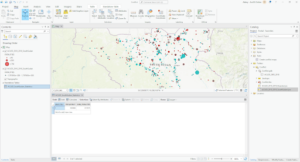
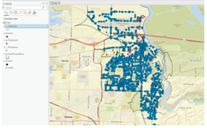
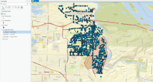
- This figure represents up to the 8th step in exercise one. At this point all that has really been done is opening an ArcGIS online map and seeing some of the features located in the layers tab that are associated with the map

- This figure represents the public schools in the area but with a different symbol. At this point in the exercise we have successfully changed and updated a symbol in the map
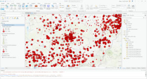
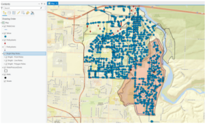
- The next figure shows the ToBreak attribute and what this attribute shows is the minutes it takes to walk to school from those areas.
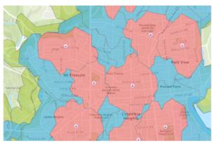
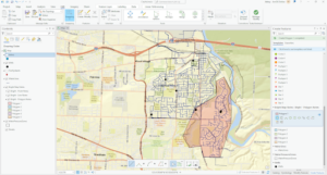
- This figure represents the different areas and how long it takes to walk to school from those areas. Using the steps in the book I was able to create this map to show the difference between 5, 10, and 15 minutes of walking to get to school. Red being 5, blue being 10, and green being a 15 minute walk to school.
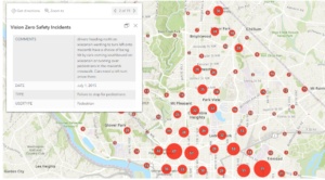
- This figure represents the Vision Zero Safety Incidents that were configured using the filter and clustering section of the editing tools for the map. As well as the map pop-up windows were configured to produce this figures pop up window you can see in the top left of the figure.
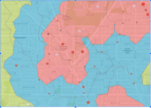
- This figure shows what the final version of the map looks like with all three layers showing. Cities can use a map like this to create stricter speeding fines and punishments for school zones where these incidents occur.
Chapter 2:
- This chapter begins with getting to know the basics of ArcGIS Pro. ArcGIS Pro offers 2D AND 3D visualization and analysis with an interactive, navigable interface.
- So far this chapter is showing that although ArcPro is similar to ArcMap, it varies in that it is more similar in some regards to Microsoft applications
- A folder connection was one of the first steps in exercises 2a and this was a very similar process to that of ArcMap
- This figure shows the air pollution by country layer in the first exercise in chapter 2. This map was produced from data that was imported into ArcPro and then manipulated to look the way it does.
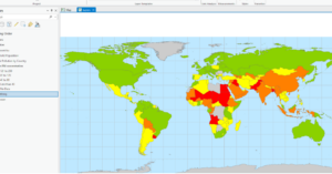
- The continents that PM concentrations are the highest are Africa and Asia.
- To restore the contents pane in ArcPRO just go to the view tab and click on contents
- The largest city according to the Cities attribute table is shanghai china
- This figure shows what the final map looks like after the first exercise in chapter 2. Some basic tools were used to manipulate the map and its data so that it looked this way as a final product.
- This figure shows what the map looks like at the end of the 2nd exercise in chapter 2. In this exercise we changed feature symbols, configured feature labels, used the measure tool, added a cloud-hosted basemap, and packaged the project to share online.
- The height of the tallest building in the third exercise in this chapter is 339.76 feet
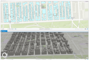
- This figure shows the final map image for the final exercise in chapter 2. In this exercise we learned how to convert a 2d map into a 3d map, and then extrude features based on the building height attribute to visualize buildings in a more realistic perspective. This exercise was fantastic if I say so myself and I was genuinely surprised going through this chapter. I think chapter 2 contained great information that is vital in getting to know ArcPro.
Chapter 3:
Questions :
- (add data to the project) The field name that indicates the state within which the county features are located is called STATE_NAME
- (add data to the project) There are 10575 residents in Wayne County Ohio between the ages of 22 and 29
- (Incorporate tabular data) Six years of data are represented in the table
- (incorporate tabular data) No I do not see a correlation between income and 2010 obesity rates. There are many counties with moderate-high income and high obesity rates. There are also counties with low income that have moderate to low obesity rates.
- (Calculate data statistics) 18.7% of households had an income of less than 15,000 per year.
- (connect spatial datasets) There are 4 food deserts in knox county
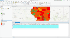
- This figure shows the map after the first exercise in chapter 3. This map was configured using select features by attribute and then exporting those features into a new dataset into the map.
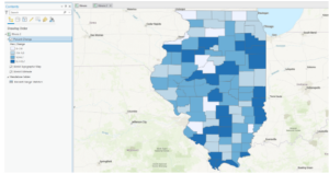
- This figure shows the final map product at the end of the second exercise in chapter 3. This exercise was all about joining the cdc data to the Illinois county feature class. This was done using a variety of methods and data manipulation techniques including joining data tables, incorporating layer symbology, and using the swipe tool to compare different years of the data on the map.
- This figure shows the final map product after the end of the 3rd exercise in chapter 3. This exercise was all about calculating the data statistics. We added a new attribute field and then populated the field with values. We then calculated the summary statistics for the state.
- This figure shows the final map product of the last exercise and the final map at the end of chapter 3. This exercise was all about spatially joining data. We spatially joined the 2010 layer with the IL_food_deserts layer and this is shown by the number of food deserts displayed on the map for each county.
Chapter 4:
Questions:
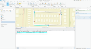
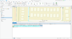
- (Configure snapping options) The selected line has 4 vertices
- (Modify Features) The Shape_area value decreased from the original water pressure zone

- This figure shows the final map product after the first exercise in chapter 4. This exercise was all about switching the city’s data collection to a geodatabase model. It was easier than expected to build a geodatabase for the city.
- This figure shows the final map product after the second exercise in chapter 4. This exercise was all about creating features and fixing the missing water lines in the map. This was done using a variety of techniques in the data tab of the ribbon. Snapping was the method that was used for the exercise.
- This figure shows the final map product of the last exercise and the end of chapter 4. This exercise was all about modifying features which included splitting a polygon, merging polygons, modifying lines and points, and adding map notes.
Chapter 5:
Questions
- (manage a repeatable workflow using task): The conflict events recorded in the dataset are battle (no change of territory), battle (government regains territory), battle (non-state actor overtakes territory), headquarters or base established, non-violent transfer of territory, remote violence, riots/protests, violence against civilians, and strategic development
- (Author a task) 14,211 fatalities resulted from violent conflicts against South Sudanese civilians between 2010 and 2018
- (Run the model) There were 71 fatalities that resulted from conflicts classified as violence against civilians in Rwanda from 2010 – 2018
- (Convert a model to a geoprocessing tool) 41 riots/protests occurred in Rwanda between 2010 and 2018 and 12 fatalities resulted from this
- (Use a custom script tool) The geoprocessing tools combined in this script are Select Layer By Attribute and Summary Statistics
- (Use a custom script tool) 26,323 fatalities resulted from conflicts classified as violence against civilians in Nigeria from 2010 to 2018
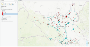
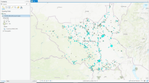
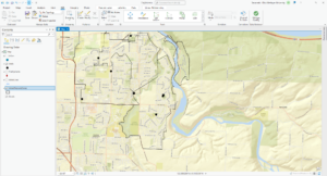
- This figure shows the final map product of the first exercise of chapter 5. This exercise was all about using the Tasks pane in ArcPro to establish a workflow for ourselves and so others can use the task we created in a similar way to create a similar map with the appropriate data.

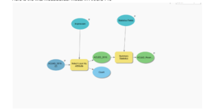
- This figure represents the final map product at the end of exercise 2 in chapter 5. This exercise was all about using ModelBuilder which is a design environment for creating spatial analysis workflow diagrams and in this exercise we used ModelBuilder to build the workflow to create this map.
- Here is the final modelbuilder model in ArcGIS Pro
- This figure shows the final map product of the last exercise in chapter 5. We can see that all three countries (South Sudan, Rwanda, and Nigeria) are highlighted as they were all worked on in different exercises throughout the chapter. This exercise was all about running geoprocessing tools in ArcGIS Pro using Python. This workflow was similar to the first two exercises but we used Python coding and a script tool to execute the processes.

Notes:
- These first five chapters of the book were very informative on how to use the tools and functions in ArcGIS Pro, and how to manipulate maps and data as well. Once we get to chapter 3 I think that’s when things start to get dicey. Although I can follow the instructions the book gives for each exercise in each chapter, I would still struggle somewhat if I were to do this off the top of my head (guess I need to review more).
Jocelyn Weaver – Week 4
Chapter 1:
- Projects: contain maps, layouts, layers, tables, tasks, tools, and connections to servers, databases, folders, and styles – everything you needed stored in one
- Can have maps 2D or 3D, or both simultaneously
- Geoprocessing tools allow you to perform spatial analysis and manage GIS data
- Configure symbology, clusters, and pip-ups to make the data layers and attributes more usable
Chapter 2:
- Content pane allows you to modify map’s layers
- Symbology: the way GIS features are displayed on a map
- Graduated symbols – are used to represent a range of symbols based on an attribute field, greater the value the larger the symbol
- Learned to import maps, add local data, practiced converting 2D to 3D


Chapter 3:
- Using GIS you can combine datasets, enrich them with new attributes, derive statistics from them, and get new information based on their relationships
- Definition query: you can set a definition query limit to limit the visible areas to only those that you choose – help to use when working with a subset of data in a map while maintaining the source data
- Attribute join: you can use this operation to append the spreadsheet table to your existing attribute table – as long as you have a common attribute field in each
- Spatial join: joining data based on location, not common attribute – allows you to define a spatial relationship between two layers
- This chapter is on data relationships
Chapter 4:
- Will populate empty geodatabase by converting shapefiles and mapping x,y location values found in nonspatial tables – all outputs will be placed in geodatabase
- Use script tool to convert multiple files at once
- Snapping: is an editing option that acts like a magnet – if point you create is within distance of another feature’s vertex, endpoints, edge, or intersection, it will jump to coincide with another feature
Chapter 5:
- Tasks: feature that allows you to use a series of predefined steps that can incorporate commands and geoprocessing tools, including model and script tools
- ModelBuilder: geoprocessing environment that allows you to easily link one tool to another and run a set of operations one after another – provides helpful visual diagrams of geoprocessing workflows
- Python is the scripting language compatible with ArcGIS software
- Model: allows you to string multiple geoprocessing tools together and rin them automatically
Abby Charlton – Week 4 (Second try Posting…Wifi hates me)
- Chapter 1
- This chapter is all about introducing the beginning aspects of ArcGIS, including reintroducing the vocabulary, concepts, and theories that were introduced in the Mitchell readings.
- Vector data is made from point, line, and polygon data
- Features are the aspects of data that you want to highlight, and then the features that you want to group together will be put into a map layer
- Features have locational data and attributes, which are the data behind the locations. An example of a feature and its attributes is mapping where trees are in an arboretum, and then including height, species, and bark depth with each tree.
- Vector data works best with boundaries, such as city mapping, buildings, etc. Raster data works the best with things that do not have boundaries, such as natural phenomena. These natural phenomena include wind speeds, elevation, temperature, and precipitation.
- Raster data is the created through a series of cells
- In this chapter, we learned how to open data and familiarize ourselves with map viewer on ArcOnline. We learned skills such as changing symbology, managing clusters, and messing.
- DCPublicSchoolMap
- Chapter 2
- This chapter teaches the basic technical elements of ArcPro–the desktop version of ArcGIS. These basic technical elements include introducing us to the top ribbon tools and the sections that make it up (map, analysis, view, insert, etc), as well as how to connect a folder to the project and changing the basemap and labels of a map.
- The third exercise kind of branched off of the basics and starting working with more data in order to create a 3D scene. We also learn here how to mess with the set-up of the screen and where to move content panels, catalog planes, and the map plane, which was useful when setting up the dual screen between the 3D city map and the 2D one.
- For some reason, a few of my files didn’t appear when I first connected the folder, so I had to reconnect. I am not sure why, but this problem continued to happen in the following chapters.
- Map1_3D
- Chapter 3
- This chapter was showing us how to make different maps and how to create and use layers.
- In the beginning, the downloaded data from ESRI did not have the .aprx file, so I had to manually add each file by using the Add Data function in the Map panel. This took more time than planned due to the error (I do not know why the .aprx file was missing), but I was able to configure it so that I could use it for the geodatabase skills.
- Next, we learned how to make choropleth maps that represent obesity in the state of Illinois. In particular, we continued practicing with attribute tables and started with the “join” function.
- Question: in what circumstances would I need to package the map for sharing?
- Illinois2
- Chapter 4
- In this chapter, we continued with geodatabases, except this time, we learned how to actually make one. Again, the .abrx was missing, so I had to manually include the data once more.
- We also learned how to establish an attribute domain, which limits which attributes are shown in the table. This is an interesting tool because it simplifies the data to what features I actually wanted to focus on.
- We also created line features, which I found to be quite difficult at first. I think this difficulty came most from the little steps that are necessary, and I am mostly new to the software, so it was difficult to locate where each task or icon was.
- Creating and editing the polygons is another skill practiced a lot in this chapter. A note for me in this case is to zoom in (this is common sense really) because I accidentally connected the wrong vertices, and then later on my sketches were a bit off. I believe these will also get better with practice, as these are my first attempts at doing either of those tasks.
- What is the significance behind the titles/names of functions? Map2
- Chapter 5
- In this chapter we learned about different types of commands within ArcPro, and while I was hesitant in the beginning about the difficulty, I was surprised to find it was much easier (not easy though) than I expected.
- Tasks are interesting–With their semi automated nature, they decrease user error, which I think is useful. There are lots of little mistakes that can be made when running this type of software, and when repeating tasks yourself, it can be easy to make one of these mistakes. However, you should carefully look over each segment in building queries within the task because they rely on specific characters or details to actually run.
- *I forgot to export my map from this chapter, but I will add it soon*
Lee Leonard-Week 2 oops
Chapter 1
I actually enjoyed this chapter a lot because it expressed different types of analysis in numerous parts of daily life (%forest, burglaries, parcels near a liquor store, etc) I cannot stress how cool it is that GIS is around us more than just using it for maps and navigation, which was my initial thought prior starting this course.
Keeping in mind what different types of geographical features are and how they are represented, a discrete feature is a feature that has definite boundaries. An example of this is a lake or a building. Continuous phenomena is something that can be measured regardless of location, so in the book it mentions temperature or precipitation. (no gaps, starts off as sample points.) Lastly, summarized data is the density of individual features within a boundary, the data applies to a whole area, but isn’t really a specified location. (Example: 740 area code is typically in Southeastern Ohio, but it isn’t specific to what county it is in. It could be Guernsey, Belmont, Noble, or even Marion county. It’s more than those counties. I’m just using the example that it isn’t limited to one county.) There are two ways to represent GIS model wise: These are called vector and raster.
Vector: This is defined using x,y locations in an area which does not have boundaries, GIS then connects these dot-like coordinates to draw lines and outlines. These dots can be areas, lines, events and of course locations. Main takeaway: Vectors utilize lines as a way to create almost an outline for locations, streams, and areas. ->discrete and summarized data typically
Raster: These are seen as more of a matrix of cells with continuous space. Used in layers, but layers can be added on top of one another and analysis is then done by combining all of the layers to make a new layer that contains cell values. This seems to rely more on scale of the cell, because it changes the layer being analyzed and also the presentation of the map. Main takeaway: cell size should be close to the original scale of the map, because using too large or small of a cell size can cause conflict with information and lack of precision on the map. ->continuous values
Both Vector and Raster: Continuous categories.
Map projections: locations on the globe, but are translated onto a flat surface like a map (Flat earth vibes, not liking that but okay GIS.)
- Distorts features and shapes, also measurements of distance, areas that are already established (counties, villages.)
Coordinate system: Uses specific units to target features in a 2D space, as well as the origin of those units.
Good gravy, this chapter is packed with information
I liked that it mentioned land use in this chapter, we learned about that in GEOG 347, so that’s rad.
Chapter 2
Now there is some degree of significance to plotting and mapping things, mainly because when we look at a map, we are looking for something specific, whether it is a similar structure or a pattern that is familiar to us. (When I drive home, sometimes on Apple maps I look specifically for the Y bridge on Zanesville because it is what I use to get into Cambridge, I can see this on a map and in person.) Maps also can be used to determine trends in areas (ex: Police officers investigating crime activity and seeing whether or not it is in the same area or different parts of the city.)
Maps are dependent on audiences and what issue is being addressed. (I really liked the color palette for the keys, sorry that’s random but it’s very pretty.) Features require locations, and locations require coordinates prior to being typed into a geographical database (so latitude, longitude, and addresses.)
It’s important to use specific colors that draw attention to different categories on maps, oftentimes soil maps utilize different colors and codes because soil types are fairly wordy sometimes, but they put the full name in the legend/key. (I think back to a time when I was in a soil microbial lab where this person showed us all the soil types in Kalamazoo county. Here’s the website if anyone wishes to take a gander at it, https://websoilsurvey.nrcs.usda.gov/app/WebSoilSurvey.aspx
After the hour-long talk the person ended it by saying soil doesn’t matter and I wanted to cry. anyways.) Using recognizable features in maps are extremely important to audiences, especially those who live there that are looking for specific rivers, landmarks, maybe a weird statue. Patterns can be seen just by the human eye, but sometimes maps have “easter eggs” for those who may see different patterns, this varies on how meaningful certain details are to people.
Chapter 3
So why are we actually mapping all details? Shouldn’t we just focus on mapping the most important features out there? NOPE. Everything is significant in some sort of way, and may actually be beneficial to someone. (typically businesses.) You can include and exclude things from maps just by a degree of relevance, because honestly it may be weird to have “how many slugs are in each yard of Delaware, OH” on a map that shows who all has a subscription to oriental trading company (I bet I just unlocked a memory for you, you’re welcome.) In legends, specific things can be shown by having bigger or smaller, or thinner/thicker lines. (Expressed by having big circles as 2501-8000 employees, or very thin lines as unknown fish habitats in streams.) Mitchell describes continuous phenomena as more of a colorful part of the map. Where areas are displayed as graduated colors and surfaces are contoured, or a 3D perspective, but can also be graduated. (Remember my palette comment in chapter 2? I think this is what I meant. My heart and little GIS mind was in the right place.) Typically lighter colors are expressed as little or a lack of in a map, while darker more shaded in colors are seen as plentiful, lots of. I feel you can heavily argue the point made on page 56 of the Mitchell textbook based simply on perspective. Maps can be a way to express data or even trends especially if used in a long term fashion. (Long term deforestation, crop rotation, droughts, maybe long term crimes? Sue me.)
Counts and amounts: total numbers. (I actually don’t know what I truly meant by this, but I’m going with it.)
- Counts: actual numbers
- Amounts: total value associated with each feature
- Can be used for discrete features
Summarizing by area is a bit harder, because counts and amounts throw a wrench in the patterns if areas are different in size (use ratios so this is accurately represented)
Ratios: Relationship between two quantities and are created by dividing one quantity by another.
- This evens out differences in areas that differ in size, but this again is the most significant for summarizing by data
- Averages are also good, because it helps compare places that have little features to places that have a variety of features
Standard classification schemes:
- Helps group similar values to look for similarities in data (I saw some statistics, gagged, and then moved onto chapter 4.)
- I liked this chapter towards the end because it showed a lot of ways to plot things on a map (I think I saw a pie chart on one page? I saw topography “contour lines” and was very happy about that)
Chapter 4
Mapping density is very important when it comes to looking at concentrations of features in an area.
- Useful for census, counties. I think this may also be used on occasion for political party concentrations in certain states?
- Dot maps represent density of individuals locations and is summarized by defined areas
- Divide total number of features or total value by the area of the polygon=density value
The Dense surface is created via a raster layer and is more blobby (I think of this as when you look at a map when a storm is coming. Is it a cluster of dots coming at your town or is it a huge blob?
Be careful with dot patterns, they should be an appropriate size for the areas on the map. Too small or too large can obscure patterns which messes up the point the map was trying to make.
- Search radius: larger it is, more generalized patterns in density surface will be
- Consideration of more features when calculating value of each cell
- Number of features is divided by a larger area
- Smaller search shows more localized variation, but broader patterns in the data may be shadowed because of small radius
- Calculation method: Uses one of two methods
- Simple: counts features within radius of each cell, which forms ring like structures that overlap each other
- Weighted: Mathematical function to give more relevance to features closest to the center (No edge effect here) Smoother and more generalized density surface. Maybe easier to interpret.
Units allow you to specify areal units you wish to use for density values.
- If areal units are different, values in legends may be extrapolated. (may predict hypothetical values that fall outside the specific data set.)
Main takeaway from this chapter: A map is so much more complicated than I ever anticipated in my lifetime, there are so many factors that go into this and I didn’t even know you could incorporate standard deviation into a map. That’s insane, mapmakers are insane.
Week 4 – Savannah Domenech
Getting to Know ArcGIS Chapter 1
Notes and Comments:
- GIS is composed of five interacting parts: hardware, software, data, procedures, and people
- Spatial data is information that represents real-world locations and the shapes of features at those locations and the relationships between them
- GIS, like mentioned in the Mitchell book, is a visual, quantitative, and analytic tool
- Geoprocessing is the manipulation of spatial data
- Open data allows anyone to get authoritative data and information. ArcGIS Hub is a way the public can freely access maps and data
- I find the concept of open data fascinating as one of the goals of it the book mentions is the ability to get right to problem-solving. We have so much data, especially in research papers, but I feel that it is hard to take action
- It’s good to keep in mind that ArcGIS Desktop is a suite and not just confined to ArcMap and that ArcGIS Pro is part of the ArcGIS Desktop suite
Exercise Notes and Screenshots:
- I couldn’t find the outline toggle in step 12 of Configure the map symbology so I skipped it; I do not believe it made a difference
- Despite this book being pretty new, the names for a bunch of things are somewhat different than the book records them to be


Getting to Know ArcGIS Chapter 2
Notes:
- ArcPro and ArcOnline communicate with each other much better than ArcMap and ArcOnline as ArcPro allows you to sign in
- ArcPro projects can contain multiple maps, geodatabases, folder connections, layer files, task lists, models, toolboxes, and more
- The world symbol next to the “Explore” tool is the full extent button
- The feature layer ribbon is activated any time a layer in the contents sidebar is selected
- Extrusion is the process of stretching flat 2D features vertically so they appear 3D
- To package a map there must be a description in the map’s metadata
Exercise Questions and Screenshots:
- (Modify map contents 5) PM concentrations are highest in Africa
- (Examine the contextual ribbon 2) If you close the content pane, go to “View” and click “Contents.” The Geoprocessing tool is next to the “Contents” button
- (Examine feature attributes 4) Shanghai, China has the largest population
- (Create a 3D scene) The height of the tallest building is 339.76


Getting to Know ArcGIS Chapter 3
Notes and Comments:
- Definition queries make certain features or areas invisible but they do not get rid of them
- To subset from a data set you can use a definition query, the clip feature, or the select and export feature
- Joining the join table to the attribute table requires that the attribute type is the same (e.g. text joins to text)
- You cannot have spaces or more than 10 characters in the field heading in the attribute table
- Spatial join allows you to join data based on location. You combine the target and the join layer into a new output layer
- I can follow along easy enough but if you told me to do this on my own I would be clueless
Questions and Screenshots:
- (Add data to project 5 part 1) The field name that indicates which state the county is in is STATE_NAME
- (Add data to project 5 part 2) The number of Wayne county residents between ages 22-29 is 10,575
- (Join data tables 3) Six years of data are represented
- (Overlay additional data 1) No, I do not see a clear correlation between income and 2010 obesity rates. While many counties with high obesity rates have lower incomes a moderate number of counties with moderate to high incomes also have high obesity rates
- (Examine infographics 3) 18.7% of households had an income of less than $15,000 per year
- (Relate tables 7) There are 4 food deserts in Knox County
- I had a problem displaying the proper amount of LILATracts so I skipped the labeling part

Getting to Know ArcGIS Chapter 4
Notes:
- Shapefiles store the data for one set of features
- Geodatabases have the ability to store multiple datasets
- Geodatabases are an ideal model for sharing data as shapefiles are much larger
- Geodatabases have the ability to create an attribute domain which minimizes the potential for data entry mistakes by setting a range to which attributes in each field must be limited to
- In the geoprocessing pane built-in tools are denoted with the hammer icon and script tools are denoted with the scroll icon
- ArcGIS applies a projected coordinate system of the first layer to all added subsequent layers
- Snapping allows you to connect features, without impossibly precise sketching
Questions and Screenshots:
- (Configure snapping options 8) The selected line has 4 vertices
- (Split polygons 12) The Shape_Area value decreased


Getting to Know ArcGIS Chapter 5
Notes:
- Tasks can be documented series of instructions that incorporate or call forth certain tools and commands
- ModelBuilder is a geoprocessing environment that allows you to easily link one tool to another and run one set of operation after another
- In the “Tasks” pane you can follow or define a workflow
Questions and Screenshots:
- (Set up a project 4) The conflict events recorded in the dataset are battle (government regains territory), battle (no change of territory), battle (non-state actor overtakes territory), headquarters or base established, non-violent transfer of territory, remote violence, riots/protests, strategic development, and violence against civilians
- (Author a task 12) 14,211 fatalities resulted from violent conflicts against South Sudanese civilians between 2010 and 2018
- (Fill out the tool parameters 5) 71 fatalities resulted from violent conflicts against Rwandan civilians between 2010 and 2018
- (Convert a model to a geoprocessing tool) 41 riots/protests occurred in Rwanda between 2010 and 2018 and 12 fatalities resulted from these events
- (Use a custom script tool 1) The geoprocessing tools of “Select Layer by Attribute” and “Summary Statistics” are combined in the script
- (Use a custom script tool 6) 26,323 fatalities resulted from violent conflicts against Nigerian civilians between 2010 and 2018


Cailee Plunkett- Week 2
Chapter 1: Introducing GIS Analysis
> GIS analysis is the process of finding geographic patterns in data and at the relationships between features.
Understanding Geographic Features
Discrete Features / Data: The actual location can be pinpointed
Continuous Phenomena / Data: Can be found or measured anywhere (precipitation, temperature, etc.)
- The phenomena cover the entire area you are mapping, and there are no gaps.
- You can determine a value at any given location (precipitation in inches or temp. in degrees).
- Usually starts as a series of sample points that are then used to assign values to the area between the points (interpolation). This can be used to show how a quantity, such as annual precipitation, varies from place to place.
- Continuous data can also be represented by areas enclosed by boundaries (if everything inside the boundaries are the same type of something, such as the type of soil).
Features Summarized by Area:
> Shows the density / counts of features within a boundary
Examples: Number of businesses in a zip code, total length of streams in each watershed, number of households in each country
- The data value applies to the whole area, not a specific location in the area.
Two Ways of Representing Geographic Features
Vector Models:
- Each feature is a row in a table
- Feature shapes defined by x,y locations
- Can be discrete locations, events, lines, areas
> Locations are represented as points with geographic coordinates
> Lines, such as streams, are represented by a series of coordinate pairs.
> Areas are represented by borders that are closed polygons.
Raster Models:
- Features represented as a “matrix of cells in continuous space”
- Each layer represents an attribute
- Analysis occurs by combining layers to create new layers with new cell values
> Cell size affects how the map looks as well as the results of the analysis, and should be based on the original map scale and minimum mapping unit
- Using too large of a cell size can cause info. to be lost
- Using a cell size that’s too small takes up a lot of storage space and takes longer to process without adding precision to the map.
> Continuous categories can be represented by either the vector or raster models, but continuous numeric values are represented using the raster model.
Understanding Geographic Attributes:
Attribute values include:
- Categories
- Ranks
- Counts: Actual number of features on a map
- Amounts: Any measurable quantity associated with a feature, ex: number of employees at a business
- Ratios
> Categories and ranks are non-continuous values.
- There is a set number of values in the data, and multiple features may have the same value.
> Counts, amounts, and ratios are continuous values.
- Each feature may have a unique value anywhere in the range (between the highest and lowest values).
Chapter 2: Mapping Where Things Are
Preparing Data
> Before you begin mapping, you need to make sure that you have geographic coordinates assigned. If the data is already in a GIS database, coordinates will already be assigned. If not, you will have to manually enter them.
> If you are mapping features by type, you must assign each feature to a category.
Making Your Map
Mapping a Single Type:
> Draw all features using the same symbol to map features as a single type. This can suggest differences in the feature that may need to be explored further.
> You can also map features in a data layer or subset based on a category value that you create. For example, instead of mapping all crimes, you could map only burglaries.
Mapping by Category:
> Using categories can help to understand how a place functions.
> Use different categories to reveal different patterns.
> If you are displaying several categories on the same map, use no more than seven categories at a time. Most people can distinguish up to seven patterns on a map, so using more can become confusing or difficult to see.
Grouping Categories:
> Using fewer categories can make it easier for a broader audience to understand your map, but there will be less detailed information shown.
> Patterns may be easier to see if you group many, similar categories together.
> You must be explicit with what is included in each category to help others understand what your map is showing.
There are multiple ways to group categories:
Option 1:
– Assign each record in the database two codes. One for its detailed category and the other for its general category.
Option 2:
– Create a table that contains one record for each detailed code, with the corresponding general code.
– Join the feature table with the new table, and use the general code to display features.
Option 3:
– When you make the map, assign the same symbol to the detailed categories that make up each general category.
Mapping Reference Features:
> You may want to add recognizable landmarks to your map to make it more meaningful, especially to those who may not be familiar with the area they are observing.
> You may also want to reference features that are specific to your analysis so that you can observe geographic relationships.
Chapter 3: Mapping the Most and Least
Counts and Amounts:
- Use to map discrete features or continuous phenomena
Ratios:
- The most common ratios are averages, proportions, and densities.
- Ratios are good for summarizing by area
> Create ratios by making a new field and adding it to the layer’s data table, and dividing the two fields containing the counts or amounts.
Class Schemes:
> The most common schemes are natural breaks, quantile, equal interval, and standard deviation.
Natural breaks:
- Classes are based on natural groupings of data values
- Class breaks are set where there is a jump in values
> Finds patterns inherent in the data
> Good for mapping data not evenly distributed
Quantile:
- Each class contains an equal number of features.
> Good for comparing areas that are similar in size, and for data that is evenly distributed
Equal interval:
- The difference between high and low values is the same for every class
> Easier to interpret since the range for each class is equal
> Good for mapping continuous data
Standard deviation:
- Features are placed in classes based on how much their values vary from the mean
> Good for seeing which features are above or below the average and for displaying data that has a normal distribution
Choosing a Map Type:
Graduated symbols:
- Use to map discrete locations, lines, or areas.
- Used to show volumes or ranks for linear networks
Graduated colors:
- Use to map discrete areas, continuous phenomena, or data summarized by area
Example: percentage of population aged 18-29 (darker colors with higher values)
Charts:
- Use to map data summarized by area, or discrete locations or areas.
- You can show patterns of categories and quantities at the same time
- Can use pie charts or bar charts
Contour lines:
- Use to show the rate of change in values in an area for spatially continuous phenomena
3D perspective views:
- Use with continuous phenomena to help visualize the surface
Chapter 4: Mapping Density
> You can create a density map based on features summarized by defined area or by creating a density surface.
Defined Area:
- You can map density graphically, using a dot map. You can also calculate a density value for each area.
- Creates a shaded fill map or dot density map
- Easier, but doesn’t pinpoint exact centers of density
> Use if you already have data summarized by area or if you want to compare natural / administrative areas with defined borders
Density Surface:
- Usually created as a raster layer
- Each cell in the layer gets a density value
- Creates a shaded density surface or contour map
- Requires more data processing, but gives a more precise view of centers of density
> Use if you want to see the concentration of point or line features
Mapping Density for Defined Areas:
> You can map density for defined areas by graphically using a dot map or by calculating a density value for each area and shading each area based on this value.
Calculating a density value for defined areas:
- Calculate density based on the areal extent of each polygon
> Add a new field to the feature data table to hold the density value. Then, assign density values by dividing the value you’re mapping by the area of the polygon.
Calculating Density Values
Cell Size:
- Cell size determines how coarse or fine the patterns will appear
- Cell size is the length of one of its sides
> To calculate cell size: convert the density units from square kilometers to cell units (meters), then divide by the number of cells per density unit. This will give you the area of each cell. Then, take the square root of the cell area.
Displaying a Density Surface:
> You can display a density surface with either graduated colors or contours
Graduated colors:
- Density surfaces are usually displayed using the shades of a single color
- Areas with higher density are typically shown with darker colors, since people tend to equate darker colors with “more.”
Contours:
- Connect points of equal density value on the surface
- Good for showing the rate of change across a surface (the closer the contours, the quicker the change).
Abby Charlton – Week Three
- Chapter five
- This chapter focuses on locating different aspects and patterns within the features of your map and how to analyze them. One important aspect to search through is your data, and there, you should start with the areas that you are mapping. If it’s a single area, you can figure out what information or patterns are specific to that area, but if you have multiple areas, you can compare them for your information. Additionally, you should recognize what types of data you have (continuous? discrete?) and if you need a count or a summary of an area. These can help you focus on certain types of information that are specific to your guiding question. Also within the area, you could analyze how features of your map interact with areas–do certain features only take place in certain areas, do they cross into multiple areas, etc.
- There are three ways of finding information from inside your map. First, drawing your areas and features can provide you with very direct, visual ways of displaying and locating patterns. This type is also good for seeing patterns in or outside of a single area. Next, you can select certain features inside an area in order to find information. This is much better for finding lists or summaries of information. Finally, overlaying the areas and features with different layers requires more processing, but it can be very useful for determining which features are in several of your areas or how prevalent some feature is.
- Frequency – the number of features with a given value or within a range of value, inside the area, and displayed at a table.
- The most common summary of numeric attributes:
- Sum. – the overall total number of something (like the total number of workers at businesses within a neighborhood)
- Average/mean – the total of a numeric attribute divided by the number of features
- Media – the middle value in the of a range of values
- Standard deviation – the average amount of values away from the mean. This gives insight into how tight or loose the values are grouped.
- Chapter Six
- This chapter is all about maps that focus on places that are located close to the map’s subject, audience, or creator. It covers how to define what you need and how to actually find it before discussing how to add realities to what you are mapping, such as cost or time.
- You are able to map categorical data such as cost or time, but most of the time, you’ll likely just need distance. It all depends on the information that you end up needing.
- There are three ways of finding what you need–straight line distance, distance over a network, and cost over a surface. Straight line distance is the calculation of area within a features of your choosing, and it’s great for the creation of boundaries. Distance or cost over a network connects a source location to an aspect of the network within a chosen distance or cost. This is best for finding a location that matches distance or cost parameters (like, cannot travel for more than 20 minutes). Finally, cost over surface is where you take both aspects and specify the location as well as the travel cost.
- If you want to find actual locations from your chosen feature’s source, you need GIS to calculate the actual distance between each location and the closest source.
- When working with distance, it’s often recommended that you set a maximum distance, as without it, you can end up with extraneous data that does not realistically apply to your reason for mapping.
- When measuring distance over a network, you should set travel parameters. This could include specifying cost for particular segments, turns, or junctions.
- When finally getting information in your mapping that supports your question, you can further identify the area within a specific distance or summarize your data that is within the chosen distance parameter.
- Chapter Seven
- This chapter is all about celebrating the fluidity of society by mapping how certain phenomena change and grow over time, and using these changes to design a better future.
- Change is important–it shows the trends of a time period, or what society deems to be relevant at the time. Change can come in several different forms, such as changes in location, in magnitude, or in character.
- Your chosen features for your map is the best way to determine which area of change you should focus on. Yet, these features can also be categorized: features that move include discrete features and events, and features that change in character or magnitude include discrete features, data summarized by area, continuous categories, and continuous values.
- When measuring change, you should also focus on the time period that you are using. What type of pattern are you using? Before and afters, trends over time (multiple events) or cyclical patterns are all good choices. Intervals are also important, as these can skew your data and/or presentation of data towards a different conclusion.
- Another aspect to focus on is how much change actually occurs. Percent change is a common way to display how much occurred. How fast it changed is also good information to know.
- There are three ways of mapping change: creating a time series, creating a tracking map, or measuring change. A time series is equivalent to mapping where the most or least are, but this time you are replacing it with certain dates. You will need to consider how many maps you’ll create. Tracking maps shows a certain feature at various points in time, and they are pretty useful for tracking discrete features. When measuring and mapping change, which is when you calculate the difference in value of a feature between two dates, you can calculate the change for discrete features, data summarized by area, continuous categories or continuous numeric values.