I’m hoping this link works, but here is my final.
Author: Cailee
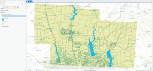
Delaware Data Inventory- Cailee Plunkett
Zip Code
> Contains all zip codes in Delaware County, Ohio
Recorded Document
> Contains points that represent recorded documents. These include subdivisions, vacations, surveys, etc.
School District
> Contains all school districts within the county
Map Sheet
> Contains all map sheets within the county
Farm Lot
> Identifies all farm lots and their boundaries in both the US Military and Virginia Military survey districts
Township
> Identifies the geographic boundaries of each township within the county
Street Centerline
> Shows the center of pavement on public and private roads within the county
Annexation
> Contains the annexations and conforming boundaries from 1853 to now
Condo
> Shows all condominium polygon boundaries within the county
Subdivision
> Shows all subdivisions and condo polygons within the county
Survey
> A shapefile of point coverage that shows land surveys within Delaware County
Dedicated ROW
> Consists of all designated Right-of-Way lines within the county, and is updated daily
Tax District
> Contains all tax districts within the county
GPS
> Shows all GPS identified monuments established between 1991 and 1997
Original Township
> Contains the original boundaries of the townships within the county before tax district changes affected their shapes
Imagery 2019
> Aerial imagery of Delaware County from 2019
Hydrology
Shows all major waterways within the county
Precinct
> Shows all voting precincts within the county
Parcel
> Consists of the polygons that represent parcel lines within the county
PLSS
> Consists of the Public Land Survey System polygons in both the US Military and Virginia Military Survey Districts of Delaware County
Address Point
> A spatially accurate representation of all certified addresses within Delaware County
2022 Leaf- On Imagery (SID File)
> 2022 imagery
Building Outline
> Contains building outlines of all structures within the county
Delaware County Contours
> Contains two-foot contours for the county
2021 Imagery (SID File)
> Imagery of the county for 2021
Delaware County E911 Data
Address mapping intended to aid with 911 response
Week 5- Plunkett
Chapter 6:
> Domains provide a way for you to constrain input information by limiting the choice of values for a particular field
> Using domains maintains data integrity- does not allow other values to be added during data collection
Chapter 7:
> The process of creating map features from addresses, place names, etc. is geocoding.
> To geocode addresses, you need an address table, reference data, and an address locator
Chapter 8:
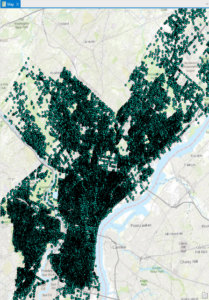
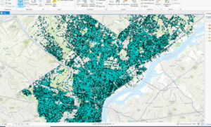

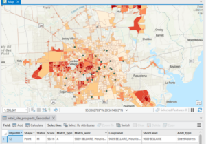
> In the first exercise, I created a kernel density to see where areas of high density may occur.
> Kernel density: the density calculated of point features around each output raster cell
> Temporal data represents a state in time
Chapter 9:
> Rasters are composed of a grid of cells instead of x, y coordinates
> Used to define and record geographic phenomena
> The reclassify tool is used to replace raster cell values with new cell values so that the rasters can be combined

Chapter 10:
> Dynamic labels are created when ArcGIS places labels for features in a layer with one click based on predetermined labeling rules.
> Useful for most mapping projects, but label positions can change depending on map scale
Week 4- Plunkett
Chapter 1:
> Point, line, and polygon data is also known as vector data
> Collecting measured values for any location on the Earth’s surface to form a digital surface is known as a raster.
Chapter 2:
> .aptx is the typical project template
>.aprx is a project file
>.ppkx is a project package
> The contents pane allows you to modify a map’s layers
> Learned how to select individual features
> Learned how to change feature symbols, display feature symbols, use the measure tool, and package my project to share online.
> Learned how to convert a 2D map to a 3D one
Chapter 3:
> An attribute query is a request for features in a table that meet user-defined criteria.
> Using an attribute join operation, we can join the spreadsheet table to the existing attribute table, as long as there is a common attribute field in each table
> Columns are often called fields.
> Fields include Object ID, which is a unique identifier assigned to every row in a table
> A layer file is a saved symbology scheme that points to a specific source datasheet
> A layer package bundles the layer file along with the source data
> Joining data based on location is a spatial join- this allows you to define a spatial relationship between two layers and combine their attributes in a new output layer

Chapter 4:
> A shapefile stores geometry and attribute data for one feature
> A geodatabase is a storage container where sets of features are stored into feature classes
> Nonspatial tables do not have well-defined geometry as feature classes do
Chapter 5:
> Python is a coding language that is compatible with ArcGIS
> You can define a workflow in the ‘tasks’ pane
Week 3- Plunkett
Chapter 5: Finding What’s Inside
> Finding what’s inside allows you to see whether an activity occurs inside an area or to summarize info. for several areas to compare
> You can draw an area boundary on top of features, use an area boundary to select the features inside and summarize them, or combine area boundaries and features to create summary data.
Selecting features inside the area:
> Good for getting a list or summary of features inside a single area
> Good for finding what’s within a certain distance of a feature
> You need the dataset containing the areas and a dataset with the features
Overlaying areas and features:
> Good for finding which features are in several areas or how much of something is in one or more areas
Using the results:
> Most common summaries include the count and frequency
Summary of a numeric attribute:
> Most common ones include the sum, average, median, and standard deviation
Overlaying areas with discrete features:
> The GIS tags each feature with a code for the area it falls within and assigns the area’s attributes to each feature
Vector method: GIS splits category or class boundaries where they cross areas and creates a new dataset with the areas that result. Each new area has the attributes of both input layers
Raster method: When you combine raster layers, the GIS compares each cell on the area layer to the corresponding cell on the layer containing the categories. It then counts the number of cells of each category in each area, calculates the areal extent by multiplying the number of cells by the area of a cell, and presents the results in a table.
Chapter 6: Finding What’s Nearby
> Finding what’s within a set distance identifies the area, and the features inside the area, affected by an activity.
Things to consider:
> Is what’s nearby defined by a set distance, or by travel to or from a feature?
> Are you measuring what’s nearby using distance or cost?
> Are you measuring distance over a flat plane or using the curvature of the earth?
Info. you need from the analysis:
> List: example is a parcel ID and address of each lot within 300 feet of a road repair project
> Count: can be a total or a count by category
> Summary statistic: can be a total amount, an amount by category, or a statistical summary (standard deviation, average, etc.)
Finding what’s nearby:
> Straight line distance: specify the source feature and the distance, and the GIS finds the area or the surrounding features within the distance
> Distance or cost over a network: specify the source locations and a distance or travel cost along each linear feature
> Cost over a surface: specify the location of the source features and a travel cost. The GIS creates a new layer showing the travel cost from each source feature
Creating a buffer:
> Specify the source feature and the buffer distance
> You can save the line as a permanent boundary or use it temporarily to find out what or how much of something is inside the area
> If you have several source features, GIS can buffer each source at the same distance or have it draw a variable distance buffer based on an attribute of each
> You can also specify several source features and the GIS will create buffers around all of them at once.
> If you want to find features within the distance of more than one source feature, you’ll need to create separate buffers and select the features surrounding each
Spider diagram: if a location is near two or more sources, GIS draws a line to each
Creating cell distance ranges: each cell potentially has a unique value. You display the the values using graduated colors so you can see the patterns
> You can summarize either discrete features or continuous data within the distance
> You can limit the area for which the GIS calculates distance by specifying a maximum distance
Chapter 7: Mapping Change
> Geographic features can change in location or change in character or magnitude
> Mapping change in location helps you see how features behave so you can predict where they might move
> Mapping change in character or magnitude shows how conditions in a given place have changed.
The geographic features:
> You can map discrete features that physically move, or events that represent geographic phenomena that change location
> Discrete features can be tracked as they move through space
> Might be individual features you can map paths for (hurricanes, vehicles, animals, etc).
> Events such as crime or earthquakes can represent geographic phenomena that occur at different locations
Measuring time:
> You can measure time in trends, ‘before and after,’ and through cycles
> If you’re mapping trends, you need to determine the interval, the number of dates, and the duration. The duration divided by the number of dates gives you the interval.
Mapping change:
> Time series: good for showing changes in boundaries, values for discrete areas, or surfaces.
– Good for showing the patterns of individual movement if you’re tracking many features, such as 911 calls over time.
> Showing fewer maps, farther apart in time, may make a change in values easier to see
> Showing more maps closer together in time may reveal patterns that are missed when using fewer maps
> It is difficult to compare more than five or six maps at a time
> Tracking map: good for showing movement in discrete locations, linear features, or area boundaries.
– Good for showing incremental movement of discrete features
> Linear features are often mapped before and after an event
> Measuring change: measure and map change to show the amount, percentage, or rate of change in a place.
Cailee Plunkett- Week 2
Chapter 1: Introducing GIS Analysis
> GIS analysis is the process of finding geographic patterns in data and at the relationships between features.
Understanding Geographic Features
Discrete Features / Data: The actual location can be pinpointed
Continuous Phenomena / Data: Can be found or measured anywhere (precipitation, temperature, etc.)
- The phenomena cover the entire area you are mapping, and there are no gaps.
- You can determine a value at any given location (precipitation in inches or temp. in degrees).
- Usually starts as a series of sample points that are then used to assign values to the area between the points (interpolation). This can be used to show how a quantity, such as annual precipitation, varies from place to place.
- Continuous data can also be represented by areas enclosed by boundaries (if everything inside the boundaries are the same type of something, such as the type of soil).
Features Summarized by Area:
> Shows the density / counts of features within a boundary
Examples: Number of businesses in a zip code, total length of streams in each watershed, number of households in each country
- The data value applies to the whole area, not a specific location in the area.
Two Ways of Representing Geographic Features
Vector Models:
- Each feature is a row in a table
- Feature shapes defined by x,y locations
- Can be discrete locations, events, lines, areas
> Locations are represented as points with geographic coordinates
> Lines, such as streams, are represented by a series of coordinate pairs.
> Areas are represented by borders that are closed polygons.
Raster Models:
- Features represented as a “matrix of cells in continuous space”
- Each layer represents an attribute
- Analysis occurs by combining layers to create new layers with new cell values
> Cell size affects how the map looks as well as the results of the analysis, and should be based on the original map scale and minimum mapping unit
- Using too large of a cell size can cause info. to be lost
- Using a cell size that’s too small takes up a lot of storage space and takes longer to process without adding precision to the map.
> Continuous categories can be represented by either the vector or raster models, but continuous numeric values are represented using the raster model.
Understanding Geographic Attributes:
Attribute values include:
- Categories
- Ranks
- Counts: Actual number of features on a map
- Amounts: Any measurable quantity associated with a feature, ex: number of employees at a business
- Ratios
> Categories and ranks are non-continuous values.
- There is a set number of values in the data, and multiple features may have the same value.
> Counts, amounts, and ratios are continuous values.
- Each feature may have a unique value anywhere in the range (between the highest and lowest values).
Chapter 2: Mapping Where Things Are
Preparing Data
> Before you begin mapping, you need to make sure that you have geographic coordinates assigned. If the data is already in a GIS database, coordinates will already be assigned. If not, you will have to manually enter them.
> If you are mapping features by type, you must assign each feature to a category.
Making Your Map
Mapping a Single Type:
> Draw all features using the same symbol to map features as a single type. This can suggest differences in the feature that may need to be explored further.
> You can also map features in a data layer or subset based on a category value that you create. For example, instead of mapping all crimes, you could map only burglaries.
Mapping by Category:
> Using categories can help to understand how a place functions.
> Use different categories to reveal different patterns.
> If you are displaying several categories on the same map, use no more than seven categories at a time. Most people can distinguish up to seven patterns on a map, so using more can become confusing or difficult to see.
Grouping Categories:
> Using fewer categories can make it easier for a broader audience to understand your map, but there will be less detailed information shown.
> Patterns may be easier to see if you group many, similar categories together.
> You must be explicit with what is included in each category to help others understand what your map is showing.
There are multiple ways to group categories:
Option 1:
– Assign each record in the database two codes. One for its detailed category and the other for its general category.
Option 2:
– Create a table that contains one record for each detailed code, with the corresponding general code.
– Join the feature table with the new table, and use the general code to display features.
Option 3:
– When you make the map, assign the same symbol to the detailed categories that make up each general category.
Mapping Reference Features:
> You may want to add recognizable landmarks to your map to make it more meaningful, especially to those who may not be familiar with the area they are observing.
> You may also want to reference features that are specific to your analysis so that you can observe geographic relationships.
Chapter 3: Mapping the Most and Least
Counts and Amounts:
- Use to map discrete features or continuous phenomena
Ratios:
- The most common ratios are averages, proportions, and densities.
- Ratios are good for summarizing by area
> Create ratios by making a new field and adding it to the layer’s data table, and dividing the two fields containing the counts or amounts.
Class Schemes:
> The most common schemes are natural breaks, quantile, equal interval, and standard deviation.
Natural breaks:
- Classes are based on natural groupings of data values
- Class breaks are set where there is a jump in values
> Finds patterns inherent in the data
> Good for mapping data not evenly distributed
Quantile:
- Each class contains an equal number of features.
> Good for comparing areas that are similar in size, and for data that is evenly distributed
Equal interval:
- The difference between high and low values is the same for every class
> Easier to interpret since the range for each class is equal
> Good for mapping continuous data
Standard deviation:
- Features are placed in classes based on how much their values vary from the mean
> Good for seeing which features are above or below the average and for displaying data that has a normal distribution
Choosing a Map Type:
Graduated symbols:
- Use to map discrete locations, lines, or areas.
- Used to show volumes or ranks for linear networks
Graduated colors:
- Use to map discrete areas, continuous phenomena, or data summarized by area
Example: percentage of population aged 18-29 (darker colors with higher values)
Charts:
- Use to map data summarized by area, or discrete locations or areas.
- You can show patterns of categories and quantities at the same time
- Can use pie charts or bar charts
Contour lines:
- Use to show the rate of change in values in an area for spatially continuous phenomena
3D perspective views:
- Use with continuous phenomena to help visualize the surface
Chapter 4: Mapping Density
> You can create a density map based on features summarized by defined area or by creating a density surface.
Defined Area:
- You can map density graphically, using a dot map. You can also calculate a density value for each area.
- Creates a shaded fill map or dot density map
- Easier, but doesn’t pinpoint exact centers of density
> Use if you already have data summarized by area or if you want to compare natural / administrative areas with defined borders
Density Surface:
- Usually created as a raster layer
- Each cell in the layer gets a density value
- Creates a shaded density surface or contour map
- Requires more data processing, but gives a more precise view of centers of density
> Use if you want to see the concentration of point or line features
Mapping Density for Defined Areas:
> You can map density for defined areas by graphically using a dot map or by calculating a density value for each area and shading each area based on this value.
Calculating a density value for defined areas:
- Calculate density based on the areal extent of each polygon
> Add a new field to the feature data table to hold the density value. Then, assign density values by dividing the value you’re mapping by the area of the polygon.
Calculating Density Values
Cell Size:
- Cell size determines how coarse or fine the patterns will appear
- Cell size is the length of one of its sides
> To calculate cell size: convert the density units from square kilometers to cell units (meters), then divide by the number of cells per density unit. This will give you the area of each cell. Then, take the square root of the cell area.
Displaying a Density Surface:
> You can display a density surface with either graduated colors or contours
Graduated colors:
- Density surfaces are usually displayed using the shades of a single color
- Areas with higher density are typically shown with darker colors, since people tend to equate darker colors with “more.”
Contours:
- Connect points of equal density value on the surface
- Good for showing the rate of change across a surface (the closer the contours, the quicker the change).
Cailee Plunkett- Week 1
Hello, my name is Cailee Plunkett and I am a junior Environmental Science major from Cincinnati, Ohio. I am also a transfer student, so this is actually my first semester here at Ohio Wesleyan. I am very excited for these next two years and can’t wait to become more involved on campus. I love to hike and do anything that gets me outside, I love animals, and I am a runner.
Chapter 1:
What I found interesting about this chapter was just how many different uses GIS has, and how many people in different jobs and fields use it. For example, it can be used for farming and municipal management, but GIS can also be used to map complex networks that provide power, fuel, and water to a town or city. Waste collection routes are mapped using GIS. Even Starbucks has reportedly used GIS. I also thought it was interesting how the acronym “GIS” can be split into GISystems and GIScience, and that GIScience is almost the theory that underlies GISystems.
The Application of Remote Sensing and Geographic Information System (GIS) for Monitoring Deforestation in South-West Nigeria
In this article, GIS was used to detect deforestation in Southwest Nigeria between 1978 and 1995 and detect land use and land cover change in Southwest Nigeria as well as to assess the stability of the land. The results of the study show that in 1978, forest vegetation covered 88.25% of the surveyed area, and that this had decreased to 63.13% by 1995. With forest cover change, between 1990 to 2000, Nigeria had lost an average of 409,700 hectares of forest per year.
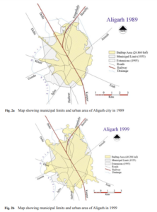
Urban Sprawl Development Around Aligarh City: A Study Aided by Satellite Remote Sensing and GIS
In this article, GIS was used to rapidly assess the developments of sprawl in Aligarh City. The results of this study show that the urban area of this city has increased around three times since 1971, and that around 1990, there was a sharp increase in land consumption as compared to population growth. As the city does not have a sewage treatment plant, with a growing urban area, there is less area for the water to drain into soils, and there will also be more flooding in low lying areas. By studying and watching for urban sprawl in an area over time, residential development can be better monitored.
References:
Peter, Yohanna, Innocent Reuben, and Emmanuel Bulus. “The application of remote sensing and geographic information system (GIS) for monitoring deforestation in south-west Nigeria.” Journal of Environmental Issues and Agriculture in Developing Countries Vol 4.1 (2012): 6.
Farooq, S., and S. Ahmad. “Urban sprawl development around Aligarh city: a study aided by satellite remote sensing and GIS.” Journal of the Indian Society of Remote Sensing 36.1 (2008): 77-88.