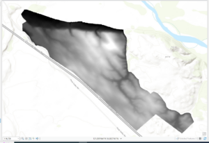
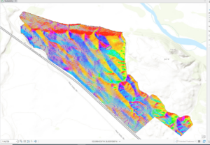
Jocelyn Weaver – Week 5

Chapter 6:

  • Domains provide a way for you to constrain input information by limiting the choice of values for a particular field, helps maintain data integrity
  • Organization – shared online workspace that is tied to your software license
  • Tree inventory map allows urban forest managers ti identify areas in which tree conditions can be poor and prioritize maintenance

Chapter 7:

  • Geocoding- create features from information that describes or names a location, typically an address
    • Address table
    • Reference data
    • Address locator – file contains the reference data and various geocoding rules and settings
  • Buffers are polygons that are created around a feature at specified distances

Chapter 8:

  • Temporal data – data that has a time attribute
  • Hot spot analysis – determines which areas are significant, including areas that are hot and cold and areas that are not significant are white
  • Space-time cube – helps visualize the data, the bins can be viewed in 2 or 3 dimensions and can show patterns of incidents over time

Chapter 9:

  • Cells – raster is composed of a grid of cells, instead of discrete x,y coordinates that define geographic entities
  • Discrete data – shows distinct and discernible regions on a map, such as soil type
  • Continuous data – there are smooth transitions between variations in the data
  • Map algebra – language that combines GIS layers, is fundamental to raster analysis
  • NoData – no values were recorded in cell (not the same as 0)
  • Mask – means of identifying areas to be included in a geoprocessing operation
  • Hillshade – surface layer that depicts shadows to model the effect of an illumination source over terrain of the land
  • Azimuth – the direction of the sun, expressed in positive degrees
  • Altitude – angle of the sun above horizon

Chapter 10:

  • Labels – based on one or more feature attributes and placed near or on a feature
  • Label class – used to specify detailed aspects of how labels are positioned and symbolized
  • Map frames – containers for maps in your page layout
  • Scale bar – dynamic element that provides an indication of the size of a feature and distance on the map

Jocelyn Weaver – Week 4

Chapter 1:


  • Projects: contain maps, layouts, layers, tables, tasks, tools, and connections to servers, databases, folders, and styles – everything you needed stored in one
  • Can have maps 2D or 3D, or both simultaneously
  • Geoprocessing tools allow you to perform spatial analysis and manage GIS data
  • Configure symbology, clusters, and pip-ups to make the data layers and attributes more usable 


Chapter 2: 


  • Content pane allows you to modify map’s layers
  • Symbology: the way GIS features are displayed on a map
    • Graduated symbols – are used to represent a range of symbols based on an attribute field, greater the value the larger the symbol
  • Learned to import maps, add local data, practiced converting 2D to 3D

Chapter 3:


  • Using GIS you can combine datasets, enrich them with new attributes, derive statistics from them, and get new information based on their relationships
  • Definition query: you can set a definition query limit to limit the visible areas to only those that you choose – help to use when working with a subset of data in a map while maintaining the source data
  • Attribute join: you can use this operation to append the spreadsheet table to your existing attribute table – as long as you have a common attribute field in each
  • Spatial join: joining data based on location, not common attribute – allows you to define a spatial relationship between two layers
  • This chapter is on data relationships

Chapter 4:


  • Will populate empty geodatabase by converting shapefiles and mapping x,y location values found in nonspatial tables – all outputs will be placed in geodatabase
  • Use script tool to convert multiple files at once
  • Snapping: is an editing option that acts like a magnet – if point you create is within distance of another feature’s vertex, endpoints, edge, or intersection, it will jump to coincide with another feature

Chapter 5:


  • Tasks: feature that allows you to use a series of predefined steps that can incorporate commands and geoprocessing tools, including model and script tools
  • ModelBuilder: geoprocessing environment that allows you to easily link one tool to another and run a set of operations one after another – provides helpful visual diagrams of geoprocessing workflows
  • Python is the scripting language compatible with ArcGIS software
  • Model: allows you to string multiple geoprocessing tools together and rin them automatically 

Jocelyn Weaver – Week 3

Mitchell ch. 5: Finding What’s Inside

Overall: Finding what is inside can let you see activities that occur in a certain area or summarize information for several areas for comparison.

  • To find what is inide you can draw boundary lines on top of a feature, use area boundary to select the feature inside and list or summarize them, or combine the area boundary and features to create summary

  • Finding what’s inside a single area

    • Service area around a central facility

    • A buffer that debines a distance around some feature

    • An administrative or natural boundary

    • Area you draw manually

    • The results of a model, such as boundaries of floodplain modeled in GIS

  • Finding what’s inside multiple areas

    • Contiguous – zip code/watersheds

    • Disjunct – state parks

    • Nested – 50 year old floodplains/area 1 or 2 miles within store

  • Discrete features: identifiable features, can list or count them or summarize a numeric attribute associated with them. 

  • Continuous features: seamless geographic phenomena, can summarize features

    • Spatially continuous categories – vegetation type/elevation

    • Continuous values – temperture, elevation, precipitation

  • Drawing areas and features: good for finding out whether features are inside or outside an area 

  • Selecting the features inside the area: good for getting a list or summary of features inside an area 

  • Overlaying the areas and features: good for finding out which features are inside which areas, and summarizing how many or how much by area

  • Statistical summaries include:

    • Count – total number of features inside area

    • Frequency – number of features with a given value, or within range of values, inside area, displayed as a table 

    • Sum – overall total

    • Average – mean

    • Median – middle of range of values

    • Standard deviation – average amount of values are from the mean

  • Vector or a raster method to overlay areas with continuous categories or classes

  • Vector – GIS splits category or class noundaires where they cross areas and creates a new dataset with the areas that result, then use data table for new layer to summarize the amont of each category in area

  • Raster – GIS compares each cell on the area layer to the corresponding cell of the layer containing the categories

Mitchell ch. 6: Finding What’s Nearby

Overall: Finding what is near lets you see what is within a set distance or tavel range of  a feature. Can monitor events in an area or find an area served by a facility or the features affected by an activity

  • Travel range is measured using distance, time, or cost. 

  • To find whats near you can measure straight-line distance, measure cost/distance over a network, or measure cost over a surface

  • Can calculate distance assuming the earth is flat (planar method) or curved (geodesic method)

    • Planar – good when area of interest is small like city, county, state

    • Geodesic – good for large areas such as large region, continent, or whole Earth

  • Once you have identified which feature are near source you can get a list of the features, a count, or a summary statistic 

    • Summary statistics can be: a total number, an amount by category, a statistical summary (mean, maximum, minimum, or standard deviation)

  • If you are specifying more than one range you can create either inclusive rings or distinct bands

    • Inclusive rings are useful for finding out how the total amount increase as the distance increases

    • Distinct bands are useful if you want to compare distance to other characteristics

  • Ways of finding what is nearby

    • Single-line distance: defining an area of influence around a feature, and creating a boundary or selecting features within the distance

    • Distance or cost over a network: measuring travel over a fixed infrastructure

    • Cost over a surface: measuring overland travel and calculating how much area is within a travel range

  • To create buffer you specify the source feature and the buffer distance, GIS draws line around feature, can have several source features with buffers around them

  • If you are finding individual locations near a source feature and you can GIS calculate the distance between each location and the closest source

Mitchell ch. 7: Mapping Change

Overall: GIS lets you map where thing move and knowing what’s changed can help you understand how thing behave over time, anticipate future conditions, or evaluate the results of an action or policy

  • Mapping change in character or magnitude shows you how condition in a place have changed. Change can be a feature or can be associated with a quantity with each feature

  • Can map discrete features that physically move or events that represent geographic phenomena that change location

    • Discrete features – change in character or in the quantity of an attribute associated with them

    • Data summatized by area – totals, percentages, or other quantities are associated with features within defined areas

    • Continuous categories – show the type of feature in a place, such as each land cover type

    • Continous values – these quantities are continuous, such as air pollution levels

  • Can map time 3 differnet ways:

    • A trend – change between two or more dates or timess

    • Before and after – conditions preceding and following an event

    • A cycle – change over a recurring time period, such as a day, month, or year

  • Snapshots show the condition at any given moment and are used to map phenomena that are continuous in time 

  • Summarizing is used for mapping discrete events in a particular place that are not continuous in time

  • Duration divided by the number of dates yields the interval

  • Number of dates you use depends on the consistency of the change

  • When calculating change in magnitude you subtract the numeric values associated with each feature

    • Can also calculate percentage to show which feature changed the most relative to their original value 

  • To measure change in type or category you sum the land area of each category and calculate the the actual or percentage difference between the dates

  • 3 Ways to map change:

    • Time series – Strong visual impact if change is substantial; shows conditions at each date/time

    • Tracking map – Easier to see movement and rate of change that with time series, especially if change is subtle

Measuring change – Shows actual difference in amounts or values

Jocelyn Weaver – Week 2

Mitchel Ch. 1: This introductory chapter starts off with defining GIS analysis as the process of looking at geographic patterns in your data and at the relationship between features. It discussed how we start the process of analysis by figuring out what information you need and the question you have at hand. It is important to take into consideration how the information will be used and who will be using it. The order of events to start is to choose a method of gathering your information, processing the data, and looking and reviewing the results. After you’re done if the data is not useful you can rerun it with different parameters. Geographic features can be discrete,  continuous phenomena, or summarized by area. Discrete features are actual locations that can be pinpointed and the feature can be either present or not. An example of this is businesses – as individual locations, streams – as linear features, and parcels – as discrete areas. Continuous phenomena allows you to determine a value at any given location; for example precipitation or temperature. It starts with a series of sample points that are either regularly or irregularly spaced. GIS then uses these points to assign values to the area between the points, which is called interpolation. Summarized data represents the counts or density of individual features within area boundaries. We also learn that geographic features are represented by vectors and rasters. Vector models put each feature in a row in a table and the feature shapes are defined by x,y location in space. Continuous data and discrete features and data summarized uses vector models. Continuous numeric values and continuous data uses raster models. The chapter highlights that all data layers you use should be in the same map projection and coordinate system to ensure the accuracy of the results when combining layers. Then it moves into talking about attribute values: categories, ranks, counts, amounts, and ratios. 


Mitchel Ch. 2: This chapter discusses different aspects of mapping and how they affect the maps. It goes over ways to make maps more efficient and how to effectively display the information you are trying to show. By looking at the different distributions of features on a map can help you see different patterns. Sometimes overlaying a lot of features and points to show patterns are effective, while on the other hand, making separate maps for different categories can make it easier for comparison. This is because it needs to be appropriate for the audience and the issue being addressed with the maps. When preparing the data you need to check that the features have geographic coordinates assigned to them because each feature needs a location in the geographic coordinates. Also, when you map features by type they need their own code that identifies which type it is in each feature. To add categories you need to create a new attribute layer in the data; many categories are hierarchical with major types divided into subtypes. When making the map you need to inform GIS what features you want to be displayed and what symbols to use to draw them. To map features as a single type, you draw all features using the same symbols. GIS stores the location of each feature as a pair of geographic coordinates or as a set of coordinates to define its shape. For example linear features are drawn by connecting many points. You can map features in a data layer or subset based on a category value, using a subset you have selected based on a category value. You can map features by category by drawing features using different symbols for each category value, this is stored in the layer’s data table. The chapter also goes over map scale and ways to make the map easier for views to understand, and or the way you change categories and change the way the readers perceive the information, which is extremely important. 


Mitchel Ch. 3: This chapter titled “Mapping the Most and Least” informs you about how doing both can help you find places that meet criteria and actions to be taken or emphasize the relationship between places. Mapping features based on quantities adds an additional level of information. By mapping this way it can help you decide how to best present the quantities to see the patterns on your map. Then the chapter goes into different types of features being mapped. Discrete features usually represent locations and linear features with graduated symbols, while areas are often shaded. For continuous phenomena areas are displayed using graduated colors while surfaces are displayed using graduated colors, contours, or 3D perspective view. Data summarized by area is usually displayed by shading each area based on its value or using a chart to show the amount in each category. It is important to understand the quantities you will be mapping to better present your data. Using counts and amounts allow to see the value each feature is given and shows you the actual number. Ratios show you the relationship between two quantities and are created by dividing one quantity by another, like averages, proportions, and densities. Ranks put features in order and can show realtice values rather than measured values. Examples are a scale with different colors saying excellent, good, fair, and poor. Classes group features with similar values by assigning them the same symbol, you can create classes manually or use a standard classification scheme. The different classifications schemes are natural breaks, quantile, and standard deviation. This chapter also talks about the importance of looking at outliers and how it might skew your results. You can put each outlier in its own class and use a special symbol for them. When creating a map you can you use graduated symbols, graduated colors, charts, contrours and 3D perspective views to show the quantities. 


Mitchel Ch. 4: This chapter covers the idea of density. Mapping density can show you the highest and lowest concentration of a feature. This is helpful for identifying patterns. A density map allows you to measure features using a unoform areal unit, such as square miles, so you can see the distribution. This can be particularly helpful when mapping an area, such as census tracts or counties, which can vary in size. To show density you can shade different areas based on the density values. Also, you can map density features, like location of businesses or feature values, like the number of employees at each business. You can map density in a couple different ways: graphically, using a dot map, or calculate a density value for each area. When creating a density surface it is created in GIS as a raster layer. You should map density by area when you have data already summarized by area, or lines or points you can summarize by area. You should create a density surface when you have individual locations, sample points, or lines. When creating a dot density map you map each area based on a total count or amount and specify how much each dot represents. The larger the amount represented by each dot, the more spread out they will be. Also, you can change dot size to emohasize the patters. When a density surface is created in GIS it defines a neighborhood around each cell center, then it totals the number of features that fall within that neighborhood and divides that number by the area og the neighborhood; that value is assigned to the cell. When picking a cell size it needs to be appropriate for the graph, smaller cells will take more time process while larger cells can lose detail and make the pattern disappear. 


Jocelyn Weaver Week 1

About me 😎

My name is Jocelyn Weaver and I am an environmental science and geography major with a botany minor. I am from Hudson Ohio which is around Cleveland. I am a junior and on the track team on campus (I throw javelin). I like hiking and being outdoors, my favorite food is mashed potatoes, and I am on the student Envs board. I am excited to learn more about GIS and use it potentially in a future career.    


Comments on Chapters 1: GIS: Short introduction

-It is true, when I tell people I do research involving GIS, most people do not know what that stands for

-Interesting how the idea of overlaying came around in 1962 and was the original idea for GIS basis

-The article brings up multiple angles in which GIS is looked at by different people and how people categorize it like wether its quantitative analysis or an extension of mapping which is an interesting concept

-It interesting all the ways GIS can be used and applied, which people do not regularly think about like farmers and what you eat and where it comes from and how to get to your local supermarket

-Never heard the term “leap-frogging” before and the example of people in sub Saharan Africa never having a landline but having cellphones now


An urban storm-inundation simulation method based on GIS by Shanghong Zhang and Baozhu Pan

I looked up GIS storm water management and multiple articles came up using GIS and other data sources to predict and map land to show where storm overflow water would go. This article specifically talks of a new method USISM to simulate urban storm inundation. Due to urbanization and other human factors flooding is more frequent. To be able to find inundation quickly an urban storm-inundation simulation method (USISM) based on GIS is proposed. GIS technology is used to find depressions in the land and other data such as digital elevation model (DEM) to obtain flow order of the depressions.


Arc StormSurge: Integrating Hurricane Storm Surge Modeling and GIS by Celso M. Ferreira, Francisco Olivera, and Jennifer L. Irish

Arc storm surge is a a GIS application that models data involving hurricane waves, surge models, simulating waves nearshore, and wave models and hydrodynamic models. This program involves pre and post processing tools to help spatial data and numerical modeling. Hurricanes cause immense costal flooding and damages and which these prediction models will be able to understand the events of a simulated hurricane storm surge. Details are in the caption following the image

Citation

Zhang, Shanghong, and Baozhu Pan. “An urban storm-inundation simulation method based on GIS.” Journal of hydrology 517 (2014): 260-268.

Ferreira, Celso M., Francisco Olivera, and Jennifer L. Irish. “Arc StormSurge: Integrating hurricane storm surge modeling and GIS.” JAWRA Journal of the American Water Resources Association 50.1 (2014): 219-233.