Final-GEOG191 (1) . I hope this works and is accessible!
Author: nathansturgill
Week 4- Sturgill
Chapter 1 (Law / Collins)
- It is important to note that the feature data in GIS contain attributes that correspond to the features attribute data.
- Feature attribute information is stored in a table in a GIS database. Each feature occupies a row in the table, and an attribute field occupies a column
- ArcGIS Pro is similar but also different from the basis of ArcMap in that it uses ArcGIS Online basemaps as the backdrop instead of the typical import of basemaps from another source. ArcMap can also use Arc Online for basemaps but this is something that is not extremely important
Exercise 1:

- This figure represents up to the 8th step in exercise one. At this point all that has really been done is opening an ArcGIS online map and seeing some of the features located in the layers tab that are associated with the map

- This figure represents the public schools in the area but with a different symbol. At this point in the exercise we have successfully changed and updated a symbol in the map
- The next figure shows the ToBreak attribute and what this attribute shows is the minutes it takes to walk to school from those areas.
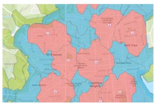
- This figure represents the different areas and how long it takes to walk to school from those areas. Using the steps in the book I was able to create this map to show the difference between 5, 10, and 15 minutes of walking to get to school. Red being 5, blue being 10, and green being a 15 minute walk to school.
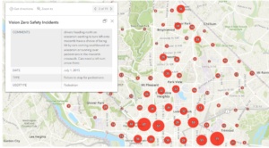
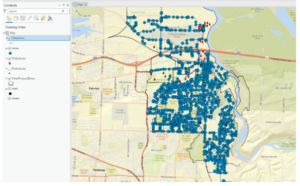
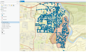
- This figure represents the Vision Zero Safety Incidents that were configured using the filter and clustering section of the editing tools for the map. As well as the map pop-up windows were configured to produce this figures pop up window you can see in the top left of the figure.
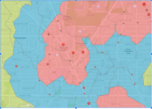
- This figure shows what the final version of the map looks like with all three layers showing. Cities can use a map like this to create stricter speeding fines and punishments for school zones where these incidents occur.
Chapter 2:
- This chapter begins with getting to know the basics of ArcGIS Pro. ArcGIS Pro offers 2D AND 3D visualization and analysis with an interactive, navigable interface.
- So far this chapter is showing that although ArcPro is similar to ArcMap, it varies in that it is more similar in some regards to Microsoft applications
- A folder connection was one of the first steps in exercises 2a and this was a very similar process to that of ArcMap
- This figure shows the air pollution by country layer in the first exercise in chapter 2. This map was produced from data that was imported into ArcPro and then manipulated to look the way it does.
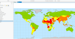
- The continents that PM concentrations are the highest are Africa and Asia.
- To restore the contents pane in ArcPRO just go to the view tab and click on contents
- The largest city according to the Cities attribute table is shanghai china
- This figure shows what the final map looks like after the first exercise in chapter 2. Some basic tools were used to manipulate the map and its data so that it looked this way as a final product.
- This figure shows what the map looks like at the end of the 2nd exercise in chapter 2. In this exercise we changed feature symbols, configured feature labels, used the measure tool, added a cloud-hosted basemap, and packaged the project to share online.
- The height of the tallest building in the third exercise in this chapter is 339.76 feet
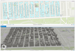
- This figure shows the final map image for the final exercise in chapter 2. In this exercise we learned how to convert a 2d map into a 3d map, and then extrude features based on the building height attribute to visualize buildings in a more realistic perspective. This exercise was fantastic if I say so myself and I was genuinely surprised going through this chapter. I think chapter 2 contained great information that is vital in getting to know ArcPro.
Chapter 3:
Questions :
- (add data to the project) The field name that indicates the state within which the county features are located is called STATE_NAME
- (add data to the project) There are 10575 residents in Wayne County Ohio between the ages of 22 and 29
- (Incorporate tabular data) Six years of data are represented in the table
- (incorporate tabular data) No I do not see a correlation between income and 2010 obesity rates. There are many counties with moderate-high income and high obesity rates. There are also counties with low income that have moderate to low obesity rates.
- (Calculate data statistics) 18.7% of households had an income of less than 15,000 per year.
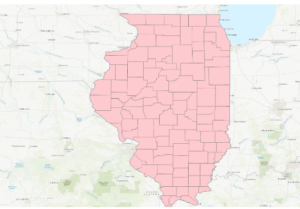
- (connect spatial datasets) There are 4 food deserts in knox county
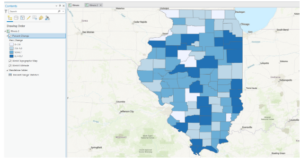
- This figure shows the map after the first exercise in chapter 3. This map was configured using select features by attribute and then exporting those features into a new dataset into the map.
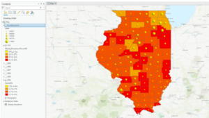
- This figure shows the final map product at the end of the second exercise in chapter 3. This exercise was all about joining the cdc data to the Illinois county feature class. This was done using a variety of methods and data manipulation techniques including joining data tables, incorporating layer symbology, and using the swipe tool to compare different years of the data on the map.
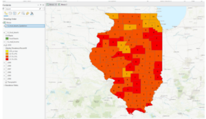
- This figure shows the final map product after the end of the 3rd exercise in chapter 3. This exercise was all about calculating the data statistics. We added a new attribute field and then populated the field with values. We then calculated the summary statistics for the state.
- This figure shows the final map product of the last exercise and the final map at the end of chapter 3. This exercise was all about spatially joining data. We spatially joined the 2010 layer with the IL_food_deserts layer and this is shown by the number of food deserts displayed on the map for each county.
Chapter 4:
Questions:
- (Configure snapping options) The selected line has 4 vertices
- (Modify Features) The Shape_area value decreased from the original water pressure zone

- This figure shows the final map product after the first exercise in chapter 4. This exercise was all about switching the city’s data collection to a geodatabase model. It was easier than expected to build a geodatabase for the city.
- This figure shows the final map product after the second exercise in chapter 4. This exercise was all about creating features and fixing the missing water lines in the map. This was done using a variety of techniques in the data tab of the ribbon. Snapping was the method that was used for the exercise.
- This figure shows the final map product of the last exercise and the end of chapter 4. This exercise was all about modifying features which included splitting a polygon, merging polygons, modifying lines and points, and adding map notes.
Chapter 5:
Questions
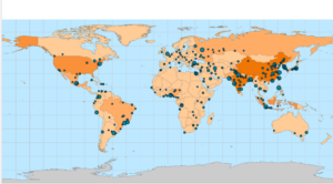
- (manage a repeatable workflow using task): The conflict events recorded in the dataset are battle (no change of territory), battle (government regains territory), battle (non-state actor overtakes territory), headquarters or base established, non-violent transfer of territory, remote violence, riots/protests, violence against civilians, and strategic development
- (Author a task) 14,211 fatalities resulted from violent conflicts against South Sudanese civilians between 2010 and 2018
- (Run the model) There were 71 fatalities that resulted from conflicts classified as violence against civilians in Rwanda from 2010 – 2018
- (Convert a model to a geoprocessing tool) 41 riots/protests occurred in Rwanda between 2010 and 2018 and 12 fatalities resulted from this
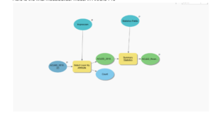
- (Use a custom script tool) The geoprocessing tools combined in this script are Select Layer By Attribute and Summary Statistics
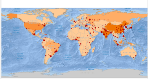
- (Use a custom script tool) 26,323 fatalities resulted from conflicts classified as violence against civilians in Nigeria from 2010 to 2018
- This figure shows the final map product of the first exercise of chapter 5. This exercise was all about using the Tasks pane in ArcPro to establish a workflow for ourselves and so others can use the task we created in a similar way to create a similar map with the appropriate data.

- This figure represents the final map product at the end of exercise 2 in chapter 5. This exercise was all about using ModelBuilder which is a design environment for creating spatial analysis workflow diagrams and in this exercise we used ModelBuilder to build the workflow to create this map.
- Here is the final modelbuilder model in ArcGIS Pro
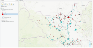
- This figure shows the final map product of the last exercise in chapter 5. We can see that all three countries (South Sudan, Rwanda, and Nigeria) are highlighted as they were all worked on in different exercises throughout the chapter. This exercise was all about running geoprocessing tools in ArcGIS Pro using Python. This workflow was similar to the first two exercises but we used Python coding and a script tool to execute the processes.

Notes:
- These first five chapters of the book were very informative on how to use the tools and functions in ArcGIS Pro, and how to manipulate maps and data as well. Once we get to chapter 3 I think that’s when things start to get dicey. Although I can follow the instructions the book gives for each exercise in each chapter, I would still struggle somewhat if I were to do this off the top of my head (guess I need to review more).
Week 3- Will Sturgill
Week 3:
Chapter 5:
Key concepts=
-
It is important to map what is inside an area to monitor what is happening in that area and it is important to map several areas to compare these areas and what is taking place inside of the areas.
-
It is important to define you analysis when mapping what’s happening inside of an area. It is equally important to evaluate and consider your data/ areas and what types of features are inside the areas.
-
The features inside of an area can either be discrete features or continuous features. Discrete features are unique and identifiable features, you can count them or list them. You can also summarize a numeric attribute associated with them as well. Discrete features are either locations, linear features such as streams, or discrete areas such as parcels.
-
Continuous features represent geographic phenomena and you can summarize the features for each area. A type of continuous features is spatially continuous categories or classes. You can measure this continuous feature by finding out how much of each category or class occurs inside the area you are mapping
-
Another type of continuous feature is a continuous value. These are numeric values that vary continuously across a surface and can include elevation and precipitation.
-
The three ways of finding what is inside the area of a map are drawing areas and features, selecting the features inside the area, and overlaying the areas and features.
-
All three methods mentioned above are good for individual reasons when it comes to finding what is inside the area of a map.
-
Drawing areas and features can be done using different methods that are required for different areas such as discrete areas or continuous features
-
Selecting features inside an area lets you use the results as a tool for analysis such as the frequency, count, and a summary of a numeric attribute.
-
Overlaying areas and features lets you find which discrete features are inside certain areas and summarize them. It also allows you to calculate the amount of each continuous category or class inside areas, and summarize continuous values inside areas.
-
When overlaying areas with continuous categories or classes the GIS uses either a vector or raster method. The vector method is more accurate but requires more processing and the raster method is more efficient since it automatically calculates the areal extent for you but is still less accurate.
Definitions:
Frequency= the number of features with a given value, or within a range of values, inside the area, displayed as a table.
Chapter 6:
Key concepts=
-
This chapter is all about finding what is nearby and the purpose behind this is to find out what’s occurring within a set distance of a feature and to also find out what is within traveling range.
-
There are different ways of finding what’s nearby and this can be done by measuring straight-line distance, measuring distance or cost over a network, or measuring cost over a surface.
-
Nearby can be based on a set distance you specify, or on travel to or from a feature. Typically if travel is involved you would measure nearness by distance or travel cost
-
Travel costs can include things like time, money, and effort expended. These are considered travel costs because of the costs associated with each.
-
Taking the curvature of the earth into account is important for geodesic method and ignoring the curvature of the earth and measuring across a flat plane is called the planar method
-
The information needed from analysis can be summed up as a list, count, and summary. Each have their own purpose for the features that are mapped
-
Straight line distance is a good and simple way of finding what’s nearby, but measuring distance or cost over a network, or cost over a surface can give you more accurate measurements as to what is nearby.
-
Creating a buffer is important because you can use the line created by the buffer as a permanent boundary or use it temporarily to find out how much of something is inside the area. Creating a buffer is done by specifying the source feature and the buffer distance
-
GIS will also allow you to create buffers around multiple source features at once, and can also buffer each source differently depending on an attribute of each.
-
Finding individual locations near a source feature is useful if you need to know exactly how far each location is from the source instead of just figuring out if it falls within a certain distance from the source
Definitions:
Distance or cost over network= specify source locations and a distance or travel cost along each linear feature.
Cost Over a Surface= specify location of source features and travel cost, and creates a new layer showing the travel cost from each feature.
Chapter 7:
Key concepts=
-
This chapter was all about mapping change. Knowing what has changed can help with the analysis of the way things interact, predict future conditions, and evaluate the results of an action.
-
Mapping change can include showing the location and condition of features at each date, or calculate and map the difference in a value for each feature between two or more dates.
-
Mapping change in location can help to predict where features may move in the future
-
Mapping change in character or magnitude can show how the conditions in a given place have changed over time
-
It is important to not that change in location and change in character are not mutually exclusive
-
A trend is when there is a change between two or more dates and times, this typically occurs when measuring time
-
There are three ways to map change and these are, time series, measuring change, and tracking maps
-
A time series is particularly useful for showing change in character or magnitude for discrete areas and surfaces.
-
Measuring change is to show the amount, percentage, or rate of change in a place
-
A tracking map is another key concept and basically shows the position of a feature or features at several dates or times (this is good for showing incremental movement). What examples could be used with a tracking map?
-
The last important key concept for the chapter is measuring and mapping change. Calculating the difference in value between two dates and then mapping the value of this is how mapping/measuring change takes place. There are various data/features you can measure and map change for including discrete features, data summarized by area, continuous numeric values, and continuous categories.
Definitions:
Change in character or magnitude= how conditions in a given location change over time
Cycle= change over recurring time period
Week 2 (Will Sturgill)
Chapter 1:
- I have been a geography student here at OWU for over 6 semesters now. I have taken roughly 10 courses that all involved GIS in some way and I have to be honest it is refreshing to go back to the basics of what really makes up GIS and GIS data. I thought that this chapter did a great job of explaining what makes up GIS and why it is important to understand the geographic features and types of features. “Geographic features are discrete, continuous phenomena, summarized by area.” (Mitchell, 2020). This quote puts into perspective the three different types of geographic features used in GIS. Discrete features like locations and lines can actually be pinpointed on a map. Continuous phenomena such as temperature can typically be found or measured anywhere. Summarized by area means that the summarized data represents the density or counts of individual features within the area’s boundaries. All three are essential in explaining the first chapter and what it means to begin to analyze GIS data.
- The two ways geographic features can be represented in GIS are raster and vector. These are technically two different types of models within a GIS system. With the vector model each feature is a row in a table and this means that it is typically defined by x,y locations in space. This also includes the use of polygons that define an area based on the x,y location. They can also be defined by boundaries which can be legally defined or naturally occurring.
- With the raster model features are represented as a matrix of cells in continuous space. Each layer represents one attribute and analysis occurs by combining the layers to create new layers with new cell values. This distinction between raster and vector models is important to note because analysis occurs differently with the two different models.
- Cell size in a raster model affects the results of the analysis
- Accurate results start with using the same map projection and coordinate system. Map projections translate locations on the globe to the flat surface of your map.
- A coordinate system specifies the units used to locate features in two-dimensional space and the origin point of those units. This is an important note because it shows what is happening behind the scenes when a certain coordinate system is used for the map and why there may be more than just one coordinate system
- Geographic features have one or more attributes that identify what the feature is or describe it. These attributes are represented as values and are extremely important when creating a map.
- The different attribute values are categories, ranks, counts, amounts, and ratios. The main difference between some of these attribute values is if they are continuous values or if they are NOT continuous values.
- Tables that contain the attribute values are important to work with in GIS and the different ways to work with them are selecting, calculating, and summarizing.
Chapter 2:
- Mapping has become increasingly important and the best example of this provided by the chapter is that you can map where things are to show you where you need to take action. Police can do this by mapping where the most burglaries might take place in a city and wherever this area may be is where they can take action next.
- This type of mapping analysis includes looking for patterns that occur and where these patterns might be.
- Symbols are used to map features in a layer of a map to show these patterns.
- Multiple features can be mapped at once using GIS to see if these features/attributes are occurring in the same place. An example of this is if police map two features, which are theft and assault, at once and see the connection of these two features occurring in the same place and determine that there is a pattern that shows and this pattern is that theft and assault are occuring in the same place/area.
- The GIS map should be appropriate for the targeted audience and should properly address the issue at hand that the map is highlighting.
- GIS maps should also include areas of reference for an audience that may not be familiar with the area being presented.
- Preparing your data for a GIS map includes creating a category attribute with a value for each feature and to also have geographic coordinates assigned.
- When mapping each feature mapped must have a code that identifies its type of feature. Many maps will display categories based on hierarchical features and there may be some features that are listed as sub-categories based on the hierarchy used.
- Mapping a subset feature in a data layer is helpful to determine patterns that are not easily seen when mapping all of the features.(this is commonly done for certain individual locations)
- Mapping features by category can help with understanding how a certain place functions.
- GIS helps with the above comment by storing a category value for each feature in the layer’s data table.
- The way you group categories can change the way readers perceive the information, for example creating a map with more than seven categories makes it difficult for the reader to see the patterns associated with the map.
- There are different methods of grouping categories that can alter the features that are being represented on the map.
- Patterns on the map will become recognizable when mapping categories, whether it be a single category or multiple categories.
Chapter 3:
- Mapping the most and least in an area is important to see relationships between places, and to also see if a feature may meet a criteria or if action needs to be taken.
- To map the most and least you need to map features based on quantity associated with each.
- Discrete features can be mapped using graduated symbols that are often shaded to show quantity. This is an important distinction between normally mapping discrete features and mapping them for quantity.
- Continuous phenomena can be mapped for quantity by displaying graduated colors
- Data summarized by area is usually displayed by shading each area based on its value or using charts to show the amount of each category in each area.
- It is also important to note again that people can recognize up to 7 colors on a map but after that it becomes difficult and distorted for people to analyze the data
- An amount is different than a count because it is the total of a value associated with each feature, versus the count of the actual number of features on the map
- Ratios show you the relationship between two quantities and are created by dividing one quantity by another for each feature. Common ratios include averages, proportions, and densities
- Ranks put features in order from high to low and they show relative values rather than measured values. When direct measures are difficult this is when ranks come in to play.
- Once the quantities are determined the next important step is to determine how to represent the data and this is commonly done by grouping the values into classes.
- Classes group features with similar values by assigning them the same symbol.
- Standard classification schemes can be used to look for patterns in the data.
- There are various forms of classification schemes and each can be used for certain types of data and features that are represented in the map.
- Outliers are extremely low and high values that can obscure the data represented and the class ranges as well. This means that outliers should be looked at closely because they could show errors in the database or even anomalies with the data.
- This chapter mentions that the features and data values your are mapping must be consider when deciding what map type to use.
Chapter 4:
- Chapter 4 deals with mapping the density of features and the purpose of this is to see possible patterns and where things may be concentrated.
- Density maps are more useful for detecting patterns than for looking at the location of individual features.
- There is a slight difference in mapping features and feature values. This difference is due to feature values being located in features themselves.
- However you can also map individual locations. This is done by using a defined area and using a dot map to represent these locations. This is one way that density can be mapped
- Another way that density can be mapped is mapping density by surface. A density surface is created in the GIS as a raster layer. Each cell in the layer gets a density value based on the number of features within a radius of the cell. This is a more precise way than mapping density via defined area
- You can also map density for a defined area by calculating a density value for each area and then shade each area based on this value
- With GIS and mapping density, the size of the cell used (specifically for calculating density values) will determine whether the map has a smooth or rougher type of surface. This is the difference between using small cells compared to bigger cells.
- Displaying density surfaces requires using graduated colors or contours. The reason for this is that each cell has a unique value and therefore requires classification which as stated before in previous chapters can be displayed graduated colors and contours.
- Contours can be useful because they connect points of equal density value on the surface. As shown in previous chapters as well as chapter 4, contour lines are typically created automatically by ArcGIS.
- The notes for this chapter above really show how detailed mapping density can be. I had never thought about the true detail and what all goes into mapping density so this chapter was a good insight to the detail of mapping density.
- Some extra notes: I did think that the reading was a bit lengthy for this week, however I found it to be extremely informative and helpful. I think it should be noted that the maps shown with each chapter were also really helpful in providing examples.
Week 1 Blog Post (Nathan Sturgill)
- Hello, my name is Nathan Sturgill but I prefer to be called Will (my middle name). I am a senior this year and I am a double major in Environmental Studies and Geography. I am from Portsmouth, Ohio, which is in Scioto County (roughly the southern tip of Ohio). My interests include skiing, golf, and wakeboarding. This will be my second class with Dr. Krygier, and I am looking forward to having a great semester! I plan on becoming the remote sensing lab student manager for the year. I also live in one of the fraternities here on campus with a great group of guys. My goal for this class is to become more skilled with GIS and to have a better understanding of the history behind GIS.

- 2. Reading Schuurman chapter 1 was very helpful in understanding the origins of what makes up GIS. GIS consists of two specific uses which are making maps and analyzing data. I had no idea there was such a debate in the GIS community as to what really makes up GIS and which of the uses is the real identity of GIS. GIS is viewed by some to be just a tool or application that is used for creating visual representations of maps and mapping data. Many others it is viewed as being an analysis of spatial data that includes creating visual maps with many different layers and factors besides just a basic cartographic map. The debate between the two was also referred to as GIS as in Geographic Information Systems and GIS as in Geographic Information Science. I thought that the most interesting difference between the two meanings for GIS was how the chapter articulated the difference. The chapter states that the science in GIS asks the question of how versus the system in GIS is where the spatial entities are. I had never thought about the difference in GIS or had even known if there was a difference in what GIS meant to the Geography community. I also thought that how the chapter explained what visual representation can mean to people when analyzing data was very interesting in that many people do not realize how they interpret visual representation compared to numerical data and cartography.
- I searched “GIS application urban expansion” and the first article that caught my attention was Characterizing and classifying urban watersheds with compositional and structural attributes. This article caught my attention because I have always been interested in urban expansion and how it affects the natural environment around us, and how we as humans contribute towards the degradation of natural environments via urbanization. This article explains the distribution of land cover, topography, infrastructure, and topography across a certain region in North Carolina. This article explains the rapid growth of urban expansion in the Southeastern region of the United States and how it affects the natural environment of the area using GIS to measure this effect. The article states that development threatens water resources in the region which in turn threatens water resources and further development of the area. This is fascinating to me because it explains how the region has suffered with poor water quality due to urbanization and the continued growth of urban communities in the area.
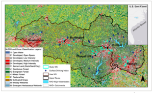
- This figure represents the study area of the region and how the area is affected by urban expansion compared to the surface water resources shown in blue dots.
https://onlinelibrary.wiley.com/doi/full/10.1002/hyp.14339
- Another article I found under “GIS application urban expansion” mentioned streams in urban heat islands and the variability in temporal and spatial temperatures. This article examines how streams that drain urban heat islands are warmer due to urban air temperatures and ground temperatures, and paved impervious surfaces that the stream may run across. This article really interested me because it shows one of the main negative consequences (using GIS to do so) of urban expansion and what urban expansion can really do to the environment. The article also explains how urban heat islands are created and how they differ in temperature from rural, and forested areas. The main reason urban areas tend to have higher temperatures than rural and forested areas is because impervious surfaces used to create infrastructure as well as a lack of natural vegetation in the area which decreases the cooling effect for the area.
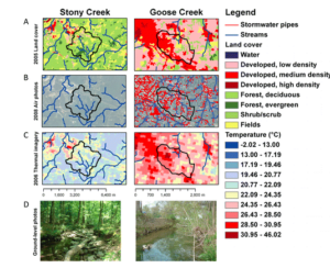
- This figure represents a comparison between a rural area and an urban area in North Carolina. Stony Creek being the rural area and Goose Creek being the urban area. The biggest difference between these two is the obvious difference in temperature for the two regions. We can also see how the forested area directly correlates with a lower temperature of the area observed, and how the urban area directly correlates to a higher temperature recorded for the area. We are able to tell this correlation between areas and temperatures because of the GIS application that is used here to observe and take these measurements.
- https://www.journals.uchicago.edu/doi/full/10.1899/12-046.1