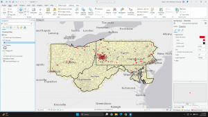
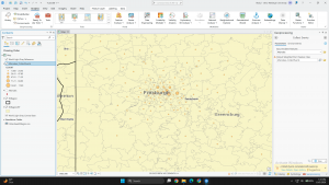
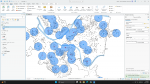
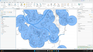
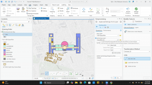
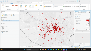
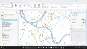
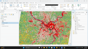
Week 4 Jefferson

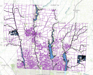
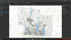
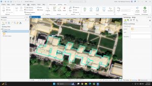
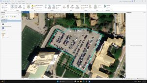
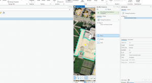
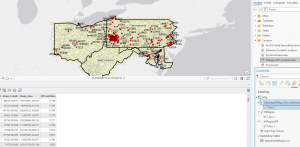
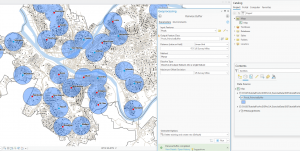
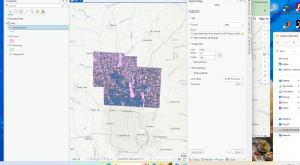
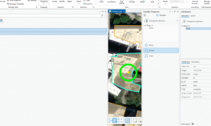
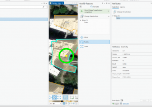
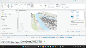
Chapter 1 mainly took me through how to use the program and what everything does. I learned how to configure the maps and work with the data. I also learned how to manipulate that data into tables. The easiest part was making the 3d map, and it was really cool to look at/explore. 

I wasn’t able to complete the query for 1.2, part 4, for searching for a feature. 

There was no option to list by drawing order. 

There was also no option I could find for toolboxes in the geoprocessing pane. 

And I could not find an option for text symbol group. 

Chap 2

I could not find the symbol for Commercial.

There is no Label class group in the labeling tab. 

I’m unclear on how to use pop-ups, specifically how to display the needed data. 

When I did a definition query, I could not find the option to have all my values show up on the map. 

I did not have the Soup Kitchen value. In my food facilities option, below it only says <all other values>, but it does not show the values. 

I learned how to use a query to limit features. Using the symbology pane throughout Chapter 2 kept confusing me. For example, in 2.5, I was supposed to choose Circle 3 within the template symbol, but I didn’t see an option to do that.

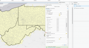
I learned about Choropleth maps and struggled a bit to make one. I originally could not find an Advanced Symbology option button when making the Choropleth map. I ended up finding it later, so I went back and did things according to this step. The odd thing was that in the classes section in Symbology, I did not have more than one upper value. 

For 2.8, I could not find the Visibility Range group. 

Chapter 3

3.1 Was very tedious when making both the maps of the US and learning how to use the legends. 

3.3 I did not understand how to add the Metropolitan Employment layer to my story. 

Chapter 3 walked me through making map layouts and charts, how to share maps to ArcGIS Online, how to use the map viewer, how to make a story in ArcGIS StoryMaps, and also how to use/make a dashboard. This was all new information for me as I followed the steps. Some of the steps were hard to follow/understand, but I had the least amount of trouble with Chapter 3.

Sisler week 4

Chapter 1:

This chapter introduced ArcGIS; it was easy to understand and follow along. The first tutorial in this chapter focused on understanding the software and where everything is. I learned about basemaps, how to turn different layers on and off, and how to reorder features on the map. I’ve learned how to use a pop-up window. When navigating maps, you can use bookmarks to help get there more easily. I wasn’t able to create my own bookmark on my map, but I understand how to. The attribute table has rows and columns of different data. Attributes provide data needed to solve a problem or investigate patterns and allow the user to search for useful information and mapped features. When analyzing, there are tools that can have the GIS create an attribute table based on the type of information you want. In tutorial 3, I created an attribute table of the minimum, maximum, mean, and standard deviation of the population density. Tutorial 4 was about adding a feature class to the map from a geodatabase, symbolizing it, and then removing it from the map. 

Chapter 2:

This chapter was all about map design. The chapter had 8 tutorials in total, the first tutorial taught me how to symbolize features by their code. This reminded me of one of the chapters by Mitchell about how it talked about giving certain features a specific symbol. The second tutorial focused on how to label features and how to configure pop ups. This tutorial taught me how to remove duplicate labels from my map, this helped declutter the map and be easier to read. The third tutorial helped sort through the data by creating a definition query, which is a filter with features of a layer. A definition query allows you to display only the features you’re interested in. The fourth tutorial was about creating a choropleth map, a choropleth map that uses color in polygons to represent numeric attribute values. I had a little difficulty creating the 3-d choropleth map. Tutorial six was about how to create your own scale for the data, I found this kind of fun being able to manipulate the groups of the data. Tutorial seven taught me how to create a dot density map, and tutorial eight was about setting visibility ranges. I found this helpful for displaying names of schools or counties within a certain distance to not overwhelm the map. 

Chapter 3:

In this chapter the textbook covered ways to display the maps that you create in the GIS software. It also covered how to share the maps online via the arcgis online website. When trying to share my own map to the web, the software wouldn’t load, and never finished uploading. This chapter taught me how to properly align the maps through the guide tool, by making rulers along the page. Some other tools that I learned how to use from this chapter include creating a legend, with/ without a title, and how to create charts. The legend allows the map’s audience to interpret the map’s symbology and understand what the map is portraying. The third tutorial was about how to properly present your graphs in a presentation style though arcgis online. I found this tutorial a bit easier compared to the rest because it was mainly copying and pasting from the word doc. However I do understand when making my own presentation of the data it won’t be that easy because I will have to come up with everything for the text boxes.  

GIS Blog 4 Elliott

Preface Chp. 1

The first tutorial sections were primarily introductions to the program and how to navigate the maps. The first and second tutorials consisted of the navigation instructions and how to use the unique features and tools that ArcGIS utilizes. The third tutorial was about working with attribute panels, which was the most complicated for me. The attribute panels are used to add and edit attribute data for groups. This was the most challenging for me because the names did not match that of the tutorials, so I had to use best judgment in order to follow along with the tutorial’s instructions. The final tutorial, tutorial 4 was demonstrating the symbolling on the maps. This tutorial was my favorite of the first tutorials because editing the map’s symbols can change the flow and overall readability of the map. Within the symbolling tab, you can alter the symbol, size, border, and color of the data point. This section of the tutorial was very easy and allowed for me to observe the effects that different symbols mean and how to determine which ones to use.

Key notes:

  • Right click a data group and within the dropdown menu click symbology to edit the data points’ appearance
  • Add bookmarks using the bookmark button on the map tab
  • In the analysis tab, click tools and open the toolbox to obtain access to a variety of tools for the program
  • To observe a 3D model double, click the item with 3D listed in the catalog pane

Screenshots Chp.1

Preface Chp. 2

This chapter gave 8 tutorials to demonstrate different necessary techniques that the ArcGIS program features. The first and second chapters expanded on the tools in chapter one such as symbology and data attributes. In the first three tutorials of chapter 2, I adjusted the symbology, and the colors associated with the map of the location. The third chapter particularly taught a tool that I used for the rest of this chapter, which is Definition Query. The fourth tutorial was brisk and displayed how to adjust the symbology and read the histogram and then change the map into a 3D Choropleth map. The fifth tutorial invol;ved adjusting the symbology to make symbols on the map more prominent, which was similar to the seventh tutorial in making dot density maps. The sixth tutorial was the most challenging to me and involved creating a choropleth map with a custom scale. This was like a combined tutorial of the previous ones and was only the most difficult because of the many steps that were involved. The final tutorial was simply adjusting the vis

ibility ranges in different bookmarks, which I found to be the easiest of the eight tutorials.

Key Notes:

  • Layer Properties window, click Definition Query > New Definition Query to create a def. Query.
  • View tab, in the View group, click Convert > To Local Scene to create a 3D Choropleth map

Screenshots Chp.2

Preface Chp. 3

I found the 3’rd chapter to be the most intriguing and informational of all these previous chapters from this week’s assignment. In this chapter, you built map layouts and charts, used the online ArcGIS website to upload your completed maps, and more.The first tutorial of this chapter, you learn how to use the guide tool to align the 2 separate maps, how to create a legend, and create charts. The legend allows you to read the map’s symbology and understand what the map is depicting. The second tutorial explains how to share your maps online to the ArcGIS website and how to access these maps and configure pop-ups. A pop-up is a symbol that appears that pertains to certain fields that you can select by clicking the field list. The third tutorial did not use the ArcGIS program entirely and was all on the online website version. This tutorial I found to be the most challenging of all the tutorials from this chapter because of the vast number of steps. I learned from this chapter how you can create and edit an online story that you share through the website. This tutorial was mostly copying and pasting but keeping track of which text and heading goes where as well as creating the heading links proved to be challenging. The last tutorial was about creating a dashboard in ArcGIS which was easier than I anticipated and required adding an element table, a bar chart, and adjusting the setting and appearance. This chapter was by far the most instructive so far and put my skills to the test but allowed for me to become more familiar with ArcGIS.

Key Notes

  • Right-click horizontal and vertical rules to add guides
  • Add legend by clicking insert, Map surrounds group, add legend
  • In share tab, inside share as group, click web map, fill in tags and summary, enable public sharing, click share

Screenshots Chp.3

Week 4 Beard

Week 4:

In chapter 1 of the GIS manual, we learned how to do some of the simpler things, like how to use the GISPro app, or what buttons do what things. We got to create different maps with different views of clinics in Alleghany County, and see where poverty zones or population density were high or low around them. Learning how to work with GIS is very important because without it we would be doing nothing correctly later on. All of the different colors and symbols made it very helpful to tell what we were doing as well. Looking at these maps could have been extremely difficult if we didn’t have the context side of the picture. One thing that I thought was interesting was the ability to see where the clinics were and their exact location they were on the map. Going into the pop-up for each clinic, I wasn’t expecting to see the exact address or the links to their website. It just shows how precise GIS can get when using it to its full extent. One difficult thing was figuring out how to do the bookmarks. Personally, I never did because it wouldn’t allow it, but it was just something that stuck out to me that even though you think this is simple, it really can be difficult sometimes. The final thing that I thought was really cool was the 3D picture. I wasn’t expecting something like this to even be possible with GIS. It was also helpful because the higher points really stick out compared to the others. You would think it would be more overwhelming due to the different components that are occurring, but it really isn’t.

Pictures from Ch. 1:

In chapter 2, we learned how to do stuff with zoning, which is pretty cool. When doing zoning, you are able to pick certain shades and colors for whatever you are looking at in each area. This is very interesting to me since it’s not something you think about on a daily basis. There are so many different things you could shade, as well as there being so many different places that the things you are looking for are located. Later, we labelled each section, creating certain numbers for each zone to signify that they are different from one another. This is important so we can explain a certain plot we are talking about without getting confused or losing it while looking at other plots. We were also able to add multiple different symbols in certain areas. This is nice so we can know what we are talking about for a certain thing. Like crosses are soup kitchens, circles are food pantries, and squares are soup kitchens. You are also able to pick certain areas on a map, and they will label the areas in a certain color based on what we are looking at. This is very nice because it makes it less complex and less work. Overall, from these maps we can see how looking at histogram maps is very useful in the long run for looking at certain data that we put it. I think the 3D portion is very helpful for seeing this more clearly, even though you can just tell from the different shades of color.


Pictures from Ch.2 

In Chapter 3, we made different maps and placed them on the same layout. This can be helpful when trying to show data from two different places, or if you are showing the same data but in two different ways. We also learned how to make legends and place them with the map that explains them. This helps present research if needed. We also went on to use other apps to let us create maps and somewhat analyze them ourselves. By placing our maps into ArcGIS online we are able to share with others what our maps look like and what research we are doing.


Pictures from Ch. 3:

Dahlstrom Week 4

Preface

Based on the preface, it seems like this book will walk us through how to use ArcGIS Pro step by step. Additionally, we will also learn methods in ArcGIS online, ArcGIS StoryMaps, and other ArcGIS software. Specifically with ArcGIS Pro, it will be teaching us how to use the GIS application to create, use, and analyze professional 2D and 3D maps. The goal of reading this book is to learn how to effectively use GIS to integrate it into and address real-world problems. I appreciate the layout of the chapters since it first explains the concepts and then allows you to do the tutorial hands on. After reading this book, I hope to have enough knowledge of GIS to use it in potential research and possibly my future career.

Chapter 1

Chapter 1 served as an introductory course on how to use a variety of basic navigations and tools in GIS. One of the most fundamental tools introduced in this chapter was the use of the contents page. The contents page allows you to add and remove different features or layer classes and is, as I learned later, an important hub for editing for features. Some map making features that were introduced in this chapter include how to add basemaps, how to change symbols, and how to add, remove, and label feature classes. I also learned all about map viewing and zooming. Knowing how to zoom in and out, change the viewing zone, zoom into specific features, create bookmarks, zoom to full extent, and search for specific features will all be useful tools for analyzing maps in the future. I also learned how to export a layout and turn the map into an image with a photo viewer. This skill is useful when I need to share my map and make it accessible to other people. Overall, I liked how the chapter gives you straight forward instructions on how to find and do things so it is easy to navigate. Throughout the chapter, I definitely started to realize that I remembered how to work and locate different features in GIS. However, I found the tutorials a little bit repetitive, as you often do a skill and then delete the work to reset.

Key Concepts/Definitions

Feature Class: Basic building block for displaying geographic features on a map. A homogeneous layer on the map. Vector data that have corresponding attributes for each feature.

Raster: Type of spatial data. An image made up of small pixels. A raster encoded with geographic information can be used as a layer in a map.

Chapter 2

In this chapter, I learned all about how to create, design, and symbolize thematic maps. I was first introduced to symbology, or the visual elements to represent geographic features or attributes. From this, I was able to learn how to change the colors of polygons, symbolize ground features, and make graduated and proportional symbols. Symbology was a very important learning concept throughout this chapter. After these tutorials, I now feel comfortable with implementing symbol changes and where to go to do so. I was also introduced to the process of making two different types of thematic maps: choropleth and dot density. I enjoyed these types of maps because it was easy to see how the values were distributed. I also think that while the 3D choropleth map is not a necessity, it adds another element that helps display features. Additionally, while making these maps, I learned how GIS creates histograms based on the data and how they can be altered. This skill will be useful to know when analyzing the map through statistical analysis. Other important skills I learned in this chapter included how to label features, remove duplicate layers, remove pop ups for features, set visibility ranges, and how to create a definition query.

Key Concepts/Definitions

Thematic Map: Strives to solve or investigate a problem. Consists of a subject layer or layers placed in spatial context with other layers. To make this map you must answer: What layer or layers are needed to represent a subject? What spatial context layers are needed to orient map users to recognize locations and patterns of the subject feature?

Definition Query: Used to filter the features of a layer rather than select a temporary subset of features to work with.

Choropleth Map: Uses colors in polygons to represent numeric attribute values. Uses classification methods, that depend on the data and intent of the map, to display the data.

Map Scale: Ratio between distance A and B (one inch) on your computer screen divided by the distance between the two same points in inches on the ground.

Chapter 3

This chapter was all about making suitable maps to present and how to share your maps with people beyond ArcGIS Pro. The first section of this chapter was how to make a layout. Layouts are mostly used to share information in formal settings such as presentations or reports. The layout contained the map, a title, and a legend. When making the layout, I especially appreciated the ruler and guideline features of GIS. These features ensured the maps were even and gave them a professional look. From these layouts, I learned how to create different charts from the maps and how to highlight certain subsets of features from the charts. For example, in one of the tutorials I highlighted the top ten states with the highest arts employment. 

The rest of the chapter focuses on the online sections of ArcGIS. I first learned how to publish a map I made on ArcGIS Pro to ArcGIS Online. Publishing to ArcGIS Online is extremely useful in sharing your map with a wider audience since it is more accessible than a desktop and ArcGIS Pro. I then received a tutorial on how to create a story through StoryMaps that showcases the data and reason behind a map. To me, StoryMaps would be the most useful for sharing with the general public because the story provides context and instructions on the meaning of the map. I particularly enjoyed the inclusion of accessibility features and sidecar blocks in StoryMaps. These features made the story easy to navigate and further expanded the range of audience. I then learned how to create a briefing. The information was similar to the story section, but formatted the information in a way that would be useful for a presentation. Lastly, I was introduced to the concept of creating a dashboard. Dashboards are useful tools for allocating resources in response to changing goods or services over time.

Jan Week 3

Mapping Density

  • Density mapping shows where things cluster instead of where each single feature sits hence it is good for patterns, bad for pinpointing.
  • Matters most when your polygons are different sizes; a raw count map makes a big polygon look busy just because it is big.
  • Two ways you can go about it:

    1. Area method: We divide features by polygon area, or use a dot map. The dots are placed randomly, so they are a picture of density, not real locations. That feels like a trap for anyone who does not read the fine print.

    2. Density method: A raster where every cell gets a value from the features inside a search radius.

  • Small cells give a smoother surface but cost processing time. A bigger radius smears the pattern out. 
  • The simple method just counts what is in the radius; the weighted method leans toward features near the cell centre and gives a cleaner map.
  • Display with graduated colours or contour lines.

So we have these classificational schema; Natural Breaks, Quantile, Equal Interval, Standard Deviation which basically decides what the map tells, which is a lot of power for one dropdown. I keep wondering how often public data gets quietly skewed by someone picking an arbitrary search radius. Still, density fixing the unequalnpolygon problem is the real win here.

Finding What’s Inside

  • Mainly for monitoring or comparing; some examples include; drug arrests near a school, or which zip code has more of something.
  • Three methods:
    1. Area > Features: More visual. Fast glance, No data out of it.
    2. Select Features:  Gives us a subset we can actually use for lists and summary stats (count, frequency, sum, average). 
    3. Overlays: Merges boundaries and features into a new layer and permanently tags features with the area’s attributes. Vector is precise but leaves slivers; raster counts cells, faster but cell size drives everything.

To be honest Vector still wins for anything legal like parcel boundaries, because “close enough” does not hold up in a property dispute. However, for non high stakes thing the latter should be good enough.

Finding What’s Nearby

  • In this chapter you ask some other different questions such as who is affected by an event, who is actually served by a facility and so on. 
  • “Near” is not only physical distance. It can be time, money, or effort, which changes the decision process.
  • Three methods:
    1. Straight line: Buffers, Select within distance, or a continuous distance surface. Planar for a flat plane, geodesic for a curved earth. Ranges can be inclusive rings (0–1, 0–2, 0–3 mi) or distinct bands (0–1, 1–2, 2–3 mi).
    2. Cost over a network: Streets and other fixed infrastructure. 
    3. Cost over a surface: Overland travel with no roads. 

The  RINGS vs BANDS distinction is the most useful thing in this chapter for me. Bands isolate each ring, so if I ever compare demographics by distance from a facility, that is the one I want. Building turntables from scratch sounds genuinely tedious, but for emergency routing I do not see how you skip it.


Meyst Week 3

Chapter Four

Density mapping is a useful tool, especially for analyzing and tracking patterns in a data set. As Mitchell introduced this topic to the reader, I wondered which field of study uses density maps the most, as density maps could be useful in many types of measurements across multiple fields. As population density is a common measurement to map and analyze, I wonder what interdisciplinary work is performed by both geographers and other unrelated fields such as demographers, epidemiologists, other health fields, or economists. Additionally, I thought about what types of data would not benefit from density mapping, or the specificity needed for a density map based on what the target demographic of the map is. In the next section, Mitchell highlights that density by defined area is better for comparing data with defined areas, with density by density surface is better for seeing the patterns or lines of data in detail. Something I found interesting in this chapter is learning that the GIS software places dots randomly in areas of a density map, and clarifies that density maps do not directly correlate with features unless adjusted. Additionally, another interesting fact is that GIS doesn’t have a set distance unit, so users can use miles, kilometers, acres, etc.

Important vocabulary for this chapter:

  • Density of features: locations, broad data to show areas of importance. Ex: locations of a chain grocery store
  • Feature values: the values within a density of features, usually more specific. Ex: employees who work at the chain grocery store
  • Density by defined area: calculated by dividing total number of features/total value of features by the area of the polygon containing the feature. Calculated with [op_density = total_pop / (area / 27878400)]
  • Density by density surface: calculated by each cell in a raster layer in GIS getting a density value. Usually more specific, but more effort.

Chapter Five

In this chapter, Mitchell starts by highlighting the importance of monitoring and mapping the insides of an area, especially in emergency situations such as chemical spills or other disasters, either natural or human-influenced. To define a data analysis of an area, Mitchell emphasizes the importance of defining a single area or multiple areas. In a single area, one county, geographic area, radius around a central point, or another relatively small area is drawn in order to fully define and understand the data analysis. In a multiple area analysis, areas are drawn through geographic boundaries, around multiple counties, or through different habitats. In the next section, Mitchell highlights steps on how exactly to merge and analyze both discrete and continuous features, specifically floodplains and and use types in this example: Find out whether a particular parcel is inside the floodplain, get a list of all parcels inside the floodplain, count the number of parcels inside the floodplain, use a map of the land and its uses to get an exact reading of which parcels of land used for different purposes are affected by the preexisting floodplain. Thinking on this topic, I wonder how exactly cities were planned pre-GIS technology, or if they were planned at all, especially cities that face heavy precipitation and rely on floodplains to prevent flooding. Additionally, I wonder if GIS technology helps decide different factors of historic buildings, such as which buildings are weather or waterproofed, which historic buildings are moved altogether, and which buildings have to be torn down or otherwise modified.

Important vocabulary for this chapter:

  • Discrete features: unique, identifiable features that can be counted quantitatively. Ex:  locations, animal nests, rivers, or parcels of land
  • Continuous features: features that cross set boundaries such as administrative boundaries. Ex: map of participation, soil types, or elevation.

Chapter Six

Chapter Six is dedicated to the importance of mapping nearby features, which initially makes me think back to the earlier chapters, where Mitchell specifically highlights the importance of using well-known landmarks in an area to make a map more legible to a larger audience. Closeness, being a relative scale, can be tricky to map. Mitchell suggests using highly traveled areas or other factors in order to map closeness, for example, mapping closeness by mapping between two cities that are commonly traveled between. Additionally, something nearby can be measured not only by distance, but also by cost, such as land types that cost the same to travel to, or two areas that cost relatively the same to travel to. From there, distance could either be calculated while taking the curvature of the Earth into account, which is called a geodesic model, or disregarding the curvature of the Earth, called the planar model.

Important vocabulary for this chapter:

  • Planar model: A model and analysis of the Earth that does NOT take into account the curvature of the Earth, and instead reads the Earth as flat
  • Geodesic model: A model and analysis of the Earth that DOES take the curvature of the Earth into account
  • List: lists certain geographic IDs, such as addresses
  • Count: total number of a certain data set, such as number of 911 calls in an area
  • Summary: A total amount of something, or total amount by category, such as acres of land in a watershed, or number of acres of forests out of forests, hills, rivers, etc.
  • Statistical summary: the average, minimum, mean, maximum, and standard deviation
  • Inclusive rings: used to demonstrate how total amount increases as distance increases, using the radius around a point
  • Distinct bands: overlapping inclusive bands, used to show amount in proportion to distance by two different distances.


Agrawal – Week 3

Chapter 4: Mapping Density

Chapter 4 explains why mapping density is more useful than mapping totals. Density is the concentration of features or values within a uniform unit of area, such as people per square mile. This matters when areas being compared are different sizes: a large county may have more people, while a smaller county may actually be more crowded. Before making the map, we need to decide whether we are mapping feature density (the number of locations, such as businesses) or feature-value density, such as the employees at those businesses.

There are two main methods. The first is mapping density by a defined area, such as a county, ZIP code, or census tract. GIS divides the count or value by the polygon’s area, and the result can be shown through shaded areas or a dot-density map. In a dot-density map, each dot represents a set amount, but the dots usually do not show exact locations. Choose dot value and size carefully so they show the pattern rather than hide it. One weakness is that a single density value applies to the whole polygon, even though density may vary within it.

The second method is creating a density surface, a raster layer in which each cell receives a value based on nearby features. Cell size controls how fine or coarse the pattern appears, while search radius determines the size of the neighborhood used in the calculation. A larger radius creates a smoother pattern; a smaller radius reveals more local variation. I found it interesting that these choices can change the story the same data tells. This made me think about lottery retailers: mapping store locations would show retailer density, while weighting stores by sales would show a different pattern. My question is: how do analysts select a cell size and search radius that reveal the pattern without exaggerating it?

Chapter 5: Finding What’s Inside

Chapter 5 focuses on finding what is inside an area. This analysis can monitor one area or compare several, such as determining which properties fall within a floodplain or how many incidents occurred inside each police district. Before starting, we must identify whether the features are discrete or continuous. Discrete features are separate and identifiable, such as buildings, roads, or crime locations. Continuous features vary across a surface, such as elevation or rainfall. We also need to decide whether the result should be a list, a count, or a statistical summary, and whether to include partially contained features.

The chapter describes three methods. Drawing the area and features together is simple and fast because it visually shows what is inside, but it produces little analytical information. Selecting features inside an area creates a subset you can list or summarize, which works well for a single area. Overlaying creates a new layer containing attributes from both the area and feature layers. It takes more processing but is most useful for comparing multiple areas or calculating how much of a feature falls inside each one. A buffer, an area created at a specified distance around a feature, can also serve as the analysis boundary.

GIS can then calculate counts, frequencies, sums, averages, medians, and standard deviations. Count is the total number of features, while frequency is the number in each category. Because I am used to working with tables, overlaying reminded me of joining datasets, except the match is based on location instead of a common ID. One point I found important is that the analyst’s definition of “inside” can change the result. For example, should a property count as flood-prone if only a tiny corner overlaps the floodplain? My question is: what rule should be used for partial overlaps, and how should that decision be explained so the map does not mislead the audience?

Chapter 6: Finding What’s Nearby

Chapter 6 explains how GIS finds what is nearby, but “nearby” does not always mean the shortest straight-line distance. It can be defined by distance or travel cost. Cost can mean time, money, fuel, effort, or another difficulty. This analysis can show how quickly a fire station can reach a neighborhood or which customers are within a store’s service area. First, we decide whether to measure proximity outward from a feature or by travel to it, whether we need a list, count, or summary, and how many distance ranges to show.

The chapter describes three methods. Straight-line distance is the shortest direct distance between features and is useful for making buffers or selecting everything within a fixed radius. Planar distance works for smaller study areas, while geodesic distance accounts for the Earth’s curvature across large regions. Distance or cost over a network follows connected features such as streets. A network contains edges, junctions, and turns, and you can assign an impedance to each part, such as travel time. Cost over a geographic surface uses raster cells to represent movement difficulty. Hills, forests, water, or other barriers can make a location costly to reach even when it looks close.

Results can be displayed as a single range, inclusive rings, or distinct bands. Inclusive rings show cumulative totals within increasing distances, while distinct bands separate features into each interval. A spider diagram connects a source to nearby features with lines. This chapter made me think about traveling between Delaware and Cleveland: straight-line distance tells me little compared with roads, bus connections, waiting time, and actual cost. I liked this chapter because it shows that proximity is really about accessibility, not just miles. My question is: when traffic, weather, or road closures change constantly, how often must network costs be updated for the analysis to remain reliable?

Montana week 3

Chapter 4

Chapter 4 talks about density(the number of things within a certain area/ volume) It talks about two ways to show density with the density by area model and the density by defined area or by surface. Density by defined area takes a distinguishable area(ex: county, zip code, etc) and collects the number of features and displays the area as a certain color based on the gradient number that the area has been given. Density by surface does not require defined borders and the range is editable. To find the density for either of these to find its range on the color coded gradient you must find the number of features and divide that by the area of which you are finding the density for. 


I face some confusion about the representation of density through defined cells. Is the total map split up into equal cells and the number of the features counted and then the circle is placed in the middle of the cell or is the cell based off of the location of the features being studied(ex: businesses, employees, etc)Or does the GIS find the average distance between all points in the cell and move the circle to that point.


I enjoy that they often include what one particular map might be used for and by whom it might be used. It is good to have a clear explanation of how these techniques are used by everyday people and businesses.


Chapter 5

This chapter “finding what’s inside” had a focus on defined areas and how you can manipulate both their visual properties and informational properties to gain insight. The example of a flood plain was used a lot in this chapter to show how different areas can be overlaid with each other. You can take a group of defined areas(in the text it was personal properties categorized by their use) and overlay something like a floodplain or a watershed above the initial scape. You can also emphasize different parts of the map, for instance you can only include parts of the property area that are included in the flood plain area or you can have all properties with a part in the floodplain highlighted. The text makes it clear that this sort of mapping would be very important for things like watershed access, flooding, fire protection, school districts and more.


The text also made some comparative examples with drawing areas vs. Selecting the features inside the area. Drawing does not require any complex calculations so it is much easier to do but cannot list information so it is visual only. The other option selecting the features is good for knowing what is inside a group of areas but does not allow you to analyze areas individually. There is also the third option of overlay which lists multiple layers and allows you to draw conclusions based on which things overlay each other. The main drawback to this though is that it uses a lot of computational power. 


An interesting question one might ask is how can these three methods be used together to make more meaningful conclusions?


Chapter 6

I think that it is an interesting idea to map the distance of something by cost. I wish you could do that in google maps to see how much you would need to spend on fuel.


This chapter analyzed the display of distance and how we show paths. A lot of the information seems like it would be tied to GPS but there was also some discussion of how it could be used by police stations, fire stations, etc… to understand their travel range. There was also discussion of the variable of cost which was a different way of looking at distance not in terms of location but in resources used to reach a point. I believe that this is a way to incorporate terrain changes into the mapping process.


There is also the sectioning of distances using inclusive rings which include all features from the outside to the center of the circle and distinct bands which are different distances from the center point and can indicate the number of features within a distinct distance band.

Another interesting style mentioned in the text was spider graphs which send a point straight to a feature within a certain range.


Switching from distance to cost creates a more detailed contour map because of the terrain features mapped.

Parks Week 3

Chapter 4:

Chapter 4 discusses how to map density. Mapping density is important to show the concentration of features and their patterns. For density, the number features are measured in uniform areal units. As with other GIS methods, careful consideration must be taken when deciding what to map. You have to consider if the data is plots, lines, or data summarized by data. You also have to consider whether you are mapping features or feature values. There are two main ways of mapping density, mapping by a defined area and mapping by a density surface. When mapping by a defined area density of individual features summarized by defined areas and each dot represents a set number. It doesn’t represent the exact location, but it’s easier to read than having one dot per location. When mapping by defined area density is calculated using the areal extent of each polygon. Dot maps are often used for mapping by defined area. They are based on the total count and how much each dot represents. There are several factors to keep in mind when making dot maps, like dot size, how much each dot represents, and area size. When mapping by density surface, raster layers are used and the total of features are divided by area. These maps offer more detailed information but require more effort. When deciding how to display the map it is important to consider aspects like cell size and search radius. These factors are important for making sure that the data is displayed in a way to properly display the patterns. The colors used for classes and how the breaks for classes are assigned. This chapter was helpful for understanding how to map density and the uses of it. There were a few points in this chapter where I struggled to understand the technical stuff, so I hope things will become more clear when actually using the GIS.

Chapter 5:

In chapter 5, the concept of “mapping what’s inside” is discussed. Mapping what is inside of a determined area is useful for monitoring what’s occurring inside it or to compare what’s inside several areas. There are several questions that need to be answered before deciding how to go about mapping. Are you finding what’s inside a single area or several? A single area lets you monitor activity or summarize information, while several areas lets you compare areas. Are the features inside discrete or continuous? Discrete features can be counted, listed, or summarized, while continuous features can be summarized. Do you need a list, count, or summary? The data needed is different if you want to get a list of all features, a total number of features or a summary of what’s inside of an area. Do you need to see the features that are completely or partially inside the area? Linear and discrete features may lie partially inside and outside of an area, so you must decide what to do in these situations. There are three ways to map what’s inside of an area. These include drawing areas and features, selecting features inside an area, and overlaying the areas and features. For drawing areas and features are drawn on top of features, which is good for seeing whether one or a few features are in an area. When selecting features inside an area you specify the area and the layer containing the features and selects a subset of features in the area, which is good for getting a list or summary of features in an area. When overlaying the areas and features the GIS creates a new layer with the attributes of area and features, which is good for finding which features are in each of several areas or how much of a feature is in one or more areas. This chapter did a good job at explaining what it means to map what’s inside an area.

Chapter 6:

Chapter 6 discussed the concept of mapping what is nearby a location. When mapping what is nearby, you can find out what is occurring within a set distance of a feature, identify what’s affected by an event or activity, and understand the cost of travel. The cost can be in regards to distance, time, monetary loss, effort, or other costs. As it seems to be a common occurrence with this book, the chapter discussed questions that you must ask yourself before you begin mapping. Is what’s nearby defined by a set distance or by travel to or from a feature?  You should measure surrounding features using straight lines for distance or a geometric network using road data for travel. Are you measuring what’s nearby using distance or cost? Measuring by distance or cost can change the result significantly in some cases. Are you measuring distance over a flat plane or using the curvature of the earth? You should use the curvature of the earth for large areas. Do you need a list, count, or summary? It is important to understand what kind of data you need to achieve your desired map. How many distance or cost ranges do you need? You could have one range, inclusive rings, or district bands. The three ways to map what’s near a location are straight-line distance, distance or cost over a network or cost over a surface. When mapping straight line distance you specify the feature and distance and the GIS finds the area or features within the distance. This method is good for creating boundaries or selecting features at a set difference. When mapping distance or cost over a network you specify source location and distance/cost along a linear feature (like roads) and the GIS finds segments within distance/cost. This method is good for finding what’s within a distance/cost of a location. When mapping cost over surface you specify location and travel cost and the GIS creates a layer showing travel cost from feature. This method is good for calculating overland travel cost. Overall, I feel like this chapter thoroughly explained the concepts of mapping what is nearby a location and how it can be used. There were also some connections made to chapter 5, which I found helpful.