Chapter 4
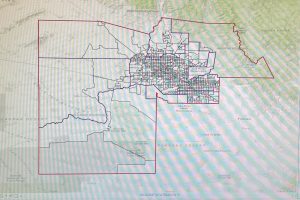
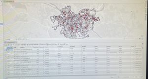
This chapter marked the introduction of working with spatial data. The tutorials first walked me through how to interact with a project’s geodatabase. This included the process of inputting outside information into the project, such as a table, how to use the database utilities in the catalog pane, and how to join attribute tables. Although this tutorial was simple, the method was extremely useful to learn since many future projects will likely require the addition of outside data. In addition to joining attribute tables, I was introduced to other functions related to attribute tables such as how to export a feature class, add a field, calculate the sum or percentage of fields, and how to extract substring fields. Although I did initially run into a few problems when working with the Python language, I was able to fix them by quickly retracing the steps. By the end of the chapter, I felt that I had a good understanding of how to use Python. The chapter then shifted to how to carry out attribute queries. Attribute queries are useful for finding geographic features based on their descriptive properties rather than their geographic properties. I found this function to be extremely useful because when you have a large dataset to work through, narrowing down the data based on attributes makes the process easier. Lastly, I learned how to aggregate data and create a point layer. Both of these processes allow for comparison between features and data to be displayed on the map.
Key Concepts/Definitions
Database: A container of the data for an organization, project, or other events for record keeping, decision-making, analysis, and research. A geodatabase has a file folder that contains .gdb at the end.
Chapter 5
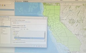
Chapter 5 contained information all about the geographic coordinate and map projection systems in GIS. The first tutorials walked me through how to change the map projection, or the flatness or curvature of the map, for a variety of different setups. For example, I practiced changing the map projection on a world map and on a map of the United States. Although I appreciated the lesson on this, these tutorials did not seem as useful to me as some of the previous ones. Additionally, since we worked with larger scale maps, I wondered if these various map projections would also be beneficial when working with maps for specific locations. Other skills I learned throughout the tutorials include how to navigate and use the coordinate systems tab in properties, import a shapefile into the geodatabase to be added to the map, add data to the map from ArcGIS Living Atlas, and the different spatial reference systems. The use of different tools was also emphasized a lot in the chapter. After the tutorials, I feel much more comfortable with searching for and using the different functions of the tools. This chapter, however, was probably the first one that I struggled with a few of the tutorials. In one section, the chapter assumes that you have had some previous work with Microsoft Excel. Although I am somewhat familiar with the program, I struggled with this part because I do not know all of the proper functions of Microsoft Excel. I also had an issue with downloading the elevation contours in the sixth tutorial. The book was not up to date with the new layout of the website, so I had a hard time downloading the file in the proper format. Even with the difficulties however, I was able to complete all of the tutorials in the chapter correctly.
Chapter 6
This chapter was focused on geoprocessing and the tools it uses to process data in GIS. Throughout the tutorials, I learned how to use geoprocessing tools such as pairwise dissolve, clip, merge, append, pairwise intersect, union, and tabulate intersection. The pairwise dissolve tool can aggregate block group attributes to other feature levels using statistics such as sum, mean, and count. The clip tool allows you to select and remove features outside a specific boundary such as streets. Clip is often paired with the extraction of features to make a study area. A study area allows you to focus on one particular section of a larger map. This function will be useful when analyzing the statistics and structure of a subarea while comparing it to the entire map. By clipping the excess features, the tool gives the study area map a cleaner finish. The merge tool allows you to merge multiple separate feature classes together into one. Merge is useful when you want to display similar features, but they are not the main focus of your project. The append tool adds features to an existing feature class, considering that both have the same attributes. The pairwise intersect tool creates a feature class combining all of the features and attributes of two input or overlaying feature classes. The union tool overlies the attributes of two input polygon layers to generate a new output polygon layer. This results in the comparison of two attributes in the same area such as neighborhoods and land usage. Finally, the tabulate intersection makes apportionments proportional to the areas of split parts of polygons and assumes that the populations of interest are uniformly distributed by area within polygons. Overall, I appreciated the setup of this chapter since each tutorial served as an introduction to a new tool in geoprocessing.
Key Concepts/Definitions
Geoprocessing: A framework and set of tools for processing geographic data. Builds study areas in a GIS and performs tasks.
Delaware Data Inventory
Address Point: This data set is a spatially accurate representation of all certified addresses within Delaware County, Ohio. The address point indicates the location of the building’s center. This data’s intended use is for appraisal mapping, 911 emergencies, accident reporting, and disaster management. The data is updated daily, but published to the site monthly.
Annexation: Contains Delaware County’s annexations and conforming boundaries from 1953 to present. The data is updated on an as-needed basis and is published monthly.
Building Outline 2024: Consists of building outlines for all structures in Delaware County, Ohio. The data was updated in 2024 and on an as-needed basis.
Building Outline 2023: Consists of building outlines for all structures in Delaware County, Ohio. The data was updated in 2023 and on an as-needed basis.
Condo: Consists of all condo polygons within Delaware County, Ohio that have been recorded.
Delaware County E911 Data: This data set is a spatially accurate representation of all certified addresses within Delaware County, Ohio. It is used for the State of Ohio Location Based Response System (LBRS). The data is updated on a daily basis, but published monthly.
GPS: Identifies all GPS monuments that were established in 1991 and 1997. The coordinates are in Universal Transverse Mercator Northing and Easting. The data is updated on an as-needed basis and published monthly.
MSAG: The Master Street Address Guide (MSAG) is a polygon feature set of the 28 different political jurisdictions such as townships, cities, and villages that make up Delaware County. The data set was created to facilitate the process of locating the boundaries of the different political jurisdictions. The data is updated on an as-needed basis and published monthly.
Municipality: This data set consists of all of the municipalities in Delaware County, Ohio.
Parcel: The data set consists of polygons that represent all cadastral parcel lines within Delaware County, Ohio. All changes to this data set are represented by recorded documents stored at the Delaware County Recorder’s Office. The data is updated on a daily basis and published monthly.
Precincts: This data set consists of voting precincts in Delaware County, Ohio. Precincts are polygons that determine each voting precinct boundary. This data is The data is updated on an as-needed basis and published as-needed by the Delaware County Board of Elections.
Recorded Document: This dataset consists of points that represent recorded documents such as vacations, subdivisions, centerline surveys, surveys, annexations, and miscellaneous documents within Delaware County, Ohio. Created to facilitate the process of locating miscellaneous documents. The data is updated on a weekly basis and published monthly.
School District: This data set consists of all school district counties within Delaware County, Ohio. The data is updated on an as-needed basis and published monthly.
Street Centerline: The State of Ohio Location Based Response System depicts the center of pavement of public and private roads within Delaware County, Ohio. Address range data was collected by field observation of existing address locations and by adding addresses using building permit locations. This data set is a spatially accurate representation of the road system. The data is intended to support appraisal mapping. 911 emergencies, accident reporting, disaster management, and roadway inventory. This layer is updated on a daily basis while the 3D layer is updated on an annual basis. The data is published monthly.
Subdivision: This data set consists of all subdivisions and condos within Delaware County, Ohio. The data is updated on a daily basis and published monthly.
Survey: This data set is a shapefile of point coverage that represents surveys of land within Delaware County, Ohio. Points represent the location of the survey platform. The data is updated on a daily basis and published monthly.
Tax District: This data set consists of all tax districts within Delaware County, Ohio. Data is dissolved on the Tax District code. The data is updated on an as-needed basis and published monthly.
Zip Code: This data set contains all zip codes within Delaware County, Ohio. The zip code layer was created in 2025 by dissolving all Delaware county parcels by their property addresses. This data set was also used to populate the zip right and zip left attributes for Delaware County’s road centerline. The data is updated on an as-needed basis and published monthly through the United States Postal Office.
Map Sheet: This data set consists of all map sheets whiting Delaware County, Ohio.
PLSS: This data set consists of all Public Land Survey System (PLSS) polygons in both the US Military and the Virginia Military Survey Districts of Delaware County, Ohio. Was created to facilitate in identifying all of the PLSS and their boundaries. The data is updated on an as-needed basis and published monthly.
Farm Lot: This data set consists of all of the farm lots in Delaware County, Ohio. Was created to facilitate in identifying all of the farm lots and their boundaries. The data is updated on an as-needed basis where surveys are recorded.
Township: This data set consists of 19 different townships that make up Delaware County, Ohio. The data is updated on an as-needed basis and published monthly.
Dedicated ROW: This data set consists of all of the lines that are designated Right-Of-Way within Delaware County, Ohio. The line data was created through Delaware County’s Parcel data. The data is updated on an as-needed basis and published monthly.
Railroads: This data set allows a user to view the locations of railroads in Delaware County, Ohio.
Building Outline 2021: Consists of building outlines for all structures in Delaware County, Ohio. The data was updated in 2021 and on an as-needed basis.
Hydrology: This data set consists of all the major waterways within Delaware County, Ohio. The data is updated on an as-needed basis and published monthly.
Delaware County Contours: 2018 Two Foot Contours for Delaware County, Ohio in a file geodatabase format.
Original Township: This data set consists of the original boundaries of townships in Delaware County, Ohio. Data was before tax district changes affected their shape.