Meyst Week 6

Chapter 7

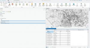
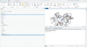
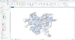
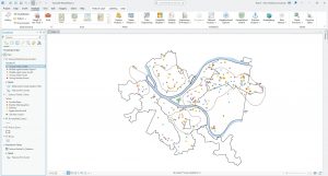
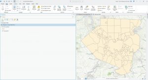
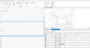
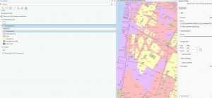
Chapter 7 was fairly straightforward to complete, introducing the concept of tracing on the map using vertices and other tools. Rotating and moving vectored shapes took a short amount of time to understand and complete, and were very helpful in the more difficult tutorials like tracing and transforming. Tutorials 1 + 2 directly followed the book except for the Your Turn section in Chapter 2. I was unable to complete it, as I was unable to find the bus symbol in general, even after searching the symbology page. After checking with a peer, we both concluded that it is either in another location, or removed from the symbology database. Additionally, in Tutorial 7-4, the CAD diagram on moved a few pixels maximum, even when the same procedure was continually ran. I could not get my diagram to align with what was shown in the book, but the command did successfully ran. After double-checking with two peers, we concluded that the actual procedure did not align with the book.

Chapter 8

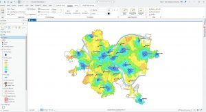
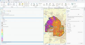
Chapter 8 was a short but helpful chapter in understanding geocoding and address location. I did not have issues with any of the tutorials, but notably, in later chapters, the tutorials do become more vague and difficult to understand at times. For example, some commands will be given to enter into a tool unprompted. While I was able to parse them out, Chapter 8 was far more difficult to understand than the earlier chapters. Additionally, I found this chapter to be helpful in understanding GIS in context, as mapping density by address or geographic factors is quite common in maps.

Chapter 9

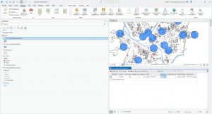
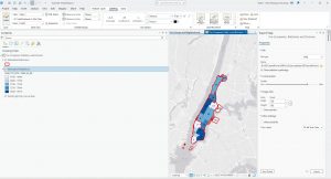
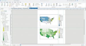
Chapter 9 marks the start of part 3 of the textbook, mainly dealing with applying previously learned knowledge. I found this chapter very helpful, especially as the final for this class deals mainly with applying our knowledge from the earlier chapters in the textbook. Unfortunately, I could not make Tutorial 9-1’s  buffer zones work, but it did not impact the rest of my work for the tutorial and merely only lacked the buffer zones shown in the textbook. I was, however, able to get the Your Turn section to work, and the buffer zones did appear after I entered that command. In Tutorial 9-2, the buffer zones and Pairwise buffer tool both worked without any issues, and I was able to complete 9-2 with no subsequent issues. Tutorial 9-3 was notably more difficult to understand, and often had instructions I found unclear or had to make me retrace my steps. I understand the vague terms are because of prior GIS experience, but some of the tutorial did require me to do an internet search to understand the prompt. From there, I had no issues with Tutorial  9-4 or 9-5.

Meyst Week Five

Chapter Four Notes:

Chapter Four was a fairly difficult chapter to complete, introducing concepts from the previous three chapters along with a tutorial on how to create your own project. I found creating my own project to be fairly difficult to begin with, as the other tutorials are all provided for the reader. However, by Tutorial 4-2, I felt far more confident with creating my own basemap and project and importing the data provided. Unlike the Chapter Three tutorial, where the reader was generally provided with copy-and-paste data, in Chapter Four, there was far less guidance on a new subject. The rest of Chapter Four mainly dealt with becoming comfortable and familiar with ArcGIS as a software, especially in terms of familiarity. In Tutorial 3-3, oddly, when calculating specific burglaries by different filters, the burglaries were off in terms of count. The textbook lists the count of burglaries as 273, with 84 occurring on the weekend. However, my count ended up as 309, with 75 occurring on the weekends. This was after I double-checked my search query for the correct date and crime. Further, the query person attributes had inaccurate values displayed. Otherwise, Chapter Four relatively followed the textbook, and I had to make no major adjustments to the commands provided in order to complete the work in the textbook.


Key Commands and Concepts Taught In This Chapter:

  • Add join: Joins two datasets together, merging data tables to be able to complete or calculate fields in relation to both tables and data sets
  • Create table: Uses pre-existing map data and condenses it into an easily editable format for further data analysis and manipulation
  • Calculating the sums of fields: adding, subtracting, etc to different data sets in order to calculate a percentage or other form of data presentation. Relies on basic Python script


Chapter Five Notes:

Chapter Five took me the longest amount of time and outside research due to inaccuracies in the textbook that make following the textbook directly impossible. Tutorial 5-1 through Tutorial 5-3 were fairly straightforward, and only took me about ten minutes each to complete. Much of the first half of Chapter 5’s tutorials are reviewing key concepts covered in previous chapters, and only take a few commands to complete. Additionally, this first part of the tutorial teaches incredibly vital map skills, which I went back to review multiple times in the following tutorials and also within completing the tutorials for Chapter 6. Tutorial 5-5 was very different from what I was used to in the preceding tutorials and chapters, as I have never worked with Microsoft Excel or other similar programs such as Google Sheets. Editing the data was fairly straightforward, and I found that highlighting the columns that I needed to avoid deleting in red text made it much easier to not lose the columns in the rest of the data set. Further on in this tutorial, I found that the command provided to join together the MinnesotaTracts and BikeWorkData tables were very incorrect. The GEOID and GEOIDNUM fields both registered as incorrect when placed in the Input and Join Table fields, and were instead placed in the order: MinnesotaTracts > GEOID > BikeWorkData > GEOIDNUM. As completing the Add Join function was vital to the rest of the tutorial, adjusting the command was necessary. In the next chapter, the tutorial erroneously lists the basemap used, which took some adjustment and guessing in order to accomplish.


Key Commands and Concepts Taught In This Chapter:

  • (For my own further review) The pathway to change the map projection for a basemap is: Contents > Properties > Coordinate System > Projected Coordinate System. This contains multiple world, US State, and country projections.


Chapter Six Notes:

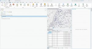
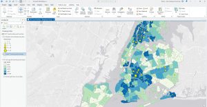
After many major adjustments to Chapter Five’s listed commands, I was relieved to find that Chapter Six had no major errors unlike the previous two chapters. Whether the outdated version or some other factor, the previous chapters very much tested my computer knowledge! Chapter 6, notably, uses far less descriptive wording than the introductory chapters, which was initially a bit of adjustment in remembering how to execute certain commands without express guidance from the textbook. For example, in the very first tutorial, the textbook asks the reader to label the New York fire stations by district. Initially, I forgot which commands were required in order to label a certain area, and I had to repeatedly undo actions I took until I was able to review and correctly label the map. Additionally, a previously introduced feature which I had some difficulty remembering how to execute was the Select tool. It took me multiple tries to realize selecting a certain feature was just clicking, not necessarily dragging the cursor over an area, which selected too many attributes. Then, while saving the selected section was not reviewed, I was able to parse out what function was required in order to save a selected area. Most of the tutorials in this chapter dealt with learning what to input for certain commands, especially key commands used frequently throughout the textbook.


Key Commands and Concepts Taught In This Chapter:

  • Merge tool: merges multiple datasets into one feature that is easier to edit and symbolize, for example, merging together all portions/neighborhoods of New York City to create a comprehensive map of all of New York City.
  • Tabulate Intersection: estimates the number of people within two boundaries, shown in the textbook as census boundaries and fire station districts.


Meyst Week 4

Chapter One

Chapter One was fairly easy to parse and understand, and aligned fairly accurately to my predictions on the chapter’s difficulty. It took me around 2 hours to complete, and centered mainly Pennsylvania and one of its major cities, Pittsburgh. Having driven through Pennsylvania and by extension Pittsburgh, I found this activity fairly interesting in understanding the economic status of Pittsburgh and simultaneously learning the beginning parts of GIS technology. At the very beginning, while completing the initial tutorials, I found remembering the prompts and commands fairly difficult. By the end of the chapter, I was far more comfortable and familiar with the software, which assisted me in later chapters.

Chapter Two

While still fairly easy to understand and manage, Chapter Two was progressively more difficult than Chapter One. Once again, this chapter included interesting economic background to a city I have personally visited (the past two summers, I have gotten to travel to NYC! Very fun!), so this chapter was quite interesting to me. The most difficult part of this chapter was the Your Turn sections; I found myself revisiting the previous section’s instructions very frequently, especially the 2D-3D map portion. Additionally, reading the unlabelled data sets was a challenge, especially with data sets with similar names like U18FHHFOOD or U18MHHFOOD.

Chapter Three

Chapter Three was easily the most difficult chapter, switching between the ARCGIS Pro app and the ARCGIS website. I found the assignments on the ARCGIS website itself were fairly straightforward, but some parts of the tutorial in the ARCGIS Pro app were quite difficult, especially the first tutorial. Creating a story map was mostly just copy-pasting from the PDF provided, so was very easy to do.


Meyst Week 3

Chapter Four

Density mapping is a useful tool, especially for analyzing and tracking patterns in a data set. As Mitchell introduced this topic to the reader, I wondered which field of study uses density maps the most, as density maps could be useful in many types of measurements across multiple fields. As population density is a common measurement to map and analyze, I wonder what interdisciplinary work is performed by both geographers and other unrelated fields such as demographers, epidemiologists, other health fields, or economists. Additionally, I thought about what types of data would not benefit from density mapping, or the specificity needed for a density map based on what the target demographic of the map is. In the next section, Mitchell highlights that density by defined area is better for comparing data with defined areas, with density by density surface is better for seeing the patterns or lines of data in detail. Something I found interesting in this chapter is learning that the GIS software places dots randomly in areas of a density map, and clarifies that density maps do not directly correlate with features unless adjusted. Additionally, another interesting fact is that GIS doesn’t have a set distance unit, so users can use miles, kilometers, acres, etc.

Important vocabulary for this chapter:

  • Density of features: locations, broad data to show areas of importance. Ex: locations of a chain grocery store
  • Feature values: the values within a density of features, usually more specific. Ex: employees who work at the chain grocery store
  • Density by defined area: calculated by dividing total number of features/total value of features by the area of the polygon containing the feature. Calculated with [op_density = total_pop / (area / 27878400)]
  • Density by density surface: calculated by each cell in a raster layer in GIS getting a density value. Usually more specific, but more effort.

Chapter Five

In this chapter, Mitchell starts by highlighting the importance of monitoring and mapping the insides of an area, especially in emergency situations such as chemical spills or other disasters, either natural or human-influenced. To define a data analysis of an area, Mitchell emphasizes the importance of defining a single area or multiple areas. In a single area, one county, geographic area, radius around a central point, or another relatively small area is drawn in order to fully define and understand the data analysis. In a multiple area analysis, areas are drawn through geographic boundaries, around multiple counties, or through different habitats. In the next section, Mitchell highlights steps on how exactly to merge and analyze both discrete and continuous features, specifically floodplains and and use types in this example: Find out whether a particular parcel is inside the floodplain, get a list of all parcels inside the floodplain, count the number of parcels inside the floodplain, use a map of the land and its uses to get an exact reading of which parcels of land used for different purposes are affected by the preexisting floodplain. Thinking on this topic, I wonder how exactly cities were planned pre-GIS technology, or if they were planned at all, especially cities that face heavy precipitation and rely on floodplains to prevent flooding. Additionally, I wonder if GIS technology helps decide different factors of historic buildings, such as which buildings are weather or waterproofed, which historic buildings are moved altogether, and which buildings have to be torn down or otherwise modified.

Important vocabulary for this chapter:

  • Discrete features: unique, identifiable features that can be counted quantitatively. Ex:  locations, animal nests, rivers, or parcels of land
  • Continuous features: features that cross set boundaries such as administrative boundaries. Ex: map of participation, soil types, or elevation.

Chapter Six

Chapter Six is dedicated to the importance of mapping nearby features, which initially makes me think back to the earlier chapters, where Mitchell specifically highlights the importance of using well-known landmarks in an area to make a map more legible to a larger audience. Closeness, being a relative scale, can be tricky to map. Mitchell suggests using highly traveled areas or other factors in order to map closeness, for example, mapping closeness by mapping between two cities that are commonly traveled between. Additionally, something nearby can be measured not only by distance, but also by cost, such as land types that cost the same to travel to, or two areas that cost relatively the same to travel to. From there, distance could either be calculated while taking the curvature of the Earth into account, which is called a geodesic model, or disregarding the curvature of the Earth, called the planar model.

Important vocabulary for this chapter:

  • Planar model: A model and analysis of the Earth that does NOT take into account the curvature of the Earth, and instead reads the Earth as flat
  • Geodesic model: A model and analysis of the Earth that DOES take the curvature of the Earth into account
  • List: lists certain geographic IDs, such as addresses
  • Count: total number of a certain data set, such as number of 911 calls in an area
  • Summary: A total amount of something, or total amount by category, such as acres of land in a watershed, or number of acres of forests out of forests, hills, rivers, etc.
  • Statistical summary: the average, minimum, mean, maximum, and standard deviation
  • Inclusive rings: used to demonstrate how total amount increases as distance increases, using the radius around a point
  • Distinct bands: overlapping inclusive bands, used to show amount in proportion to distance by two different distances.


Meyst Week 2

Chapter One

Mitchell begins by framing the process of GIS analysis similar to that of the scientific method: First with asking a question, then researching and compiling and presenting data in a digestible format based on the type of data presented. I find this similarity very interesting, yet explainable, as GIS analysis and GIS as a software is based heavily in the environmental sciences, especially geography. Additionally, Mitchell highlights multiple careers that could benefit from or currently use GIS technology, even if they are not associated with the environmental sciences. Careers such as criminology, law (Mitchell highlights how GIS data could be included in court cases), and development all use or could benefit from GIS technology or analysis. In the next section, I learned of discrete features on maps, which include color-coding, shapes, etc. to highlight and present a certain feature of the map, such as streams. Continuous phenomena, another new term to me, are phenomena that can be measured anywhere, such as precipitation. Features summarized by area are used to show density of something in an area, such as population density. All of these are reliant on either of two ways to represent geographic features: Vector models, which rely on the x,y coordinates of a feature to shape out the features. The other, raster models, use cells to shade in and represent a feature, and layer on one another to represent intersecting features. A disadvantage of raster models is that larger cells lead to a loss in detail, so some may choose to make the pixel size of the cell smaller for more detail. Additionally, since map projections are distorted by the curvature of the Earth, mapping larger areas such as states, countries, or continents means that this distortion needs to be taken into account, while with mapping smaller areas, this distortion is negligible.

Chapter Two

When deciding what to map, Mitchell highlights two questions that should be taken into account for GIS analysis. First, what information do you need from the analysis? This will largely differ on a case to case basis, as Mitchell highlights with the examples of police mapping crime rates or a retailer mapping their audience and where they live in order to place the most effective advertisements. Second, how will you use the map? Audience should be heavily considered, especially for factors such as the amount of detail for the map, labels, whether to include reference locations such as streets and landmarks, size of the final planned map, etc. I find these thorough steps in analysis interesting from a professional standpoint, as the process of deciding what to map varies heavily between tasks and audience, in comparison to other forms of measuring data like composition analysis in soil science or raw data in the aforementioned case of crime rates. Additionally, this section highlights both the scientific and communication skills required for GIS analysis, as researching and understanding your audience is incredibly important to conduct a thorough GIS analysis, as Mitchell notes. In the next section of Mitchell’s introduction to GIS and GIS analysis, we learn about preparing data to be used in mapping. I find it interesting that some of the data is hierarchical, and how hierarchies are assumed in the data. Additionally, in the following section, the rule of seven categories to best show data points is very interesting to me, as I originally thought that far more categories would be feasible given that categories are not similar colors. However, thinking back to GIS-made maps that I’ve used for research and for simplifying my thoughts, most maps were not as complex as the zoning map Mitchell uses as an example, and grouped some categories together, even if the audience was scholars and researchers.

Chapter Three

Mitchell starts this chapter reflecting on terms from the first chapter: discrete features, continuous phenomena, or data summarized by area. With additional knowledge from the previous chapters, the context of data types and different forms of quantification are mentioned, allowing the reader to understand these previously learned concepts in context. Following this tie-in to previous chapters, the reader is presented with different ways to present map data in a graduated format; with symbols, shading, etc. in order to analyze patterns in the data in addition to mapping discrete features. This section helped me better understand the content of the chapters in a visual way, highlighting the intersection between discrete features and data analysis in Chapter 2. A new concept in this chapter is types of quantities: counts and amounts, ratios, and ranks. Counts and amounts is the raw data mapped directly, such as the number of restaurants in an area, or the population sightings for a species. Given that the data is placed as points on the map, I assume that counts and amounts quantities only work on smaller amounts of data unless the points of gradation are grouped together in areas of high concentration. Ratios and ranks are less direct forms of quantitative data, ratios being based off of the data in relation to another factor, such as the ratio of schools to children, while ranks put the data into gradual tiers of severity, assigning a shade to each level. Thinking back to maps I have seen both inside and outside of an academic context, I have seen all of these forms of data presentation on maps. Interestingly, I have noticed that in an academic setting, I have seen quantitative data presented more through ratios and ranks, while when presenting data to the general public, counts and amounts are more widely used.
Meyst Week 1

I have finished the GEOG 291 quiz 😀

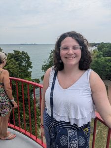
Pictured above: me standing atop Marblehead Lighthouse 🙂

Prior to attending OWU, I had not heard of anything beyond surface-level mentions of GIS technology or of classes dedicated to GIS, even within my high school’s environmental science course. My brother, previously a field biology major, was not fond of the geology or geography sides of his major, so I initially had a negative impression of GIS and similar courses. Before completing this reading, I had a very rudimentary understanding of what exactly GIS is and what it can accomplish, especially in interdisciplinary studies of the environment such as environmental architecture or environmental impacts on disease research.

Learning of the history of GIS technology and doing my own research into the quantitative revolution that Schuurman repeatedly describes was incredibly fascinating, especially as I could relate it to my own understanding of technology at the time of the 1950s and 60s (specifically think of NASA’s room-sized IBM computers used during the Apollo missions). Additionally, learning of the unclear history of the preceding technologies that ultimately inspired research and the development of GIS technology was both interesting and largely surprising, as GIS technology has been developed in the modern, recorded era and alongside other technological revolutions, such as personal computers and data storage.

Additionally, I was surprised by the pervasiveness of GIS technology in geographical analysis, especially as Schuurman specifically notes how GIS affects construction, transportation, and recreation to such a high degree. Even as GIS has its limitations with fuzzy boundaries that are difficult to categorize, GIS is still an incredibly important technology into understanding multiple environmental and human-dependent impacts and how these factors interact with one another. I was very intrigued to learn about GIS scientists and their ability to predict certain subjects such as urban growth, with the inclusion of pre-existing GIS data and analysis of the rate of growth or decline in certain factors.

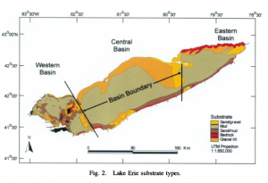
GIS technology can be used to map and understand soil composition and how it may effect an ecosystem. Pictured above is a map of the type of substrate along the bottom of Lake Erie throughout multiple state and international boundaries. Researchers at the Ohio State University analyzed the potential spread of invasive zebra mussels in Lake Erie by modeling the bathymetry and substrate type along the bottom of Lake Erie, using data from both models to predict how the mussels may spread over time.

Haltuch, Melissa A., et al. “Geographic Information System (GIS) Analysis of Ecosystem Invasion: Exotic Mussels in Lake Erie.” https://www.jstor.org/stable/2670637

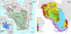
GIS technology can be used to map the biome composition of an area, and gain a better understanding of the habitat a threatened species may inhabit. Pictured above is a biome analysis of the critically endangered Florida panther’s current habitat. As stated by Schuurman, boundaries such as biomes and habitats of different organisms can be fuzzy, but the data provided is still very important to conservation efforts.
Article Source: Landscape Analysis of Adult Florida Panther Habitat
Frakes RA, Belden RC, Wood BE, James FE (2015) Landscape Analysis of Adult Florida Panther Habitat. PLOS ONE 10(7): e0133044. https://doi.org/10.1371/journal.pone.0133044