Hutto Week 3

Chapter 4 

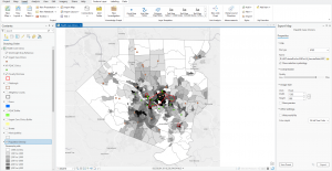
Chapter 4 explains the reasoning behind mapping density, as well as when it is important to map density, what to map and the two types of ways of mapping density. Density maps allow viewers to observe each individual feature of a map using a uniform areal unit of measurement, such as per square mile, per county, or per census tract. Census tracts are specific geographic regions defined solely for the purpose of conducting the census. When would a density map be used? One example could be: a local nonprofit wants to see which areas of the State of Ohio have a more concentrated homeless population using census tracts as a measurement, and so the nonprofit collects the data on the number of homeless individuals in each census tract, with the darker shade being the highest concentration of homelessness and the lighter shade being the lowest concentration. When choosing what to map, you can choose to map (1) the density features, which include the number of businesses, schools, parks, etc., or (2) to map feature values such as the number of employees at each business, the number of teachers per school, the number of trees per park, etc.. Density maps can be represented using a random distribution of dots on a map to show the concentration of particular features, or using a density surface, which is a raster layer that can show the number of features within a particular radius of cells. For example, if local law enforcement were mapping the density of individual crimes within a given area, a density surface could be used to show the concentration of higher occurrences of crimes in a given area and which areas crime occurs the least. When creating a dot density map, dots should not be so large that areas with higher density are obscured and difficult to interpret.


Chapter 5

Chapter 5 explains the reasoning behind “mapping inside” an area and its uses. Mapping inside requires you to draw a boundary around the area that you want to analyze. For example, if a construction company is trying to see which neighborhoods are more prone to flooding, the construction company may draw a boundary around a particular area of interest and see which properties are near floodplains or if floodplains intersect with certain areas to get a better sense of where to build. In the chapter, Mitchell also provides an example of a district attorney being able to draw a boundary to map out which crimes occurred and whether the crimes that occurred were within a certain radius of a school, which could lead to tougher criminal penalties. The chapter also touches on discrete and continuous features when mapping inside. Discrete features are easily identifiable features on a map such as roads, rivers, waterstreams, or even locations such as student addresses. Continuous features are represented using seamless geographical phenomena such as vegetation. For example, a geographer could represent the different types of soil using continuous categories. When mapping inside, a geographer may want to know which type of soil is within a 1000-square feet radius. When counting the number of features within a boundary, Mitchell states that you should include features that are partially within the boundaries inside of count and if you want to emphasize the different categories and features within a particular boundary, that you can use GIS to create an overlay that clips out the features and portions of categories that’s on the outside of a boundary that way you are left with a map of only the boundaries and all of the features and categories inside the boundaries being focused on. You can also create an overlay to where the features of the summary statistics you’re mapping are in color and the outer boundaries features are still present but in black and white to emphasize their nonimportance.


Chapter 6

Chapter 6 explains how to map what’s nearby. Similar to the last chapter, you could draw a circle around a particular area of interest to see what is all within the boundaries. Chapter 6 explains that while doing that, you can also map what’s nearby based on the distance specified from one area to another as well as the travel costs. How can this be done? Mitchell explains that this can be done using a simple straight-line distance. For example, if Starbucks executives were looking to see which grocery stores, parks, or recreational centers are nearby and how far, the distance from each of the locations could be represented using a straight line which could represent a mile or 2 miles, etc. Travel costs could also be measured when looking at what’s nearby. To calculate the travel cost, Mitchell points out that you would need to use GIS, assign each street segment with a cost. To do this, you would need to find the per unit cost (for example, labor and fuel costs) and then multiply that by the length of each street segment. You can also measure the travel time for each street segment or block while considering the speed limits for each street segment and multiplying the length of each segment by the speed limit. This is the formula the chapter provides for calculating travel time: “minutes = length / ((mph * 5280) / 60)”.

Hutto Week 2

CHAPTER 1

In Chapter 1 of The Ensri Guide to GIS Analysis, Mitchell introduces us to various common practices and techniques used to represent the geographic features of a GIS map, which I was not familiar with prior to reading of this chapter. Mitchell starts by introducing us to two common types of models that planners or researchers in general use: Vector and Raster models. Vector modeling uses points, lines, outlines, closed polygons, and other geometric objects to represent various geographic features of a map. For example, roads, rivers, and streams may be represented using outlines, while residential, commercial, and industrial buildings or the boundaries of these zones could use closed polygon shapes to represent these objects on a map. When thinking of how local law enforcement chooses to organize the various crime statistics in an area, categories, which Mitchell also introduces us to in this chapter, can be used to represent the various types of crime committed within an area using points; for example, types of crimes committed and the exact coordinates of the crime could include burglaries, traffic crimes, murder, etc. Mitchell in this chapter also introduces us to Raster models, which use a matrix of cells in a continuous space to represent, for example, the temperature across a State or the United States. When using a Raster model to represent large plots of land, Mitchell also expands on the use of categories with Raster models which assists with organizing to make better sense of data; for example, a geographer may choose to represent the different types of levels of a mountainous geographic area such as Alaska, and so, a geographer could choose to represent the level of each mountain using categories and then a raster model to show the variations of levels of mountains within the selected region.

CHAPTER 2

In Chapter 2 of The Esri Guide to Analysis, Mitchell further discusses the features that were being touched on in the previous chapter, while also touching on the application of those features in mapping, for example, various crime statistics such as burglary, traffic crimes, etc., or residential, commercial, and industrial zones in planning. Mitchell states that generally, when using categories to define the details of certain objects and features of scale within a map, he discusses that, with mapping vegetation as an example, it is difficult for viewers to distinguish the important aspects of the map if you have small contiguous features and large contiguous features if you are using a raster model. He provides a solution, suggesting that when mapping, to map each category equal weight to others. Mitchell also states that when using categories to map out specific zones for a municipality, in general, you should not use more than seven types of categories or else, visually, it could be difficult to comprehend the map and which details are important and needed and which details are better left out which my question to that would be when would it be appropriate to have seven or more categories when it would make a significant difference to the information that whoever is viewing the map?

CHAPTER 3

In Chapter 3 of The Esri Guide to Analysis, Mitchell introduces us to classes, charts, as well as classification schemes. When mapping quantities, Mitchell recommends assigning each individual value its own symbol or by grouping them in classes. When presenting quantities in a map, there is also a tradeoff between presenting values accurately and generalizing values to see the map. One example Mitchell provides is a map showing the poverty rate of counties or districts where each county or district is represented with a different shade which represents a different percentage range. When discussing how to get the classification scheme, I found this section of the chapter to be the most difficult and confusing since it covers several mathematical approaches to grouping schemes. The four schemes that Mitchell touches on in this chapter are natural breaks, quantile, equal interval, and standard deviation. From what I understand from the reading, Natural breaks isolate outliers in the highest and lowest class by emphasizing the jumps in values and somehow that translates to darker shades, and from the example, this somehow translates into a different shade of the map. Overall when touching on classification scheme, Mitchell doesn’t do a good job of elaborating on how the values from the chart translates into a different shade and I would likely reread the chapter or seek elsewhere for a better understanding of the statistical classification method behind how it translates into a visual map.


Hutto Week 1

*I have completed the GEOG 291 Quiz for Week1* 

My name is Tomorick Hutto. I am a junior here at OWU, and I am majoring in Politics and Government with a minor in Religion. I chose to enroll in GEOG 291 after becoming interested in a career in urban and regional planning, specifically when it comes to mapping transportation accessibility and seeing how many internships and careers in the field rely on GIS, so taking this course is more of a way for me to build a technical skill that I can use later rather than just taking a course to fulfill a degree requirement. 

After reading Schuurman Ch.1, I found myself to have a better grasp and understanding of what GISystems and GIScience are, the multiple identities the acronym encompasses, as well as how GIS has been used and can be used in each of our daily lives. Prior to reading this chapter, I had a relatively vague understanding of what GIS was and its uses; I knew that planning commissions and other state and local government agencies used GIS software within the planning process to see residential, commercial, and industrial zones and how proposed developments could affect each of those zones and surrounding communities, however, I was not familiar with the uses of GIS software, at least when it came to other private firms such as Starbucks and Sanitation/Dumpster companies as well as even the defining role Geographers and university researchers played in part of developing and utilizing GIS software. 

One of the points I found most interesting throughout the Chapter was when Schuurman brought up how GIScientists study the underlying theories and concepts of what makes GISystems, and even how GIScientists have studied questions about whether GIS software and other technological tools that have been developed for similar uses are inherently gendered, which is a question that I had not even considered prior to reading this chapter. 

Another part of the chapter that I found particularly interesting was when Schuurman touched on the significance of the implementation of e-governance by various federal and provincial governments throughout the world and how e-governance technologies have been used to share information with the public in a much transparent manner which includes allowing private firms to access tax assessment information, survey lines, and other useful public definitions, which can be useful as a means to reduce high levels of corruption in different governments, however, I do also find the arguments of potential data privacy concerns thought provoking and whether there are better alternative methods to address privacy concerns while also still being able to relay important data which has been proven useful for people in various disciplines.


Source 1: Osei, Ernestina, “Identifying Socio-Economic Areas of Concern Towards Inclusion in GIS Hazard Management in Detroit, Michigan.” (2026). Master’s Theses or Doctor of Nursing Practice. 3306. DOI: 10.58809/CSVU1038 Available at: https://scholars.fhsu.edu/theses/3306

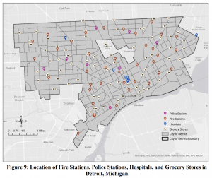
Figure 9 shows the locations of Fire stations, Police stations, Hospitals, and Grocery stores in Detroit. I found Figure 9 interesting since this particular study examines the spatial distribution of socio-economic vulnerability and accessibility to essential services in Detroit and highlights that when Hazards or other weather crises strike, the lack of grocery stores in parts of Detroit where there could be potential food deserts, make those with lower incomes more susceptible to exposure and sensitive to environmental hazards due to traveling to the grocery store with the proper needs.    


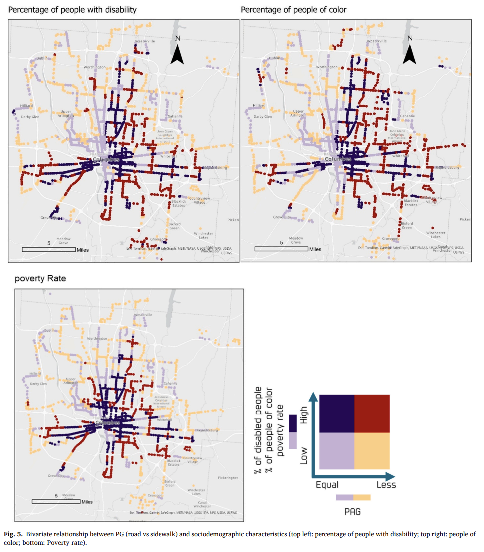
The above map was interesting to me because it uses a Ped shed Gap measurement; basically a way of showing where people can or cannot walk to essential places and then compares that with the percentage of people of color and those with disabilities.  I’ve never seen a map like this before until now and it took me looking at the map more closely as well as the description within the study, which measures the impacts of sidewalks on public transit and accessibility, to understand the relationships better. 

Source 2: https://doi.org/10.1016/j.trip.2025.101576