Chapter 1
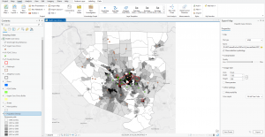
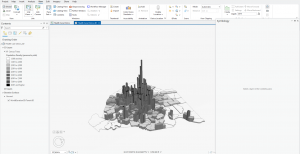
Chapter one introduces us to various features of ArcGIS, which include basemaps, Population density, as well as 3d models and how to export map layouts. For population density, in the tutorial we were given a map of Allegheny County, Pennsylvania, which shows the location of Urgent Care Clinics and FQHC clinics, which are clinics that receive federal funding for their operation and services. Using population density, we were able to compare the relationship between areas of higher poverty and community access using census tracts to either an Urgent Care Clinic or an FQHC clinic, and I found that urban areas (in the middle of Allegheny) have a higher poverty rate and therefore also have access to more FQHC clinics than rural or suburban areas of Allegheny. Using 3d layers, you are also able to see this relationship and which areas have a higher poverty rate than others.
Chapter 2
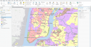
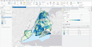
Chapter two introduces us to labels for polygons in land use and water layers which I found helpful. Using the labeling feature inside the labeling tab of ArcGIS, I was able to label each individual neighborhoods inside of individual landuse such as Commercial, Residential, and Manufacturing zones Tutorial 2.4 also teaches us how to create choropleth maps as well as see a histogram visualization of the choropleth. In Tutorial 2.4, we created a choropleth and anaylized the relationship between individual burroughs in New York City and households over the age of 60 receiving food stamps and found that Northern and Southern burroughs have a higher concentration of those over the age of 60 receiving food stamps than those in eastern and lower western Burroughs of New York City.
Chapter 3
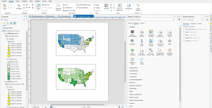
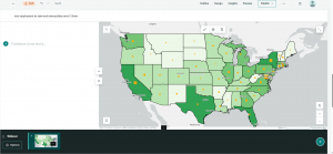
Chapter three covers the uses of ArcGIS Online, which allows us to map, share, and analyze the maps that we create on desktop through a web browser. This chapter also introduces us to the creation of map legends in layout exports. In the Layout Exports tab, we were able to display the two different maps we created: the first map at the top shows Arts employment per 1000 population and the annual average wages, while the bottom map shows Arts employment and annual wages. Legends were created for both maps, and using the ruler and guide features, I was able to insert the legends into the layout export so that the display is clean. Map sharing to ArcGIS Online also allows us to interact with each map through the web browser using interactive features.