Boldman Week 3

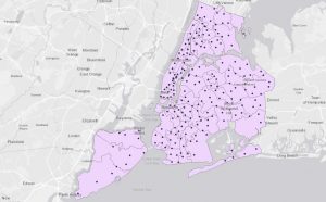
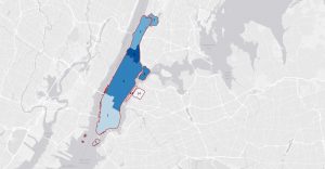
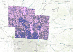
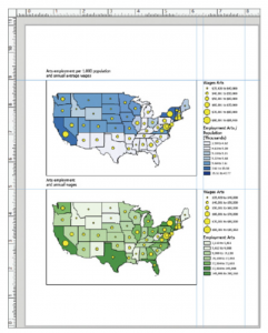
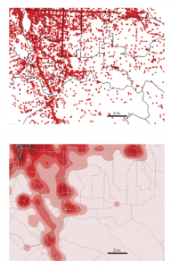
Map density shows distinctive patterns, clearly making locations easier to find. 


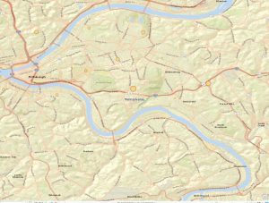
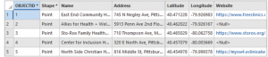
Map 1 shows the locations of businesses individually


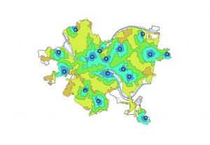
This is the density surface showing the concentration of  where businesses are in the specific area


You can map defined areas in multiple ways using GIS. Dot maps present individual locations or things and each dot can represent a specific number of features. The dots are placed randomly and aren’t the most precise data. Dots packed closely together are more densely populated than dots scattered far from each other. Dot maps are useful when many features can be clumped or grouped and shown in a defined area to keep the map easy to read.  Maps created and shown as density surfaces are done using raster methods to provide detailed information. Each cell in the layer gets a value and based on the overall values in the defined area, the density is determined. A density surface is created from individual locations or linear features. Choosing either of these methods works depending on what data is given and how specific the information needs to be presented. 


In GIS, to create a density surface, start by inputting a search radius for a neighborhood to be defined. GIS totals the individual feature values and divides by the neighborhood area based on the radius. Cells are typically between 10 and 100 cells per density unit. Cell size determines how fine a pattern appears and smaller cells will appear smoother and take more time to process. Bigger cells take less time to process data but are coarser-looking and have a higher chance of losing patterns in the process. Search radius can result in how general the patterns can appear. With a larger search radius, GIS generalizes the patterns and considers more features. 


Two methods are used to calculate cell values. The simple method is to only count the features included in the search radius with a value. The result is a series of rings that overlap each other. The second method is more complicated but provides a clear, precise density surface. Every cell in the layer is counted and given a value, resulting in a smoother, more generalized density surface. Density surfaces are represented either as colors or contours. Graduated colors are used to clearly show patterns and distinguish each density value and contour lines connect points of equal density on top of the map. Using contour lines, equal points of interval have to be applied in order for the lines to be spaced and readable. 

Chapter 5

     Knowing what is happening inside the map makes it easier to understand where action needs to be taken. This allows people who are reading and analyzing the map to compare areas to each other and see where there is more or less of something. Determining how many areas are being analyzed is important because it determines how many features are being looked for. Single areas may include fewer features and broader topics and is the preferred method if there is only one focus topic. Studying multiple areas at once is usually because features are being compared across a region.  GIS can provide information in list, count or summary form of features shown in a specific area. Analysts can create a summarized list of features in a specific area and it is mostly used to focus on the number of features in one or more areas or to select specific features in the area and GIS checks the location of each feature to and ensure it isn’t in the area. Another method of finding the features inside of a map is overlaying the areas and features by combining the area and features into one layer and then comparing to another area. 


     GIS can also be used to create reports of selected features. When a radius is set inside of a single area, GIS can provide a total count of specific features selected inside of the radius. GIS can also provide the frequency when given a range of values of features inside the area, displayed as a table.  The table can be represented as a bar or pie graph and summarized data. Summarized data can be created by categories or values and being as specific as possible and noting the variations in areas that can be tricky for GIS software to differentiate while summarizing data. 

     Summarized data can be compared between two areas based on the particular statistics or results. Tables can be created and merged together per area and some GIS softwares can even automatically do this. Tables can be created into bar charts which creates a visualization to compare real time data of two or more areas.

Chapter 6

 Chapter 6 focuses on how GIS can be used to find activity within a specific radius of a feature. This is a useful tool for map makers because it provides information about the area where the feature is located. Travel range is useful information because, within the radius, it defines what area is good for a specific feature. Travel range is another factor by which distance can be measured to and from a location. Measuring distance using travel can be measured by cost or distance. Defining features by distance or travel can expose other sources in the neighboring areas, and in this case distance is measured using straight lines.
    Before analysis, GIS needs to know whether the distance is being measured on a flat plane or using the curvature of the Earth. As the map maker, small areas such as cities are mostly accurate if the distance is measured on a flat plane. On the other hand, using the geodesic method for larger regions is more accurate and will display correctly on the outer layer of the Earth. Using data found using the travel range or radius to find activity within the neighboring area of a location, GIS provides a list, count, or summary of statistics based on attributes depending on the purpose of the map. Once at least one or more distances are found, inclusive rings are useful to continue expanding the total amount of increase as the distance increases. Using the same distance, distinct bands can be useful when comparing distance to another characteristic.
There are three ways to find what’s nearby:
  • Straight-line distance – Using specified sources and distance, GIS finds the area and surrounding features within the distance. This method is used primarily when boundaries are a set parameter, or there is a set distance around a feature.
  • Distance or cost over a network – Specific source locations and distance or travel cost along linear features. GIS uses this approach for finding what’s within a travel distance or cost of a location.
  • Cost over surface – You specify the location of the source features and travel cost. This approach is good for calculating overland travel cost. GIS creates a new layer showing travel costs with a range of distances.

Boldman Week 2

Chapter 1

     Spatial Data has grown tremendously outside of the scientific world, becoming available to many other sources. GIS answers questions about why things are done the way they are and how they are related. There are two ways to evaluate spatial data, depending on the question being asked and how the information will be used. The first method contains the bigger-picture kind of information and is quicker to access, and the other kinds of methods require more digging and time to process the more specific information. The information found is typically present in many different ways, like tables, maps, etc. Depending on how information is presented, the data is either valid or useful, or it will say that more digging is needed.​

      To use GIS effectively, users should understand the types of geographic features represented in the software. Features on a map can be described as discrete, continuous, or summarized phenomena. Discrete features, such as specific locations, are depicted as lines or dots depending on the settings. Continuous phenomena, like weather patterns such as precipitation and temperature, are measured through equally spaced data points with no visible gaps. GIS software applies a process called interpolation to assign values to areas between these points. Continuous data can also be represented by enclosed boundaries (such as those showing soil or vegetation types), which are used to illustrate large, uniform areas of the landscape. However, these boundaries are not as definitive as discrete features. Features summarized by area primarily indicate the density within a specific boundary—for example, the number of businesses in a zip code or the number of houses within a certain radius.

      Geographic features are shown through two different models, vector and raster. In a vector model, features are displayed in a table and buildings are represented as x,y locations connected with dashed lines. Raster models are presented as a matrix of cells by layer. Each layer is a specific attribute. Cell size is vital to an accurate map because if the size isn’t perfect, then information is lost. 

     There are five different types of attribute levels. These are types of attributes that determine how each feature is analyzed determines what level to use.

Different levels of attributes:

    1.  Categories – Groups of different features that are alike in some way and are represented in code or numbers.
    2.  Ranks – Features are put in order from highest to lowest and used when features are hard to distinguish
    3.  Counts – The count is the actual number of features on a map
    4.   Amounts –  The quantity connected to a feature
    5.  Ratios – Comparing two quantities by dividing one by the other


Chapter 2


     Chapter 2 focuses primarily on how and why features are placed where they are placed. Viewing a map now is much clearer to me because chapter helps me understand how to find patterns throughout a map. The map features are always determined based on how the information is presented and how the map is used. For instance, the police department tracks where crimes are committed and what types using GIS to better monitor high crime areas each month.  Prior to placing features on a map, all features included will have geographic coordinates as longitude and latitude values and be identified as a type (must fall into a category). Mapping can occur as a single type because GIS will use the same kind of symbol and suggest that this map can be explored further. As features are added, GIS will use the applied coordinates to create lines or areas to define shapes for specific areas or smaller / single features will be drawn as a symbol defined by coordinates. Instead of laying all of the features in one layer, smaller patterns can be revealed by creating a subset which can only be represented in an underlying layer instead of just one big layer.

     When one map has a multitude of categories, it is suggested that groups are created to sort the categories into smaller sets of data.

Option 1: Assign each record 2 database codes. One for detailed category and the second for  its general category

Option 2: Create a table containing one record for each category corresponding to its general code. Once the map is ready to be displayed, the table and map will be linked together showing general codes with the features. 

Option 3: Assigning categories by specifying the correlated symbol to go with it. Mostly used for single locations

Chapter 3

     Mapping areas with the highest and lowest concentrations of specific variables is invaluable for businesses in strategic planning and market analysis. For instance, when a physician’s office considers expansion, mapping the ratio of people per existing office per mile can highlight underserved regions. This helps ensure a new location addresses real gaps in access, which increases the likelihood of success and optimizes resource allocation.   

     Understanding the three types of map features—discrete, continuous, and summarized—enhances how landscapes and demographic data are visualized. Discrete features pinpoint specific locations or boundaries, continuous features represent gradients like population density, and summarized features aggregate information over defined areas.

     Standard classification schemes are essential tools in GIS for grouping similar data points, revealing underlying patterns, and making complex data more interpretable. These schemes rely on how the data are distributed. When data points are evenly distributed, classifications such as equal intervals or quantiles can be used for clear, balanced mapping. Charts and histograms help visualize this distribution. If the data have natural groupings or outliers, methods like natural breaks (Jenks optimization) are preferable, as they better reflect the true structure of the data.

     Using GIS becomes more straightforward when data is evenly distributed, as outliers and skewed distributions can complicate analysis and visualization. Careful selection of classification methods ensures more accurate, meaningful maps that support better business decisions.

     There are five ways to show quantities using GIS software: 

    1. Graduated symbols – includes locations, lines and areas and is best used for minimal featured maps
    2. Graduated colors – includes areas and continuous phenomena and makes patterns easy to read
    3. Charts – Used for specific locations within an area to show categories and quantities
    4. Contours – Used to represent rate of change across large parts of area
    5. D perspective views – Adds visual impacts throughout the map
Boldman Week 1

Part 1

I completed the GEOG 291 quiz and reviewed the syllabus and schedule.

Part 2 Introduction


     My name is Mia Boldman, majoring in Zoology and Environmental Science. I am from Huron, Ohio and I am a junior at Ohio Wesleyan. I am interested in conducting research in national parks focused on conservation efforts tMy name is Mia Boldman, and I am majoring in Zoology and Environmental Science. I am from Huron, Ohio, and I am a junior at Ohio Wesleyan. I am interested in conducting research in national parks focused on conservation efforts to restore wildlife populations. Taking GEOG 291 will help me understand this important resource, which can track environmental changes and provide vital information about ecosystems within protected areas such as national parks. o restore wildlife populations. Taking GEOG 291 will help me understand this important resource, which can track environmental changes and provide vital information about ecosystems within naturally protected areas such as national parks. 

Part 3 Schuurman Ch. 1

     I have heard of geospatial analysis before, but I never knew how many different aspects of life GIS can be useful in. It surprised me that GIS is used in so many different ways, from different kinds of scientists to big corporations such as Starbucks and car companies. Seeing GIS being used by city officials is interesting because GIS provides information on where properties lie in the area, from residential to industrial, and which ones are impacted by construction. This is just one example that shows GIS makes such a big impact today and in our everyday lives.

     I learned that there are three distinctions between GIScience and GISystems. The distinctions between these are very close, and data can be misrepresented. GISystems are processes for outputting data and digital coding, where classification comes at the end. There tends to be some debate regarding what the spatial data shows, which causes heated discussion on what the parameter should be for spatial objects. There is a major disagreement on what boundaries are created between the spatial objects. For instance, the discussion on what the boundary for mountains is a heated conversation for all parties involved because a mountain ranges from small to extremely large, and the boundary can have a small range like up to 1,000 m or a bigger range like up to 5,000 m. On the other hand, GIScience provides the theoretical basis for what is executed. It is also reliant on spatial data, but it refines the boundaries to have equal bearings. All of the boundaries drawn always provide a different result based on levels of aggression.

Part 4 Applications

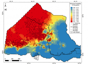
     GIS applications are used in a variety of ways in conservation. Researchers will use spatial analysis to track the migration patterns of specific species to find new ecosystems around the world. Scientists will use GIS to assist with where and how protective measures are applied in habitats. 

Null. “WCS Canada Story Maps Collection.” ArcGIS StoryMaps, Esri, 5 Dec. 2022, storymaps.arcgis.com/collections/557d7b52083349068a747affd5a1420c?item=4.