Map density shows distinctive patterns, clearly making locations easier to find.
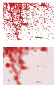
Map 1 shows the locations of businesses individually
This is the density surface showing the concentration of where businesses are in the specific area
You can map defined areas in multiple ways using GIS. Dot maps present individual locations or things and each dot can represent a specific number of features. The dots are placed randomly and aren’t the most precise data. Dots packed closely together are more densely populated than dots scattered far from each other. Dot maps are useful when many features can be clumped or grouped and shown in a defined area to keep the map easy to read. Maps created and shown as density surfaces are done using raster methods to provide detailed information. Each cell in the layer gets a value and based on the overall values in the defined area, the density is determined. A density surface is created from individual locations or linear features. Choosing either of these methods works depending on what data is given and how specific the information needs to be presented.
In GIS, to create a density surface, start by inputting a search radius for a neighborhood to be defined. GIS totals the individual feature values and divides by the neighborhood area based on the radius. Cells are typically between 10 and 100 cells per density unit. Cell size determines how fine a pattern appears and smaller cells will appear smoother and take more time to process. Bigger cells take less time to process data but are coarser-looking and have a higher chance of losing patterns in the process. Search radius can result in how general the patterns can appear. With a larger search radius, GIS generalizes the patterns and considers more features.
Two methods are used to calculate cell values. The simple method is to only count the features included in the search radius with a value. The result is a series of rings that overlap each other. The second method is more complicated but provides a clear, precise density surface. Every cell in the layer is counted and given a value, resulting in a smoother, more generalized density surface. Density surfaces are represented either as colors or contours. Graduated colors are used to clearly show patterns and distinguish each density value and contour lines connect points of equal density on top of the map. Using contour lines, equal points of interval have to be applied in order for the lines to be spaced and readable.
Chapter 5
Knowing what is happening inside the map makes it easier to understand where action needs to be taken. This allows people who are reading and analyzing the map to compare areas to each other and see where there is more or less of something. Determining how many areas are being analyzed is important because it determines how many features are being looked for. Single areas may include fewer features and broader topics and is the preferred method if there is only one focus topic. Studying multiple areas at once is usually because features are being compared across a region. GIS can provide information in list, count or summary form of features shown in a specific area. Analysts can create a summarized list of features in a specific area and it is mostly used to focus on the number of features in one or more areas or to select specific features in the area and GIS checks the location of each feature to and ensure it isn’t in the area. Another method of finding the features inside of a map is overlaying the areas and features by combining the area and features into one layer and then comparing to another area.
GIS can also be used to create reports of selected features. When a radius is set inside of a single area, GIS can provide a total count of specific features selected inside of the radius. GIS can also provide the frequency when given a range of values of features inside the area, displayed as a table. The table can be represented as a bar or pie graph and summarized data. Summarized data can be created by categories or values and being as specific as possible and noting the variations in areas that can be tricky for GIS software to differentiate while summarizing data.
Summarized data can be compared between two areas based on the particular statistics or results. Tables can be created and merged together per area and some GIS softwares can even automatically do this. Tables can be created into bar charts which creates a visualization to compare real time data of two or more areas.
Chapter 6
- Straight-line distance – Using specified sources and distance, GIS finds the area and surrounding features within the distance. This method is used primarily when boundaries are a set parameter, or there is a set distance around a feature.
- Distance or cost over a network – Specific source locations and distance or travel cost along linear features. GIS uses this approach for finding what’s within a travel distance or cost of a location.
- Cost over surface – You specify the location of the source features and travel cost. This approach is good for calculating overland travel cost. GIS creates a new layer showing travel costs with a range of distances.