Bailey Week 3

Chapter 4: Showing How “Crowded” an Area Is (Density)

Density mapping is a way to show where things are bunched tightly together and where they are spread out. When comparing different regions on a map, looking purely at simple totals can be misleading because map regions—like countries, states, or neighborhoods—come in all different shapes and sizes. A huge county might have a lot of houses simply because it covers a lot of land, while a tiny neighborhood might actually be far more crowded even if it has fewer total homes. Density maps solve this problem by looking at the concentration of items relative to the size of the space they occupy. The basic math comes down to dividing the total number of items by the amount of land area.

To show density, mapmakers choose from three main techniques depending on the type of information they have:

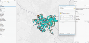
  • Coloring Pre-Drawn Regions: When information is already grouped by neighborhoods or counties, mapmakers paint the regions using different shades of color. Busier, denser areas get darker shades, while emptier places get lighter shades.
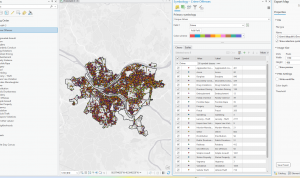
  • Creating “Heat Maps”: When mapmakers have exact point locations (like individual crime reports or store addresses) or line features (like roads or rivers), they create a smooth, continuous background grid. This works much like a weather map showing hot and cold zones. The mapmaker controls how detailed this grid looks by picking the size of the grid squares (cell size) and deciding how far out the system looks around each spot to calculate crowding (search radius).
  • Using Dot Patterns: This method drops simple dots inside a boundary, where each dot stands for a set amount (for example, one dot representing two birds). The dots do not mark the actual, exact spots where those items exist in real life. Instead, they serve as a visual trick: where the dots are clustered tightly together, the map reader instantly knows the area is crowded, and where the dots are scattered, the area is mostly empty.

Chapter 5: Stacking Map Layers and Counting What’s Inside

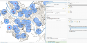
A major part of working with maps involves focusing on specific locations and seeing how different layers of information overlap. If a mapmaker wants to highlight a single neighborhood to track what happens inside it, they can draw a thick, bold line around its border or shade it in. To make that target neighborhood stand out clearly, they might fade out the surrounding background using light colors or subtle patterns, or draw important features directly over top of the background. Mapmakers also frequently build buffers, which are simply perimeter zones drawn around a feature—like drawing a 1-mile circle around a school to show its immediate neighborhood.

When answering complex questions, mapmakers stack different thematic map layers directly on top of each other, much like placing transparent sheets on top of a light table. Stacking layers allows you to compare different datasets, see which features fall inside specific boundaries, and figure out how much of a feature sits within a target area. During this process, map tools can instantly run helpful summary math on the items captured inside an area:

  • Counting: Tallying the total number of items found inside the boundary.
  • Categories: Counting how many items belong to a specific group (like counting how many oak trees are in a park compared to pine trees).
  • Totals and Averages: Adding up numerical values or finding the typical average amount for items in that zone.
  • Middle Values and Spreads: Finding the exact midpoint value in a list of numbers (median) or seeing whether the numbers are mostly similar or wildly different (standard deviation).

Instead of using crisp geometric shapes, mapmakers can also perform layer stacking using a pixel grid layout. In this grid approach, the system simply counts how many pixel squares fall inside a specific area to measure coverage.

Chapter 6: Measuring Distance and Travel Effort

Proximity analysis looks at what exists nearby a key spot. In the real world, measuring how close something is involves much more than drawing a straight line with a ruler. True “distance” (traveling range) depends on three key real-world factors: physical space, time, and financial cost. To measure how close things really are, mapmakers use three primary approaches:

  1. As-the-Crow-Flies Distance: Measuring a straight line through the air from Point A to Point B.
  2. Street Network Distance: Measuring travel along real connected roads and turn-by-turn routes.
  3. Real-World Cost Distance: Measuring movement across actual terrain while taking obstacles and friction into account, such as steep hills, severe weather, or rush-hour traffic.

Mapping actual travel costs—like measuring how long a trip takes when bad weather slows down traffic—gives a far more accurate picture of a store’s true customer area than just drawing a simple physical circle on a flat map.

To display distance clearly, mapmakers use three main visual styles:

  • Distance Rings: Concentric circles drawn outward from a central point, showing set distance steps (like 1-mile, 5-mile, and 10-mile radiuses).
  • Spider Diagrams: Connecting lines that radiate out from a central hub to several destination points, creating a pattern that looks like spider legs.
  • Distance Grids: A background grid where every individual pixel square knows its exact calculated distance to the nearest key location, making it easy to generate dynamic borders.

Bailey Week 2

Chapter 1


Maps come in many forms, think of paper maps that show minimal information such as roads and towns.  GIS maps have spatial pictures and can be created to show in depth information.  Chapter 1 is about advance mapping where you can find patterns, trends and work towards solving problems. 

Some key terms I found interesting listed below.


Map Features: GIS uses three main shapes to draw everything.  Points, which are tiny dots for certain locations.  Lines, connected paths such as pathways and roads.  Polygons, shapes with boundaries that outline an area such as a county.


Discrete Data, has clear edges like property lines.


Continuous Data, flows across space with out hard borders such as temperature


It is amazing that almost everything can be mapped.  How can you protect private information from becoming part of this system?  I wonder if people can use this tool to commit crimes?


Chapter 2


This chapter involves plotting locations  and spotting groups clustered together.

Mapping where things are located.


Single Symbol Mapping, giving every single item the same icon and color


Clusters, tight bunches of dots


Outliers, lone dots far away from everything else


If you are going to map everything your map could look messy. Map scale has to be right so that your information can be interpreted.  Are there sources to help pick the best map scale?


Chapter 3


Talks about mapping numbers and the importance of calculating them correctly before putting them on your map.  You do not want incorrect information available to interested parties.


Data grouping,  how you split up numbers into groups before picking colors


Normalization, fixing raw counts so a fair comparison can be made.


Choropleth Map, classic shaded map where areas are colored lighter or darker based on their numbers


So you should never map raw totals for large regions. You need to make sure detail is incorporated or your map will just show basic information.


How do you choose color shades?

Bailey Assignment Week 1


Hello,


Hello, my Name is Janie (Garcia) Bailey) I am 49 years old. I was born and raised in North West Ohio, a small town called Tedrow. My father is a Texas native American Latino self taught Auto Mechanic and my mother is a Michigan native Farmer and Architect. I attended Pettisville Highschool graduated in 1995. I attended Hocking College and completed a Associates Degree in Applied Science, Wildlife Recreation and Park Ranger Services. I completed OPOTA and worked as a State Park Officer for the ODNR for several years. While in service I was awarded Life Saving Recognition for a ice water Rescue and promoted to Specialist Officer. I left the ODNR to pursue my own business venture as a self employed Taxidermist. My first role at OWU was working for Public Safety. I currently hold a position in Facilities as a Central Receiving Clerk. I am a active outdoor enthusiast. I enjoy hunting, fishing, foraging and low impact camping. I have a small hobby farm where I grow many vegetables, fruits and have a Apiary. I also have cattle, rabbits, chickens and goats which we raise for family consumption. I enjoy the challenge and benefits of being self sustaining. Goal in life is to leave the smallest carbon footprint achievable. I am a Environmental Studies Major


Nadine Schuurman’s book chapter shows how Geographic Information Systems (GIS) quietly power our modern world. It’s easy to think of GIS as just digital mapping or GPS, but it actually touches almost every part of our lives. From showing farmers how to grow crops better to helping cities plan utility lines, track diseases, or decide where to build new stores, GIS works behind the scenes to help people make smart decisions based on location. What makes GIS so neat is how it turns messy lists of data into clear pictures. Schuurman explains how it all started with a simple idea: stacking clear sheets of paper over each other to see how different things on a map overlap—like roads, rivers, and property boundaries. Today, computers do this instantly. Instead of staring at huge spreadsheets of numbers, GIS lets us see patterns on a map, making complicated information easy for anyone to understand. This is huge when it comes to the environmental impact of construction. Building things like highways, housing complexes, or factories can easily damage nature. With GIS, planners can run “what-if”scenariosbefore a single digger moves any dirt. They can stack map layers to see if a new building will pollute a nearby river, destroy local animal habitats, or cause flooding down the road. Instead of fixing environmental mistakes after a project is finished, GIS helps us spot risks ahead of time. It acts as a bridge between human progress and nature, helping us build what we need without destroying the environment around us.

GEOG 291 Quiz Taken