Week 4
Chapter 1
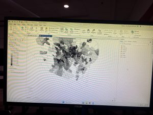
Chapter 1 was mostly about getting familiar with ArcGIS Pro and learning how to navigate the different parts of the software. We worked with layers, attribute data, symbols, labels, and both 2D and 3D maps. The health care clinic example was interesting because we could look at the locations of clinics along with other information about the area instead of just seeing points on a map. I also liked the 3D population density map because the differences were easier to visually notice when they were represented by height. I did have some trouble finding certain tools because there are a lot of different tabs and options in ArcGIS Pro, but going through the tutorial helped me get more comfortable navigating it.
Question: When is a 3D map more useful than showing the same information on a regular 2D map?
Chapter 2
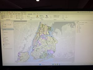
Chapter 2 focused more on how the information on a map is actually displayed. We worked with symbology, labels, choropleth maps, dot density, and visibility ranges. One thing I found interesting was how differently the same type of data can look depending on how it is symbolized or categorized. For the New York City land use map, the different colors made it easier to distinguish between types of land use such as commercial, manufacturing, parks, and residential areas. Having the borough and neighborhood boundaries along with the land use data also helped give the map more context. This chapter was a little more difficult for me because some of the options in ArcGIS were not always where I expected them to be, but I got more familiar with working with layers and their properties.
Question: How do you decide which type of symbology is best for a dataset without making the map too complicated?
Chapter 3: Maps for End Users
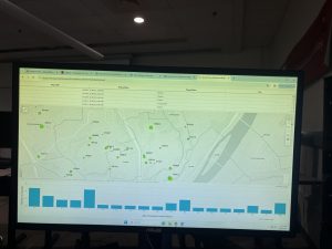
Chapter 3 was different from the first two because it focused more on how GIS information can be shared and presented to other people. We worked with layouts and also used ArcGIS Online tools such as StoryMaps and Dashboards. I liked seeing how the work done in ArcGIS Pro could be used in an online format instead of only staying inside the desktop application. The Ground Crew Dashboard was probably the most interesting part for me because it put several ways of looking at the data in one place. The dashboard included the locations of service requests on a map, information about individual requests in a table, and a chart showing the age of the requests. Seeing these together helped me understand how a dashboard can make geographic data easier to look at and understand without needing to work directly in ArcGIS Pro.
Question: When would a Dashboard be more useful than just sharing a regular map?