GIS Blog 4 Elliott

Preface Chp. 1

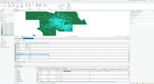
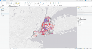
The first tutorial sections were primarily introductions to the program and how to navigate the maps. The first and second tutorials consisted of the navigation instructions and how to use the unique features and tools that ArcGIS utilizes. The third tutorial was about working with attribute panels, which was the most complicated for me. The attribute panels are used to add and edit attribute data for groups. This was the most challenging for me because the names did not match that of the tutorials, so I had to use best judgment in order to follow along with the tutorial’s instructions. The final tutorial, tutorial 4 was demonstrating the symbolling on the maps. This tutorial was my favorite of the first tutorials because editing the map’s symbols can change the flow and overall readability of the map. Within the symbolling tab, you can alter the symbol, size, border, and color of the data point. This section of the tutorial was very easy and allowed for me to observe the effects that different symbols mean and how to determine which ones to use.

Key notes:

  • Right click a data group and within the dropdown menu click symbology to edit the data points’ appearance
  • Add bookmarks using the bookmark button on the map tab
  • In the analysis tab, click tools and open the toolbox to obtain access to a variety of tools for the program
  • To observe a 3D model double, click the item with 3D listed in the catalog pane

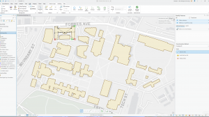
Screenshots Chp.1

Preface Chp. 2

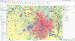
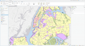
This chapter gave 8 tutorials to demonstrate different necessary techniques that the ArcGIS program features. The first and second chapters expanded on the tools in chapter one such as symbology and data attributes. In the first three tutorials of chapter 2, I adjusted the symbology, and the colors associated with the map of the location. The third chapter particularly taught a tool that I used for the rest of this chapter, which is Definition Query. The fourth tutorial was brisk and displayed how to adjust the symbology and read the histogram and then change the map into a 3D Choropleth map. The fifth tutorial invol;ved adjusting the symbology to make symbols on the map more prominent, which was similar to the seventh tutorial in making dot density maps. The sixth tutorial was the most challenging to me and involved creating a choropleth map with a custom scale. This was like a combined tutorial of the previous ones and was only the most difficult because of the many steps that were involved. The final tutorial was simply adjusting the vis

ibility ranges in different bookmarks, which I found to be the easiest of the eight tutorials.

Key Notes:

  • Layer Properties window, click Definition Query > New Definition Query to create a def. Query.
  • View tab, in the View group, click Convert > To Local Scene to create a 3D Choropleth map

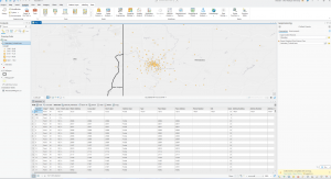
Screenshots Chp.2

Preface Chp. 3

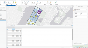
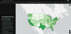
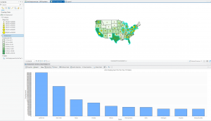
I found the 3’rd chapter to be the most intriguing and informational of all these previous chapters from this week’s assignment. In this chapter, you built map layouts and charts, used the online ArcGIS website to upload your completed maps, and more.The first tutorial of this chapter, you learn how to use the guide tool to align the 2 separate maps, how to create a legend, and create charts. The legend allows you to read the map’s symbology and understand what the map is depicting. The second tutorial explains how to share your maps online to the ArcGIS website and how to access these maps and configure pop-ups. A pop-up is a symbol that appears that pertains to certain fields that you can select by clicking the field list. The third tutorial did not use the ArcGIS program entirely and was all on the online website version. This tutorial I found to be the most challenging of all the tutorials from this chapter because of the vast number of steps. I learned from this chapter how you can create and edit an online story that you share through the website. This tutorial was mostly copying and pasting but keeping track of which text and heading goes where as well as creating the heading links proved to be challenging. The last tutorial was about creating a dashboard in ArcGIS which was easier than I anticipated and required adding an element table, a bar chart, and adjusting the setting and appearance. This chapter was by far the most instructive so far and put my skills to the test but allowed for me to become more familiar with ArcGIS.

Key Notes

  • Right-click horizontal and vertical rules to add guides
  • Add legend by clicking insert, Map surrounds group, add legend
  • In share tab, inside share as group, click web map, fill in tags and summary, enable public sharing, click share

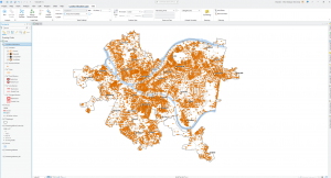
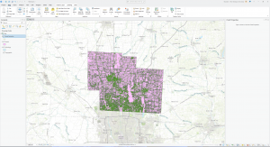
Screenshots Chp.3

Elliott Week 4

Mitchell, Chp. 4

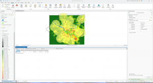
Chapter four described mapping density, which is symbols on a map marking the density of a given set of data. The purpose of this is to highlight where the highest or lowest density of the targeted set of data is. An example of this could be a construction crew viewing a city map with red dots marking every pothole within the city’s sidewalks and streets. Utilizing GIS mapping to view where the highest density of potholes in the area are, the construction crew could make the choice of where their next road replacement should be based on deductive reasoning. This example demonstrates how mapping density of a data variable can be utilized for tracking disease, weather patterns, public transportation, etc. This form of data display has infinite uses and is extremely simple and self explainable. Learning about the various cells and calculations needed for situations requiring density values surprised me. These calculations are crucial because there are several parameters that can affect how the GIS calculates the density surfaces. The factors that affect the GIS calculations are: cell size, which determines how coarse or smooth the patterns in the GIS map will be. In order to have a smooth surface, you must create more and smaller cells, which in turn demands more on your computer, like processing and storage space, which slows down the processing time for making the map. A coarser map looks rougher because of the larger cells however, with bigger and fewer cells the less strain on your computer while processing. Search radius is the maximum distance setting of a data point, which also affects the GIS system similarly to cell size. The larger the search radius, the more generic the patterns are, and the smaller the more detailed. The calculation method uses two different methods to determine cell size. The simpler method only calculates the features within the search radius of a data cell, whereas the more complex method uses a mathematical function to expand on complex features closer to the center of the cell, not just within the search radius. The last factor that affects the GIS calculations is units, which is the unit of measurement required for the mapping density of the GIS map. These factors all play crucial roles for the desired accuracy required for each map.


Mitchell, Chp. 5

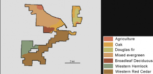
The next chapter, chapter five, describes mapping what is inside a given area. This can be done to monitor what may be happening in an area, prepare for a predicted outcome, analyze data within an area, and more. In order to find out what’s inside a set area, a boundary line is drawn and data points within the area are displayed. In Andy Mitchell’s textbook (chp.5) they show the following image:

Andy Mitchell, 2020, pg. 144) This image demonstrates GIS mapping what tree species are inside a selected area in order to view where certain tree species prefer. This image helped me understand what this chapter of the book was described by displaying a real world example of how this information could be used such as a log company looking for specific tree species, a conservation group looking for native and diverse wooded habitat and tree species, a township looking for water patterns in the area based on which trees prefer which area, and etc. In order to actually determine what is inside, there are three ways of finding it out. The three ways are drawing areas and features, selecting the features inside the area, and overlapping the areas and features. Drawing areas and fields is good for finding out if features are inside or outside an area however is quick and easy for visuals but lacks information about the inside features. Selecting the features inside the area is good for getting a list or summary of features inside an area however, it does not tell you what is inside each of several areas. The last method, overlapping the areas and features, is good at finding out which features are inside which areas and summarizing how many or how much by area, however, it requires a significant amount more processing and strain on your computer. In summary, these methods have their strengths and weaknesses, and each is used for separate features and utilizations.


Mitchell, Chp. 6

Chapter five discussed ‌mapping inside an area, chapter 6, however, discusses mapping finding what is nearby an area. Finding what is nearby can be crucial for finding out what is happening in a given distance and finding out what is within traveling range. There are two measurements in GIS when it comes to measuring distance: one is distance, and one is cost. Distance is obviously how far from point A to B, but cost is how much time it would cost. An example of cost over distance might be the national park rescue service that may only have to hike 4 miles to get to someone, but they have a high time cost of climbing over the mountain and across the river. Time is money and is one the biggest expenses, so measuring the time commitment aids in accurately reflecting in the GIS mapping. The three ways of finding out what’s nearby is straight-line distance, distance or cost over a network, and cost over a surface. Straight-line distance is exactly how far from point A to B in a straight line and is good at setting a boundary and measuring the distance of one point to another. Distance or cost over a network accounts for linear features and adds a cost of time besides distance, and is good for finding what is within travel distance as well as cost. The final method, cost over a surface, specifies the location and travel cost, and people primarily utilize it for over-landing off primary roads. These methods all have their own uses, and not one fits all. They each are utilized in various situations, such as when I gave an example of the NP rescue service they would use cost over surface. Furthermore, users frequently add buffers and boundaries to create a zone around given features. This addition helps measure cost and distance, ensuring an accurate measurement.


Elliott: Week 2 Blog

Mitchell, chp. 1,

Andy Mitchell describes GIS as “a process for looking at geographic patterns in your data and at relationships between features.” (Andy Mitchell, 2020, pg 3). This description of GIS narrows down the broad field of GIS mapping into an understandable description of how GIS analysts collect data and record patterns to create a multilayered model of recorded data. As described in the textbook, collecting this data is similar to the typical scientific method. This process consists of asking a question, understanding your data, choosing a method, processing the data, and analyzing results of the process. In GIS, there are continuous phenomena, which are continuous data that starts as sample points. GIS analysts then assign values to the area between these sample points. This process is known as interpolation. This process is crucial for collecting precise measurements and recording data of an area over time. It is crucial to note that you can also treat some noncontinuous data as continuous to create maps that highlight how quantities may vary across a given location. This process helps fill data gaps from unmeasured areas and simplifies complex, intricate data. 

Additionally, GIS utilizes map projections and coordinate systems to ensure accurate results when combining data layers. “A map projection translates locations on the globe (which is almost a sphere) onto the flat surface of your map. All map projections distort the shapes of the features being displayed, as well as measurements of area, distance, and direction.” (Andy Mitchell, 2020, pg 13). The quotation explains that a 3D sphere is translated onto a 2D map, and this process distorts the features to compensate for the dimensional change. This is one of the main complexities in GIS and topography: changing the 3-dimensional measurements into a tangible 2-dimensional mapping system.


Mitchell, Chp. 2,

The second chapter varies from the first by describing the processes of mapping, where things are in relation to their location on maps. You must first ask what information you need and how you will use the map. After concluding the intent and required data, you must prepare your data, such as coordinates and assigned category values. The category values portion of the data is crucial to assign features to a correlated code in order to categorize them. I found this portion of the reading fascinating due to how you categorize the data by hierarchical types and subtypes in order to create organization within the masses of data to maximize simplicity and efficiency. After you have prepared and organized the data, you can begin actually creating your map. You can map all single features or subset features in order to create more intricate data that reveals patterns that are not always apparent with just single features. The GIS system’s role in this process is to store the location of each feature as a set of coordinates or pairs. Various unique symbols are used to pinpoint the locations of the features that you input. The textbook expresses that you typically want to include 7 or less categories because more than this can create difficulty in seeing the patterns. You can have more than 7 categories in your map however, you want to group the categories into each other to make them easier to identify. In order for your map to be meaningful, you want to utilize recognizable features such as landmarks like highways, towns, rivers, etc. You can also use reference features specific to your map and analysis to observe the relationships in the data. An example of reference features could be if you’re mapping the growth of a fast-food chain, you could map the nearby competitors that contribute to fluctuations in data and have geographic relationships.


Mitchell, Chp. 3,

The third chapter expresses the importance of grouping the map data based on quantities and mapping the most and least. Mitchell, Chp. 3 explains this by saying, “Mapping features based on quantities adds an additional level of information beyond simply mapping the locations of features. For example, mapping the locations of businesses gives a sense of where workers are, information that might be useful for a transportation planner. But mapping the businesses based on the number of employees at each business gives a much better picture of where employees are.” (Andy Mitchell, 2020, pg 52). After reading this chapter, this description and example helped me understand the different utilizations of mapping locations and features like I described previously, and mapping quantities in order to add additional information and create a more organized map. The example that Mitchell used highlights how the locations of employees can be extremely useful for certain data, but the quantifiable number of employees at each individual location paints a much better picture of where each employee is across the different locations. The quantities that you are mapping (most and least) can be categorized in counts and amounts, ranks, and ratios. Counts and amounts display the total value of each feature and its extent in comparison to other features being recorded. It is important to note that counts are used for the actual number of features, whereas amounts are used for describing the total value associated with the features. Ratios, however, show the relationship between various quantities that are collected by dividing one by the other to collect ratios like proportions and averages. Rank ‌these features in order in terms of highest to lowest of the recorded data. An example of a rank: maybe if you’re collecting data on thriving tree species in an area, you would rank the strongest trees at the top of the rank and the weakest at the bottom. These 3 forms of data organization help to sort‌ large quantities of data into understandable and observable sections.

Sources:

  • “Andy Mitchell’s, May 26, 2020, Esri Guide to GIS Analysis, Volume 1, Second Edition (Chp.1, pg.3), (Chp.1, pg. 13), (Chp.3, pg. 52)

Hughes Week 1

I have finished the GEOG 291 Quiz:

Pictured above is me standing in front of the London Tower!


Hello, my name is Brandon Elliott, but I go by Brandon Hughes. I am a freshman majoring in environmental studies. The reason I took this class is that my brother, who is a senior, expressed how he enjoyed learning about GIS and its uses from this course. I am also interested in the implications of GIS and how it is used to analyze land for various uses. I intend to do fieldwork with my environmental studies degree, so taking this GEOG 291 course will expand my knowledge of analyzing data, understanding the GIS resource, as well as how to utilize this system for my benefit.


Prior to this week’s reading, my understanding of GIS from my brother, who also is majoring in environmental studies, was that it was a system that people used to create maps and record the geography of locations. After the first reading, I now understand the value that GIS has, not only for simple factors like delivery services and maps but also for its utilization by emergency services and zoning. GIS has been utilized countless times dating back to the 1960s when the technology behind the system was being developed and the capabilities had not yet been fully comprehended. 


Schuurman’s initial chapter highlighted how the nascent GIS system was underestimated because of its technological limitations, an idea that resonated with me. Numerous people preferred manual cartography rather than computerized spatial analysis. This highlights how new technology may not always be a hit initially and can use improvements in order to adopt the system until it takes off. I find this interesting because at this time many individuals still preferred the physical and traditional cartography techniques rather than the newly invented GIS system of using computerized methods. This trend is becoming apparent in present times with how people are beginning to revert back to more traditional methods rather than newer technology such as the use of AI. However we could also be in a similar period where the newer technology is not trusted but with advancements the systems become more utilized and advanced. The spatial analysis confusion from common mapping can be highlighted by my observation with how individuals may not fully understand the differences i the systems and how they have independent uses rather than 


The textbook mentions how transformations within the digital environment have huge impacts on the accuracy of GIS. In order to limit large fluctuations in the data causing inaccuracy, GIScientist must account for the impact of transformations. This insight provides a strong basis for an understanding of how much data and layers are compiled within the geospatial tool that even small alterations can have a domino effect through the various layers of the mapping system.


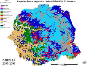
The GIS system is used in countless aspects of life for numerous fields. I chose to look into GIS’s impact on an interest of mine in identifying invasive plant species and analyzing the factors contributing to their spread. After researching this topic and GIS’s application on this I learned that the system compiles soil types, rainfall patterns, and terrain of a location that plays a large role in the spread of these species. Scientists may analyze the current data of the region and compile a visualization for future vegetation prediction scenarios, such as this image of Yosemite that the National Park Service utilizes:

“Geographic Information System” Yosemite National Park, National Park Service, Aug. 22, 2023 (Projected Future Vegetation).


An additional application of GIS can be inverse to predicting and limiting the spread of invasive species by mapping and protecting ‌native species. This application of GIS is also widely utilized by National Park services and conservation groups to analyze the data behind why these species are thriving or struggling and how to adapt their approach to maximize conservation.


Sources: