Jan Week 4

Preface

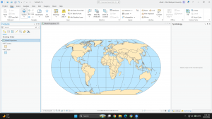
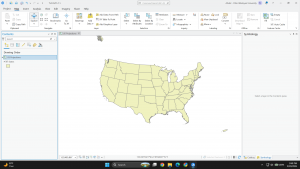
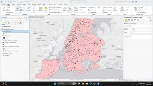
The book covers ArcGIS Pro (desktop), ArcGIS Online (web maps), Living Atlas (ready made data), StoryMaps, and Dashboards. It has three parts: using maps then  preparing data and analyzing it. Note: I have no Windows PC, so I ran ArcGIS Pro in Windows 11 through Parallels on my MacBook.

Chapter 1: Introducing ArcGIS

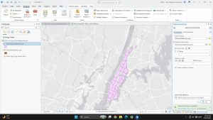
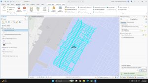
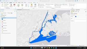
  • I already knew most of the terminologies from previous readings but doing hands on work with them made much big of a difference compared to seeing screen shots or reading about them.
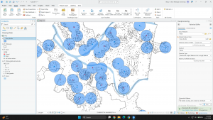
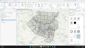
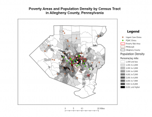
  • Subsidized FQHC clinics cluster in dense, poor parts of Pittsburgh, while urgent care clinics sit in the suburbs.
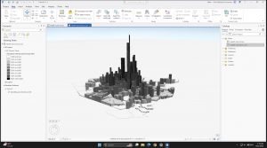
  • The 3D scene shows population density far better than shades of gray.

Question: How do planners decide reachable distane for people without cars?

Chapter 2: Map Design

  • The subject gets bright colors, and context gets gray.
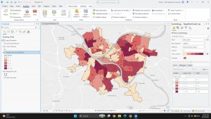
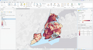
  • My quantile choropleth breaks (830 to 11,595) get wider at the top, so the data is skewed.
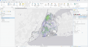
  • The dot density map shows two groups (under 18 and over 60) on one map.
  • Fixed a broken data source (the red “!”) using Repair Data Source.


Question: Can quantile classes mislead when a few values are much larger than the rest?

Chapter 3: Maps for End Users

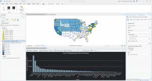
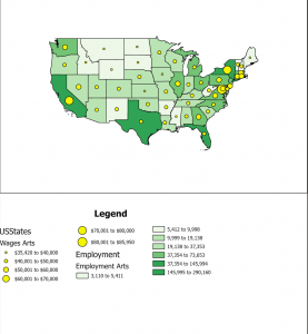
  • Built a two map layout of arts employment and wages by state.
  • The bar chart shows California (290k) and New York (200k) far ahead in arts jobs.
  • I’ll finish the online parts (sharing, StoryMaps, Dashboards) and follow up.


Question: Is employment per 1,000 people a fairer comparison than total jobs?

Jan Week 3

Mapping Density

  • Density mapping shows where things cluster instead of where each single feature sits hence it is good for patterns, bad for pinpointing.
  • Matters most when your polygons are different sizes; a raw count map makes a big polygon look busy just because it is big.
  • Two ways you can go about it:

    1. Area method: We divide features by polygon area, or use a dot map. The dots are placed randomly, so they are a picture of density, not real locations. That feels like a trap for anyone who does not read the fine print.

    2. Density method: A raster where every cell gets a value from the features inside a search radius.

  • Small cells give a smoother surface but cost processing time. A bigger radius smears the pattern out. 
  • The simple method just counts what is in the radius; the weighted method leans toward features near the cell centre and gives a cleaner map.
  • Display with graduated colours or contour lines.

So we have these classificational schema; Natural Breaks, Quantile, Equal Interval, Standard Deviation which basically decides what the map tells, which is a lot of power for one dropdown. I keep wondering how often public data gets quietly skewed by someone picking an arbitrary search radius. Still, density fixing the unequalnpolygon problem is the real win here.

Finding What’s Inside

  • Mainly for monitoring or comparing; some examples include; drug arrests near a school, or which zip code has more of something.
  • Three methods:
    1. Area > Features: More visual. Fast glance, No data out of it.
    2. Select Features:  Gives us a subset we can actually use for lists and summary stats (count, frequency, sum, average). 
    3. Overlays: Merges boundaries and features into a new layer and permanently tags features with the area’s attributes. Vector is precise but leaves slivers; raster counts cells, faster but cell size drives everything.

To be honest Vector still wins for anything legal like parcel boundaries, because “close enough” does not hold up in a property dispute. However, for non high stakes thing the latter should be good enough.

Finding What’s Nearby

  • In this chapter you ask some other different questions such as who is affected by an event, who is actually served by a facility and so on. 
  • “Near” is not only physical distance. It can be time, money, or effort, which changes the decision process.
  • Three methods:
    1. Straight line: Buffers, Select within distance, or a continuous distance surface. Planar for a flat plane, geodesic for a curved earth. Ranges can be inclusive rings (0–1, 0–2, 0–3 mi) or distinct bands (0–1, 1–2, 2–3 mi).
    2. Cost over a network: Streets and other fixed infrastructure. 
    3. Cost over a surface: Overland travel with no roads. 

The  RINGS vs BANDS distinction is the most useful thing in this chapter for me. Bands isolate each ring, so if I ever compare demographics by distance from a facility, that is the one I want. Building turntables from scratch sounds genuinely tedious, but for emergency routing I do not see how you skip it.


Jan Week 2

“Into to GIS Analysis”

GIS analysis finds patterns and relationships in spatial data to solve real world problems. The workflow follows a five steps process: find & define your specific question, understand your data, choose a method, process it, evaluate the result & lastly form a conclusion. Some important terms in the chapter:

  1. Feature types: Discrete (points, lines, polygons), Continuous (gapless surfaces like elevation), or Area (zip codes, census tracts).
  2. Data models: Vector (coordinate based) or Raster (cell based). 
  3. Attributes: Categories, Ranks, Counts/Amounts, or Ratios.

GIS work involves but is not limited to; querying, calculating, and summarizing tables. Stuff depends on matching these three components listed above in the correct manner such as relating the right data model with the right attribute both according to your question. Hence, before I start any analysis I will understand my question foremost and then move onto deciding things because that lone thing can make it or break it. 

“Mapping Where Things Are”

Mapping locations shows distribution, clustering, and dispersion. Data need be prepped first with accurate coordinates and clean category codes. Like the question was the most important thing in the first chapter, your data means just as much here. Three key things again: 

  1. You can map one feature type, isolate a subset, or map multiple categories to show relationships and hierarchy.
  2. People can only reliably tell apart about seven colors or patterns so anything past that needs grouping.
  3. Symbology rules:
    • Color beats shape for points
    • Vary line width for networks
    • Keep reference layers muted (light-gray basemaps) so context doesn’t fight the data

When we start to build a map most of us just wish to add more and more things, add in more features, add in more information, yes I concede more information might be better but most of the time it is simplicity and visual hierarchy instead which decide whether a map actually works or not and that seven category limit is the hard ceiling. For anything public facing I’ll group categories aggressively and stick to minimal basemaps so the real data stands out.

“Mapping the Most and Least”

Mapping quantities compares places to show trends and concentrations. The big rule: when areas are unequal in size, use ratios (averages, proportions, densities), never raw counts, or the pattern is misleading.

  1. Classifications:
    • Natural Breaks: clustered data
    • Quantile: equal features per class
    • Equal Interval: identical value ranges
    • Standard Deviation: distance from the mean
  2. Outliers be handled or they compress everything else into one class.
  3. Display options: graduated symbols, graduated colors, pie/bar charts, contours.

The classification we pick completely changes the story the map tells, and raw counts should never go on variable-sized polygons. 

Jan Week 1

I have completed the GEOG 291 quiz and reviewed the syllabus

Introduction

Rafay here! A Microbiology major from Pakistan. I do plant biology research in Dr. Wolverton’s lab, and outside of that I make documentaries and shoot film photography. I am taking this class as I know nothing about GIS and it intrigues me. Hope to learn more about it. 

Thoughts on Chapter 1

“After reading the text I can sum it up in three words; GIS is not exactly constant, that’s four but as Schuurman says that GIS “suffers from the scourge of being many things to many people: software to a municipality, a scientific approach to a researcher.” Hence the applications are not limited, whether you are a Humanities student or a STEM one, or you are a corporate worker or a researcher, you can use it.

Moreover, in the reading one camp asks where spatial entities are, the other asks how we encode them and what different analytical methods do to the answers. Both are GIS! But maps and mapping is not the same as doing spatial analysis. Mapping shows a dataset visually and stops there, however, spatial analysis generates information that can not be extracted by just taking a look at either, map or data.

The author then dabbles into the history of this system talking about McHarg’s 1962 highway overlay which, being super old school, used tracing paper on a light table. No computer was involved; it was the metaphor of overlay that entered GIS.

Though ironically, the history is messier than I expected, and kind of accidental. CGIS came out of Tomlinson and Pratt happening to sit next to each other on a plane, and the name was handed down by a member of Parliament. 

That does carry into how we use GIS now, most users treat GISystems as a black box, borrowing Latour’s term; nobody asks how the software decides where the income polygon boundaries go, the output is just assumed true. 

GIS wants crisp lines and reality is fuzzy, so the categories you pick determine the answer. And that stops being abstract the moment resources are attached, if funding depends on communities falling below an income threshold, then how you define income is doing political work, not just technical work.”

Application

Astrophotographers use GIS to overlay satellite sensor data with topographic maps to locate dark sky areas classifying them into Bortles. By mapping artificial light domes, they can pinpoint the optimal remote locations for executing long night sky exposures and capturing clear star trails.

As the nights draw in, the stars emerge. The latest addition to our Esri UK Map Gallery celebrates the beauty of our night sky... if you know where to be 🌃🌙 🌌✨

Source: Esri UK, “Explore your night sky this WInter” Map Gallery.