Sisler Week 3

Mitchell Chapter 4-

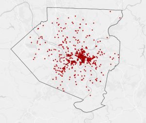
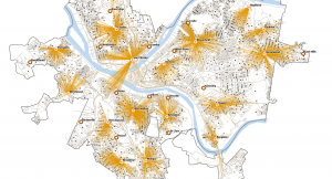
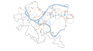
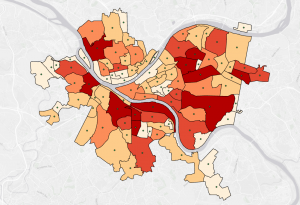
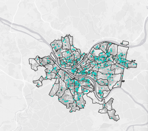
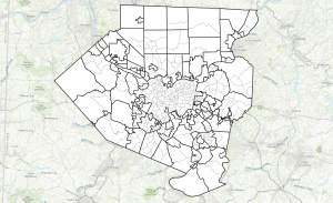
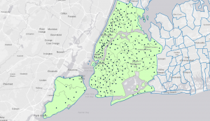
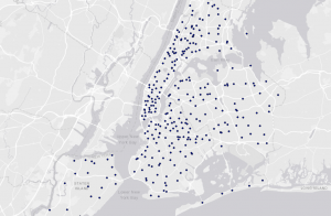
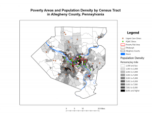
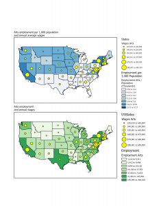
There are two ways to map density: by defined area and by density surface. You can map density by defined area using a dot map, where dots are randomly placed within the defined area to represent a certain number of features. These dot density maps show density graphically, rather than showing the actual density value. These kinds of maps are generally easier to read; however, the user has to make sure the dots are an appropriate size to not overlap and hide the pattern. Mapping density by defined area is normally displayed as a shaded map of the areas, with a range of colors. The density value applies to the entire area and may vary in that shaded region. 

The second method of mapping density is by density surface. Density surface maps are created as a raster layer; each cell has a density value. This approach is more detailed but does require more effort. You can create a density surface map from locations, sample points of data, crimes, or even bird nests. A cool type of density surface map is a contour map, which compares all the density values within a certain defined radius. From that compared value, the point is then given the average and shaded to that average. The cell size of the map determines how coarse or fine the patterns are. If you want the map to be smooth, the cell size needs to be smaller, but the process will take a long time to process. To find the cell size, you have to convert density to cell units, divide by the number of cells, and take the square root. When displaying the density surface map, you have to be careful how you classify the values, whether that be natural breaks, quantile, equal intervals, or standard deviation. Each grouping shows a different pattern in the densities. 

Mitchell Chapter 5-

I found it interesting that people map things to know what’s inside the area to monitor things like crime, or to compare many areas based on what’s inside of them. The data can be of things in a single area, or multiple surrounding areas. There are two types of features that reside inside an area, discrete and continuous. Discrete features are unique, where you can count them. Where continuous features represent geographic phenomena, like vegetation type. The information that you want portrayed from the analysis can tell you a lot. For example if you want the features to be completely, or partially inside an area, or if you want the surrounding area to be highlighted. The different types of mapping these features can tell you different things. 

There are three ways of finding what’s inside an area. The first is drawing areas and features, it’s quick and easy but only visual. This makes it harder to get information about the features inside. The second is selecting features inside the area, this is good for getting information inside a single area, but not several areas. The last method is overlaying the areas and features, which is good for showing what’s inside several areas, but takes more processing. After selecting the best method and creating a map, you can use the GIS to create a report of the features. A numeric attribute can be a sum, average, median, or standard deviation. When drawing features and highlighting them you can have the non highlighted parts be gray, or a lighter version of the features inside. The second option provides some information about what the features are. When overlaying areas, you can summarize the features by area. You can also summarize by category or value, it is important to account for variations in the areas. When making a map with overlaying areas on areas, it is important to look for slivers, and merge them with the adjacent larger areas. 

Mitchell Chapter 6-

This chapter focused on what’s nearby on the map. It discusses the importance of traveling ranges, and how to measure different ways to travel. A person would want to see what’s nearby for specific reasons, one of them could be to see how long it would take for police or firefighters to respond. 

To find what’s nearby there are a few different ways to measure distance. One of the methods is measuring what’s nearby, this can be measured by cost or distance. When measuring response time, you would want to measure by time, not distance. When measuring distance there are two different ways, the planar method and the geodesic method. When measuring smaller areas its best to use the planar method, and when measuring large areas like a continent its best to use the geodesic method. When measuring using the straight line distance, it’s good for creating boundaries, or setting distances around a source. When mapping for distance travelled,  its good for finding what’s within a travel distance of a fixed area/network. Mapping cost is good for calculating travel cost over land like forest or roadways. When displaying the information from several sources, there may be areas of overlapping distances or features labeled. If a spider diagram is used it is easy to see the features (like customers) that are in a certain distance from the source (like stores). A network layer is a geometric network composed of edges, junctions, and turns. You can set travel parameters, and costs to each road, turn, or stop sign. This means that you could set costs to turns, intersections or individual segments.When setting a cost, you have to create a turntable. When you create a boundary, you can find what’s inside the boundary by using information from chapter 5. You can compare distances of rings surrounding a source.

Sisler Week 2

Chapter 1-

Some key concepts from this chapter include what GIS is, geographic features, and geographic attributes. 

Definitions:

GIS analysis- Geographic Information System analysis is a process of looking at data to find relationships, patterns, and the features of the data. 

Geographic Features- The type of feature affects the steps of the analysis process; the three types are discrete, continuous phenomena, and summarized by area. 

Geographic attributes- A way to identify what the geographic feature is by describing it, or representing some magnitude from the feature. 

Comments/Notes on the chapter-

One of the first steps to GIS analysis is framing the question. This is to find what information you need, how it will be used, and who it is for. The second step of GIS analysis is to understand your data and to choose a method of getting information. There are 2-3 types of ways to get information: fast with approximate information, and other types that take longer but have more precise results. Once you have picked a model, the next step is to process the data and look at the results.  There are different types of geographic features. Discrete features are locations and lines; they are either shown or not. Continuous phenomena start out as a series of sample points; on the map there will be no gaps. Continuous data can also be enclosed by boundaries; the boundaries indicate where things are more similar than not. Summarized data represents the counts or densities of individual features within a boundary.  There are two ways of representing data, vector and raster. The vector model is shown as points, sets of coordinates, or enclosed areas. When working with data this way, the analysis involves working with the attributes in the layers data table. The raster model is represented as a matrix of cells in a continuous space. The analysis of raster data involves combining layers of data to create new layers with new cell values. Discrete and summarized data are normally represented by vector models. Continuous categories are represented by either, while continuous numerical data is normally represented by raster models.  There are five geographic attributes: categories, ranks, counts, amounts, and ratios. Categories are a group of similar things, while ranks are putting things into an order from high to low. Counts and amounts show you a total number, a count is the actual number of features on the map and amounts are any measurable quantity with a feature. Ratios show the relationship between two quantities. 

Chapter 2-

Comments/Notes on this chapter-

Maps are a big part of GIS analysis. When looking at the distribution of features on a map you can see patterns that help people understand the area and where action is needed. When deciding what to map you have to look for geographic patterns in your data set. The information from the map depends on what you want to know, whether that’s where cops need to be stationed due to crimes or where a new store should be built depending on where customers are.  

When creating the map you want the features to have geographic coordinates and a category attribute for each value. The categories on the map can have subtypes. When making the map you can tell the GIS which features to display and what symbols for each feature. The GIS can store the location of each feature as a pair of geographic coordinates or a set of pairs to define its shape, line, or point. When mapping a category, you can map the subsets as different colors for individual locations to show relationships between the areas. If patterns are complex, you can create separate maps for each category, to see the patterns easier. When mapping roads, you can have different types of roads as different line thickness to help differentiate between highways and backroads for example. When displaying categories, you don’t want more than seven categories; however depending on the scale of the map you could need more categories than seven to show a pattern. When using a large scale, more than seven categories can make the pattern hard to see. When grouping categories, you want to group similar things alike, and to help distinguish the pattern. Depending on how you group things can change how readers perceive the information. The base of the map should include landmarks, and should be a simple monochrome color to not distract from the data you want to show. 

Chapter 3-

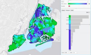
In this chapter it discusses how to best compare places, and understand relationships by using maps. When mapping it depends on what type of features you want to map. When looking for relationships or patterns in the data, it is helpful to look at the data in high and low detail and look at different ways to display it. This can help you find patterns easier, and distinguish when it is harder for the intended audience to see the pattern or relationship. When mapping you want to know what type of quantities you are mapping to display the data the best. When mapping with counts or amounts, you can map ratios to help represent the distribution of features. Ranks are useful when direct measures of data are hard to make, or if the quantity represents a combination of different factors. When mapping the determined quantities, you have to decide to assign each its own value or group them together into a class. When using classes you assign them the same symbol on the map, and define the range by determining which features fall into each class. When grouping data there are a few different ways, natural breaks, quantile, equal intervals, and standard deviation. Each grouping way shows different patterns in the data, so depending on what relationship you want to display. Each grouping also has its own advantages and disadvantages. There are also different classification schemes to know when mapping. There are ways to make the classes easier to when, for example making the legend easier to understand. 

Key words/ definitions

Quantities- Quantities can be counts or amounts, ratios, or ranks. 

Counts- The actual number of each feature on the map.

Amounts- The total of a value that is associated with each feature. 

Ratios- Ratios show the relationship between two quantities and are created by dividing one quantity by another quantity. 

Ranks- Ranks put features in order from high to low and show relative values. 

Sisler Week 1

I read the syllabus and schedule, and I took the Geog 291 quiz!

Hello, my name is Kiley Sisler. I am a current sophomore and I am from Powell, Ohio. I am still currently undecided for my major; I am leaning towards astrophysics and computer science though. I am taking this class because I wanted to add ArcGIS Pro to my resume. Outside of Ohio Wesleyan, I partake in Tang Soo Do, and I am training to get my fourth-degree black belt right now.  

Chapter 1. 

I had never heard of GIS until I attended a career fair last year. I originally thought GIS was just used to map things like plants, forests, the way water flows and ecosystems. GIS originally started out in 1962, when Ian McHarg wanted to build a highway with the least amount of disturbance to everything around it. He used pieces of paper to create layers to find the spot of least disturbance to build the highway. I find it interesting that computerized spatial analysis was not really explored until the early 60’s, because the physical maps were acting as a decoy of the impact spatial analysis could have. 

There are many identities of GIS, GISystems, GIScientists, and GIScience. GISystems are assumed to be true by most of the users. It took a while for a new identity of GIS to be created/found. The next one was GIScience, which is the theoretical basis of GISystems. GIScientists are people that question the models, and if they would work in different scenarios. The work of these GIScientists starts before any of the data is put in digitally as well. GISystems has different processes compared to GIScience, such as classifications, spatial analysis, and digital encoding. Where GIScience has more theoretical bases and justification for these processes. Both GISystems and GIScience are dependent on spatial data. 

The definitions of boundaries are a heated topic, especially when it comes to resources. GIS is now used to help predict future outcomes from previous data. Some of the power that GIS has is from the power it has from visualization. Geographic visualization is both traditional cartography and the ability of expressing physical relationships with spatial data visually. GIS is used in agriculture, finding which crop is best based on the soil tests, and it is also used by the government for tax purposes. I never knew that GIS was used so much and on such a wide scale.  

Application 1

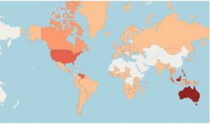
GIS for Carnivorous Plant Distribution & Conservation

Source:  Distribution Map – Carnivorous Plant Database 

Carnivorous plants—such as Drosera, Nepenthes, Sarracenia, and Utricularia—often inhabit nutrient-poor wetlands and highly specific microclimates. GIS helps researchers map species distributions, model habitat suitability, and track environmental changes affecting these sensitive plants. Some key GIS uses for carnivorous plants include mapping global species occurrences, modeling climate, identifying biodiversity hotspots, and helping support conservation planning in threatened wetland ecosystems. 

General GIS applications in environmental monitoring (contextual environmental GIS research)

Application 2

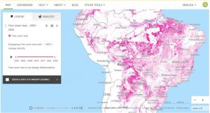
World Resources Institute. “Global Forest Watch.” WRI Data Explorer, World Resources Institute, 2026, https://datasets.wri.org/applications/global-forest-watch-app?utm_source=chatgpt.com 

GIS Application: Monitoring Deforestation

One important application of GIS in deforestation is Global Forest Watch (GFW), an online platform that uses satellite data and interactive maps to monitor changes in forests around the world. GIS allows users to see where trees are being lost and compare forest changes over time. Global Forest Watch can also show information about protected areas, land use, and deforestation alerts. This makes GIS useful for governments, researchers, and conservation organizations because they can identify areas experiencing forest loss and determine where conservation efforts may be needed. For example, a researcher could use the map to examine tree-cover loss in the Amazon rainforest and compare it with roads, protected areas, or agricultural regions. Global Forest Watch provides near-real-time information about where and how forests are changing, making it an important GIS application for monitoring and responding to deforestation.