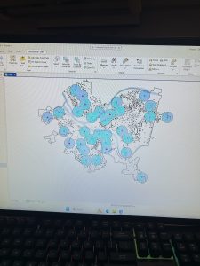
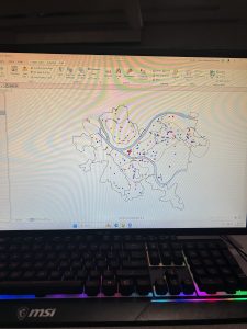
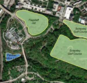
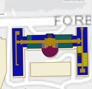
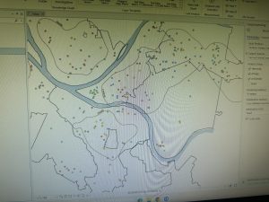
Bruner Week 3

Chapter 4

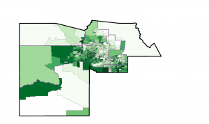
This chapter was all about how you would go about mapping density in GIS software. Obviously, with discrete points, you can observe density to some extent by looking at where a large amount of dots in a small amount of space are, but mapping specifically for density can give you a more specific understanding of which “dense” places are more or less so, rather than just identifying clusters. There are methods of mapping density that use dots randomly placed based on ratio per area by GIS, but this is also visually more accurate to look at than raw data, AND there are ways to make it more visually accurate, like processing this information in small areas.

There are many different ways to map density, including by area and with a density surface. Mapping by area can output a shaded fill map or a dot density map. This type of mapping is good for data that has already been summarized by area or that can be summarized by the GIS. However, it doesn’t pinpoint centers of density and can be very inaccurate for large areas because of this.

A density surface, which is created with the help of the GIS, is good for individual locations, sample points, and lines, so more discrete data. It can output a shaded or contoured map. Compared to mapping by area, it is more precise at pinpointing centers of density, but it requires more data processing.

For already defined areas, density maps can be in the form of dots or shades. As with everything, choosing one of these depends on what kind of information you are working with and what you want your map to convey. It is important to make the information you aim for as easily understood as possible.

Parameters to consider in density mapping are, cell size (if you are using a raster map), search radius, calculation method, and units.

Chapter 5

Chapter 5 was about graphic analysis and how to combine more than one layer of a map to create a map that can show correlation. Rather than focusing on physical features, this chapter talked about how to focus on occurrences in an area and can show viewers where attention is necessary.

There are two main ways to define your analysis, one being in separate layers, and another being a huge combined layer with all information in one.

Finding what’s inside a single area lets you monitor activity or summarize information about an area. This includes:

  • Service area around a central facility
  • A buffer defining distance around a feature
  • Administrative or natural boundaries
  • Manually-created area (for some sort of proposal)

For any of these when dealing with several layers of a map intersecting, you can choose to include all features that are even somewhat in your “boundary” layer, include only features that are fully in the boundary, or include parts of features whenever they show up in the boundary of the other layer. Which of these is chosen depends, again, on the map you are creating. It is best to create a map that makes it easiest to see features and important patterns, but from what the book described, this is a pretty intuitive process.

The GIS can place features that occur in both layers in a table, but if there are multiple areas within your data, it cannot recognize them as separate. I would imagine that if every area was a different set of layers, the GIS could recognize them as different that way, but this probably is very tedious and requires lots of processing.

The process GIS goes through to help with this is also described in this chapter. GIS can choose the best overlay method based on your data, and if it chooses a format your map currently isn’t in, it can convert it to that format in order to move forward with the processing.

Choosing a vector map can give you a more precise measure of areal extent, but requires lots of processing to remove silvers (errors in matching layers up) and to calculate the amount of each category.

Choosing a raster map can have varying precision based on the cell size used, and small cell sizes, which are more accurate, require more processing like a vector map would. However, raster maps don’t create the issue of silvers, they are faster to create, and they automatically calculate area extent. It is slower than vector processing though. I think personally that this is the better method as long as you use small cell sizes.

Chapter 6

Chapter 6 addressed how to represent how nearby activity can affect data between two features or using a set distance or cost in the form of a sort of “radius” around a certain area. This radius can have multiple levels if it helps to convey closeness better.

There is also an option of whether or not to include curvature of the earth depending on how large of an area your map is covering. I would imagine that it is also important to account for geographic features or barriers that would change the cost of travel, like if there is a mountain to be climbed or dodged.

There are 3 main ways nearby activity can be represented.

  1. Straight line distance: specify the source and the radius, and the GIS creates a nice circle using that information. It is good for creating a boundary or selecting features at a set distance, and you only need two very simple layers to do it.
  2. Distance or cost over a network: specify source location and distances along each linear feature you want included. This one is good for finding what is within a specific travel distance of a location accounting for means of getting there (like roads). You need 3 layers, but one of them can be directly from ArcGIS
  3. Cost over a surface: specify the source features and a travel cost, and the Gis will show the travel cost as it grows from each feature. This is sort of like the sorted radius, but it is based on cost and not distance. I would assume it accounts for geographic features as mentioned before.

The chapter also goes more in depth about how to actually get these different things to work in the software, like how to get a map to show distance from feature to feature, and how to make the map have several distance ranges. You can also set several different source features, and have the distances set to be “near at least one” of them after defining both.

Overall, so far from reading these chapters, I am getting the gist of how GIS works, but a lot of the specifics on how it works and what to do when I want specific things to happen is losing me a bit without having been on the software. I am hoping that once I begin working with it, I will understand better.

Robinson Week 3

Chapter 4:

In the previous chapter, we learned how correlations can be shown when using data sets to map the most and least of this information. This chapter focuses on mapping density, its importance, and the various ways we can use and build it. This is crucial because it shows viewers where high concentrations of features are located. GIS allows you to map features or feature values; each will result in different outputs (based on what the user inputs). To make either useful, we need to create a density map. One way to do that is to define an area. This can be done graphically with a dot map or by calculating each value per area. Using calculations requires a couple of things. First, by adding a new field for a density table based on the coverage area of the polygon. Then, assign density values and finally divide the values by the polygon area. This method may need a conversion equation if the density units don’t equal area units. This creates a map by total amount or counts, while noting what each dot signifies (e.g., 10 or 10,000 people). Another way is by density surface, created through a raster layer.  It divides the total amount of features by the search radius field. When it comes to calculating density sizes, a few things are required: cell size (to define patterns, its size is given by the length of the cell), searching for a radius (used to find objects on a map), calculation methods (which have 2 methods that can be used: simple and ring series), and units (measurement). How do we display a density surface? We can display it using gradient colors and contours. (This topic was discussed in Chapter 3.) The results will depend heavily on how the density surface is created.

Chapter 5:

Previously, we learned about map density, importance, and their use cases. Within this chapter, discussing the importance of mapping its inner contents. Helping the reader compare fewer and more areas (reviewed in the previous chapter). To define our evaluation, there are a couple of things the user wants to know. How many areas do you have, and whether they are inside one area (e.g., a shopping mall) or have multiple areas (e.g., zip codes)? Each area must be identifiable by a unique name. Drawing areas and features like surfaces and lines works well when the user is trying to find what’s inside and outside a given area. It’s easy to use, but it relies heavily on visual information. Selecting features in a region is useful if you want a summary or list of what’s inside that region. Its downside is that it works for only one area, not multiple. Overlaying has the benefits of both drawing and selection (only within), but it requires more processing power. The only time a user should choose overlaying is if they have multiple areas (examples: zip codes, disjuncts: pieces of land that are separated, or nested: smaller areas inside larger ones) and want a summary of each area; a single area (examples: a shopping mall, buffer, an administrative or natural boundary, manually drawn area, or a result of a model) and want a list of discrete features; or a single area and want a summary of continuous values. Overlaying with discrete features is used when the user wants to know which features are inside or outside a given space. A use case is finding the number of bears in a specific park. With continuous data, we blend gradients to find patterns. A pretty common example is varying temperatures or rainfall across a certain region.
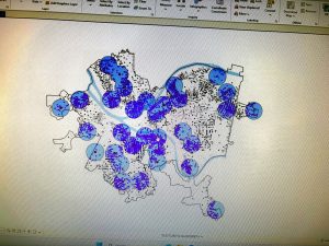
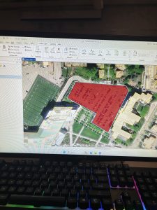
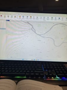
Chapter 6:

In the prior chapter, we learned about mapping inner contents. This chapter covers mapping nearby areas. People define distance as a measurement (think inches, feet, and miles), while others measure it by cost. The best method for your analysis entirely depends on a couple of things. Maybe you want to use list, count, or summary (discussed in previous chapters). Or you might want to know how many distance ranges you’ll need. There are 2: inclusive rings, used to find the total increase as the distance rises. The other includes distance bands, used for when you want to compare distance to different characteristics. How do you find what’s nearby, though? There’s straight-line distance, used to create boundaries or select features around an area. Cost over a network, which finds what’s within travel distance. Then there is cost over a surface, which not only measures distance but also calculates the area within a given range. Buffers create a boundary line to show what’s far away. To create one, the user defines the source feature (or features) and the buffer distance. The aftermath lets people see details in a given area. Special ones are used for finding multiple features. To find objects in several distance ranges, create multiple proximity zones. To pick features close to many objects, the user selects and tags the feature with a code. For features within several distance ranges, you select each object once for each distance. Feature-to-feature is great for tracking distance from a source object, which has its own use cases. There are several options when making a map for this case. Out of the many maps used in this chapter. The one that caught my attention the most was the spider diagram (not really a map, but close enough). It looks like a firework going off in multiple locations.

Grennell Week 3

Personal Summary

Chapter 4: 

In chapter four, the topic of mapping density is covered.  For context, in GIS, density is equivalent to concentration. By mapping areas of both high and low concentrations, it allows you to recognize patterns. After covering the Why the chapter transitions into the what.  It stares that in order to map density, “you can shade defined areas based on a density value or create a density surface.  ( This confused me because it didnt explain what each of them were.  So I did a little reasearch because I was confused and found that a Density surface is absically a gradient over a wide range while a density value is a bullentin point in a small area that gives specified values). It also talks about using GIS to map both points and lines. ( points make sense to graph but lines not so much, I tried to figure out what it meant but it just confused me more).  The last thing mentioned in the topic of “deciding what to map” was the topic of features vs feature values, Which was easy to understand since they gave examples for this one.  Mapping  features would be like mapping the locations of buisnesses while feature values would be like taking the number of emplyees at each buisness. The chaprer then tells two ways to map density, The first is by mapping a defined area (which is I think using Density value because the images show plots of a small region) in this method you can use a dot map to calculate density for each value. The other method is by density surface (ok I think I was right)  which is when each layer gets its own density which makes a gradient type look agross the entire map.

Chapter 5: 

The title of this chapter is “finding whats inside” (im gonna take a guess just by the title it might mention how to interpret the density and make sense of it when making a hypothesis) . The chapter starts off by exlpaining the importance of mapping out the inside of an area. It states that “people map what’s inside an area to monitor what’s occuring inside it, or to compare several areas based on whats inside each”. ( I think this is a common thing thats done in most ENVS/BIO type labs at this school. I never realized that GIS was so commonly used and I never knew what it was until this year).  An example that the chapter used to express the importance of mapping was by  monitoring drug-related arrests within 1,000 feet if a school. In doing so they would give harsher punishments to said dealers. The chapter then goes into “definng your analysis” ( I assumed correctly) .  It mentions that you can draw an area boundry on top of the features to help summarize them (this made no sense to me at all, but It could be because I havent done any actual GIS work yet).  The chapter also states that in order to analyze your data you have to conside how many and the type of features it contains.  (which makes sense because how can you hypothesize something whithout knowing what exactly your looking at). After further reading I think im starting to understand the boundries, I assumed it was no different then any other boundry and it isnt but its there to seperate a specified area from things not considered “in range”.

Chapter 6: 

Chapter six is titled “finding whats nearby”,  but covers things like defining your analysis, three ways to find whats nearby.  (this doesnt really make sense to me considering the last chapter was talking about setting boundries in order to cust things off, but now it wants you to also map whats around)? The chapter starts by explaing the “Why”, turns out its important because lets say your going to like walmart but theres a target close. By having the target pinged on the map it lets you know that theres also a target you could go too. (or at least thats how i interpreted this section of the reading). The chpater also talks about a method used to find whats nearby, the method they mentioned was measuring using straght line distance (is this like literally a straght line from A to B) by doing this they can gain an idea of measuring “nearness”. Another meathod that they said is measuring distance or nearness by travel cost (this was in context to traveling only though).  In the chapter it also talks about measuring whats nearby using either distance or cost,  it states that you can measure cost in terms of how long it will take to reach points A to B ( I was thinkning like cost as in $, this makes stuff so much more understandable) . The chapter also starts bringing up other topics that I didnt really take into account. For exampke if your measuring travel are you measuring the distance over a flat plane or using the curvature of the earth. ( If im being honest this did not cross my mind but it makes so much more sense to think of this. This makes me wonder if things like google maps uses a flat map or curvature to measure long disances).

Hutto Week 3

Chapter 4 

Chapter 4 explains the reasoning behind mapping density, as well as when it is important to map density, what to map and the two types of ways of mapping density. Density maps allow viewers to observe each individual feature of a map using a uniform areal unit of measurement, such as per square mile, per county, or per census tract. Census tracts are specific geographic regions defined solely for the purpose of conducting the census. When would a density map be used? One example could be: a local nonprofit wants to see which areas of the State of Ohio have a more concentrated homeless population using census tracts as a measurement, and so the nonprofit collects the data on the number of homeless individuals in each census tract, with the darker shade being the highest concentration of homelessness and the lighter shade being the lowest concentration. When choosing what to map, you can choose to map (1) the density features, which include the number of businesses, schools, parks, etc., or (2) to map feature values such as the number of employees at each business, the number of teachers per school, the number of trees per park, etc.. Density maps can be represented using a random distribution of dots on a map to show the concentration of particular features, or using a density surface, which is a raster layer that can show the number of features within a particular radius of cells. For example, if local law enforcement were mapping the density of individual crimes within a given area, a density surface could be used to show the concentration of higher occurrences of crimes in a given area and which areas crime occurs the least. When creating a dot density map, dots should not be so large that areas with higher density are obscured and difficult to interpret.


Chapter 5

Chapter 5 explains the reasoning behind “mapping inside” an area and its uses. Mapping inside requires you to draw a boundary around the area that you want to analyze. For example, if a construction company is trying to see which neighborhoods are more prone to flooding, the construction company may draw a boundary around a particular area of interest and see which properties are near floodplains or if floodplains intersect with certain areas to get a better sense of where to build. In the chapter, Mitchell also provides an example of a district attorney being able to draw a boundary to map out which crimes occurred and whether the crimes that occurred were within a certain radius of a school, which could lead to tougher criminal penalties. The chapter also touches on discrete and continuous features when mapping inside. Discrete features are easily identifiable features on a map such as roads, rivers, waterstreams, or even locations such as student addresses. Continuous features are represented using seamless geographical phenomena such as vegetation. For example, a geographer could represent the different types of soil using continuous categories. When mapping inside, a geographer may want to know which type of soil is within a 1000-square feet radius. When counting the number of features within a boundary, Mitchell states that you should include features that are partially within the boundaries inside of count and if you want to emphasize the different categories and features within a particular boundary, that you can use GIS to create an overlay that clips out the features and portions of categories that’s on the outside of a boundary that way you are left with a map of only the boundaries and all of the features and categories inside the boundaries being focused on. You can also create an overlay to where the features of the summary statistics you’re mapping are in color and the outer boundaries features are still present but in black and white to emphasize their nonimportance.


Chapter 6

Chapter 6 explains how to map what’s nearby. Similar to the last chapter, you could draw a circle around a particular area of interest to see what is all within the boundaries. Chapter 6 explains that while doing that, you can also map what’s nearby based on the distance specified from one area to another as well as the travel costs. How can this be done? Mitchell explains that this can be done using a simple straight-line distance. For example, if Starbucks executives were looking to see which grocery stores, parks, or recreational centers are nearby and how far, the distance from each of the locations could be represented using a straight line which could represent a mile or 2 miles, etc. Travel costs could also be measured when looking at what’s nearby. To calculate the travel cost, Mitchell points out that you would need to use GIS, assign each street segment with a cost. To do this, you would need to find the per unit cost (for example, labor and fuel costs) and then multiply that by the length of each street segment. You can also measure the travel time for each street segment or block while considering the speed limits for each street segment and multiplying the length of each segment by the speed limit. This is the formula the chapter provides for calculating travel time: “minutes = length / ((mph * 5280) / 60)”.

McMahon Week 3

Chapter 4:

Mapping density is important for identifying patterns such as how much crime has occurred in a specific area. Before mapping, identify the features and the information that the map needs, this information will be useful for the viewer. There are two ways to map density: mapping features, which can be mapping businesses, or feature values, which can be the number of employees in a business. The information presented can be important depending on the views intention with the information. One way the chapter identifies mapping density is by using a dot map. The dot maps benefit the viewer because it can show the amount of features in an area with a given value for each dot so that the map is easier to read. Another way the chapter show density is by density surface. This confused me a bit because I’m not sure what the raster layer is and how that influences the density. The chapter also shows how lines can be interpreted for the length on the map. I thought it was interesting how the chapter gave examples of when density maps can be beneficial, such as population densities for census mapping, or employment  mapping for bus routes. In the section about what GIS does, I was a little confused on how the chapter used neighborhood. I am uncertain if it is used in the way of urban living, people close together, or in other type of understanding. And with that however, it made sense about how to calculate the density base on the amount of features recorded to the area mapped. I thought that calculating the cell size was an interesting part of the chapter because it used words like “smoother” and “courser” to describe the patterns. I also thought the math equation was helpful.

Chapter 5

This chapter begins by stating the importance of analyzing if you’re using a single area or more than one to map your data. There are many different kinds of single areas but they are just a set area. However in multiple areas, you are able to compare more. I thought the examples were useful for this section. A key word was a continuous which means that the values continue overtime and examples are temperate, elevation, and precipitation. The chapter also goes into the different kinds of data plotting such as using  lists, counts, or a summary. I also found the visuals to be helpful in this section as well. I thought it was interesting how the chapter showed  layering GIS to show levels of importance. When selecting the features for inside an area, you need the have the dataset with features and the areas, as well as anything else that needs to be summarized. Whereas, overlaying GIS combines area and features to compare the layers and calculate a summary. This also includes having the features with area and the database, as well as anything that needs to be summarized. I thought the chart did a good job of explaining the pros and cons of each method and gave a list on the features needed. The chapter goes into a step by step process on drawling the lines and features. This includes a key method of being able to easily identify the features that are inside the area. It goes on the state that the features can be used by a single symbol, or be symbolized by category or quantity. Then draw a thick-black lines around the area  the distinguish the area. You can use the GIS to make a report about different features. Later in the chapter, some key words such as count and frequency were used. Count meaning the total number of features inside an area. And frequency is the number of features in a given value.

Chapter 6

Mapping nearby can be important for city planning and notifying residents of certain structures. This can also help traveling range which is beneficial to define area served by faculty. Defining the distance around your features can be helpful in determining with method to use. Nearness can be measured by distance and cost. Cost includes time, effort, and money. The maps helped me in determining the difference between these key words. The chapter also points out the importance of measuring a flat plane, or taking the Earth’s curvature into consideration if it is over a long stretch of land. Another key detail to put into consideration is to analyze if there needs to be a list, count, or summary. I understood the chapters use of counts, however, I was a little confused about the lists and summaries. A key term from the chapter was inclusive rings which are used to find out the total amount increased as the distance increasing. Another key term is distinct bands which are used to compare distance to other characteristics. The chapter also laid out the three ways in which you can locate what’s nearby. One way is the straight-line distance which is reliant on the specificity of the source features and the distance and then the GIS finds out the features surrounding with the distance. Distant or cost over the network  is when the source locations are laid out along with distance or travel cost. And lastly the cost over a surface is when you specify the location of source features and travel cost. I like the way that the chapter points out what is needed for each kind and lays out its pros.

Sisler Week 3

Mitchell Chapter 4-

There are two ways to map density: by defined area and by density surface. You can map density by defined area using a dot map, where dots are randomly placed within the defined area to represent a certain number of features. These dot density maps show density graphically, rather than showing the actual density value. These kinds of maps are generally easier to read; however, the user has to make sure the dots are an appropriate size to not overlap and hide the pattern. Mapping density by defined area is normally displayed as a shaded map of the areas, with a range of colors. The density value applies to the entire area and may vary in that shaded region. 

The second method of mapping density is by density surface. Density surface maps are created as a raster layer; each cell has a density value. This approach is more detailed but does require more effort. You can create a density surface map from locations, sample points of data, crimes, or even bird nests. A cool type of density surface map is a contour map, which compares all the density values within a certain defined radius. From that compared value, the point is then given the average and shaded to that average. The cell size of the map determines how coarse or fine the patterns are. If you want the map to be smooth, the cell size needs to be smaller, but the process will take a long time to process. To find the cell size, you have to convert density to cell units, divide by the number of cells, and take the square root. When displaying the density surface map, you have to be careful how you classify the values, whether that be natural breaks, quantile, equal intervals, or standard deviation. Each grouping shows a different pattern in the densities. 

Mitchell Chapter 5-

I found it interesting that people map things to know what’s inside the area to monitor things like crime, or to compare many areas based on what’s inside of them. The data can be of things in a single area, or multiple surrounding areas. There are two types of features that reside inside an area, discrete and continuous. Discrete features are unique, where you can count them. Where continuous features represent geographic phenomena, like vegetation type. The information that you want portrayed from the analysis can tell you a lot. For example if you want the features to be completely, or partially inside an area, or if you want the surrounding area to be highlighted. The different types of mapping these features can tell you different things. 

There are three ways of finding what’s inside an area. The first is drawing areas and features, it’s quick and easy but only visual. This makes it harder to get information about the features inside. The second is selecting features inside the area, this is good for getting information inside a single area, but not several areas. The last method is overlaying the areas and features, which is good for showing what’s inside several areas, but takes more processing. After selecting the best method and creating a map, you can use the GIS to create a report of the features. A numeric attribute can be a sum, average, median, or standard deviation. When drawing features and highlighting them you can have the non highlighted parts be gray, or a lighter version of the features inside. The second option provides some information about what the features are. When overlaying areas, you can summarize the features by area. You can also summarize by category or value, it is important to account for variations in the areas. When making a map with overlaying areas on areas, it is important to look for slivers, and merge them with the adjacent larger areas. 

Mitchell Chapter 6-

This chapter focused on what’s nearby on the map. It discusses the importance of traveling ranges, and how to measure different ways to travel. A person would want to see what’s nearby for specific reasons, one of them could be to see how long it would take for police or firefighters to respond. 

To find what’s nearby there are a few different ways to measure distance. One of the methods is measuring what’s nearby, this can be measured by cost or distance. When measuring response time, you would want to measure by time, not distance. When measuring distance there are two different ways, the planar method and the geodesic method. When measuring smaller areas its best to use the planar method, and when measuring large areas like a continent its best to use the geodesic method. When measuring using the straight line distance, it’s good for creating boundaries, or setting distances around a source. When mapping for distance travelled,  its good for finding what’s within a travel distance of a fixed area/network. Mapping cost is good for calculating travel cost over land like forest or roadways. When displaying the information from several sources, there may be areas of overlapping distances or features labeled. If a spider diagram is used it is easy to see the features (like customers) that are in a certain distance from the source (like stores). A network layer is a geometric network composed of edges, junctions, and turns. You can set travel parameters, and costs to each road, turn, or stop sign. This means that you could set costs to turns, intersections or individual segments.When setting a cost, you have to create a turntable. When you create a boundary, you can find what’s inside the boundary by using information from chapter 5. You can compare distances of rings surrounding a source.

Bailey Week 3

Chapter 4: Showing How “Crowded” an Area Is (Density)

Density mapping is a way to show where things are bunched tightly together and where they are spread out. When comparing different regions on a map, looking purely at simple totals can be misleading because map regions—like countries, states, or neighborhoods—come in all different shapes and sizes. A huge county might have a lot of houses simply because it covers a lot of land, while a tiny neighborhood might actually be far more crowded even if it has fewer total homes. Density maps solve this problem by looking at the concentration of items relative to the size of the space they occupy. The basic math comes down to dividing the total number of items by the amount of land area.

To show density, mapmakers choose from three main techniques depending on the type of information they have:

  • Coloring Pre-Drawn Regions: When information is already grouped by neighborhoods or counties, mapmakers paint the regions using different shades of color. Busier, denser areas get darker shades, while emptier places get lighter shades.
  • Creating “Heat Maps”: When mapmakers have exact point locations (like individual crime reports or store addresses) or line features (like roads or rivers), they create a smooth, continuous background grid. This works much like a weather map showing hot and cold zones. The mapmaker controls how detailed this grid looks by picking the size of the grid squares (cell size) and deciding how far out the system looks around each spot to calculate crowding (search radius).
  • Using Dot Patterns: This method drops simple dots inside a boundary, where each dot stands for a set amount (for example, one dot representing two birds). The dots do not mark the actual, exact spots where those items exist in real life. Instead, they serve as a visual trick: where the dots are clustered tightly together, the map reader instantly knows the area is crowded, and where the dots are scattered, the area is mostly empty.

Chapter 5: Stacking Map Layers and Counting What’s Inside

A major part of working with maps involves focusing on specific locations and seeing how different layers of information overlap. If a mapmaker wants to highlight a single neighborhood to track what happens inside it, they can draw a thick, bold line around its border or shade it in. To make that target neighborhood stand out clearly, they might fade out the surrounding background using light colors or subtle patterns, or draw important features directly over top of the background. Mapmakers also frequently build buffers, which are simply perimeter zones drawn around a feature—like drawing a 1-mile circle around a school to show its immediate neighborhood.

When answering complex questions, mapmakers stack different thematic map layers directly on top of each other, much like placing transparent sheets on top of a light table. Stacking layers allows you to compare different datasets, see which features fall inside specific boundaries, and figure out how much of a feature sits within a target area. During this process, map tools can instantly run helpful summary math on the items captured inside an area:

  • Counting: Tallying the total number of items found inside the boundary.
  • Categories: Counting how many items belong to a specific group (like counting how many oak trees are in a park compared to pine trees).
  • Totals and Averages: Adding up numerical values or finding the typical average amount for items in that zone.
  • Middle Values and Spreads: Finding the exact midpoint value in a list of numbers (median) or seeing whether the numbers are mostly similar or wildly different (standard deviation).

Instead of using crisp geometric shapes, mapmakers can also perform layer stacking using a pixel grid layout. In this grid approach, the system simply counts how many pixel squares fall inside a specific area to measure coverage.

Chapter 6: Measuring Distance and Travel Effort

Proximity analysis looks at what exists nearby a key spot. In the real world, measuring how close something is involves much more than drawing a straight line with a ruler. True “distance” (traveling range) depends on three key real-world factors: physical space, time, and financial cost. To measure how close things really are, mapmakers use three primary approaches:

  1. As-the-Crow-Flies Distance: Measuring a straight line through the air from Point A to Point B.
  2. Street Network Distance: Measuring travel along real connected roads and turn-by-turn routes.
  3. Real-World Cost Distance: Measuring movement across actual terrain while taking obstacles and friction into account, such as steep hills, severe weather, or rush-hour traffic.

Mapping actual travel costs—like measuring how long a trip takes when bad weather slows down traffic—gives a far more accurate picture of a store’s true customer area than just drawing a simple physical circle on a flat map.

To display distance clearly, mapmakers use three main visual styles:

  • Distance Rings: Concentric circles drawn outward from a central point, showing set distance steps (like 1-mile, 5-mile, and 10-mile radiuses).
  • Spider Diagrams: Connecting lines that radiate out from a central hub to several destination points, creating a pattern that looks like spider legs.
  • Distance Grids: A background grid where every individual pixel square knows its exact calculated distance to the nearest key location, making it easy to generate dynamic borders.

week 3 Jefferson

Chapter 4

Mapping density is crucial for maps, as it shows you where the highest concentration of a feature is. Density maps are also useful when observing patterns and mapping areas of different sizes. Using these maps allows you to measure the number of features with areal units (ex: hectares/square miles); this is a valuable feature so that distribution over area can be seen adequately. Density maps become very helpful when you are trying to map census tracts or countries since they vary in size.
To map density, you can shade areas based on density value, or you can create a density surface. Different density features can include locations of businesses, crimes, and numbers of employees.
Dots can be used to represent the density of the locations (specifically individual locations). The dots will represent a certain number of features (ex: one dot may be 2 birds). The closer together the dots are, the higher the density is.
To calculate the density: divide the total number of features by the area of the polygon
A density surface is created in the GIS and is created as a raster layer. A density surface can be made from individual locations or linear features (roads/streams).

Methods:
Make a density map by area if the data you have is already summarized by area.
Make a density surface if you have individual locations (sample points and lines).

Dot density map:
This is a map that uses dots to represent a total count or amount based on how much each dot represents
The dots don’t represent the actual locations
Used for quicker reads of the map
Represents density graphically
Cell size: determines how the patterns show on the maps.
Search radius: This affects how many patterns will show up on the maps.

Chapter 5
Single area: A single area makes it so you can monitor activity.
Buffer: defines a distance around a feature
Discrete features: are identifiable features (locations and linear features)

Overlaying areas and features creates a new layer that has the attributes of both of the layers. Overlaying can also be used to compare the two layers. This can be helpful when trying to find which features are in each of several areas or finding how much of a feature is in one or more areas. To do this, you need data within an area (a dataset with features) that includes all the attributes you want to summarize.

To see which areas are discrete, you can shade the outer area with a lighter color or draw the boundaries of that area’s features on top. By doing this, you can emphasize the features inside the area. Another option is filling out the outer area with a pattern or a translucent color. If you are shading discrete areas

To map a single area, you can shade the area in or use a thick line to show the boundary.
Count: the total number of features inside an area.
Frequency: the number of features that are in a given value.
Sum: the total number/overall total
Average: the total of a number divided by the number of features
Median: the value in the middle of the range
Standard deviation: the average amount of values

Raster method: this method combines raster layers. The GIS will compare each cell with the area layer that corresponds to the layer containing the categories. The number of cells is counted for each category within each area.

Chapter 6

This chapter how to find what happens within a distance on a map. It explains the importance of traveling range, how to define and measure what is near, and how to measure travel.

Traveling range: A measured distance (measured by space, time, and cost)

If you want to find what is nearby on the map, then you can calculate a straight-line distance. Or you can assess the cost over a net distance, or assess the cost across a surface. These are different methods that can be used. Sometimes the features that surround a certain area may already be within the area of influence.
Distance is used to know how close something is to another thing. To find what is nearby, you can use cost. A common cost is time, and time can be used to find what is nearby. An example would be that it takes longer for a customer to get to a store because bad weather impacts traffic. When considering travel, you can map what is nearby by distance or cost. The most accurate way to do this is to map travel costs.

Inclusive rings: Circles that encapsulate a certain distance
Spider diagram: looks like a spider; the GIS draws lines to two or more sources with a similar location
Distance surface: used to make buffers at specific distances

Redman week 3

Chapter 4:

Mapping density in GIS shows concentration of features. When a data set contains many individual points, looking at the map can become confusing. A density map helps this by calculating the features in one unit of an area, such as businesses per square mile. This allows you to compare density in areas of different sizes. Density maps allow for pattern recognition for concentration, which has many practical uses.

The two main approaches to mapping density are defined areas and density surfaces:

Mapping by defined areas uses established boundaries and uses the formula pop_density=total_pop/(area?27878400). Defined areas can be mapped by either shaded fill maps or dot density maps. Shaded fill maps use a range of colors to display density ratios across an entire polygon. In dot density maps, each dot represents a specific number or amount of what you want to map. Dots are randomly placed within the defined area, not showing the true location. Closely packed dots show high density.

Mapping by density surface provides a detailed, continuous representation of concentrations without relying on established borders. A density surface is created as a raster layer. GIS looks at the features within a specified neighborhood around each cell to calculate density value.

The way that a density surface looks depends on many GIS calculations. Search radius is the parameters of the location examined. A smaller search radius yields a more local variation and more details, while a larger search yields more features. Cell size determines how fine or coarse the pattern will appear. Smaller cells make for a smoother pattern, but require more time and storage, while larger cells put less strain on the computer, but look coarser. In the calculation method, the simple method counts features of the search equally, making overlapping rings, and the weighted method uses a mathematical function to produce a more precise surface.

After the calculation, density surfaces are displayed using graduated colors to distinguish contour lines, which connect points of equal density on top of the map using equal interval spacing to make for easier reading


Chapter 5: 

This chapter focuses on identifying graphic features in a boundary line. Understanding what is inside an area helps people monitor local activities, predict outcomes, or compare multiple areas in a region. GIS can present this information in list, count, or summary form. It often uses tables, bar charts, or pie graphs to display statistics. 

There are three methods for finding and mapping what is inside a geographic boundary: drawing areas and features, selecting features inside an area, and overlaying areas and features. 

For drawing areas and features, you place a boundary over features to see what falls inside or outside the space. This method is fast, but lacks detailed calculations.

Selecting features involves you specifying the area containing the features, then GIS selects a subset of the features inside the area. It is good for getting a list or summary of features inside a single area, and finding a distance from a feature, but does not tell you what is in each area, only all areas together. 

Overlaying the areas and features is more detailed. It involves combining the area and features into a new layer. It is useful to find features in specific areas. It is good because it provides more detail, but it requires more time and effort.

Choosing which of the three methods to use depends how much detail you have. All three methods have their pros and cons, and you get out of it what you put in, as with many other methods in GIS.


Chapter 6: 

This chapter discusses mapping what is nearby. This allows for identification of features or areas affected by an event. Finding what is nearby is helpful when analyzing travel ranges and proximity surrounding a source feature. An example of this is when a fire department calculates how long it will take to get to a specific street to narrow down response time of calls. 

Nearby measurements are calculated by using travel cost or physical distance. Cost represents the around or resources it takes to move between two points. Time, energy, money, and effort can all be calculated into this. Before you analyze nearby features, you have to choose if you want to apply the planar or geodesic measurement method and decide how to display the data. The planar method treats the earth as a flat surface, which can work for smaller areas, while the geodesic measurement takes into account the curvature of the earth, which is better for large regional areas. Once distances are calculated, GIS can summarize the attributes using inclusive rings, which show how feature counts accumulate as distance increases, or distinct bands, which display differences in feature amounts within separate distance intervals. Results can be displayed using buffers, which create defined zones at a specified distance to establish a service area.

There are three ways to find what is nearby. The first is straight-line distance, which measures direct distance between two points without taking into account any obstacles. This is the simplest approach and it works well for establishing fixed boundaries, but is highly unrealistic for travel

The second method, Distance or cost over a network, measures travel along established paths. This is more realistic as it provides an attainable path of travel and gives a more accurate travel time, such as increasing the time when the physical distance remains unchanged. 

The third method is cost over a surface. This one measures overland travel across a continuous geographic surface rather than roads. This method assigns differing travel costs to different landscapes to account for terrain difficulty, which allows for more accurate wildlife tracking or planning off road rescue routes across landscaped with inconsistent terrain.

Choosing a method depends on what data you need and whether you are measuring boundaries, road travel, or overland movement.

MaBailey Week 3

Chapter 4 demonstrates mapping density, which helps understand where things are concentrated. A density map shows where there are higher and lower concentrations of the features being searched for. This is especially useful when a dataset contains so many points that looking at individual locations becomes confusing. For example, a regular map could show the locations of hundreds of businesses, but a density map makes it easier to recognize which parts of a city have the greatest concentration of businesses. Density also makes it easier to compare areas of different sizes because values can be expressed using a consistent unit, such as businesses per square mile.
There are two main approaches to mapping density. 1.) Is defined areas, EX.) counties, ZIP codes, census tracts, or watersheds. How to calculate a density value. Density = number or amount of features ÷ area
Then there is a dot density map, each dot represents a certain number or amount of something. Instead of locating each actual person, one dot might represent 100 people.
2.) Density surface. A density surface is generally created as a raster layer made of cells. GIS looks at the features within a specified neighborhood around each cell and calculates a density value. This creates a continuous looking surface showing areas of high and low concentration.
The search radius is important because it affects how the final pattern looks. A smaller radius reveals more local variation, while a larger radius produces a smoother and more generalized pattern. The density surface can then be displayed with graduated colors or contours.
Density maps allow you to see patterns of concentration. The method you choose should depend on your data and the question you are trying to answer. Mapping by defined areas is useful for comparing established geographic units, while a density surface provides a more detailed picture of where concentrations actually occur.

Density- The number or amount of something within a specified amount of area.
Density map- A map showing where features or values are highly or lightly concentrated.
Defined area- An area with established boundaries, such as a county, census tract, watershed, or ZIP code.
Dot density map- A map where each dot represents a certain number or amount of something.
Density surface- A continuous-looking representation showing concentrations across an area.
Raster- Geographic data represented as a grid of cells.
Cell- An individual square within a raster dataset that stores a value.
Search radius- The distance around a location that GIS examines when calculating density.
Concentration- The degree to which features are grouped within an area.
Areal unit- A standard unit of area used to calculate density, such as acres or square miles.
Centroid- A point representing the center of a geographic area.
Contour- A line connecting locations with the same value.
Generalization- Simplifying geographic information to show broader patterns.

Chapter 5 focuses on what is inside a particular area. people need to know which geographic features are located within a boundary. Data about what’s inside can be used either to monitor or to compare multiple areas based on the features that are being searched. EX- Environmental scientists could determine which streams, wetlands, forests, or animal habitats occur inside a protected area. Emergency managers could determine which neighborhoods fall within a flood zone. Police departments could compare the number of crimes occurring within different districts.
The chapter demonstrates three ways of finding what’s inside. 1- Drawing/selecting an area boundary over geographic features. This allows you to visually see what is located within the area. It typically does not provide detailed calculations.2- Selecting features within the boundary. GIS can identify those features and allow you to examine them. EX. You could select all businesses within a developed district and calculate how many employees might work at the various businesses within that district and boundary. .3- Overlaying areas and features. Overlay combines layers so GIS can calculate more detailed information about their spatial layouts. This is especially useful when features cross the boundary. EX. a forest might only be partly inside a protected area. Overlaying the layers allows GIS to determine how much of that forest actually falls within the boundary. Mitchell gives a similar example of using overlay to calculate different land cover types inside protected areas. GIS can identify, summarize, and compare features based on whether they occur within a particular geographic area.

Inside- A spatial relationship in which a feature occurs within the boundary of another feature.
Boundary- The line defining the limits of a geographic area.
Selection- Identifying specific features that meet geographic or attribute requirements.
Overlay- Combining geographic layers to examine how their features overlap or relate.
Spatial relationship- The geographic relationship between two or more features.
Layer- A collection of similar geographic information displayed together in GIS.
Polygon- A closed geographic shape representing an area.
Buffer- An area created around a geographic feature at a specified distance.
Administrative boundary- A human-created boundary, such as a county, state, school district, or police district.
Clip- A GIS operation that removes features or portions of features outside a boundary.
Summarize- To calculate information about a group of features, such as their number, total area, or average value.

Chapter 6 is about finding what is nearby a geographic feature. EX. Environmental managers could identify land within a certain distance of streams to protect water quality. Emergency services could determine which streets a fire department can reach within a certain amount of time. Businesses could also determine how many potential customers live within a certain driving time of a store. There are three major ways of measuring nearness, straight-line distance, distance or cost over a network, and cost over a geographic surface.
Straight-line distance is the simplest method. It measures the direct distance between features without considering roads, barriers, terrain, or other factors. Buffers are commonly used with this type of analysis. Straight-line distance is not realistic. EX). If you’re studying how quickly an ambulance can reach a house, the ambulance cannot simply travel in a straight line across buildings and rivers. It has to follow roads. That is where network analysis becomes useful. A network represents connected paths such as streets. Cost does not only mean money. A travel cost can be time, distance, money, or effort. For example, traffic increases the time required to reach a location even if the physical distance stays the same.
Cost over a geographic surface. Instead of only roads, GIS assigns different travel costs to different areas of the landscape. This is useful for things such as wildlife movement or determining the easiest route across terrain.Two locations may be physically close together but difficult or time consuming to travel between. Choosing the appropriate measure of nearness makes the analysis much more meaningful.
Nearby- Features occurring within a specified distance or travel range of another feature.
Proximity- How close one geographic feature is to another.
Straight line distance- The shortest direct distance between two locations.
Buffer- An area created at a specified distance around a point, line, or polygon.
Source feature- The feature from which distance or travel is measured.
Travel range- The area that can be reached within a specified distance, time, or cost.
Network- A connected system of paths, such as streets, railroads, or pipelines.
Network analysis- GIS analysis involving movement along connected routes.
Travel cost- The amount of time, distance, money, or effort needed to move between locations.
Cost surface- A geographic surface representing how difficult or expensive it is to move through different locations.
Service area- The geographic area that can be reached or served by a facility.
Area of influence- The surrounding area that may be affected by a geographic feature or activity.
Distance-The amount of space separating two geographic locations.
Geographic surface- A representation of values that vary continuously across an area..