week 3 Jefferson

Chapter 4

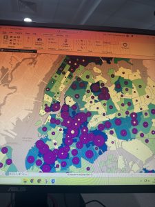
Mapping density is crucial for maps, as it shows you where the highest concentration of a feature is. Density maps are also useful when observing patterns and mapping areas of different sizes. Using these maps allows you to measure the number of features with areal units (ex: hectares/square miles); this is a valuable feature so that distribution over area can be seen adequately. Density maps become very helpful when you are trying to map census tracts or countries since they vary in size.
To map density, you can shade areas based on density value, or you can create a density surface. Different density features can include locations of businesses, crimes, and numbers of employees.
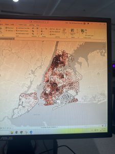
Dots can be used to represent the density of the locations (specifically individual locations). The dots will represent a certain number of features (ex: one dot may be 2 birds). The closer together the dots are, the higher the density is.
To calculate the density: divide the total number of features by the area of the polygon
A density surface is created in the GIS and is created as a raster layer. A density surface can be made from individual locations or linear features (roads/streams).

Methods:
Make a density map by area if the data you have is already summarized by area.
Make a density surface if you have individual locations (sample points and lines).

Dot density map:
This is a map that uses dots to represent a total count or amount based on how much each dot represents
The dots don’t represent the actual locations
Used for quicker reads of the map
Represents density graphically
Cell size: determines how the patterns show on the maps.
Search radius: This affects how many patterns will show up on the maps.

Chapter 5
Single area: A single area makes it so you can monitor activity.
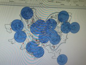
Buffer: defines a distance around a feature
Discrete features: are identifiable features (locations and linear features)

Overlaying areas and features creates a new layer that has the attributes of both of the layers. Overlaying can also be used to compare the two layers. This can be helpful when trying to find which features are in each of several areas or finding how much of a feature is in one or more areas. To do this, you need data within an area (a dataset with features) that includes all the attributes you want to summarize.

To see which areas are discrete, you can shade the outer area with a lighter color or draw the boundaries of that area’s features on top. By doing this, you can emphasize the features inside the area. Another option is filling out the outer area with a pattern or a translucent color. If you are shading discrete areas

To map a single area, you can shade the area in or use a thick line to show the boundary.
Count: the total number of features inside an area.
Frequency: the number of features that are in a given value.
Sum: the total number/overall total
Average: the total of a number divided by the number of features
Median: the value in the middle of the range
Standard deviation: the average amount of values

Raster method: this method combines raster layers. The GIS will compare each cell with the area layer that corresponds to the layer containing the categories. The number of cells is counted for each category within each area.

Chapter 6

This chapter how to find what happens within a distance on a map. It explains the importance of traveling range, how to define and measure what is near, and how to measure travel.

Traveling range: A measured distance (measured by space, time, and cost)

If you want to find what is nearby on the map, then you can calculate a straight-line distance. Or you can assess the cost over a net distance, or assess the cost across a surface. These are different methods that can be used. Sometimes the features that surround a certain area may already be within the area of influence.
Distance is used to know how close something is to another thing. To find what is nearby, you can use cost. A common cost is time, and time can be used to find what is nearby. An example would be that it takes longer for a customer to get to a store because bad weather impacts traffic. When considering travel, you can map what is nearby by distance or cost. The most accurate way to do this is to map travel costs.

Inclusive rings: Circles that encapsulate a certain distance
Spider diagram: looks like a spider; the GIS draws lines to two or more sources with a similar location
Distance surface: used to make buffers at specific distances

Week 2 Jefferson

Chapter one

GIS can be used for more purposes than building geodatabases and making maps. Most notably, it can be used to address pressing issues and world problems. GIS is used to look at geographic information/patterns in data and address relationships between features. The features can be quite simple, and they can also be quite complex. To begin, you must start with an analysis; to do this, you need to figure out the information needed. It is important to be as specific as possible with your question. Next, you must understand the data to be able to decide the method you use. Once you have your method, you can process the data to then be able to interpret it.

Discrete features: have locations and lines, and the actual location can be pinpointed at any given spot.
Continuous phenomena: precipitation or temperature that can be found or measured anywhere. This will blanket the whole area that we are mapping.
Continuous data: often begins with sample points that can be regularly or irregularly spaced out. It can also show areas closed in by boundaries if everything inside the boundary is the same.
Features summarized by area: can represent the counts or density of individual features that are in certain boundaries. An example mentioned by the book is the number of businesses in each zip code and the total length of streams in each watershed, and lastly, the number of households in each country.
Categories: groups of similar characteristics/things.
Ranks: ranks features from high to low, mainly used for direct measures when they are difficult or if the quantity represents a combination of factors.
Counts and amounts: a count shows the true number of features on a map. The amount is any quantity associated with a feature that is measurable.
Ratio: shows the relationship between two different quantities.
Continuous and non- continuous values: counts, amounts, and ratios are continuous values.

It seems like you have to be very careful and technical with how you use GIS. One part that I read talked about cell size: if you use a cell size too big, some information can be lost, and if you use a cell size too small, then it takes up too much storage space.

Chapter two

Maps are used to see where and what a certain feature is. If you look at the allotment of features on the map, you can notice patterns that better help you understand the area that is being mapped. GIS can be used to map the location of different features to see if certain features occur in the same place. The book gives examples of businesses mapping customers by age, a police station creating maps based on crimes that vary in type, or seeing if assaults and thefts happen in the same area.
When planning a map, make sure that geographical coordinates are assigned and that each feature has a different category. Each feature needs a code that is unique to that feature. The GIS will store the location of all the features with a pair of geographic coordinates that will define their shape(line or area). Symbols will be assigned to the features as you specify them.
For linear features (streets), the GIS will draw lines to connect the points of interest that define the shape of each street. For areas like land, the GIS will draw the outline, or it will fill them in with a certain color or pattern.
When dealing with a subset of features, it is important to map the features in a data layer. Mapping within subsets is more commonly used with individual locations.
It is important when mapping an area that is large area to have fewer than seven categories. This makes it easier to see patterns. And if there are more than seven categories, then grouping some of the categories will help lessen the initial number.
Freeways are often drawn wider than highways.

Chapter three

Maps show location, but to add more factors to elevate the amount of information that a map shows, you can add different features based on quantities. Some features that can be mapped are: discrete features, continuous phenomena, and data summarized by area.
Quantities can be: amounts, ratios, or ranks.
When summarizing by area, if you use counts or amounts, they can skew the patterns if the areas happen to vary in size
The most common ratios are averages, proportions, and densities
Proportions: show you what part of a whole each quantity represents and are often shown as percentages.
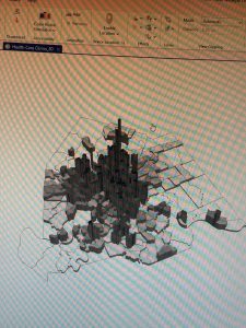
Densities show you where the features are concentrated. (value/area=value per unit of area). Density is used to show distribution for the areas that are being summarized
Ranks put features in order from high to low. Ranks are used to show relative values instead of measured values. Sometimes direct measurements may be hard. Ranks also tend to be mapped as individual values. Also, it is worth noting that you should assign one symbol for each rank. And if you have too many ranks (more than seven), put them into classes.
Classes: Classes are counts, amounts, and ratios grouped. Using classes is helpful when the map is used for public discussion since it makes the viewer able to compare areas more quickly. How you decide to define the class will determine what features fall into each class and what the map will look like.
Individual values: Individual values can present a clear picture of data since the features are not grouped. If you map individual values, then you can search for certain patterns in the raw data, this can help if you are unfamiliar with the data or the area that you are mapping when looking for subtle patterns in the data.
Natural breaks: a classification that finds groups and patterns that are inherent in the data. The values in a class are probable to be similar, and the values between different classes are different.
Equal interval: each class has an equal scope of values (the difference between high and low values is the same for each class).
Standard deviation: “each class is defined by its distance from the mean value of all the features”

Jefferson Week 1

Finished GEOG 291 Quiz!!

Hello! I am Talia Jefferson. I am a sophomore and am majoring in Environmental Science. I love getting outside, taking walks, and watching different shows.

Before reading  Schuurman ch. 1 I was not aware of what GIS was/is. It was a term that I heard a lot last year and yet I never took the time to understand what it meant. When I have thought of GIS, my first thoughts were mapping, and now I know that is only a tiny part of what GIS does.  GIS began as a way for a landscape architect to make the most optimal route for a new highway. It began as a need for innovation and then eventually evolved.

I realized while reading I had heard the term GIS in National Geographic docs. I remember in the vidoes, GIS was used to reconstruct a visual of what land in an area looked like hundreds to thousand years ago. I always found this very interesting and a good use of tech. The visual reconstruction made it so the scientists could start to understand ancient life and practices to enhance our historical knowledge. It is always important to learn and understand the past, especially the parts of ancient history that is still left widely unknown. But this is not the only good GIS can do. The article mentioned GIS success in health, agriculture, development etc…

Gis is used to map an area to then analyze spatial data within location and other descriptions. Which is then used to for urban planning, tracking natural disasters/climate, used for businesses, resource management…all things that are important to help society function efficiently. Before reading this article I did not understand the importance of GIS. It was merely a word I heard from time to time and one I never put my thought into. Now I can appreciate the full extent of GIS and the science behind it while also learning how to use it in this class.

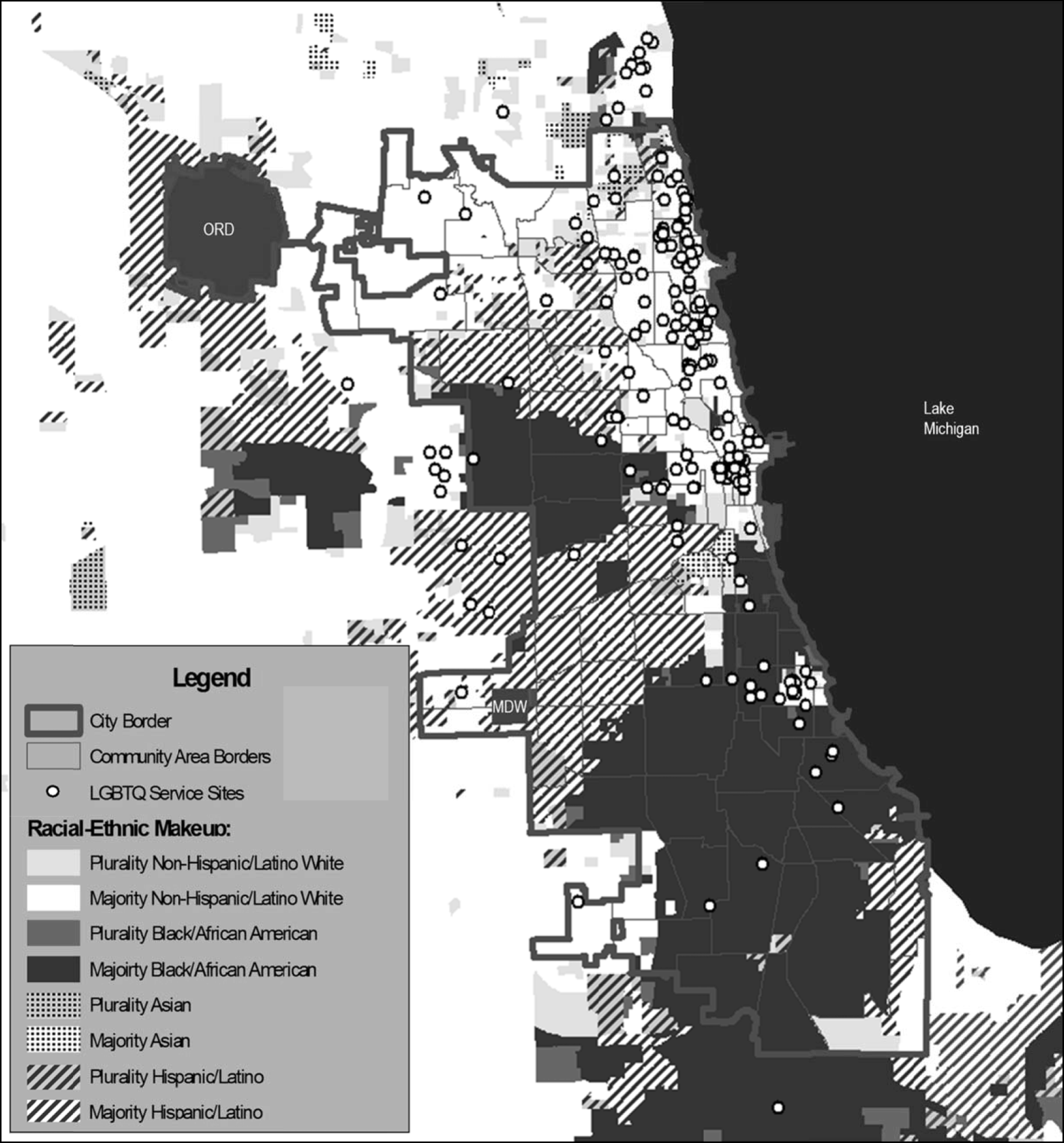
Fig. 1

This image represents three main areas that show the analysis of the spatial context of the services for LQBGTIA people that were disproportionately located in areas with less people of color and underrepresented in Black/African American and Hispanic/Latino groups.

Chicago LGBTQ service sites and race/ethnicity. Racial/ethnic data is based on the 2011–2015 American Community Survey estimates and presented at the block group level. ORD, O’Hare International Airport; MDW, Midway International Airport

Rosentel, K., VandeVusse, A., & Hill, B. J. (2019). Racial and Socioeconomic Inequity in the Spatial Distribution of LGBTQ Human Services: an Exploratory Analysis of LGBTQ Services in Chicago. Sexuality Research and Social Policy17(1), 87–103. https://doi.org/10.1007/s13178-019-0374-0

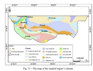
This image is a map of the climate in norther Iran. The purpose of the map is to plan for planting and restoration of the endangered lily in the northern part of Iran. More maps were preparied that then were overlaid in GIS software to separate suitable regions for planting vs non-suitable regions for planting. It was found that 19 suitable regions were compatible with the site condition of the species were queried in the GIS.

Eslami, A., Kaviani, B., Amini, M., Abari, K., & Hashemi, S. (2014). The use of geographical information system (GIS) to query the endangered lily [Lilium ledebourii (Baker) Bioss.] species for planting and restoration in the northern part of Iran. Indian Journal of Geo-Marine Sciences43(10). https://www.niscpr.res.in/jinfo/IJMS/IJMS-Forthcoming-Articles/BKP-IJMS-PR-Oct%202014/MS%202267%20Edited.pdf