Parks Week 3

Chapter 4:

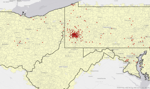
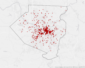
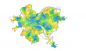
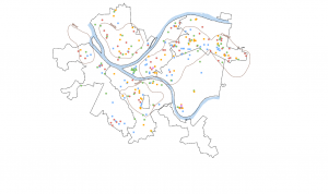
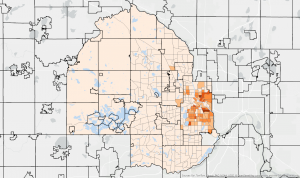
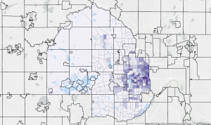
Chapter 4 discusses how to map density. Mapping density is important to show the concentration of features and their patterns. For density, the number features are measured in uniform areal units. As with other GIS methods, careful consideration must be taken when deciding what to map. You have to consider if the data is plots, lines, or data summarized by data. You also have to consider whether you are mapping features or feature values. There are two main ways of mapping density, mapping by a defined area and mapping by a density surface. When mapping by a defined area density of individual features summarized by defined areas and each dot represents a set number. It doesn’t represent the exact location, but it’s easier to read than having one dot per location. When mapping by defined area density is calculated using the areal extent of each polygon. Dot maps are often used for mapping by defined area. They are based on the total count and how much each dot represents. There are several factors to keep in mind when making dot maps, like dot size, how much each dot represents, and area size. When mapping by density surface, raster layers are used and the total of features are divided by area. These maps offer more detailed information but require more effort. When deciding how to display the map it is important to consider aspects like cell size and search radius. These factors are important for making sure that the data is displayed in a way to properly display the patterns. The colors used for classes and how the breaks for classes are assigned. This chapter was helpful for understanding how to map density and the uses of it. There were a few points in this chapter where I struggled to understand the technical stuff, so I hope things will become more clear when actually using the GIS.

Chapter 5:

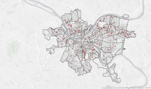
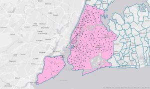
In chapter 5, the concept of “mapping what’s inside” is discussed. Mapping what is inside of a determined area is useful for monitoring what’s occurring inside it or to compare what’s inside several areas. There are several questions that need to be answered before deciding how to go about mapping. Are you finding what’s inside a single area or several? A single area lets you monitor activity or summarize information, while several areas lets you compare areas. Are the features inside discrete or continuous? Discrete features can be counted, listed, or summarized, while continuous features can be summarized. Do you need a list, count, or summary? The data needed is different if you want to get a list of all features, a total number of features or a summary of what’s inside of an area. Do you need to see the features that are completely or partially inside the area? Linear and discrete features may lie partially inside and outside of an area, so you must decide what to do in these situations. There are three ways to map what’s inside of an area. These include drawing areas and features, selecting features inside an area, and overlaying the areas and features. For drawing areas and features are drawn on top of features, which is good for seeing whether one or a few features are in an area. When selecting features inside an area you specify the area and the layer containing the features and selects a subset of features in the area, which is good for getting a list or summary of features in an area. When overlaying the areas and features the GIS creates a new layer with the attributes of area and features, which is good for finding which features are in each of several areas or how much of a feature is in one or more areas. This chapter did a good job at explaining what it means to map what’s inside an area.

Chapter 6:

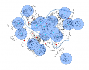
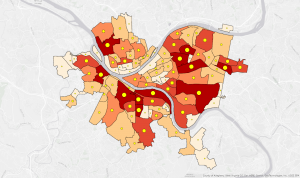
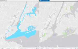
Chapter 6 discussed the concept of mapping what is nearby a location. When mapping what is nearby, you can find out what is occurring within a set distance of a feature, identify what’s affected by an event or activity, and understand the cost of travel. The cost can be in regards to distance, time, monetary loss, effort, or other costs. As it seems to be a common occurrence with this book, the chapter discussed questions that you must ask yourself before you begin mapping. Is what’s nearby defined by a set distance or by travel to or from a feature?  You should measure surrounding features using straight lines for distance or a geometric network using road data for travel. Are you measuring what’s nearby using distance or cost? Measuring by distance or cost can change the result significantly in some cases. Are you measuring distance over a flat plane or using the curvature of the earth? You should use the curvature of the earth for large areas. Do you need a list, count, or summary? It is important to understand what kind of data you need to achieve your desired map. How many distance or cost ranges do you need? You could have one range, inclusive rings, or district bands. The three ways to map what’s near a location are straight-line distance, distance or cost over a network or cost over a surface. When mapping straight line distance you specify the feature and distance and the GIS finds the area or features within the distance. This method is good for creating boundaries or selecting features at a set difference. When mapping distance or cost over a network you specify source location and distance/cost along a linear feature (like roads) and the GIS finds segments within distance/cost. This method is good for finding what’s within a distance/cost of a location. When mapping cost over surface you specify location and travel cost and the GIS creates a layer showing travel cost from feature. This method is good for calculating overland travel cost. Overall, I feel like this chapter thoroughly explained the concepts of mapping what is nearby a location and how it can be used. There were also some connections made to chapter 5, which I found helpful.

Parks Week 2

Chapter 1:

In chapter 1, some of the base information of GIS and data used for it were discussed. The general process for using GIS is detailed at the start of the chapter. The steps included were framing your question, understanding your data, choosing a method, processing your data, and looking at the results. These steps are important for ensuring that you are approaching your analysis correctly and choosing the right methods. The chapter also details the different types of geographic features: discrete features, continuous phenomena, and features summarized by area. Discrete features are where the presence of a feature can be determined at a specific pinpointed location. Continuous phenomena blanket the entire map and can be enclosed by boundaries. Features summarized by area get a count or density of features within an area’s boundaries. A lot of data is like this, but does not have precise location details. The differentiation between geographic features is important for determining how to analyze the data. Geographic features can either be vector or raster. For vector features, each feature is a row in a table and feature shapes are defined by x,y locations. Vectors are used for discrete features, data summarized by area, and continuous categories. For raster features, the features are represented by a matrix of cells in continuous space. Rasters are used for continuous categories and continuous numeric values. They can also be used for discrete features when layering. The chapter also discussed how geographic features can have different attributes. These attributes included categories, ranks, counts, and ratios. At the end, the chapter detailed how to work with tables when using GIS. Subsets of data are selected to work with or assign attributes values to. Attribute values are calculated to assign ranks, ratios, or averages. The attribute values can be summarized to get statistics. Overall, I felt that this chapter did a good job covering the basics of understanding geographic data usage in GIS.

Chapter 2:

Chapter 2 introduced some of the information needed to make quality maps. First, you need to decide what to map. Different maps require different types of information and different amounts of information, so you must decide what is right for the map you are trying to make. Considering how you will use the map will help you make this decision. To prepare your data to be mapped you have to make sure that the necessary geographic coordinates and categories are assigned. If the data come from the GIS database, then coordinates are likely to already be assigned. You can map a single type of feature or map by categories. When mapping by categories you can choose to group the categories. If you have more than seven categories, it is recommended that you group them into broader categories. However, grouping categories can change how the data is perceived by the reader, so be careful with how you group them. There are several ways you can group categories in the data. These include using two different codes to represent categories and subcategories, joining a detailed code to a general code after, and assigning symbols to various detailed categories that comprise each general category. When using symbols it is important to do it effectively. Use a single symbol for each individual location, but do not overcrowd the map. For linear symbols, using width and pattern differences are helpful for differentiating the symbols. You should also make the symbols for similar categories shades of the same color. If you are printing the map make the symbols larger and keep in mind that printers usually have better resolution than screen displays. It was also discussed in this chapter that adding reference features, like recognizable landmarks and roads, can help orient the reader. Adding relevant features, like adding store locations if you are mapping customers, can help add context to the map. Map reference features should be displayed in pale colors. When analyzing the patterns on your map, you may need to zoom in or out to see patterns, so keep that in mind when sizing the map. This chapter helped me understand important factors when making maps, especially in regards to using categories and symbols.

Chapter 3:

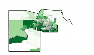
Chapter 3 discussed more important factors in creating maps, with a focus on quantities, classes, and map styles. It was again discussed how it is important to understand the goal of your map before making it. You need to consider what kind of data you are mapping. Are your data discrete features, continuous phenomena, data summarized by area? Understanding this helps you decide how to display the data. You should also consider if you are using the map to explore patterns or if you are presenting the data. When exploring you should show more detail to find patterns, but when presenting the map use generalized data to reveal patterns. There are several ways that quantities can be used in displaying data in maps. You can use counts, the actual numbers, or amounts, the total of value, to display discrete features or continuous phenomena, but not for summarizing by area. You can use ratios to show the relationship between two categories to even out differences between large and small areas to map more accurately when summarizing by area. Ranks can be used to put features in order from high to low and show relative values instead of measured values, which is  useful when direct measures are difficult. You can use classes to display your data in a way that is easier for viewers to understand. There are several classification schemes that can be used. These include natural breaks, which find patterns inherent in your data, quantiles, which compare areas of roughly same size, equal intervals, which use equal intervals to appeal to a nontechnical audience, and standard deviation, which shows if features are above or below average. Each of these schemes have their own advantages and disadvantages, so it is important to consider carefully which best fits the needs of your data. It is recommended that you only use 4-5 classes in your display. This chapter also discussed important choices needed in making the maps. Different types of data need to be displayed in different ways. Maps of discrete locations and lines should use graduated symbols, charts, or 3D views. Maps or discrete areas or data summarized by area should use graduated colors, charts, or 3D views. Maps of continuous phenomena should use graduated colors, contour lines, or 3D views. There are several things to consider when using these displays, like colors, sizes, intervals, and perspective, so care should be taken to make these decisions. Effectively displaying your data allows for patterns to be found most efficiently. I found this chapter to be helpful in understanding how the seemingly small features of maps can have a big impact on how they are interpreted.
 

Parks Week 1

*I have completed the GEOG 291 quiz and reviewed the syllabus*

My name is Brittney Parks and I am a senior at OWU. I am majoring in zoology and botany, with a minor in philosophy. I am planning to pursue a PhD. after I graduate this spring. On campus I am the secretary of the Women in STEM club and fundraising chair for the Women’s Rugby club. I have also been doing research with Dr. Gangloff for three years. I am hoping that being able to learn GIS will help me have a more diverse set of skills to assist me in my future research. 

Admittedly, I knew very little about GIS when I selected this course, I had just been told it would be a good skill to have. After reading this chapter I feel like I have a much better understanding of what GIS is. I had always just thought of GIS as an environmental science thing, so it was interesting reading about all of the interesting applications for GIS. I found it especially interesting that it can be used for researching the spread of infectious diseases and archeology. The example of John Snow’s application of visual intuition mapping to study the Cholera outbreak (Page 13) reminded me of how GIS could be used to study infectious diseases. I hadn’t considered that GIS could be applied to situations like that. 

This reading helped me understand the concepts and details of GIS better. The author discusses the difference between mapping, which is visually displaying geographic information, and spatial imaging, which generates information using geographic information. I was previously unaware of the different definitions of GIS, geographic information science (GIScience) and geographic information system (GISystem), but I think the reading did a good job of explaining it. To my understanding, GISystem is the development of tools and processes to analyze spatial data and GIScience is studying the theories and concepts related to spatial data. The author described it as “GIScience is the theoretical basis for GISystems” (Page 11). It was also interesting to read about the debate and discourse occurring within the GIS field. They are still trying to figure out how to define boundaries and categories for spatial entities. I found the examples of the boundary between the mountains and the foothill and the categorization of mountain elevation levels to be helpful in understanding this. Learning about how there is still debate within the field really highlights how it is still an actively growing and developing field. 

Application 1:

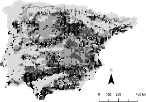
In this study, they used GIS to map out the presence of a viper species in the Iberian Peninsula in comparison to the suitability of the habitat in the area. Applications like this can be very important for wildlife conservation research.

Habitat suitability map is shown below.

Santos, X., Brito, J. C., Sillero, N., Pleguezuelos, J. M., Llorente, G. A., Fahd, S., & Parellada, X. (2006). Inferring habitat-suitability areas with ecological modelling techniques and GIS: A contribution to assess the conservation status of Vipera latastei. Biological Conservation, 130(3), 416–425. https://doi.org/10.1016/j.biocon.2006.01.003

Application 2:

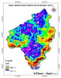
In this study, they used GIS to look at soil moisture across part of India and how it affects the agricultural capabilities in the area. Applications like this can be very important for fulfilling agricultural needs with the increase in drought conditions.

Soil moisture in the study area is shown below.

Saha, A., Patil, M., Goyal, V. C., & Rathore, D. S. (2019). Assessment and Impact of Soil Moisture Index in Agricultural Drought Estimation Using Remote Sensing and GIS Techniques. Proceedings, 7(1), 2. https://doi.org/10.3390/ECWS-3-05802