Bruner Week 3

Chapter 4

This chapter was all about how you would go about mapping density in GIS software. Obviously, with discrete points, you can observe density to some extent by looking at where a large amount of dots in a small amount of space are, but mapping specifically for density can give you a more specific understanding of which “dense” places are more or less so, rather than just identifying clusters. There are methods of mapping density that use dots randomly placed based on ratio per area by GIS, but this is also visually more accurate to look at than raw data, AND there are ways to make it more visually accurate, like processing this information in small areas.

There are many different ways to map density, including by area and with a density surface. Mapping by area can output a shaded fill map or a dot density map. This type of mapping is good for data that has already been summarized by area or that can be summarized by the GIS. However, it doesn’t pinpoint centers of density and can be very inaccurate for large areas because of this.

A density surface, which is created with the help of the GIS, is good for individual locations, sample points, and lines, so more discrete data. It can output a shaded or contoured map. Compared to mapping by area, it is more precise at pinpointing centers of density, but it requires more data processing.

For already defined areas, density maps can be in the form of dots or shades. As with everything, choosing one of these depends on what kind of information you are working with and what you want your map to convey. It is important to make the information you aim for as easily understood as possible.

Parameters to consider in density mapping are, cell size (if you are using a raster map), search radius, calculation method, and units.

Chapter 5

Chapter 5 was about graphic analysis and how to combine more than one layer of a map to create a map that can show correlation. Rather than focusing on physical features, this chapter talked about how to focus on occurrences in an area and can show viewers where attention is necessary.

There are two main ways to define your analysis, one being in separate layers, and another being a huge combined layer with all information in one.

Finding what’s inside a single area lets you monitor activity or summarize information about an area. This includes:

  • Service area around a central facility
  • A buffer defining distance around a feature
  • Administrative or natural boundaries
  • Manually-created area (for some sort of proposal)

For any of these when dealing with several layers of a map intersecting, you can choose to include all features that are even somewhat in your “boundary” layer, include only features that are fully in the boundary, or include parts of features whenever they show up in the boundary of the other layer. Which of these is chosen depends, again, on the map you are creating. It is best to create a map that makes it easiest to see features and important patterns, but from what the book described, this is a pretty intuitive process.

The GIS can place features that occur in both layers in a table, but if there are multiple areas within your data, it cannot recognize them as separate. I would imagine that if every area was a different set of layers, the GIS could recognize them as different that way, but this probably is very tedious and requires lots of processing.

The process GIS goes through to help with this is also described in this chapter. GIS can choose the best overlay method based on your data, and if it chooses a format your map currently isn’t in, it can convert it to that format in order to move forward with the processing.

Choosing a vector map can give you a more precise measure of areal extent, but requires lots of processing to remove silvers (errors in matching layers up) and to calculate the amount of each category.

Choosing a raster map can have varying precision based on the cell size used, and small cell sizes, which are more accurate, require more processing like a vector map would. However, raster maps don’t create the issue of silvers, they are faster to create, and they automatically calculate area extent. It is slower than vector processing though. I think personally that this is the better method as long as you use small cell sizes.

Chapter 6

Chapter 6 addressed how to represent how nearby activity can affect data between two features or using a set distance or cost in the form of a sort of “radius” around a certain area. This radius can have multiple levels if it helps to convey closeness better.

There is also an option of whether or not to include curvature of the earth depending on how large of an area your map is covering. I would imagine that it is also important to account for geographic features or barriers that would change the cost of travel, like if there is a mountain to be climbed or dodged.

There are 3 main ways nearby activity can be represented.

  1. Straight line distance: specify the source and the radius, and the GIS creates a nice circle using that information. It is good for creating a boundary or selecting features at a set distance, and you only need two very simple layers to do it.
  2. Distance or cost over a network: specify source location and distances along each linear feature you want included. This one is good for finding what is within a specific travel distance of a location accounting for means of getting there (like roads). You need 3 layers, but one of them can be directly from ArcGIS
  3. Cost over a surface: specify the source features and a travel cost, and the Gis will show the travel cost as it grows from each feature. This is sort of like the sorted radius, but it is based on cost and not distance. I would assume it accounts for geographic features as mentioned before.

The chapter also goes more in depth about how to actually get these different things to work in the software, like how to get a map to show distance from feature to feature, and how to make the map have several distance ranges. You can also set several different source features, and have the distances set to be “near at least one” of them after defining both.

Overall, so far from reading these chapters, I am getting the gist of how GIS works, but a lot of the specifics on how it works and what to do when I want specific things to happen is losing me a bit without having been on the software. I am hoping that once I begin working with it, I will understand better.

Bruner Week 2

Chapter 1

This first chapter was mostly about the logistics of GIS. This included the different types of things that GIS maps can show, including where things are, density, change, and others. However, it cannot be useful if you do not know what question you are trying to answer with data and how you plan to represent your data, what data you actually need to gather and how precise it needs to be, and which features you plan to represent in your map.

This chapter also went into the different ways geographic features can be mapped out through different systems, like vector and raster models, and discrete, continuous, and features summarized by area within those models.

Discrete Features:

  • Can show a pinpointed location and has no “grey area”
  • Things like physical barriers or legal boundaries could be shown this way.

Continuous Features:

  • Shows features that occur within the entire selected area
  • Value shown can be determined at any location within the “selected area”
  • Can either be the entire map, or an area closed by a boundary within a map
  • Values are grouped together simply by being more similar to each other than not

Features Summarized by Area:

  • Shows density of features in an area
  • Would apply to the entire area
  • Value shown is an average rather than several pinpointed values shown at their respective locations.

I am still unsure about exactly how vector models work. From what I have gathered, they are points placed manually by coordinate rather than by GIS like with raster models, but I am not sure what exactly they are outside of knowing the difference between them and raster models.

In addition to the basics of map features, information on a map can be shown through categories, ranks (both non-continuous), counts, amounts, and ratios (all continuous). Which of these that are used can completely determine what type of analysis is possible using the map created.

Another concept discussed was how to work with the visual data by selecting, calculating, or summarizing it through the GIS software.

Chapter 2

Chapter 2 spent a lot of time exploring how to actually set a map up to reflect what it is intended to show. It described different ways of using patterns to show correlation. Categories can be split up simply or split several times so that one location can be part of multiple different categories to make its label more specific. They can also be completely separated into 2 maps if they get too cluttered on one. They say the maximum number of categories on one map should be 7. It is also important to note that while more information can get into more specifics than less, it is much easier for a general audience to notice trends on a simpler map. It is then good to find a happy medium where the map can be just specific enough without making the information difficult to decipher. When putting attention into these things, trends on your map can show where attention or action is needed in an area.

This chapter also went a bit into how the GIS handles different inputs of data to make them visually make sense. When you place a point, it can store that value as an (x,y) coordinate, and it can assign points to multiple subsets, as I mentioned in the paragraph prior, to allow information about locations more specific. This can be done using multiple symbols, like using colors for one category and shapes for the other.

Colors and shapes can also be strategically used to make your map more visually friendly. Colors that are close together can help to show subcategories that are similar to one another, but if there are too many categories, it can be hard to see the differences between colors that are very close to one another. In order to figure out what color system is best, sometimes it is helpful to understand the type of place you are mapping.

Chapter 3

This last chapter went into maps using different types of quantitative data, as most data in GIS tends to not be qualitative. It compared the effects that raw numbers, ratios, proportions, densities, and ranks had on maps, as well as continuous and categorical classes. Most of the time, with continuous measurements, the GIS software would sort them into classes using one of 5 methods. Which one of these that is chosen to be used, as a common theme, completely depends on what you are doing with your map and what you want it to show.

The GIS can sort continuous data with:

Natural Breaks: creating categories based on natural breaks in the data

-good for unevenly distributed data, because it goes by clusters rather than values alone

-hard to compare with other maps because it is a case-by-case system

Quantile: equal number of features for each class

-good for comparing areas of the same size and mapping evenly distributed values

-can determine position of features among others

-some values can become a skew for classes and recognizing patterns

Equal Interval: equal range of values in every class

-every class is an equal ratio to one another

-good for continuous data

-there may be classes that don’t have any features at all in them because of the sort of “disregard” for the actual numbers

Standard Deviation:

-good for seeing features relative to an average, but doesn’t show the actual numbers, just their relativity to this number

-outliers can really skew the overall picture of the data

You could also create classes manually, but I think this has the possibility of creating bias in your data if you were expecting a specific result. However, this method could also easily cater to getting rid of outlier effects on data.

This chapter also went a bit into specific ways that concentration of data can be shown, including graduated symbols and colors, charts, contours, and 3D views. It also described situations where all of these would be best, but as always, it depends on your data and the picture you are trying to create for a desired audience. The goal is to find patterns where concentration is.


Bruner Week 1

*I have completed the GEOG 291 Quiz

My name is Keira Bruner and I am a sophomore from Cleveland majoring in Environmental Science and minoring in Sociology. I chose to take this class mostly because it is required for my major, but also because I think it would be a helpful science for me to understand if I ever want to actually work in the environmental field.

Before reading the Schuurman reading, I had no idea that GIS was such a widely used system. For some reason I thought that people only used it to map environmental issues/improvements, but then again, I thought it was closer to just being cartography. I learned that it is actually the analysis of a map, not the map itself. I was also impressed to find out that the US Census Bureau uses GIS, because I have had to use that website to analyze information even further for a sociology class, and it is just interesting to find out that I have used the information already without knowing what it was.

It is also interesting that there isn’t a way to avoid making some sort of distinction between two categories when approaching a blurry line in data, like the difference between a mountain and a valley. This would mean that two people could do a map on the same thing and end up with completely different boundaries and conclusions depending on where they decided to place lines. Also in this situation, the approach on the analysis of the data could completely differ because there are so many factors one could chose to define, but they can’t just do all of them or the final map will be entirely too busy and confusing to look at. I am gathering that this is just another instance, like coding, where the output from the technology is pretty customizable depending on the user.

As far as its uses go, I wasn’t surprised to learn that it can be used for predicting urban growth based on the analysis of current conditions. Looking into and preparing for the future seems to be a goal that a lot of people aim for when approaching new technology, because it is something humans can’t yet do while getting results that have certainty.

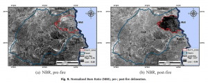
One application for GIS is shown in this map from a study connecting susceptibility of soil erosion to wildfire affected areas in Attika.

The map shows that there is a correlation between the two, as soil is much more eroded from heavy rainfall in the affected area post wildfire both compared to prior in that area and the unaffected areas around it.

Efthimiou, Nikolaos, Emmanouil Psomiadis, and Panos Panagos. “Fire severity and soil erosion susceptibility mapping using multi-temporal Earth Observation data: The case of Mati fatal wildfire in Eastern Attica, Greece.” Catena 187 (2020): doi.org/10.1016/j.catena.2019.104320

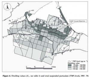
Another example of a GIS application is to represent environmental injustices.

This map is representing air pollution in proximity to a factory in Canada. The thickness of the lines represents the density of air pollution in an area, and it is higher the closer you move to the factory.