Redman Week 5

Part Two: Preparing Spatial Data for Use

Chapter 4: File Geodatabases 

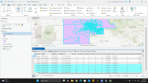
In this chapter, the focus changes from the visual aspect of maps to the data behind it. Chapter 4 shifts from map layouts to managing spatial data in the file Geodatabase, which is ESRI’s storage system. File geodatabases serve as organized storage for feature classes, raster datasets, and attribute tables. This is useful in research, spatial analysis, and keeping records. The purpose of this chapter is to learn how to organize project data, import external shapefiles and tabular data into a project geodatabase, modify field attributes, and execute relational joins and spatial queries in ArcGIS Pro.

Terminology:

  • File geodatabase (.gdb): ESRI’s database used to store feature classes, raster datasets, and standalone attribute tables optimized for ArcGIS Pro.
  • Feature class: A collection of geographic features with the same geometry type (point, line, or polygon) and identical attribute fields stored in a geodatabase.
  • Shapefile: A legacy vector data storage format for storing the location, shape, and attributes of geographic features, commonly converted into feature classes for geodatabase use.
  • Table join: An operation that appends the fields of one table to another based on a common matching attribute field across both datasets.

Tutorial: The tutorial was very helpful in learning how to navigate spatial data management. It showed how to:

  • Import data into a new ArcGIS Pro project
    • Create an ArcGIS Pro project
    • Set up a folder connection
    • Convert a shapefile to a feature class
    • Import a data table into a file geodatabase
    • Use database utilities in the Catalog pane
  • Modify attribute tables
    • Delete unneeded columns
    • Add a field and populate it using the Calculate Field tool
    • Join a data table to a feature class attribute table
    • Export a feature class to make a join permanent
    • Calculate the sum of fields
    • Calculate the percentage of total population under 20 years old
    • Extract substring fields and concatenate string fields
  • Carrying out attribute queries
    • View crime incidents
    • Create a date-range selection query
    • Reuse a saved query to create a definition query
    • Query a subset of crime types using OR connectors and parentheses
    • Query the day-of-week range
    • Query person attributes
  • Aggregate data with spatial joins
    • Build a spatial join
  • Use central point features for polygons
    • Create a central point feature class for polygons
    • Create a point layer
  • Create a new table for a one-to-many join
    • Create a table
    • Make a one-to-many join

Overall, I learned a lot in this chapter about backend data management. Cleaning up attribute fields and setting up relational joins makes spatial analysis more organized and increases efficiency

Chapter 5: Spatial data

This chapter focuses on spatial data formats and coordinate systems used for mapping locations accurately on Earth’s surface. It explains geographic coordinate systems, world map projections, US map projections, and setting projected coordinate systems for local, state, and national maps. The chapter also demonstrates how to work with vector data formats, download spatial and tabular data from the US Census Bureau, and source ready-to-use geospatial datasets from external repositories.

Terminology:

  • Geographic Coordinate System (GCS): Three dimensional reference system that uses latitude and longitude angular units (degrees) to measure locations on the Earth’s surface.
  • Projected Coordinate System (PCS):  Two dimensional planar surface that uses a mathematical transformation to project the Earth’s spherical surface onto a flat map.
  • State Plane Coordinate System: A set of 126 geographic zones dividing the United States to provide localized, high-accuracy projected coordinate systems with minimal distortion for local government and surveying work.
  • Geospatial data: Digital spatial data that represents geographic features and can be rendered into vector layers, raster datasets, or web services in GIS software.

Tutorial: For this chapter, the tutorial shows how to:

  • Examine world map projections
    • Examine distortions in latitude/longitude maps
    • Apply world projections like Hammer-Aitoff and Robinson on the fly
  • Change map projections for national maps
    • Change map projections to Albers Equal Area Conic
  • Set local coordinate systems
    • Look up State Plane zones in ArcGIS Living Atlas
    • Apply localized coordinate systems and project geographic layers on the fly
    • Configure map display units to feet or meters
  • Work with vector data formats
    • Convert shapefiles into file geodatabase feature classes
    • Plot point layers from XY coordinates
    • Convert KML files to feature classes using KML To Layer
  • Download Census Bureau spatial and tabular data
    • Download TIGER shapefiles and demographic data from the US Census Bureau
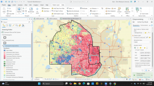
    • Join demographic tables to spatial boundary layers using GEOIDs

I learned a lot in this chapter about coordinate systems and projections. It was very helpful to see how changing projections prevents spatial distortion when analyzing geographic areas.

Chapter 6:Geoprocessing

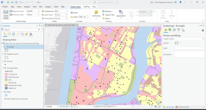
This chapter covers geoprocessing tools and workflows used to extract, aggregate, overlay, and analyze spatial features. Geoprocessing is used as a tool in ArcGIS Pro to isolate specific geographic study areas, combine overlapping dataset boundaries, and apportion demographic attributes in unaligned spatial units. In this chapter, the text shows how to process and prepare layers for emergency management officials in Manhattan and the Upper West Side neighborhood.

Terminology:

  • Geoprocessing: A fundamental GIS framework and set of analytical tools used to manipulate, process, extract, transform, and evaluate spatial data to perform spatial analysis.
  • Pairwise Dissolve: Aggregation tool used to remove interior polygon boundaries sharing a common attribute while calculating summary statistics across combined shapes.
  • Pairwise Clip: An extraction tool that acts as a boundary cutter, keeping only the intersecting portions of input features within a specified boundary polygon.
  • Apportioning data: A method of estimating tabular attributes for custom target zones by calculating the proportion of spatial overlap between non-aligned polygon boundaries.

Tutorial: This chapter shows how to:

  • Dissolve features to create higher-level boundaries
    • Open attribute tables for block groups and examine housing attributes
    • Run Pairwise Dissolve on block groups to remove interior boundary lines and sum housing units by neighborhood
    • Dissolve fire companies to create fire battalion and fire division feature classes with population totals
  • Extract features for a study area
    • Use Select By Attributes to isolate a neighborhood boundary and export it as a study area
    • Use Select By Location to extract block groups and street segments intersecting the study area
    • Execute Pairwise Clip to trim street networks cleanly along perimeter boundaries
  • Overlaying datasets
    • Merge separate borough water feature layers into a single consolidated water dataset
    • Append firehouses and police stations to an existing EMS facilities point layer
    • Intersect streets and fire companies using Pairwise Intersect to assign response responsibilities
    • Run Union on neighborhood and land-use layers to calculate land-use areas
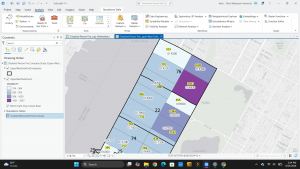
    • Use Tabulate Intersection to apportion demographic population data between census tracts and fire zones

This chapter was helpful in teaching about how spatial overlay tools work together to aid in urban planning and emergency management tasks.

Redman Week 4

Preface: The preface of this book explains that ArcGIS Online is a service that allows for making, analyzing, and sharing interactive maps. In part one of this book, users learn how to work with existing ArcGIS maps and how to navigate maps and data. Readers also learn how to use cartographic principles to symbolize a range of map types, build map layouts, and use ArcGIS storymaps to present results. Part two introduces the usage of real data to prepare for use. In part 3, the book focuses on analyzing spatial data and maps to solve problems. Buffers, service areas, facility locations, and data clustering will be used to analyze spatial relationships. Raster GIS and ModelBuilder will be used for analyzing demand for services. Lastly, readers use 3D GIS in the context of city planning. 


Part One: Using, Making, and Sharing Maps:


Chapter 1: 

In this chapter, an existing map is used. It has the locations of urgent health-care clinics in Allegheny county, PA. There are both federally qualified health centers that provide subsidized healthcare, and nonsubsidized clinics. The purpose is to be familiarized with how the software works and to analyze both clinic types to determine if they are sited in appropriate locations. 

Terminology:

  • Feature class: building block for displaying geographic features. Feature classes are vector data with corresponding attributes for each feature. 
    • Clinics: line feature. Has centerlines for all streets in the county.
    • Municipality: polygon feature class that has boundaries for all municipalities in the county.
  • Raster dataset: major type of spatial data. It is an image made up of pixels so small that you cannot see individual ones. If it is encoded with geographic coordinates, it can be used as a layer in a map. 
  • File geodatabase: folder that stores feature classes, raster datasets, and other data files. 
  • Project: file that contains maps

Tutorial: 

The tutorial was very helpful in learning how to navigate the map. It showed how to:

  • Get an overview of ArcGIS Pro
    • Set up a project
    • Add an d remove basemaps
    • Turn layers on and off
    • Reorder feature classes in the contents pane
    • Examine the catalog pane and open and export a map layout
  • Navigate ArcGIS Pro
    • Use a popup window
    • Zoom in to a raster feature class
    • Use bookmarks
    • Search for a feature
  • Work with attribute data
    • Open a table
    • Work with fields view of an attribute table
    • Select records and features of a map feature class
    • Obtain summary statistics using a tool
  • Symbolize maps
    • Symbolize feature classes
    • Label a feature class
    • add/remove feature classes
    • View and navigate scenes

Overall, I learned a lot in this chapter about how to navigate GIS. So far, it is a very interesting application and seems very user-friendly. I was able to follow all of the instructions provided even though I have never attempted to navigate a map site like this.

Chapter 2:

This chapter explains map design, specifically, how to design and symbolize thematic maps. Thematic maps help to solve and investigate problems. Thematic maps are composed of subject layers placed in spatial context of other layers. When deciding on layers for thematic maps, you should consider two things. The first is what layers are required to represent the subject, and the second is deciding on spatial context layers needed to orient users to recognize locations. Vector layers are used for subjects of thematic maps because of a large amount of data. This chapter focuses on cartographic skills and principles on symbology using several vector-based thematic maps. 

Tutorial: for this chapter, it shows how to:

  • Symbolize qualitative attributes
    • Display polygons using a single symbol
    • Display polygons using unique value symbols
  • Label features and configuring popups
    • Change label properties
    • Remove duplicate labels
    • Manage popups
  • Filter with definition queries
    • Create a definition query
    • Symbolize figure and ground features
  • Create choropleth maps for qualitative attributes
    • Create a choropleth map of households receiving food stamps
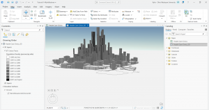
    • Extrude a 3D choropleth map
  • Display data using graduated and proportional point symbols
    • Create a map of graduated size points
    • Normalize population maps with custom scales
    • Create a choropleth map with normalized population and custom scale 
    • Import symbology and use swipe to compare features 
  • Create dot density maps
    • Set visibility ranges 
    • Set visibility range for labels and feature layers

I learned a lot in this chapter about thematic maps and different displays of them. It was very informative on scaling and labeling.


Chapter 3: 

This chapter shows how to share maps with people who do not have skills with maps besides navigation. This chapter teaches how to provide maps in many different formats. Formats include reports, slides, posters, or static maps for websites created from map data, online interactive maps, interactive online purports and presentations, and interactive online dashboards. 

Tutorial: this chapter shows how to:

  • Build layouts and charts
    • Create a layout and add maps to it
    • Resize and place maps
    • Add guides and snap maps to the guides
    • Insert legends
    • Insert text
    • Create charts
  • Share maps online
    • Set properties for online sharing
    • Share maps in ArcGIS online
    • Use map viewer in ArcGIS online
    • Change the style of a layer
    • Configure pop-ups
  • Create a story and a briefing in ArcGIS StoryMaps
    • Create a story
    • Add blocks for the introduction
    • Add a sidecar block with a mao
    • Add content for the left panel of the map
    • Enable navigation
    • Add credits
    • Preview and publish map
    • Create a briefing
  • Create a dashboard in ArcGIS Dashboards
    • Create a dashboard and add a map element
    • Add a table element
    • Adjust table
    • Add serial (bar) chart
    • Add interactions to the dashboard
    • Finish the dashboard

This chapter was very different from the last two chapters as it shows ways to display the information to other people who do not know how to use GIS. The tutorial made it very easy to organize charts and align the graphics in a way that is easy to read.


Redman week 3

Chapter 4:

Mapping density in GIS shows concentration of features. When a data set contains many individual points, looking at the map can become confusing. A density map helps this by calculating the features in one unit of an area, such as businesses per square mile. This allows you to compare density in areas of different sizes. Density maps allow for pattern recognition for concentration, which has many practical uses.

The two main approaches to mapping density are defined areas and density surfaces:

Mapping by defined areas uses established boundaries and uses the formula pop_density=total_pop/(area?27878400). Defined areas can be mapped by either shaded fill maps or dot density maps. Shaded fill maps use a range of colors to display density ratios across an entire polygon. In dot density maps, each dot represents a specific number or amount of what you want to map. Dots are randomly placed within the defined area, not showing the true location. Closely packed dots show high density.

Mapping by density surface provides a detailed, continuous representation of concentrations without relying on established borders. A density surface is created as a raster layer. GIS looks at the features within a specified neighborhood around each cell to calculate density value.

The way that a density surface looks depends on many GIS calculations. Search radius is the parameters of the location examined. A smaller search radius yields a more local variation and more details, while a larger search yields more features. Cell size determines how fine or coarse the pattern will appear. Smaller cells make for a smoother pattern, but require more time and storage, while larger cells put less strain on the computer, but look coarser. In the calculation method, the simple method counts features of the search equally, making overlapping rings, and the weighted method uses a mathematical function to produce a more precise surface.

After the calculation, density surfaces are displayed using graduated colors to distinguish contour lines, which connect points of equal density on top of the map using equal interval spacing to make for easier reading


Chapter 5: 

This chapter focuses on identifying graphic features in a boundary line. Understanding what is inside an area helps people monitor local activities, predict outcomes, or compare multiple areas in a region. GIS can present this information in list, count, or summary form. It often uses tables, bar charts, or pie graphs to display statistics. 

There are three methods for finding and mapping what is inside a geographic boundary: drawing areas and features, selecting features inside an area, and overlaying areas and features. 

For drawing areas and features, you place a boundary over features to see what falls inside or outside the space. This method is fast, but lacks detailed calculations.

Selecting features involves you specifying the area containing the features, then GIS selects a subset of the features inside the area. It is good for getting a list or summary of features inside a single area, and finding a distance from a feature, but does not tell you what is in each area, only all areas together. 

Overlaying the areas and features is more detailed. It involves combining the area and features into a new layer. It is useful to find features in specific areas. It is good because it provides more detail, but it requires more time and effort.

Choosing which of the three methods to use depends how much detail you have. All three methods have their pros and cons, and you get out of it what you put in, as with many other methods in GIS.


Chapter 6: 

This chapter discusses mapping what is nearby. This allows for identification of features or areas affected by an event. Finding what is nearby is helpful when analyzing travel ranges and proximity surrounding a source feature. An example of this is when a fire department calculates how long it will take to get to a specific street to narrow down response time of calls. 

Nearby measurements are calculated by using travel cost or physical distance. Cost represents the around or resources it takes to move between two points. Time, energy, money, and effort can all be calculated into this. Before you analyze nearby features, you have to choose if you want to apply the planar or geodesic measurement method and decide how to display the data. The planar method treats the earth as a flat surface, which can work for smaller areas, while the geodesic measurement takes into account the curvature of the earth, which is better for large regional areas. Once distances are calculated, GIS can summarize the attributes using inclusive rings, which show how feature counts accumulate as distance increases, or distinct bands, which display differences in feature amounts within separate distance intervals. Results can be displayed using buffers, which create defined zones at a specified distance to establish a service area.

There are three ways to find what is nearby. The first is straight-line distance, which measures direct distance between two points without taking into account any obstacles. This is the simplest approach and it works well for establishing fixed boundaries, but is highly unrealistic for travel

The second method, Distance or cost over a network, measures travel along established paths. This is more realistic as it provides an attainable path of travel and gives a more accurate travel time, such as increasing the time when the physical distance remains unchanged. 

The third method is cost over a surface. This one measures overland travel across a continuous geographic surface rather than roads. This method assigns differing travel costs to different landscapes to account for terrain difficulty, which allows for more accurate wildlife tracking or planning off road rescue routes across landscaped with inconsistent terrain.

Choosing a method depends on what data you need and whether you are measuring boundaries, road travel, or overland movement.

Redman week 2

Chapter 1:

The chapter starts by explaining that GIS analysis is a process for looking at geographic patterns in data and relationships between features. The data may either be simple or complex. The process for performing an analysis includes five steps. The first step is to frame a question. To analyze something, you need to know the information that you want to find, and this requires forming a question. The second step is to understand the data to be able to determine what method to use. Third is choosing the method. Some methods are less time consuming than others, but only provide a basic understanding, and the methods that take longer produce more in-depth results. The fourth step in processing data and performing the steps in GIS. Finally, the results will be produced as a map, chart, or something similar. 

Understanding geographic features is an important part of GIS. There are three different types of features that can be used. Discrete features are used for discrete locations and lines, and location is able to be pinpointed. Continuous phenomena are precipitation or temperature and can be found or measured anywhere. It blankets the entire area of mapping. Features summarized by area represent density of features within boundaries.

There are two ways to represent geographic features. The first is a vector model, which includes features (discrete locations, events, lines, and areas). The second model is a raster, which is a matrix of cells. It is important to have the same map projection and coordinate systems to ensure accurate results. 

It is important to understand geographic attributes to determine the type of analysis you want to do. There are five attributes. Categories are represented by numeric codes or text. Ranks are used for when direct measures are difficult. Ranks are relative, so it is not exact. Counts and amounts show total numbers. Ratios show the relationship between two categories. Categories and ranks are continuous, counts, amounts, and ratios are not.

Working with data tables is important for GIS analysis. Three common operations are selecting, calculating, and summarizing.

Chapter 2: 

This chapter starts with explaining that mapping where things are can show where action is needed. This can eventually show causes for certain patterns, such as a concentrated area for crime rate. 

In order to decide what to map, you need to know the information that you are trying to gain from the map, and how the map will be used. The information needed for a map can differ depending on the end goal. Some maps are used to determine a concentration of something, others can be used for discreet locations. Determining how the map will be used can be determined by the audience and issue being addressed. 

Preparing the data requires assigning geographic coordinates and assigning category values. 

To actually make the map, you put the information into GIS. the features can either be displayed in a layer as a single type or categories. In a single type, only one symbol is used. This can show patterns. Mapping by category uses multiple symbols and can provide a more detailed understanding. This allows for displaying features by type, how many categories there are, which features are mapped, the map scale, how categories are grouped, and which symbols are used. It also allows for reference features such as major roads/highways and landmarks. 

If the map produced presents the information clearly, patterns in the data can be seen. If it is a single category, features can be clustered, uniform, or randomly distributed. Patterns can begin to provide explanations for why things are where they are. While this can provide a visual example, to determine if the patterns are significant, statistics are required to quantify the relationships between features.


Chapter 3:

In GIS, people map the most and least to see the relationship between places. Mapping features based on quantities can provide extra information in concentration. For this mapping. You need to map the patterns of features with similar values. 

Knowing the types of features that you are mapping is important to know how to present the quantities to see patterns on the map. This can include discrete features, continuous phenomena, or data summarized by area. 

When making a map, the purpose of the map is important to know how to present the information. To map the most and least, understanding quantities is important to be able to assign features.

Once the quantities are determined, they can be represented by assigning each value its own symbol, or grouping the values into classes. Mapping quantities requires a balance between accuracy and being able to be able to see patterns on a map by generalization of values. Counts, amounts, and ratios are grouped into classes. 

Mapping individual values presents an accurate picture of the data, but may make it harder to read the map. Classes can make the map much easier to read. For making classes, they can be created manually or by using a standard classification scheme. Classification schemes include: natural breaks, quantile, equal interval, and standard deviation. It is important to be able to choose the best one for the information you have. 

Once the data has been effectively classified, the next step is making the map. Make sure that only important data is used to ensure easy comprehension by readers. GIS provides these options for creating maps to show quantities: graduated symbols, graduated colors, charts, contours, and 3D perspective views. 

  • Graduated symbols: map discrete locations, lines, or areas
  • Graduated colors: map discrete areas, data summarized by are, continuous phenomena
  • Charts: data summarized by area, discrete locations, or areas
  • Contour lines: show rate of change in values across area for spatially continuous phenomena
  • 3D perspective views: continuous phenomena to help visualize surface

Redman week 1

I completed the GEOG 291 quiz.

My name is Kylie Redman. I am a junior from Richwood, OH studying Zoology. I took this class to gain a better understanding of GIS and its purpose. I think that taking this class will help me to gain a better understanding of conservation and how I can have an impact in my career of working with animals.

Before I read this chapter, I did not know how widespread GIS was or that it was of any significance. I thought that it was just a map. I now know that in addition to being a map, it also involves the analysis of maps, and includes many different uses. 

One surprising thing about GIS is that the topic struggles to have a distinct identity with just one use, as it can be used in two completely different ways. The first way that GIS can be used is as a software tool. Municipalities and local government organizations use GIS mainly as a software program. It is used to map out exact lines of properties and urban zones, organize databases, and analyze the effect of building a road along a new route. In a more scientific approach, researchers, scientists, and university professors use GIS to solve complex theoretical equations. This can include drawing clear boundaries on maps, and the tracking of disease spread. The Author makes it a point to make a distinction between mapping versus spatial analysis in GIS. Simple mapping displays spatial geographic data, while spatial analysis involves using multiple data layers to develop new information that is not shown on a regular map.

This chapter reviews the history of GIS in the development from basic computer maps to the modern spatial analysis tool. The history section includes landscape architect Ian McHarg, who invented the technique for map layers to route highways. Early computer Cartography, and pioneering systems were also involved in the history of GIS.

In the latter part of this chapter, challenges are discussed. In order to add geographic features into a computer, there needs to be sharp boundary lines, which can be difficult as many borders of cities and towns do not have distinct boundaries. Date models, categorization, visualization, and scale were also shown to be challenges.

In all, GIS is so much more than just a tool to navigate to a new city. GIS is very important for spatial analysis to solve complex problems.

Application 1: highways cutting through habitats of animals frequently result in heightened animal mortality rates. To address this rising issue,  researchers used GIS to integrate tracking data from bears, bobcats, fishers(small mammal) to design a road system that involves strategically places underpasses and overpasses to reduce animal fatality.

Application 2: When creating nature reserves, standard borders often fail to cover the full areas where endangered plants and animals actually live. To fix this, conservation scientists use GIS to combine field sightings with environmental data like climate, terrain, and soil type. GIS combines all of these to map habits of all three species to help scientists protect wildlife while also benefiting land needs for people.

TMinimum cost-distance habitat linkages for a) black bear, b) bobcat, and c) fisher. These were merged to create the functional habitat linkage d)

These maps show the calculated minimum cost-distance habitat linkages for a) black bear, b) bobcat, and c) fisher. the three images were merged to form the functional habitat linkage (image 4)


Source: Geo Contributor. (2024, August 12). How GIS is Being Used in Conservation Biology. Geography Realm.