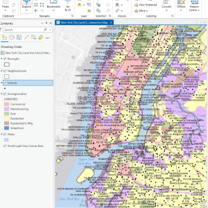
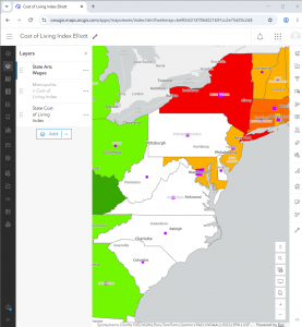
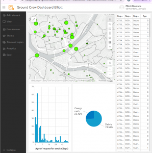
Montana week 3

Chapter 4

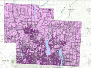
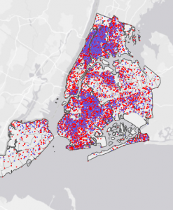
Chapter 4 talks about density(the number of things within a certain area/ volume) It talks about two ways to show density with the density by area model and the density by defined area or by surface. Density by defined area takes a distinguishable area(ex: county, zip code, etc) and collects the number of features and displays the area as a certain color based on the gradient number that the area has been given. Density by surface does not require defined borders and the range is editable. To find the density for either of these to find its range on the color coded gradient you must find the number of features and divide that by the area of which you are finding the density for. 


I face some confusion about the representation of density through defined cells. Is the total map split up into equal cells and the number of the features counted and then the circle is placed in the middle of the cell or is the cell based off of the location of the features being studied(ex: businesses, employees, etc)Or does the GIS find the average distance between all points in the cell and move the circle to that point.


I enjoy that they often include what one particular map might be used for and by whom it might be used. It is good to have a clear explanation of how these techniques are used by everyday people and businesses.


Chapter 5

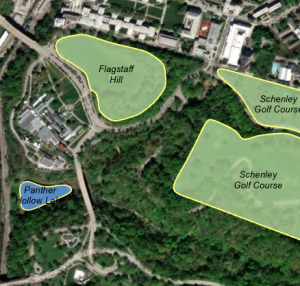
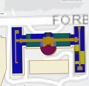
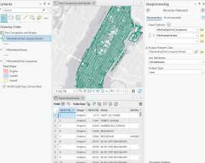
This chapter “finding what’s inside” had a focus on defined areas and how you can manipulate both their visual properties and informational properties to gain insight. The example of a flood plain was used a lot in this chapter to show how different areas can be overlaid with each other. You can take a group of defined areas(in the text it was personal properties categorized by their use) and overlay something like a floodplain or a watershed above the initial scape. You can also emphasize different parts of the map, for instance you can only include parts of the property area that are included in the flood plain area or you can have all properties with a part in the floodplain highlighted. The text makes it clear that this sort of mapping would be very important for things like watershed access, flooding, fire protection, school districts and more.


The text also made some comparative examples with drawing areas vs. Selecting the features inside the area. Drawing does not require any complex calculations so it is much easier to do but cannot list information so it is visual only. The other option selecting the features is good for knowing what is inside a group of areas but does not allow you to analyze areas individually. There is also the third option of overlay which lists multiple layers and allows you to draw conclusions based on which things overlay each other. The main drawback to this though is that it uses a lot of computational power. 


An interesting question one might ask is how can these three methods be used together to make more meaningful conclusions?


Chapter 6

I think that it is an interesting idea to map the distance of something by cost. I wish you could do that in google maps to see how much you would need to spend on fuel.


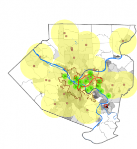
This chapter analyzed the display of distance and how we show paths. A lot of the information seems like it would be tied to GPS but there was also some discussion of how it could be used by police stations, fire stations, etc… to understand their travel range. There was also discussion of the variable of cost which was a different way of looking at distance not in terms of location but in resources used to reach a point. I believe that this is a way to incorporate terrain changes into the mapping process.


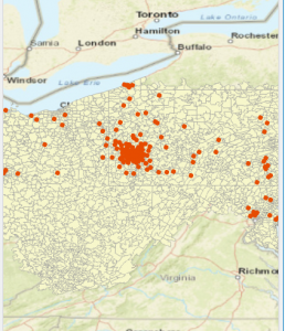
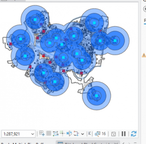
There is also the sectioning of distances using inclusive rings which include all features from the outside to the center of the circle and distinct bands which are different distances from the center point and can indicate the number of features within a distinct distance band.

Another interesting style mentioned in the text was spider graphs which send a point straight to a feature within a certain range.


Switching from distance to cost creates a more detailed contour map because of the terrain features mapped.

Montana Week 2

Chapter 1

The first chapter introduces us to many of the essential techniques used in mapping and display of geographic features. Beginning with the first section you realize that it is paramount that you be specific in defining the geographic features you want to display and their corresponding attributes. Next we examine the choices one must make when deciding the way you want to gather/ display the information in question. In terms of display we are presented with the ideas of vector or rather format that have different levels of scalability with the vector option being adapted to a wide range of scales the rather methods looses sharpness at smaller scales but is perhaps more adept at showing the blend between to regions. We also have ways of defining the data we aim to present/analyze. Very distinctly data can be modeled discretely while regions with similar conditions or qualities are modeled continuously. Lastly they can be summarized by areas where specific points are given greater importance by being defined to a distinct geographic location.


I find some confusion about how lines might be drawn with individual points. What sort of software might be used to generate points on a line or are the points created by hand to model larger phenomena?


What advantages might the Rather method have at a smaller scale. Would it be easier to demonstrate the pervading category within a cell using the rather model as opposed to showing the distinctive line used by the vector model?


Each feature displayed on the map is given different attributes which are not shown on the map but rather in the table of information but ultimately determine how each feature is represented. Geographic borders remain constant between different features.


Chapter 2

The text states “ The GIS reads these and assigns geographic coordinates.” This got me thinking. Are all GIS the same or do some have different capabilities and handicaps?


This chapter of the textbook seems to be more focused on what the GIS is capable of and is less focused on the specific geographic features and their attached attributes that the user implements into the GIS. It also dived into the aesthetics of mapmaking and gave some helpful tips on styling, shaping and color coding of various features as well as how you can make maps more simplified through multiple levels of map complexity. One essential point that I got from this part of the textbook is that your map should aspire to be readable by everyone but should also be helpful to experts in whatever subject they aim to map.


There was also some focus on what to display to convey information best to the reader. I am wondering if there will be a greater emphasis on what to include and not include in your map in one of the coming sections ex: what things not to input into your map to make it seem unprofessional(clip art, 3d graphics etc).


I thought it was interesting that the maximum number of colors you should include was 7. I hadn’t thought about mapmaking that way psychologically but it does make sense. Is there some fluctuation in this where people can comprehend more than 7 shades? It is also sometimes necessary to use more than 7 shades. How can you make this more user friendly?


Chapter 3

The idea of summarizing data from most to least seems somewhat elementary to me. Would it not be better to explain how these things are programmed into a map?


I think the distinction between count and amount is an important distinction to make but I feel like the words are so similar would other more technical terminology make definitions seem more distinct example #categories paired with amount, etc..


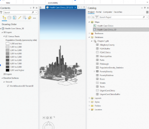
The 3D modelling looks complex and I had not thought about the use of a light source to create shadows and how the positioning of that light source might create a very different visual.


This chapter focused on display of variables and mapping things from most to least. It examined the different ways you can choose to group numbers or ways that you can have the GIS automatically separate numbers into different classes using things like natural breaks. It then talked about some more ways to distinguish between these different classes you have made, For example: using line width when showing quality of stream health etc. and introduced charts to show categorical data internal to the area on the GIS. The chapter also gave a very helpful breakdown of the advantages and disadvantages of different types of display styles which I thought was really nice and simplified the earlier knowledge well and provided basis for comparison.

Montana Week 1

I completed the GEOG 291 quiz and reviewed the syllabus

Hello my name is Elliott Montana and I am a junior here at Ohio Wesleyan. I enjoy swimming on the swim team and going out fishing with my buddies. I am a Biology and Geography dual major hoping to pursue a career in natural resources/wildlife crime prevention. I think that the addition of GIS skills both as a desktop and online application will boost my career success in the field I plan to enter.


I have heard about GIS from several colleagues during my first year here at OWU and felt confused by what exactly it was and how it was used. My first interpretation is that it was solely a device used to make 3D maps. I now see that it is more complex than that and encompasses not just the technology used but also the analysis used to interpret the figures and data collected.


I thought that the idea of GIS being the “clearing of the fuzzy” was an interesting sentiment and made some sense to me. To me this translates to a set of decisions that help us define the distinct patterns that we can sense while viewing spatial objects through a geographic lens ex; what separates a mountain and a hill.


In addition to this I had not realized quite how much GIS is built into all the systems that function in our human society ex: The garbage routes and bike paths mentioned in the text. I had assumed that these processes were carried out by polling methods or simple measurements of distance covered.


I do not believe that my understanding of what GIS is has reached completion(I don’t believe anybody’s understanding of new and evolving things ever reaches 100%) but I think I will gain a better understanding of the concept over the next reading and practical hands-on experience with the technology.


Application 1


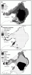
A GIS spatial analysis was used for several different factors in projecting habitat suitability for several species of marine fish in the Port Phillip Bay. The catch data was taken by fishing companies in the bay. Parameters measured include depth, substratum and sediment type.

Morris, L., & Ball, D. (2006, January 1). Habitat suitability modelling of economically important fish species with commercial fisheries data. Ices Journal Of Marine Science. Academic.Oup.Com. https://academic.oup.com/icesjms/article/63/9/1590/696978?utm_source=chatgpt.com&login=true


Application 2

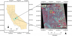
The next study aimed to identify swimming pools within an area using  the Normalized Difference Water Index (NDWI) which works within a GIS system to identify standing water that is constituted as a swimming pool. The purpose of this is to identify places where mosquitoes might be breeding in an effort to combat the spread of the deadly West Nile virus.

APA Style

McFeeters, S. K. (2013). Using the Normalized Difference Water Index (NDWI) within a Geographic Information System to Detect Swimming Pools for Mosquito Abatement: A Practical Approach. Remote Sensing, 5(7), 3544-3561. https://doi.org/10.3390/rs5073544