Tutorial
Chapter 1
In the first chapter of the tutorial a massive amount of information was presented. Many aspects of how you can interact with various panels in the GIS and various display elements were explored. All of our work centered around Alleghany county PA and the urgent care availability and type of urgent care as it relates to other factors (ex:pop density, total pop per area, etc.) while also including other features like roads and rivers.
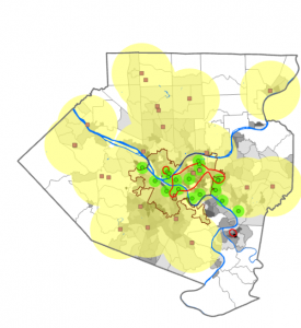
This map rendering focuses on the two different types of healthcare facilities in the county. The green dots(subsidized FQHC clinics) and their subsequent buffers are concentrated in the areas where poverty is most likely to occur. The Urgent Care Clinics(unsubsidized are located primarily in the suburbs where poverty is less common.
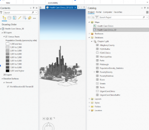
At the very end of the 1st tutorial we got to turn the map into a 3d model based on population density. You can see the same concentration in the center of the county but now with more variable range since it can be displayed in height.
Chapter 2
Chapter 2 had a huge emphasis on the symbology feature when you would right click one of the terms in the contents page. It focused on ways that you could display and scale data.
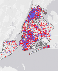
This image used the display by dot density symbology to show the population of individuals receiving food stamps over the age of 60(red) and individuals under the age of 18(blue)
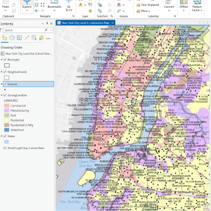
Another cool thing this chapter looked at was at what scales do we have various names for places to come up. I got confused a couple of times on this one because things were taking a while to show up because they were appearing at similar layers and on a pretty huge scale.
Chapter 3
This chapter had a focus on the cross compatibility between the ArcGIS pro application and the online version where documents made in the pro version are made more accessible and user friendly. The system for editing your maps in the online version is much simpler but as a result lacks the ability to do complex tasks. The first part of chapter 3 also demonstrated how to include legends onto existing maps and how to show two maps at once for comparison.
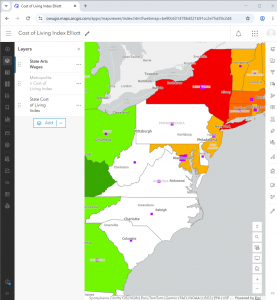
This first image is of a map made in the GIS that was then transferred to StoryMaps to be viewed. A brief introduction and summary of the map was included as well as the necessary citations and their usages.
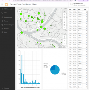
This last image is a dataset and map that was transferred from ArcGIS pro to the online GIS. Using the Dashboard utility we could make a simple table and corresponding charts.