Week 3 Beard

Chapter 4 gives us an insight into how mapping density can really create a map, as well as help viewers understand what topics are being presented. Mapping density can be very helpful due to the ways you can present it on a map. For example, the different shades on a map can help show how dense something is. Depending on what you are mapping, the patterns from the densities can be different. These differences help create more accurate areas on maps. Throughout the chapter, I was able to see the big differences between the dot density maps, the shaded density maps, and the more thermal-looking maps. There are definitely certain ones that are better to use than others; for example, if there were so many samples that you couldn’t see the data you are looking for, a dot map wouldn’t work (a shaded map would be better). One thing that really surprised me was that the larger the search radius, the more generalized the patterns in the density surface will be. For some reason, this just seems like it should be the opposite. I imagined that the smaller the area, the easier it would be to map and make it more general due to the fact that there isn’t going to be a lot of differences. After looking at the maps, though, that helped me understand why bigger is better for this type of map. Another important thing for maps is units. To make sure the map is proper, you have to have the right units to make it more specific to what data you are using.

Key Terms:

  • Mapping Density: shows where the highest concentration of the feature is
  • Two ways of mapping density:
    • A defined area: by using something like a dot map, we can see how high densities are by the amount of dots (use for data already summarized by area)
    • By density surface (use for individual locations, sample points, or lines)
  • A dot density map: area based on a total count or amount and specified by how much each dot represents.
  • Density Surface: good for showing where point or line features are concentrated.
  • Higher density: darker marks
  • Lower density: Lighter marks ( light maps)


Chapter 5 presents the ideas of what is actually inside a map, and why the information plotted is important. Making sure we map certain things in certain areas is important because it can help society grow and improve. One good thing about using different ways of mapping an area is that it can give you more information than you initially expected. If you were to draw a map a certain way, you could see the difference between the inside of the area and the outside of the area. One thing that is nice about GIS is that you get to decide the area and the layer containing the certain thing you are looking for, while GIS gives you a subset of features inside the area. One thing that I thought was cool was the overlapping features in areas. This is very useful as it can help you see the differences between inside your area and outside, which I was talking about before. It can help with finding features in several areas or also finding out how much of something is in an area. When making a map, it is good to ask yourself these questions. What it is good for, what types of features are you going to include, and what trade-offs are you getting from making this map. One thing that is good about this is that you can see from making an initial map if you need a single or multiple. In multiple areas, it can be hard to see certain things as well; to fix this, you can shade certain things you are looking for, or fill it with a pattern, or draw a boundary around the area. There are a lot of things to do, so it is nice to pick whatever will stick out the most to you.

Key Terms:

How to Analyze certain maps:

  • Single Area:
    • A service area around a central facility (fire response area)
    • A buffer that defines a distance around some feature (a stream)
    • An administrative or natural boundary (police beat, parcel of land)
    • An area you draw manually (a proposed sales territory)
  • Multiple Areas:
    • Contiguous (zipcodes/watersheds)
    • Disjunction (state parks)
  • Discrete features: unique, identifiable features.
  • Comparing methods:
    • Drawing areas and features:
      • What is it good for: finding out whether features are inside or outside an area.
      • Types of features: locations, lines, areas, surfaces
      • Trade-offs: quick and easy, but visual only, so you can’t get information about the features inside
    • Selecting the features inside the area:
      • What is it good for: getting a list or summary of features inside an area
      • Types of features: locations, lines, and areas
      • Trade-offs: good for getting info about what’s inside a single area, but does not tell you what’s in each of several areas (only all areas together)
    • Overlaying the areas and features: 
      • What is it good for: finding out which features are inside which areas, and summarizing how many or how much by area
      • Types of features: Locations, Lines, Areas. and Surfaces
      • Trade-offs: Good for finding and displaying what’s within each of several areas, but requires more processing


Chapter 6 helps explain how to see what is nearby in the maps that are created. GIS is helpful in letting us find out what is occurring within a set distance of a feature, as well as being able to find out what is within traveling range. Knowing what is within a travel range is good for helping to delineate areas that are suitable for a specific use. Some things that we use to see what is nearby are looking at straight-line distance, measuring distance or cost over a network, or measuring cost over a surface. When using the measurement of straight-line distance, that would be due to an area of influence. Before we are able to see what is near, we have to know other important aspects, which we talked about in past chapters. Each method for finding what is nearby is different, so when you are deciding which one to use, you need to look at what is being measured. If it is a quick estimate of travel range, then it would be straight-line distance. If you were measuring travel over a fixed infrastructure, then it would be cost or distance over a network. Finally, if you were to be measuring overland travel, then you would use cost over a surface, and all of these have their pros and cons. To use these techniques, you would have to use a buffer, and with this you can use as many buffers as you need to get all the features that should be in the map.


Key Terms:

  • Traveling Range: is measured using distance, time, or cost
  • The Planar Method: is appropriate when your area of interest is relatively small
  • Inclusive Rings: are useful for finding out how the total amount increases as the distance increases
  • Distinct Bands: are useful if you want to compare distance to other characteristics.
  • Information that is needed from the analysis:
    • Do you need a list, count, or summary?
    • How many distance or cost ranges do you need?
  • Three ways of finding what’s nearby:
    • Straight-line distance
      • Use for: Defining an area of influence around a feature, and creating a boundary or selecting features within the distance.
      • Surrounding features: Locations, Lines, Areas
      • Measure: Distance
      • Pros: Relatively quick and easy
      • Cons: Only gives a rough approximation of travel distance
    • Cost over a surface
      • Use for: Measuring overland travel and calculating how much area is within the travel range
      • Surrounding features: continuous raster surface
      • Measure: Cost
      • Pros: Lets you combine several layers to measure overland travel cost
      • Cons: Requires some data preparation to build the cost surface
    • Distance or cost over a network
      • Use for: measuring travel over a fixed infrastructure
      • Surrounding features: Locations, Lines
      • Measure: Distance or cost
      • Pros: Gives more precise travel distance/cost over a network
      • Cons: Requires an accurate network layer
  • Selecting features near several sources:
    • First, select and tag features within the distance of the first source
    • Secondly, select and tag the features within the distance of the second source
    • Thirdly, select the features within the distance of both sources

Beard Week 2

Chapter 1 gave a brief insight into what GIS is and how we can use it. One thing I find very interesting is that you can use GIS mapping for many different things, from crime in certain cities to deforestation or the loss of certain animals. To me, this is interesting because GIS seems like a science-type of thing, but in reality, it isn’t. Another interesting thing is that you can use GIS mapping for more precise things (like precise locations) or you can just use it for more broad stuff (like looking at a whole city).

Key Words:

Most common geographic analysis tasks:

  • Mapping where things are
  • Mapping the most and least
  • Mapping density
  • Finding what’s inside
  • Finding what’s nearby
  • Mapping change

GIS analysis: the process for looking at geographic patterns in your data and at relationships between features

Steps of GIS analysis:

  • Frame the question
  • Understand the data
  • Choose a method
  • Process the data
  • Look at the results

Types of features:

  • Discrete
  • Continuous Phenomena
  • Summarized by area

Ways to represent geographic features:

  • Vector
  • Raster

Types of attribute values:

  • Categories: groups of similar things
  • Ranks: put features in order, from high to low
  • Counts: the actual number of features
  • Amounts: any measurable quantity associated with a feature
  • Ratios: show you the relationship between two quantities and are created by dividing one quantity by another for each feature

Three common operations on features and values:

  • Selecting
  • Calculating
  • summarizing

Chapter 2 gave us a summary of why mapping is important in our world. When mapping is used, we are able to see where the main problems may be occurring and where people need to be focusing on to fix a problem. Another important thing is that there are many types of maps that can be used, which causes some to be better for showcasing certain topics than others. One cool thing that I realized in this chapter was that there are so many ways to show what data you are looking at. You can use dots, lines, or plots. There are so many different types. The only problem that I have is that it seems that some are more difficult to understand than others. For example, when they are showing the zoning code with all the different colors compared to the business map.

Chapter 3 helped give us an idea of how to pick which data is best for presenting. If you were focusing on something in a high-income area, you probably wouldn’t want to include low-income areas unless there is a similarity between the two in what you are searching. One thing that this chapter has shown me is that there is a decent amount of math that goes into these maps for each point of data. One thing that stuck out to me was mapping individual values. This helps with finding patterns in raw data and is also very useful when you are looking at something you aren’t used to. One final thing is that there are many advantages and disadvantages to the way people classify their schemes. So, no matter which one you use, there is always going to be a fault, and it will never be perfect

Key Words:

Counts: the actual number of features on a map

Amounts: the total of a value associated with each feature

Ratios: show the relationship between two quantities (averages, proportions, and densities)

Proportions: Show you what part of a whole each quantity represents

Densities: show you where features are concentrated

Ranks: put features in order, high to low

Classes: help features with similar values by assigning them with the same symbol

Natural Breaks: values within a class are likely to be similar and values between classes are different

Quantile: Each class has an equal number of features in it

Equal Interval: each class has an equal range of values

Standard deviation: defined by its distance from the mean value of all the features
Beard Week 1

I have completed the GEOG 291 Quiz for Week 1

Hello! My name is Payton Beard, and I am a junior from Cincinnati, Ohio. I am a zoology major with a chemistry and ENVS minor, in hopes to either work at a zoo or become a vet. I chose to take this class, as it seemed like something interesting that also followed along with my ENVS minor. Outside of class I am a part of the soccer and softball team, so I am always busy.

3)

After reading this article, I learned how important GIS actually is. I had never heard of GIS until coming to OWU, but it is cool to see all of the different companies, and all of the researchers that use GIS in their everyday lives. GIS can be helpful to so many fields due to the fact that it was developed by multiple fields throughout history.  When I first started to search about GIS it really just seemed to me like a bunch of maps that showed random stuff, but after reading this it became apparent to me that it is more than just a map it can show things like transportation or agriculture or even healthcare which is something I would of never expected.

Something I found really interesting in the article is that GIS can be used in decision making all throughout society. GIS can be helpful for planning out cities, where road ways may go (like seen in the beginning of the article), and just how to improve societal ways in general. GIS can really strength society and help display more improvements that could make out world better than it already is. I believe that GIS is a very important part in our world today as it is like a piece of scratch paper where you can continuously make plans until you find the perfect resolution.

Another part of the article I thought was very interesting was how Dr. John Snow was able to use GIS in a way to track the spread of Cholera in London. When I think of a map I think of something that shows landmarks, mountains, or just things like land plots and stuff like that. I would of never thought that you could track the spread of Cholera. Seeing how he was able to track the deaths and the water pumps that the public were using was a major part in him figuring out what was happening and what the relationship the 2 things had. It also helps show that local knowledge mixed with interpretation can be really helpful in figuring out big problems.

4)


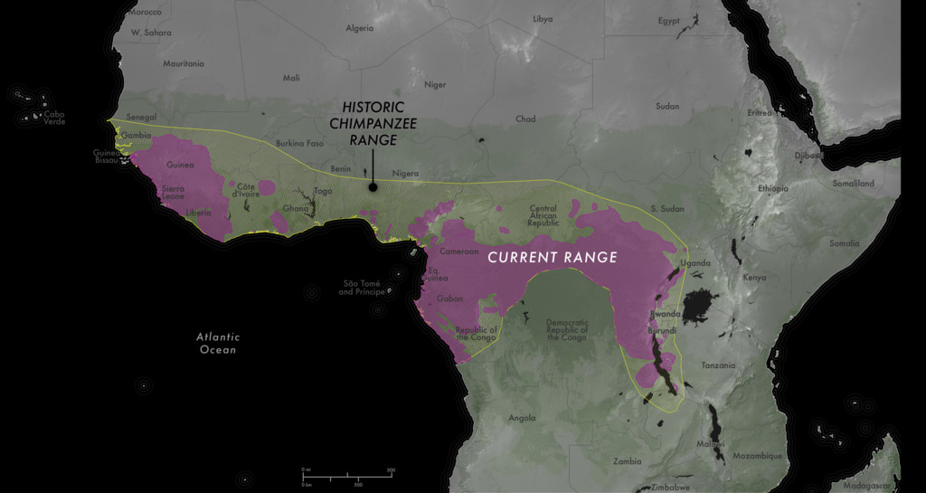
Chimpanzees heavily rely on forests, but with deforestation happening in Africa due to it changing for more agriculture, development, and other use the chimps are starting to lose their homes. Not only is this just happening to the chimps any animals that are in this environment are starting to struggle. The main purpose of this study was to find the most sustainable habitats for the chimpanzees in Africa, so that scientists were able to protect their populations more. As seen in the map the yellow represents the historic range that chimpanzees have been able to roam, and the pink represents the current range chimpanzees are about to roam. Just from this picture we are ale to see how much of the land has been taken away for human use, and how dangerous it is getting.

Garrison, Michala. “NASA Scientific Visualization Studio.” NASA, NASA, 13 Sept. 2023, svs.gsfc.nasa.gov


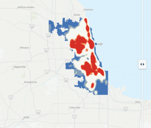
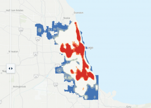
The purpose of this article was to show how crime rates in Chicago have changed over time. With Chicago being a large city there is plenty of bad things that can and have gone on there. In this article, they talked about how crime patterns have changed over a time period from 2001 to 2025 (left 2001, right 2025). GIS was used her to help show where crime is happening, which we can see from these 2 pictures. Yes it may look like crime has gone down over the years and it most likely has, but we can also tell that it is more spread out in 2025 compared to 2001. In this article they compare crime patterns to plenty of factors, but so are unemployment, changes over time, and where they are located within Chicago. With that we can tell that crime is not evenly distributed as crime is concentrated in certain parts of Chicago and not just spread equally all around. We can see from the red hotspots that the crime is likely higher which could be due to any of the factors that I listed before.

Zaroujtaghi, Ayda. “Beyond the Decline.” ArcGIS StoryMaps, Esri, 11 May 2026, storymaps.arcgis.com/stories/6bd041427d514764b99fbe91928b8b66?