Week 4:
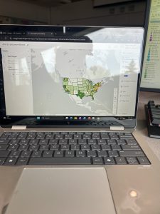
In chapter 1 of the GIS manual, we learned how to do some of the simpler things, like how to use the GISPro app, or what buttons do what things. We got to create different maps with different views of clinics in Alleghany County, and see where poverty zones or population density were high or low around them. Learning how to work with GIS is very important because without it we would be doing nothing correctly later on. All of the different colors and symbols made it very helpful to tell what we were doing as well. Looking at these maps could have been extremely difficult if we didn’t have the context side of the picture. One thing that I thought was interesting was the ability to see where the clinics were and their exact location they were on the map. Going into the pop-up for each clinic, I wasn’t expecting to see the exact address or the links to their website. It just shows how precise GIS can get when using it to its full extent. One difficult thing was figuring out how to do the bookmarks. Personally, I never did because it wouldn’t allow it, but it was just something that stuck out to me that even though you think this is simple, it really can be difficult sometimes. The final thing that I thought was really cool was the 3D picture. I wasn’t expecting something like this to even be possible with GIS. It was also helpful because the higher points really stick out compared to the others. You would think it would be more overwhelming due to the different components that are occurring, but it really isn’t.
Pictures from Ch. 1:
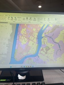
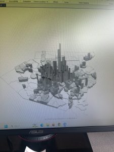
In chapter 2, we learned how to do stuff with zoning, which is pretty cool. When doing zoning, you are able to pick certain shades and colors for whatever you are looking at in each area. This is very interesting to me since it’s not something you think about on a daily basis. There are so many different things you could shade, as well as there being so many different places that the things you are looking for are located. Later, we labelled each section, creating certain numbers for each zone to signify that they are different from one another. This is important so we can explain a certain plot we are talking about without getting confused or losing it while looking at other plots. We were also able to add multiple different symbols in certain areas. This is nice so we can know what we are talking about for a certain thing. Like crosses are soup kitchens, circles are food pantries, and squares are soup kitchens. You are also able to pick certain areas on a map, and they will label the areas in a certain color based on what we are looking at. This is very nice because it makes it less complex and less work. Overall, from these maps we can see how looking at histogram maps is very useful in the long run for looking at certain data that we put it. I think the 3D portion is very helpful for seeing this more clearly, even though you can just tell from the different shades of color.
Pictures from Ch.2
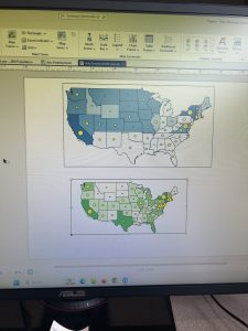
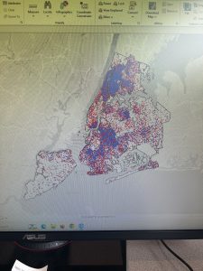
In Chapter 3, we made different maps and placed them on the same layout. This can be helpful when trying to show data from two different places, or if you are showing the same data but in two different ways. We also learned how to make legends and place them with the map that explains them. This helps present research if needed. We also went on to use other apps to let us create maps and somewhat analyze them ourselves. By placing our maps into ArcGIS online we are able to share with others what our maps look like and what research we are doing.
Pictures from Ch. 3: