McMahon Week 4

Chapter 1:

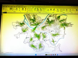
For chapter 1, I was able to navigate through the software by looking at the contents table and the different categories on the top of the screen. On the map, I was able to analyze density population,  areas of poverty, clinics, and other aspects of the urban area. The step by step process was somewhat helpful, but there were many times when I got lost or couldn’t find the section it was asking us to locate.  On this chapter however, I learned how to organize features alphabetically in the different tables. It was interesting to locate the different clinics on the map and see what was around, including the population density and poverty rates within that area. I also found it interesting to move the icons and symbols around to make the map more readable. I thought I was able to book mark pretty well throughout the instructions of the chapter.

Key words: Attribute tables, input tables, population density

Chapter2:

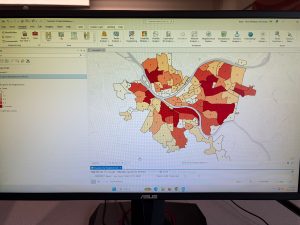
Within chapter 2, there were many steps that included changing symbols and labeling the properties. The section in 2-2 was a bit confusing because I couldn’t find the drop down labels and continue the steps, but I noticed the images within the chapter and I thought it was interesting how the area could be split into categories. I thought that 2-4 was interesting because it showed how the incorporate a 3D map instead of looking at the 2D map and this helped to look at density of a population. Throughout the chapter, showed techniques to show different features of the same layer in the same map. I was able to use graduated symbols to show the density of food bands and soup kitchens in the area from the chapter and then I was also able to organize male and female population receiving food stamps. I was a little confused on what the source fields and target fields were from this chapter and what those represented. From 2-7 I was able to understand how the make a dot density map and analyze it. Lastly, for 2-8, I was able to label parts of the map, however I don’t think I was labeling correctly  because I couldn’t find where the last step was. However I understand the importance of scaling the map

Key words and concepts: Creating a definition query, visibility ranges

Chapter 3:

From chapter three, I thought it was interesting to do the story board with adding headings and content. I thought this chapter was interesting since we had to complete more downloads and we used our maps to make graphs. Some steps I struggled with, like downloading the picture to my ArchGis account, but when I figured it out it was nice to have my maps in a place to refer to. I thought it was helpful to change the last map into a pie chart and a graph.

Key words: Dashboard, bulleted list, heading

McMahon Week 3

Chapter 4:

Mapping density is important for identifying patterns such as how much crime has occurred in a specific area. Before mapping, identify the features and the information that the map needs, this information will be useful for the viewer. There are two ways to map density: mapping features, which can be mapping businesses, or feature values, which can be the number of employees in a business. The information presented can be important depending on the views intention with the information. One way the chapter identifies mapping density is by using a dot map. The dot maps benefit the viewer because it can show the amount of features in an area with a given value for each dot so that the map is easier to read. Another way the chapter show density is by density surface. This confused me a bit because I’m not sure what the raster layer is and how that influences the density. The chapter also shows how lines can be interpreted for the length on the map. I thought it was interesting how the chapter gave examples of when density maps can be beneficial, such as population densities for census mapping, or employment  mapping for bus routes. In the section about what GIS does, I was a little confused on how the chapter used neighborhood. I am uncertain if it is used in the way of urban living, people close together, or in other type of understanding. And with that however, it made sense about how to calculate the density base on the amount of features recorded to the area mapped. I thought that calculating the cell size was an interesting part of the chapter because it used words like “smoother” and “courser” to describe the patterns. I also thought the math equation was helpful.

Chapter 5

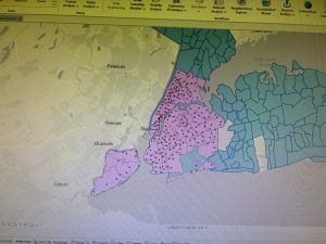
This chapter begins by stating the importance of analyzing if you’re using a single area or more than one to map your data. There are many different kinds of single areas but they are just a set area. However in multiple areas, you are able to compare more. I thought the examples were useful for this section. A key word was a continuous which means that the values continue overtime and examples are temperate, elevation, and precipitation. The chapter also goes into the different kinds of data plotting such as using  lists, counts, or a summary. I also found the visuals to be helpful in this section as well. I thought it was interesting how the chapter showed  layering GIS to show levels of importance. When selecting the features for inside an area, you need the have the dataset with features and the areas, as well as anything else that needs to be summarized. Whereas, overlaying GIS combines area and features to compare the layers and calculate a summary. This also includes having the features with area and the database, as well as anything that needs to be summarized. I thought the chart did a good job of explaining the pros and cons of each method and gave a list on the features needed. The chapter goes into a step by step process on drawling the lines and features. This includes a key method of being able to easily identify the features that are inside the area. It goes on the state that the features can be used by a single symbol, or be symbolized by category or quantity. Then draw a thick-black lines around the area  the distinguish the area. You can use the GIS to make a report about different features. Later in the chapter, some key words such as count and frequency were used. Count meaning the total number of features inside an area. And frequency is the number of features in a given value.

Chapter 6

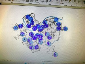
Mapping nearby can be important for city planning and notifying residents of certain structures. This can also help traveling range which is beneficial to define area served by faculty. Defining the distance around your features can be helpful in determining with method to use. Nearness can be measured by distance and cost. Cost includes time, effort, and money. The maps helped me in determining the difference between these key words. The chapter also points out the importance of measuring a flat plane, or taking the Earth’s curvature into consideration if it is over a long stretch of land. Another key detail to put into consideration is to analyze if there needs to be a list, count, or summary. I understood the chapters use of counts, however, I was a little confused about the lists and summaries. A key term from the chapter was inclusive rings which are used to find out the total amount increased as the distance increasing. Another key term is distinct bands which are used to compare distance to other characteristics. The chapter also laid out the three ways in which you can locate what’s nearby. One way is the straight-line distance which is reliant on the specificity of the source features and the distance and then the GIS finds out the features surrounding with the distance. Distant or cost over the network  is when the source locations are laid out along with distance or travel cost. And lastly the cost over a surface is when you specify the location of source features and travel cost. I like the way that the chapter points out what is needed for each kind and lays out its pros.

McMahon Week 2

Chapter 1:

GIS is collecting data and analyzing the patterns that the data presents. The steps in mapping an analysis is to start by asking a specific question, understanding all aspects of the question, choosing a scientific method, then processing and looking at the data to make sure it valid for presentation. There are also three geographic features which include features that are discrete, a continuous phenomenon, or summarized by area. Discrete features include the location to be pinpointed, meaning it’s either present or it’s not. Continuous phenomenon is mapping data such as precipitation or temperature since they can be measured anywhere and  uses a process known as interpolation to plot the given values. Continuous phenomenon can also plot data that is the same throughout a given area, such as soil composition or vegetation. Lastly, features summarized by area count the amount of features within the plotted boundaries. This process typically maps diversity in populations. Other key words from the chapter include vector and raster. The vector model showcases data in a line other than table and are defined by x,y,x locations on the map. The raster model shows features in a continues space with layers of specific cells. A key idea from the chapter was to understand the geographic attributes of defining the feature used and then describing it. The types of attribute values are categories: smaller groups, ranks: features in order from high to low, counts and amounts: show total numbers, ratios: show relationship between two quantities. The last concept from this chapter was how to work with data tables by selecting the rows of data in a logical expression then calculate. This section confused me a bit because I wasn’t sure on what this section meant. But lastly the chapter expresses to summarize the values into statistics.

Chapter 2:

The chapter opens why stating the importance of mapping information. I thought the examples given such as crime mapping and mapping environmental changes were important because it gives people a gauge on why things are happening. Altering mapping these disturbances, the question and be asked to why this is happening in this area and analyzing if these same features are   present in similar places. After the data is collected, it’s up to the person who collected the data on how it is to be presented. Some ideas to make it better for the viewer was to add information that was collected or the lack there of, while also adding important land marks such as post offices, parks, or street names. This important can be valuable for people if the area is unfamiliar. Some key ideas when mapping data was having geographical coordinates like longitude and latitude. There is also the importance of categorizing the information. The example I thought was interesting was “crime” but them identifying the crime was assault, burglary, or other types of crime. One key idea from this chapter was how to map GIS by using a pair of coordinates for a location with the name of the address or a symbol to identify the specific target location. Other notable features include drawling lines for roads and filling in colored spaces for open land. I this idea was important for the chapter. The chapter goes into the importance of grouping and organizing data for the reader. A key claim from the chapter was to not extend more than 7 categories because the information can become blurry. However, it’s important to note all data but grouping what is similar and important is a skill that is used in GIS. Some mapping features included thicker lines for high traffic roads and different symbols with unique colors will also distinguish between features on the map. I thought this chapter gave important information of the stylist choices when mapping.

Chapter 3:

Mapping the least and most amount of data can be important for people to see relationships between places or know which area fits their needs. Discrete features are typically one location represented with larger symbols to represent the density. A continuous phenomenon can be displayed with difference of shading between densities. A question I had from this section was about the difference between graduated colors and shading. This chapter breaks up these two phases, however from the maps, they both look like lighter colors to darker colors showing the change in densities. I did find it interesting how the mapping of population in an area can be beneficial through looking at densities of population and mapping human activity, while also mapping environmental changes and data. A key phrase that I learned from the chapter was counts and amounts. This phrase is identified as the counts being the actual numbers of features on a map where the amount is the value for each feature. Ratios was also an important key word from the chapter and this was defined as the relation between two values and this can be showcased through averages, densities, and proportions. Finding the average is just dividing the total number by the number of groups. With categories, I was a little confused on how to calculate it. With densities, they show how concentrated values are and these are calculate by dividing the value by area of land. Further in the chapter, other important aspects of mapping included creating classes or mapping individual values. In classes, there are quantile, equal interval, and standard deviation. Lastly, towards the end of the chapter, we are shown difference types of mapping with their advantages and disadvantages of each system of mapping.
McMahon Week 1

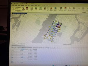
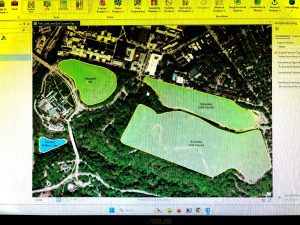
Screenshot

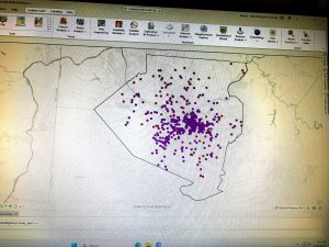
Completed GEOG 291 quiz

My name is Katie McMahon and I am a sophomore this year. I am majoring in Environmental Studies and I am minoring in Sociology. This class is required for my major but I think learning the content will be important for my major.

Before reading the passage by Schuurman, I was unfamiliar with GIS and its importance. I had a vague understanding that it was a collection of data, but after reading the passage, I learned that it is the examination of the map and not just a graph of data. With understanding that, I learned how it contributes to everyday life and not just the environmental aspects of life. From the passage, I learned how much GIS has advanced over time and how these advancements are improving urban life. I found it interesting that so many amities such as parks, buildings, and other public spaces rely on the spacial data from GIS. I also found it interesting that many choices that people make every day are influenced by the systems that GIS created. And with that, the reading pointed how GIS can be related to feminism by questioning the data that was collected for any bias. From the reading, I did learn how GIScientists analyze their data very closely since bias and miscommunication can occur. Along with that the author states how GIScience is the theoretical justification for data and showcases the way in which the data was collected.  Whereas GISystems are much more straightforward in presenting the data. From the reading I learned that GIS is more than just a collection of data. It’s more about the interception of the data and what it means. This can prove to be important to the environment and urban living since both influence each other on a daily basis.

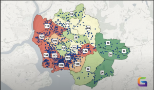
GIS data of crime density in

This figure shows crime density in different locations. This can prove to be important for people living in these areas to know where crime occurs and the analyzation of why crime is happening in these places. This is important for safety and then striving to eliminate the cause of the crime.

Shrivastava, A. (2025, May 15). Crime mapping with GIS: Tools, techniques, and real-world uses. GeoWGS84. https://www.geowgs84.com/post/crime-mapping-with-gis-tools-techniques-and-real-world-uses

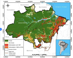
GIS data of deforestation in the Brazilian Amazon

This figure examines the rate of deforestation to the rate in which the forrest is restoring from 1975-2018. Scientists can analyze this rate of restoration compared to deforestation in order to redirect deforestation into a part where restoration is greater than the loss of trees and wildlife.

From Monitoring deforestation using GIS, by Da Cruz et al. (2021), as reproduced in Rahman et al. (2025), ResearchGate. https://www.researchgate.net/figure/Monitoring-deforestation-using-GIS-Da-Cruz-et-al-2021_fig4_388281540