Dahlstrom Week 5

Chapter 4

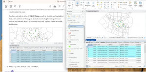
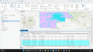
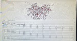
This chapter marked the introduction of working with spatial data. The tutorials first walked me through how to interact with a project’s geodatabase. This included the process of inputting outside information into the project, such as a table, how to use the database utilities in the catalog pane, and how to join attribute tables. Although this tutorial was simple, the method was extremely useful to learn since many future projects will likely require the addition of outside data. In addition to joining attribute tables, I was introduced to other functions related to attribute tables such as how to export a feature class, add a field, calculate the sum or percentage of fields, and how to extract substring fields. Although I did initially run into a few problems when working with the Python language, I was able to fix them by quickly retracing the steps. By the end of the chapter, I felt that I had a good understanding of how to use Python. The chapter then shifted to how to carry out attribute queries. Attribute queries are useful for finding geographic features based on their descriptive properties rather than their geographic properties. I found this function to be extremely useful because when you have a large dataset to work through, narrowing down the data based on attributes makes the process easier. Lastly, I learned how to aggregate data and create a point layer. Both of these processes allow for comparison between features and data to be displayed on the map.

Key Concepts/Definitions

Database: A container of the data for an organization, project, or other events for record keeping, decision-making, analysis, and research. A geodatabase has a file folder that contains .gdb at the end.
Chapter 5

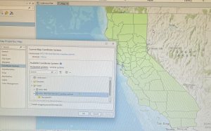
Chapter 5 contained information all about the geographic coordinate and map projection systems in GIS. The first tutorials walked me through how to change the map projection, or the flatness or curvature of the map, for a variety of different setups. For example, I practiced changing the map projection on a world map and on a map of the United States. Although I appreciated the lesson on this, these tutorials did not seem as useful to me as some of the previous ones. Additionally, since we worked with larger scale maps, I wondered if these various map projections would also be beneficial when working with maps for specific locations. Other skills I learned throughout the tutorials include how to navigate and use the coordinate systems tab in properties, import a shapefile into the geodatabase to be added to the map, add data to the map from ArcGIS Living Atlas, and the different spatial reference systems. The use of different tools was also emphasized a lot in the chapter. After the tutorials, I feel much more comfortable with searching for and using the different functions of the tools. This chapter, however, was probably the first one that I struggled with a few of the tutorials. In one section, the chapter assumes that you have had some previous work with Microsoft Excel. Although I am somewhat familiar with the program, I struggled with this part because I do not know all of the proper functions of Microsoft Excel. I also had an issue with downloading the elevation contours in the sixth tutorial. The book was not up to date with the new layout of the website, so I had a hard time downloading the file in the proper format. Even with the difficulties however, I was able to complete all of the tutorials in the chapter correctly.
Chapter 6

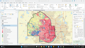
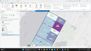
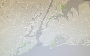
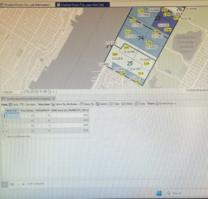
This chapter was focused on geoprocessing and the tools it uses to process data in GIS. Throughout the tutorials, I learned how to use geoprocessing tools such as pairwise dissolve, clip, merge, append, pairwise intersect, union, and tabulate intersection. The pairwise dissolve tool can aggregate block group attributes to other feature levels using statistics such as sum, mean, and count. The clip tool allows you to select and remove features outside a specific boundary such as streets. Clip is often paired with the extraction of features to make a study area. A study area allows you to focus on one particular section of a larger map. This function will be useful when analyzing the statistics and structure of a subarea while comparing it to the entire map. By clipping the excess features, the tool gives the study area map a cleaner finish. The merge tool allows you to merge multiple separate feature classes together into one. Merge is useful when you want to display similar features, but they are not the main focus of your project. The append tool adds features to an existing feature class, considering that both have the same attributes. The pairwise intersect tool creates a feature class combining all of the features and attributes of two input or overlaying feature classes. The union tool overlies the attributes of two input polygon layers to generate a new output polygon layer. This results in the comparison of two attributes in the same area such as neighborhoods and land usage. Finally, the tabulate intersection makes apportionments proportional to the areas of split parts of polygons and assumes that the populations of interest are uniformly distributed by area within polygons. Overall, I appreciated the setup of this chapter since each tutorial served as an introduction to a new tool in geoprocessing. 

Key Concepts/Definitions

Geoprocessing: A framework and set of tools for processing geographic data. Builds study areas in a GIS and performs tasks.
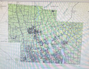
Delaware Data Inventory

Address Point: This data set is a spatially accurate representation of all certified addresses within Delaware County, Ohio. The address point indicates the location of the building’s center. This data’s intended use is for appraisal mapping, 911 emergencies, accident reporting, and disaster management. The data is updated daily, but published to the site monthly.

Annexation: Contains Delaware County’s annexations and conforming boundaries from 1953 to present. The data is updated on an as-needed basis and is published monthly.

Building Outline 2024: Consists of building outlines for all structures in Delaware County, Ohio. The data was updated in 2024 and on an as-needed basis.

Building Outline 2023: Consists of building outlines for all structures in Delaware County, Ohio. The data was updated in 2023 and on an as-needed basis.

Condo: Consists of all condo polygons within Delaware County, Ohio that have been recorded. 

Delaware County E911 Data: This data set is a spatially accurate representation of all certified addresses within Delaware County, Ohio. It is used for the State of Ohio Location Based Response System (LBRS). The data is updated on a daily basis, but published monthly.

GPS: Identifies all GPS monuments that were established in 1991 and 1997. The coordinates are in Universal Transverse Mercator Northing and Easting. The data is updated on an as-needed basis and published monthly.

MSAG: The Master Street Address Guide (MSAG) is a polygon feature set of the 28 different political jurisdictions such as townships, cities, and villages that make up Delaware County. The data set was created to facilitate the process of locating the boundaries of the different political jurisdictions. The data is updated on an as-needed basis and published monthly.

Municipality: This data set consists of all of the municipalities in Delaware County, Ohio. 

Parcel: The data set consists of polygons that represent all cadastral parcel lines within Delaware County, Ohio. All changes to this data set are represented by recorded documents stored at the Delaware County Recorder’s Office. The data is updated on a daily basis and published monthly.

Precincts: This data set consists of voting precincts in Delaware County, Ohio. Precincts are polygons that determine each voting precinct boundary. This data is The data is updated on an as-needed basis and published as-needed by the Delaware County Board of Elections.

Recorded Document: This dataset consists of points that represent recorded documents such as vacations, subdivisions, centerline surveys, surveys, annexations, and miscellaneous documents within Delaware County, Ohio. Created to facilitate the process of locating miscellaneous documents. The data is updated on a weekly basis and published monthly.

School District: This data set consists of all school district counties within Delaware County, Ohio. The data is updated on an as-needed basis and published monthly.

Street Centerline: The State of Ohio Location Based Response System depicts the center of pavement of public and private roads within Delaware County, Ohio. Address range data was collected by field observation of existing address locations and by adding addresses using building permit locations. This data set is a spatially accurate representation of the road system. The data is intended to support appraisal mapping. 911 emergencies, accident reporting, disaster management, and roadway inventory. This layer is updated on a daily basis while the 3D layer is updated on an annual basis. The data is published monthly.

Subdivision: This data set consists of all subdivisions and condos within Delaware County, Ohio. The data is updated on a daily basis and published monthly.

Survey: This data set is a shapefile of point coverage that represents surveys of land within Delaware County, Ohio. Points represent the location of the survey platform. The data is updated on a daily basis and published monthly.

Tax District: This data set consists of all tax districts within Delaware County, Ohio. Data is dissolved on the Tax District code. The data is updated on an as-needed basis and published monthly.

Zip Code: This data set contains all zip codes within Delaware County, Ohio. The zip code layer was created in 2025 by dissolving all Delaware county parcels by their property addresses. This data set was also used to populate the zip right and zip left attributes for Delaware County’s road centerline. The data is updated on an as-needed basis and published monthly through the United States Postal Office.

Map Sheet: This data set consists of all map sheets whiting Delaware County, Ohio.

PLSS: This data set consists of all Public Land Survey System (PLSS) polygons in both the US Military and the Virginia Military Survey Districts of Delaware County, Ohio. Was created to facilitate in identifying all of the PLSS and their boundaries. The data is updated on an as-needed basis and published monthly.

Farm Lot: This data set consists of all of the farm lots in Delaware County, Ohio. Was created to facilitate in identifying all of the farm lots and their boundaries. The data is updated on an as-needed basis where surveys are recorded.

Township: This data set consists of 19 different townships that make up Delaware County, Ohio. The data is updated on an as-needed basis and published monthly.

Dedicated ROW: This data set consists of all of the lines that are designated Right-Of-Way within Delaware County, Ohio. The line data was created through Delaware County’s Parcel data. The data is updated on an as-needed basis and published monthly.

Railroads: This data set allows a user to view the locations of railroads in Delaware County, Ohio.

Building Outline 2021: Consists of building outlines for all structures in Delaware County, Ohio. The data was updated in 2021 and on an as-needed basis.

Hydrology: This data set consists of all the major waterways within Delaware County, Ohio. The data is updated on an as-needed basis and published monthly.

Delaware County Contours: 2018 Two Foot Contours for Delaware County, Ohio in a file geodatabase format.

Original Township: This data set consists of the original boundaries of townships in Delaware County, Ohio. Data was before tax district changes affected their shape.
MaBailey Week4

Chapter 1 we are introduced to the foundations of arc and its basic functions. Here we learn how to save files and work with a layer of a map. 


I

n chapter 2 we learn how to design and symbolize thematic maps. We work with a thematic map. A thematic map consists of a subject layer placed in spatial context with other layers, like streets and political boundaries.


Chapter 3 things ramp up and we are now moving data and information to arc online. Here i got very confused and lost while transferring information. I also had trouble navigating the layout of arconline due to irt being different from the previous app we have been learning on. Steps seem to be a little less clear to me. 

Redman Week 5

Part Two: Preparing Spatial Data for Use

Chapter 4: File Geodatabases 

In this chapter, the focus changes from the visual aspect of maps to the data behind it. Chapter 4 shifts from map layouts to managing spatial data in the file Geodatabase, which is ESRI’s storage system. File geodatabases serve as organized storage for feature classes, raster datasets, and attribute tables. This is useful in research, spatial analysis, and keeping records. The purpose of this chapter is to learn how to organize project data, import external shapefiles and tabular data into a project geodatabase, modify field attributes, and execute relational joins and spatial queries in ArcGIS Pro.

Terminology:

  • File geodatabase (.gdb): ESRI’s database used to store feature classes, raster datasets, and standalone attribute tables optimized for ArcGIS Pro.
  • Feature class: A collection of geographic features with the same geometry type (point, line, or polygon) and identical attribute fields stored in a geodatabase.
  • Shapefile: A legacy vector data storage format for storing the location, shape, and attributes of geographic features, commonly converted into feature classes for geodatabase use.
  • Table join: An operation that appends the fields of one table to another based on a common matching attribute field across both datasets.

Tutorial: The tutorial was very helpful in learning how to navigate spatial data management. It showed how to:

  • Import data into a new ArcGIS Pro project
    • Create an ArcGIS Pro project
    • Set up a folder connection
    • Convert a shapefile to a feature class
    • Import a data table into a file geodatabase
    • Use database utilities in the Catalog pane
  • Modify attribute tables
    • Delete unneeded columns
    • Add a field and populate it using the Calculate Field tool
    • Join a data table to a feature class attribute table
    • Export a feature class to make a join permanent
    • Calculate the sum of fields
    • Calculate the percentage of total population under 20 years old
    • Extract substring fields and concatenate string fields
  • Carrying out attribute queries
    • View crime incidents
    • Create a date-range selection query
    • Reuse a saved query to create a definition query
    • Query a subset of crime types using OR connectors and parentheses
    • Query the day-of-week range
    • Query person attributes
  • Aggregate data with spatial joins
    • Build a spatial join
  • Use central point features for polygons
    • Create a central point feature class for polygons
    • Create a point layer
  • Create a new table for a one-to-many join
    • Create a table
    • Make a one-to-many join

Overall, I learned a lot in this chapter about backend data management. Cleaning up attribute fields and setting up relational joins makes spatial analysis more organized and increases efficiency

Chapter 5: Spatial data

This chapter focuses on spatial data formats and coordinate systems used for mapping locations accurately on Earth’s surface. It explains geographic coordinate systems, world map projections, US map projections, and setting projected coordinate systems for local, state, and national maps. The chapter also demonstrates how to work with vector data formats, download spatial and tabular data from the US Census Bureau, and source ready-to-use geospatial datasets from external repositories.

Terminology:

  • Geographic Coordinate System (GCS): Three dimensional reference system that uses latitude and longitude angular units (degrees) to measure locations on the Earth’s surface.
  • Projected Coordinate System (PCS):  Two dimensional planar surface that uses a mathematical transformation to project the Earth’s spherical surface onto a flat map.
  • State Plane Coordinate System: A set of 126 geographic zones dividing the United States to provide localized, high-accuracy projected coordinate systems with minimal distortion for local government and surveying work.
  • Geospatial data: Digital spatial data that represents geographic features and can be rendered into vector layers, raster datasets, or web services in GIS software.

Tutorial: For this chapter, the tutorial shows how to:

  • Examine world map projections
    • Examine distortions in latitude/longitude maps
    • Apply world projections like Hammer-Aitoff and Robinson on the fly
  • Change map projections for national maps
    • Change map projections to Albers Equal Area Conic
  • Set local coordinate systems
    • Look up State Plane zones in ArcGIS Living Atlas
    • Apply localized coordinate systems and project geographic layers on the fly
    • Configure map display units to feet or meters
  • Work with vector data formats
    • Convert shapefiles into file geodatabase feature classes
    • Plot point layers from XY coordinates
    • Convert KML files to feature classes using KML To Layer
  • Download Census Bureau spatial and tabular data
    • Download TIGER shapefiles and demographic data from the US Census Bureau
    • Join demographic tables to spatial boundary layers using GEOIDs

I learned a lot in this chapter about coordinate systems and projections. It was very helpful to see how changing projections prevents spatial distortion when analyzing geographic areas.

Chapter 6:Geoprocessing

This chapter covers geoprocessing tools and workflows used to extract, aggregate, overlay, and analyze spatial features. Geoprocessing is used as a tool in ArcGIS Pro to isolate specific geographic study areas, combine overlapping dataset boundaries, and apportion demographic attributes in unaligned spatial units. In this chapter, the text shows how to process and prepare layers for emergency management officials in Manhattan and the Upper West Side neighborhood.

Terminology:

  • Geoprocessing: A fundamental GIS framework and set of analytical tools used to manipulate, process, extract, transform, and evaluate spatial data to perform spatial analysis.
  • Pairwise Dissolve: Aggregation tool used to remove interior polygon boundaries sharing a common attribute while calculating summary statistics across combined shapes.
  • Pairwise Clip: An extraction tool that acts as a boundary cutter, keeping only the intersecting portions of input features within a specified boundary polygon.
  • Apportioning data: A method of estimating tabular attributes for custom target zones by calculating the proportion of spatial overlap between non-aligned polygon boundaries.

Tutorial: This chapter shows how to:

  • Dissolve features to create higher-level boundaries
    • Open attribute tables for block groups and examine housing attributes
    • Run Pairwise Dissolve on block groups to remove interior boundary lines and sum housing units by neighborhood
    • Dissolve fire companies to create fire battalion and fire division feature classes with population totals
  • Extract features for a study area
    • Use Select By Attributes to isolate a neighborhood boundary and export it as a study area
    • Use Select By Location to extract block groups and street segments intersecting the study area
    • Execute Pairwise Clip to trim street networks cleanly along perimeter boundaries
  • Overlaying datasets
    • Merge separate borough water feature layers into a single consolidated water dataset
    • Append firehouses and police stations to an existing EMS facilities point layer
    • Intersect streets and fire companies using Pairwise Intersect to assign response responsibilities
    • Run Union on neighborhood and land-use layers to calculate land-use areas
    • Use Tabulate Intersection to apportion demographic population data between census tracts and fire zones

This chapter was helpful in teaching about how spatial overlay tools work together to aid in urban planning and emergency management tasks.

Jan Week 4

Preface

The book covers ArcGIS Pro (desktop), ArcGIS Online (web maps), Living Atlas (ready made data), StoryMaps, and Dashboards. It has three parts: using maps then  preparing data and analyzing it. Note: I have no Windows PC, so I ran ArcGIS Pro in Windows 11 through Parallels on my MacBook.

Chapter 1: Introducing ArcGIS

  • I already knew most of the terminologies from previous readings but doing hands on work with them made much big of a difference compared to seeing screen shots or reading about them.
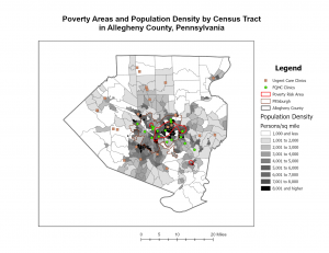
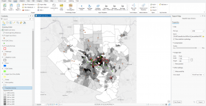
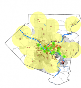
  • Subsidized FQHC clinics cluster in dense, poor parts of Pittsburgh, while urgent care clinics sit in the suburbs.
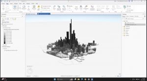
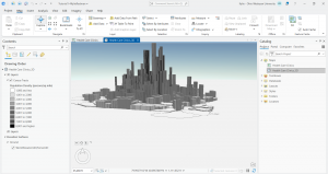
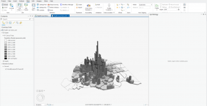
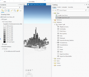
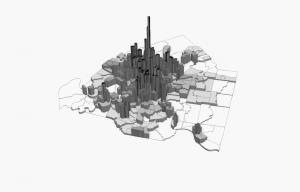
  • The 3D scene shows population density far better than shades of gray.

Question: How do planners decide reachable distane for people without cars?

Chapter 2: Map Design

  • The subject gets bright colors, and context gets gray.
  • My quantile choropleth breaks (830 to 11,595) get wider at the top, so the data is skewed.
  • The dot density map shows two groups (under 18 and over 60) on one map.
  • Fixed a broken data source (the red “!”) using Repair Data Source.


Question: Can quantile classes mislead when a few values are much larger than the rest?

Chapter 3: Maps for End Users

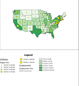
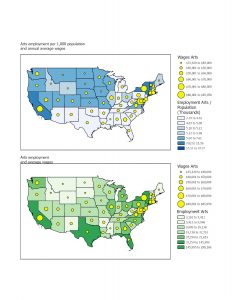
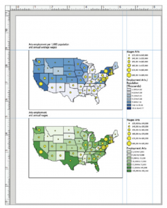
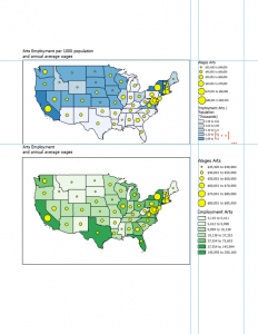
  • Built a two map layout of arts employment and wages by state.
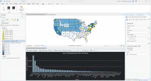
  • The bar chart shows California (290k) and New York (200k) far ahead in arts jobs.
  • I’ll finish the online parts (sharing, StoryMaps, Dashboards) and follow up.


Question: Is employment per 1,000 people a fairer comparison than total jobs?

Redman Week 4

Preface: The preface of this book explains that ArcGIS Online is a service that allows for making, analyzing, and sharing interactive maps. In part one of this book, users learn how to work with existing ArcGIS maps and how to navigate maps and data. Readers also learn how to use cartographic principles to symbolize a range of map types, build map layouts, and use ArcGIS storymaps to present results. Part two introduces the usage of real data to prepare for use. In part 3, the book focuses on analyzing spatial data and maps to solve problems. Buffers, service areas, facility locations, and data clustering will be used to analyze spatial relationships. Raster GIS and ModelBuilder will be used for analyzing demand for services. Lastly, readers use 3D GIS in the context of city planning. 


Part One: Using, Making, and Sharing Maps:


Chapter 1: 

In this chapter, an existing map is used. It has the locations of urgent health-care clinics in Allegheny county, PA. There are both federally qualified health centers that provide subsidized healthcare, and nonsubsidized clinics. The purpose is to be familiarized with how the software works and to analyze both clinic types to determine if they are sited in appropriate locations. 

Terminology:

  • Feature class: building block for displaying geographic features. Feature classes are vector data with corresponding attributes for each feature. 
    • Clinics: line feature. Has centerlines for all streets in the county.
    • Municipality: polygon feature class that has boundaries for all municipalities in the county.
  • Raster dataset: major type of spatial data. It is an image made up of pixels so small that you cannot see individual ones. If it is encoded with geographic coordinates, it can be used as a layer in a map. 
  • File geodatabase: folder that stores feature classes, raster datasets, and other data files. 
  • Project: file that contains maps

Tutorial: 

The tutorial was very helpful in learning how to navigate the map. It showed how to:

  • Get an overview of ArcGIS Pro
    • Set up a project
    • Add an d remove basemaps
    • Turn layers on and off
    • Reorder feature classes in the contents pane
    • Examine the catalog pane and open and export a map layout
  • Navigate ArcGIS Pro
    • Use a popup window
    • Zoom in to a raster feature class
    • Use bookmarks
    • Search for a feature
  • Work with attribute data
    • Open a table
    • Work with fields view of an attribute table
    • Select records and features of a map feature class
    • Obtain summary statistics using a tool
  • Symbolize maps
    • Symbolize feature classes
    • Label a feature class
    • add/remove feature classes
    • View and navigate scenes

Overall, I learned a lot in this chapter about how to navigate GIS. So far, it is a very interesting application and seems very user-friendly. I was able to follow all of the instructions provided even though I have never attempted to navigate a map site like this.

Chapter 2:

This chapter explains map design, specifically, how to design and symbolize thematic maps. Thematic maps help to solve and investigate problems. Thematic maps are composed of subject layers placed in spatial context of other layers. When deciding on layers for thematic maps, you should consider two things. The first is what layers are required to represent the subject, and the second is deciding on spatial context layers needed to orient users to recognize locations. Vector layers are used for subjects of thematic maps because of a large amount of data. This chapter focuses on cartographic skills and principles on symbology using several vector-based thematic maps. 

Tutorial: for this chapter, it shows how to:

  • Symbolize qualitative attributes
    • Display polygons using a single symbol
    • Display polygons using unique value symbols
  • Label features and configuring popups
    • Change label properties
    • Remove duplicate labels
    • Manage popups
  • Filter with definition queries
    • Create a definition query
    • Symbolize figure and ground features
  • Create choropleth maps for qualitative attributes
    • Create a choropleth map of households receiving food stamps
    • Extrude a 3D choropleth map
  • Display data using graduated and proportional point symbols
    • Create a map of graduated size points
    • Normalize population maps with custom scales
    • Create a choropleth map with normalized population and custom scale 
    • Import symbology and use swipe to compare features 
  • Create dot density maps
    • Set visibility ranges 
    • Set visibility range for labels and feature layers

I learned a lot in this chapter about thematic maps and different displays of them. It was very informative on scaling and labeling.


Chapter 3: 

This chapter shows how to share maps with people who do not have skills with maps besides navigation. This chapter teaches how to provide maps in many different formats. Formats include reports, slides, posters, or static maps for websites created from map data, online interactive maps, interactive online purports and presentations, and interactive online dashboards. 

Tutorial: this chapter shows how to:

  • Build layouts and charts
    • Create a layout and add maps to it
    • Resize and place maps
    • Add guides and snap maps to the guides
    • Insert legends
    • Insert text
    • Create charts
  • Share maps online
    • Set properties for online sharing
    • Share maps in ArcGIS online
    • Use map viewer in ArcGIS online
    • Change the style of a layer
    • Configure pop-ups
  • Create a story and a briefing in ArcGIS StoryMaps
    • Create a story
    • Add blocks for the introduction
    • Add a sidecar block with a mao
    • Add content for the left panel of the map
    • Enable navigation
    • Add credits
    • Preview and publish map
    • Create a briefing
  • Create a dashboard in ArcGIS Dashboards
    • Create a dashboard and add a map element
    • Add a table element
    • Adjust table
    • Add serial (bar) chart
    • Add interactions to the dashboard
    • Finish the dashboard

This chapter was very different from the last two chapters as it shows ways to display the information to other people who do not know how to use GIS. The tutorial made it very easy to organize charts and align the graphics in a way that is easy to read.


McMahon Week 4

Chapter 1:

For chapter 1, I was able to navigate through the software by looking at the contents table and the different categories on the top of the screen. On the map, I was able to analyze density population,  areas of poverty, clinics, and other aspects of the urban area. The step by step process was somewhat helpful, but there were many times when I got lost or couldn’t find the section it was asking us to locate.  On this chapter however, I learned how to organize features alphabetically in the different tables. It was interesting to locate the different clinics on the map and see what was around, including the population density and poverty rates within that area. I also found it interesting to move the icons and symbols around to make the map more readable. I thought I was able to book mark pretty well throughout the instructions of the chapter.

Key words: Attribute tables, input tables, population density

Chapter2:

Within chapter 2, there were many steps that included changing symbols and labeling the properties. The section in 2-2 was a bit confusing because I couldn’t find the drop down labels and continue the steps, but I noticed the images within the chapter and I thought it was interesting how the area could be split into categories. I thought that 2-4 was interesting because it showed how the incorporate a 3D map instead of looking at the 2D map and this helped to look at density of a population. Throughout the chapter, showed techniques to show different features of the same layer in the same map. I was able to use graduated symbols to show the density of food bands and soup kitchens in the area from the chapter and then I was also able to organize male and female population receiving food stamps. I was a little confused on what the source fields and target fields were from this chapter and what those represented. From 2-7 I was able to understand how the make a dot density map and analyze it. Lastly, for 2-8, I was able to label parts of the map, however I don’t think I was labeling correctly  because I couldn’t find where the last step was. However I understand the importance of scaling the map

Key words and concepts: Creating a definition query, visibility ranges

Chapter 3:

From chapter three, I thought it was interesting to do the story board with adding headings and content. I thought this chapter was interesting since we had to complete more downloads and we used our maps to make graphs. Some steps I struggled with, like downloading the picture to my ArchGis account, but when I figured it out it was nice to have my maps in a place to refer to. I thought it was helpful to change the last map into a pie chart and a graph.

Key words: Dashboard, bulleted list, heading

Hutto Week 4

Chapter 1

Chapter one introduces us to various features of ArcGIS, which include basemaps, Population density, as well as 3d models and how to export map layouts.  For population density, in the tutorial we were given a map of Allegheny County, Pennsylvania, which shows the location of Urgent Care Clinics and FQHC clinics, which are clinics that receive federal funding for their operation and services.  Using population density, we were able to compare the relationship between areas of higher poverty and community access using census tracts to either an Urgent Care Clinic or an FQHC clinic, and I found that urban areas (in the middle of Allegheny) have a higher poverty rate and therefore also have access to more FQHC clinics than rural or suburban areas of Allegheny.  Using 3d layers, you are also able to see this relationship and which areas have a higher poverty rate than others.


Chapter 2 

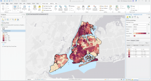
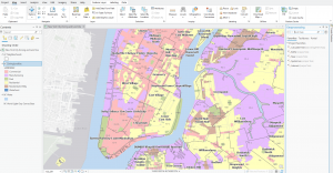
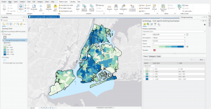
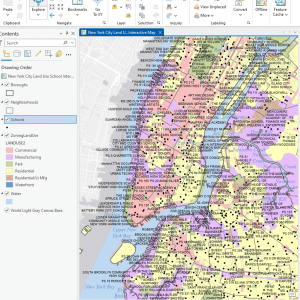
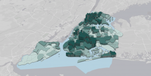
Chapter two introduces us to labels for polygons in land use and water layers which I found helpful. Using the labeling feature inside the labeling tab of ArcGIS, I was able to label each individual neighborhoods inside of individual landuse such as Commercial, Residential, and Manufacturing zones Tutorial 2.4 also teaches us how to create choropleth maps as well as see a histogram visualization of the choropleth. In Tutorial 2.4, we created a choropleth and anaylized the relationship between individual burroughs in New York City and households over the age of 60 receiving food stamps and found that Northern and Southern burroughs have a higher concentration of those over the age of 60 receiving food stamps than those in eastern and lower western Burroughs of New York City.


Chapter 3

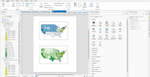
Chapter three covers the uses of ArcGIS Online, which allows us to map, share, and analyze the maps that we create on desktop through a web browser. This chapter also introduces us to the creation of map legends in layout exports. In the Layout Exports tab, we were able to display the two different maps we created: the first map at the top shows Arts employment per 1000 population and the annual average wages, while the bottom map shows Arts employment and annual wages. Legends were created for both maps, and using the ruler and guide features, I was able to insert the legends into the layout export so that the display is clean. Map sharing to ArcGIS Online also allows us to interact with each map through the web browser using interactive features.

Boldman Week 4

Chapter 1

Chapter 1 introduced some of the commonly used tools for representing data in GIS. Symbology is used to represent specific layers or areas on a map and helps make different features easier to identify. In this chapter, I learned how to change the type of symbol used to represent different features on a map. I also learned how to label features such as cities, parks, healthcare centers, and other locations. These tools helped me better understand how data can be organized and displayed in a way that makes a map easier to read and understand. Map features can be sorted by their attributes, making it easier to find specific types of data. When locations are deselected, GIS removes the symbol for that location from the map. This allows map viewers to save time by using the attribute table to quickly find and select specific data.

Chapter 2

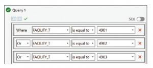
In this chapter, I learned different ways to manage large amounts of data efficiently and organize it more effectively on a map. I learned how to use definition queries and apply SQL logic to create specific filters that target certain points of data. This showed me that GIS can be used to analyze not only entire populations but also specific age groups or other characteristics within a population. One example I practiced was creating a filter to identify people over the age of 60 who receive food stamps. I then limited the layers on the map so that this specific data appeared as the top layer. This helped me better understand how GIS can focus on specific groups within larger datasets and display information clearly and organizedly.

Chapter 3

Chapter three provides a fundamental skill for GIS work. This chapter focuses on specific layouts for distributing and publishing maps. I learned how to add map data to a web map form and create legends with specific data points. This allowed me to take a copy of an interactive map and copy it to ArcGIS StoryMaps. StoryMaps is software that reminded me of making a website because of the elements that could be added and the different templates I could work with.

Montana week 4

Tutorial

Chapter 1


In the first chapter of the tutorial a massive amount of information was presented. Many aspects of how you can interact with various panels in the GIS and various display elements were explored. All of our work centered around Alleghany county PA and the urgent care availability and type of urgent care as it relates to other factors (ex:pop density, total pop per area, etc.) while also including other features like roads and rivers.

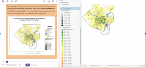
This map rendering focuses on the two different types of healthcare facilities in the county. The green dots(subsidized FQHC clinics)  and their subsequent buffers are concentrated in the areas where poverty is most likely to occur. The Urgent Care Clinics(unsubsidized are located primarily in the suburbs where poverty is less common.

At the very end of the 1st tutorial we got to turn the map into a 3d model based on population density. You can see the same concentration in the center of the county but now with more variable range since it can be displayed in height.


Chapter 2


Chapter 2 had a huge emphasis on the symbology feature when you would right click one of the terms in the contents page. It focused on ways that you could display and scale data.

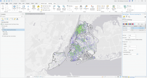
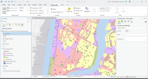
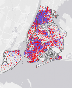
This image used the display by dot density symbology to show the population of individuals receiving food stamps over the age of 60(red) and individuals under the age of 18(blue)

Another cool thing this chapter looked at was at what scales do we have various names for places to come up. I got confused a couple of times on this one because things were taking a while to show up because they were appearing at similar layers and on a pretty huge scale.

Chapter 3

This chapter had a focus on the cross compatibility between the ArcGIS pro application and the online version where documents made in the pro version are made more accessible and user friendly. The system for editing your maps in the online version is much simpler but as a result lacks the ability to do complex tasks. The first part of chapter 3 also demonstrated how to include legends onto existing maps and how to show two maps at once for comparison.

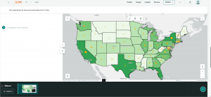
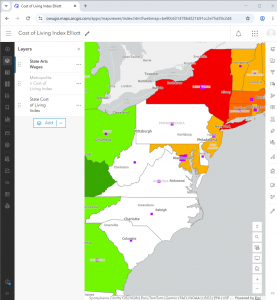
This first image is of a map made in the GIS that was then transferred to StoryMaps to be viewed. A brief introduction and summary of the map was included as well as the necessary citations and their usages.

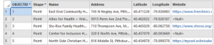
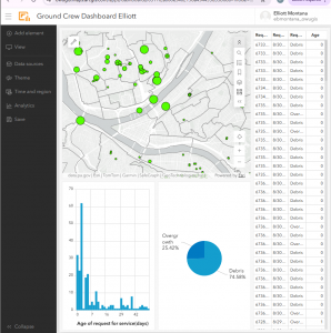
This last image is a dataset and map that was transferred from ArcGIS pro to the online GIS. Using the Dashboard utility we could make a simple table and corresponding charts.

Robinson Week 4

Chapter 1:

Before the start of this chapter, I thought using GIS was going to be pretty straightforward. The setup process was pretty easy. When I finally opened and ran the program, it looked pretty intimidating. So many buttons, sections, and menus to click through. One common thing I kept running into was the book’s broad directions when it came to finding menus. That made finding them a bit difficult. It took a good minute to get used to everything. Overall, I thought the workflow was fun, even though it was challenging to use, especially at first. The first chapter covered a few things, from the introduction to the GIS program to working with 3d3Daps. This chapter also covered some of the topics mentioned in the Mitchell book. Some of the included terms were classes, features, maps, etc. Part 1 was just a general overview of the program, understanding some of the basic concepts of it. The next section showed us how to navigate the program, which did help trying to move around the app program a bit easier. The next section had us working with attribute data, which lets the user search for features on a map and find necessary information. Section 6 had us symbolizing maps, turning raw data into visual information that everyone can see. This section was the most interesting because it involved setting up the overall map. I was trying to get all these bits and pieces to come together and turn them into a final product. One thing I was toying with for a good minute was the 3-d maps. After doing the labs for Chapter I, I felt generally really excited about learning to use these new programs. I look forward to the rest of the chapter and what it could offer down the line.

Chapter 2:

Chapter 2, just like Chapter 1, still felt like moving into a new world. Throughout the process, I was still trying to get used to the menus. Knowing where to find things, which sections they are in, etc. Chapter 2 goes into more detail about designing a map. A good chunk of the information on how to make a good map (depending on the data you’re presenting) was talked about previously. That gave me a decent understanding of what to expect in this chapter. Chapter 1 had us symbolizing qualitative attributes, learning how to symbolize features based on their code. The next section, my favorite section so far, was labeling features and how to configure pop-ups. Finding out what pop-ups are in GIS caught me a bit off guard. Regardless, it was one of the easiest sections of the chapter. Section 3 was the most interesting one, showing us how to filter information by defining queries. The next one discussed how to make choropleth (I’d never heard this word before) maps for quantitative attributes, but this section was the most enjoyable. Section 5 made us create maps with dot-to-scale references and gradients. Making dot density maps was the most interesting, and I spent maybe 30 minutes toying around with some of the features. Just to see what the end result would look like. My attitude toward GIS changed by the end of chapter 2. Searching through menus has gotten easier (the book was hit or miss), making the process of going through these labs much quicker. When working through this chapter, I started clicking through the menus more, trying to figure out each one’s function. Most of that time was spent working on section 3. Regardless, I had a fun time working with this chapter, and everything that I had to do in it.

Chapter 3:

Chapter 2, just like Chapter 1, still felt like moving into a new world. Throughout the process, I was still trying to get used to the menus. Knowing where to find things, which sections they are in, etc. Chapter 2 goes into more detail about designing a map. A good chunk of the information on how to make a good map (depending on the data you’re presenting) was talked about previously. That gave me a decent understanding of what to expect in this chapter. Chapter 1 had us symbolizing qualitative attributes, learning how to symbolize features based on their code. The next section, my favorite section so far, was labeling features and how to configure pop-ups. Finding out what pop-ups are in GIS caught me a bit off guard. Regardless, it was one of the easiest sections of the chapter. Section 3 was the most interesting one, showing us how to filter information by defining queries. The next one discussed how to make choropleth (I’d never heard this word before) maps for quantitative attributes, but this section was the most enjoyable. Section 5 made us create maps with dot-to-scale references and gradients. Making dot density maps was the most interesting, and I spent maybe 30 minutes toying around with some of the features. Just to see what the end result would look like. My attitude toward GIS changed by the end of chapter 2. Searching through menus has gotten easier (the book was hit or miss), making the process of going through these labs much quicker. When working through this chapter, I started clicking through the menus more, trying to figure out each one’s function. Most of that time was spent working on section 3. Regardless, I had a fun time working with this chapter, and everything that I had to do in it.