Beard Week 1

I have completed the GEOG 291 Quiz for Week 1

Hello! My name is Payton Beard, and I am a junior from Cincinnati, Ohio. I am a zoology major with a chemistry and ENVS minor, in hopes to either work at a zoo or become a vet. I chose to take this class, as it seemed like something interesting that also followed along with my ENVS minor. Outside of class I am a part of the soccer and softball team, so I am always busy.

3)

After reading this article, I learned how important GIS actually is. I had never heard of GIS until coming to OWU, but it is cool to see all of the different companies, and all of the researchers that use GIS in their everyday lives. GIS can be helpful to so many fields due to the fact that it was developed by multiple fields throughout history.  When I first started to search about GIS it really just seemed to me like a bunch of maps that showed random stuff, but after reading this it became apparent to me that it is more than just a map it can show things like transportation or agriculture or even healthcare which is something I would of never expected.

Something I found really interesting in the article is that GIS can be used in decision making all throughout society. GIS can be helpful for planning out cities, where road ways may go (like seen in the beginning of the article), and just how to improve societal ways in general. GIS can really strength society and help display more improvements that could make out world better than it already is. I believe that GIS is a very important part in our world today as it is like a piece of scratch paper where you can continuously make plans until you find the perfect resolution.

Another part of the article I thought was very interesting was how Dr. John Snow was able to use GIS in a way to track the spread of Cholera in London. When I think of a map I think of something that shows landmarks, mountains, or just things like land plots and stuff like that. I would of never thought that you could track the spread of Cholera. Seeing how he was able to track the deaths and the water pumps that the public were using was a major part in him figuring out what was happening and what the relationship the 2 things had. It also helps show that local knowledge mixed with interpretation can be really helpful in figuring out big problems.

4)
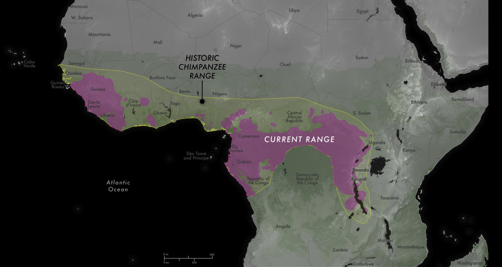
 

Chimpanzees heavily rely on forests, but with deforestation happening in Africa due to it changing for more agriculture, development, and other use the chimps are starting to lose their homes. Not only is this just happening to the chimps any animals that are in this environment are starting to struggle. The main purpose of this study was to find the most sustainable habitats for the chimpanzees in Africa, so that scientists were able to protect their populations more. As seen in the map the yellow represents the historic range that chimpanzees have been able to roam, and the pink represents the current range chimpanzees are about to roam. Just from this picture we are ale to see how much of the land has been taken away for human use, and how dangerous it is getting.

Garrison, Michala. “NASA Scientific Visualization Studio.” NASA, NASA, 13 Sept. 2023, svs.gsfc.nasa.gov
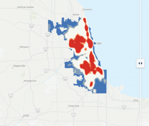
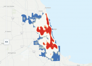
 

The purpose of this article was to show how crime rates in Chicago have changed over time. With Chicago being a large city there is plenty of bad things that can and have gone on there. In this article, they talked about how crime patterns have changed over a time period from 2001 to 2025 (left 2001, right 2025). GIS was used her to help show where crime is happening, which we can see from these 2 pictures. Yes it may look like crime has gone down over the years and it most likely has, but we can also tell that it is more spread out in 2025 compared to 2001. In this article they compare crime patterns to plenty of factors, but so are unemployment, changes over time, and where they are located within Chicago. With that we can tell that crime is not evenly distributed as crime is concentrated in certain parts of Chicago and not just spread equally all around. We can see from the red hotspots that the crime is likely higher which could be due to any of the factors that I listed before.

Zaroujtaghi, Ayda. “Beyond the Decline.” ArcGIS StoryMaps, Esri, 11 May 2026, storymaps.arcgis.com/stories/6bd041427d514764b99fbe91928b8b66?

Hutto Week 1

*I have completed the GEOG 291 Quiz for Week1* 

My name is Tomorick Hutto. I am a junior here at OWU, and I am majoring in Politics and Government with a minor in Religion. I chose to enroll in GEOG 291 after becoming interested in a career in urban and regional planning, specifically when it comes to mapping transportation accessibility and seeing how many internships and careers in the field rely on GIS, so taking this course is more of a way for me to build a technical skill that I can use later rather than just taking a course to fulfill a degree requirement. 

After reading Schuurman Ch.1, I found myself to have a better grasp and understanding of what GISystems and GIScience are, the multiple identities the acronym encompasses, as well as how GIS has been used and can be used in each of our daily lives. Prior to reading this chapter, I had a relatively vague understanding of what GIS was and its uses; I knew that planning commissions and other state and local government agencies used GIS software within the planning process to see residential, commercial, and industrial zones and how proposed developments could affect each of those zones and surrounding communities, however, I was not familiar with the uses of GIS software, at least when it came to other private firms such as Starbucks and Sanitation/Dumpster companies as well as even the defining role Geographers and university researchers played in part of developing and utilizing GIS software. 

One of the points I found most interesting throughout the Chapter was when Schuurman brought up how GIScientists study the underlying theories and concepts of what makes GISystems, and even how GIScientists have studied questions about whether GIS software and other technological tools that have been developed for similar uses are inherently gendered, which is a question that I had not even considered prior to reading this chapter. 

Another part of the chapter that I found particularly interesting was when Schuurman touched on the significance of the implementation of e-governance by various federal and provincial governments throughout the world and how e-governance technologies have been used to share information with the public in a much transparent manner which includes allowing private firms to access tax assessment information, survey lines, and other useful public definitions, which can be useful as a means to reduce high levels of corruption in different governments, however, I do also find the arguments of potential data privacy concerns thought provoking and whether there are better alternative methods to address privacy concerns while also still being able to relay important data which has been proven useful for people in various disciplines.


Source 1: Osei, Ernestina, “Identifying Socio-Economic Areas of Concern Towards Inclusion in GIS Hazard Management in Detroit, Michigan.” (2026). Master’s Theses or Doctor of Nursing Practice. 3306. DOI: 10.58809/CSVU1038 Available at: https://scholars.fhsu.edu/theses/3306

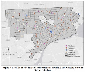
Figure 9 shows the locations of Fire stations, Police stations, Hospitals, and Grocery stores in Detroit. I found Figure 9 interesting since this particular study examines the spatial distribution of socio-economic vulnerability and accessibility to essential services in Detroit and highlights that when Hazards or other weather crises strike, the lack of grocery stores in parts of Detroit where there could be potential food deserts, make those with lower incomes more susceptible to exposure and sensitive to environmental hazards due to traveling to the grocery store with the proper needs.    


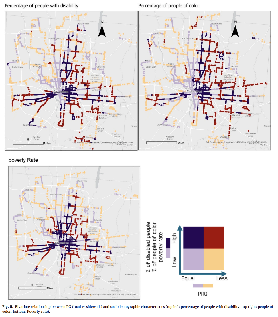
The above map was interesting to me because it uses a Ped shed Gap measurement; basically a way of showing where people can or cannot walk to essential places and then compares that with the percentage of people of color and those with disabilities.  I’ve never seen a map like this before until now and it took me looking at the map more closely as well as the description within the study, which measures the impacts of sidewalks on public transit and accessibility, to understand the relationships better. 

Source 2: https://doi.org/10.1016/j.trip.2025.101576


Dahlstrom Week 1

Part 1

*I reviewed the course syllabus and schedule to complete the GEOG 291 Quiz.*

Part 2

Hello! My name is Emma Dahlstrom and I am from Lexington, Kentucky. I am a sophomore this year at Ohio Wesleyan University. Currently, I am a declared Environmental Science Major and intend on eventually double majoring in biology or a related field. Although I do not know exactly what I would like to pursue after school, I have always been interested in working in the field of conservation. I am taking GEOG 291 not only for my major, but also because I have heard so much about GIS and was intrigued to learn more about it. Outside of my classes, I am on the university’s softball team and a member of Women In Stem.

Part 3

Originally I thought that GIS was just used in geography related fields and as a form of mapping. However, upon reading this chapter, I learned that its technology was used for so much more. One area that stood out to me particularly was how heavily it impacts agriculture. Coming from an agricultural based community, it was interesting to learn about all the ways GIS impacts its businesses. I was also surprised to learn that GIS was used in medical settings, planning cities, regulating commerce, e-governance, and so much more.

I also found it interesting the GIS had an identity problem. I was unaware that there are two sides to GIS: the “where”  spatial entities are and the “how” we encode spatial entities and the repercussions of different methods of analysis on answers to geographic questions. This identity problem allowed them to differentiate the important difference of spatial analysis and mapping to me. Spatial analysis is extracting the information from spatial data while mapping represents geographical data in a visual form.

Although I was somewhat familiar with GISystems, I was unaware that there was a second face to GIS called GIScience. I learned that GIS is now widely considered a “black box” system because it has become so widely established that it is simply assumed to be true and justifications are no longer required. However, GIScience was established to research and question the accuracy and underlying assumptions of these systems. This established the point that when using GIS, you must responsibly analyze the data to reach an accurate conclusion.  

Lastly, I found that the ability of GIS to visualize spatial relationships and objects makes interpreting the analytical pattern more accessible. This not only applies to the general public, but also to researchers as well. For example, the chapter details how the visual map of the cholera outbreak in London allowed epidemiologist John Snow to identify the location of the outbreak’s origin. 

Overall, this chapter introduced me to the history of GIS and the vast amount of fields and problems that it impacts in our everyday lives.

Part 4

Source 1:

Owusu‐Sekyere, Adriana, and George Ashiagbor. “Mapping the Paths of Giants: A GIS‐Based Habitat Connectivity Model for Forest Elephant Conservation in a West African Forest Block.” African Journal of Ecology [HOBOKEN], vol. 63, no. 2, no. 70028, Mar. 2025, https://doi.org/10.1111/aje.70028.

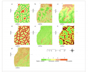
The Bia Goaso Forest Block in Ghana is home to a vital population of African forest elephants. Historically, the elephants had more extensive ranges and moved across a broader landscape. However, in recent years the population has been isolated which could cause several biological issues for the species. Through the use of a GIS-based habitat connectivity model, scientists were able to find a strong solution that enables the integration of landscape and ecological data on elephant habitat selection and movement. This map shows the variables influencing the choice of movement for the forest elephants based on proximity to water, land use, elevation, proximity to roads, slope, proximity to community, and terrain ruggedness. In addition, it details a variety of locations in the forest block that are suitable and unsuitable for forest elephants. By taking all of the variables into account and eliminating the unsuitable habitats for elephants, scientists were able to identify core channels and areas for elephant movement. This allows for the protection and maintenance of those pivotal areas for the conservation of the elephant species.

Source 2:

Kucsicsa, Gheorghe, and Cristina Dumitrică. “Spatial Modelling of Deforestation in Romanian Carpathian Mountains Using GIS and Logistic Regression.” Journal of Mountain Science [Heidelberg], vol. 16, no. 5, May 2019, pp. 1005–22, https://doi.org/10.1007/s11629-018-5053-8.

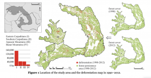
This study focused on the Carpathian Mountains which is an area of land that is heavily affected by forest loss. The goal of the study was to examine and analyze the various variables of deforestation in the area and to model the probability of deforestation through the use of GIS. This map displays the difference in forest coverage between 1990 and 2012. In the combined map, the persistent forest coverage stayed green, while the areas affected by deforestation were represented by red. This provides a clear visual of the affected areas. The map also sections off the area into four parts. This displays which parts of the mountains were being most affected by deforestation. By doing this, the scientists were able to identify the variables and their significance in the area. Understanding the driving forces of deforestation in affected areas allows conservationists to adopt appropriate policies and decisions in forest management and conservation.

Agrawal Week 1

** I reviewed the course syllabus and schedule and completed the GEOG 291 quiz. My photo is attached below.

Introduction

Hi, my name is Radhika Agrawal, and I am a senior at Ohio Wesleyan University. I am pursuing degrees in Quantitative Economics, Computer Science, and Data Analytics. I am interested in data analysis, business intelligence, and using data to understand real-world problems. I decided to take GEOG 291 because I want to add geospatial analysis and ArcGIS Pro to my technical skills. I am interested in learning how location-based data can be used in transportation, consumer behavior, economic development, and public-sector decision-making.

Schuurman Chapter 1

Before reading this chapter, I mainly thought GIS was software used to create maps. However, this chapter explained that GIS is much broader than that. It can mean Geographic Information Systems, which includes the software, hardware, data, and tools, but it can also mean Geographic Information Science. GIScience focuses more on how geographic information is collected, represented, analyzed, and understood.

I found the history of GIS interesting. Ian McHarg used transparent sheets with different layers, such as land use, forests, houses, and roads, to find the best location for a highway. He did this without a computer, but the same idea of layering information is still an important part of GIS today. Computers have made it much easier to combine many layers and study the relationships between them.

The chapter also explained the difference between mapping and spatial analysis. A map displays information, while spatial analysis can help us discover new information and answer questions. For example, John Snow mapped cholera cases and water pumps in London. The pattern on the map helped connect the outbreak to a particular water pump. This showed me how visualizing data can make patterns much easier to understand than looking at numbers in a table.

I was also surprised by how often GIS is used in everyday life. It is used in transportation, agriculture, healthcare, business, utilities, government services, and even deciding where stores should open. Many people benefit from GIS without realizing that it is being used.

One important point from the chapter is that GIS results are not automatically perfect or unbiased. Analysts make decisions about what data to collect, how to create categories, where to draw boundaries, and what to display. These choices can affect the final results. Overall, this chapter helped me understand that GIS is not just about making maps. It is a powerful way to analyze real-world problems, but it must also be used carefully and responsibly.

ChatGPT GIS Applications

1. Transportation Safety and Crash Analysis

GIS is widely used by transportation agencies to identify dangerous roads and intersections. Crash records can be placed on a map over road-network layers. Analysts can then identify crash clusters, compare accident frequency and severity, and study factors such as traffic volume, road design, weather, and nearby intersections. Transportation agencies can use this information to decide where improvements such as traffic signals, crosswalks, lighting, or redesigned intersections are most needed. The Federal Highway Administration explains that GIS-based crash applications often combine maps, dashboards, graphs, and filters. This allows agencies to find high-crash areas and make better roadway-safety decisions. I find this application interesting because it combines data analytics with transportation planning and can directly improve public safety.

Source: https://www.gis.fhwa.dot.gov/reports/Using_GIS_for_Crash_Location_and_Analysis_at_State_DOTs_June2022.pdf

2. Public Health and Healthcare Accessibility

GIS can also help public-health agencies understand how health conditions and access to services differ across locations. The CDC’s PLACES interactive map displays measures such as obesity, physical inactivity, health-insurance coverage, disabilities, and other health outcomes at different geographic levels. Analysts can combine this information with the locations of hospitals, clinics, transportation routes, and demographic data. This analysis can identify communities experiencing poor health outcomes or limited access to healthcare. Public officials can then use the results to decide where clinics, outreach programs, transportation assistance, or other resources are most needed. I find this application interesting because it shows how geographic and demographic data can support fairer resource allocation and policy decisions.

Map: https://www.cdc.gov/places/tools/interactive-map-tool.html

Aslam Week 7 (emailed this before)

Final Project Data Summary

  1. Tax District

This data set contains all the tax districts within Delaware County. The Auditor’s Office establishes these districts based on tax codes, and this data set is updated whenever necessary. It is published monthly.

  1. Parcel

This dataset includes all parcel boundaries in the County. The information in this dataset is updated daily by the Auditor’s GIS Office. The information is subject to change as recorded documents are filed.The information on parcels, such as owners and appraisals, is kept using the CAMA system.

  1. Address Point

These are official LBRS address points, which are centroids of buildings. They are used for reporting accidents, 911 calls, geocoding, among other uses. This information is updated daily by the Auditor’s GIS Office.

  1. Recorded Document

This data set comprises all recorded documents that do not include active subdivision plans, such as annexations, vacations, centerline changes, and surveys. This data set is used to locate these recorded documents; updates are done on a weekly basis.

  1. Zip Code

This data set comprises all the zip codes found in Delaware County.This information was cleaned up in the early 2000s, and this data set was created by dissolving parcels based on addresses. It is updated when changes occur within the USPS.

  1. School District

This data set shows the school districts within Delaware County. This information was created based on parcel information and is updated whenever changes occur.

  1. Map Sheet

This data set contains all the map sheets within Delaware County. It is essentially the index grid used to create maps within the County.

  1. PLSS

This dataset includes all PLSS polygons for U.S. Military and Virginia Military Survey Districts. It helps identify these survey districts. It is updated as new survey work is recorded.

  1. MSAG

At this level, the Master Street Address Guide is added, wherein the boundaries of the 28 political jurisdictions such as townships, cities, and villages are presented.

  1. Municipality

In this dataset, the map indicating the incorporated municipalities such as cities and villages in Delaware County is added.

  1. Farm Lot

The boundaries of the farmlots in the U.S. Military and Virginia Military Districts, old boundaries included, are presented in this level of the dataset if updated.

  1. Township

This dataset includes all 19 townships in Delaware County, updated as the boundaries are changed.

  1. Street Centerline

This layer includes the LBRS Street Centerline layer, showing the center of the pavement of all the roads in Delaware County, where the address ranges were created through field checks.

  1. Annexation

This dataset includes all annexations recorded in Delaware County since 1853.

  1. Condo

This dataset includes the boundaries of all the condos in Delaware County, obtained from the Recorder’s Office.

  1. Subdivision

This dataset shows the boundaries of all the subdivisions and condos, obtained from the Recorder’s Office.

  1. Survey

This dataset includes a point layer showing the locations of the surveys, obtained from the Recorder’s Office and the Map Department.The survey documents have been scanned and linked. It updates daily.

  1. Dedicated ROW

This dataset shows all right of way lines in the county. These are from daily parcel updates and show land set aside for roadways and public access.

  1. Building Outline 2024

This is the building outline dataset for 2024. It shows all building footprints as they are currently in the most recent imagery.

  1. Building Outline 2023 

Similar to above, this dataset shows building outlines from 2023.

  1. Railroads

This dataset shows railroad locations in Delaware County. It allows users to view where railroad tracks are in the county.

  1. Precincts

This dataset maps all precincts in Delaware County. It is maintained in conjunction with the Board of Elections and is updated as precinct boundaries are changed.

  1. Delaware County E911 Data

Another LBRS dataset for address points, this one is specifically for emergency response. It is used for 911 response and phase II. It updates daily.

  1. Building Outline 2021

Building outlines from 2021. Useful for viewing older building footprints.

  1. Hydrology

This dataset shows all major waterways in Delaware County. It was updated in 2018 using LiDAR. It also includes other water features.

  1. GPS

This dataset lists all GPS monuments established in 1991 and 1997. These are used for surveying and accuracy.

  1. Delaware County Contours

This dataset contains all 2-foot contour lines. It was made from 2018 elevation data.

  1. Original Township

This dataset shows original township boundaries before changes from tax districts.

Azizi Week 4

Chapter 1

  • In Chapter 1, I worked through several tutorials that introduced the basic tools and concepts of ArcGIS Pro. At first, it took some time to locate certain features, and I felt a bit confused in the beginning. However, as I continued through the tutorials, I gradually became more comfortable navigating the software.
  • One concept that stood out to me was how layers are organized on a map. I learned that layers are placed on top of a basemap and that the order of layers is important, because one layer can hide another if it is placed above it. Understanding how to arrange layers correctly is important for making sure the map displays the information clearly.
  • In Tutorial 2, I worked with feature classes and practiced zooming to features. It was interesting to see the different types of feature classes and how they are used to represent geographic information.
  • Tutorial 3 focused more on attributes and how they can be managed. I learned how to search for, rename, arrange, and select features in the attribute table. I also used the Summary Statistics tool to calculate statistics for attribute values.
  • In Tutorial 4, I learned how to change labels, such as those for municipalities, and how to modify symbols using the symbology tools. I also practiced adding and removing feature classes. One of the most interesting parts of this chapter for me was working with a 3D map for the first time and seeing how spatial data can be visualized in three dimensions.

Chapter 2

  • In Chapter 2, I learned more about symbolizing maps using qualitative attributes, labeling features, and configuring pop-ups. It was interesting to see how ArcGIS can use attribute values to automatically symbolize different features on a map. I also learned how to create definition queries to show only a subset of features from a dataset, which was very helpful when focusing on specific information. I also practiced symbolizing maps in the exercises, which helped me understand how attributes control how features appear on a map.
  • Another thing I worked on was setting visibility ranges for labels. This was mostly about understanding map scales and how the scale of a map relates to real-life distances and areas. I learned how labels and features can appear or disappear depending on the zoom level you choose. This helps keep the map clear and prevents too many features from appearing at once.
  • I also learned about different ways to symbolize quantitative data, such as using graduated symbols or proportional symbols to represent differences in values. This makes it easier to see patterns and comparisons across the map. Another interesting concept was dot density maps, which help visualize how certain quantities are distributed across an area.
  • Overall, Chapter 2 focuses more on map design and how to make thematic maps clearer and easier to understand. It shows how the choice of symbols, labels, and scales can help highlight the main subject of the map while keeping other information in the background.

Chapter 3

  • In this chapter, I learned how to build map layouts that can include more than one map. It was interesting to see how layouts are designed for reports, presentations, or websites, and how guidelines help place maps and other elements neatly and precisely on the page.
  • I also learned how to share maps from ArcGIS Pro by publishing them to ArcGIS Online as web maps. It was interesting to see how maps created in ArcGIS Pro can be used online and then edited further in the ArcGIS Online Map Viewer.
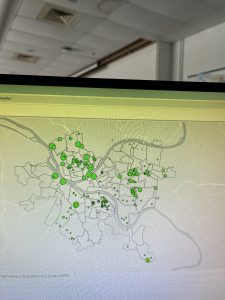
  • I created a dashboard using ArcGIS Dashboards and displayed spatial data more interactively. The dashboard had a map, tables, and charts that updated dynamically based on the area shown on the map. It was interesting to see how this type of tool can help organizations monitor service requests and make decisions more efficiently.
  • While working with the dashboard tutorial, I explored different tools like bookmarks, basemaps, and layers. I was also supposed to find the “Expand” button on the top right corner of the map to enlarge it, but I honestly could not locate it, so I continued exploring the map using the other available tools.

Butte_Weeks 6-7

Week 6 Work:

Chapter 7:

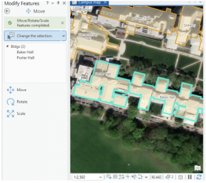
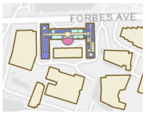
This chapter/ tutorial was actually a lot of fun to work with. It felt a lot like working in Adobe Illustrator, with making the point lines, and moving the features. I also felt very fancy using the Cartography tool, and “improving the aesthetic” of my map/ its lines. Learning how to edit, delete and move the buildings around was super cool. This is extra useful in the world we live in today, with construction and deconstruction always affecting/ moving locations and landmarks. It was interesting to think that no matter how “good” a map might be, there can still be aspects of it that are warped between the system and ground map. Being able to fix that distortion can be an extremely invaluable tool. Creating features is also very useful when starting a map from scratch, or if the project doesn’t include the needed feature class. Because this chapter dealt with a lot of permanent modifications, it included good advice to keep an unedited version of whatever map you’re working on in case of any errors. That way you can just go back to the original file and start the map over again. Using a style of system work that mimics the work of Architects and professional location planners at the end made the assignment feel very professional. Like, it ran us through what the professionals do, giving us an idea of what to expect if any of us wish to go to that level.

Chapter 8:

This chapter went very local, working primarily with Zip Codes and Counties. Using geocoding to map the charts of zip codes and counties, the chapter bridged the gap between chart data and actual geographic locations, inputting them into analyzable features on the maps. This chapter introduced Match Scores, something that I am still trying to understand a little bit more. Essentially, the match score shows the percentage of accuracy of an address when evaluated with a reference. Around 85%-98% is usually an acceptable score range, but in some situations it’s ideal to try to have a perfect 100% match. I did have a few issues with this chapter when trying to Rematch Addresses. Whenever I would try to click the map to set the rematch, I would continue to get pop-ups and the rematch selection wouldn’t actually register. I turned off the pop-up setting from the map (temporarily) and it seemed to bypass the issue. As I stated before, I believe that longer tutorials are more beneficial to my learning process- and this was heightened using chapter 8. As this chapter only actually has 2 assignments built into it, they both build off of every step followed in the textbook. If something was missed, or incorrectly done, the entire assignment would be messed up and needed to be redone. This was a bit annoying, but in the end the repetition definitely aided my understanding of the topics taught in this chapter.

Chapter 9:

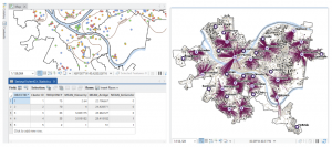
Learning about and setting up buffers was something that was briefly recapped in some of the much earlier chapters, so I had some initial knowledge on them. My first thought when working with them was that they’re bubble letters for feature plots! These bubbles were quite fun to set up, and I can visualize a lot of reasons why someone would use them on a map- like finding a specific feature within a distance from certain features, and gathering data on what’s outside these zones as well. It’s very neat that the buffers can have multiple layers of distances applied to a single feature set at the same time. And although I actually like the “target” look on the map, and how it visibly shows the change in distance on the plot, I can understand that there might be reasons to make a single “multiple ring” buffer containing both blended together. A small note for the future, that using Optimized seed in the Multivariate Clustering tool is the setting that should be used when making your own projects/ data. This entire chapter was extra visually appealing for some reason, the colors used as symbology on the features fit well, and I absolutely love the way the map looks with the Locations-Allocation assignment with the lines diverging from the “ideal” location points. That entire assignment was fascinating as well, how the system was able to calculate the best locations of pools from the data collected and accessed. It was a great representation of the ability of GIS to manipulate datasets to create purpose driven maps. The system works for real world problems, using analysis to work out relationships between features/ points, and provide a simple answer to questions asked about data.


Week 7 Work:

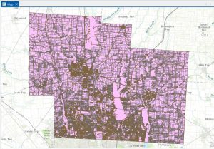
The Delaware City maps have been downloaded, and inserted onto a created GIS Pro map for the final project map. I moved the maps around adjusting their map display from the drawing order to see which layering was best, featuring all the needed datasets. The Parcel map is very interesting to explore, with how much detail it has within its data and display. I generated ideas for my final project and evaluated each dataset’s information.

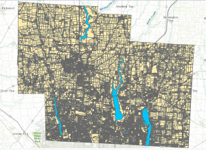
The Parcel map is managed daily by the Delaware County’s Auditor GIS Office, with data kept by the Delaware County Recorder’s Office. It shows clearly defined boundaries of land plots and features from all around Delaware. It is packed to the brim with every single road, building and section of land, complete with their IDs, data, and building names. I will note that the map looks like it could be a little bit off, with some features not in the correct location on the map, or it could simply be the way I have it layed out creating this illusion. This dataset is key to working on the “What’s Inside?” section of the final project, as it requires the data being gathered to be set from within, or inside a parcel of Delaware land.

The Hydrology map shows all major waterways of the Delaware County, and was made in July of 2022 with no updates since then. This dataset could be useful if inspired to work with runoff into waterways, or a specific project with water. However, it may not be entirely useful for other areas of mapping besides acting as a location identifier. 

The Street Centerline map is a highly adaptable map with many ways to use it and displays exactly what it sounds like, all the public and private roads located within the Delaware County district. Made from data collected by The State of Ohio Location Based Response System (LBRS), the map remains updated daily for most aspects except for the monthly 3-D model updates. This map is great for landmarking, and making the map easy to understand if reading it for specific locations. This map can be useful for a number of things ranging from emergency response maps and ranges, to appraisals and accident reports. 

Ramirez Week 7

PLSS: This data is called the public land survey systems where all the public land is visible in Delaware county. This data is useful for both U.S and Virginia military districts and it is updated monthly. 

Zip Code: This data set contains all the zip codes in Delaware county. Some of the zip codes were manually created because they did not automatically appear on the system. They also used U.S postal service and other sources to gain the information. This map is also updated monthly.  

School District: This dataset contains all school districts within Delaware County. The data comes from the Delaware County school district records. It is updated and published monthly.

Township: Includes information of 19 different townships in Delaware County. It is also updated when needed and published monthly. 

Delaware County E911 Data: This data includes information on all certified addresses within Delaware County. It contains information regarding 911 agency information to improve their services. It is also updated when necessary and published monthly.

Building outline 2021: Data consists of all building outlines in Delaware county. The most recent update was in 2021 but it is updated as needed. 

Original Township: I couldn’t find any information regarding this dataset. 

Recorded Document: This includes points which represent recorded documents in Delaware county’s Recorder’s Plat Books. This is helpful when it comes to locating specific documents that may be scattered throughout the county. This is updated weekly and published monthly. 

Building Outline: I couldn’t find any information about this dataset. 

Dedicated ROW: Represents all the Right-of-Way paths in Delaware county. Information was gathered from Delaware’s County Parcel data. This is updated daily and published monthly. 

Building Outline 2023: Shows all the building outlines in Delaware county from 2023.

Precincts: Included information about voting Precincts in Delaware county. Information was gathered using Delaware County Auditor’s GIS from the Delaware County election board. It is updated when needed and is published when needed by the election board.

Delaware County Contours: It looks like the data is from 2018 and it shows the Two Foot Contours for Delaware County.

Street Centerline: Includes data on paved public and private roads within Delaware county. It is used to support road safety and improve 911 services, as well as ensuring the roads are up to date. It looks like it is updated annually but the data is published monthly

Condo: Includes data of all condos within Delaware county. 

Parcel: Includes data on all registered parcel lines in Delaware County. The data was collected through the Delaware County Auditor’s GIS office. It is monitored daily and is published monthly 

Subdivision:  Includes data of all subdivisions and condos from the Delaware County recorder’s office. It is updated daily and published monthly. 

Tax District: Includes information of all tax districts in Delaware county. The data is recorded on the Tax district code. It is updated as needed and published monthly. 

Address point: This includes information of all registered  addresses in Delaware county. It helps 911 agencies to find the most suitable places for their job. It is updated daily and published monthly.

Map sheet: I could not find any information about this set.

Hydrology: includes all major waterways in Delaware county. Information was gathered and updated using the LIDAR enhanced dataset in 2018. It is updated as needed and published monthly.