Walz – Week 4

Preface:

The preface went over what this tutorial/book is about. It briefly talked about what the chapters are over and what applications you will be using GIS for. It went over the software and different websites of ArcGIS to expand upon your map. It talked about the different tutorial sets along with this content being a learning system of 25 years of experience.

Chapter 1:

Chapter 1 had us exploring a map and getting familiar with a lot of the tools and things you change on a map. It went over navigation of a map, symbology, working with the attribute tables along with labeling maps and using keys.

Chapter 2:

Chapter 2 took a look at map design and how to visually look at qualitative attributes. Things like dot density, symbolizing these values and changing their color, doing a definition query to look at a specific set of the attributes visually, and a choropleth map.

Chapter 3:

This chapter dealt with building map layouts, presenting your maps, and sharing them. Made a map key for the 3-1 tutorial map, fooled around a bit with the sizes and colors. I learned to share a map to ArcGIS online along with writing a summary and putting tags. When I tried sharing, it looked like the OWU wifi was too slow (?) and wouldn’t let me upload, because of this I couldn’t do the 3-3 tutorial but I read through the steps and got the gist of creating a story. I was able to upload 3-4 map and went into ArcGIS online dashboard.

Fox – Week 4

This week, I read chapters 1,2, and 3 of the GIS tutorial book and made some maps!

Chapter 1: This was my first dive into making these maps, and I will say it did take me a second to figure everything out. But the book did do a really good job of giving good directions on what to click and when, along with providing pictures so we know if we’re on track. 

Chapter 2: In this chapter, I made maps of just an area, looking at certain characteristics. This map did take me a little bit longer to figure out, just because of all the different colors and details the book was having us add, which led me to get a little confused at times. Although I did realize how easy the map was to read once I got all the colors and layers onto the map. 

Chapter 3: I think that sharing maps online is a very good thing and much easier than I had thought it would be. I appreciate that I was able to get ARCGIS right onto my personal computer, which made the process and the entirety of this week’s work a lot easier and more convenient. Overall, the processes of making all these maps is a lot easier than I had originally anticipated. 

Tadokoro, Week4

Preface

The preface to GIS Tutorial for ArcGIS Pro 3.1 greets readers to the fifth edition of this comprehensive, step-by-step workbook. The workbook strongly focuses on creating, analyzing, and sharing 2D and 3D maps through portals such as ArcGIS Online and Living Atlas. It uses a systematic learning approach that combines lectures, lab work, and student-driven projects and provides step-by-step tutorials, assignments, and lecture notes to support learning.
Furthermore, the book illustrates actual-world, real-world applications such as poor population’s health access analysis, crime data mining to detect patterns, mapping poverty indices, and urban planning based on LIDAR data. The learning process is organized into three divisions: working with maps already available, preparing and managing spatial data, and problem-solving through spatial data analysis.

Chapter 1

At first, I didn’t know where things were, and it took me some time to figure it out. However, I tried to take my time and carefully follow the steps in the text.
I was especially happy when the bookmark I created actually worked.


Chapter 2

In this chapter, I operated the Symbolize function many times, which helped me understand how it works in depth. What I found especially interesting was learning how pop-ups disappear when zooming in and reappear when zooming out. I had often seen this behavior in Google Maps, so it was fascinating to understand how it actually works.I also realized that combining colors and symbols makes the map much easier to understand. In Tutorial 2-6, I learned that simply changing where to set custom classifications can make information on the map much more readable.


Chapter 3

I learned how to actually share a map and also how to edit a shared map. I realized that many of the tasks in Chapter 3 can be done from my own computer, and once a map is created and shared, it can be edited anytime and anywhere, with the option to add graphs and tables. I thought this was very convenient. Moreover, I felt that not only sharing the map but also including it in a web-based story helps readers understand more deeply. I was glad to learn how to create this as well.


Tooill – Week 5

Chapter 4-

  • Right click on fields in an attribute table to edit and remove them.
  • On field view of an attribute table, you can add fields. Be sure to click save!
  • Joining a data table to a feature class attribute – Joins and relates -> Join -> Input join field -> Join table field -> Validate -> OK
  • Exporting a feature class – Contents pane -> Right click -> Data -> Export features -> Enter relevant info -> Run tool
  • Calculating sum of fields -> Fields view of attribute table -> Right click field -> Calculate field (calculating % is same except expressions)
  • Creating a query – Map tab -> Selection group -> Select by attributes -> Add clauses
  • Aggregating data with spatial joins – Search spatial join tool -> Fill in fields -> Run

Chapter 5-

  • State plane coordinate system – livingatlas.arcgis.com
  • Could not get shapefile to work. File would not be extracted and uploaded.
  • Adding X,Y data -Contents pane -> right-click ie. Libraries > Display XY Data -> Output Feature Class: ie. Libraries -> X field: XCOORD -> Y field: YCOORD -> Coordinate System: Current Map -> Run
  • Use the KML to Layer tool to convert a KML file to a feature class
  • Not going to lie, couldn’t get half of these chapter 5 tutorials to work so there isn’t much to note


Chapter 6-

  • Pairwise Dissolve tool – Dissolves block groups to create neighborhoods.
  • Select attributes to create a study area, then remove original layer to leave only what you want to see.
  • Use Select by Location to create study area block groups
  • While holding shift, select different block groups. Then, use export features tool to separate them from the rest of the blocks and remove the original layer.
  • Pairwise clip tool is for clipping streets
  • Merging water features – Merge tool -> choose inputs/outputs -> run tool -> turn off original water layers
  • use the Append tool to add features to an existing feature class, considering that both have the same attributes
  • The Union tool overlays the geometry and attributes of two input polygon layers to generate a new output polygon layer aka helps determine area.

Hess – Week 3

Mitchell Chapter 4 – Mapping Density – 

Density mapping highlights concentrations of features, making it useful for identifying patterns rather than exact locations. Density maps rely on areal unit to show distribution. Mapping density is especially useful when mapping areas, such as census tracts or counties, which vary greatly in size. The next step is deciding what to map, whether you need to represent features themselves, or their values, as this choice shapes the patterns revealed. Points or lines are usually mapped with a density surface, while summarized data is mapped within defined areas. there are two main approaches: mapping density by defined areas or creating a density surface. Defined areas can show density through calculated values or dot maps, where each dot represents as set amount. A density surface, on the other hand, is a raster layer where each cell holds a density value. To build one, you set parameters and units, which influence how patterns appear – call size control detail, search radius controls generalization, and calculation methods vary by approach. Finally, density surfaces can be displayed with graduated colors or contour lines. The patterns in a density surface are affected by the distribution of sample points. The more sample points, and the more dispersed they are, the more valid the patterns will be. Be aware that the values in the areas between the points are estimates. Looking at the results are very important to determine what the information is telling you.

Mitchell Chapter 5 – Finding What’s Inside –

Finding what’s inside is a method in GIS used to determine whether certain features occur within an area and to compare information across different or multiple areas. Comparison is often crucial, as it helps us understand what surrounding areas contain—or lack. To do this, we can either draw boundaries or use existing ones, such as zip codes or watersheds, with each area identified by name. GIS makes it possible to generate lists, counts, or summaries of features within an area. These can include features entirely inside the boundary, those partially inside, or even just the portion that falls within. One common approach is overlaying areas and features, which provides clear summaries but can be more computationally intensive. When overlaying summarized data, it’s best if the summarized units fall completely inside the defined area. This technique works well for both continuous data and discrete features, whether for a single area or multiple. For clarity, maps should label areas or distinguish them with shading. When analyzing the selected features, it’s useful to consider frequency, or how many features share a given value. Results can be displayed as bar charts for counts or pie charts for proportions. Numeric attributes can also be summarized using statistics such as sum, average, median, or standard deviation. While the focus is on features inside the area, showing outside features in a lighter shade adds valuable context. Overlaying continuous categories or classes requires attention to the data model. GIS may default to raster methods, as they are often simpler, though vector overlay is possible but more complex. Small “slivers” of areas may appear during overlay and should be removed manually or by the GIS system. For raster overlays, the software also generates a results table to support further analysis.

Mitchell Chapter 6 – Finding What’s Nearby – 

Finding what’s nearby is a key GIS function used to evaluate events in an area, determine the reach of a service, or identify features affected by a condition—for example, homes impacted by flooding. Understanding what occurs within a set distance or travel range is critical for many applications. There are three main approaches to measuring what’s nearby: straight-line distance, distance or cost over a network, and cost over a surface. Straight-line distance is appropriate when there is no movement between the source and surrounding features. When movement is involved, travel can be measured across a geometric network, such as streets, or across the landscape itself. Cost surfaces add another layer of analysis by incorporating factors like time, money, or effort, rather than just physical distance. GIS calculations also consider the shape of the Earth. On a small scale, distances can be measured using the planar model, which assumes a flat Earth. For larger areas, where distortion becomes significant, the geodesic model is used to account for Earth’s curvature and provide more accurate results. When analyzing nearby features, it is important to determine whether the goal is to produce a list, a count, or a summary of attributes. Another consideration is how to structure distance or cost ranges. For example, if evaluating the accessibility of fire stations, you might want to know how many streets fall within one, two, or three miles. In such cases, GIS can create inclusive rings, where each range builds on the previous one, or distinct bands, where each ring represents a separate distance category. Ultimately, finding what’s nearby helps answer practical questions about proximity, accessibility, and impact. Whether measuring straight-line distances, network travel times, or cost surfaces, GIS provides flexible tools to analyze spatial relationships and support decision-making.

Hess – Week 2

Mitchell Chapter 1 – Introducing GIS Analysis – 

What is GIS Analysis? – GIS analysis is a process for looking at geographic patterns in your data and at relationships between features. The actual methods you use can be very simple—sometimes, just by making a map you’re doing analysis—or more complex, involving models that mimic the real world by combining many data layers. The chapters in this book follow the process you go through when performing an analysis. You start your analysis by figuring out what information you need, this can usually be started with a question. Being specific with the question will make the analysis easier in the end. The type of data and features that you use help determine what method you should go with. There are often multiple different methods to getting your data, one usually being faster or more efficient than the others. Once you’ve selected your method, you then use a GIS to interpret your data. The last step is to interpret your results, they can support or deny what you previously thought as well as give a better insight to your topic of choice.

Understanding Geographic Features – The type of geographic features you’re working with affect all steps of the analysis process. Spending some time up front looking at your data—and figuring out how it can be analyzed—will make the process run smoothly. There are three main feature types: discrete, continuous phenomena, or summarized by area. For discrete locations and lines, the actual location can be pinpointed. At any given spot, the feature is either present or not. Continuous phenomena such as precipitation or temperature can be found or measured anywhere. These phenomena blanket the entire area you’re mapping—there are no gaps. You can determine a value (annual precipitation in inches or average monthly temperature in degrees) at any given location. Continuous phenomena often start out as sample points, the GIS then uses these points to assign values between the points, an example could be a weather map. Continuous data can also be data that is enclosed by boundaries, such as county or state lines. Features summarized by area are summarized data that represents the counts or density of individual features within area boundaries, an example would be the total number of households in a county.

Understanding Geographic Attributes – There are five main types of attribute values: categories, ranks, counts, amounts, and ratios. Categories are groups of similar things. They help you organize and make sense of your data. Ranks put features in order, from high to low. Ranks are used when direct measures are difficult or if the quantity represents a combination of factors. Counts and amounts show you total numbers. A count is the actual number of features on a map. Ratios show you the relationship between two quantities and are created by dividing one quantity by another for each feature.

Mitchell Chapter 2 – Mapping Where Things Are – 

Why map where things are? – By mapping things, we can now look at the picture as a whole, rater than looking at one item at a time, this helps us to pick out pattern and/or correlation between parts of the map. By looking at the locations of the features, you can begin to explore the causes for the patterns you see.

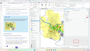
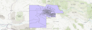
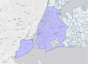
Deciding what to map – To look for geographic patterns in your data, you need to collect all data that you possibly can and then you can filter and sort and overlay exactly what layers and items or locations you want to compare on your map. you can use these “layers” to compare and see what type of event, or thing occurs in the same space or vicinity as anything thing you are looking at. The map should be appropriate to the audience, so it should be user friendly, and it should also be appropriate for the issue or topic being addressed. An audience that is unfamiliar with the area or the data being mapped will want to see information that provides reference locations, such as roads, lakes, or administrative boundaries. The way that the map is presented will also affect how much information you are able to show. Small maps such as one that will be in a journal should only show the imperative information, while larger maps are able to show more information that maybe is not quite as important.

Preparing your data – Before creating your map, make sure the features you’re mapping have geographic coordinates assigned and, optionally, have a category attribute with a value for each feature. Each feature needs a geographic location in coordinates, as well as a code to determine its type, such as whether a crime is an assault, theft or burglary.

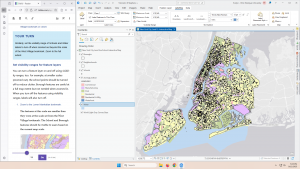
Making your map – To create your map, you tell GIS what features you would like to display and what symbol to use for them, you can map them all as a single type or layer, or you can make sure that they all are assigned their correct code value. The GIS stores the location of each feature as a pair of geographic coordinates or as a set of coordinate pairs that define its shape (line or area). When you make a map, the GIS uses the coordinates to draw the features, using a symbol you specify. For individual locations, such as customer addresses, the GIS draws a symbol at the point defined by the coordinates for each address. For linear features, such as streets, the GIS draws lines to connect the points that define the shape of each street. For areas, such as parcels of land, the GIS draws their outlines or fills them in with a color or pattern.

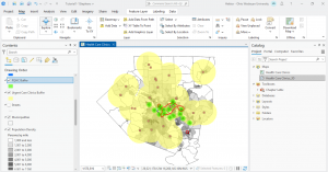
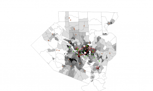
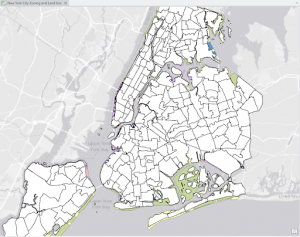
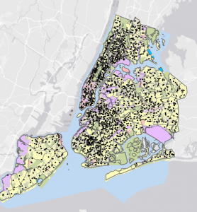
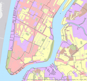
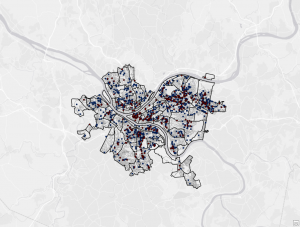
Analyzing geographic patterns – If your map presents the information clearly, you may be able to see some patterns in the data. If you’re mapping a single category, you may see that features appear to be clustered, uniformly spaced, or randomly distributed. The patterns partly depend on the scale of the map. By zooming in or out, you may see patterns that were not evident before. Based on what you know about a place, or similar places, you may discover that the patterns are meaningful. This map of parcels shows the development pattern common to many towns: a central commercial strip abutted by manufacturing and multifamily housing, with single-family housing around the edges, and beyond that, agriculture. You can begin to understand how the town developed and where it might grow.

Mitchell Chapter 3 – Mapping the Most and Least – 

Why map the most and least? – By mapping the most and the least, you gain deeper insight into patterns across point, line, or area features (introduced in chapter one). The chapter emphasizes defining your map’s purpose and tailoring it to your audiences knowledge. With GIS, you can both explore data to uncover patterns and present maps that tell as story or answer questions.

What do you need to map? – The way that you display your data depands on the feature type, discrete features often use graduated symbols or shading, while summarized data is typically shown with shaded areas or charts. Sometimes you have to dive deep to discover patterns, only to dumb it back down to a generalized map or table to highlight the key trends or important factors of the topic, also to be Able to answer the big question or problem.

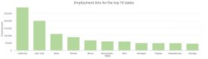
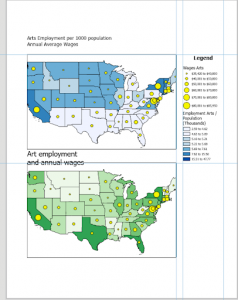
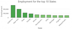
Understanding quantities – Quantities can be counts or amounts, ratios, or ranks. Knowing the type of quantities you’re mapping will help you decide the best way to present the data. Counts and amounts show you total numbers. A count is the actual number of features on the map. An amount is the total of a value associated with each feature. Using a count or an amount lets you see the value of each feature as well as its magnitude compared with other features. Ratios show you the relationship between two quantities, and are created by dividing one quantity by another, for each feature. Using ratios evens out differences between large and small areas, or areas with many features and those with few, so the map more accurately shows the distribution of features. Because of this, ratios are particularly useful when summarizing by area. Ranks put features in order, from high to low. They show relative values rather than measured values. Ranks are useful when direct measures are difficult or if the quantity represents a combination of factors. For example, it’s hard to quantify the scenic value of a stream. You may be able to state, however, that the section that passes through a mountain gorge has a higher scenic value than the section passing near a dairy farm.

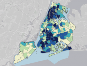
Creating classes – Classes group features with similar values using the same symbol, and they can be created manually or through classification schemes: Natural Breaks highlights inherent groupings in uneven data; Quantile assigns an equal number of features to each class; Equal interval divides data into equal ranges, making it beginner-friendly; and standard deviation classifies values based on their distance from the mean.

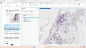
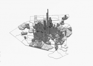
Making a map – When mapping quantities, you can choose from several display methods: Graduated symbols for discrete points, lines, or areas; graduated colors for areas, summarized data, or continuous phenomena; charts to show both quantities and categories for areas or locations; contour lines to illustrate changes across continuous surfaces; and 3D perspective views to visualize continuous phenomena as surfaces.

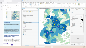
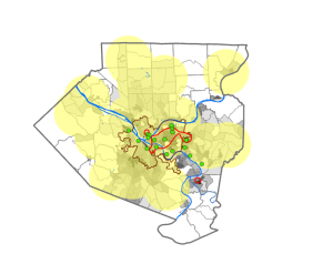
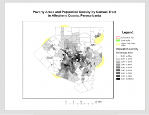
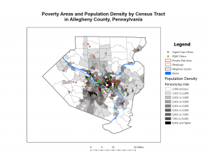
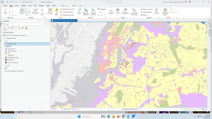
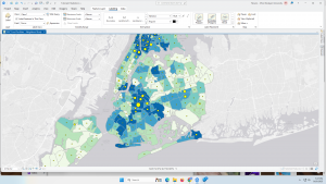
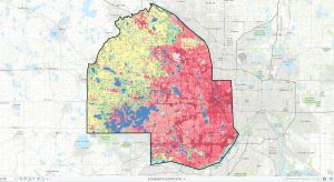
Looking for patterns – If your map presents the information clearly, you can compare different parts of the map to see where the highest and lowest values are. Looking at the transition between where the least and most are (for example, seeing where change is rapid or gradual) can give you further insight into relationships between places. You’ll want to see whether values cluster or are evenly distributed. In this map, the Asian-American population is clustered in three areas. A store owner selling to this population would focus on these areas for an ad campaign.

Hess – Week 1

Hi my name is Brendon Hess, I am a Sophomore this year and I am majoring in Biology.

I completed the week 1 quiz. After reading Schuurman Chapter 1, I realized how many applications to the real word GIS really has. Without even realizing it, I take for granted how complexly laid out our everyday lives really are. GIS has helped organize basically every part of our lives, the roads we drive to school, the sidewalks we walk, the building layouts and locations we have classes in, the most efficient ways from town to town, GIS is everywhere. One thing I found very interesting after reading this chapter was how the original GIS maps were hand drawn by cartographers! I mean can you imagine how many hours it takes to make one map? Then you need to make multiple by hand, so accurate that they can be laid on top of each other and a route for a road can be created! I found it very cool that that was someone’s job at one point and I can’t imagine the time comitment. Another thing that stuck out to me in this reading was the map on Cholera outbreaks in London in 1854. I thought this map was very interesting because of its significance in which time it was created. This map was made very early on in the storyline of GIS and it does a very good job at indicating that there could be a link between well water and catching a case of Cholera. The reading also brings up a good point that these maps can sometimes help the general public to better understand data. Sometimes its hard for people to collect what’s happening by just looking at a table, but if you have a map to go along with the table, then it may help people understand what’s going on. After reading this chapter I am looking forward to learning about all of the strange things that GIS can help us compare and predict based on overlaying data and maps.

One possible application for GIS that I am interested in is the use of GIS to track animal populations. From what I found, it sounds like it can be used in many ways such as, monitoring movement and habitat use, and human-wildlife conflict and conservation planning by integrating spacial, ecological, and social data. After learning this, I think that the conservation biology applications are something that I am very interested in. Here is a photo from the Ohio Division of Natural Resources showing the use of GIS to show where forests, wildlife, and parks are in the Delaware area.

Another possible application for this technology is the mapping and tracking of marine wildlife. Because we know very little about our oceans, I think it would be cool to know where the fish are going during the different seasons and try to link it to a why. The why, could be a completely different GIS map that we could link it to, such as water temperature.

Sources:

Esri. “Lands and Facilities – ArcGIS Experience.” ArcGIS Experience by Esri, experience.arcgis.com/experience/cd0e442b17b14e16843447a5063997cd/page/Lands-and-Facilities-Main. Accessed [10, Sept., 2025].

White Week 3

Chapter 4).

Mapping density is crucial for identifying patterns relative to where features are concentrated. Concentrated areas of crime for example will need action by law enforcement. Mapping density is useful for mapping areas (census tracts or counties) of different sizes and showing patterns rather than details about individual features. In order to map density, we can either shade defined areas based on a density value or create a density surface. Generally features of GIS are mapped using a density surface. The other thing we can do is map already summarized data by defined areas like administrative boundaries. We can either map density features or feature values that we talked about last week. A feature value goes beyond just the feature location like the number of employees at each business. Density by defined summarized area does not show actual feature locations but rather represents a specific number of features. Density = # of features / area of polygon. We may need to use a conversion factor to keep units consistent. On the other hand, the GIS creates a density surface as a raster layer and can be locations or linear features like roads. Map density surface if you have individual features or sample points. Density by defined area seems simpler but density surface mapping looks better but is more complex to do. ArcGIS imposes density by defined area on the maps by shading. For a dot density map, we map each area or dot based on a total count or amount. Two different size census tracts with the same population would be the same color on a shaded map but a dot density map shows that the smaller tract has a higher density with the same number of dots in a smaller space. Dot maps are not calculated density values but the actual total numbers or values for each area. The four parameters of cell size, search radius, calculation method, and units are important considerations for calculating density values. I’m not too comfortable with calculating cell size and density converse and so I’ll definitely have to refer back to the book if we have to do this. A tip to remember is to use a value for units that reflect what features we are mapping Square meters for plants or trees and square miles for businesses. Another cool thing is that we can create a density surface using center points from data summarized by defined areas. When displaying a density surface, we employ graduated colors by creating custom class ranges or allow the GIS to do this through a standard classification scheme. Overall, the patterns of the map depend on the creation of the density surface and its parameters. 

Chapter 5).

Finding what’s inside allows us to evaluate if something occurs within an area or identify comparable information for different/multiple areas. Comparison here is important because it can be crucial in some cases to know what surrounding areas have within them or not. In order to find what’s inside we can either draw or utilize area boundaries. The number of areas and the types of features in those areas are fundamental. A grouping of zipcodes would be several areas combined. Identify each area with a name like the name of the watershed for example. We can use the GIS to get a list, count, or summary of the features within an area. We can include features that fall completely inside (for amounts), partially inside (for lists and counts), or the portion of each feature inside the area. The overlaying the areas and features approach seems good by showing what features are inside and summary details but takes longer to process. If you’re overlaying an area on data that’s summarized by area, we should make sure the summarized areas fall completely inside. This is good to do with multiple areas or single areas that need summaries of continuous data, or discrete features including only the portion inside the area. To distinguish areas when actually making the map, label them and or draw in a different shade. When selecting features inside an area and using the results it is good to know what a frequency is. A frequency is the number of features with a given value or range of values. A bar chart can be shown for numbers and a pier chart for proportions of a whole or percentages. The summary of a numeric attribute of a feature can be a sum, average, median, or standard deviation. A sidenote is that we can show what is inside the area only but it is good to show the features outside of the area as well for contextual information. I like the look of showing features inside the area with a darker color and features outside with a lighter shade of that same color. When overlaying areas with continuous categories or classes the GIS will generally select the modeling whether it be vector or raster methods based on the data we have.  Pay attention to slivers which are very small areas that are there or emerge after overlay. Remove them at first or have the GIS remove after mapping. Sometimes Raster overlay is the default or the GIS converts it to raster because it is simpler. The GIS also creates a table to analyze the results of the overlay for the raster method. Geez vector overlay seems much more difficult.  

Chapter 6).

Finding what’s nearby is super good for considering events in an area, finding the area served by something, or the features affected by something (homes impacted by flooding). What occurs within set distance or traveling ranges is critical for many uses of GIS. In order to find and evaluate what’s nearby, we can measure straight line distance, measure distance or cost over a network, or measure cost over a surface. In cases where no movement between the source and surrounding features, measure using straight-line distance. If there is movement, travel can be measured over a geometric network like a street or over land. Finding what’s nearby can also be done by measuring costs which include time, money and or effort. This relevance of the curvature of the Earth comes into play here again in that calculating distance under the conditions of a flat Earth uses the planar model while doing this under the conditions of a spherical Earth uses the geodesic model. This distortion only occurs again when the area is large but for small areas of interest it doesn’t apply and planar modeling can be done. It is important to consider whether we will need a list, count or summary, and how many distance or cost ranges are needed. If we want to know how many streets are within 1, 2, and 3 miles of a fire station, we can use inclusive rings or distinct bands. 

Wagner- Week 3

Chapter 4

The first section asked the question: why map density? Mapping density will show the concentration of features on a map. It is helpful when searching for a pattern rather than specific locations of features. Density maps use areal units that will clearly show the distribution.  The next section is on deciding what to map. You need to think about the features you’re mapping and the information you need from the map. If you want to map the density of points or lines you will typically use a density surface. If you have data that has already been summarized then you map it using defined areas.You also need to decide if you want to map features or the feature values because it can affect the patterns in the data. Section 3 focuses on the two ways of mapping density: based on features summarized by a defined area or by creating a density surface. When mapping by a defined area you can map density graphically, using a dot map, or by calculating a density value for each area. A density surface is created as a raster layer and each cell in the layer gets a density value. It then focuses on mapping density for defined areas. You can calculate a density value for defined areas based on the areal extent of each polygon or you can create a dot density map based on the total count or amount and then specify how much each dot represents. The last section is about creating a density surface. You will specify call size, search radius, calculation method, and units, all which affect how the GIS calculates the density. The cell size determines how coarse or fine the patterns appear and the search radius will determine how generalized the patterns will be, there are two calculation methods, and you can specify what kind of areal units you want the density to be calculated in. You can also display a density surface using either graduated colors or contours. 

Chapter 5

Chapter 5 was about finding what’s inside.  It is useful to map what’s inside an area to see what is happening there or to compare it to other insides of areas. You first need to determine if you are finding what’s inside a single area or each of many areas, if the features are continuous or discrete, what kind of information you need from the analysis, and if you need to see features that are completely or partially inside. What I have noticed is that there are always a lot of beginning steps and decisions when it comes to deciding how to map and analyze. You can find what’s inside by drawing areas and features, selecting the features inside the area, or overlaying the areas and features. By drawing areas and features you can simply look at what features are inside or outside the area. You can see which discrete and continuous features are inside the areas depending on what data you have. When you select features inside the area the GIS checks if each feature is inside the area and then flags the ones that are. Overlaying areas and features is more complex and finds which discrete features are inside certain areas and summarizes them, calculates the amount of each continuous category or class inside one or more areas, or summarizes continuous values inside one or more areas. Reading about all of these methods feels confusing and I think I would need to do it in order to understand it more. I am ready to actually use the software and see some of these processes actually happen. 


Chapter 6

Chapter 6 is about mapping what’s nearby. By mapping what’s nearby, you can find out how and event or activity affects an area and features inside of it. There are yet again a million different questions you need to answer in order to determine how you map and analyze your data. To identify what is nearby you can use: straight line distance(Defining an area of influence around a feature, and creating a boundary or selecting features within the distance) , distance or cost over a network(Measuring travel over a fixed infrastructure) , or cost over a surface(Measuring overland travel and calculating how much area is within the travel range). You can use straight line distance by creating a buffer to define a boundary and what is inside it, select features to find features within a given distance, calculate feature-to-feature distance to find and assign distance to locations near a source, or create a distance surface to calculate continuous distance from a source. When measuring distance or cost over a network, GIS identifies all the lines within a network and you can then find features around the area. When calculating cost over a geographic surface, GIS creates a raster layer where the value of each cell is the total travel cost from the nearest source cell. Again, I read all of this information and it feels like a lot but I am excited to see what I can do and learn from using the software next week. 

Tooill – Week 4

Chapter 1- 

  • I logged into ArcGIS, downloaded the tutorials, and created a new project. I also learned how to save my projects.
  • I learned how to add and remove basemaps, like a street basemap, for example, and I learned what layers are and how to add and remove them (located in the contents pane).
  • I learned how to share and export files/maps and I familiarized myself with creating and removing pop ups, as well as zooming in and out.
  • I practiced making bookmarks.
  • Every vector feature class has an attribute table, and each feature (point, line, or polygon) of a feature class has a record or row of data. You right click on a feature class and select “attribute table.” In the map tab, choose “select by attribute.” On the attribute table, click “show selected records.”
  • Right clicking on feature classes, attributes, etc. gives you lots of options to choose. You can sort data in different ways (like ascending and descending), deleting data, etc.. 
  • Analysis tab -> tools button -> geoprocessing plane -> toolboxes -> expand analysis tools -> statistics -> summary statistics
  • Symbolize features classes by right clicking on one and selecting symbology. Then choose the desired symbol. 
  • You can label feature classes on a map by choosing a feature class and clicking on the labeling tab at the top of the screen. 
  • In the Catalog pane, expand Maps, double-click the desired 3-D feature. Use the right and left buttons to navigate, or the scroll wheel. You can also press V and the down arrow key to tilt the map and see the 3-D view.

Chapter 2-

  • In this chapter, I worked on adding and changing more symbols, like in chapter 1, specifically changing things like color, color scheme, and text size. 
  • To remove duplicate labels, follow these steps: 1) Right click the layer under concern and click Labeling Properties. 2) Click Position, then Conflict Resolution. 3) Expand “Remove Duplicate Labels”, then click Remove All. This removes duplicate labels. 
  • Why did we use the numbers 4901, 4902, and 4903 for creating a definition query instead of any other ascending numbers? 
  • A choropleth map is a thematic map that uses varying shades or colors to represent data values across different geographic regions, making it easier to visualize and compare data distributions. 
  • View tab -> convert -> to local scene -> contents pane -> drag feature class in question to above 3D layers heading -> feature layer tab -> extrusion group -> type -> base height -> extrusion group -> field -> select the relevant field.
  •  Importing symbology: symbology pane -> import symbology
  • Dot density map: go to symbology and set dot density as primary symbology
  • Go to the feature layer tab to utilize the visibility range tool. This changes what distance you can see labels at (zoom in and labels disappear, zoom out and they reappear, and vice versa). 

Chapter 3-

  • You can use guides in order to place features of a map precisely. Right click on the space you want to add a feature, and make sure that ruler and guides are selected. Then, you can click on the ruler once you close out of that screen and choose “add guide.”
  • On the insert tab, you select legend to add a legend. When one legend is selected, you can choose legend items and show properties to display more information on the legend. 
  • You can add text for a title and many other things under the insert tab.  
  • Data tab -> visual group -> create chart. At the top of the chart properties plane, choose general, and then add a chart title and x and y axis labels. You can adjust color, size, and thickness on these charts. 
  • Sharing a map online: Share tab -> share A’s -> web map -> add your name in name field -> fill in other summary info -> under share, choose with everyone -> analyze -> share.
  • I logged into ArcGIS Online and found the map that I just shared under my content. On ArcGIS Online, I was able to change features and symbology. 
  • The story maps on ArcGIS were pretty cool, I really liked the format of them and getting to create my own. All of the steps were pretty self explanatory and something that I could have done without the tutorial. 
  • To create a dashboard on ArcGIS Online, go to the app launcher (9 dots) and select dashboards. You have to apply the settings relevant to the work that you’re doing. 
  • On the dashboard toolbar (left side of screen) you can add different elements, like tables. This didn’t work well for me because after I created the tables, I couldn’t get them to show up on the map at all, but they showed up as a separate tab. As I was following along with the tutorial, I should have been able to accomplish this but it did not work.