Brock Week 6

Chapter 9:

  • Tutorial 9-1: Learned how to use buffers for proximity analysis, run the pairwise buffer tool, select block centroids within buffers, and sum the number of a population
  • Tutorial 9-2: Learned how to create and use multiple-ring buffers and use spatial overlay to get statistics by buffer area
  • Tutorial 9-3: learned how to create multiple-ring service areas for calibrating a gravity model, create multiple-ring service area polygons, spatially join areas and pool tags, calculate pool use statistics for service areas, make a scatterplot, and fit a curve to the gravity model data points
  • Tutorial 9-4: learned how to use network analyst to locate facilities and analyze optimal solutions
  • Tutorial 9-5: Learned how to perform data cluster analysis and interpret the clusters

Chapter 10:

    • Tutorial 10-1: learned how to process raster datasets, examine raster dataset properties, import a raster dataset into a file geodatabase, set the geoprocessing environment for raster analysis, extract land use using a mask, symbolize a raster dataset using a layer file, create and symbolize hillshade for elevation, use hillshade for shaded relief of land use, and create elevation contours
    • Tutorial 10-2: learned how to make a density heat map, study the project location, run KDS, create a threshold contour layer for locating a service, use threshold areas to estimate data rates
    • Tutorial 10-3: learned how to build a risk index model explore the project area, standardize an input attribute, set the geoprocessing environment for raster analysis, create a new toolbox and model, add processes to the model, configure a kernel density process, configure the raster calculator process, run a model in edit mode, symbolize a KDS raster layer, and save its layer file, add variables to the model, use in-line variable substitution, use layer file to automatically symbolize the raster layer when created, and run a model tool
  • Notes: for some reason when I ran my model it didn’t look like the pictures in the book

Chapter 11

    • Tutorial 11-1: Learned how to explore a global scene and its properties, navigate a scene with a mouse and keyboard keys, change the basemap, and exaggerate and apply a shade and time to a surface
    • Tutorial 11-2: learned how to create a local scene and TIN surface, set a local scene, create a TIN surface, change the scene’s surface and coordinate system, change the symbology of a tin
    • Tutorial 11-3: learned how to create z-enabled feature classes, digitize data and objects on surfaces using z-mode, display data and objects realistically
    • Tutorial 11-4: learned how to create features and line-of-sight analysis using lidar data, create a LAS dataset, generate a raster DSM and DTM, create an nDSM raster, create random points for buildings, add surface information to random points, assign maximum value (height) to random points, join  maximum z-value (height) to building footprints and display as 3D buildings, use lidar to determine bridge elevation heights, draw a bridge using Z Mode elevation, conduct a line-of-sight analysis
  • Notes: something went wrong with running the different tools because my 3D Bldgs layer did not produce a lot of tall buildings. When I was entering in the information in the varying tools it was taking a long time to process on ArcGIS Pro, so I think that might have been where the issue was. The bridge section seemed to give me a lot of issues that I couldn’t figure out. For some reason, I did not have the layers that the 11-6 tutorial was asking me to turn on for the Smithfield Street section so I did not get to complete that section.
  • Tutorial 11-5: learned how to work with 3D features, extrude floors, use a range slider to view building floors edit a building’s height using dynamic constraints and the attribute table 
  • Tutorial 11-6: learned how to use procedural rules and multipatch models, apply building rules using stacked blocks, apply an international building rule, view multipatch models of buildings and street furniture
  • Tutorial 11-7:learned how to create animation, add an animation to the project and create keyframes, play an animation and change the duration, create a pause, add and delete keyframes, create a movie from the animation

Screenshots:

Brock Week 5

Chapter 4:

  • Tutorial 4-1: introduction to working with file geodatabases
  • Tutorial 4-2: Messed up what I removed from the contents pane. Attempted to go back to fix this mistake, but it doesn’t seem like an easy fix
  • Tutorial 4-3: three primary kinds of attribute queries
    • Most fundamental type: addresses the what and when. Often combines several crime types with the use of logical operators
    • Secondary type: adds criteria such as time of day or day of the week 
    • Third type: adds criteria based on the attributes of the people or the objects 
    • SQL button: SQL shows the criteria that the query builder built
  • Tutorial 4-4: introduction to aggregating data with spatial joins
  • Tutorial 4-5: using central point features for polygons
  • Tutorial 4-6:creating a new table for one-to-many join

Chapter 5:

  • Tutorial 5-1: my coordinates were 17oW, 14oN for the western most tip of Africa. Country Senegal. Worked with world map projections
    • The network of lines on the map is called graticule and it has 30-degree intervals east-west and north-south
  • Tutorial 5-2: worked with US map projections
  • Tutorial 5-3: set projected coordinate systems 
  • Tutorial 5-4: worked with vector data formats 
    • Shapefile extensions: .shp, .dbf, .shx
  • Tutorial 5-5: 
  • Tutorial 5:6 I was not able to complete this section because https://apps.nationalmap.gov/downloader/ was having a “national outage” or something like that when I tried to access the data

Chapter 6:

  • Tutorial 6-1: dissolving features to create neighborhoods and fire divisions and battalions 
  • Tutorial 6-2: extracting and clipping features for a study area
  • Tutorial 6-3: merging water features 
  • Tutorial 6-4: appending firehouses and police stations to ems facilities 
  • Tutorial 6-5: the “your turn” section data joining deal was not data joining dealing aka not working.
  • Tutorial 6-6: using union on neighboring and land-use features 
  • Tutorial 6-7: using the tabulate intersection tool 

Chapter 7

  • Tutorial 7-1: edited polygon features
  • Tutorial 7-2: created and deleted polygon features. The your turn section was not your turning aka not working
  • Tutorial 7-3: used cartography tools 
  • Tutorial 7-4: transformed feature

Chapter 8

  • Tutorial 8-1: geocoded data using zip codes
  • Tutorial 8-2: geocoded street addresses

Week 4 Brock

Chapter 1:

Tutorial 1-1

  • This tutorial served as a great introduction for learning how to navigate ArcGIS Pro. I learned how to set up projects for future use, save a project into an .aptx file, and add and remove a basemap.

Tutorial 1-2

  • Learned how to use a pop up window, zoom in feature, zoom in to raster feature class, bookmarks, and search for a feature.

Tutorial 1-3

  • Learned how to work with attribute data, open a table, work with the fields view of an attribute table, select records and features of a map feature class, and obtain summary statistics.
  • All attributes are those provided by a Census Bureau. You can change the order, names, and display names of attributes.

Tutorial 1-4: This tutorial popped up with an error, so I wasn’t able to complete it

Chapter 2:

Tutorial 2-1

  • Learned how to symbolize qualitative attributes and display polygons using unique value symbols

Tutorial 2-2

  • Learned how to label features and configure pop-ups, change label properties, remove duplicate labels, and manage pop-ups

Tutorial 2-3

  • Learned how to filter with definition queries, create a definition query, and symbolize figure and ground features. 

Tutorial 2-4: 

  • The layer that this tutorial wanted me to use said that it did not have a valid data source so I imported the neighborhood data set to fix this issue. Learned how to create choropleth maps for quantitative attributes, create a choropleth map, and extrude a 3D choropleth map.

Tutorial 2-5

  • Learned how to display data using graduated and proportional point symbols and create a map of graduated-size points

Tutorial 2-6

  • Learned how to normalize populations maps with custom scales, create a choropleth map with normalized population and custom scale, and import symbology and use swipe to compare features

Tutorial 2-7

  • Learned how to create dot density map

Tutorial 2-8

  • Learned how to set visibility ranges for labels and feature layers

Chapter 3:

Tutorial 3-1

  • Learned how to build layout and charts, create a layout and add maps to it, resize and place maps, add guides and snap maps to the guides, insert legends, insert text, and create charts

Tutorial 3-2

  • Learned how to share maps online, set properties online, share maps in ArcGIS Online, Use map viewer in ArcGIS online, change the style of a layer, and configure pop-ups

Tutorial 3-3

  • Learned how to create a story in ArcGIS online, add blocks to the introduction, add a sidecar block with a map, add content for the left panel of the map, enable navigation, add credits, and previous and publish a map

Tutorial 3-4 

  • Learned how to create a dashboard in ArcGIS Dashboards, add a map element to the dashboard, add a table element, adjust the dashboard, add a serial (bar) chart, add interactions to the dashboard, and finish a dashboard


*for some reason all of my other screenshots have disappeared, so unfortunately this is all that I could provide.

Brock Week 3

Chapter 4:

  • Why map density

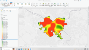
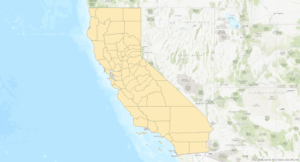
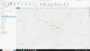
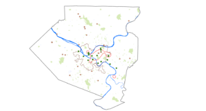
Mapping density shows you where the highest concentrations of features are. These maps are useful for looking at patterns rather than locations of individual features and for mapping areas of different sizes. Density maps let you measure the number of features using a uniform areal unit so you can clearly see the distribution. This is especially useful when mapping areas which vary greatly in size (census tracts or counties).

  • Deciding what to map

 Although you can simply map feature locations to see where they are concentrated, creating a density map gives you a measurement of density per area, so you can more accurately compare areas, or know certain areas  meet your criteria. You can create a density map area on features summarized by defined area or by creating a density surface

  • Two ways of mapping density 

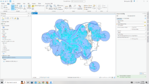
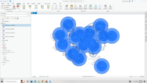
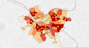
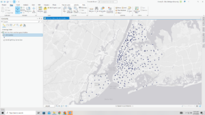
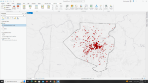
You can use a dot map to represent the density of individual locations summarized by defined areas. Each dot represents a specified number of features. The dots are distributed randomly within each area; they don’t represent actual features in that area. Dot density maps show density graphically rather than showing density value. You can use dot map to show density when you have many clustered features. A density surface is usually created in the GIS as a raster layer. Each cell in the layer gets a density value, such as number of businesses per square mile, based on the number of features within a radius of the cell. This approach provides the most detailed information but requires more effort

  • Mapping density for defined areas

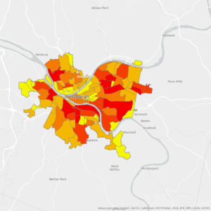
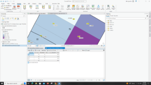
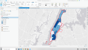
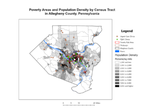
With this method, you calculate density based on the areal extent of each polygon. First, add a new field to the features data table to hold the density value. Then, adding the density values by dividing the value you’re mapping by the areas of the polygon. If the density units are different from the area units, you’ll need to use a conversion factor in the calculation to change the area units to the density units. Density by defined area is usually displayed as a shaded map, using a range of color shades with one or two hues. In this case density is treated as a ration and is mapped like any other ratio map. Some softwares lets you calculate density on the fly by specifying the value you’re mapping density for and the attribute containing the area of each feature. The GIS then calculates the density and shades accordingly. Density value for each polygon applies to the entire polygon. The actual density at any given location within the polygon may vary greatly from this value. This is especially true for large polygons

  • Creating a density surface

The GIS calculates a density value for each cell in the layer. Density surfaces are food for showing where pint or line features are concentrated. The GIS defines a neighborhood around each cell center. It then totals the number of features that fall within that neighborhood and decides that number by the area of the neighborhood. That value is assigned to the cell, the GIS moves on to the next cell and does the same thing. This creates a running average of features per area, resulting in a smoothed surface. 

Chapter 5:

  • Why map what’s inside

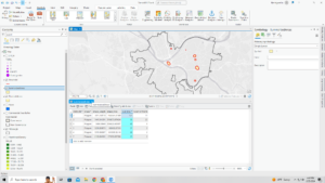
People map what’s inside an area to monitor what’s occurring inside it or to compare several areas baked on what’s inside each. This allows for people to discern whether they should take action. Summarizing what’s inside each of several areas lets people compare areas to see where there’s more and less of something.

  • Defining you analysis

To find what’s inside, you can draw an area boundary on top of the features, use an area boundary to select the features inside and list or summarize them, or combine the area boundary and features to create summary data. You need to consider how many areas you have, and what type of features are inside the areas. 

  • Three ways of finding what’s inside

Finding what’s in a single area: finding what’s inside a single area lets you monitor activity or summarize information about the area. Multiple areas: finding how much of something is inside each of several areas lets you compare the areas. discrete features are unique, identifiable features. You can list or count them, or summarize a numeric attribute associated with them such as locations, linear features, or discrete areas.

  • Drawing areas and features 

Drawing areas and features: Good for finding out whether features are inside or outside an area. Locations, lines, areas, surfaces. Trade Offs: Quick and easy but visual only so you can’t get information about features inside. Selecting the features inside the area: Good for getting a list or summary of features inside an area. Locations, lines, areas. Trade Offs: good for getting info about what’s inside a single area, but does not tell you what’s in each of several areas (only all areas together). Overlaying the areas and features: Good for finding out which features are inside which areas, and summarizing how many or how much by area. Locations, lines, areas, surfaces. Trade Offs: good for finding and displaying what’s within each of several areas, but requires more processing 

  • Selecting features inside an area

With this method you specify the features and the area. GIS checks if each feature is inside the area and flags ones that are. You can also use this method to find what’s inside a set of areas you are treating as one. However, the GIS doesn’t distinguish which area each feature is in, only that it’s in one of them. Geographic isolation is also a quick way to find out which features are within a given distance of another feature. 

  • Overlaying areas and features

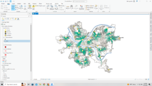
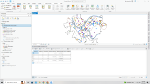
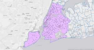
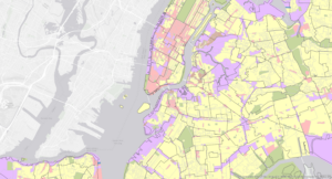
Overlaying areas with discrete features: GIS tags each feature with a code for the area it falls within and assigns the areas attributes to each feature. GIS checks to see which area each feature is in and assigns the areas ID and attributes to the features recorded in the data table. Overlaying areas with continuous categories or classes: GIS summarizes the amount of each category or class features falling inside one or more areas. You can get a map, table or chart of the results. GIS uses either a vector or a raster method to overlay areas with continuous categories or classes. Overlaying areas with continuous values GIS can summarize the values and create a map or table of summary statistics for each area. These include mean, minimum value, maximum value, value range, standard deviation, and sum. You can create a chart from the table to compare areas based on a particular statistic.

Chapter 6:

  • Why map what’s nearby

Using GIS, you can ding out what’s occurring within a set distance of a feature.

Traveling range is measured using distance, time, or cost. Knowing what’s within traveling range can help delineate areas that are suitable.

  • Defining your analysis

Defining your analysis: to find what’s nearby, you can measure straight-line distance, measure distance or cost over a network, or measure cost over a surface. Defining and measuring near: what’s nearby can be based on a set distance you specify, or on travel to or from a feature. When a surrounding feature is within a feature’s area of influence, measure using straight line distance. When movement or travel between the source and the surrounding features happen, measure over a geometric network. Distance is one way of defining or measuring how close something is, but nearness doesn’t have to be measured using distance. You can use cost to measure distance (i.e. travel costs). If you’re mapping what’s nearby based on travel, you can use distance or cost. Costs give a more precise measure of what’s nearby than distance but depending on the situation, distance can be more sufficient. Planar method: some analyses calculate distance assuming the surface of the earth is flat. Appropriate for small areas; city, country, or state. Geodesic method: some analyses calculate distance taking into account the curvature of the earth. Appropriate for large regions; continents, entire earth. List; an example of a list is the parcel ID and address of each lot within 200 ft of a road repair project. Count: a total or count by category. For example, the total number of calls to 911 within a mile of a fire station over a six-month period, or number of calls by type. Summary statistic examples: total amount, such as the number of acres of land within a stream buffer. Amount by category, such as the number of acres of each land cover type within a stream buffer. Statistical summary such as an average, minimum, maximum, or standard deviation

You can specify a single range or several ranges using inclusive rings or distinct bands. Inclusive rings are useful for finding out how the total amount increases as distance increases. Distinct bands are useful if you want to compare distance to other characteristics. 

  • Three ways of finding what’s nearby

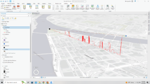
Straight line distance, you specify the source feature and the distance and the GIS finds the area or the surrounding features within the distance. This is good for creating a boundary or selecting features at a set distance around a source. You need a layer containing the source feature and a layer containing the surrounding features. Use straight line distance if you’re defining an area of influence or want a quick estimate of travel range. Distance or cost over a network, you specify the source locations and a distance or travel cost along each linear feature. The GIS finds segments of the network are within the distance or cost. You can then use the area covered by these segments to find the surrounding features near each source. This is good for finding what’s within a travel distance or cost of a location, over a fixed network. You need the locations of the source features, a network layer, and a layer containing the surrounding features. Use cost or distance over a network if you’re measuring travel over a fixed infrastructure to or from a source. Cost over a surface: you can specify the location of the source features and a travel cost. The GIS creates a new layer showing the travel cost from each source feature. This approach is good for calculating overland travel costs. You need a layer containing the source features and a raster layer representing the cost surface. Use Cost over a surface if you’re measuring overland travel

  • using straight line distance 

Using straight line distance: create a buffer to design a boundary and find what’s inside it. Select features to find features within a given distance. Calculate feature-to-feature distance to find and assign distance to locations near a source. Create a distance surface to calculate continuous distance from a source. Creating a buffer: to create a buffer, you specify the source feature and the buffer distance. For locations, the GIS draws a circle of a radius equal to the distance you specified. For linear features, the GIS draws a line around the features at the specified distance. For areas, the GIS draws a line around the feature at the specified distance. For areas, the GIS draws a line at the specified distance from the boundary- rather than the center of the area. Finding features within several distance ranges: If you want to know which features are within several distance ranges of the sources as inclusive rings, you have to create several separate buffers and select the surrounding features for each. 

  • Measuring distance or cost over a network

Measuring distance or cost over a network: GIS identifies all the lines in a network, within a given distance, time, or cost of a source location. Source locations in networks are often termed centers because they usually represent centers that people, goods, or services travel to or from where you can then find the surrounding features along, or within, the area covered by those lines. Specifying the network layer. A geometric network is composed of edges (lines), junctions, and turns. Turns are used to specify the cost to travel through a junction. To get accurate results, make sure: edges are in the right place, use edges that actually exist, edges connect to other segments accurately, and use the correct attributes for each edge. Setting travel parameters: In addition to specifying the cost for individual segments, you can specify the cost for turns from one segment onto another or for stops at an intersection.

  • Calculating cost over a geographic surface

Calculating cost over a geographic surface: Calculating cost over a surface lets you find out what’s nearby when traveling overland. With this method, the GIS creates a raster layer in which the value of each cell is the total travel cost from the nearest source cell. Calculating cost over a surface also shows you the rate of change. Specifying the cost: Cost can include time, money, or some other cost. To calculate cost over a surface, you specify the layer containing the source feature and a second layer containing the cost value of each cell. To create a cost layer based on several factors, you combine all the input layers. Getting the information: Once the GIS has created the cost distance layer, you can either identify the area within a specific distance of the source features or summarize how much of something is within the distance. If you’re mapping discrete features with the cost distance surface, you can show them on top of the distance grid. The distance grid is displayed using graduated color

Brock- Week 2

Chapter 1:
Distinguished differences in data and emphasized the importance of being as specific as possible about the question you’re trying to answer. This is because it will help you decide how to approach the analysis, which method to use and how to present the results. There two types of models in GIS; raster and vector. In a vector model, each feature is in a row in a table, and feature shapes are defined by x,y locations in space. Features can be discrete locations or events, lines, or areas. Lines such as streams, roads, or pipelines are represented as a series of coordinate pairs. Areas are defined by borders and are represented as closed polygons. They can be legally defined or naturally occurring boundaries. Discrete features and data summarized are represented in this model. With a raster model, features are represented as a matrix of cells in continuous space. The cell size you use for a raster layer will affect the results of the analysis and how the map looks. Cell size should be based on map scale. Continuous categories are usually represented as either vector or raster. Continuous categories are represented as raster. Discrete features may also be represented by raster if you are combining them with other layers in a model since raster is particularly food for this kind of analysis.

Chapter 2:
Mapping where things are can show you where you need to take action. This allows you to explore causes for the patterns you see. Look for geographic patterns in your data to map the features in a layer using different kinds of symbols. Can also use GIS to map different types of features and see whether certain types occur in the same place. Each feature needs a location in geographic coordinates. When you map features by type, each feature must have a code that identifies its type. To add a category, you create a new attribute in the layer’s data table and assign the appropriate value to each feature. Many categories are hierarchical, with major types divided into subtypes. In some cases a single code indicates both the major type and subtype. To create a map, you tell GIS which features you want to display and what symbols to use to draw them. You can map features by category, by drawing features using a different symbol for each category value. Mapping features by category can provide an understanding of how a place functions. The GIS stores a category value for each feature in the layers data table. It also stores, separately, the characteristics of the symbols you specified to draw each value. When you display the features, the GIS looks up the symbol for each feature based on its category value and uses that symbol to draw the features on the map. Features might belong to more than one category. Using different categories can reveal different patterns.
Usually, several categories are shown on the same map. However, if the patterns are complex or the features are close together, creating a separate map for each category can make patterns within a particular category and even across categories- easier to see. Displaying a subset of categories may make it easier to see if different categories are related. If you’re showing several categories on a single map, you want to display no more than seven. Because most people can distinguish up to seven colors or patterns on a map, displaying more categories than this makes the patterns difficult to see. The distribution features and the scale of the map will also affect the number of categories you can display.
If the map contains small scattered features rather than large contiguous ones, rader will find it difficult to distinguish the various categories. If the features are sparsely distributed, you can display more categories than if the features are dense.

Chapter 3:
Mapping features based on quantities adds an additional level of information beyond simply mapping the locations of features. You can map quantities associated with discrete features, continuous phenomena, or data summarized by area. Discrete features can be individual locations, linear features, or areas. Locations and linear features are usually represented with graduated symbols, while areas are often shaded to represent quantities. Continuous phenomena can be defined areas or a surface of continuous values. Areas displayed using graduated colors while surfaces are displayed using graduated colors, contours, or a s 3D perspective view. Data summarized by area is usually displayed by shading each area based on its values or using charts to show the amount of each category. Once you’ve determined what type of quantities you have, you need to decide how to represent them on the map, either by assigning each individual value its own symbol or by grouping the values into classes. Counts, amounts, and ratios usually are grouped into classes, since each feature potentially has a different value. This is especially true if the range of values is large. Use graduated symbols to map discrete locations, lines or areas. Graduated point symbols are drawn at locations of individual features, or at the centroid of an area, to show magnitude of the data value.
Use graduated colors yo map discrete areas, data summarized by area, or continuous phenomena . Usually assign shades of one or two colors to the classes. If you have less than five or six classes, use the same color and vary the shade. Different colors have different visual impacts. Reds and oranges attract the most attention; blue-green, the least. It’s easier to distinguish between shades of blues and purples than shades of other colors.
If you have more than seven or eight classes, you may want to use a combination of colors and shades, using two or even three colors to help distinguish the classes. Warm colors for higher values . Cool colors for lower values. Using two color is also good for showing data with both positive and negative values, such as percentages above or below an average value. Use charts to map data summarized by arena or discrete location or areas. With charts, you can show patterns of quantities and categories at the same time. That lets you show more information on a map rather than showing each category on its own map.

Brock Week 1

Introduction:

  • Hello! My name is Liberty Brock, and I am a senior here at OWU. I am double majoring in Botany and Environmental Science. I’m from a small, rural town in the foothills of Appalachia Ohio. I have always loved being outdoors so that is where a lot of my passion for nature comes from as well as my motivation behind my majors. My hobbies include hiking, reading, anything artsy/crafty, running, and spending quality time with my friends. 

Schuurman Reading: Chapter 1

  • After reading the first chapter of this book, I feel more confident with taking this class. I have little to no knowledge or past experience in GIS and I’ve honestly had a little bit of a love hate relationship with the thought of GIS. Before reading this chapter, I didn’t really understand the basics of GIS and I think that’s kind of what has turned me away from wanting to take one of these courses. Now, I understand the versatility and importance of this system and how it can even improve the overall well being/quality of life. Even though this system is more complex than it’s face value of being a mapping system, I think that almost makes it easier to comprehend. From my interpretation, it seems as though the GIS system is comprised of algorithms and stages rather than being a whole system functioning at a base level. There are a multitude of different pieces that allow the whole system to function as one similarly to how a puzzle works. Each piece of the puzzle doesn’t really represent the entire image of the puzzle when looking at the pieces alone, but those pieces interconnected together create this … I really enjoyed learning about the different functions of GIS and that they extend beyond fields in Environmental Science and Geography. Before reading this, I didn’t realize that GIS was prevalent in social work issues as well such property definitions, tax assessment information, and etc. Additionally, I really enjoyed learning about the history of GIS and how the roots of GIS trace all the way back to 1962 from a landscape architect, Ian McHarg, who created the concept of overlay.

GIS Application

  • I’m really interested in how GIS could be used to map invasive species in an area. Using google, I searched for “GIS mapping applications” and “invasive plant species” to see how GIS is being used to track the movement of invasive species. It seems like there is limited information over this topic though, which makes sense because I can imagine that this is difficult to track. https://www.stanleyparkinvasiveplants.com/SPinvasivePlantMapping.pdf
  • GIS image
  • I’m also interested in how GIS is used to optimize agricultural production.  Using google, I searched for “GIS mapping applications” and “agriculture” to see how GIS is improving crop outputs. https://smallfarms.cornell.edu/2017/04/use-of-gis/