Maglott-Week 6

Chapter 9:Ā 

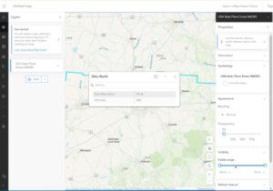
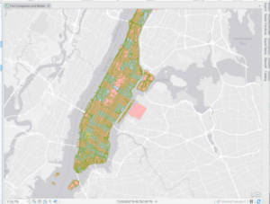
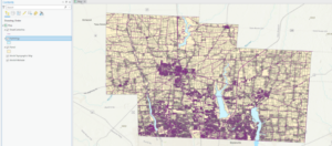
This chapter introduced the Service Area Layer tool, which allowed you to add a network of things together. Overall, I didnā€™t have too much trouble with this chapter. I had some trouble with 9.3 because I could not add the new fields to create the scatterplot. Iā€™m not really sure if it was an issue on my end or a bug in the tutorial. I also selected sum for the DemandWeight in 9.4 but I didnā€™t notice anything happening or change. Iā€™m not sure if J was supposed to see a change or not. One thing new this chapter mentions is K-means which is used for clustering. I noticed under the clustering method that there were also k medoids. Iā€™m curious what they could be for.


Chapter 10

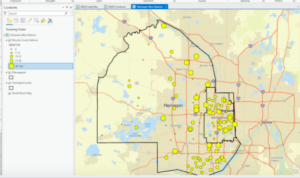
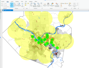
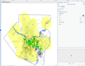
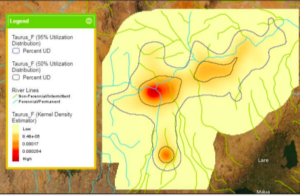
This chapter introduced some new concepts and tools. One was the Kernel Density Smoothing tool which allowed you to smooth data spatially. We also got a chance to use ModelBuilder and build models in ArcGIS Pro. I think this tool could be really helpful if you are creating something for an employer. Additionally, the drop shadow under the process and output boxes symbolizing they have been run is neat. The Validate button can also be usedĀ  to ensure they are ready to run again or edit. I ran into a few issues with FHHChld weight and NoHighSchoolWeight. I learned that you have to click save before rerunning the model for there to not be error marks by these parameters. I eventuallyĀ  got model to work

Chapter 11

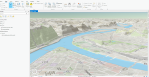
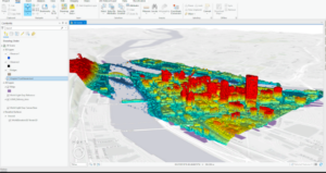
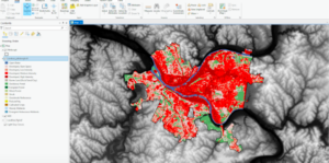
I really enjoyed learning the keyboard shortcuts for moving around the map in this chapter. You can use J for down and U for up, A to go left and D to rotate right ,W and S tilt up and down , and B+move mouse allows you to look around in one spot sort of like a 360 tour video. By selecting Map properties for 3D-> illumination-> date and time, you can see the shadows and 3D features of the map in real time, which I thought was cool. I thought it was cool how we were able to display 3D images on the map like the trees. We also used the Create LAS Dataset tool in 11-4 which made a really cool 3D model of the city. I thought it was cool how we could modify the scale of the building in section 5. This was done by selecting Modify under the edit tab and the clicking scale on the pane that popped up. This would be really helpful if you were trying to design a new building.

My most favorite lesson from this book was section 7 where it goes over how to make a animation with the bookmarks. I thought that this was both really cool and something I could definitely see myself using in the future for an employer project. We were able to make the animation by going to manage bookmarks, then clicking the add button under animations on the view tab. Next, we clicked create first keyframe and then clicked the first bookmark. After selecting the second bookmark we clicked Append Next Keyframe at the bottom to add it to the animation. After repeating this with all the bookmarks, they were strung together into a short clip. You can also make it pause on a scene by clicking the scene and selecting hold. Click insert after moving to a different location on the map to make the animation go to that area.

Maglott-Week5

Chapter 4:Ā 

I ran into some issues at the beginning of chapter 4. I had no problem making the folder connection and converting the shapefile to a feature class. This main issue began when there was no Tracts feature class under YouthPopulation.gdb. Another issue I ran into was that I did not have Tracts in my content pane. This meant that I had trouble doing the majority of tutorial 4-2. The tutorials afterwards had much less issues. I thought that the select by attributes tools was interesting and a good way to narrow down larger data sets to find exactly what you are looking for. I was really impressed with when the Select by Attributes tool was used to figure out who may have committed the unsolved burglary. Another odd issue I ran into was in tutorial 3, when I changed the burglary symbol to dark red. The points still showed up as a teal color unless I was actively zooming in or out, then they would change to red. This didnā€™t affect my work, but was odd.

Chapter 5:Ā 

I thought that the ability to change the map from a rectangle to an oval/ more 2D sphere shape was useful. This was done by clicking properties for the map, going to coordinate system, Projected coordinate system, world, and then clicking Hammer-Aitoff(world). Iā€™m curious what the other options under the Projected coordinate system look like. I noticed that looking at some of the zone abbreviations for Ohio cities the zone abbreviation has the state abbreviation(OH for Ohio) and then the letter after it seems to be what part of Ohio ( North, East, South, or West) the city is found. I ran into a few issues in this section but got them figured out. I found that sometimes when I downloaded data into a folder and then tried to open it in Arc, the file and data would not be there so I would have to close and reopen Arc and then I could find the folder with the data I needed to add.

Chapter 6

In this chapter, it introduces new tools like the Pairwise Dissolve tool and the Pairwise Clip tool. The Dissolve tool removes the inner lines from a neighborhood while maintaining the outer boundary. The Clip tool can be used to create street segments that can be added to your study area. I could not figure out how to save the Streets as UpperWestSideStreetsForGeocoding with the Select by Location tool but somehow the streets still ended up getting cut cleanly for the neighborhood. This chapter also uses the merge tool, to merge feature classes into one, and the Append tool, to add features to feature classes that already exist. I thought section 5 was cool where we intersected the Manhattan Fire Company and Manhattan Street feature classes and this allowed us to see what streets were served by which fire station. The Union tool was also introduced which allowed us to combine table data together on the map. This section seemed to go by pretty quickly and gave me fewer issues than the last chapter.

I thought it was cool that you could adjust the outlines of the buildings with the buildings by using the select tool and then move in the edit tab. I had issues getting the lasso tool to just move one point and not the whole polygon, but was able to fix the issue by selecting the stretch proportionally button. This chapter introduces the smooth Polygon tool to make the edges of the polygon more rounded instead of straight segments.Ā 

Chapter 8

I ended up having a lot of trouble with this chapter. I’m not sure if others had a similar issue, but when I was using the Create Locator tool, it would not accept the Output Locator name even when I tried to save it to different places than the book listed. This was an issue because the locator was needed to do the other work inĀ  this chapter. I met with Krygier and we still were unable to figure it out so he told me to skip this chapter.

Delaware Data & Inventory : Map with 3 layers (Parcels, Street Centerlines, and Hydrology)

Week 4 Maglott

ArcGIS Pro 3.1

Chapter 1Ā 

I found the previous extent button, which is located in the navigation group, really helpful for jumping back to previous areas you were analyzing. This is a lot easier than trying to move the map around and relocate the area you were in.I also found the bookmark feature beneficial for the same reason. Something I notice about the street when zooming in is that they adjust along the road to the area that you are zooming into. This is helpful because if you are trying to analyze an area that is surrounded by certain streets, then you do not have to keep moving the map over to look at the road name, it automatically adjusts toward that area. I also thought that the shortcut of holding the ctrl key and clicking a checkbox to clear all the feature classes was helpful. The symbology feature, which you get to by right-clicking the feature class is also helpful for adjusting the shape, color, and size of symbols. I think my favorite part of this chapter was being able to convert the map from a 2D map to a 3D map. I think this could potentially be helpful if you needed to know information about the shape of a building or how tall it is compared to other buildings.

Chapter 2

This chapter went over a lot about the abilities and uses of the symbology pane. You can label the villages and rivers by right-clicking the feature classes and selecting labeling properties. This allows you to change symbol characteristics as well as set the values for the symbols. You can also import Symbology by selecting the stacked three lines( options) and clicking Import Symbology. I thought the swipe tool, which can be accessed by clicking the feature class, selecting the feature layer at the top of the screen, and clicking swipe in the compare group. This allows you to view the layer underneath the top layer by clicking and dragging the pointer across the screen. However, you can clear the swipe tool by selecting Explore underneath the map tab. I thought the dot density symbology was an interesting way to display data. I found it interesting that when the dot value was smaller, more dots were made, and when it was larger, there were less dots. I think this is because the dot value is the number of people each dot represents, which would explain why when the dot value is bigger, fewer dots are shown and vice versa.

Chapter 3:

I liked learning how to create a layout and add maps to it. This seems especially helpful to look at two maps side by side. A layout can be made by clicking insert, new layout, and selecting the type and size you want. The maps are added by selecting insert, clicking map frames, and selecting the default of the map you want to add. Then, you just create a box by dragging the mouse across the layout. The maps can be edited by right-clicking and selecting properties, which opens the element tab with map options. I also thought that using the rulers and added guides to help center and align the maps was a clever way to place the maps in line with each other. Legends can also be added to the map by clicking Insert, Legend, and selecting the legend you want. By clicking and dragging the mouse, you can add the legend to the map. I also liked the addition of the bar chart, which I feel could be helpful based on what data you are looking for. The bar chart can be made by clicking the feature class, clicking data at the top of the screen, and then selecting the create chart under the visualize group. Other charts are also available under the Create chart button. The third and fourth sections of this chapter have a lot a beneficial tools and tips for presenting your data as a story map. However, the amount of content in these chapters was very dense. It is definitely something I will want to go back and review again.Ā 

Maglott-Week 3

Chapter 4: Chapter four discusses mapping density, which is useful for displaying where the data is most concentrated. Displaying the density can help identify specific areas with the highest values, such as population, businesses, or crimes within square miles. You can map features which are the number of businesses or people in an area or you can map feature values which refer to the quantity of something for each feature such as the number of workers at each business. One way to display density is by using dot maps where dots represent a specific number of a feature and how close the dots are together represents a higher density and dots that are distributed further apart represent lower density areas. Surface density can be shown using a raster layer where lower-density areas are shaded in a lighter color and higher-density areas are shaded in a darker color. You should only map using surface density if the data is specific locations, sample points, or lines. However, only map density should be used if the data is summarized by area. ArcGIS allows you to map density without needing to do prior calculations, which is very useful and efficient. ArcGIS also makes it easy to make a dot density map by automatically adjusting the number of dots when the amount each dot represents is defined. It’s important to pay attention to cell size, search radius, calculation method, and units. Cell size determines how smooth the appearance of the pattern is. Smaller cell size allows for smoother appearances but can lead to longer processing times and take up storage space. A cell size between 10 and 100 cells/ density unit is best. Search radius shows broader patterns when it is larger and more localized patterns when smaller. Calculation method is how the cell values are calculated. Simple calculation includes features in the search radius of each cell. Weighted calculation shows features closest to the center of the cell. Units are important because the appropriate unit should be chosen based on what is being mapped. Using larger units is better for showing features further away while smaller units are better for more localized features.Ā 

Chapter 5: Chapter 5 explains how to tell if certain features or activities occur within a certain area or not. The reasoning behind this was fascinating. Mapping what is happening within an area can help understand what issues certain areas may struggle with and potential reasons that certain areas may have these issues. Iā€™m still a little confused about what continuous features are referring to but based on the explanation in Chapter 5 I think it refers to features that can change over time such as elevation and vegetation type. Discrete features are countable and unchanging over time such as locations of crimes or streams and roads. To find out what is inside a certain area or boundary, you can use three different methods. One option is drawing the boundary and identifying what features are within those boundaries. Another option is making a boundary and then selecting a layer that has specific features, which GIS can use to find subsets of those features in that specific area. This is most useful when you want to summarize the features inside an area. The last option is a little confusing to me. I interpreted this method as GIS using the area and specified features to make a new layer that displays only the features in that area. I think that is how it works, but without doing it in GIS Iā€™m not completely sure that is how it works. It seems that using GIS to make a new layer allows you to find features within an area and information about the features. Drawing and counting the features tells the number of features but doesnā€™t give additional information about the features. Choosing the features within the area gives a summary of what’s inside the area but doesnā€™t provide specific details about what’s inside the area. However, making a new layer with GIS is best for multiple areas while the other options are best for when you are analyzing only one area. GIS allows you to get a report on certain features which you can use to make a statistical summary that can be used to compare features within areas.Ā 

Chapter 6: Chapter 6 explores how to map what is nearby and why this might be useful. Mapping certain things near a certain feature can be useful, especially for gaining info and preparation. For example, knowing how many families are within 20 minutes of the hospital allows the hospital to prepare by knowing how many employees should be staffed to help the nearby population. You can measure what is nearby based on distance, such as what is within a 50-mile radius, or by cost, such as time or gas money per mile. Cost is more useful when basing what is nearby on travel, which makes sense because one house may be a mile from the hospital but can get there within 4 minutes while a house that is Ā¾ of a mile is 6 minutes from the hospital due to traffic and roads. You can use different ranges to see what is nearby in different distances or costs from the feature. Inclusive rings can be used to see how an amount of something nearby changes as the distance increases. Distinct bands on the other hand compare how the range closest to the feature, 500-1000ft compares to the range furthest from the feature, 1000-2000 ft. This could give information about if the location of the feature is in the best location based on what is nearby. For example, more crimes may occur in the further range than the closer range, which would mean that it would take longer for the police to get to the scene. This could help the police prepare by sending more patrol cars into the further range to reach the scene faster. Different methods to use to measure what is nearby are straight line distance, distance or cost over a network, and cost over a surface. Straight line distance makes a boundary a certain distance from the feature and IDs what is near the feature within the boundary. Distance or cost over a network uses a certain distance or cost, like time, from the feature to see what is nearby the feature in that range. I donā€™t understand what cost over a surface is referring to, however. I think it might be referring to the amount of time it takes to get to a feature based on the surface, such as hills or flat surfaces that could affect how long it takes to get to the feature.Ā 

Maglott Week 2

Mitchell Ch. 1,2,&3 readings

Chapter 1 seemed to talk a lot about the types of ways data can be used and how it is categorized. This included discrete features, which are data with precise location, and continuous phenomena, which are data that can not be pinpointed at one location and take up a range of areas like weather. Data can also be summarized by area, which is where counts or exact data is summarized by combining it based on different locations such as by households, towns, counties, etc. I was surprised to learn that there were many more options for mapping besides just x, y, and z coordinates. The x, y, and z coordinates are utilized in vector models to show precise locations while raster models use cells to show abnormal shapes of similar areas. These are two ways that geographic features can be represented in GIS. Additionally, the attribute values are beneficial for presenting data in different ways. Attributes included counts and amounts which showed the exact numbers of something. Ranks that would provide a numbered rank for things but not show the numeric difference between the ranks, just that they are in different ranks. Ratios show the average number of things per something, like the average number of pets per house. Lastly, categories allow for similar things to be categorized together such as rivers, streams, and waterways. For example, trying to show the exact number of animal shelters in a certain state would be better displayed using counts. Trying to show the average number of animals per shelter would be better displayed using ratios. For working with data in tables, how the data is selected is important. For example, to find a specific characteristic of something within a category, you would select the category and then add ā€œand X <8ā€ where x is the specific characteristic you want to look at. For looking for things that fall in either/or category, you would include ā€œorā€ between the categories listed. Tables can also be used to calculate things such as rank or ratio or to summarize data.Ā 

Chapter 2, had a lot of good points about what information should be shown on the map and how to present it to make the purpose of the map clear. When mapping a single type, you would just plot all the data points using the same symbol, which can show the data distribution. You can break the data down into subsets to get more specific data to compare. An example of this may be instead of just stores, you can break them down into subsets of grocery stores, clothing stores, and gas stations. These more specific data points can help reveal distributions or patterns in the data that might reveal that 8/10 of the grocery stores are clustered between ā…– of the towns on the map, making it more difficult for further away towns to get groceries. Different categories may be shown on a map to demonstrate where the data is found, however, the book warns that no more than seven categories should be used. I think that this is a rule because too much data can become very overwhelming and make it hard to see and read the data. If the map is hard to read or understand, the viewer is less likely to try to figure out what it is trying to show. Additionally, mapping by category can make it easier to read and understand the map and where the different data points are about different landmarks or roads.Ā  The overall conclusion of that chapter seemed to be that the amount of data listed on the map and how it was displayed, like what colors and shapes to use, depended on the purpose of the map, and that reference features are helpful to better view and understand the map.Ā 

Chapter 3 talks about mapping the most and least values as this can help find where certain things may be more popular or available like the number of bakeries within a state or where something is lacking like the number of dentists in different areas within a state. Again, the purpose of the map is important to keep in mind. Using a map to show a specific pattern would require fewer data to be displayed than trying to look for possible patterns that may be present. This chapter talks about the 4 different classes known as natural breaks, quantile, equal interval, and standard deviation. Natural breaks are grouped based on groups that have similar values. This is useful when the values are not evenly distributed but can make it difficult to compare to other maps. Quantile is where the data is grouped so that each group has an equal number of features. This is useful when the areas are approximately the same size and mapping data is evenly distributed but may make it so that data points seem more different from each other than they are. Equal intervals are grouped so that in each group the difference between the highest and lowest values in each group is the same. This type of class allows data to be displayed so it is easily understood but clustered data could lead to too many or no features in each class. Standard deviations are grouped based on how far from the mean the values deviate. This can be useful for easily identifying the values that stray above or below the average but doesnā€™t provide precise values for the features, just the difference of the actual value from the mean or average. I thought it was interesting that you can tell if you chose the right classification scheme based on if there is a significant change in the data when the number of classes is changed. The chapter talks about how to assign colors to classes and mentions that most people think of greater values in association with darker colors. This makes sense to me and Iā€™ve seen this pattern in maps I’ve seen. Charts can also be used to display more info, quantities, and categories in different locations, but can make it more difficult for readers to interpret. Contour lines are lines commonly used to show changes in elevation or pressure on a map. When the lines are closer together, there is a higher rate of change, while lines further apart represent a lower rate of change.

Week 1 Maglott

1. My name is Sammy Maglott and this is my last semester of senior year. I am majoring in Environmental Science and Zoology. I run Cross Country and Track and am a member of the SEAL house.Ā 

  1. Schuurman Reading: Chp.Ā  1Ā 

It’s cool how GIS can be applied outside of the environmental field. I chose to take this class to fulfill my credit to graduate and because I noticed that in many job positions, I was interested in, experience working with GIS mapping was at least desired, if not a requirement. I thought it was really interesting that ā€œspatial analysisā€ and ā€œmappingā€ are very different. I was also surprised that spatial analysis allows more information to be obtained than mapping. Iā€™m still a little confused about what information spatial analysis obtains that mapping does not, though. Itā€™s strange to think that GIS is still fairly new as it was first introduced and used in the 1960s. I definitely could understand certain geographers being uninterested in switching from cartography to relying on computer spatial analyses. Growing up in a world where there was already so much technology surrounding us, I think our generation has been more apt to utilize technology. I think it would be difficult to switch from doing something by hand to trying to use a program on a computer. The part about the GIScientist was something that I had never heard of or thought about before. However, I think that it is important that there are people who question the reliability and accuracy of GIS results to ensure that the data we are collecting is correct and usable. It would be sort of a waste to use GIS to analyze lots of data and get a result that isnā€™t necessarily true or very accurate. I also had never considered how GIS might categorize things, like mountains mentioned in the book, and how these categories or boundaries could become very important when it comes to graphing things like areas in need of federal funding. In conclusion, GIS has a much broader application than I initially thought. Not only can it be beneficial to geographers, but can be used for farming, identifying disease outbreak zones, finding which roads are most likely to flood or degrade, planning electrical grids and gas lines, and much more!

3.Google Applications

Amanda J. Zellmer, Margaret M. Hanes, Sarah M. Hird, Bryan C. Carstens, Deep Phylogeographic Structure and Environmental Differentiation in the Carnivorous Plant Sarracenia alata, Systematic Biology, Volume 61, Issue 5, October 2012, Pages 763ā€“777, https://doi.org/10.1093/sysbio/sys048

This is a map showing the distribution of different carnivorous plants along with the location of bodies of water in each area. One GIS application used was CIrcuitscape, which allowed them to calculate the total resistance of the landscape separating the pairs of populations. GIS layers are used to find the resistance distance.

Kabatha, P. (2018). An open source web GIS tool for analysis and visualization of elephant GPS telemetry data, alongside environmental and anthropogenic variables. Master Thesis in Geographical Information Science.

This map shows the distribution of elephants where red areas show higher elephant presence and yellow areas show low elephant presence. GIS applications such as Python, Toolkit, ArcPy, and more were used to generate the map with the different bodies of water and landscapes as well as mark where elephant presence was the highest.Ā