Andisman, Week 6

Chapter 9: Spatial Analysis: Buffers, service areas, facility location models, and clustering

9.1

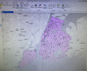
  • A buffer is a polygon surrounding map features of a feature class. The radius of the buffer is specified and, generally, the radius is used to find what’s hear the feature being buffered
  • Use the Pairwise Buffer Tool. Created buffer data can be summarized and analyzed using the Summarize tool

9.2

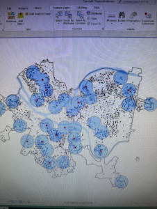
  • Multiple ring buffers can be configured to be separate polygons to therefore allow you to select other features within given distance ranges from the buffered feature. Use the Multiple Ring Buffer Tool
  • Use the Spatial Join Tool to use spatial overlay to get statistics by buffer area. It joins all attributes of the multiple ring buffer to block centroids and sums the numbers inside each ring

9.3

  • Service areas are like buffers but are based on travel over a network, usually a street network dataset
  • Gravity model: Assumes that the farther apart two features are, the less attraction between them. The falloff in attraction with distance is often nonlinear and rapid, as in Newton’s gravity model for physical objects, where the denominator of attraction is distance squared
  • Use the 7 step workflow

9.4

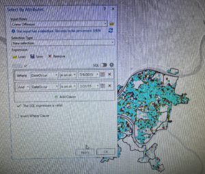
  • When using the location allocation model, demand is represented by polygon centroids, blocks, block groups, tracts, zip codes, and so on, for which you have data on the target population
  • This section ran a model to choose the best of the locations to remain open using geographic access as the criteria. Use the Location Allocation tool under the Analysis tab, in the Workflows section, under Network Analysis to create a new layer in the Contents pane

9.5

  • The goal of data mining is exploration. Data clustering, a branch of data mining finds clusters of data points that are close to each other but distant from points of other clusters
  • A limitation of clustering is that there is no way of knowing true clusters in real data to compare with what an algorithm determines are clusters. Therefore, it is purely exploratory. 
  • K-means clustering is a simple method in the Multivariate Clustering Tool that partitions a dataset with n observations and p variables into k<n clusters. K-means assumes that all attributes are equally important for clustering because it uses distance between numeric points as its basis. 5 clusters is generally most informative. 
  • Each observation is a 3D vector and is characterized by its centroid with the corresponding means of each cluster variable

Chapter 10 Raster GIS

10.1

  • Raster layers are for continuous features like satellite images, topography, and precipitation. You can also use raster layers to display an attribute such as population for large numbers of vector features like city blocks or countries. 
  • Raster dataset is a generic name for a cell based map layer stored on a disk in a raster data format
  • All raster datasets have at least one band of values. A band is comparable to an attribute for vector layers and stores the values in a single attribute in an array. The values can be + or – integers or floating point numbers
  • Color capture and representation in raster datasets is important. Spatial resolution is the length of one side of a square pixel 
  • The Raster to Other Tool can import a raster dataset into a file geodatabase 

10.2

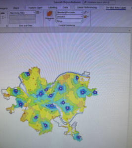
  • Kernel Density Smoothing (KDS) is a widely used method in statistics for smoothing data spatially. The input is a vector point layer, often of center points of polygons for population data or point locations
  • It accomplishes smoothing by placing a kernel, a bell shaped surface with surface area 1, over each point. If there is population, N, at a point, the kernel is multiplied by N so that its total area is N. Then all kernels are summed to produced a smoothed surface, a raster dataset 
  • The key parameter of KDS is its search radius, which corresponds to the radius of the kernel’s footprint. If the search radius is small, you will get highly peaked mountains, or, if large, you get wider rolling hills. 
  • There are no exact guidelines on how to choose a search radius
  • Can be good for representing demand surface for a good or service because its data smoothing represents the uncertainty of locations for future demand relative to historical demand
  • Use the Kernel Density Tool

10.3

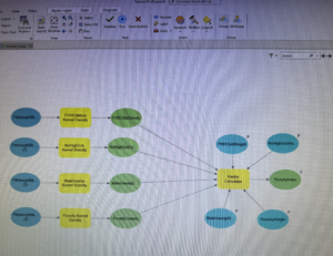
  • Instead of code scripting, you can drag tools to a canvas and connect them in a workflow using ModelBuilder that you can use to run code. 
  • If you have a reasonable theory that several variables are predictive of a dependent variable of interest such as poverty (whether the dependent variable is observable), the Dawes method contends that you can proceed by removing scale from each input arable and averaging the scales inputted to create a predictive index. This can be used for a risk index model. 
  • Alternatively, you can assign different weights to different variables according to your preference. A good way to remove scale from a variable is to calculate z scores, subtracting the mean and dividing by the standard deviation for each value of a variable. Each standardized variable has a mean of zero and a SD of one (and therefore no scale).

Chapter 11: 3D GIS

11.1

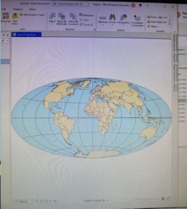
  • Global viewing model: For large extent, real world content in which the curvature of the earth is important
  • Local viewing model: Small extent content in a projected coordinate system or for situations in which the curvature of the earth isn’t important
  • Understanding a scene’s elevation surface, map units, and heights is important to the scene
  • Use mouse wheel to tilt view, J or U on keyboard to move map up/down, A or D to rotate view clockwise or counterclockwise, W or S to tilt camera up/down, arrow keys to move the view, B and left arrow to look around, N to view true north, P to look straight down
  • You can exaggerate a landscape with visual effects to help it stand out. It doesn’t change the elevation, just makes it more prominent. This can include lighting or time of day. Use the Elevation Surface Layer tab for light position and vertical exaggeration. Use Contents pane + properties of 3D scene for Date/time/illumination

11.2

  • An advantage of local scenes is using your own elevation surface data such as triangulated irregular networks (TIN’s) or lidar data, using a projected coordinate system, managing features below a surface, and more accessible editing of data
  • TIN’s are typically used for high precision  modeling of small areas to allow for the calculation of surface area and volume. They are also useful for viewing underground features. Use the Create Tin Tool 

11.3

  • You can import 3D models and symbolize 2D features as 3D features and specify the source of your z-values when you create features
  • The Current Z Control Tool is used to set the 3D elevation source for drawing or obtaining Z-values
  • This is useful if more than one source is defined for a global or local scale, or if you java another source not already included in the map
  • The Create Feature Class geoprocessing tool allows you to determine the required output feature class’ z-values
  • I planted trees 🙂

11.4

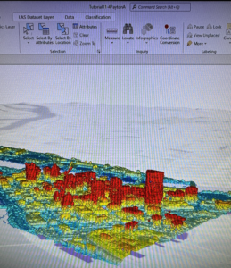
  • The generation of 3D buildings from lidar LAS datasets requires two surface models: a digital surface model (DSM) and a digital terrain model (DTM)
  • A LAS dataset created from original LAS data provides fast access to lidar data without the need for data conversion to work with LAS files for a specific study area
  • Use Create LAS Dataset tool
  • DSMs represent the surface of the earth, including buildings, tree canopies, and other things that create a surface above the terrain. 
  • LAS Dataset to Raster tool to create DSM
  • DTM contains only the topology, a bare earth terrain surface. In many cases, it is the same as a digital elevation model (DEM). Before creating the raster, you filter the ground features
  • An nDSM surface is the difference between the DSM and DTM surfaces that is normalized to the bare earth surface. You can use this raster surface to apply point features used for buildings to determine their height. Use the Create Random Points Tool. Assign z-values (height) from the nDSM raster surface using the Add Surface Information Tool. The Summary Statistics tool calculates the maximum Z Value for all buildings using the building’s random points

11.5

  • Editing building polygons that are already 3D features to create multiple floors in a building and view floors using a range slider and manually edit polygons’ heights using z constraints
  • Use the Duplicate Vertical Tool to create floors. You can also use this tool to copy points or lines (like furniture or pipes) in a positive or negative direction
  • Add a range slider to visualize certain floors

11.6

  • A CityEngine rule package (.rpk) is a file that contains a compiled rule and all the assets (textures and 3D models) that rule logic uses for creating 3D content. You can use these packages to create symbology that constructs and draws the procedural feature on the fly from the source data
  • Another method that creates 3D models and stores them as a feature class is called a multipatch, whose features are a collection of patches that represent the boundary of a 3D object. It stores color, texture, transparency, and geometric data in its features
  • When you apply procedural rules, you must display features as layers in a scene. The feature class polygon itself does not have to include Z Values, but it must be in a scene, and you can use 2D layers such as building polygons 

11.7

  • Animations are created by capturing an ordered set of viewpoints (such as bookmarks) as keyframes and managing how the camera transition between them
  • Find the animation tool under the View tab in the Animation group, then click Add
  • To export an animation, in the export group, click the Movie button. In the export movie pane, in the movie export presets group, click Draft.

Andisman, Week 5

Chapter 4: File Geodatabases

4.1 + 4.2

  • File geodatabase: Esri’s simplified database for storing geospatial data, including features, classes, and raster datasets for single users for small groups
  • In ArcGIS, data management and processing in a file geodatabase is done through the Catalog pane -> tools -> user interface
  • They have no practical limits for numbers and sizes of feature classes or raster datasets stored in them, and are optimized for data processing and storage in Arc. They also allow data tables to be related and joined 
  • Note: Attribute, Field, Variable, and Column are interchangeable names for the columns of data tables
  • Note: Record, Row, and Observation are interchangeable names for the rows in a data table
  • Shapefile: A spatial data format for a single point, line or polygon layer. 
  • Connect a data folder through the catalog pane -> folders -> right click -> add folder connection
  • Shapefiles need to be converted to a feature class and stored in a geodatabase because it doesn’t support advanced capabilities. Do so with the export features tool in the geoprocessing group in the analysis tab
  • Deleting tables/feature classes from a file geodatabase is permanent, but removing a layer from the Contents pane removes it only from the map and leaves the feature class in a file geodatabase
  • Fields in a data table in gray font are essential and cannot be modified
  • Joining tables requires each table to have an attribute with matching values stored with the same data type

4.2 Note: A bug in 4.2 with ‘Tracts’ I think? Something weird going on here, got through as far as I could, but data was not showing up and it would not let me get past running the calculation of the sum of fields for PopYouth.

4.3

  • Attribute queries are based on SQL
  • A simple criterion has the following form: 

attribute  name <logical operator> attribute value

  • The attribute name can be any column heading or field name in the attribute table, and several logical operators are “ =, >, <, =>, =<”. The attribute table specifies what you’re looking for. For example: the following simple criterion selects all cries that are robberies where robbery is a value of the crime attribute:    Crime = ‘Robbery’ 
  • Numeric fields do not need quotation marks like text does
  • OR and AND can also be used to select and specify criteria
  • The use of parentheses, like in algebraic expressions, is essential because logical expressions are run one pair at a time for simple expressions, generally working from right to left, but with certain logical operators going first, such as AND being run before OR. This can result in incorrect information unless you use parentheses to control the run order
  • Crime analysis use three kinds of attribute queries: ‘What and when”, specific when such as time of day, and specific who or what or how 
  • Queries for event locations, such as crimes, almost always use date-range criteria
  • The ‘qry’ prefix is the standard prefix for database inquiries

4.4

  • Spatial join tool was easy 🙂

4.5

  • The centroid pf a polygon is the arithmetic mean of all points within the polygon. If you want all center points to lie within their polygons, the remedy in ArcGIS is to use central points instead of centroids

4.6

  • Sometimes a data table has a field name that uses a code that, by itself, isn’t easily understood. Therefore, you need a code table with all the codes in one field, along with their descriptions in the second field. This join is called a one-to-many
  • Use the Create Table tool

Chapter 5 Spatial Data

5.1 

  • Geographic coordinate systems use latitude and longitude coordinates gor locations on the surface of the earth, whereas projected coordinate systems use a mathematical transformation from an ellipsoid or a sphere to a flat surface and a two dimensional coordinate
  • Geographic coordinates are angles calculated from the intersection of the prime meridian and the equator. 
  • Longitude measures east – west and ranges from 0 to 180 degrees, latitude measures north and south and ranges from 0 to 90 degrees
  • The network of lines on the map os called a graticule and has 30 degree intervals east – west and north – south
  • The Robinson World projection is the most accurate at the mod latitudes in the N and S hemispheres where most people live, and minimizes distortions 

5.2

  • When working with projections, you can either get accurate shapes/angles or accurate areas, but not both at the same time
  • As a rule, use projections that give an accurate area (even if it causes some distortion in shape or direction), such as the Albers Equal Area or the Cylindrical Equal Area projection. Albers is the standard for the US Geological Survey and the US Census Bureau

5.3

  • For medium and large scale maps, use localized projection coordinate systems tuned for the study data, that have little/minimal distortion
  • This tutorial set the projected coordinate system (state plane) for a local map by adding the first layer to the map and specified the display units
  • The first step to using the State Plane coordinate system is to look up the correct zone for your area and the specific projected coordinate system tailored to your study area
  • You can set the default coordinate system using the Choose Spatial Reference option, regardless of what layers you add to it

5.4

  • A shapefile consists of at least three files with the following extensions: .shp, .dbf, or .shx
  • Shp file stores the geometry of features, dbf file stores the attribute table, and shx file stores an inde of the spatial geometry
  • X = longitude; Y = latitude
  • KML file is the file format used to display geographic data in many mapping applications, is an international standard, and maintained by the Open Geospatial Consortium
  • KML files can be converted into a feature class by inputting the KML in the KML to Layer Tool, outputting to the data file, and then naming the  new data file.

5.5

  • Discrepancy with the data we have to download from the internet compared to what is written in the book for Tutorial 5-5. Column JK written in the book for the “male transport to work via bicycles” is actually column EG or code S0801_C02_011E on the spreadsheet. Column SE in the book for “female transport to work via bicycles” is actually Column IQ on the spreadsheet.
  • Lots of free data is available to download from the US Census Bureau website
  • Using Topographically Integrated Geographic Encoding and Referencing shapefile (TIGER)

5.6

  • You can download data from many government websites such as the USGS National Map Viewer  or Data.gov, or USDA, DOC, NOAA, US Census Bureau, DOI, EPA, NASA, ArcGIS Living Atlas of the World
  • This chapter involved searching for and adding a land use raster layer from ArcGIS Atlas
  • In ArcGISPro, you can add data from the atlas using Catalog Pane -> Portal -> Living Atlas (or the Add Data button)
  • Rasters are large files
  • If you want to extract a subset of data, use the Extract by Mask tool

Chapter 6 Geoprocessing

6.1

  • Geoprocessing is a framework and set of tools for processing geographic data. Generally, it must be used to build study areas in GIS and perform tasks. 
  • This section focused on dissolving features, which retains the outer boundary lines bt removes interior lines from the block groups
  • The Pairwise Dissolve tool can aggregate block group attributes using statistics such as sum, mean, and count. The PwD Tool needs data as the Dissolve Field. For example ‘Name’

6.2

  • This section worked through extracting and clipping features for a study region when there were more features than needed by first creating a single polygon, using the new polygon and select by location to create features of block groups in the study area only, and then use the Clip Tool

6.3

  • This section merged several adjacent water features to build oe water feature as a single layer by using the Merge Geoprocessing Tool

6.4

  • The Append Tool adds features to an existing feature class, considering that both have the same attributes, or the same schema
  • The schema is the table (field) structure. This allows you to choose the option for matching the input table’s schema to the target table’s schema

6.5

  • The Pairwise Intersect Tool creates a feature class combining all the features and attributes of two input (and overlaying) feature classes, like fire companies and streets
  • The Intersect Tool excluses any parts of two or more input layers that don’t overlay each other
  • Studying the attribute tables of each feature class familiarizes you with the attributes before you intersect features
  • After intersecting features, you can go through the attribute table to create a summary with the Summary Statistics Tool

6.6

  • The Union Tool overlays the geometry and attributes of two input polygon layers to generate a new output polygon layer. This can be useful for things like urban planning, allowing you to calculate things like land use type
  • The Calculate Geometry Attributes Tool can be used for calculating value such as acreage

6.7

  • The Tabulate Intersection Tool makes estimations by making apportionments proportional to the areas of split parts of polygons, such as block groups, and assumes that the populations of interest are uniformly distributed by an area within polygons

Chapter 7: Digitizing

7.1

  • This section introduced the editing process for existing facets of a GIS map, specifically, the editing of polygon features, by splitting polygons, through the addition of vertex points, and revising them to match existing features such as a building on the World Imagery Basemap. 
  • To move a polygon, use Select and then under the tools section in the Edits tab, choose move to adjust its position
  • To rotate a polygon, select it, click ‘Move’, and then in the Modify Features tab, choose Rotate
  • Vertex points can be added to reflect a building’s true shape. Select by the same steps, but under tools, choose Edit Verticles
  • Polygons can also be split using the “split” tool

7.2

  • Point and line feature classes can be created with similar steps
  • Polygon features can be created and deleted
  • Feature classes can be created directly from the Catalog pane and attributes can be added, but the Create Feature Class Tool could instead be used with attributes later added in the attribute table
  • Select and use the “Delete” button under the Edits tab to delete polygons
  • The Trace Tool creates a polygon using parameters like streets as guidelines

7.3

  • A useful tool to improve the aesthetic or cartography quality of polygons is the Smooth polygon Tool. 
  • Smoothing Tolerance: A shorter length will result in more detail, but will take longer to process

7.4

  • Computer Aided Design (CAD) are commonly used but not geographically referenced to a coordinate system
  • Transforming features in GIS makes aligning CAD drawing to GIS maps easy, regardless of the coordinates and units
  • CAD drawings contain color coded layers. You cannot edit CAD drawings directly, so you have to export them as a feature class by right clicking the polygon in Contents -> Data -> Export Features. The saved polygon will be automatically added to Contents, and the old CAD can be removed
  • The result of exporting a CAD drawing are that the properties of the drawing are added as fields in the attribute table. To alter this, use the Apply Symbology From Layer Tool

Chapter 8: Geocoding

8.1

  • Geocoding is a GIS process that matches location fields in tabular data to corresponding fields in existing feature classes. Examples include street addresses + zip codes, or transaction data collected by organizations. 
  • The software uses Algorithms to identify possible incorrect entries for things like misspelled street addresses and attempts to problem solve inconsistencies.
  • The following components are used: Source table, reference data, geocoding tool, locator
  • A geocaching locator is a set of files that stores parameters and other data for the geocoding process. Use the Create Locator Tool. High parameter values allow fewer match errors, while low parameter values allow more match errors. 
  • Geocode Address Tool can be used to use geocode data by zip code

Andisman, Week 4

Chapter 1 Introducing ArcGIS: Navigation, symbolizing, labeling, 2D / 3D Maps

1.1 

 Feature Class: The basic building block for displaying graphic features on a map. They are vector data with corresponding attributes for each feature.

Raster Dataset: A major type of spatial data that creates a raster, an image made up of pixels. A good example is satellite imagery.

File geodatabase: A folder with the extension .gdp that stores feature classes, raster datasets, and other related files.
Basemap: A layer that helps orient users to a location. Additional feature classes are placed on top of a basemap to provide specific information for visualization, analysis, or problem solving. 

1.2 

  • You can search for features using attribute values, such as the name of a street. 
  • Some feature classes can be set to be seen only when zoomed to a certain scale
  • You can access preset locations and scales using spatial bookmarks
  • You can read the attribute data of any feature by clicking the feature to show a pop up

1.3

  • Attributes allow you to search for useful information and mapped features
  • You can change the order of attribute columns in a table, change the names, see the data type of attributes, delete attributes, and make only certain attributes visible in the Fields of View menu
  • Press and hold shift with the selection tool on to select any subset of points. Hold shift and click to select one more multiple, hold control to deselect. 
  • The summary statistics tool can compute maximum, minimum, mean, and SD and writes the results on a new table

1.4

  • Symbols of feature classes can be changed by color, size, and shape
  • Features can be labeled with different fonts with added halos for improved readability
  • The contrast in population density within an urban area is difficult to appreciate using color symbology. 3D makes an impressive difference.

Chapter 2: 3D maps, dot density maps, visibility ranges, point symbols, symbolizing maps

2.1 

  • Thematic map: Consists of a subject layer or layers placed in spatial context with other layers, such as streets and political boundaries. TO choose layers for a thematic map, ask the questions “What layer or layers are needed to represent the subject” and “what spatial context layers are needed to orient map users to recognize locations and patterns of subject features?”. Often, but not always, the subject of thematic maps are vector layers (points, lines, or polygons)
  • An overall goal of thematic maps is to make the subject prominent while placing spatial context layers in the background
  • Lighter colors help reduce distraction and clutter, especially with border colors

2.2 

  • Two forms of text in ArcGIS are labels and pop-ups.
  • Functions for labeling are a little spread out between different tabs and access points, a little confusing to remember where all are located.

2.3

  • A definition query cam limit the features displayed to a desired subset of the larger collection, based on the values in the feature attribute table
  • A definition query is different from “Select By Attribute (ch.1)” because it is used to filter the features of a layer rather than select a temporary subset to work with. They both have a similar SQL (Structured Query Language) interface
  • Find Definition Query under right clicking the feature and selecting properties
  • Using an ‘Or’ connector makes a compound condition, so any record satisfying one of the two simple conditions will be displayed. If ‘and’ was used instead, no records would be selected because a facility cannot have more than one code value. 
  • Different shapes for symbology are important for users with color blindness or still being able to be distinguishable in black and white  copies 
  • Figure features are brightly colored and ground features are shades of grey

2.4

  • Numeric elements attributes should be broken into relatively few classes of roughly 3-9. 
  • To symbolize map features, you need only the sex of maximum values for the class, called break points. The minimum value is included in the class, but the maximum goes in the next classification. 
  • A choropleth map uses color in polygons to represent numeric attribute values, generally increasing in darkness of color where  shade would represent increasing value. 
  • Classification methods are used to display choropleth maps, and the default method is Natural Breaks (Jenks), which uses an algorithm to cluster values of the numeric attributes into groups, with boundaries of the groups (break points) defining classes
  • The Quantile method is easily understood and provides information about the shape of a distribution. It breaks a distribution into classes, each with the same percentage of data points. For example, quantiles with 4 classes each have 25% of the data observations
  • Other methods are the Defined Interval Method (uniform distribution with easily read numbers for break points) and the Geometric Interval method (increasing width interval distribution of break points)
  • Many attributes have skewed distribution
  • To make a 3D map, select feature layer, go to extrusion group, type, then base height. 

2.5

  • Graduated and proportional point symbols: Proportionally sized point symbols can display data such as a larger symbol indicating a larger data value

2.6

  • Chropleth maps of normalized population data have different uses from those of choropleth maps of population
  • Dividing a segment of the population by the total population to provide info about the makeup of an area = Normalizing
  • Density maps can also be normalized. Dividing population and other variables by their polygon areas, yielding a measure of spatial concentration.
  • Geometric Interval Method works well for representing the long tails of distributions skewed to the right, but the breakpoints aren’t easily read
  • Comparing a symbology layer through import layer and swipe to compare features can allow a quick visual comparison between datasets 

2.7

  • Dot density maps can denote quantitative values. An advantage over choropleth maps is that more than one variable can be displayed at the same time using different colored dots

2.8

  • GIS uses visibility ranges to automatically turn layers and labeling on and of, depending on zoom level
  • Map scale: The ratio of the distance between one point and another on your screen divided by the distance between the same two points in inches on the ground
  • Map scale is unitless, as a ratio that divides units. Therefore, you can use any distance unit
  • Scale is counterintuitive, similar to SAV ratios. The large number is actually a smaller scale, and the smaller is actually larger. 
  • Large scale shows feature labels turned on when zoomed in, and off when out. Features can also be turned off when zoomed in. 
  • Features and labels can have different visibility ranges to reduce clutter

Chapter 3: Maps for End Users: Building map layouts and charts, sharing maps on ARCGIS Online, use MapViewer in ArcGIS Online, Story Maps/Dashboards

3.1 

  • If making a report, it’s better to keep tables and maps as stand alone figures so they are separate and your layout is simple and clear
  • Right click a layout figure, click properties, under elements and placement size, you can change the sizing to be the same as other figures or resize a figure. Under layout, then Map, use Full Extent to make the figure properly fit the new sizing. 
  • Right click on the ruler to add a guide to place figures at the same boundary lines, and then drag them to the guide boundary lines to ‘snap’ them in place
  • ArcGIS will automatically generate and design a legend. Can be found under Insert -> map surrounds -> legend

3.2

  • To share/publish a map online, you must change a property of the map. You must also have a basemap layer. Right click the map under contents, click properties and then under general, make sure the ‘allow assignment of unique numeric IDs for web sharing…” is checked
  • You can modify map settings on the arcgis website

3.3

  • ArcGIS story maps allows you to create stories that include web based interactive maps, text, images, videos, and other content

Andisman, Week 3

Chapter 4 Mapping Density

Mapping density allows for the visualization of the concentration of the values that you are studying, therefore, displaying patterns potentially indicating what action needs to be taken if areas meet your criteria. Mapping density is often displayed through degrees of color and can be in a general/fuzzy display like weather radar or clear separation such as with states, or through the distribution of symbols such as in dot density. Density can be achieved by simply mapping the locations of features. Using measurement units such as hectares or square miles, map density shows you distribution across the area. Density can be useful for something like population. It is important to note the difference between mapping features and feature values. Features could be the locations of businesses, or feature values could be the number of employees at each business, and therefore the patterns visualized with density can be very different and used for different purposes. There are two ways to create a density map, either by defined area or by creating a density surface.  Density value for an area is calculated by dividing the total number of features or total value of features by the area of the polygon. A density surface is typically created with GIS as a raster layer. This is a more detailed approach but requires more work. Use map density if you already have data, lines, or points summarized by area. On the other hand, use density surface if you have individual locations, sample points, or lines.  


Chapter 5: Finding What’s Inside

This chapter explores three ways to see whether an activity is happening inside an area or summarize information from multiple areas to compare. An example of this could include monitoring specific types of arrest, or chemical exposure. This can be done within a single area, or several areas. This chapter also recalls differentiating discrete vs. continuous features. The first of the three ways to find what’s inside is to draw areas and features by making a map that shows the boundaries of the area. This approach visualizes whether or not the features you’re looking at are inside or outside an area, and you need a dataset containing the boundary of the area and another dataset containing the features. Another approach is selecting the features inside the area. You do this approach by specifying the area and the layer containing the features so that GIS can select a subset of features inside the area. This approach is beneficial for generating a list/summary of features in an area and needs a dataset containing the areas, a dataset containing the features, and, if any, attributes you want to summarize. Finally, the last approach is overlaying the areas and features. With this approach, GIS combines the area and features to create a new layer with the attributes of both. It is good for finding features that are present in multiple areas, and needs a dataset containing the areas and a dataset with the features. When selecting which approach to use, consider the guidelines for choosing: If you have a single area and only need to see the features inside, use the draw the areas and features approach. On the other hand, if you have a single area but need a list or summary of discrete features fully or partially inside. Finally, use the overlay option if you have multiple areas or need a summary of continuous values. 


Chapter 6: Finding What’s Nearby

This chapter focuses on the aspects of looking outside the target area’s boundaries and assessing what is nearby within a set distance. It can help for  tasks such as monitoring  occurrences, examining nearby relevant factors, or addressing impacted nearby areas. ‘Traveling range’ is a noteworthy term for this chapter, and can be measured by distance, time, or cost. Similar to finding what’s inside, there are three approaches to finding what’s nearby. You can measure straight line distance, measure distance or cost over a network, or measure cost over a surface. It is important to understand and consider the nearby features because what is outside the focused area may be highly relevant to the internal mapped area. This outside distance is called the feature’s area of influence. Straight line distance is used for defining an area of influence around a feature, creating a boundary, or selecting features within the distance and is a relatively easy approach that measures distance. Though, it only gives a rough approximation of travel distance. Distance/cost over a network is used to measure travel over a fixed infrastructure and has the capability to measure distance or cost, though can be more in depth because it requires an accurate network layer but offers a more precise result. Finally, using cost over a surface is used for measuring overland travel and calculating how much area is within the travel range. It has the ability to measure cost and gives you the ability to combine several layers, however, it requires some data preparation to build the cost surface.  


Andisman, Week 2

Chapter 1: Introducing GIS Analysis

Furthering an idea from the Schuurman reading that states that the effectiveness of GIS is up to the understanding of the assumptions used to govern the compilation, analysis, and visualization of the data determine how accurate or applicable the data is, the Mitchell book quickly reinforces this topic by informing the reader that, “To do effective GIS analysis, you still need to know how to structure your analysis and which tools to use for a particular task.” Between these two sources making a clear, repeated articulation of this idea, it is evident that one must understand that GIS is a complex process that cannot be properly executed without a thorough understanding of its application and assumptions. To me, this stresses that one cannot passively use GIS. Though it is a computer program meant to simplify data processing, visualize complex information, and take away human handwork, it is not a simple application by any means. GIS, though it can indeed range to degrees of complex research, is found in our everyday lives without us often thinking about it. The Mitchell book addresses that the most common geographical mapping tasks that are done are “Mapping where things are, Mapping the most and least, Mapping density, Finding what’s inside, Finding what’s nearby, Mapping change.”

For a stepwise consideration of the approach to GIS, you begin an analysis by “framing the question.” This entails determining what information it is that you need, and is often in the form of a question. For example, how many banks were robbed in 2019? Increased specificity will improve your approach. The data must also be understood, because the type of data will determine the specific method that you need for your approach. After this building of foundation, you will choose a method. Following this, you will process the data with GIS, and then interpret the results. 

Other things to be aware of are the different types of geographic features. Some of these features, and their definitions as explained by the text, include:

  • Discrete Features – “For discrete locations and lines, the actual location can be pinpointed. At any given spot, the feature is either present or not.”
  • Continuous Phenomena – “Continuous phenomena such as precipitation or temperature can be found or measured anywhere. These phenomena blanket the entire area you’re mapping—there are no gaps. You can determine a value (annual precipitation in inches or average monthly temperature in degrees) at any given location.”
  • Interpopulation – “Continuous data often starts out as a series of sample points, either regularly spaced, such as sampled elevation data, or irregularly spaced, such as weather stations. The GIS uses these points to assign values to the area between the points, in a process called interpolation.”
  • Centroids – Center points
  • Summarized Data – “Represents the counts or density of individual features within area boundaries.” For example, the number of businesses in each zip code. The data value applies to the entire area, but not to any specific location within it. 
  • Vector Model – “Each feature is a row in a table, and feature shapes are defined by x,y locations in space (the GIS connects the dots to draw lines and outlines). Features can be discrete locations or events, lines, or areas. Locations, such as the address of a customer or the spot a crime was committed, are represented as points having a pair of geographic coordinates.” Much of the work with vector data involves summarizing the data. 
  • Raster Model – “With the raster model, features are represented as a matrix of cells in continuous space. Each layer represents one attribute (although others can be attached), and most analysis occurs by combining the layers to create new layers with new cell values.” The cell size used with affect the analysis results and the look of the map, and should be determined based on the original map scale and minimum mapping unit. 
  • Geographic Attribute Types 
    • Categories – Groups of similar things 
    • Ranks – Used to put features in order, relatively
    • Counts; amounts – Show total numbers of features on a map; any measurable quantity associated with a feature
    • Ratios – The relationship between two quantities. Types include proportions and densities. 
  • Counts, amounts and ratios are continuous values


Use of the two models can be applied to essentially any feature type, however, it is typical for discrete features and data summarized by area to be used with the vector model, continuous data with either, and numeric values using the raster model. An additional note that discrete features can be use with raster when combining the with other layers in a model. Care should also be taken when selecting a map projection and coordinate system as this can be a point of error if not from an established GIS database.  


Chapter 2: Mapping Where Things Are 

Using the distribution of features on a nap rather than individual features is the right way to approach visualizing the patterns present in the map and therefore allow you to better understand what you’re mapping. The function of mapping is to show you where things are, where you need to take action, or what areas meet your criteria. Analyzing the locations of features and the patterns that they present ultimately allows you to explore the causes of the patterns. In order to search for geographic patterns in data, you map the features in a layer through they use of different symbols. When displaying mapping to an audience, it is important to provide the appropriate amount of information. An unfamiliar audience will need to see detailed information, whereas a familiar audience will not need as much context. Additionally, the size of the area mapped also influences how much detail should be included. As preparation for making a map, the features mapped will need to have geographic coordinates assigned, and, optionally, have a category attribute with a value for each feature. When mapping features by type, each feature must have a code that identifies its type. To do so by adding a category, create a new attribute in the layer’s data table and assign the appropriate value to each feature. Finally, to create the map, tell the GIS which features you want to display and with what symbols to use to draw them. This can be mapped in a single layer or show them by category values. Mapping with a single feature would have all features drawn using the same symbol. Single feature mapping can be useful to visualize differences. Mapping a subset of features can also be used to reveal patterns that aren’t apparent when mapping all features. Features mapped by category would be done by drawing different symbols for each category value and can provide an understand of how a place functions. It is also important to note that if you are showing several categories on a single map, do not display more than 7 colors, otherwise it will be too different to differentiate the categories and patterns, especially when mapping an area that is large relative to the feature size. If using more than 7 categories, it can be beneficial to group them to aid in the visualization of patterns. The use of less categories by grouping can cause some information to be lost, but can make understanding more simplified. Explicit description must be included in the report or map to explain groupings if used. At this point, I recognize that the use of GIS itself is also a process of layering. Each step has precise checkpoints and considerations that must be done in the proper order. Just as the final output of GIS is a map of layers and interpretation, so is the process to create a mapping. This chapter summarizes the importance and techniques in making legible and comprehensible maps. 


Chapter 3: Mapping the Most and the Least

Mapping the most and the least allows for a comparison of places based on quantities to find places that meet specific criteria, give direction for action, or examine relationships. Quantities associated with discrete features, continuous phenomena, and data summarized by area can be mapped this way. Highs and lows can be visualized on maps in ways such as thinner/thicker lines, larger/smaller symbols, or shades of colors. Quantities can be counts, amounts, ratios, or ranks and are mapped by assigning symbols to features based on an attribute that contains a quantity. Counts; amounts = Show total numbers of features on a map; any measurable quantity associated with a feature. Note: If summarizing by area, using counts/amounts can skew patterns if the areas vary in size and ratios should instead be used to accurately represent the distribution of features. Ratios are particularly useful when summarizing by area and show you the relationship between two quantities and are created by dividing one quantity by another for each feature. They can be useful to even out differences between large and small areas, or areas with many/few features to more accurately show the distribution of features. The most common ratios used are averages, proportions, and densities. Averages: Comparing places that have few features with those that have many. Proportions( often a %): Show what part of a whole each quantity represents. Densities: Show where features are concentrated. Be careful not to create ratios from other ratios! Ranks are useful when direct measure are difficult or the quantity represents a combination of factors because they show relative values rather than measured values. After determining the types of quantities that you have, you decide how to represent them on the map by grouping the values into classes, and classes are especially valuable when used in maps for public discussion because it allows for faster comprehension. As a way to search for patterns in raw data, though it is slightly more complex, individual values can be mapped to be helpful if you are unfamiliar with the data, are looking for subtle patterns, or are deciding how to group values into classes. When manually creating classes, this should be done if you are looking for features that meet specific criteria or values. Alternatively, standard classification schemes should be used if you want to group similar values to look for specific patterns in the data. Four of the most common schemes are ‘natural breaks,’ ‘quantile,’ ‘equal interval,’ and ’standard deviation.” Reference to this chapter can specify the details and differences of the different classification schedules. This chapter further summarizes that knowing the purpose and audience of the map is a key factor in forming an effective, understandable, and accurate map. 

Andisman, Week 1

  1. Introduction: Hello! My name is Payton Andisman. I am a senior majoring in Biology with a minor in music performance. Outside of classes, I enjoy being involved with theater, fitness, and listening to podcasts. I am taking this class for its skills that can be useful in the environmental science fields. 
    1. Schuurman reading comments and thoughts: 

    I learned that the roots of GIS date back to the 1960’s where early visualizations were done by hand and not computer. Unlike Spatial Analysis that generates information from maps or data alone, ‘mapping’ represents geographical data, with varying degrees of consistency, in a visual form. It does not create more information than was originally provided, but does provide a valuable means for the brain to discern patterns. Over the course of its development, modern GIS is an outcome of both social and technological developments. GIS is a tool of visualization that is governed by the human interpretation of data and computer algorithms, allowing for the intuitive understanding of data. I noted Schuurman’s description of the “love hate relationship” with GIS because of its faults and biases, indicating how even with the advanced computing technology, it is up to the understanding of the assumptions used to govern the compilation, analysis, and visualization of the data that determine how accurate or applicable the data is. 

    I was intrigued by a portion of the first page:  “philosophical implications of using GIS for research, planning, marketing, environmental management, or other tasks.” I was curious how this would go on to be described because “philosophical” wasn’t the word that I expected to be paired with a data compiling software. Before reading on, I wondered what similarities and differences might be involved with the implications of GIS software for important studies  vs. the moral concerns of AI software. 

    Additionally, the introduction articulated that GIS’s reach lies far beyond the boundaries of scientific research and extends into a vast array of fields. Use of this software and understanding of its methods can be a valuable tool for many careers, projects, and of course, scientific data.

3.

Application: A personal interest of mine is the field of coffee growing and roasting. I looked into GIS and coffee farming on Google Scholar and found many examples of GIS being used for the study of and planning for coffee farming.  

This map shows: “Potential Arabica coffee yield (t ha−1) predicted using ordinary kriging in the ten agroecological zones based on actual yields (tha−1) measured at sample sites.” https://journals.plos.org/plosone/article?id=10.1371/journal.pone.0107449 

Another application that GIS can be a part of is the study of animal migration. This map “shows the migration routes of White Storks fitted with transmitters received by satellite over Turkey. This data can be used by the Turkish, Israel, US, NATO Air Forces, to avoid collisions with migrating.” https://www.researchgate.net/profile/Judy-Shamoun-Baranes/publication/267385744_Development_of_a_GIS-based_Bird_Model_Migration_Model_for_the_Middle_East/links/54c0df870cf216