Gassert, week 7

Address point: Displays office addresses within Delaware County. Specially accurate with the intent of being able to be used for reports.


Annexation: Shows all boundaries within Delaware County from 1853 to present.


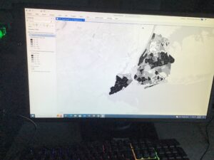
Building outline 2021: Displays all building outlines in Delaware from 2021. I’d assume this needs updated.


Condo: Displays all condominium units/polygons recorded in the county.


Dedicated ROW: Shows all right of way lines in the county.


Delaware County contours: 2-foot contours from 2018. I would also assume this could be updated to be more recent.


Delaware County E911 data: Shows the address points from the previous “Address Points” layer. This gives 911 responders information to determine relative addresses to where a call comes from.


Farm lot: Shows all farm lots divided by US military and Virginia military survey distinctions in Delaware County.


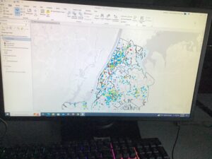
GPS: Displays all GPS monuments identified in Delaware County between 1991 and 1997.


Hydrology: Shows every major waterway that runs through Delaware County. It was last updated in 2018 and is updated when needed.


MSAG: Acronym for “Master Street Address Guide”. It shows that there are 28 jurisdictions in Delaware County.


Map Sheet: Shows all map sheets in Delaware County.


Municipality: Shows all municipalities in Delaware County. (Political subdivisions)


Original township: Shows the original boundaries of Delaware County before tax district changes.


PLSS: Acronym for “Public Land Survey System”. It shows the PLSS polygons for the US military + Virginia military survey in Delaware County.


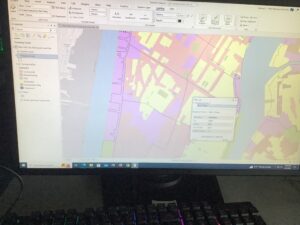
Parcel: Shows polygons that represent the cadastral parcel lines. Cadastral meaning real estate ownership and taxation.


Precinct: Shows various voting precincts. This gets updated when needed.


Recorded document: In place for miscellaneous documents like plat books, instrument records, and cabinet/slide data.


School district: Displays polygons that represent school districts within Delaware County.


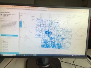
Street centerline: Displays public + private roads in Delaware County. 


Subdivision: Representative of all the subdivisions and condos in the county. 


Survey: A shapefile that covers all the land surveys in the county.


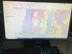
Tax district: Shows all the divisions in tax districts in Delaware County. This is represented in polygons and is updated when needed.


Township: Shows all 19 townships that make up Delaware County. 


Zipcode data: Consists of all the zipcodes listed in Delaware County. This gets updated regularly.

Gassert, week 6

Ch. 9


9.1: A buffer here is defined/represented as a polygon in surrounding map features in a feature class. There is usually a specified radius. You have to use the pairwise buffer tool to create the buffer data.


9.2: Use multiple ring buffer tool to configure polygons. Use the “spatial join tool” to utilize the spatial overlay for statistics. 


9.3: This was complicated and I believe I messed something up. It gave me an error and when I went back to try and fix it, it wouldn’t load.


9.4: This one was also weird to me, as I believe whatever I did wrong in 9.3 got me backwards.


9.5: Got back into the correct lane for this part (I think). I feel the “your turn” part could’ve had a little bit more guidance.


Ch. 10


10.1: Used the raster layers for attributes. This shows things like precipitation and land topography. This sort of map looks vaguely familiar to me and it was easy to use.


10.2: There was a little bit of discrepancy here with the tools I was suppose pd to use, but I figured it out. The KDS thing for smoothing data was easy to use and learn because it’s pretty flexible.


10.3: Another part with a “your turn” section. The book doesn’t really give a whole lot of pointers and useful images to know what you’re doing. I felt what I did was at least half complete.


Ch. 11


11.1: After 3D stuff sparing to work in the past, this one actually loaded! These tutorials were a little easier to follow along with since the visuals weren’t too convoluted.


11.2: Pretty linear, showed me local elevation data. This data looks pretty precise.


11.3: Adding stuff was actually pretty fun. You can do this by specifying z values.


11.4: There were a lot of parts to this that seemed off with the book. This part was hard for me to understand.


11.5: This was a little like 11.3, but with more to it. This showed you how to edit buildings to have more floors to make them more accurate in 3D. You use the duplicate vertical tool to do this.


11.6: This part, you need the CityEngine rule package file (listed as .rpk) to have all the assets to do this. It has the textures and 3D models included. 


11.7: This part was super laggy and late to load things in. The tool you use for the animation is in the view tab under the animation group (which makes sense).  


Gassert, week 5

NOTE: internet was not being nice to me when I uploaded this, so there are no pictures of progress right now. I will add those ASAP when BishopNet agrees with me


Gassert week 5


Ch.4


4.1: Just an intro to the geodatabase files. Relatively easy to follow along with this.


4.2: Still learning how to use the contents panes correctly. If you make a mistake, it’s very difficult to try and go back to fix it. The book did not match up with the software, making the calculations wrong.


4.3: “Attribute queries” that label what and when of something, time/date/day, and people. The SQL button is used to show the criteria selected.


4.4: Intro to the aggregation of the data with spatial joints. I was able to figure this out pretty easy.


4.5: We sort of did this in the week 4 tutorials, adding shapes to show data. This was familiar.


4.6: This also felt similar to an earlier tutorial from week 4. Was easier to do this now that I recognized the instructions and the software.


Ch. 5


5.1: Used coordinates to look at a map projection. I didn’t know that the lines on this kind of map was called a graticule.


5.2: Used similar setup to look at a map of the US rather than the whole world. 


5.3: Sort of similar to the previous two examples, except this was more specific to a smaller area.


5.4: Showed how to use vector data. Showed how to utilize X,Y coordinates and how to add it to the map.


5.5: Calculating stuff is not my strongsuit. I decided to try and come back to this and 5.6 later.


5.6: I did come back to this and 5.5 and my brain stopped working.


Ch.6


6.1: Used the “pairwise dissolve tool” to generate groups. 


6.2: Used the clip tool to select a specific area. Pretty self explanatory.


6.3: Not sure if there was a book discrepancy, but this didn’t work right. There was an error message (which others seemed to encounter too).


6.4: Used append tool to merge data


6.5: Showed more depth to the merge data part and how it can be used to show streets in divisions.


6.6: Merged data from tables. Fairly quick and simple.


6.7: Used the intersection tool. Pretty easy to follow along on the application.


Ch. 7


7.1: This shows how to edit features and shapes on a map. I feel like this could have been in an earlier tutorial rather than now. I wish I had this knowledge a week or two ago.


7.2: Same as 7.1, I wish I knew how to create feature classes myself sooner in more straightforward words.


7.3: This took a hot minute to load for me, but it eventually worked. 


7.4: REALLY didn’t want to load. I think the connection was bad today or something. I’d like to come back and try it again to see if it works on a day it’s not storming.


Ch. 8


8.1: Seeing this chapter was only two sections was so relieving. The book tells you what tool does what and why it’s there, which I wish the book did way before now. This gave details about how to use geocoding with zip codes.


8.2: This made slightly less sense than 8.1, but I figured out that it wants me to use geocoding for street addresses.

Gassert, week 4

Ch 1

1.1:  It took me a little bit to sort everything out as I have not used an application like this before, so getting everything started was a little shaky for me. 

1.2: I had a rough time figuring everything out, but after a while things started coming together.

1.3: Being someone that doesn’t understand numbers very well, I had to figure out what the numbers all meant (including some google searches to help me find out what the numbers mean). That was not a fun time, BUT, I’m hoping that’ll change later on once I get the full gist of it.

1.4: I was not able to see a 3D version. Others seemed to have this issue too, so that eases my mind to know I’m not missing something or doing something wrong!

Ch 2

2.1: I’m not sure if I did this 100% correctly. I understand how to change the colors, but the symbol names don’t seem to totally match what’s in the book.

2.2: It took me a bit to find where all the tabs were. I had to go back a few times to figure out how to toggle layers to see where everything is.

2.3: This step was a little unclear to me. I’m not sure if the software didn’t match up here, but I couldn’t find all the tabs.

2.4: This 3D part worked, so I’m not sure why the 3D part 1.4 didn’t. This map looked pretty cool.

2.5: I couldn’t figure out how to get the circle symbol icons to come up. The color gradient worked just fine, but I couldn’t get the circles.

2.6: I got through this part just fine, but I’m not understanding what information it’s trying to tell me. I see the labels and the differences on the map, but I feel like the differences between the two datasets were a little off. 

2.7: This part I understood and got through with ease. This information is easier to read.

2.8: I did everything right here except for the neighborhood labels. I didn’t see what the book was telling me to click on in the application.

Ch. 3

3.1: I got a little lost with the two maps and which one was supposed to be which (it said one of them twice on the application, which ever the green map pop up was). I got the heights right and had to figure out how to make the text bigger.

3.2: I logged in and figured out the site. I took a little while,to navigate the site, but got a hang of it eventually.

3.3: I struggled a bit with finding where I needed to go on the website. I didn’t really understand how this section was supposed to work.

3.4: I couldn’t find the dashboard thing like the book says. I got the map up, but some things the book said didn’t add up with what I was doing.

Gassert, week 3

Ch. 4

     This chapter begins with map density and what it depicts. In simple terms, map density shows where high concentrations of a certain subject are. Paying attention to map density can help in observing patterns within an area to determine places of interest. Map density can also be shown in two different ways, being by area or density surface. The density by area maps are personally a little easier to understand. More dots or marks in a section of the map means there is a higher density of a certain feature there. Surface density doesn’t show much area separation, making it harder to work with to a degree (but it’s more accurate). With surface density, the GIS will determine the surface density for you, but the user has to determine the cell size. You have to be careful when determining the cell size because if it’s too big, the map may appear vague and unclear. Smaller cell sizes tend to have more detail, which in turn takes up a lot of storage space and may take longer to generate every detail. The textbook guides you through how to calculate an appropriate cell size based on the map size. 


Ch. 5

     Chapter 5 starts with explaining why it’s important to map things in the first place. Many different groups of people can utilize these maps for things like research and political demographics. For example, researchers tracking whale migration would want to see where individuals frequent for breedings and feeding, so marking these places and movements on a map proves to be useful to see where the whales prefer to be for certain reasons. It’s very important to label and define what’s inside the map so you don’t lose track of your data. The book gives a few different ways of finding and keeping track of features in the map, which consists of; drawing areas, selection inside an area, and overlaying areas. Drawing area only gives you a visual of where things are, but does not give you detailed information about what you’ve found. Selection allows you to actually specify the features in front of you. The GIS will search the area map for you and determine the feature and mark it. Overlaying will assign a code to a certain feature that’s in the area. The GIS will check the area for the specific feature and give the features IDs. Overlaying seems to be the most detailed and informative way of keeping track of features on your map. 


Ch. 6

     This last chapter gives reasons for why it’s significant to “map what’s nearby”. The three big methods the book gives for this is cost over surface, straight-line distance, and distance/cost over network. The straight-line distance is the simplest method of determining nearby features. This only measures the distance and roughly estimates the time it would take to reach a location. We use things like this a lot when we go places that are unfamiliar and need to know how to get there and the best (possibly shortest) route to get there. The cost over surface method allows us to determine the cost of travel to a destination. This requires more data to determine the cost involved, but the calculations prove to be pretty reliable. The last method is cost/distance over the network. This method combines the previous two, needing locations of interest along with the value/cost of an area. The last chunk of this chapter tells you how to calculate the cost (time, money, etc.) over a geographic surface. Once you add all of the layers to the map, the GIS thankfully calculates the total costs for you. Once that’s been done, the map user can filter through the cells of the map to pick out areas of higher or lower cost. 

Gassert week 2

Chapter 1: This first chapter highlighted the various ways in which GIS is used, as well as the different types that are utilized. This chapter also shows how patterns are used to map out the geography of a space and how different data sets can be shown on one map. This book so far does a decent job at giving visuals to help the reader better understand what exactly GIS maps are and the types of information the maps convey. This chapter details the specific terms of GIS features, those being discrete GIS data, continuous phenomena, and area summarization. Each of these components have the potential to be used at once to map out specific areas. The ability to keep record of several key companies with GIS can help researchers monitor environmental changes in a variety of ways. 

     These maps help scientists map out large areas with coordinates. Measuring a large area can be difficult, so using GIS coordinates can help solve part of that problem. I was not previously familiar with the terms “vector and raster” before, but this first chapter helped me understand what these two words are and what they mean in the context of GIS data (vector being exact geographical points and lines and raster being a mix of “cells” that represent certain information). 


Chapter 2: The second chapter builds off the first and goes into detail about how the maps function and how they work. It outlines how to set up the maps and how to appropriately apply collected data to said maps. It shows the difference between smaller maps as opposed to larger ones, as well as what can be used to mark points of interest. One thing I found interesting about this chapter is the fact it suggests that no more than 7 data sets should be represented on the map. I can understand why they suggest this, but after doing some research on GIS maps, I feel like I’ve seen maps with a lot more than 7 points on them. I’m sure they suggest the smaller number to make the map easier to understand for those that are new to GIS, but once you learn how to use them and how to read them, using a few more data categories isn’t too big of an issue. 


Chapter 3: This chapter seems to me like it’s testing your knowledge of the first two chapters. The first two chapters served as a tutorial of sorts to introduce you to what GIS is, what it’s used for, and how to read it. This chapter poses questions to the reader to take you through the processes of creating your own GIS map. This section also makes the reader think about what data they’re putting on their map and what matters more. The types of data that’s available on the maps make it easier to compare and contrast different regions about what that area may lack compared to another. 

     This chapter goes into more detail about how to color code categories and classes of information on a map. These colors can be used to differentiate waterways from roads as well as show man made landmarks vs. natural landmarks. Contour lines can also be used to show elevation and pressure changes within a given area. 

Gassert, Week 1

Hi there! I’m Sydney Gassert. I’m a sophomore majoring in ENVS with a strong interest in animal behavior. I was born here in Ohio, but have lived in California, Texas, and Arizona. I’ve gained a lot of experience with animals over my time in high school in Arizona, working with an organization called Fallen Feathers. While volunteering there, I worked with wild birds to be rehabilitated and rescue parrots to find new families. I currently work at the Columbus Zoo in guest relations and at a vet/pet boarding facility as a kennel tech. After college, I hope to advance at the zoo and become a part of the animal care team either in the aviaries or with the pinnipeds!

A few more little fun facts about me; I play the violin, I’m into photography, and I keep bugs as pets (that is my spiny flower mantis on my face in the pic I posted. Her name is Matcha and she’s very silly)


This chapter gave me a good refresher on what GIS is and what it can be utilized for. I’ve never used an actual digital GIS system myself, but seeing this now I remember reviewing maps of Mexican wolf populations in Arizona for one of my classes I had in high school. We were challenged to analyze the map and figure out where the different wolf packs were traveling and where they frequented based on coordinates. If GIS wasn’t popularized when it was, a lot of advancements may not have been made. Without GIS systems, it would be harder to map out and identify different regions. Many different categories of people can benefit from GIS systems to do their jobs. Architects, biologists, oceanographers, and geologists just to name a few. The fact that you can also add different layers to GIS maps to show changes over time and movement is also incredibly fascinating and helpful to give a visual of migration patterns of animals for example. I hope to gain more knowledge on how to generate and use the GIS myself to possibly help a little in my career path.


Being that I have a heavy interest in animal behavior, I decided to take a look at southern resident killer whale sightings. I have an unhealthy obsession with orcas, so why not take a look at one of the most threatened populations? All of the circular dot marks on the map mean different things like foraging, feeding, and even social interactions between the pods. The square dots on the map indicate boat travel and types of boats that sail the same areas that the SRKWs frequent. This map shows a good amount of interference between boats and the whales, which can interrupt the whales’ way of life. 

https://www.arcgis.com/apps/mapviewer/index.html?webmap=226b74dc38ba46eba2e5d6317ddf0b54