Miller Week 7

Delaware Data Inventory:

Address Point: Shows all the specific addresses for the county.

Annexation: Shows different parts or subdivisions of towns scattered throughout the county.

Building Outline: Shows the outline for all the structures present.

Condo: Shows all the different condo outlines.

Emergency 911 Data: Another way that shows address within the county, with a more spatially accurate data used for emergency response.

GPS: Shows all the GPS monuments made in the years 1991 and 1997.

Hydrology: Shows the county’s main water sources.

MSAG:  Shows the political jurisdictions areas in the county,

Municipality: Shows the city limits of defined towns/cities in the county.

Paracel: Shows all the county’s specific zoning areas for each property.

Precinct:  Shows the different voting areas within the county.

Recorded Document: Shows specific points where important data has been collected in the county.

School District: Shows all the school districts within the county.

Street Centerline: Gives accurate detail on all the roads present.

Subdivision:  Shows all the subdivisions and condos as well in the county.

Tax District: Shows all the tax districts in the county.


Miller Week 6

9.1 – Learned how to use the pairwise buffer tool. Was able to figure out all the steps but adding a new buffer on top of a previous buffer.
9.2 – Was able to create multiple ring buffers, which would have been useful for the last step in the previous section.
9.3 – Was somehow not able to find the excel work. Overall, quite a long section, but slow and careful work made the entire section go smoothly for the most part.
9.4 – Used the network analysis to connect certain features to facilities. This section was short and mostly simplistic.
9.5 – Was able to perform a cluster analysis with previously given data. A simple section that yielded the proper results.
10.1 – Did a lot of work using raster datasets. Although the actual reasoning behind using these tools made no sense, I was still able to follow all the directions.
10.2 – Was able to make a kernel density heat map with the use of multiple tools. The end product was quite cool.
10.3 – Learned how to build a risk index model. This section was quite long, but I was able to figure out most of the steps. I was not able to find the PovertyIndex.lyrx file, so I was not able to finish that part of the section.
11.1 – Started diving into using 3D GIS, in which I learned the basic tools to navigate the system.
11.2 – Worked with creating and editing TIN surfaces. Another cool process, in which the steps made sense to me.
11.3 – Was able to add z-enabled features, which were 3D models of specific points on the map. Overall, it was neat to see the final result.
11.4 – This section was quite long and took a decent amount of work to do. I was able to get through all the steps but the bridge steps did not work. The bridge option was not available in the create features pane.
11.5 – Was able to work with 3D features, such as creating stories within buildings, and altering building heights. Overall, this was an easy tutorial.
11.6 – This section also worked with modifying buildings from a 3D model. All the parts of this tutorial worked for me but the last section, despite the steps being simplistic.
11.7 – Was able to work with creating and editing an animation using bookmarks. Overall, a very cool process that I did not know was possible. I was not able to export the animation, as the export time was somehow quite long.

Miller Week 5

4.1 – Figured out different ways of importing and to move data on GIS pro. I was not unable to figure out how to set up a folder connection, but the rest of the steps made sense.
4.2 – I was able to learn more information about modifying attribute tables, along with using the fields view. All the steps made sense, but the expression with the population under 20 was not showing up.
4.3 – Was able to work more with the attribute queries, as I was able to narrow down the specific data. It was really cool to narrow down the crime data to one individual.
4.4 – A relatively quick and easy chapter. Continued to mess with attribute tables, and reused some steps from the first part of the book.
4.5 – Continued to learn new items for the tool box. I was once again able to mess with the symbology tool as well.
4.6 – Another short chapter, I was able to work more with attribute tables. I was not able to figure out how to make a one-to-many join section.
5.1 – Was able to figure out how to change the type of world map. Pretty easy to understand.
5.2 – Pretty much the same concept as 5.1, but working with US maps.
5.3 – Worked on adding new layers to a given coordinate system, along with changing coordinate systems. Overall a cool process.
5.4 – Was able to figure out the vector data donat section, which was similar to 5.3. I need to relearn working with the symbology a bit more.
5.5 – This section was quite complicated and took a while to figure out. I was unable to find/import the three consensus shape files, which limited me for doing the rest of the section.
5.6 – I am not going to lie, none of this section worked for me. I think I am running into the problem that the data is not downloading to the proper source, in which I am not able to complete the section.
6.1 – I was able to dissolve certain features to show smaller neighborhoods. This section made sense and was easy to follow.
6.2 – I knew what this section wanted me to do, which was to combine the neighborhood and the streets within the given neighborhood. However, the directions were quite confusing, and I was not able to get the final product.
6.3 – Quite an easy process of using the merge tool to merge water features.
6.4 – Really did not understand the purpose of the append tool. However, the directions were fairly simple, as it seemed like I added more specific data to the attribute table.
6.5 – Was able to intersect features to help figure out the fire zones. The overall process was easy to follow.
6.6 – Was able to summarize certain values in neighborhoods in the Brooklyn area, which was quite interesting. Finally figured out how to use the join tables tool.
6.7 – Another straightforward section. Was able to use the tabulate intersection tool to compare numbers of disabled people in different fire zones.
7.1 – Was able to mess with editing polygons, whether it was changing their shape, or splitting them. Overall an easy and cool section.
7.2 – Also a very easy section to understand. I was successfully able to create and delete certain polygons.
7.3 – The smooth polygon tool is not only easy, but very satisfying to use.
7.4 – This section focused on transforming polygons. It took a lot of steps to accomplish this, but I did get the right result.
8.1 – Started the basics on geocoding, which mainly uses zip codes as data. The overall process was fairly easy to follow.
8.2 – Did more geocoding, but with street addresses instead. Also a straightforward section.

Miller Week 4

1.1 – Was a little bit difficult trying to get things going, until I realized that I needed to extract the files. Once done, the book made the steps easy and simplistic.
1.2 – A lot more steps than the previous tutorial, but the steps were easy to follow. The zoom in steps seem to be quite useful, and the search for feature steps seem thorough to me. It now feels like I am starting to actually use GIS.
1.3 – A lot easier to understand than part 2 of chapter 1. The attribute tables made more sense to me, although I am still quite confused on their overall purpose. It feels like I am taking baby steps into the world of GIS.
1.4 – This part of the chapter focused on changing fonts and point formats, along with adding new features. The 3D part did not work for me as well. Probably needs to be updated.

2.1 – Adding and color coding the different residential zones was easier than expected. It seemed like GIS did a majority of the work.
2.2 – Learned how to label features and to configure what pop ups that I want. I followed all the steps for pop ups, but they would not appear when I clicked on the neighborhood. ‘
2.3 – This process seemed quite easy to me, as it seemed like a combination of parts 1 and 2 of chapter 2. This section made me feel more confident, as there was some “review” from previous sections.
2.4 – This process was quite interesting to do, and I am glad that the 3D model actually worked! The steps were also easier to follow.
2.5 – By far the most simplistic steps to follow compared to the other sections. The reasoning behind using the defined interval method made sense to me.
2.6 – It seemed cool to me that you could compare similar data to two different groups. The swipe option was really interesting, as it made it easier to show the actual comparisons side by side.
2.7 – Really cool to actually learn how to use dot density. Although the amount of dots can be overwhelming, it does a good job at specifying specific locations on a map.
2.8 – This part showed how to have specific feature names and points appear and disappear as you zoom in and out. This can be useful, as having too many names/points can be overwhelming.

3.1 – First started off with building layouts for maps and legends in order to transition them from GIS to paper. It was also cool to actually be able to interpret the data through figures such as the bar graph.
3.2 – Sharing the GIS Pro work was easy to do, but the steps for navigating the website were difficult to understand. It may be that the website got updated, or that I am just not understanding the website.
3.3 – Worked on actually publishing something in a website and professional format on the GIS website. Took a lot of time to do so, but it was quite cool to do so.
3.4 – Was able to create a dashboard on the GIS website. The steps were fairly straightforward to follow, and I was able to share and make the URL link work.

Miller Week 3

Chapter 4:

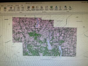
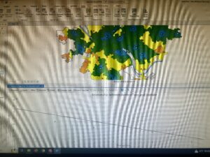
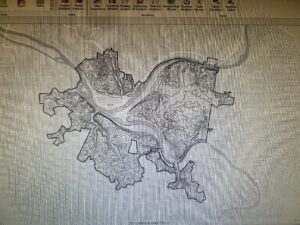
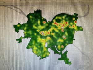
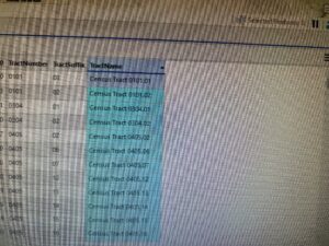
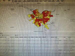
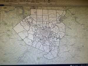
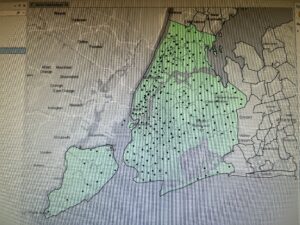
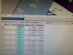
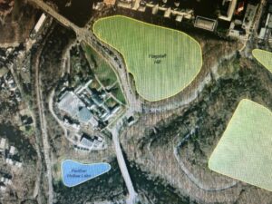
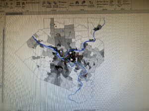
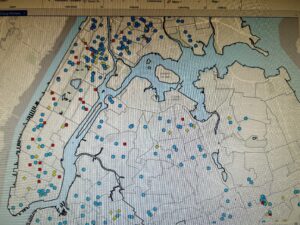
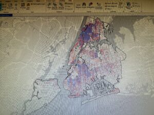
This chapter discusses what mapping density is and how it can be used for GIS work. I honestly have never thought about this kind of mapping, but it does relate to some important concepts such as population and urban densities. After the chapter defines mapping density and its importance, the chapter talks about how you figure out what to map for mapping density. You can either use point or line methods for this, which is related back to Chapter 3. In general, there are two ways to map density. The first way is to map it by defined areas, which correlates to dividing the total number of features to the area given, which gives the density of each defined area. The second way is through density surface. This method seems more complicated for me to understand, but it does seem like it shows more information compared to the defined areas method. The chapter then dives further into using both methods, and how to undergo both methods using GIS. For the density of the defined areas, one method besides calculating a density value, you can use a dot density map for the defined areas. This allows more accurate representation of where the density is taking place in the given areas. To undergo the second method, the first thing to do is to calculate the density values that you would use. To do this, you need to know factors such as cell size, search radius, the calculation method, and the units that you are willing to use. Overall, these steps seem quite confusing for me, as the process seems more complicated for the density surface. Once the data is presented on the map, then you need to figure out how to present the given data. It is important to know things such as what colors to use to represent the density, along with using the proper contours. 

Chapter 5:

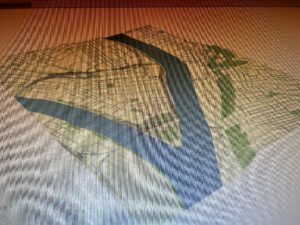
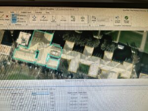
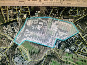
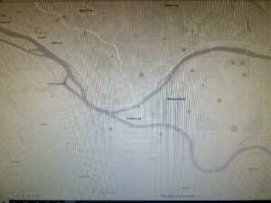
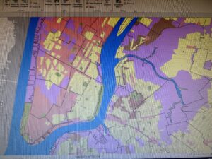
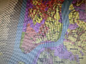
When I first started to read the chapter, I honestly had no idea what “finding what’s inside” actually meant. From what I have interpreted, this chapter focuses on helping pinpoint or to highlight certain features found within a given area of a map. This allows those to see more detail on what is going on in a specific area of interest. When undergoing this process, you need to define the actual area you want to focus on. This area does not have to be a single region, as it can pinpoint other surrounding areas as well. You also want to figure out if the area is either discrete or continuous, which relates to other ideas discussed in the first two chapters. The next question that needs to be addressed is the kind of information that you are trying to collect. It is also important to note that all the features that are being measured within the given areas can also be found outside the given area being measured as well. Overall, there are three ways to make these areas inside. The first method is drawing areas and features, which seems to be a quick and easy method, but it does not provide precise measurements in the areas. The second method is selecting the features inside the area, which gives good insight into one area, but only that one selected area. The final method is overlying the areas and features, which gives the most accurate and precise representation of the data, but is the most complicated process. The chapter then goes on to explain which method one should choose and the process of completing the method of choice. All these methods seem complicated and require multiple steps to complete in my opinion.

Chapter 6:

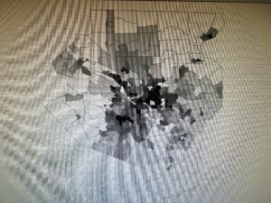
The start of this chapter seems quite similar to what chapter 5 had to entail. However, what makes this chapter different is that it allows one to define a set distance or feature, which allows one to see what occurs within that area. From what I understand, this allows us to predict how adding something to an area will affect that area, whereas chapter 5 looks at what is already defined in a given area. The first step to this process is to determine the distance of a given area. Then, you need to figure out what kind of information that you want to collect. Usually, this either involves gathering a count, list, or a statistical summary. Another important idea to consider is the amount of ranges that you need, as there can be multiple given ranges within a map. Once those steps are complete, there are three methods to undergo finding what’s nearby. The first method is straight-line distance, which measures distance and is quick and easy to use, but it only gives a rough estimate of the distance. The second method is distance/cost over a network, which can measure either and is more precise, but it requires an accurate network layer. The third method is cost over a surface, which measures cost which allows one to combine multiple layers, but it requires data from multiple sources. The chapter then goes on to explain what method to use and how to use the said method through GIS. Like the previous chapter, the steps to undergo any of these methods seem quite complex. However, I feel like using this book as a guide when it comes to actual GIS work will not be a bad idea, as this book does contain useful introductory information.

Miller Week 2

Chapter 1:

Overall, it is quite interesting to view GIS from an introductory standpoint. Since I know very little about what GIS actually is, it is quite nice to grasp the basic background behind what GIS is. The chapter first starts off with the generic process of what GIS entails. The simplistic steps behind GIS remind me of the steps found within the scientific method. The chapter then goes into the types of geographic features found within the GIS maps. Discrete features are the features on the maps that can actually be defined, which are generally represented as dots or lines. Continuous features are a little more complex to me, but they seem to be features that can be measured pretty much anywhere. There can also be features that can be summarized by area, which is a more density based data. The chapter then goes on to explain how geographic features can be represented. The first way is the vector model, which seems to be a more discrete method, which seems to pinpoint exact points and areas by using coordinates for instance. The raster model seems to be a more continuous representation, where there are layers representing the entire region of the given map. Overall, the differences between vector and raster models seem to have some overlap between them and therefore can be quite confusing. The chapter then talks about attribute values, which relate to geographic features. The five attributes (categories, ranks, counts, amounts, ratios) all make sense to me. The chapter then closes off with understanding the use of data tables. The three features that you use for the data tables are selecting, calculating, and summarizing. Overall, this part seems quite complicated, and I think that actually practicing it will make it easier to understand. 

Chapter 2:

This chapter talks about the importance of mapping, and the process of how to undergo mapping through the GIS software. Personally, I find maps interesting, which is one of the reasons why I took GIS. From what I know about maps, they tell you where places are and what unique features are present in different locations. However, I find it interesting that GIS can use maps to help pinpoint certain areas that need particular attention. The chapter talks about the process of mapping. The questions that it asks seem similar to the questions found in chapter 1, which takes the process as a step by step methodology. With using GIS, there are many ways that one can map their data. Mapping with a single type method can show simplistic and universal features, which helps those find a distinct pattern. Another mapping process is through mapping by category. This adds a key to help distinguish different areas found on a map, which helps to create an idea of where different regions are located. Also when it comes to categories, you want to make sure that you don’t have too many,or else it becomes complicated for the reader. If you need to have a large amount of categories, then you might just want to generalize the categories to make things more simplistic. It is also important to know what symbols to use for defining each category in your key. Overall, the purpose of mapping with GIS is to help one analyze certain patterns going on with their data. It can be as simple as zooming in or out or removing certain features on your map that will help you pinpoint certain patterns. 

Chapter 3:

This chapter talks about mapping the most and the least, which I honestly had no idea what that meant prior to reading this chapter. However, I have learned that it is a process of mapping that helps researchers correlate patterns or find areas that need to take action. Basically, it is diving deeper into the general ideas of mapping that were discussed in Chapter 2. It also takes in certain ideas from chapter one, as the beginning of the chapter talks about discrete and continuous mapping, along with ideas from the five attributes. Although this information was a little on the repetitive side, it was still good to relearn the information, along with understanding the importance of it to the overall idea of the chapter. After the review session in the beginning of the chapter, it talks about how to properly represent the data on a map. Using counts, ratios, and amounts would generally yield maps that show different classifications. The overall idea of using classes for mapping made sense to me. However, what was a completely new concept was the use of standard classification schemes. There are four of these schemes, which consists of natural breaks, quantile, equal interval, and standard deviation. I have only heard of one of those, and the other three seem a little confusing for me to fully understand what they mean. However, it was easier to understand the overall methods in choosing what classification schemes to use depending on what data you have. The end of the chapter discussed other important aspects, such as determining how many classes you need, and how to deal with outliers.

Miller Week 1

Hello, my name is Evan Miller. I am a senior, and my major is Zoology. I run both cross country and track and field here at OWU. I also have a passion for birds, as I want to pursue conservation work in the field of ornithology down the road.

Honestly, I never heard of GIS until a friend of my recommended the class to me. Knowing that I enjoy looking at certain maps, I am shocked about the importance and the magnitude that GIS is used, as many major companies and city planners use GIS. When I first heard of what GIS is about, I thought it was a fancy form of mapping. However, it turns out that mapping and spatial analysis are two completely different ideas. As mapping shows physical geographical features present, spatial analysis uses other data to make comparisons with the already known geographical features, which is uniquely interesting. I also had the initial thought of GIS being relatively new, due to more recent computer advances and the fact that I have never heard of GIS until recently. However, GIS has been around in the 1960s, even around the time when computers were considered a new innovation at the time. Going along with the history of GIS, the overall idea seems more complicated and controversial than I initially imagined.  For instance, it seems that some view GIS as solely a quantitative tool, while others view it just as a mapping tool. Although that I currently have not used GIS, it seems that GIS uses both quantitative and mapping mechanisms to help whatever the researcher is looking for. Also, I really did not know there were differences between GIScience and systems, even though there are some distinct difference between the two.  Overall, I really did not understand how much GIS is used and how widely important it is in out everyday society. For instance, GIS plays a significant role in helping agricultural yield, as it helps to provide visual data over certain fields. The fact that GIS is used in a wide variety of ways has made me more curious on how it works and how to use it.

Since I have interest in bird conservation, many bird populations have been undergoing a severe decline in their population sizes over the years. One of the ways to help understand and monitor their populations is through analyzing certain species’ migration patterns. Some researchers have used GIS to help determine more optimal sites to help collect migratory data.

https://www.esri.com/about/newsroom/arcuser/bird-migration/

Going along with conservation work, GIS can be used to help determine where to prioritize conservation for certain species. For instance, GIS can map where the specific type of habitat a particular species likes to reside in, which can help conservationist where to prioritize the protection of their suitable land.

https://www.birdconservancy.org/big-data-for-bird-conservation