Rose-Final Week

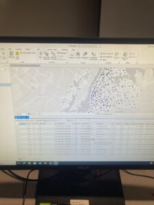
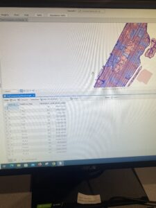
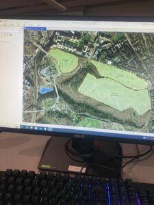
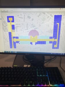
Delaware Data Inventory

  • Address Point: Representation of all certified address within Delaware County Auditor’s GIS Office
  • Annexation: Contains Delaware County’s annexations and conforming boundaries from 1853 to present
  • Building Outline: Consists of building outlines for all structures in Delaware County, Ohio
  • Condo: Consists of all condominium polygons within Delaware County, Ohio that have been recorded
  • Dedicated ROW: Consists of all lines that are designated Right-of-Way within Delaware County, Ohio
  • Delaware County Contours: 2018 Two Foot Contours
  • Delaware County E911 Data: Spatially accurate representation of all certified address within Delaware County
  • Farm Lot: Consists of all the farm lots in both the US Military and the Virginia Military Survey Districts of Delaware County
  • GPS: Identifies all GPS monuments that were established in 1991 and 1997
  • Hydrology: Consists of major waterways in Delaware County, Ohio
  • MSAG: The Master Street Address Guide polygon feature set of the 28 different political jurisdictions such as townships, cities, and the villages that make up Delaware County
  • Map Sheet: Consists of all map sheets within Delaware County
  • Municipality: Consists of all municipalities within Delaware County
  • Original Township: Consists of the original boundaries of the townships in Delaware County before tax district changes affected their shapes
  • PLSS: Consists of all the Public Land Survey System polygons in both the US Military and the Virginia Military Survey Districts of Delaware County
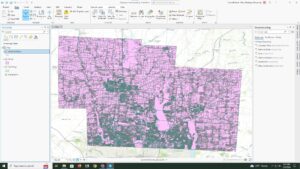
  • Parcel: Consists of polygons that represent all cadastral parcel lines within Delaware County
  • Precinct: Consists of Voting Precincts within Delaware County
  • Recorded Document: Consists of points that represent record documents in the Delaware County Recorder’s Plat Books, Cabinet/Slides and Instrument Records
  • School District: Consists of all School District within Delaware County
  • Street Centerline: The State of Ohio Location Based Response System Street_Centerlines depict center of pavement of public and private roads within Delaware County
  • Subdivision: Consists of all subdivisions and condos recorded in the Delaware County Recorder’s office
  • Survey:  Survey Points is a shapefile of a point coverage that represents surveys of land within Delaware County
  • Tax District: Consists of all tax districts within Delaware County
  • Township :Consists of 19 different townships that make up Delaware County
  • Zip Code: Contains all zip codes within Delaware County

Rose Week 6

Chapter 9


Chapter 9 was pretty simple and straightforward as it focused on spatial analysis and combining and interrupting data based on different locations. I ran into some issues finding some of the newer functions it asked me to use but I eventually was able to find them and continue on with the chapter.


Chapter 10


 For 10-1 I did not have the LandUse_Pgh file in my Chapter10.gdb so I couldn’t finish this tutorial. I am not sure why I am missing some of the downloaded data. This has been happening throughout these tutorials. 10-2 was straightforward and I was able to get through it pretty easy but 10-3 was difficult for me when I got to the point when you have to enter some expressions in the raster calculator and that did not work for me. I think I did a step wrong before that but I don’t know how to fix it. 


Chapter 11


This chapter focused on all things 3D in ArcGIS. I had some issues just because of the nature of the use of 3D but nothing too crazy. It is very cool to see things from this point of view, especially while using the program in exclusively 2D the past 3 weeks. 3D GIS is a bit daunting but these tutorials made it much simpler and easier to navigate and understand. 

Rose Week 5

Chapter 4


I had some issues with chapter 4. For some reason tutorials 4-1 and 4-2 did not get downloaded to the flashdrive I have all my work on so I was unable to do them. I am not sure why but this also occurred in the previous part as well. However, I was able to do the rest of the tutorials. In these I had to do filtering and linking some of data and carrying out attribute queries. I also carried out a spatial join of the burglary data along with using some more symbology. I had some issues with the last tutorial when creating a joined table however as I kept on saying I could not before the join due to the fact there was nothing to join so I am not sure what I did wrong. 


Chapter 5


The first two tutorials in the chapter went smoothly as it was just adjusting the map and the format it is viewed in. The third tutorial was also pretty straightforward in manipulating coordinate systems. However on 5-4 I had issues as when I went to go for the export features tool and went to change the output feature class, I did not have CouncilDistricts saved in my Chapter5.gdb for some reason. I am not sure what is going on with somethings not being saved or downloaded onto my flash drive but because of this I was unable to finish 5-4. I had issues again with the last two tutorials as well. I don’t think I was saving or extracting the data correctly from the outside sources. This led me to have issues importing that data into the maps.


Chapter 6


Chapter 6 was one of the longer chapters just based on how manyt tutorials there were, not so much of the content or how long they took. This chapter focused on geoprocessing which had me use various different tools to process, merge, and manage some of the data. For the most part these tutorials went smooth but often had little hiccups toward the send of sections with running some functions or joining data. However it was interesting to look at New York City again as I used to live there. 


Chapter 7


This chapter was fairly short and had us manipulating and digitizing some of the landmarks on maps. Most of this chapter was straightforward but there were areas that confusing and left me stuck when trying to mess with some of the layers and features.


Chapter 8


Short chapter talking about geocoding. In this chapter we messed with some stuff using zipcodes in various areas. I am not entirely sure what was happing however but the tutorials were straightforward besides in a few areas I had issues with but not too bad.


Rose Week 4

Chapter 1


This chapter was a good run through of some of the basic actions of ArcGIS pro. Also looked at some of the attributed data and feature classes within the map. Some of the things within this chapter were difficult but others very easy to understand. Definitely comes with just usage of the program. Like others I had issues with chapter 1-4 which is unfortunate because seeing the 3D model would be very interesting. So far the tutorials have been pretty straightforward and easy to follow. 

Chapter 2


This chapter started diving much deeper into what ArcGIS has to offer. Much of it dealt with the symbolization on the maps and how to change it. My chapter 2-4 had issues running and could not complete that one however. I found the maps really interesting as they looked at New York City, Manhattan and the West Village specifically. This interested me as I used to live in New York City(in Queens though) and much of the data was on food pantries and soup kitchens which is stuff I like to focus on as an HHK major. I had some minor issues finding smaller tabs and windows it asked me to click but I eventually found them and again it probably just comes with usage of the program and familiarity with it. 

Chapter 3


This chapter really focused on finalizing maps we create. The first chapter focuses on organizing the maps and creating charts and tables to complement the data being used. The other sections  showed us how to share maps online and put them in ArcGIS online within our organization along with changing some features and pop ups. For some reason chapter 3-3 did not download for me and could not do the tutorial.

This was a ton of content and definitely should have started earlier in the week so I think I messed up on a few things but I will know for next week to start much earlier and give myself time to get through at my own pace and doing the tutorials carefully.

Rose Week 3

Chapter 4

  • Mapping density shows you where the highest concentration of features are
    • Useful for looking at patterns rather than locations of individual features and for mapping areas of different sizes
    • Lets you map an area using a uniformal unit to clearly see the distribution-
  • Can shade defined areas based on density value or create density surface
  • Can use GIS to map the density of points or lines
    • Usually these features are mapped using a density surface
  • Can map the density of the features or feature values
    • Will give you very different results
  • Although can map feature locations to see where they’re concentrated, creating a density map gives a measurement of density per area, 
    • Can more accurately compare areas or know whether certain areas meet your criteria
  • Can map density graphically, using a dot map, or calculate the density value for each area
  • A density surface is usually created in the GIS as a raster layer
  • Calculating a density value for defined areas
    • Calculate density based on the areal extent of each polygon
  • Some GIS software such as ArcGIS lets you calculate density on the fly
  • Creating a dot density map
    • Map each area based on a total count or amount and specify how much each dot represents
  • When creating dot density map, specify how many features each dot represents and how big the dots are
    • Important to be proper size in order to show patterns correctly
  • Can use GIS to summary features or feature values for each polygon
  • To create density surface, GIS defines a neighborhood around each cell center
  • Need to set several parameters to affect how GIS calculates density surface and what the patterns look like
  • GIS uses one of two methods for calculating cell values
    • Simple method counts only those features within the search radius of each cell
    • Weighted method uses mathematical function to give more importance to features closer to the center of the cell
  • GIS lets you specify areal units in which you want the density values calculated


Chapter 5

  • People map what’s inside an area to monitor what’s going on inside it or to compare several areas based on what’s inside each
    • By monitoring what’s going on in an area, people know whether to take action
  • To find what’s inside can draw an area boundary on top of the features  and use an area boundary to select the features inside and list or summarize them or combine the area boundary and features to create summary data
  • Need to consider how many areas you have and what type of features are inside the areas
  • Can use single area or multiple areas
  • Linear features and discrete areas might lie partially inside and outside an area
  • Can choose to include only features that fall completely inside
    • Features that fall inside but extend beyond the boundary or include only the portion of the features that falls inside the area boundary
  • Drawing areas on top of features is a quick and easy way to see what’s inside
    • However can find out what’s inside in other ways that give you additional information i.e. list of the features or summary statistics
  • Sometimes making a map and looking at it is all the analysis needed
    • Using GIS to draw the area or areas on top of the features, you can see which discrete features are inside or outside an area or get a sense of the range of continuous values in the area
  • GIS checks the location of each feature to see if it’s inside the area and flags the ones that are
    • The highlights selected features on the map and selects corresponding rows i the feature set’s data table
  • Can use GIS to create a report on the selected features
  • GIS tags each feature with a code for the area it falls within and assigns the area’s attributes to each feature
  • If you have a single area, mapping individual locations is similar to mapping locations using geographic selection
    • If mapping lines or areas with a single area, can draw just the portion of each feature inside the containing area
  • GIS summarizes the amount of each category or class features falling inside one or more areas
    • Can get a map, table, or chart of the results


Chapter 6

  • Using GIS can find out what’s occurring in a set distance of a feature
    • Can also find what’s within traveling range
    • Traveling distance measured by distance, time, or cost
  • To find what’s nearby, can use straight-line distance, measure distance or cost over network or measure cost over distance
    • Deciding how to measure “nearness” and what info you need to form analysis will help you decide what method to use
  • What’s nearby can be based on a set distance you specify, or on travel to or from a feature
    • If travel is involved can measure nearness using distance or travel cost
  • Knowing the information you need will help you choose the best method for your analysis
    • List, count, or summary?
  • Three ways of finding what’s nearby
    • Simple way of finding what’s nearby is to use straight-line distance
      • However measuring distance or cost over a network, or cost over a surface, can give you a more accurate measure of what’s nearby
  • Using selection to find what’s nearby is like creating a buffer
    • Specify the distance from the source and the GIS selects the surrounding features within the distance
    • GIS does not create a boundary around the source features
      • It calculates the distance and selects the the features in one step so you don’t have have to use a buffer to select the features surrounding the source
  • If you’re finding individual locations near a source feature, you can have the GIS calculate the actual distance between each location and the closet source
    • Useful if need to know exactly how far each location is from the source rather than whether it’s within a given distance
  • Spider diagram: GIS can draw a line between each location and is nearest source
  • Creating a distance surface
    • Create a raster layer of continuous distance from the source
  • Measuring distance or cost over a network
    • GIS identifies all the line in a network(i.e. streets or pipelines) within a given distance, time, or cost of a source location
      • Source locations in networks are often termed centers because they usually represent centers that people, goods, or services travel to or from
  • Geometric network composed of edges/lines, junctions, and turns
  • Calculating cost distance over a surface lets you find out what’s nearby when traveling overland

Rose Week 2

Chapter 1

  • A bit of review because I took GEOG 292
  • GIS has evolved from simply making maps to analyzing some of the world’s most pressing issues
  • Beginning of chapter focuses some of the creation of GIS maps 
    • Framing a question and why we would even create the map in the first place
    • Understanding the data that has been collected for the map. Allows you to think and produce a map in a way that the viewer can absorb the information well and possibly think critically about the information.
    • This is a part of the “choose a method” phase it talks about in order to adequately show the data.
    • Also talks about processing the data and looking at the results. All apart forming the basis of a map.
  • Understanding geographic features in a map and how the data plays into that. 
  • Types of features
    • Discrete features
      • Location, lines, and actual location pinpointed
    • Continuous phenomena
      • Blanket entire area of mapping-no gaps
    • Features summarized by area
      • Represents the counts or density of individual features within area boundaries
    • Two ways of representing geographic features
      • Vector Model: each feature is a row in a table and feature shapes are defined by x,y locations in space
      • Raster model: features represented as a matrix of cells in continuous space
  • Map projections and coordinate systems
    • All data layers being used should be in the same map projection and coordinate system.
      • Ensure accurate results when layers are combined to see relationships
  • Types of attribute values
    • Categories
      • Groups of similar things, helps organize and make sense of data
    • Ranks
      • Puts features in order from high to low. Used when direct measures are difficult or if the quantity represents a combination of factors
    • Counts and Amounts
      • Show total numbers
      • Counts is the actual number of features on a map and an amount can be a measurable quantity associated with a feature
    • Ratios
      • Show a relationship between two quantities and are created by dividing one quantity by another for each feature

Chapter 2

  • Better to look at distribution of features rather than individual to gain better understanding
  • Different features for different layers
  • Cater map towards audience
  • Each layer needs geographic coordinates and map features must have a type of category value to identify each easily
  • Map features of as a single type must all be using the same symbol
    • Easily shows patterns even within the simplest of maps
  • GIS is able to put the data, location, and feature types all together in order to make a cohesive map 
  • Using a subset of features allows you or the user to narrow down the the category value to something more specific or even make the range more broad
  • Mapping features by category can provide understanding on how a place functions
  • Features may belong to more than one category, using different categories within the map can reveal different and addition patterns on the data
  • Too many categories within the same map is detrimental. 
    • Display no more than seven different categories
    • When mapping an area that is large relative to the size of the features, using more than seven categories can make the patterns to hard to determine(map scaling)
    • In smaller areas that are being mapped, individual features are easier to distinguish, so more categories will also be easier to distinguish
      • Using too few categories can cause important info to be left out

Chapter 3

  • People map where the most and least are to find places that meet their criteria and take action or in order to observe relationship between places and data
  • To map the most and least you map features based on a quantity associated with each
    • Adds an additional level of info beyond mapping the locations of features
  • By mapping the patterns of features with similar values you’ll see where the most and least are
  • You can map quantities associated with discrete features, continuous phenomena, or data summarized by area
  • Must keep the purpose of the map and the intended audience in mind in order to help decide how to present the info on your map
  • Once you determined what type of quantities you have, need to decide how to represent them on the map
    • Either assigning each individual value its own symbol or by grouping the value into classes
  • Mapping individual values you present an accurate picture of the data since you don’t group features together
    • May require more effort on the part of map reader to understand the info
  • To decide which scheme to use, need to know how the data values are distributed across their range
    • Create bar chart and set horizontal axis to be attributed values and vertical axis the number of features having a particular value
  • Look at outliers closely as they may be result of an error in the database or anomalies based on small data samples or may be completely valid
  • Once decided how to classify data values, you’ll want to create a map that presents the info to map readers as clearly as possible
    • Keep map simple and present only the info necessary to show patterns in data

Rose Week 1

Rose Week 1

  • Hello, my name is Evan Rose, a senior from Fairfield, Connecticut. I study Health and Human Kinetics here and I am a part of the lacrosse team. Because of this I enjoy studying exercise and movement along with the food we put into our body. I have used ArcGIS in the past as I was a part of the GEOG 292 class last semester but not the 291.


  • Because I took GEOG 292 and have some GIS programs, some of this was a review for me. I am well aware how powerful GIS mapping is and how it is used in all facets of our lives. It is used to look at almost an infinite amount of data regarding anything you can think of. Some of the things I did not know was the history behind GIS, especially it being founded and created so early. I figured a program with the amount of strength and use the GIS has probably would have been created later in history rather than in the early 1960s. GIS has an absurd amount of utility and versatility in the modern world as it helps us understand geographical trends. Because of this, GIS has created lots of controversy in the realm of geography as it changes how people perceive maps, data, and geography. People who know GIS and have been using it are thought to be out of touch with the quantitative side and how data is viewed when doing research. I did not realize the philosophical turmoil that GIS has caused since its debut and how it has influenced people’s way of thinking. However, after reading and thinking about it, it does make a lot of sense to me as a program like this with as much power and versatility was bound to shake up the very way people think and look at the field. However, I cannot completely understand the schools of thought and the true extent of influence GIS has had on our world as I am not deeply embedded into the field myself but I can understand that it does have significant impact. 


  • I find studying food security or lack thereof around the world very interesting and GIS is used a lot in looking at trends in certain areas to help combat food insecurity. GIS helps map out areas of food insecurity and possible geographical reasons that lead to these issues

https://link-springer-com.owu.idm.oclc.org/chapter/10.1007/978-3-030-03273-9_8

  • Another thing I looked at was the rates of obesity. GIS was used in a study to mark hot spots and areas that are at risk for childhood obesity in Portugal. From this data they are able to come up with ways to combat this risk and increase the health of others in these areas. 

Spatial distribution of the odds ratio of obesity at 7 years of age across Porto Metropolitan Area. (A) Unadjusted model; (B) adjusted for maternal education; (C) adjusted for maternal education and neighborhood socio-economic and built environment characteristics.

https://academic.oup.com/ije/article/49/3/934/5585655