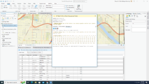
Schtucka week 7

Dataset:

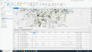
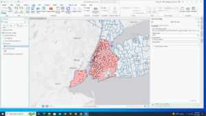
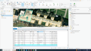
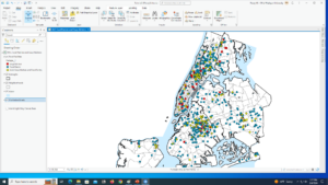
Address point: This shows all of the confirmed and office addresses inside of Delaware County. This also is a spatially accurate display.
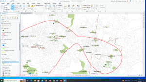
Annexation: This shows Delaware County’s annexations with their boundaries. This is updated as-need and has data from 1853 to present.
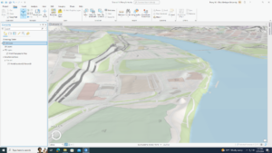
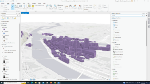
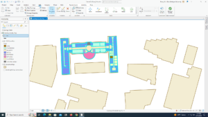
Building Outline 2021: This is a map from 2021 that shows all of the building outlines in Delaware County.
Condo: This shows all of the condominium polygons that are within Delaware County. However, it only shows the ones that have been recorded with the Delaware County Recorders Office.
Dedicated ROW: This shows all of the Right-Of-Way line data within Delaware County. This data is updated as-need and is created by updating daily.
Delaware County Contours: This shows the contour lines of Delaware County from 2018. These are given in two foot contours.
Delaware County E911 Data: This shows which address points from Address_Points layer that gives 911 agencies the information to determine the closest address to a caller.
Farm Lot: This data set shows determined farmlots. It includes those that are US Military and Virginia Military Survey Distinctions within Delaware County.
GPS: This includes all of the GPS monuments in Delaware County that were established in 1991 and 1997.
Hydrology: This shows all of the major waterways inside of Delaware County. This was created in 2018 using LiDAR technology and is updated as-needed.
MSAG: Short for Master Street Address Guide. This shows 28 political jurisdictions that create Delaware County.
Map Sheet: This shows all of the map sheets inside of Delaware County.
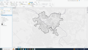
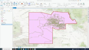
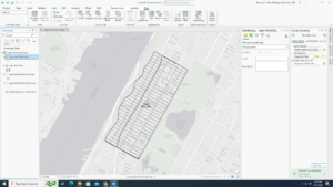
Municipality: This shows all of the municipalities that are inside of Delaware County.
Original Township: This shows what boundaries Delaware County originally had before tax district changes.
PLSS: Short for Public Land Survey System. This shows the Public Land Survey System polygons in US Military and Virginia Military Survey inside of Delaware County.
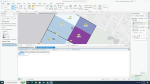
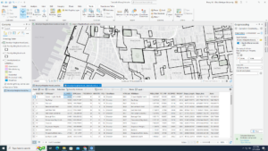
Parcel: This shows all of the cadastral parcel lines inside of Delaware County. These are represented as polygons.
Precinct: This shows the different Voting Precincts inside of Delaware County. This dataset is updated as-need.
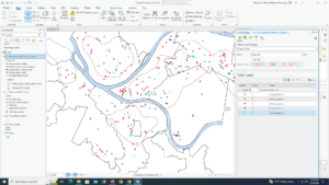
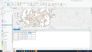
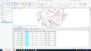
Recorded Document: This shows points that are representative of record documents in Delaware County Recorder’s Plat Books, Cabinet/Slide and Instrument Records.
School District:This shows polygons for all of the school districts of Delaware County.
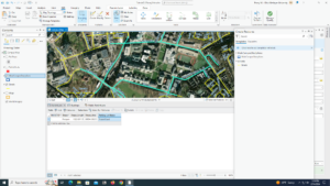
Street Centerline: This shows public and private roads inside of Delaware County. It represents the center of the pavement.
Subdivision: This shows all of the recorded subdivisions and condos in Delaware County Recorder’s office. This is updated on a daily basis.
Survey: This is a shapefile that shows surveys of land in Delaware County.
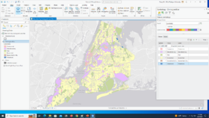
Tax district: This shows all of the different tax districts inside of Delaware County represented by polygons. The data is updated as-need.
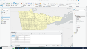
Township: This shows the 19 different townships that Delaware County consists of. This is updated as-need.
Zipcode: This shows the zip codes of Delaware County represented by polygons.

Schtucka week 6

9.1 – I thought we had learned how to use the buffer tool before, maybe I just remember reading about it or just seeing it in a different chapter’s tutorial. 

9.2 – I think this section is really cool. It’s really helpful to be able to select within a buffer to help narrow down data more. 

  • I don’t think i was able to do the section section of this tutorial properly, I was not able to find the output fields or merge rule part of the spatial join tool, I did my best to find what seemed equivalent but it does not look right 

9.3 – My Polygons_Tags_Pop attribute able did not have a name section, so I did what I could following it but my stuff is a little wanky. 

9.4 – This section was the easiest to do because the book actually was following along nicely with the software. I also think it is cool that we can locate facilities so easily.

9.5 –  I think knowing how to analyze and use clusters will be very helpful in the future of my GIS career.

10.1 – I really enjoyed this section, it’s cool to be able to create stereotypical features I used to think of when I thought about mapping. 

10.2 – When I ran my symbology pane for heart attack density it didn’t stay within the area and went to the whole map and I am not sure why.

10.3 – I was not able to get multiple parts of this section to work, and the sections followed off of each other so I was not able to complete the entire section. 

  • My FHHChildren field was not able to be made correctly
  • I could not calculate ZFHHCHld = (!FHHChildren! – 45.2) / 66.8 because it said FHHChildren did not exist 
  • the kernel density tool would not drag into multiple areas on my screen, and because of that I was not able to complete the rest of this section

11.1 – This section was fun to play around with, 3d renditions are really cool and I’m excited to work with them now 

11.2 – I don’t really understand the difference between local view and global view. 

  • I followed the directions for the symbology and it didn’t look the same

11.3 – I think the trees are cute and I will like putting 3d objects in later projects

11.4 – This section was challenging in a good way, it was rewarding to see my buildings pop up. 

11.5 – Using scale is more simple than I thought it would be.

11.6 – Creating the building was interesting, but I feel like turning on a street layer just to see planters was sort of pointless. 

11.7 – This section was the most interesting from the book – I had no clue GIS could be used for things like this.

Schtucka week 5

4.1 – My youth population gbp did not have a tracks feature class in it but it had cities and PopYouth so I just finished the tutorial using only those two.

4.2 – I don’t like how objectID is also known as fid, it was confusing. Also, my attribute table also did not look like how the book showed.

4.3 – This section was really hard for me to understand, I feel like it took me way longer than it should have.

4.4 – I liked this tutorial because I feel like this will be good to know in the future. 

4.5 – I also liked this tutorial because it will be nice to know in the future. I also find graduated symbols interesting so it was fun to see a new way to use them.

4.6 – This section was interesting because I had to apply my knowledge from the first part of the chapter and it was fun to see what I am able to do with loose instruction.

5.1 – It was interesting to see the different map projections that are used. 

5.2 – This section feels like 5.1, it was also interesting for the same reason. 

5.3 – I liked getting out of the GIS software and going back to the arcgis.com to learn new ways to utilize the website within the software. However, a lot of this section was redundant with just having to check which coordinate system a lot of the different layers were using. 

5.4 – In the contents pane, there was no right click option for Display XY data, instead, i had to use XY Table To Point in Geoprocessing to get the same results 

5.5 – Column JK is “Estimate!!Female!!Workers16yearsandover!!PLACE OF WORK!!Not living in a place – column EG was the right column

  • Column SE was not the right one for female, IQ 
  • I did up until Join data and create a choropleth map. I could not for the life of me figure out how to export the data into Chapter5.gdb and was not able to continue through the section because of that

5.6 – After downloading the data for Bicycle Count, and converting to points, it says that there is an error for every data point and it won’t let me create a graduated symbol layer because of it.

6.1 – This section is cool because it combines stuff from previous chapters while adding new details to them. 

6.2 – I like the select by location filter, it was really fun to use.

6.3 – The Merge feature tool is really easy to use, but I had a hard time finding it at first and tried to use the wrong Merge tool. 

6.4 – I feel the same way about 6.4 that I do about 6.3. The Append tool really easy to use, but it was hard to find due to the kinds of append tools. 

6.5 – It was cool to see a new type of tool, however, I don’t know in what other context I would be able to use this tool. 

6.6 – This section was interesting, but my Calculate Geometry Attributes tool settings didn’t line up with what the book was saying, but it was close enough where I was able to still figure it out. 

6.7 – I feel like a lot of these sections are doing the same thing, I know they aren’t, however, all of the tools are getting conjoined in my head because of how similar they are and I will have to go back in the book to differentiate between them.  


7.1 – I really like the move feature. It’s cool how you are able to just pick up a polygon. 

7.2 – I also liked this section, it was it was simple but definitely useful information to know

7.3 – Smoother features tool adds a better appearance to the map and it is fun to do. However, I don’t like how it makes a new feature instead of just changing the original one. 

7.4 – I have used AutoCAD in the past, and it was interesting to see how it can be used inside of ArcGIS.

8.1 – This section was interesting to see and do because of the amount of data points that it has, it was cool to sort and fix zip codes.

8.2 – I feel similarly about this section and 8.1, it was fun to play around with the different address points. 

Schtucka week 4

1.1 – I was intimidated at first having to put my reading into practice, but the book makes it so easy. I love how it talks you through it and understands that it is the reader’s first time using the software.

1.2 – I don’t like how we learned about pop-up windows here but then didn’t use them again until chapter 3. 

1.3- Using the attribute table confused me at first, but after working with it a few times and some trial and error I think I have it down. I will keep this section in mind though as a reference for when I have to use one next

1.4- For some reason, I could not get the 3D version of the Population Density to work. I restarted and tried multiple times and was not able to get it.

2.1 – Learning how to use a symbol was so much easier than I thought it would be. 

2.2- I found this section relatively easy. It was a lot of repeating the same process over and over. It is useful to know how to turn off repeating labels.

2.3- One section in this tutorial wanted me to make ManhattanStreets a ground feature and I wasn’t sure how to do that so I skipped that step. 

2.4- Creating a 3D choropleth map was the highlight of this assignment. It took me a few tries to get it right, but it was so rewarding in the end. 

2.5- I really enjoyed reading about graduated sizes in Mitchell, so getting to do them was really cool. A repeating trend in this book is everything actually being a lot simpler than I thought it would be. 

2.6 – This section was a little confusing for me. It felt like I was just doing what the book said but didn’t actually understand it. I’ll have to go back and read about it more and do some individual research.

2.7- Reading about dot density maps they seemed more complex than actually making them. I also found it interesting changing the dot value around and playing with the features. 

2.8- I think it is really useful that you are able to change what features show when you zoom. I had a lot of fun making this section.

3.1- While creating my map titles I had a had time figuring out number 6 in the Insert Text section. It says to Click Text, expand Position, and for Height, type 0.45. However, my Position did not have height, but there was a size section that I found height in and use that, however, it did not look like the example.

3.2 – It was a good change of pace to go to ArcGIS online after working in ArcGIS Pro itself for so long. ArcGIS online is equally as easy to navigate as the ArcGIS Pro software, and I like how the online version mirrors the functions and wording as the software. 

3.3 – I felt like this section was very repetitive. I would have liked just reading about creating the website instead of actually copying and pasting what they wanted me to. 

3.4 – I really liked this section! I thought it was really interesting to build my own dashboard and be able to customize it with what I think is the most important and make it how I want to look visually.

Schtucka week 3

Chapter 4

The fourth chapter of Mitchell was about mapping the density of features. I found this chapter of Mitchell particularly intriguing because I have an interest in density maps. I find these types of maps interesting because they are typically each to read and the reader is able to get a lot of information at a glance. According to Mitchell, a density map “shows you where the highest concentration of features is.” The chapter describes two ways that density is able to be mapped, defined area and density surface. When creating a density map by defined area, a dot map is easily used. With a dot map, dots are able to represent the density of a thing within a location summarized by defined areas. These maps lean more towards showing the data graphically instead of density features. When creating a density map by density surface, a GIS raster layer is typically used. Each of the cells within the layer is assigned a density value. When using this method, the result is usually a density surface or a contour map. This method is typically a lot more labor and time-intensive. When comparing the two methods, it is easy to point out when one method should be used over the other. A density map should be created by a defined area when the data is already summarized by area or can be summarized. A density map should be created by density surface if the data consists of individual locations, sample points, or lines. This type of mapping is best used if the mapper is trying to see the concentration of a point. One comment I have for this chapter is that Mitchell introduces the idea of a raster layer while describing creating a density map by density surface, however, he doesn’t explain what a raster layer is until later in the chapter. I feel like not knowing what a raster layer was until pages later caused me to struggle with the concept of density surface at first.

Chapter 5

The fifth chapter of Mitchell was about finding what is inside of a dedicated area of a map. Mitchell states that mapping the inside “let(s) you see whether an activity occurs inside an area or summarize information for each of several areas so you can compare them.” He then gives two reasons for why someone might want to do this: to show whether or not to take action on something and to see if there is more or less of something. Personally, I like how this chapter was laid out. The format of this chapter was like chapter three with headings appearing as questions to help the reader. The chapter focuses on the three main methods to map what’s inside of a dedicated area. In the beginning, it tells the reader what things to consider in order to find the best method for them. The things listed to consider are as follows, the data you want to collect, whether you want to map a single area or multiple areas, whether your features are discrete or continuous, the information you want to find out from mapping, and if you are using features inside the area or both inside and partially outside the area. Next, the chapter then gives a brief description of the three main types of methods for mapping inside. First, there is
drawing areas and features, where the person creating the map will make the map to have it show the boundary of the area and the features inside of it. Next, there is selecting the features inside the area. The person creating the map will dedicate an area and the layer containing the features, and then GIS will select a subset of the features within the area. The final method is overlaying the areas and features. The person creating the map will combine the area and features in a new layer along with attributes for both or they will create two layers in order to calculate summary stats. After the brief description of the methods, the chapter then dives into greater detail by comparing the methods and walking the reader through how to create them.

Chapter 6

The sixth chapter of Mitchell is about finding what is nearby. Mitchell states that “finding what’s nearby lets you see what’s within a set distance or travel range of a feature. This lets you monitor events in an area, or find the area served by a facility or the features affected by an activity.” One thing I found interesting in this chapter is the concept of costs. Cost is a way that you are able to measure distance while mapping. Measuring cost doesn’t necessarily mean that it costs a certain amount of money to get there, which is what I originally thought when the concept was introduced. A cost is sort of like a trade off. While a cost can be the expense it will take to get to a certain point, it also can have other meanings. For instance, according to Mitchell, a cost is time and effort expended. These types of costs are called travel costs. When time is a cost, it means that it will take you an increased amount of time to get somewhere by taking a certain route. According to Mitchell, an example of time being a travel cost is “it takes longer … for customers to get to a store through heavy traffic.” When effort expended is a cost, it is the wage of difficulty taken to get somewhere. An example given by Mitchell of effort expended is “a deer walking through thick underbrush versus open forest to reach a stream.” The concept of costs is so interesting to me because I never would have considered that these types of ideas would be used when mapping. I think that it is cool that as a mapper, you have to think about the different trade offs people will have to make while traveling a specific route.

Schtucka week 2

Going into the first chapter of Mitchell, I knew very little about GIS. However, by reading this chapter of the book, I became a lot more familiar with the concept. Chapter 1 was able to help me get a better understanding of what GIS is as a whole and also the breakdown of the software. One thing that I learned is that GIS has many different tasks and things that you are able to use it for. Before reading, I knew that there was a wide use of GIS. However, on page 13 of Mitchell, the book states a list of what GIS is most commonly used for. The list goes, in no particular order, “mapping where things are, mapping the most and least, mapping density, finding what’s inside, finding what’s nearby, mapping change.” This list is helpful to me because it gives me a more narrow idea of what GIS is used for instead of the “wide use” mindset that I previously had. Furthermore, the most interesting thing I learned is that in GIS there are different operations that you are able to perform on data tables. These caught my attention because they are different, useful tools that I did not know that GIS was able to do. The first operation is selecting; you are able to assign a value to a feature. The second operation is calculation; you can calculate attributes’ values in order to give new values to the features. The third operation is summarizing; you are able to get different statistics for specific attributes. I think that it is really interesting when you are able to find shortcuts or codes in different software in order to use it more efficiently. I believe that later on in my GIS learning and use, these operations will become very useful. 


The second chapter of Mitchell is all about mapping. Mapping is important because when you map things, you are able to look and see where you could potentially need to take action or what areas are able to meet your criteria. One fun thing I learned about mapping from Chapter 2 is that it is typically helpful to add different categories to your map. Categories split up features into different subtypes and aid the readability and fluidity of a map. Without categories, it might be hard to determine certain uses for your map and it may be difficult to read under certain contexts. Mitchell states that “mapping features by category can provide an understanding of how a place functions.” Mitchell then gives the example of how using a black line for road types only shows where the roads are, but if you categorize them into types of roads, the hierarchy of the roads would be visible along with regional traffic patterns. This shows that categories are extremely helpful when creating a map. In this example, adding categories gave the map a new function and made it easier to read. However, adding categories can be tricky to do properly. Mitchell says that there should never be more than 7 categories because the more categories you use, the more difficult reading your map will be. A few factors play into the 7 category rule: scale of features and map scale relative to features. One thing to keep in mind is that the scale of the features on a map can greatly influence the number of categories used. If the features on a map are small, it will be difficult to distinguish which categories are which if there are too many used. Also, if the map scale is large in scale to the features, the more categories used, the more difficult the categories are to see.


I found the third chapter of Mitchell particularly interesting because it was all about creating a map. I liked how this chapter was set up compared to the other chapters. This chapter was formatted by walking the reader through creating a map by telling them what questions to ask themselves in the process. These questions were the headings for each section, and the section would walk the reader through what to consider in order to answer the questions properly. My favorite section of this question system was about classes. Classes allow the person mapping to group together different values into classes, and they are typically utilized when the map will be presented for discussion instead of for individual analysis. I think the concept of classes is cool because they let the mapper create groups of data and then assign the different groups a symbol. Another thing I thought was interesting about classes is that they can be made manually or by the GIS program. Mitchell states that creating classes manually is usually used when the person creating the map is looking “for features that meet specific criteria or comparing features to a specific, meaningful value.” When creating classes using GIS software, the person mapping will use a standard classification scheme. Mitchell states that the person mapping will want to use a standard classification scheme when they “want to group similar values to look for patterns in the data. You can choose from several schemes.” I found standard classification schemes particularly interesting because there are multiple different ones that are available. There are natural breaks, quantile, equal interval, and standard deviation. In my opinion, Mitchell did a really good job breaking down the different types of classification schemes by stating how each one works, what it is good to use it for, and the disadvantages of using it. 

Schtucka Week 1

 – Hello! My name is Pacey Schtucka and I am a freshman at OWU. I am majoring in environmental science with a minor in geography. I am from Wadsworth, OH. Since a young age I have always loved being outdoors. My love for being outside turned into a passion for the environment as I grew older. Now, I want to learn more about the ins and outs of it all

  • As I am starting this course, I have a very limited knowledge of what GIS actually is. The reading helped me to get a better grasp of what purpose GIS serves and who it serves. With that being said, I think that it is really awesome how it has so many different means to different groups. This reading showed me that from the beginning of its time, GIS has been extremely diverse and never has had one solid definition. I also found it interesting that now GIS is a computer program, but its origins come before computers were universally usable. One thing I am confused about is how this reading talked about GIS being different from mapping stating that, “it’s differentiated from “mapping” because it generates more information or knowledge than can be gleaned from maps or data alone,” but then goes on to say that some see it as an “extension of mapping” (Schuurman). The reading goes a lot of back and forth stating different viewpoints on GIS so perhaps my confusion may just be coming from interpreting the viewpoints wrong. Furthermore, I was unaware of how incorporated GIS is into everyday life. GIS is something that I first heard about my first semester at OWU. My peers told me how learning GIS would be a useful skill and I took their word for it. This reading by Schuurman is opening my eyes to a whole new perspective in the sense of GIS. Schuurman describes in the reading how almost everything can be brought back to GIS. She gives the example of food; every step from growing the food to how it gets to your plate can be brought back to GIS. It was really interesting to read about Schuurman breaking down every which way GIS is involved in a process that I did not even consider it to be involved in before reading.


  • One application I find interesting is GIS to study glaciers. Using ChatGPT, I found that GIS is able to map out glaciers and then the mapping is used to show the change and help look into the melting rate. From this I googled GIS glacial change and I found the World Glacier Monitoring Serivce on. WGMS teams with ESRI ArcGIS and allows people to view the glaciers over time.  https://www.antarcticglaciers.org/students-3/resources-for-teachers/exploring-present-day-glaciers-in-a-gis/ 
  • Also using Chat GPT I found the GIS is used for disease mapping. GIS is able to be used to map different regions for disease spreading and to see what areas are affected. This made me interested in the use of GIS for COVID-19 mapping. I found this map from ArcGIS at https://www.arcgis.com/apps/dashboards/bda7594740fd40299423467b48e9ecf6 . This map was last updated on 3/10/23 but until then they used GIS to map the number of COVID-19 cases around the world.Â