Brokaw Week 2

Chapter 1: Introducing GIS Analysis

Some comments, notes, and questions I had while reading this chapter were plentiful. It was interesting to find out that spatial analysis is working to bring attention to real-world problems and issues people face. GIS is growing rapidly and we are finding more and more uses for its capabilities. GIS analysis is using models of the real world and looking at the geographical patterns. There are 3 types of geographical features: discrete, continuous phenomena, or summarized by area. Discrete locations and lines are actual spots found and can be easily read line buildings or bodies of water. Continuous phenomena are going to span the whole map you make because it shows weather patterns like rainfall or temperature. Interpolation is when GIS gives values to points irregularly or regularly spaced on a map. Geographical features summarized by area could be the number of households in each county, or business zip code. Reading about the two types of GIS models vector and raster I am a little confused. A vector model is a map that shows a point and is labeled using x and y coordinates mainly used to show small details. The raster model is for larger spaces that need to be analyzed and is not good if looking for precise measurements. I thought it was interesting to find out that map projects get distorted because of the curvature of the earth. So when looking at a large section of Earth it will relatively not be 100% accurate. After reading about ranks and counts and amounts for features that are mapped it gives me an idea why different levels are color-coded and categorized for their particular purpose. How will summarizing the values of a large population help us to find an average? Will data tables help to sort out ranks for a map that needs to be created? 
 

Chapter 2: Mapping Where Things Are

Why map where things are? To see patterns that may need another perspective besides being in a table or literature. What is the difference between distribution features and individual features? Distribution features are patterns and many professionals use GIS to target areas they are in need of their assistance. Deciding what to map? Is a process since you want a map to be easily read and understood and to correctly convey information to readers. Learning how to create features to be layered over other features to display different years or a pattern of change. Being detailed on either category or doing a broad overview to minimize distractions for the intended audience. Preparing data needs to be organized before starting a map and to have all features with a location. How will geographic coordinates be assigned to the GIS database? Will we be learning how to code features or will the software we use already be coded? It was neat to find out that we just told the GIS what features and symbols we wanted to be shown. Mapping a single type may or may not be able to show patterns but for a single type, all the same symbols will be used. What is the main idea behind GIS? It has many capabilities for setting coordinate pairs and storing the locations, symbols, and streets. Using a subset of features to layer data was neat to show the relationship between two completely different categories. 
 

Chapter 3: Mapping the most and least

To find a place to map you should look for areas with equal quantities of an abundance of species and, or a place with a decline or decrease in species. It’s all about finding information that will be helpful to us in the future. What we need to map is finding patterns with similar values with quantities that should be studied. The features we will be focusing on mapping will be centered around discrete and linear features. The continuous phenomena are areas that cover. When looking at a map or creating one the dark areas will be greater in value from lighter shades. All ranks will be coded in this way so that the more pigmented areas will be darker or have more than light colors. A map that shows the longest salmon runs were categorized and coded on a map and from the pattern it was determined that the counties will longer runs have watersheds. The difference between presenting or doing research with a map will be set up in two separate ways. If presenting a map it will need to be simple to show a pattern and a more generalized view. If doing research on a map it can be detailed and have lots of different features.  Business can be mapped by the number of employees and the size of circles will be used to show employment numbers. For a larger area say the whole state of Ohio using counts and amounts would be the most beneficial and it will be rounded numbers. Block groups vary in size so a rough guess would be sufficient.  Using ratios to show the distribution of features with averages, proportions, and densities. 


Pois Week 2

Chapter 1: GIS itself is the process of looking at geographical patterns in your data and at the relationship between the features within said data.

Start by framing your question: This can typically start off as a question, and being as specific as possible about the question you are asking will help with deciding the best method to approach it with.  Understanding your data can also aid in making things more clear and narrowing down what method you should use. Finish by looking at your results and deciding if the data is relevant/useful, or if you should use a different approach.

There are multiple kinds of features in GIS: For discrete locations and lines, the actual location can be pinpointed, and the feature is either present or not. Continuous phenomena like precipitation can be found or measured anywhere. Summarized data represent the counts or density of individual features within area boundaries.

Vector and Raster: With the vector model, each feature is a row in a table, and feature shapes are defined by x, and y locations in space. With the raster model, features are represented as a matrix of cells in continuous space.

Types of attribute styles: Categories, ranks, counts, amounts, ratios

The only thing I worry about from this chapter is coming up with my own question. There are so many different topics with so many different subtopics, and the possibilities are so open that it’s almost overwhelming.

Chapter 2: Prepping your data involves ensuring that the features you are mapping have geographic coordinates assigned and have a category attribute with a value for each feature. If you are bringing data from another program or entering it by hand, the features will need to have location information like a street address or latitude-longitude, and GIS will assign the coordinates.

To make your own map, you’ll tell GIS which features you want to display and what symbols to use to draw them. Mapping a single type involves drawing all features with the same symbol, while mapping by category involves using a different symbol for each category. If you use the method with multiple categories, you shouldn’t use more than seven categories, otherwise, you will have to group categories.

Along with symbols, text labels can also be used to help distinguish categories (e.g. OW = Open water)

Chapter 3: This chapter continues to discuss different methods of displaying data, as well as how they should be understood. It seems like the best method for display varies between the project and what its purpose is.

Natural breaks: Data is not evenly distributed

Quartile: Data is evenly distributed

Proportion: part of the whole

Rank: high, medium, low

Density: concentration of data/feature

I found all three chapters helpful in terms of explaining the basics of GIS. There are pictures to illustrate every point that is made, which is super helpful for me, as I have always needed some kind of visual or example to understand any concept.

McFarland Week 2

1)

Common uses for geographic analysis: Mapping where things are, Mapping the most and least, Mapping density, Finding what’ s inside, Finding what’s nearby, Mapping change

GIS analysis is a process for looking at geographic patterns in your data and at relationships between features.

Process: Frame the question, Understand your data, Choose a method, process the data, Look at the results.

Geographic features are discrete (the actual location can be pinpointed; at any given spot, the feature is either present or not) , continuous phenomena(blanket the entire area being mapped, but a value can be determined at any given location), or summarized by area (density of a variable within area boundaries,.Data applies to entire area, but not any specific location within it).

Vector Model: Each feature is a row in a table, and feature shapes are defined by x,y locations in space. Analysis involves working with (summarizing) the attributes in the layer’s data table. Better for discrete features and data summarized by area.

Raster Model: Features are represented as a matrix of cells in a continuous space. Analysis occurs by combining the layers to create new layers with new cell values. (must use perfect cell size: too small requires too much storage and takes longer to process, too large will cause detail and information to be lost). Better for continuous numeric values.

Although vector discrete features are usually best represented in vector models they are often better represented in raster models when multiple layers are being analyzed.

Types of attribute values:

Categories: Groups of similar things for example the crime category could include theft, burglaries, assaults, etc.

Ranks: Ranks put features in order, from high to low. Used when measurements are difficult to quantify. Ranks are relative, so they are compared to each other.

Counts and Amounts: Hard data, actual numbers. Can be a measurable quantity associated with a feature.

Ratios: Show you the relationship between two quantities and are created by dividing one quantity by another for proportions or densities.

categories+ranks=noncontinuous / counts, amounts, and ratios= continuous

2)

Pay attention to distribution of features rather than the features themselves.

Should I have a question in mind, or even my hypothesis, before beginning the process of geographic analysis?

GIS stores information such as either a coordinate pair or a set of coordinate pairs to define shapes.

Subsets can be separate layers that convey information with more specificity to reveal patterns that possibly weren’t previously apparent when mapping all features.

Showing a subset of continuous data leaves the features without a context. 🙁

Using different colors or symbols for each type of feature in a category can show a more complex understanding of a specific area and how it functions. If the types within a category are very similar or overlaid it could be beneficial to use separate maps and compare rather than setting all of the data on a single map.

When mapping large areas the use of too many categories can make patterns difficult to see, but fewer categories can be beneficial at conveying patterns. Grouping categories can also be beneficial, for example rather than showing four types of industrial zoning on a large map; the use of one general industrial feature and a possible separate map of subsets could work better.

Use symbols that are easily discernible from each other!

clustered: features likely to be near other features

uniform: features less likely to be found near other features

random: features equally likely to be found anywhere

To determine whether patterns are meaningful the analyst must use statistics to measure and quantify the relationships between features.

How does an analyst determine whether a pattern is meaningful or simply caused by chance?

3)

Mapping using quantity rather than just features gives a more in-depth map that could be more helpful to find places that meet criteria, need action, or to see relationships.

Mapping most and least can be used in many different ways that I had never considered previous to reading this chapter.

Just like in writing you must keep your purpose and intended audience in mind. Are you exploring the data yourself or creating a map to convey information to someone else? “In many cases, you’ll start by exploring the data to see what patterns emerge and what questions arise, and later create a generalized map to reveal specific patterns” (56).

Mapping counts and amounts:

discrete features (ex; number of employees at each business)

continuous phenomena (ex; annual precipitation at any location)

summarizing by area (ex; mapping number of employees per square mile)

Mapping ratios:

Proportions show you what part of a whole act quantity represents

Densities show you where features are concentrated

Ranks can be indicated using varying words- like high, medium, low- or using numerical values- ie 1-10-.

Classes group features with similar values by a signing them the same symbol.

Standard classification schemes:

Natural breaks (Jenks): Classes are based on natural groupings of data values.

  • good for mapping data values that are not evenly distributed, places clustered values in same set.
  • difficult to compare with other maps, difficult to choose right number of classes

quantile: Classes contain an equal number of features

  • good for comparing areas that are roughly the same size
  • good for evenly distributed data
  • if areas vary greatly, a quantile classification can skew the patterns on the map

equal interval: The difference between the high and low values is the same for each class

  • presenting information to a nontechnical audience
  • mapping continuous data
  • difficult to class clustered data

standard deviation: Features are placed in classes based how much their values vary from the mean

  • good for displaying data around the mean
  • very susceptible to being skewed from outliers


Fraire Week 2

Chapter 1

It’s kind of crazy how fast GIS is growing and how useful it is to know how to use it.

GIS analysis is a process for looking at geographic patterns in your data and at relationships between features.

I honestly struggle sometimes to come up with a research question when using GIS. It’s just such a large storage of data and the endless possibilities are daunting sometimes. It’s also really rewarding to look at your results at the end. Seeing your hard work mapped out and displaying data is super cool.

discrete: It is either there or it’s not, it can be pinpointed. continuous: Like rain/temperature they can be found/measured anywhere. areas enclosed by boundaries. summarized: represents counts or densities of individual features within a boundary (number of businesses in an area, total length of streams of watersheds)

When it started talking about summing certain data for an area I had setnull calculator flashbacks.  I’ve done vectors/rasters in Remote Sensing and I still don’t fully get it. Looking at the pictures it seems like vector is more cookie-cutter in its separation while raster looks gradual.  Figuring out how to overlay layers onto a pre-existing map with a coordinate system almost made me throw the computers last year. Brazil kept ending up in the middle of the ocean instead of overlaying on where it’s supposed to be.

Categories are groups of similar things.  can be represented using numeric codes or text. Ranks put features in order, from high to low. used when direct measures are difficult or if the quantity represents a combination of factors. Counts and amounts show you the total numbers. A count is the actual number of features on a map. An amount can be any measurable quantity associated with a feature.

Counts, amounts, and ratios are continuous values. Categories and ranks are not continuous values.

Chapter 2

This chapter so far reminds me a lot of the Importance of Maps course I took with Krygier. I think he said it’s not a class anymore? but it was based on a lot of map history and the bare structure/make-up of maps.

I also remember that assigning category values is annoying sometimes. The values just just from what you make them and the rules of how it works are really finicky (something for me to remember when doing this work).

why are all of these maps about crimes

At first, I didn’t think that 7 categories was a good max until it showed the map example with more than 7 and it felt very jumbled. This is something I will definitely keep in mind.

I didn’t have a ton of comments for this chapter, it felt very similar to what we learned in Maps so it was mostly a review. It talked about map projections and considerations when displaying maps. It went over the details of maps such as symbols, color, and width that can alter how a viewer perceives the map. I did mention above the few things I learned, but this chapter was also a lot more maps than Chapter 1. I do enjoy looking at them but it makes it harder to take notes sometimes.

Chapter 3

They mentioned the use of graduated colors or line width to show most to least values but this has always been a harder concept for me when making maps. I have a harder time differentiating symbols when they are just gradual transitions of themselves.

I think I have done ratios in ArcGIS and not realized. After reading this chapter I understand what I was doing a bit better now.

Counts and amounts show you the total numbers. Ratios show you the relationship between two quantities and are created by dividing one quantity by another, for each feature. Ranks put features in order, from high to low. Counts, amounts, and ratios are classes. Ranks are individual values.

Creating classes is also frustrating sometimes with Arc Pro. If data is unevenly distributed with gaps: natural breaks. If data is evenly disturbed and I want to emphasize the difference between values: SD or equal interval. If data is evenly distributed and you want to emphasize the relative difference of values: quantile.

I have never used a lot of these features in Arc. Some of them are really cool.

Pois Week 1

1. Hi! My name is Zoie Pois; I am a senior double majoring in Zoology and Environmental Science with a Psychology minor. I am from Louisville, Kentucky, and attended a middle school similar to a Montessori school that focused heavily on nature and art, so I have been protective of nature for as long as I can remember. I enjoy being out in nature, doing crafts/art, listening to music, and hanging out with my close friends. I am unsure what I want to do after graduation, but I hope that it will revolve around nature and animals in some capacity, which are two things I am very passionate about. The picture of me for my introduction is refusing to act right, so we’ll see if it decides to show up when I post.

2. I have previously worked a tiny bit with GIS, but I am coming into this class with minimal knowledge about it. It was fascinating to read about the uses of GIS in areas that I did know it could even be used in. I had assumed that it could only be used predominantly for geographical and solar purposes. Now I know that it can be used in things that range from infectious diseases to Starbucks. I appreciated the author’s distinction between mapping and spatial analysis by explaining that spatial analysis generates more information or knowledge than can be gathered from maps or data alone, In contrast, mapping is unable to create more data/knowledge than what is already given. It was also interesting to read about Dr. John Snow and the cholera outbreak and how it is linked to a trend in science towards using visual displays to understand patterns. I am personally a person who relies pretty heavily on visuals to understand concepts fully, so I am glad that this trend continued to gain more popularity. After reading, I wondered what else GIS can be used for and how there is a vast amount of information that I was previously unaware of.

3. I am doing an internship with Watson Acres Flower Farm this semester, so I wanted to look at GIS information in relation to pollinators and maybe even pollen itself. One study I found talked about the interaction of lovebugs (Plecia nearctica) and honey bees. Some studies have suggested that honey bees will not visit flowers that have lovebugs on them, and since the distribution of lovebug populations has the potential to change due to the warming climate, the usual pollination pattern of species like honey bees could be disrupted. Using GIS, the authors tracked what areas would remain suitable for lovebugs and how those areas are likely to increase in the future.

Diversity 14 00690 g004

Map showing historic/current habitat suitable for Plecia nearctica in the USA.

Diversity 14 00690 g006

Map showing future habitat suitable for Plecia nearctica in the USA during 2050.


I also looked into a study that took an infrastructural method of pollinators to strategize urban planning for pollinators by pinpointing hotspots and pinch points. The higher the HSI value (darker areas), the more suitable the 100 m cell is predicted to be for this species group.


Abou-Shaara, H. F., Amiri, E., & Parys, K. A. (2022). Tracking the effects of climate change on the distribution of Plecia nearctica (Diptera, Bibionidae) in the USA using MaxEnt and GIS. Diversity14(8), 690.

Bellamy, C. C., van der Jagt, A. P., Barbour, S., Smith, M., & Moseley, D. (2017). A spatial framework for targeting urban planning for pollinators and people with local stakeholders: a route to healthy, blossoming communities?. Environmental Research158, 255-268.

Gullatte – Week One

Hi, my name is Rheigna (Ray-Na) Gullatte and I am from Cleveland, Ohio. I am double majoring in environmental studies and geography with a sociology minor. I put a picture of Apollo, my cat, because I miss him…a lot. I hope to get an internship in the future that supports my major 🙂 I don’t know much about GIS, but that is why I’m here. 


Chp. 1

     This was a really interesting read because I am majoring in geography and environmental studies and Dr. Rowley said it would be a very beneficial skill to learn. I’m very obsessed with social justice issues so GIS would only help me in research and mapping things out. Early GIS development happened in the 1960s which is fairly recent but I haven’t heard a whole lot about it. Canada is credited with one of the first cartography systems. I thought spatial analysis was interchangeable with mapping but the article says that spatial analysis generates more information from maps or data. There’s also something called spatial mapping that I looked up. This essentially combines spatial analysis and mapping so that’s cool. 

     This article was kind of a hard read with all new information being presented to me but there’s many outcomes of GIS. There is GIScience and GISystems which were all created for their own purposes. GISystems includes processes like spatial analysis and encoding into software while GIScience uses theory and justification for the way GISystems work. The way these definitions are worded are kind of tricky so I know I will have to do a little bit extra research and reading to understand. The chapter 2 title piqued my interest because I am taking Human Geography with Toenjes and having classes that help each other flow makes me really happy. It just reassures me that the classes I’m taking are all going to help me in the long run.

     My favorite part of the entire article is when it talks about who uses GIS and why. I think it’s interesting how GIS is incorporated into our everyday lives and many people do not realize that. The example they gave to put this into perspective is that GIS is used in the process of where we eat, where our food comes from, and how it gets to the grocery store. Google and Apple maps are very popular GIS systems but a lot of people do not know that. 


  1. GIS keywords- My keywords were “gentrification” and “poverty” 

The map above is a simple map showing that gentrification happens at a greater scale in major cities than any other rural city. The major cities where it is happening the most include Washington, D.C., Philadelphia, New York, and San Diego. 

The article is called, “Shifting neighborhoods: Gentrification and cultural displacement in American cities”

  • This article explains what gentrification is and why it is so problematic. GIS comes into play because it allows us to map out where gentrification is the biggest problem and why. Like stated, gentrification happens the most in major cities. It disproportionately displaces black and hispanic residents. Gentrification is essentially raising property values, tearing old buildings down to build new and modern buildings. Although this may help the economy, it causes cultural displacement for families who are forced to move because the rent is too high.

Richardson, Jason, et al. “Shifting Neighborhoods: Gentrification and Cultural Displacement in  

      American Cities ” NCRC.” NCRC, 2 Nov. 2022, ncrc.org/gentrification/.  

_______________________________


2. I used the same keywords with an additional one, “GIS” “Gentrification” “Washington D.C.”

The pictures above shows the same corner about 40 years apart and you can clearly see how much has changed. 

  • This article basically discusses one of the biggest cities and their problem with identification. I’m sure a lot of people have been to D.C. but they might write off gentrification as a good thing. I’ve been to D.C. in 2018 and it was running rampant in the hotel where I stayed. A street down from the four star hotel where I stayed would be considered the “hood”. Families’ houses were not up to code, windows broken, and other things that they could not really control. They were watching their neighborhood turn into a tourist attraction. 

Person. “Mapping Gentrification in Washington D.C.” ArcGIS StoryMaps, Esri, 16 Oct. 2022, 

        storymaps.arcgis.com/stories/009773cc5c224421a66d1ce9ff089849.  


Brokaw Week 1

Hello everyone my name is Riley Brokaw, I’m a sophomore majoring in Environmental Science. In my free time, I love to go skiing at a ski resort not far from my house where I also am a children’s ski instructor. I grew up on a small family farm not far outside of Mansfield, OH that my great grandpa bought and started raising sheep, and since then we have about a dozen beef cattle we will raise and slaughter every year. I feel this is where my passion for the environment really came room and how important it is to preserve what we have around us and understand where our food comes from. In the summers we plant a pretty large garden with probably everything you could think of and just this past summer we used sunflowers as a cover crop for one of our fields which attracted so many bees. While I’m at school I enjoy getting ice cream with my 2 best friends and watching their field hockey games. I am also on the women’s tennis team here at OWU!

I thought the first chapter of Schuurman was very interesting although somewhat confusing. He really went into depth on GIS and how many purposes it has for humans and how we use it to map out where a disease originated from or how a certain species is decreasing. I liked reading how we use maps to show the path our food originated from around the world and how it got to our grocery stores. I had learned that as a business strategy, farmers use GIS to strategically send their produce to areas with the local interest of course but also purchase pricing and its associated transportation cost and if the community would spend that on the produce. It was also very interesting to read how Amazon tracks and uses information collected digitally to make a rough map of every person on their interests and likes, so Amazon can promote products tailored to what information they have. From what I understood the main similarity between GIScience and GISsystems is that they both share common kinds of literature and ideals and use spatial data. When looking at just GIS systems I learned it is heavily focused on facts, classification, and outputting data into the software. While GIS science is focused on theoretical ideas and justifying the reasons for GIS systems, a GIS scientist would look at the cause and effect and ask questions associated with why and how something would react in a situation. The history of GIS comes from a very practical area of pre-planning infrastructure and looking at the landscape for what the easiest and most cost-efficient path would be. Still to this day, we as humans try to look for those characteristics in everything we do to cause the least disruption to our environment.

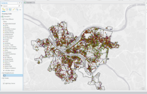
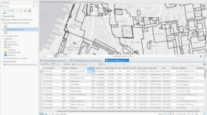
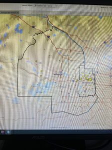
I took a search into GIS on vineyards and how water erosion from farming and harvesting practices is affecting the landscape. The dotted circles show where the whole terrace has slid down from an influx of heavy rain.    https://doi.org/10.1016/j.catena.2020.104604

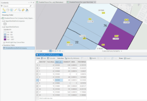
The second source I looked into was a watershed and after sediment loss was reported a system was constructed to combat the soil erosion called the GIS-based Sediment Assessment Tool for Effective Erosion Control (SATEEC). https://doi.org/10.1016/j.catena.2005.06.013


McFarland Week 1

  1. Hello everyone my name is Logan McFarland and I am a freshman with plans to major in environmental science. I  love backpacking, fishing, and generally being outside. I was born in Medina, OH but lived in Granville, OH most of my life. My passion for the environment stemmed from being able to visit many wonderful natural places in my life; even being able to go backpacking in four states just last summer. This picture was taken during a week long backpacking/fishing trip in the upper peninsula of Michigan
    .
  2. Coming into this class I wasn’t really sure what GIS was, where it came from, or how broad its applications are, so this chapter was quite eye-opening for me. GIS is a very convoluted field of geography with a subsequent convoluted history. It was interesting to me that the beginnings of GIS were far before the beginnings of the digital age, and that in the early stages of digital GIS many geographers  preferred the manually produced maps. The third section of this chapter regarding the convoluted history of GIS that I had previously mentioned, although relatively difficult to follow, gave me a good look into the subtle differences that scientists debate like: Was GIS a mere descendant of the quantitative revolution or did its inclusion of visual intuition transcend the quantitative revolution itself? I liked how the author recognized that the use of visual means of conveying information rather than text or numerical data is seen as generally “unscientific” but when used in this application is often more efficient at conveying patterns and phenomena. Not to mention patterns that would go unnoticed using tables become the keystone discoveries of GIS.  The next section exploring the differences between GIScience and GISystems was equally interesting and and puzzling as the previous section. From my interpretation it is that GIScience is the ideas and theories that are put into application using GISystems, but both require spatial data and analysis to create a mutualistic relationship. The example about the relationship between the spread of Cholera and the use of public wells in London brings to light the importance of local information alongside GIS, but it also shows how tedious GIS can be with much room for error. Previously, I knew that GIS had everyday applications- i.e. GPS- but I did not realize how it is used in almost every aspect of our lives in some way or another.
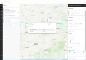
  3. The first application that I came across came from searching for GIS use for trout fishing. In this application Trout Unlimited used arcgis to show where protected lands cross streams with natural brook trout populations
    .
    The second application is from the California department of Fish and Wildlife to use GIS to map chemical spraying in an attempt to restore the population of native cutthroat trout in the remote Carson-Iceberg Wilderness. This stream is the only native area for this rare trout species.
    Will Patterson, Ken DeVore. “Restoring Rare Trout to Its Native Range.” Esri, 6 Feb. 2019, www.esri.com/about/newsroom/arcuser/restoring-rare-trout-to-its-native-range/.

Coleman-Week 1


Introduction

Hi! My name is Maddie Coleman and I use they/she pronouns. I am a senior at OWU and I am double majoring in General Zoology and Environmental Science with minors in Botany and History. I was part of SSRP last summer and worked with plant genomics in Dr. Wolverton’s lab. I am still ongoing with his research as well as working on my own. I am a 2nd year RA in Welch Hall this year and am very passionate about building a sense of belonging on my floor. I am an advocate for pollinators especially honey bees and up until recently, I kept an apiary of my own for six years. I love to work out and read a good book when I have time apart from my classes. Currently, I am planning on taking a gap year after I graduate and then wish to pursue a graduate program in Entomology. I hope to restart my beekeeping business and learn about sustainable agricultural pest management.

Schuurman Ch.1 Reading Notes

I didn’t realize how GIS is used for a lot of different things including mapping out where to build corporation buildings like Starbucks. I think it is cool how GIS can mean and act in so many different ways based on the applications and purposes for using it. It seems like a useful tool for many different fields and not just science.I didn’t know the ideas of GIS go back to the 1960’s because it just seems like a fairly advanced technological development. I think it makes sense that the first guy responsible for helping to further GIS was in architecture since I feel like everytime I think of GIS I think of “mapping” and “lay out”. I love how Canada was responsible for one of the first GIS models and systems too. I won’t lie, I feel like the majority of the text gets confusing when it talks about some of its history and definitions in extensive detail, but some are interesting like how technology and social movements contributed to the foundation of GIS. It does make lots of sense that there was a vast amount of quantitative research and info that went into the development of GIS. Okay so two main groups used GIS in the beginning; one for extensions of mapping and one for spatial analysis. It seems like what the author is getting at was that the ending image as a result of GIS was more valued than all the input and methodology that went into it. I think this is because images can help people especially who are non-scientists to understand the outcomes better. I started getting confused again for GISsystems and GIScience, so many definitions and complexes lol. There is G-commerce that is crazy, so much new info. Now it’s got me thinking about what I use that is based on GIS everyday, GPS, weather(possibly), banking etc. Even research to compute diagrams and images is part of GIS which is something that I hope will be a part of my career.

GIS Applications

When I searched “GIS Applications” so many uses came up, but important ones pertaining to my interests are agricultural mapping. GIS can help farmers to figure out areas best for planting and managing land resources in order to become successful.

https://www.integratesustainability.com.au/wp-content/uploads/2018/11/GIS-pic-2-CropScope.png

Fig.1: Here is an image that shows crop data and what and where crops are being planted based on land availability. 


GIS can see honey bee populations and help find areas to raise and locate bees. 

Figure 1: Land map showing the potential suitability to beekeeping activity estimated by the approach described in the research [8]

References:

Geospatial World. (2018). How GIS is enabling the agricultural sector. Retrieved from https://www.geospatialworld.net/blogs/gis-in-agriculture/ 

Stork, N. E., McBroom, J., Gely, C., & Hamilton, A. J. (2015). New approaches narrow global species estimates for beetles, insects, and terrestrial arthropods. Proceedings of the National Academy of Sciences, 112(24), 7519-7523.

Fraire Week 1

Hello, my name is Logan Fraire, I am a senior majoring in Zoology and Environmental Science with a Botany minor. I’m pretty involved with the ENVS Department, I am a member of the Student Board as well as the Student Department Manager on the Faculty Board. I really love nature and all the arts (books, fashion, applied, etc.). I’m super into plants and hope to work with them using remote sensing when I graduate 😀

Reading this chapter, it’s interesting to think that people wouldn’t be able to give a single example of GIS impacting their day-to-day lives. It just feels like such a prominent tool in my life that I wouldn’t be able to do a lot of things without it. I did agree that as an undergrad student, I knew what GIS was, but not a ton of how scientists use it for their research. (This text feels like they used big words on purpose to sound cool). When it talked about overlay and spatial analysis, it reminded me of Rowley telling us about how he had to manually overlay maps as an undergrad student. I often forget the times before tech and what that would have looked like so it’s always interesting to me to hear about these methods. I knew of ESRI but for some reason, I didn’t know it stood for Environmental Research Systems Inc. It’s also interesting to think of GIS as a new tool in Geography. It makes sense but to my knowledge, it is nearly fundamental for Geography and would be difficult to do without it. In the context of the chapter, I agree with Nancy Obermeyer’s view of GIS being as fundamental as a calculator. The chapter mentioned how GIS users don’t often question the result output from their technology and I related to this because I am also guilty of not questioning it. I just assume the system is right, like many other users. I agree that GIScience is foundational for GISystems, but it just goes well over my head to keep in mind sometimes. It’s interesting to question the relationship of GIScience/systems with humans. It makes me wonder what the evolving world of AI will do to GIS tech and our relationship with it. I knew about a lot of GIS applications, but not about G-commerce/business applications, very cool.

I looked into GIS applications and lizards. I found some cool work using GIS to model lizard habitat sites for research by Branch et al. Here’s a map of those habitat types:

I also found a cool study where they were trying to map the fundamental niche of a nocturnal gecko species using internal, environmental, and climatic data gathered in their work. They used GIS tech to run many models to understand where these geckos might be active in Australia based on multiple factors. Here’s an example of some of those models:

caption: Fig 4: Results of continent-wide 0.05°-resolution biophysical simulations for the physiology of EA6 male Heteronotia binoei for (a) degree-days for egg development, (b) potential activity time, (c) maintenance metabolic costs, (d) food requirements per hour of activity, (e) water loss, and (f) discretionary water. All maps are of annual summations. The dotted line represents the known southern distributional limit of H. binoei”

Branch, L. C., Hokit, D. G., Stith, B. M., Bowen, B. W., & Clark, A. M. (1999). Effects of landscape dynamics on endemic scrub lizards: an assessment with molecular genetics and GIS modeling. Florida Game and Fresh Water Fish Commission.

Kearney, M., & Porter, W. P. (2004). Mapping the fundamental niche: physiology, climate, and the distribution of a nocturnal lizard. Ecology85(11), 3119-3131.