Roberts Week 7

  • Address Point: A maintained and certified collection of addresses in Delaware county. Its primary listed uses deal with emergency response and reporting, especially when providing the information for 911 agencies.
  • Annexation: Displays Delaware County boundaries from 1853 to the present. The data is up to date and is published monthly.
  • Building Outline: Shows the outlines for all buildings in Delaware County. It says that it is updated as needed, with the most recent data being from 2021.
  • Condo: Contains the polygons for all condominium buildings in Delaware County. In addition to the polygons it also contains information on the number of units and the recorded date of the condos, among other data.
  • Dedicated ROW: Contains lines that represent all the ROWs (Right-of-Way) in Delaware County. The information is very up to date and well maintained, as it’s updated daily and published monthly.
  • Delaware County Contours: Contains a two- foot elevation map (contour) of Delaware County. Can be downloaded in the form of a geodatabase.
  • Delaware County E911 Data: Similar to Address Point, the E911 data contains information on the addresses in Delaware County with a more explicit purpose of emergency response usage.
  • Farm Lot: Shows all of the farm lots in the US Military and the Virginia Military Survey Districts of Delaware County. It’s regularly updated and clearly shows the boundaries of the farm lots.
  • GPS: Contains information on GPS monuments that were established between in the years 1991 and 1997. Information about the movements, such as their status (if they were destroyed or not) and their coordinates are included in the download.
  • Hydrology: Shows LIDAR-enchanced data of all the major waterways present in Delaware County. This data set is also updated and published on a regular basis.
  • Map Sheet: Shows all the map sheets covering Delaware County. Contains information such as the area and length of each map sheet.
  • Original Township: Contains information on the boundaries of the 18 original townships in Delaware county. This information is more historic rather than up-to-date, as the shapes of the townships were changed with tax district adjustments.
  • PLSS: Contains polygons that represent the PLSS- Public Land Survey System. It is updated and published regularly and helps easily identify the boundaries in multiple survey districts (including the US Military and the Virginia Military Survey Districts of Delaware County).
  • Parcel: Includes the polygons of all parcels and their boundaries in Delaware County. The download contains information such as the address, owner, and class of each parcel. The data in the download is also updated daily and published regularly.
  • Precinct: Shows the boundaries of the different voting precincts in Delaware County. The data is maintained with the assistance of the Delaware County Board of Elections and is updated frequently.
  • Recorded Document: Contains points that represent documents that were recorded in Delaware county. These can include surveys, subdivisions, annexations, and more. There also appears to be links to PDFs of the official document.
  • School District: Clearly illustrates the boundaries of each school district present within Delaware County. Includes information on the area and school name, among other data.
  • Street Centerline: Shows a spatially accurate illustration of the center lines of all roads (public and private) in the county. It can be used in emergency response and disaster management while also containing information such as the speed limit and name of the street.
  • Subdivision: Shows all subdivisions and condos in Delaware County. It is regularly updated and an effective visual illustration.
  • Survey: Contains points that represent land surveys in Delaware County. Each point has multiple IDs that are observable upon clicking on the point. This dataset contains the newer surveys and is updated daily and published monthly.
  • Tax District:Displays the boundaries of all the tax districts in Delaware County. There is information about the length and area of each district, which is all kept up to date.
  • Township: Shows the shape, area, length, and name of the 19 townships of the county. It’s only updated as-needed, but is published monthly.
  • Zip Code: Shows the boundaries of each of the zip codes present in Delaware county. You can find information about the actual zip code and name of area by selecting a polygon. The data is collected in collaboration with USPS and is updated monthly.

Roberts Week 6

Chapter 9

9-1 This tutorial was fairly simple and straightforward. I was glad that I was successfully able to add the buffers and tables in this tutorial since I had issues with it in some of the previous tutorials.

9-2 I had no issues with the first half of the tutorial. I think the multiple ring buffers were easy to apply and seemed to cut down the amount of work you’d have to do to create multiple buffers of varying distances from the same subject. However, when using the Spatial Join tool I was unable to find the ‘output fields’ option, which meant the results of running the tool were not what I was supposed to get.

9-3 Once again, the first half of the tutorial went smoothly but I ended up stuck at the same point as in tutorial 9-2. I retried several times to use the Spatial Join tools, following the instructions on the book, but I was never provided with an option to ‘output fields’ and therefore also not a ‘merge rule’ setting. I compared my screen to ones online and mine was missing an entire input box, which was supposed to be located under the fields category.

9-4 This tutorial went pretty quickly and was easy to understand the process of. The end results look professional and clean, so I could see it being used for many different types of projects.

9-5 I was able to do this tutorial without many issues. I think the clusters and labeling groups is pretty similar to processes that were in previous tutorials. It also seems like it could be a pretty good tool to know how to use in the future.

Chapter 10

10-1 This tutorial was lengthy but easy for me to understand, despite the initial tutorial screen being a bit overwhelming at first. I was able to follow along all the different parts and think that the book did a great job of teaching how to use many different tools and visual effects in a singular tutorial.

10-2 Similar to 10-1, I think this tutorial was fairly easy to follow. I did get a little lost with the purpose of some of these tools or what they meant, but I’m sure that I’d be able to gain understanding by looking through the tutorial again.

10-3 I encountered one issue when doing the ‘calculate field’ option for the PittsburghBlkGroups table, as it sent me a warning sign after I ran it and left the ZFHHChld column as all ‘null’. I believe it may have been an issue with entering the information below the Fields List, but I’m not sure how I’d fix it. However, this didn’t seem to impact the rest of this tutorial because I was able to follow the rest of the directions smoothly. I think it was a good introduction to the complex ModeBuilder tool, which seems very useful.

Chapter 11

11-1 This tutorial helped me learn how to navigate the map in a 3-D view, which was really neat to look at. It was a fairly short and simple tutorial.

11-2 I also didn’t run into any major issues for this tutorial. Once again I find the 3-D maps entertaining, and this one only being a manipulable slice of land was fun to work with.

11-3 This tutorial was also short and simple. The ability to add 3-D features is both cool and useful, along with being relatively simple to implement. I could see using this for planning placement of objects or for visualization purposes on the map.

11-4 This tutorial took a bit longer than the other ones from chapter 11, but it also held a lot of information about using and manipulating rasters and 3-D models of buildings. It was very cool to see the model build itself up and the city unfold from a dataset. I didn’t have any major issues or concerns when completing this tutorial.

11-5 I didn’t have any issues with this tutorial and was able to understand it pretty well. I think the slider feature to navigate between floors was probably my favorite feature highlighted in this tutorial, but I can see how visually interesting and useful all the other parts of this tutorial are too.

11-6 The only issue I had with this tutorial was that my building was stuck appearing very short (it looked like the roof was the first and only floor) despite typing in the settings exactly as the book said. Everything else both appeared and functioned properly and the building manipulation features are pretty interesting. Before doing this chapter I was unaware that ArcGIS had this many options for building appearance and placement.

11-7 The animation and movie feature is very cool- it’s something that I never would have expected to be able to do directly in the GIS program. The animation was also surprisingly smooth between frames (I was expecting a slideshow) and very easy to create.

Roberts Week 5

Chapter 4

4-1 This tutorial had a different start than the others, which at first confused I was able to gain understanding pretty quickly. I got stuck for a while but then was able to figure out my mistakes after I started it over.

4-2 Similar issues to tutorial 1; I had to restart due to the tribute tables missing information and some other minor issues that added up pretty quickly. However, after restarting I was able to retrace my steps and figure out where I went wrong.

4-3 This tutorial was much easier than the first two and used some concepts that I was familiar with from previous tutorials. I think overall it went very smoothly.

4-4 This tutorial was really short and simple. It was fun seeing the information displayed in an easy-to-read manner.

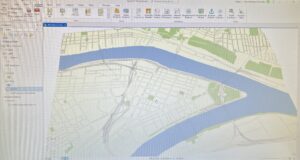
4-5 Similar to 4-4, this tutorial built upon previously mentioned concepts and I found it to be pretty easy and comprehensible.

4-6 I ended up getting stuck on this one simply because my data tab was missing and I couldn’t access the features that I needed to complete the fields for the UCRHierarchyCode table. Most likely it was a mistake on my part, but I wasn’t able to figure out where I went wrong.

Chapter 5

5-1 This tutorial was really short and simple- I had no issues and thought that seeing the different world projections was interesting.

5-2 I was able to complete this tutorial without any issues. It was very similar to the 5-1 tutorial but did help make the point that the projections only made a massive difference on a global scale and not nearly as much on a continental or regional scale.

5-3 This tutorial also went smoothly. I was a little confused about the lack of instructions on how to ‘add tracts’ until I realized that I actually remembered how to from a previous tutorial. It was pretty uplifting to see that I remembered and was able to execute the task with so little description (even if it wasn’t a very large task).

5-4 While I was able to navigate through some issues regarding not being able to locate files, I did get stuck because I could not locate the ‘Display XY Data ‘ under the right-click options for the libraries table.However, I was able to do the part after it (converting the KML file to a feature) without any trouble.

5-5 I was able to add most of the files (CountySubdivisions, MinnesotaTracts, and the HennepinWater ones) but the BikeWorkData never showed up in my census folder after I extracted it in the same way I did the others. This confused me because I had no issues with the other ones, but the BikeData one was missing.

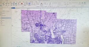
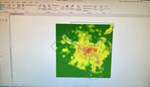
5-6 The masking ability was really cool. The contrast between the county and the surrounding areas made it easy to focus on patterns present within Hennepin. However, later on in the tutorial, I had the same issue as I did in the last one where my file wasn’t in the place where I extracted it.

Chapter 6

6-1 At first I was a little uncertain that I was doing this tutorial correctly, but then when I compared my results with the one the book provides as an example I realized that I was actually on the right track.

6-2 This tutorial was pretty straightforward and I was able to work through it smoothly until the very end, during which I couldn’t figure out how to save the the streets for the ‘select by location’ section as the “UpperWestSideStreetsForGeocoding”

6-3 This tutorial was a short and simple way to explain how to use the merge tool. I found it very helpful and understood it very clearly with no issues.

6-4 Similar to 6-3, this tutorial is short and an easy-to-understand way to teach the functions and purpose of the ‘append’ tool.

6-5 I could see how the tool that this tutorial focused on, the Pairwise Intersect Tool, could be useful. Like the previous two, this tutorial was short and simple and I found it pretty comprehensive.

6-6 This tutorial went decently smoothly until the very end. I realized that I’ve had issues joining tables in the past tutorials that demanded it, so I’ll have to do further investigation as to why this is a recurring problem for me. However, other than the issues I ran into I found this tutorial pretty informative.

6-7 I didn’t run into any major concerns during this tutorial. I was able to navigate pretty accurately when comparing to the book and my tables were matched and organized in the same way.

Chapter 7

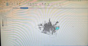
7-1 This tutorial went smoothly and was actually a little fun. Moving the outlines of the buildings onto their actual shape/location was like a puzzle. It was also a really efficient way to get familiar with new features while still being interesting.

7-2 This tutorial was a little bit more time consuming, but did a good job outlining the creation, manipulation, and deleting of polygons. I was able to create the polygons and feature classes pretty easily and I think the book did a good job at walking you through it with images.

7-3 This tutorial was short and simple. I had no issues with it and could see how this tool could be used to make information more presentable, clean, and professional-looking.

7-4 Besides my building being a bit further than the study area buildings baseman in comparison to the tutorial, I was still able to follow along all the steps and get a result that I’m pretty satisfied with.

Chapter 8

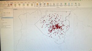
8-1 The only issue that I had with this tutorial was that at the very end the collect events tool sent the message “Collect Events failed”. I compared my input and output to what the book stated and they matched exactly, so I was a little confused as to where I went wrong.

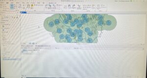
8-2 Other than a few minor mistakes, I think the final tutorial for chapter 8 went pretty well. My circles representing the attendees appear a little clunky, but I think that they still get the message across and are close enough to what the book illustrates.

Roberts Week 4

Chapter 1

1-1 This was a good introduction to navigation the Arc program. As someone who isn’t very technologically inclined it was difficult at first, but I think the book did a surprisingly good job at being clear in instructions. It was neat learning some of the basic features and I felt like I was learning a lot pretty quickly. The only issue I had was figuring out how to add a buffer, as my buffers were white and opaque, which made half of my map appear as missing.

1-2 The second project was much easier to me than the first, most likely because I was getting used to the controls and learning from a book rather than a video or live instruction. I liked seeing the raster layer and navigating the map to see different information and views. I could easily see the bookmarking being a useful feature when working on a project.

1-3 I had several issues come up where I got stuck, but was able to work through it after re-reading the book a few times. The information in the tutorial was very helpful and I could see how bringing up the statistics for something such as population density could be a useful feature.

1-4 The text symbol section took me a little bit to find (I was expecting it to fall under ‘symbology’ like in the previous step) but once I did locate it, it was pretty simple to adjust.The 3-D feature was also something completely different but very cool.

Chapter 2

2-1 This section was pretty short and straightforward compared to the others. I thought that adjusting the colors was sort of fun and helpful at the same time. It made the map look organized and easier to read.

2-2 The zone labelling took me a few minutes to figure out, as I was looking for the labelling option on the ‘content’ tab on the left when in reality it was on the top. After I figured this out, though, everything else went relatively smoothly. The labelling features make map reading super easy, clean-looking, and pleasing to the eye.

2-3 I found this tutorial to be pretty easy enough to follow. In fact, reading and completing the symbology section made me realize a mistake that I made in a previous tutorial and I could tell exactly where I went wrong. The only part that I got confused on in this tutorial was what a ‘ground feature’ was and how to make ManhattanStreets one, but otherwise I think it went well.

2-4 This tutorial started a bit strangely, as I had to ‘repair a layer’s data’, which wasn’t referred to in the books, However, it was a fairly simple fix, I just had to open the file for ‘neighborhoods’ for it to repair itself. The rest of the tutorial went flawlessly- the 3-D map was super cool and I could see it being very practical for emphasizing a pattern with visuals.

2-5 The use of graduated and proportional symbols in the symbology panel was a change from what we’ve been using. I think it’s pretty simple to navigate and can have a very cool and useful result.

2-6 I had a little bit of an issue with the rounding on this tutorial. I was able to put ‘decimal places= 0’ for the display on the contents panel, but the histogram under the symbology panel did not round at all, contrary to what the book states is supposed to happen. Interestingly enough, I had no issue with entering the upper values for the manual interval classes and histogram. The ‘swipe’ feature to reveal an underlying layer is pretty neat; I could see it being useful for presentations or just dramatic effect.

2-7 I noticed that the book is providing fewer and fewer steps for certain processes, such as opening and adjusting symbology. I haven’t had an issue with this, which shows that I’ve learned quite a bit, which is nice to think about. This tutorial was super quick and a simple introduction to dot-density maps, which are great visual tools.

2-8 This tutorial was pretty straightforward and easy for me to execute. It actually helped me understand why my labelling was acting strange in one of the earlier tutorials

Chapter 3

3-1  This tutorial was a bit of a change of pace from the map-making, so it presented a bit more difficulty for me. I was unable to find the ‘catalog’ pane and therefore unable to save the maps as a file. I also had an issue where each individual part of the legend had the bold word ‘legend’ above it instead of just at the top of each map’s whole legend, as is showed in the textbook. Fortunately, I did find creating the chart to be simple enough and was able to do so without any major issues.

3-2 This tutorial was a bit difficult for me because I could not locate the ‘MapSharing.pdf’ or even the file explorer that was supposed to contain it. However, I was able to successfully share the maps and continue the rest of the steps listed in the tutorial on my personal computer using the arcGIS website.

3-3 I quickly realized while working on this tutorial that I was supposed to open the PDF from 3-2 externally, which helps me understand how to avoid repeating the mistake. The whole create a story feature seems really cool. It’s very easy to navigate and is a clean way to present information.

3-4 This tutorial was pretty simple and I completed it without any major issues. The only note/concern I had was in the very last step, creating a menu for the dashboard, I had no ‘menu’ option after I clicked ‘add element’, which was a little confusing.

Roberts Week 3

Chapter 4

  • Using density maps can be beneficial if you need to focus on identifying patterns or trends in comparison to other mapping methods that use the specific location of points of interest to gather information. Density also functions as a proportion, which can be helpful in comparing counties of different sizes or larger populations.
  • A dot map is one way of mapping density. Each dot represents a set number of subject (ex. businesses) and the closer the dots are together the higher the density of the subjects in that area. This is an example of mapping density based on area, which is relatively easy but does not provide precise area about the centers of density. This method is useful if you already have data summarized by area.
  • Another method of mapping density, creating a density surface, can be done in the form of a contour map. This method takes more data processing than the ‘density based on area’ method, but can also present a more precise view of the centers of the densities.
  • One thing that stood out to me was that in dot density maps the dots don’t represent the actual location of the object. I assumed that the dots showed the location of each object and you could compare the density based on the object’s proximity to one another. According to the book, though, GIS places the dots randomly within the given area
  • There are several factors that can affect legibility for both methods of mapping density. When using dot maps you can manipulate the size of the dots and how many dots are present (how many objects each dot represents). With the density surface method you can manipulate the cell size, search radius, calculation method, and units, which all can have a substantial impact on map appearance and effectiveness.
  • When using graduated colors in a density surface map there are several ways to classify the different ‘levels’ of gradation: Natural breaks, quantile, equal interval, and standard deviation. The number of classifications can also impact the appearance of the map.
  • Using contour lines is another way of showing density, as it connects points with the same value to create a line that indicates different levels of density.

Chapter 5

  • The beginning of this chapter sort of answers a question I had earlier on in the reading (about what ‘inside’ could mean in the context of GIS). Considering ‘inside’ as in the confines of a boundary such as district or county makes much more sense.
  • When looking at what’s mapped inside you should consider whether a feature is discrete or continuous; Discrete features can be given numerical values and are unique and identifiable. Discrete features can include locations or linear features. Continuous features are less definite in their boundaries and seamless in their transitions. Soil types, precipitation, and elevation are all examples of continuous features
  • You can collect many different types of information from inside a given area depending on what you are looking for (ex. count, summary…). You can also determine whether to include objects/’parcels’ that are fully inside or partially inside the given area.
  • There are three primary ways of finding what’s inside an area, each having their own pros, cons, and applications. These three methods are drawing the areas and features, selecting the features inside the area, or overlaying the areas and features. They can also all have a variation in the best way to display the results obtained that correlates to their most relevant function.

Chapter 6

  • There are many apparent and practical uses for applying GIS to find what’s in a nearby area. There seems to be a theme of using GIS to search for objects that are within a given radius of something, in units such as travel time/cost or meters.
  • It is often more beneficial to map nearby objects based on travel time than by distance, although it typically takes more preparation and data to map. The example provided of 3-minute travel time surrounding a fire department is a good way of showing this benefit; Travel time is more relevant to us in the instance of an emergency than distance, because travel time is the factor that we have to deal with and is what is actively being used as the unit of measurement when the service is dispatched.
  • If mapping a large section you may want to consider the curvature of the Earth. In general, you should also keep in mind what you hope to get out of mapping, such as a list, count, or summary of information.
  • There are three methods of determining what’s nearby: Using straight-line distance (is relatively simple but rough in approximation), distance or cost over a network (gives precise information and is used for measuring travel over a fixed infrastructure), and cost over a surface (used for determining how much area is within the travel range, which is measure by cost).
  • Similarly to the different methods of mapping demonstrated in previous chapter, these three methods all can be presented in different manners. They serve seperate and often overlapping purposes. In designing a map or project it’s best that you select a method of determining what’s nearby that fits your specific project. This can include matching what information you hope to receive, the measurements you use to get this information, and how you want to present your findings.
  • I think that all these different methods could be very overwhelming to learn at first, but once I have a specific idea of what kind of project I’d be applying these methods towards then it would be easier to select one.

Roberts Week 2

Chapter 1

  • Because GIS has been around for such a long time the tools and technology that use it have evolved significantly. The number of people that are familiar with GIS has also increased along with the usage.
  • The most common uses of GIS seem like they could be used very broadly for a wide variety of fields. I would be interested in seeing an example of each of these uses, particularly the ‘finding what’s inside’ point because I am have a little difficulty imagining what this could be applied for. Maybe what species is inside a geographical region?
  • GIS is described as being a process for observing patterns and relationships in features. It does so through the construction of maps or models.
  • The way working with GIS is described sound very similar to the way conducting a scientific experiment is; Start with a question, choose methods, gather information, and observe and analyze the results.
  • As I was reading I did have a question of the definition of a ‘parcel’ because it was brought up many times and used in a way that I was not familiar with. After a quick search I found that it was simply an area of land with clear boundaries, often split off from a larger chunk. This made the word make much more sense in the context of the book.
  • I think the idea of continuous data/ phenomena showing similarities between areas rather than exact information is interesting. It’s seeing more of a relationship between areas that you may not be able to observe as easily without the visual, such as simply using a table.
  • Summarizing data and mapping discrete features should use the vector model, and continuous numerical values should use the rester model.
  • Categories and ranks are not continuous values because they are assigned one set, whole number. Contrarily, counts, amounts, and ratios are continuous values because they are not assigned a set number and can be anywhere within a range.
  • The process to select features seemed a little technical at first, but this section of the chapter seemed to make it make sense and acted as a helpful guide.

Chapter 2

  • The first few pages of chapter 2 seemed a little redundant. It established that mapping is important and locational information has many uses across a variety of fields, which is something that the reading we did for last week also elaborated on.
  • It’s important to remember that when you’re making maps you should assign geographical coordinates to features and possibly category types as well.
  • Mapping by subsets or mapping by whole features/categories can be beneficial in identifying patterns that may not have been observable using the opposite method (they both have valid uses).
  • The connection between recommending a maximum of seven categories and the human ability to easily identify seven colors is pretty neat. Having a cut off to ensure clarity also seems like it could prove useful keep in mind for future projects (keeping in mind there seems to be a sweet spot in between having not enough categories and leaving out information and having too many that it gets confusing).
  • You can group categories by either providing each category a detailed code and a general code or by creating a table with a detailed code and general code which can then be combined with the feature database table to be displayed using the general code. The second method make it easier to adjust the category groupings. The third method is to use a symbol for each general category, which can be reused if needed later.
  • The issue with using symbols is that they are harder to separate than points using color, especially if the shapes are small. I would imagine that combing shapes and color variations may be an even more effective way of distinguishing features.
  • ArcGIS provides basemaps that you can use that contains grayed-out reference buildings and landmarks for you to overlay your information on top of.

Chapter 3

  • One of the first things I noted was how many examples there were in this chapter. I think it will be helpful to see all the different methods of mapping quantity – through contours, summaries of areas, and gradating colors, for example- that you can use choose from to most accurately and legibly display your information.
  • If the areas you are summarizing vary in size you should use ratios (averages, proportions, or densities) rather than counts to be able to accurately observe patterns. This seems like important information, especially since skewed data can become a major problem and fuel misunderstanding of an issue or piece of information (can do more harm than good, despite the intentions).
  • The concept of ranking seems intriguing to me, especially when it comes to things that are more subjective like the provided example of the scenic value of a river. What factors are used to determine the ranking? Though this may be helpful to some, what’s the determining factor of the rankings that makes it widely accepted as a ‘correct’ ranking?
  • A lot of sections in this chapter appear to be ones taken almost directly from other chapters (ex. river ranking example, business example, and even several paragraphs explaining the relativity of ranks) so it was a little redundant at times.
  • Natural breaks (classes are based on natural groupings of values), Quantile (Each class contains an equal number of features), Equal Interval (high and low values of each class have the same difference between them), and Standard Deviation (classes are based on their variation from the mean) are all ways to classify information. They each have their own strengths, weaknesses, and uses. This section of the book appears to be very helpful in determining which scheme to use based on a chart your data produces.
  • Graduated symbols, graduated colors, charts, contours, and 3D perspective views are all map formats that you can choose from to effectively present your data. Similarly to the classifications, each map style has its own best uses, advantages, and disadvantages, but it mostly varies based on which type of information you would like to present.

Roberts Week 1

1. Introduction: Hi, my name’s Haley Roberts and I’m a first-year environmental science major. I’m from Bowling Green, Ohio, which is just under 2 hours North of here. In my free time I enjoy drawing, reading, camping, and rollerskating. I don’t really know much about using ArcGIS, but it seems like a valuable skill to have in an environmental science profession, so I’m excited to learn more about it.

2. Schuurman: The first thing that stood out to me in the reading was how widespread the use of GIS is. It definitely made me rethink what I thought I knew about GIS- I wouldn’t have even considered it as something that could be applied to police training or organ donation. I think it’s really interesting how the concept of GIS was initially expressed with layered tracing paper in the ’60s. Even though this makes sense, I always associated GIS as a very modern concept used on computers with special software, so hearing that GIS dates back about 60 years was shocking. Reading about the overall timeline and evolution of GIS was also fascinating. Comparing the image in the reading of one of the first computerized GIS images to what modern technology is capable of makes me in awe of the long strides that we’ve come in technological advancement. I liked how the reading compared GIS’s impact on the quantitative revolution to the calculator’s impact on mathematics. This seems to emphasize how much more we are capable of now that we have technology that can do tasks nearly instantaneously when they used to take weeks to years. The fact that GIS is known for its ability to provide a very visual demonstration of data is neat, especially as someone who is a very visual learner like myself. After the reading I can understand just how much GIS impacts people even outside the academic communities that use it the most frequently (ex. farming and consuming farmed goods, taxes, and other uses of GIS apply to the general public). The reading also helped me realize that I’ve used GIS concepts before in other classes like CNX100 or even for personal research, I just didn’t recognize it for what it was at the time.

3. ApplicationsOne of the applications of GIS that I kept seeing was to use it for natural disaster management. One of the examples of this that I found the most intriguing was using it to map power outages caused by hurricanes. Especially in a time where storms are, on average, steadily increasing in intensity, using GIS to brace for power outages and recognize which areas as the most frequently impacted seems like it could of great importance.

https://appliedsciences.nasa.gov/our-impact/story/evolving-gis-technologies-advance-disaster-management

Another application of GIS would be to map the movement patterns of certain animals. This article chooses to look at a species of frog in California, but despite being an older article I think a lot of the methods could still be applicable today. I could see using GIS in a similar manner to monitor the movement of endangered species or to observe whether or not a factor such as a wildfire, deforestation, or global warming impacted a species’ movement patterns.

https://scholarworks.calstate.edu/downloads/xs55mf25c