Gullatte week 4

These chapters and guided tutorials were generally pretty easy to follow. I got stuck a few times, but rereading the instructions and playing around with all the tabs in the software made it very doable. I thought it was neat seeing all the different features that the software offers and even went off on my own to find maps of my hometown. There’s so many different maps that people upload, at least to my hometown and it was just cool to explore the different maps people made. After each chapter, they had keywords so I’m just going to define some of them below. These pictures are from 3 of the four chapters the guided tutorials we went over. There’s a lot of information in each chapter but its all very useful and enlightening. 

Basemap- A map that is the basis of GIS visual and geographic context. It may include information such as landforms, administrative boundaries, landmarks, and roads

Vector- A coordinate-based data model that represents geographic features as points, lines, and polygons. Each point feature is represented as a single coordinate pair, while line and polygon features are represented as ordered lists of vertices. 

Layer- [data structures] The visual representation of a geographic dataset in any digital map environment

Raster[data models] In imagery and elevation, a spatial data model organized into a matrix of equally sized cells, or pixels, and arranged in rows and columns, composed of single or multiple bands. 

Geoprocessing[analysis/geoprocessing] A GIS operation that is used to manipulate data from an input dataset and return the result as an output dataset. 

Extrusionthe process of projecting features in a two-dimensional data source into a three-dimensional representation: points become vertical lines, lines become planes, and polygons become three-dimensional blocks.

Attribute query a request for records of features in a table based on their attribute values 

Layer file[data structures] In ArcGIS, a file with a .lyr extension that stores the path to a source dataset and other layer properties, including symbology.

Layer package[Internet] A special file (layer_name.lpk) that contains a layer, a copy of the data, and an XML file that has a brief description of the layer.

Spatial join[spatial analysis] A type of table join operation in which fields from one layer’s attribute table are appended to another layer’s attribute table based on the relative locations of the features in the two layers.

Shapefile[ESRI software] A vector data storage format for storing the location, shape, and attributes of geographic features

Geodatabase[ESRI software] A database or file structure used primarily to store, query, and manipulate spatial data.

Feature class[ESRI software] In ArcGIS, a collection of geographic features with the same geometry type (such as point, line, or polygon), the same attributes, and the same spatial reference

Feature dataset[ESRI software] Data that represents geographic features as geometric shapes.

SpheroidA three-dimensional shape obtained by rotating an ellipse about its minor axis, resulting in an oblate spheroid, or about its major axis, resulting in a prolate spheroid.

On-the-fly projection Assembled, created, presented, or calculated dynamically during a transaction such as a Web page search or data display query.

Metadata[data transfer] Information associated with data that provides contextual details. Metadata can include date/time, origin, standards, and other relevant properties.

Attribute domain[data structures] In a geodatabase, a mechanism for enforcing data integrity.

Edit sketch[ESRI software] In ArcGIS software, a temporary, underlying representation that is used to create or edit feature geometry.

Feature template[ESRI software] A collection of default settings for creating a feature, including the layer where the feature will be stored, the attributes it will have, and the default tool used to create it.


McFarland Week 4

Chapter 1:

This chapter was pretty self-explanatory. Here is my final map with all features visible.


Chapter 2:

2A

Getting used to using a desktop is going to be interesting!

2B

Me measuring the distance from Moscow to Kyiv!

2C

Figured out 3d modeling!

Chapter 3:

3A

3B

I got this far and the 2005 layer just decided to not work.

3C

I couldn’t figure out how to import Healthstudy2.aprx because I couldn’t do the previous step.

Chapter 4:

This chapter was pretty straightforward, not much discrepancy between the book and the program.

PS: Thanks, Krygier for telling me how to take screenshots with better quality!

4A

4B

4C


fraire week 4

Chapter 1
I didn’t expect the instructions to be so simple and linear. I figured it would ask me to do something instead of giving me step-by-step instructions down to the button to press.

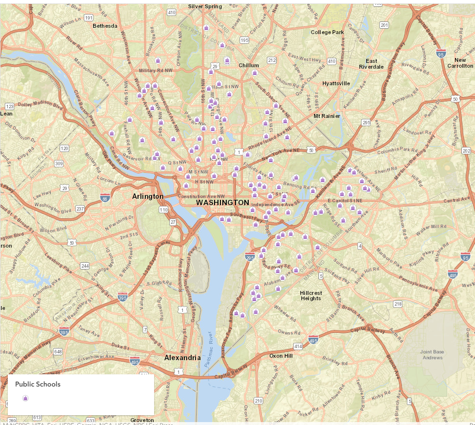
My map after editing the public school symbology of the schools:

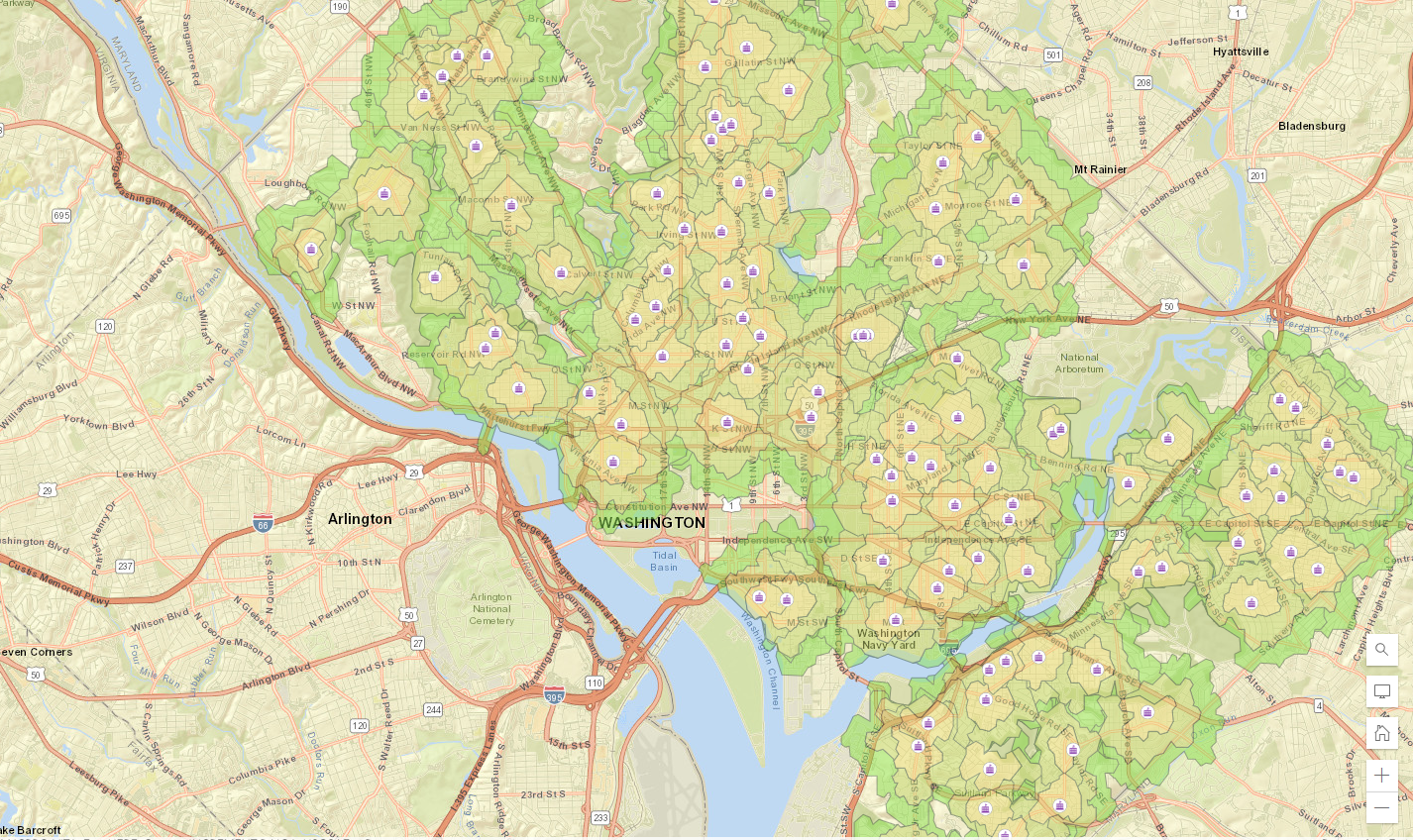
I funked around with the school walking areas and changed the color/added an outline. The outline helped me visualize where zones end but it does block up the map a bit with overlapping outlines. The color selection also feels inverted to human bias in color. The fact that the furthest walk is green is a bit confusing and should be considered if this map was ever used:

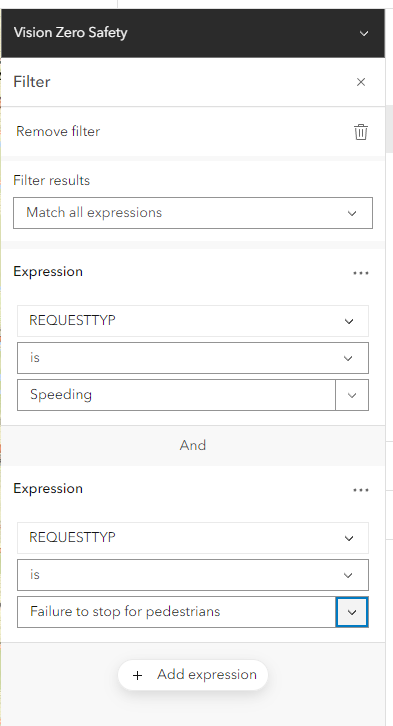
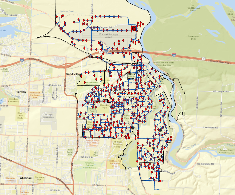
I added filters to the vision zero safety layer. These are going to minimize the amount of data points I see to only the selected expressions:

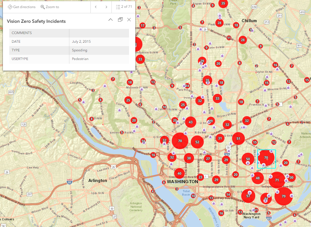
This next step required a little going astray from the book. It asked me to open the “clustering” tab but that doesn’t exist anymore, it has been renamed to “aggregation”. This is one of those reminders that things do update and change just a bit. But here’s my cute little clustered map of danger zones for pedestrians after it has been properly configured for fields:

Chapter 2

2.1

So far this work is super helpful for those who haven’t used ArcPRO before, but for those who have this feels like a drag. I understand starting from the bottom but some of this stuff is things I don’t even think about when I do them now.

I’m not sure if using the control key for selection is an Apple thing but I had to hold the shift button to select the 5 cities.

2.2

Opening the symbology tab was weird. I don’t often use the catalog tab as you have to manually open it to get to it. I can easily right-click the layer and select symbology. Just a reminder that there’s lots of ways to make something happen.

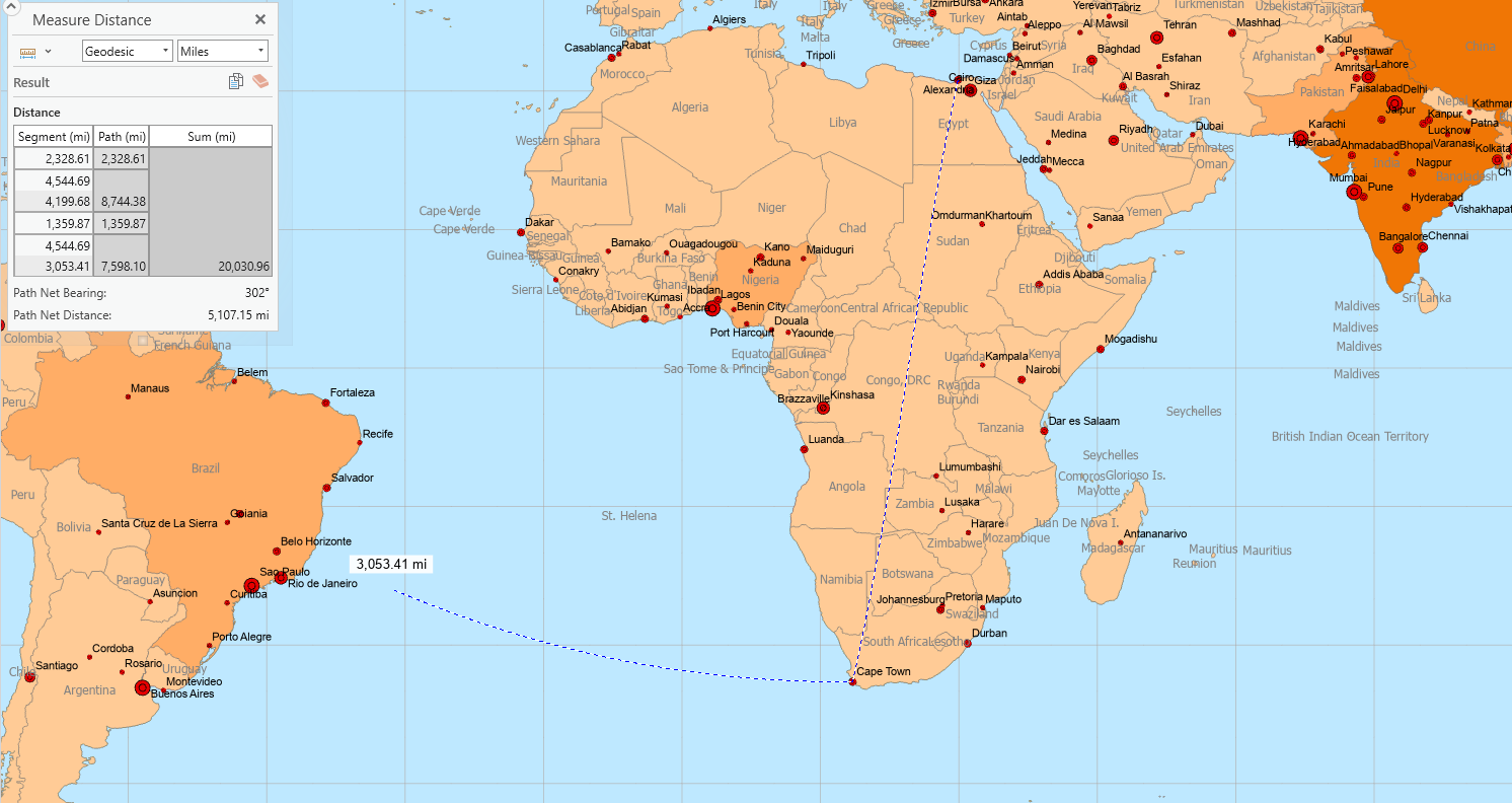
Here’s me messing around with distance measurements. The distance form Cape Town to Alexandria is 20,663.81 miles!

2.3

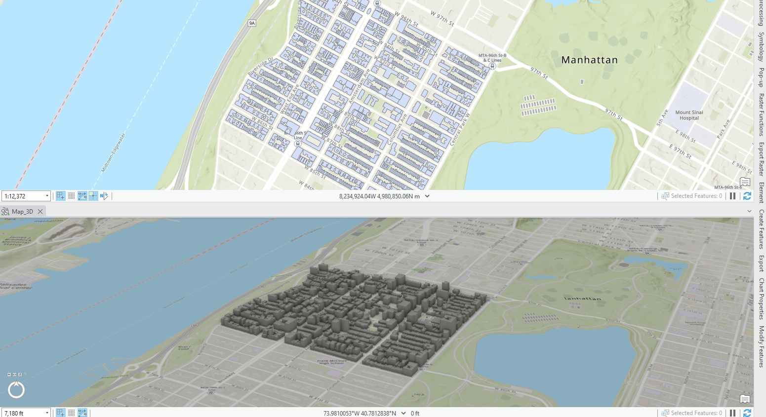
I’ve never made 3D images in Arc before, it looks so cool. Here’s my little linked map moment:

Chapter 3

I don’t like clicking the data tab to access the attribute table. I would rather right-click the layer to open it. The “new expression” button has also been changed to a “new clause” button instead. It’s weird though because it’s still labeled as expressions.

The export features have also changed. So I wasn’t allowed to save but not rename the output. So I just created it with the default name but renamed the layer. I’m not sure if it will show under this name in the file location but it worked.

I was really familiar with this exercise. I was reminded how finicky classes can be sometimes when you enter values. It makes me nervous.

Using the geoprocessing tools I found that the naming for double (double precision) didn’t exist anymore there was only double (64 bit). I had to do this step twice, because I wasn’t sure what went wrong but it came out right the second time. It was still a little wonky but it turned out with the same values.

Using the attribute table is a little extra mathy for me. I try to grasp what I’m doing but it’s difficult to understand sometimes.

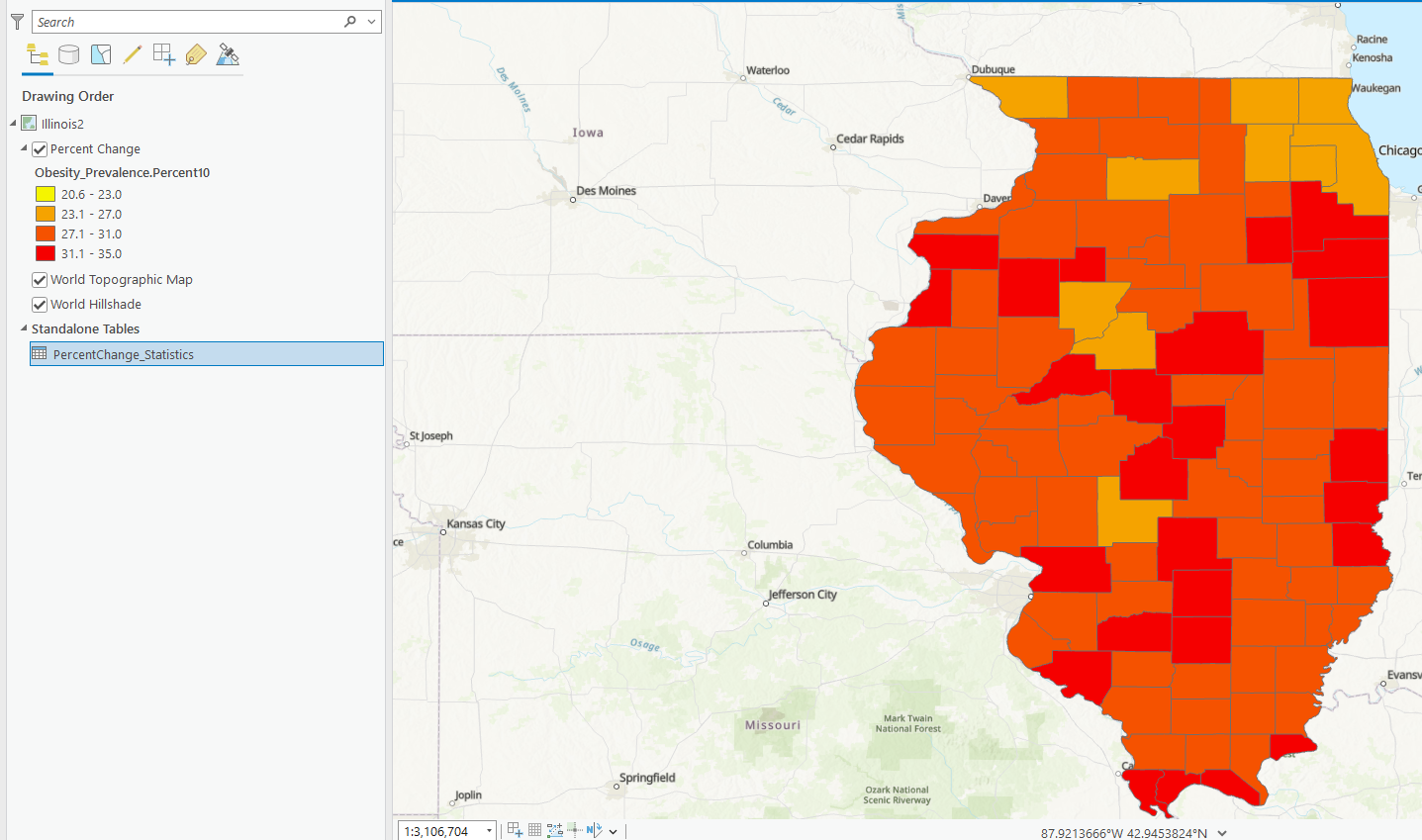
Read the fine print, I couldn’t use the infographics tool until I was logged into ArcOnline. Weird but glad I caught it. Still couldn’t do the infographics. I used the correct login but it wouldn’t work and locked me out for 15 minutes… I got this far though! I had the map and percentage stats so this was the last step.

For the next exercise I was also having some troubles. When I imported the food deserts table layer, it was corrupted from the source. Google told me to repair the source but it said it was unavailable for the layer. After numerous location changes and removing and readding the file, it still didn’t work. Even opening it from the file to a new map it shows that it’s corrupted. So no stats here for me. I couldn’t do a spatial join either >:(

weird text I’ve never gotten  but got it saving the health data…I had to save it so I just updated it?

Chapter 4

my beautiful city water things map:

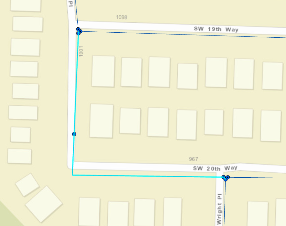
This city is safe, I repaired their waterlines:

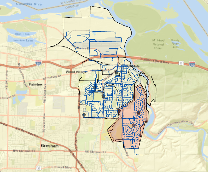
My final map for chapter 4 after editing the water zones and highlighting it!:

Overall theses exercises taught me new things and reminded me how to do some older things. I only missed two steps due to being stuck but I wasn’t ever overly frustrated. Hopefully, this continues with our projects but we’ll see!

Coleman-Week 3

Ch. 4

Mapping the density of your study will help allow you to better see patterns and other important ideas. Something you can do to map density is create areas of color with density value that can be demonstrated by creating a key. You can use GIS to map density points which are usually points of surface. GIS can allow you to map the density of features or of feature values.These two different approaches yield different results and info. There are ultimately two ways of mapping density according to the book. The first way is you can create a density map based on features summarized by defined areas(s). The second way is you can create a density map by creating a density surface.

For mapping density by defined arena it can be mapped geographically using a dot map or you can calculate a density value for each area. For mapping density by surface, you usually create in GIS a raster layer. Each cell in the layer gets a density value, such as number of businesses per square mile, based on the number of features within a radius of the cell. Comparing methods: you should map density by areas if you have data already summarized by area, or lines or points you can summarize by area(output, trade-offs). This method doesn’t pinpoint exact centers of density, especially for large areas. You should map density by surface if you have individual locations, sample points or lines. So it seems that by precision for small areas then pick surface to map density and large areas with less precision do area. 

Must be able to calc density values per area: pop density=total pop/(area/?) Dots can help a lot with density.You can use GIS to summarize features or feature values.GIS uses two methods for calculating the cell values needed for mapping density:simple method/calc and weighted/calc method. You can display density using patterns or colors. I like how darker shades mean more dense and lighter means less dense.

Ch.5

People map what is inside an area in order to monitor what is happening inside it, or to compare several areas based on what’s inside each. By summarizing what’s inside these areas, allows people to compare areas to figure out more of an understanding for a feature. You can access a single area or find out what is inside each of the several areas in your map. 

Single area: When you find what’s inside a single area, it will let you monitor activity or summarize info about the area. Ex:a service area around a central facility, such as a library district.                                                

Multiple areas: This method would let you compare the areas that you look inside of. Ex: contiguous, such as zip codes or watersheds.

Discrete features: these are unique and identifiable features. Ex: crimes or streams

Continuous features: represent seamless geographic phenomena. Ex: classes or categories

After you get the info from the analysis, you must determine which method to use. 

Ex: list, count or summary?

You can use GIS to select features that are either completely or partially inside the area or even not at all. 

There are three different ways to calculate or find out what is inside your intended area.

  1. You can create a map showing the boundary of the area and the features, this is called drawing areas and features. Good for visual approach. Need a dataset containing the boundary of the area or areas and a dataset containing the features.
  2. You can specify the area and the layer containing features and GIS can select a subset of the features inside the area, this is called selecting the features inside the area. Good for getting a list or summary. It is also good for finding what’s within a given distance of a feature. Need the dataset with the features and any important attributes.
  3. Overlaying the areas and features allows GIS to combine the area and the features to create a new layer with the attributes of both or compare the two layers. Good for finding which features are in each of several areas.

There was another way, but these seemed like the most important and relevant. Overlaying areas and features is an important method. **Vector method and raster method

Ch.6

A map can help you find what is nearby. To find what’s nearby, you can measure straight-line distance, measure distance or cost over a network, or measure cost over a surface. What’s nearby  can be based on a set distance you specify, or on travel to or from a feature. 

Distance is one way to measure how close something is nearby. You can also measure what is nearby using cost. Time is one of the most common costs.Other costs include money. These are referred to as travel costs. You can specify a single range or several ranges when looking to map something nearby. For multiple ranges, you can create rings. Ex: sonar, but the book says inclusive rings. Other ways to help compare distances are distinct bands. 

The main three ways to find what is nearby are:

  1. Straight-line distance
  2. Distance or cost over a network
  3. Cost over a surface

These methods all vary and have several pros and cons which are around page 467 for reference. You will have to choose which method based on your map and what you dataset is as well as what you are trying to find. Once you have the info, you can make a map either including the stuff nearby or if it is separated.

Gullatte Week 3

Chapter 4: Mapping Density

      This chapter first starts out with saying why mapping density is important. It’s important because it shows where the highest concentration of things is. This makes it easier to find areas that need help or just to see where a lot of buildings or places are in that area. Mapping density is useful especially for censuses or counties. Like every other thing being mapped, you have to decide what features you want to map and then get into even more detail by mapping feature values.  You can also create a density surface from locations or singular things like a street. It says density surfaces are created in GIS as raster layers. A raster layer in one definition is described as a background layer for other layers. 

Mapping density for defined areas:

      You can map it in two ways: by a dot density map or by calculating density value for each area and shade each by value. The maps are usually two colors and shaded in. For density for defined areas, it’s treated and mapped like a ratio. Dot density maps are represented for a certain quantity. For example, one dot could equal 200 people. I think both types of maps are somewhat common and very easy to understand. In GIS terms of how all of this works when creating a density surface, GIS will find a neighborhood and add up all of its features. It then divides that by the area of the neighborhood. The value is then given to that neighborhood area. The GIS is essentially creating an average for every neighborhood and its area. The search radius can change. The cell size also matters. The smaller the cell, the smoother it is and the bigger it is the rougher or more coarse it will be. 

Chapter 5: Finding What’s Inside

     Mapping what is inside an area is really important for several reasons. For one, it lets people compare areas to see what there’s more of and what there’s less of. For example, mapping burglaries and where they occur may help police where to spend more time. Or, if you want to know where to put a police station, you will be able to map inside areas and see where police presence is needed. To do this you draw a boundary circle around a place. In this example, a circle is drawn around a fire station with all incidents including gas leaks, fire, medical and more. This makes it a layered map. Features here can be discrete (features you  can count or list) or continuous (features like elevation). GIS can tell you if a singular feature is inside an area, list all the features, the number of features, and more. As I am learning, Geographic information systems can do a lot of things that we do not know about. This system is very intricate and useful in many different ways that I probably can’t comprehend. This article is super helpful because it gives plenty of examples and plenty of pictures or maps explaining. They also answer every question a person would have when learning about this technology. For example, when a feature falls out of a boundary line or area, it gives you the option to pick what you want to include or not. You can choose to exclude a feature but I think the best feature is choosing to keep a feature even if it runs outside of the boundary line. Three ways of finding what’s inside. The three are drawing areas and features, picking the features, and finally overlaying the areas and its features. Every method has its own advantages and disadvantages so it’s probably a preference. I think I would draw the areas and its features because it seems the easiest to understand and complete. 

Chapter 6: Finding what’s Nearby:

     The point of mapping what’s nearby is because you can find out what’s happening within a set distance of a feature affected by an event, store, or something else. The example they gave for this is that a city planner would have to let the residents around it know that they were building a beverage store. This identifies the area and the features. Also you can find out what’s in the traveling range. Finding this out can help define an area served by a facility or place. The example they gave for this is that a fire chief would want to know which streets are reachable in 3 minutes. Nearby is a word that everybody describes differently which makes this a little trickier than others. Depending on how you define it, it’ll tell you what method is most useful for you. The three main methods used are straight-line distance, distance or cost over a network, and cost over a surface. Just like for mapping what’s inside, every method has its own advantages and disadvantages. Straight line is used if you’re defining an area of influence or a quick estimate of travel range.You can create a buffer, you do this by specifying the source feature and buffer the distance. You pick features to find features within a given distance.  With travel range or distance you have to factor in cost. Use distance or cost when you are measuring travel over a fixed infrastructure. Finally, use cost over surface if measuring overland travel. This chapter is word heavy so I know I had to reread some parts several times and I know I will probably have to go back and reread again! Like mentioned earlier, with travel, a cost will have to be calculated. For this, GIS creates a raster layer in which the value of each cell is the total cost from the nearest cell source. This seems easy enough seeing as if it was explained in the earlier chapter. 

Mattox Week 3

GIS ch4


Chapter four is about mapping density. This type of map or feature when creating a map is especially useful when you have largely varied sizes in the area that is being analyzed. Density maps are also good with showing patterns as opposed to individual connections. Within this, there are two ways to go about creating a density map. One way is by defined areas. In the book, this method is a rather quick and easy way to display information that has already been summarized. This isn’t the most detailed way of making a density map because it doesn’t come straight from raw data. If there is no need for that extra detail though, this is a great method to get a pattern down and to get a visual to start with. The other method of making a density map is by density surface. This method is more detailed but takes a lot more data input since it isn’t already summarized. This method looks a lot like raster models because of the layering and use of cells. It is possible to switch between the two by assigning values to the summarized maps. Things such as the cell size, search radius, methods of calculation, and units affect how the map will come out. Small cell size makes a smoother map versus a more jagged map with large cell size. Small radius shows a lot of variety in information versus a generalizable map with larger search radius. This chapter also revisits chapter 3 with the concepts of natural breaks, quartiles, equal intervals, and standard deviation. This connection is helpful to relate the ideas in my mind. I am interested to see how other types of maps incorporate these same grouping categories. I also wonder what other categories could be similar between different models or maps.


GIS ch5


Chapter 5 is about taking a closer look inside the maps to understand the use of certain features, values, or layers. The idea of discrete v continuous values is revisited. Discrete is identifiable and unique like locations or addresses. Continuous can be numerical values or categories but the values vary greatly. After this, more methods were given to … Areas and features, inside areas, and overlay were described. Studying the areas and features is good for quick and easy information but it is hard to find individual values because it is mostly visual and not numerical. Selecting inside an area is good for precise information about that area but anything outside of it is not helpful. Overlying methods is great for understanding the parts that lacked in the other two options but it takes a lot of data input to give a lot of detail. Next, the ways of making these maps were considered. Lines and locations, discrete area, and continuous features were the options. Lines and locations use thick lines and dots to mark location. Discrete areas are mapped by distinct features such as buildings or rivers with lines or shading. Continuous features use a lot of gradients and color to show how areas connect. The way to summarize these features or values was also given with some options. At this point I have noticed it feeling more like a tutorial or like what I expect when we actually start mapping. This is an interesting turning point but because of that I think this chapter is really beneficial for getting ready to start applying some of this knowledge. The next handful of pages goes on to describe overlaps. This is also a topic that has been revisited but in more detail. 


GIS ch6


This chapter starts with an evaluation of costs versus distance in mapping. One way to map is by distance which is often sufficient but not the most detailed. Cost includes travel expenses and a lot more effort but is very precise. This is a common theme with the comparisons of mapping methods throughout this book. Going along with that theme, the new methods of planar and geodesic mapping were introduced. Planar mapping calculates values with the earth being a flat surface and this is fine when these values are over a small area because it is generally flat. However, when a larger area is being analyzed  the curvature of the earth has to be taken into account for. This is known as the geodesic method which is used for large areas of mapping. District bands are useful if you want to compare distance to other characteristics and inclusive rings are useful for finding out how the total amount increases as the distance increases. Methods used for finding values inside of a map were explained. Straight line distance is quick and easy but less precise and it measures distance. Distance in cost over a network measures distance or cost and is good for measuring this relation over one individual infrastructure. Cost over surface is a method of measuring cost and is good for layers but takes a lot of data preparation. Creating a buffer is another important step to demonstrate boundaries of the values. Boundaries are the edges and their uses and centers can be sums. The rest of the chapter was mainly about how to put all of these newer methods into practice to create a useful and beneficial map. I’m curious to see how all of this information will translate to the tutorial portion/book.


Pois Week 3

Chapter 4:

In Chapter 4, the author focuses predominantly on mapping density and how to interpret the maps. There are two methods of displaying density. You can show the density for each area graphically using a dot density map, or you can calculate a density value for each area and shade each based on this value. You can also display a density surface using either graduated colors or contours.

The cell size determines how coarse or fine the patterns will appear. The smaller the cell size, the smoother the surface.

Calculating cell size: Convert density units to cell units, then divide by the number of cells, and then take the square root to get the cell size (one side)

Natural breaks: Class ranges are based on groupings of data values.

Quantile: Each class has the same number of cells in it.

Equal interval: The difference between the high and low values is the same for each class

Standard deviation: The classes are defined by a number of standard deviations from the mean of all values in the layer.

Chapter 5:

Discrete features: Unique, identifiable features. You can list or count them or summarize a numeric attribute associated with them. They are either locations, such as student addresses, crimes, or eagle nests; linear features, such as streams, pipelines, or roads; or discrete areas, such as parcels.

Continuous features: Represent seamless geographic phenomena and include things like spatially continuous categories or classes, such as vegetation type or elevation range.

Three ways of finding what is inside:

Drawing areas and features -You create a map showing the boundary of the area and the features. You can then see which features are inside and outside the area.

Selecting features inside the area – You specify the area and the layer containing the features, and the GIS selects a subset of the features inside the area.

Overlaying the areas and features: The GIS combines the area and the features to create a new layer with the attributes of both or compares the two layers to calculate summary statistics for each area on the fly.

Chapter 6

Using GIS, you can find out what’s occurring within a set distance of a feature. To find what’s nearby, you can either measure a straight-line distance, measure distance or cost over a network, or measure cost over a surface. This will help you decide which method to use.

After identifying which features are near, there are three methods for gathering your information:

List – An example of a list is the parcel-ID and address of each lot within 300 feet of a road repair project.

Count – The count can be a total or a count by category.

Summary statistic – a total amount, such as the number of acres of land within a stream buffer, or an amount by category, such as the number of acres of each land cover type (forest, meadow, and so on) within a stream buffer

Three ways of finding what is nearby:

Straight line distance – specify the source feature and the distance, and the GIS finds the area or the surrounding features within the distance. Use straight-line distance if you’re defining an area of influence or want a quick estimate of travel range.

Distance or cost over a network – specify the source locations and a distance or travel cost along each linear feature. Use cost or distance over a network if you’re measuring travel over a fixed infrastructure to or from a source.

Cost over a surface – specify the location of the source features and a travel cost. Use cost over a surface if you’re measuring overland travel.

Brokaw Week 3


In chapter 4 I learned a lot of interesting facts about mapping density and how to read maps. The main purpose of a density map is so we can compare higher concentrations of features over many locations. We measure the features and their concentrations with a uniform areal unit.  These maps are super helpful when looking for correlations over a large area. Why would environmentalists want to know where things are concentrated? How do these density maps record changing conditions? Are we talking about migration or influxes of animals changing weather patterns or growing seasons? What are some of the steps that go into planning what needs to be mapped? The most important things to know before starting are all of your features and the area you want to focus on. Geographical Information Systems will map the density using a density surface. When first making a map it is important to plot the locations of interest and then find the density surface per a measurable unit like a square mile. All maps should have 2 steps first the black and white with only the targeted locations then the second map that has a color gradient showing higher and lower densities. What is the difference between features or feature values? Mapping density of features would be like the location of houses and the feature value documents many people living in the house. These maps are useful for planning roads or development efforts. A dot map is used to show density values when the map already has cluster features. This type of map makes it easier to read because they are distributed randomly. They show density geographically. To find density you divide mass (number of features) by volume (area of the polygon). Geographical Information systems will help you find density surfaces with a raster layer. It is a very detailed way to show data but also takes a lot more time. 

Chapter 5 was about learning what’s inside of a map, analysis, drawing features, and creating overlay areas. The method you choose depends solely on the data you are presenting. There are a couple of different areas you could graph. A single area for example would be a town and the features would be buildings, emergency teams, or hazards reported. These maps make it easier to convey information to the community rather than using numbers and coordinates. We use GIS to predict future climate changes and how people will be affected in years to come. Discrete features are countable locations that are unique to their place of origin like roads, buildings, lakes, and home addresses.  A location would be crimes and linear features are roads in a protected area like a state park. Continuous features are more complicated they are broad areas summarized there are subgroups of continuous features. Spatially continuous will tell how much of each type is in the area. Continuous values are always numeric like elevation, precipitation, road density, habitat suitability, and temperature. Will we need to make a note if we include either the whole or part of a feature if it lands partially inside a boundary?  An example of a scenario when you would want to include a feature that lands partially inside a zone would be a house having a zone change. When labeling discrete features a light translucent color is ideal to show the configuration of the selected area. To distinguish areas the use of different colors is recommended to show the difference. This is all to make the map easier to see and understand. Using thick and thin lines will be helpful when making boundaries. Using GIS to select an area to be summarized first to choose the location, locations of boundaries, and distance, and the GIS will do the rest. 

In Chapter 6 I learned why it’s important to map what is in range and capable of being recorded and monitored. Trying to map an area too large will only result in inaccurate data where a large section of the population is left out. A note for my future self is that traveling range is measured by cost, distance, and time. Knowing what the preferred traveling use is also helpful if it driving or walking. Areas of influence are measured using a straight-line distance of travel movement. What information will be helpful to me in the future? The count will be numerical or by type. A summary statistic is a total amount or amount by category number of acres with variable other characteristics. A statistical summary is a minimum, average, maximum, or standard deviation for example the average household size within a boundary of the local school. To get more information on distance use inclusive rings which are used to find the total amount of increases as the distance increases. Distinct bands can compare characteristics with distances. To get a more accurate measure, measuring distance over cost will be helpful. Using a ready-to-use network like ArcGIS will save time when needing to know a segment of the network and an attribute specifying its length and cost value. The cons of using a straight-line distance are it only gives an approximation of the travel distance while it is good at measuring distance quickly and easily.  Distance or cost over a network is good at giving precise distance and cost but it requires a perfect network layer. To make a buffer, the line can either be temporary or permanent so that the sources can be counted. GIS will make the buffer based on either the street size or type. If you want information on the feature to feature GIS will do the calculations and find the exact distance to the source.


McFarland Week 3

Chapter 4 (Mapping Density):

Density maps give a clearer distribution array than simply mapping features.

Two types of density mapping: based on features summarized by defined area or by creating a density surface

Defined area: Ex( Using a dot map to represent density of individual locations)

  • Use if data already summarized by area or in lines/points easily summarized by area
  • Easy, but doesn’t pinpoint exact densities

Density Surface: Ex( Raster layer with each cell being assigned a density value such as per square mile)

  • Use if given individual locations, points, or lines
  • more precise view of density, but is more difficult

pop_density = total_pop / (area/27878400)

27878400 square feet in a square mile

Dot density map seems to be a combination of defined area and density surface.

It is possible to map defined areas using individual features, but you have to make sure it meets your criteria.

When GIS runs the program to create density surface it creates a neighborhood or area around each cell that creates a smooth transition from cell to cell.

How to find the right cell size:

  1. Convert density units to cell units
  2. Divide by the number of cells
  3. Take the square root to get the cell size (one side)

Finding the right cell size is just finding the sweet spot between not using too much processing power while still showing the detail of patterns.

It is possible to map density surface with data summarized by defined area. You can use census tract centroids for each cell to create a smoothed surface.

It is possible to use the four different classification schemes to achieve different outcomes.

Often higher densities are shown using darker colors, but using lighter colors could draw the reader’s eyes to the area more effectively.

Chapter 5 (Finding what’s inside):

In order to map what’s inside you need to define your area of study and combine that with features to create summary data.

Single area:

Analyzing activity or summary information in that area

  • A service area around a central facility
  • A buffer that defines a distance around some feature
  • An administrative or natural boundary (parcel of land or watershed)
  • Manually drawn area (proposed sales territory)
  • Results of a previous model (floodplain modeled in GIS)
  • Combination of several areas treating them as one

Multiple Areas:

  • Contiguous (such as zip codes or water sheds)
  • Disjunct (state parks)

Discrete features are unique, identifiable features. Continuous features represent seamless geographic phenomena.

When using a list or count of features you should include those features that are partially within the boundaries of the mapped area.

Three ways of finding what’s inside:

Drawing areas and features:

  • Create a map showing the boundaries of areas and the features to see if features are inside the areas. All you need is a dataset containing the boundary of the area/s and a dataset containing the feature/s.

Selecting features inside the area:

  • Specify the area and the layer containing the features, then GIS selects a subset of the features inside the area. Good for getting a list or summary of features inside an area. Need a dataset containing the areas and one with features.

Overlaying the areas and features:

  • GIS combines the area and the features to create a layer with both attributes to compare them. Good for calculating summary statistics and finding which features are in each of several areas, or finding out how much of something is in one or more areas.
  • Need data with areas and data with features (including attributes you want summarized)

Shade outer area to emphasize features and fill outer area with translucent color to emphasize outer area when mapping discrete areas.

If a feature falls within two or more areas, the GIS splits the feature where it crosses the area boundary. Most any types of maps can be overlayed for comparison.

Chapter6 (Finding what’s nearby):

Mapping what’s nearby can be used to find out what’s happening within a set distance of a feature.

Distance can be measured in distance or travel cost.

Three methods:

  • Straight-line Distance
    good for creating a boundary or selecting features a set distance away from a feature. Layer containing main feature and surrounding features.
  • Distance or cost over a network
    Good for finding what’s within a certain travel distance/ travel price over a fixed network. Need locations of source features, a network layer, and a layer containing surrounding feature (usually)
  • Cost over a surface
    Good for calculating overland travel cost. Need layer containing source features and a raster layer with the cost surface.

Choosing a method:

  • straight-line when defining area or want a quick estimate of travel range
  • cost or distance over network when measuring travel over a fixed infrastructure network
  • cost over a surface when measuring overland travel

When analyzing features within an area color-coding can be used to draw attention to different categories of features.

When creating a distance surface you can set a maximum distance for which GIS will only calculate to that point.

Cost in a cost over surface map can be time, money (such as cost to develop an area), or effort expended. For example a deer might expend less energy moving through open forest than through thick brush.

Is an elevation/ topography map a version o a cost over surface map?

A lot can be done with a cost over surface map. No maximum can be set, or a maximum can be set, or the area outside a certain limit can be selected.

When using more than six or seven ranges, you can use two or three hues to help distinguish the ranges.

fraire week 3

Chapter 4
Two ways to map density: by defined areas or by density surface.

defined areas: you can show and calculate density for the defined area. You can use a dot map.

density surface: created in GIS raster layers. Simple calculations are not as easy to read as weighted calculation in terms of rings. You can use graduated colors or contours to map density surfaces. Be aware of how many class you use, between 3-15 is the sweet spot, more or less gets confusing and loses data. Also note the colors you choose for the gradient and what appeals to the eye more (dark or light color gradient indicates high density).

Be cautious of how much info we need or don’t need, it’s a fine line between too much and too little info to not lose the obvious patterns in densities.
I remember calculating cell size conversions in remote sensing, it took such a long time. I think I left for lunch, used the restroom, got Rowley coffee and it still wasn’t done. I think I was converting points to tangible pixels with units but it’s crazy how much power and time it takes for these things sometimes.

This chapter was pretty short and covered a lot of things I knew how to do technically, but gave me more info on the use and reason behind these techniques. I liked comparing the dot and contour maps, I think it would be cool to do something with those in a project.

Chapter 5
to find out what’s inside, first build you area of study, and if its one or many.
I recall searching for feature attributes in remote sensing to narrow down a price range for potential house buyers. I also remember trying to import a boundary layer (shapefile) of Brazil and it kept not working. The datums were the same but it was not wanting to place itself properly. It took me 2-3 days to figure out how to do it.

Drawing areas/features: find whether features are in area or not. good for single area.
Selecting features in area: get a list of features in area, good for single area.
Overlaying areas/features: which features are in which areas and how many/how much in that area. good for multiple areas.

Most common summaries: count and frequency.
count: the total number of features inside the area, such as the number of businesses in a neighborhood.
frequency: the number of features with a given value, or within a range of values, inside the area, displayed as a table.

These slivers are very annoying. I remember making data points on a top layer that was slivered and when I flushed it out those data points were nulled because they didn’t fall in the area. I had to go back and move the points in just a hair to get them to be present.

The vector method provides a more precise measure of areal extent but requires more processing and postprocessing to remove slivers and to calculate the amount of each category in each area.

when choosing overlay to remove slivers: the raster method is more efficient because it automatically calculates the areal extent for you, but it can be less accurate, depending on the cell size you use. also prevents the problem of slivers. It is often faster because the computation that the GIS must do is simpler.
single area with one category: bar chart, or pie graph; multiple areas with one category: bar chart; multiple areas with multiple categories: histogram, cluster, or stacked bar chart, with few areas/categories you can use pie chart too

Chapter 6

I didn’t consider time or effort a cost in distance before this chapter.

Planar: calculating distance assuming the surface of the earth is flat

geodesic: taking into account the curvature of the earth when calculating distance

Inclusive bands: tells you the total number within bands as distance increases

distinct bands: lets you compare distance to other characteristics like how much someone 1000m away spends on groceries compared to 2000m.

I like the chapter setups where it introduces a concept, tells you its pros and cons, and also tells you how GIS does it as a function/what you need to do it, etc. Its helpful to have consistency. 

These few chapters have covered a lot of what was in our exercises for remote sensing. I had to do parcel selection within a given boundary to find homes for homebuyers that met their specifications.  I was reminded of this when it discussed selection within boundaries. I’m glad that a lot this is getting explained now. I would get pretty confused doing raster calculator calculations and not understanding what the numbers and symbols I entered meant. It is plugging in data into the calculator as a word problem too, the worst kind of math.

The spider diagram is cool, I like it. The graduated symbols map seems harder to read, the graduation of triangle size is hard to distinguish (for me)

The calculation of these distance seems like a really useful tool. I have worked with this concept a little bit but not to the extent that they went into in this chapter. I learned more about what Arc is doing behind the scenes in my random clicking and it makes things more comprehensive for me. I am more aware of why I’m doing something as opposed to just following directions to get it done.