McFarland Week 6

Delaware County Data:

Zipcode: Contains all of the zip codes that are represeted in Delaware County. Data based on Census Bureau zip code files, and is updated on an as needed basis.

Recorded Document: Contains points for recorded documents. Documents include: vacations, subdivisions, centerline surverys, surveys, annexations, and miscellaneous documents within the county.

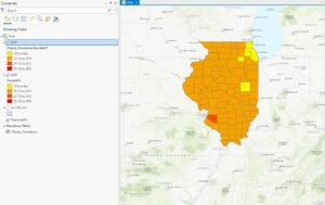
School District: Contains all of the boundaries for all of the school districts represented in Delware County. Updated as needed, and published on a monthly basis.

Map Sheet: Consists of all map sheets in Delaware County. All individual map sheets correlate to a numeric value to help distinguish between certain areas.

Farm Lot: Contains al of the farm lots in Delaware County. Data is based on US Military and Virginia Military surveys.

  • Kind of confused on why the whole county is broken into farm lots, but i’m thinking it was how it was originally divied up during westward expansion. Not sure, though.

Township: Contains all 19 townships that make up Delaware County. Updated on an as-needed basis and published monthly.

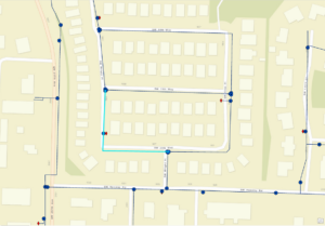
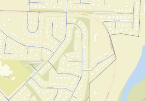
Street Centerline: Represents the centerlines of all public and private roads within Delaware County. Updated on a daily basis as it is intended to support 911 emergency responses, accident reporting, disaster management, and more.

Annexation: Shows all of the annexations and conforming boundaries from 1853 to present day. Updated on an as-needed basis and published monthly.

Condo: Contains all condominium complexes in Delaware county. Based on data from the Delaware County Recorders Office.

Subdivision: Consists of all subdivisions and condominium complexes in Delaware County. Updated daily and published Monthly. A subdivision is a parcel of land that is divided into two or more pieces for sale.

Survey: Represents the many surveys of land within Delaware County. Updated daily and published monthly.

  • Not sure what the surveys represent, but there is a lot of data in this shapefile.

Dedicated ROW: Represents all Right-of-Way lines within Delaware County. Updated daily and published Monthly.

  • Not sure how this layer really works or what each section represents, but it looks interesting!

Tax district: Contains all tax districts within Delaware County. Data is based on the Auditor’s Real Estate Office for the county.

GPS: Identifies GPS monuments that were establushed in the 1990’s. Updated as-needed and published monthly.

  • Again, not sure what these monuments are or what their GIS implications are, but looks interesting nonetheless.

Original Township: Consists of the original township boundaries in Delaware County. Unaffected boundaries before tax district changes.

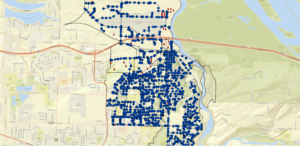
Address Points-DXF: Contains points for all addresses in Delaware County. Maintined by the county Auditor’s GIS Office. Points represent the center of each building “as best as possible”.

Precinct: Represents all voting precints in Delaware County and is based on data from the County Board of Elections. Both updated and published as needed.

Hydrology: Consists of all major waterways in Delaware County. Data was enhanced in 2018 with the use of LIDAR data.

  • LIDAR is light detection and ranging.

Building Outline 2021: Shows all building outlines in Delaware County. So much data in this layer that you need to zoom in to view the outlines.

Parcel: Represents all cadastral parcel lines within the county. Data maintained by the County Auditor’s Computer Aided Mass Appraisal system.

PLSS: Consists of all Public Land survey polygonsin the county. Data is also based on Military survey data from US and Virginia Militaries.

Street Centerlines- DXF: Another representation of street centerlines for the LBRS. The LBRS is The State of Ohio Location Based Response System.

Address Point: Spatially accurate depiction of certified addresses in the county. Used to determine the closest valid address from a set of coordinated for 911 responses.

2022 Leaf-On Imagery: Imagery from 2022 12in Resolution.

Delaware County Contours: 2018 Two Foot Contours for the county.

Building Outlines – DXF: Another representation of building outlines in the county.

  • DXF stands for Drawing Exchange Format, which is a “legacy format originating in the CAD industry to exchange 2D vector data” as defined from the arcgis website.

Delaware County E911 Data: Another representation of accurate certified addresses in the county used for 911 responses.

ArcGIS:

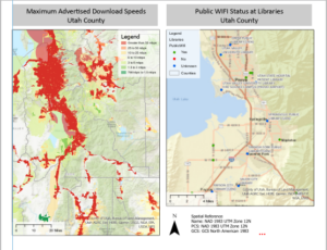
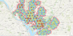
Here’s my final map with all three instructed layers along with a scale bar, legend, north arrow, and title. Unfortunately, my screenshot is horrible quality. Also, I had to unzip all of the files to be able to drag them into ArcGIS.


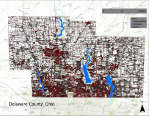
P.S. Thanks, other logan for the idea of creating a whole layout rather than just a screenshot with the visible layers.


McFarland Week 5

Chapter 5:

This chapter was a lot easier now that I know the basics of the software from last week’s chapters.

A)

B)

C)

I did the entire chapter without many issues, but when I tried to package it, I got an error message that my map has no layers.  Not sure what to do about this because my map definitely has some layers.

Chapter 6:

A)

Not much to show for this section, but I’m starting to get more confident using the software. We’ll see how long that lasts!

B)

C)

I can’t seem to find the ArcGIS Collector app anywhere on the IOS app store.

Chapter 7:

A)

B)

I am doing all of the steps correctly, but to be honest I’m not confident I know exactly what I’m doing.

C)

Chapter 8:

A)

Not sure how to access the appearance tab to change transparency. (Update: I figured it out)

b)

C)

D)

Made a cool animation of changing robbery demographics, unfortunately this is only a screenshot. Sorry!

Chapter 10:

A)

B)

Messed around with labeling libraries in Salt Lake City!

C/D)

My final layout below!

Note: Downloaded three assigned .shp filed from Delaware GIS Data Hub.


McFarland Week 4

Chapter 1:

This chapter was pretty self-explanatory. Here is my final map with all features visible.


Chapter 2:

2A

Getting used to using a desktop is going to be interesting!

2B

Me measuring the distance from Moscow to Kyiv!

2C

Figured out 3d modeling!

Chapter 3:

3A

3B

I got this far and the 2005 layer just decided to not work.

3C

I couldn’t figure out how to import Healthstudy2.aprx because I couldn’t do the previous step.

Chapter 4:

This chapter was pretty straightforward, not much discrepancy between the book and the program.

PS: Thanks, Krygier for telling me how to take screenshots with better quality!

4A

4B

4C


McFarland Week 3

Chapter 4 (Mapping Density):

Density maps give a clearer distribution array than simply mapping features.

Two types of density mapping: based on features summarized by defined area or by creating a density surface

Defined area: Ex( Using a dot map to represent density of individual locations)

  • Use if data already summarized by area or in lines/points easily summarized by area
  • Easy, but doesn’t pinpoint exact densities

Density Surface: Ex( Raster layer with each cell being assigned a density value such as per square mile)

  • Use if given individual locations, points, or lines
  • more precise view of density, but is more difficult

pop_density = total_pop / (area/27878400)

27878400 square feet in a square mile

Dot density map seems to be a combination of defined area and density surface.

It is possible to map defined areas using individual features, but you have to make sure it meets your criteria.

When GIS runs the program to create density surface it creates a neighborhood or area around each cell that creates a smooth transition from cell to cell.

How to find the right cell size:

  1. Convert density units to cell units
  2. Divide by the number of cells
  3. Take the square root to get the cell size (one side)

Finding the right cell size is just finding the sweet spot between not using too much processing power while still showing the detail of patterns.

It is possible to map density surface with data summarized by defined area. You can use census tract centroids for each cell to create a smoothed surface.

It is possible to use the four different classification schemes to achieve different outcomes.

Often higher densities are shown using darker colors, but using lighter colors could draw the reader’s eyes to the area more effectively.

Chapter 5 (Finding what’s inside):

In order to map what’s inside you need to define your area of study and combine that with features to create summary data.

Single area:

Analyzing activity or summary information in that area

  • A service area around a central facility
  • A buffer that defines a distance around some feature
  • An administrative or natural boundary (parcel of land or watershed)
  • Manually drawn area (proposed sales territory)
  • Results of a previous model (floodplain modeled in GIS)
  • Combination of several areas treating them as one

Multiple Areas:

  • Contiguous (such as zip codes or water sheds)
  • Disjunct (state parks)

Discrete features are unique, identifiable features. Continuous features represent seamless geographic phenomena.

When using a list or count of features you should include those features that are partially within the boundaries of the mapped area.

Three ways of finding what’s inside:

Drawing areas and features:

  • Create a map showing the boundaries of areas and the features to see if features are inside the areas. All you need is a dataset containing the boundary of the area/s and a dataset containing the feature/s.

Selecting features inside the area:

  • Specify the area and the layer containing the features, then GIS selects a subset of the features inside the area. Good for getting a list or summary of features inside an area. Need a dataset containing the areas and one with features.

Overlaying the areas and features:

  • GIS combines the area and the features to create a layer with both attributes to compare them. Good for calculating summary statistics and finding which features are in each of several areas, or finding out how much of something is in one or more areas.
  • Need data with areas and data with features (including attributes you want summarized)

Shade outer area to emphasize features and fill outer area with translucent color to emphasize outer area when mapping discrete areas.

If a feature falls within two or more areas, the GIS splits the feature where it crosses the area boundary. Most any types of maps can be overlayed for comparison.

Chapter6 (Finding what’s nearby):

Mapping what’s nearby can be used to find out what’s happening within a set distance of a feature.

Distance can be measured in distance or travel cost.

Three methods:

  • Straight-line Distance
    good for creating a boundary or selecting features a set distance away from a feature. Layer containing main feature and surrounding features.
  • Distance or cost over a network
    Good for finding what’s within a certain travel distance/ travel price over a fixed network. Need locations of source features, a network layer, and a layer containing surrounding feature (usually)
  • Cost over a surface
    Good for calculating overland travel cost. Need layer containing source features and a raster layer with the cost surface.

Choosing a method:

  • straight-line when defining area or want a quick estimate of travel range
  • cost or distance over network when measuring travel over a fixed infrastructure network
  • cost over a surface when measuring overland travel

When analyzing features within an area color-coding can be used to draw attention to different categories of features.

When creating a distance surface you can set a maximum distance for which GIS will only calculate to that point.

Cost in a cost over surface map can be time, money (such as cost to develop an area), or effort expended. For example a deer might expend less energy moving through open forest than through thick brush.

Is an elevation/ topography map a version o a cost over surface map?

A lot can be done with a cost over surface map. No maximum can be set, or a maximum can be set, or the area outside a certain limit can be selected.

When using more than six or seven ranges, you can use two or three hues to help distinguish the ranges.

McFarland Week 2

1)

Common uses for geographic analysis: Mapping where things are, Mapping the most and least, Mapping density, Finding what’ s inside, Finding what’s nearby, Mapping change

GIS analysis is a process for looking at geographic patterns in your data and at relationships between features.

Process: Frame the question, Understand your data, Choose a method, process the data, Look at the results.

Geographic features are discrete (the actual location can be pinpointed; at any given spot, the feature is either present or not) , continuous phenomena(blanket the entire area being mapped, but a value can be determined at any given location), or summarized by area (density of a variable within area boundaries,.Data applies to entire area, but not any specific location within it).

Vector Model: Each feature is a row in a table, and feature shapes are defined by x,y locations in space. Analysis involves working with (summarizing) the attributes in the layer’s data table. Better for discrete features and data summarized by area.

Raster Model: Features are represented as a matrix of cells in a continuous space. Analysis occurs by combining the layers to create new layers with new cell values. (must use perfect cell size: too small requires too much storage and takes longer to process, too large will cause detail and information to be lost). Better for continuous numeric values.

Although vector discrete features are usually best represented in vector models they are often better represented in raster models when multiple layers are being analyzed.

Types of attribute values:

Categories: Groups of similar things for example the crime category could include theft, burglaries, assaults, etc.

Ranks: Ranks put features in order, from high to low. Used when measurements are difficult to quantify. Ranks are relative, so they are compared to each other.

Counts and Amounts: Hard data, actual numbers. Can be a measurable quantity associated with a feature.

Ratios: Show you the relationship between two quantities and are created by dividing one quantity by another for proportions or densities.

categories+ranks=noncontinuous / counts, amounts, and ratios= continuous

2)

Pay attention to distribution of features rather than the features themselves.

Should I have a question in mind, or even my hypothesis, before beginning the process of geographic analysis?

GIS stores information such as either a coordinate pair or a set of coordinate pairs to define shapes.

Subsets can be separate layers that convey information with more specificity to reveal patterns that possibly weren’t previously apparent when mapping all features.

Showing a subset of continuous data leaves the features without a context. 🙁

Using different colors or symbols for each type of feature in a category can show a more complex understanding of a specific area and how it functions. If the types within a category are very similar or overlaid it could be beneficial to use separate maps and compare rather than setting all of the data on a single map.

When mapping large areas the use of too many categories can make patterns difficult to see, but fewer categories can be beneficial at conveying patterns. Grouping categories can also be beneficial, for example rather than showing four types of industrial zoning on a large map; the use of one general industrial feature and a possible separate map of subsets could work better.

Use symbols that are easily discernible from each other!

clustered: features likely to be near other features

uniform: features less likely to be found near other features

random: features equally likely to be found anywhere

To determine whether patterns are meaningful the analyst must use statistics to measure and quantify the relationships between features.

How does an analyst determine whether a pattern is meaningful or simply caused by chance?

3)

Mapping using quantity rather than just features gives a more in-depth map that could be more helpful to find places that meet criteria, need action, or to see relationships.

Mapping most and least can be used in many different ways that I had never considered previous to reading this chapter.

Just like in writing you must keep your purpose and intended audience in mind. Are you exploring the data yourself or creating a map to convey information to someone else? “In many cases, you’ll start by exploring the data to see what patterns emerge and what questions arise, and later create a generalized map to reveal specific patterns” (56).

Mapping counts and amounts:

discrete features (ex; number of employees at each business)

continuous phenomena (ex; annual precipitation at any location)

summarizing by area (ex; mapping number of employees per square mile)

Mapping ratios:

Proportions show you what part of a whole act quantity represents

Densities show you where features are concentrated

Ranks can be indicated using varying words- like high, medium, low- or using numerical values- ie 1-10-.

Classes group features with similar values by a signing them the same symbol.

Standard classification schemes:

Natural breaks (Jenks): Classes are based on natural groupings of data values.

  • good for mapping data values that are not evenly distributed, places clustered values in same set.
  • difficult to compare with other maps, difficult to choose right number of classes

quantile: Classes contain an equal number of features

  • good for comparing areas that are roughly the same size
  • good for evenly distributed data
  • if areas vary greatly, a quantile classification can skew the patterns on the map

equal interval: The difference between the high and low values is the same for each class

  • presenting information to a nontechnical audience
  • mapping continuous data
  • difficult to class clustered data

standard deviation: Features are placed in classes based how much their values vary from the mean

  • good for displaying data around the mean
  • very susceptible to being skewed from outliers


McFarland Week 1

  1. Hello everyone my name is Logan McFarland and I am a freshman with plans to major in environmental science. I  love backpacking, fishing, and generally being outside. I was born in Medina, OH but lived in Granville, OH most of my life. My passion for the environment stemmed from being able to visit many wonderful natural places in my life; even being able to go backpacking in four states just last summer. This picture was taken during a week long backpacking/fishing trip in the upper peninsula of Michigan
    .
  2. Coming into this class I wasn’t really sure what GIS was, where it came from, or how broad its applications are, so this chapter was quite eye-opening for me. GIS is a very convoluted field of geography with a subsequent convoluted history. It was interesting to me that the beginnings of GIS were far before the beginnings of the digital age, and that in the early stages of digital GIS many geographers  preferred the manually produced maps. The third section of this chapter regarding the convoluted history of GIS that I had previously mentioned, although relatively difficult to follow, gave me a good look into the subtle differences that scientists debate like: Was GIS a mere descendant of the quantitative revolution or did its inclusion of visual intuition transcend the quantitative revolution itself? I liked how the author recognized that the use of visual means of conveying information rather than text or numerical data is seen as generally “unscientific” but when used in this application is often more efficient at conveying patterns and phenomena. Not to mention patterns that would go unnoticed using tables become the keystone discoveries of GIS.  The next section exploring the differences between GIScience and GISystems was equally interesting and and puzzling as the previous section. From my interpretation it is that GIScience is the ideas and theories that are put into application using GISystems, but both require spatial data and analysis to create a mutualistic relationship. The example about the relationship between the spread of Cholera and the use of public wells in London brings to light the importance of local information alongside GIS, but it also shows how tedious GIS can be with much room for error. Previously, I knew that GIS had everyday applications- i.e. GPS- but I did not realize how it is used in almost every aspect of our lives in some way or another.
  3. The first application that I came across came from searching for GIS use for trout fishing. In this application Trout Unlimited used arcgis to show where protected lands cross streams with natural brook trout populations
    .
    The second application is from the California department of Fish and Wildlife to use GIS to map chemical spraying in an attempt to restore the population of native cutthroat trout in the remote Carson-Iceberg Wilderness. This stream is the only native area for this rare trout species.
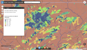
    Will Patterson, Ken DeVore. “Restoring Rare Trout to Its Native Range.” Esri, 6 Feb. 2019, www.esri.com/about/newsroom/arcuser/restoring-rare-trout-to-its-native-range/.