Mattox Week 6

Zip Codes: All zip codes in Delaware County from censuses, tax mailing addresses, and postal scrive websites. 

Recorded Document: Points representing miscellaneous documents in Delaware, Ohio.

School District: School districts in Delaware county from parcel records. 

Mapping Sheet: All of the areas in Delaware county clearly divided and showing each individual map sheet all together. 

Farm Lot: Military service district farm lot boundaries.

Township: Boundaries of 19 different townships in Delaware county. 

Street Centerline: Paved private and public roads.

Annexation: Conforming boundaries dating back to 1853.

Condo:  Condominium polygon boundaries in Delaware.

Subdivision: All subdivisions and condos in Delaware. 

Survey: Surveys represented as points similar to the recorded documents. 

Dedicated ROW: Designated right-of-way lines.

Tax District: Tax districts within Delaware county. 

GPS: GPS monuments between 1991 and 1997.

Original Township: Similar to township data.

Address Points: Central points on homes representing addresses. 

Precinct: Voting from the Delaware County Board of Elections.

Hydrology: Major waterways.

Building Outline 2021: All structures in Delaware County outlined.

Parcel: All cadastral parcel lines within Delaware County. 

PLSS: Public land survey system polygons in military survey districts. 

2022 Leaf-on Imagery: I couldn’t see a map or information on this one. 

Delaware County Contours: Contours showing elevation in Delaware County. 

Delaware County E911 Data: Accident reporting points.

Mattox Week 5

Week five work went smoother than week four but there were still some chapters I just couldn’t really get to do what they were supposed to. Over all though I feel like I was more comfortable with the software this time around so I felt a lot better about the exercises that went well. I felt like I could navigate everything pretty easily and even though there were still some funky hiccups I think I understand things better now.

Mattox Week 4

Towards the beginning of the week four work, I didn’t have technical things figured out yet so I was unable to get very far with a few of the exercises but I figured some things out and it went a lot smother in the later chapters of this week.  

These ones went well

These ones did not

Mattox Week 3

GIS ch4


Chapter four is about mapping density. This type of map or feature when creating a map is especially useful when you have largely varied sizes in the area that is being analyzed. Density maps are also good with showing patterns as opposed to individual connections. Within this, there are two ways to go about creating a density map. One way is by defined areas. In the book, this method is a rather quick and easy way to display information that has already been summarized. This isn’t the most detailed way of making a density map because it doesn’t come straight from raw data. If there is no need for that extra detail though, this is a great method to get a pattern down and to get a visual to start with. The other method of making a density map is by density surface. This method is more detailed but takes a lot more data input since it isn’t already summarized. This method looks a lot like raster models because of the layering and use of cells. It is possible to switch between the two by assigning values to the summarized maps. Things such as the cell size, search radius, methods of calculation, and units affect how the map will come out. Small cell size makes a smoother map versus a more jagged map with large cell size. Small radius shows a lot of variety in information versus a generalizable map with larger search radius. This chapter also revisits chapter 3 with the concepts of natural breaks, quartiles, equal intervals, and standard deviation. This connection is helpful to relate the ideas in my mind. I am interested to see how other types of maps incorporate these same grouping categories. I also wonder what other categories could be similar between different models or maps.


GIS ch5


Chapter 5 is about taking a closer look inside the maps to understand the use of certain features, values, or layers. The idea of discrete v continuous values is revisited. Discrete is identifiable and unique like locations or addresses. Continuous can be numerical values or categories but the values vary greatly. After this, more methods were given to … Areas and features, inside areas, and overlay were described. Studying the areas and features is good for quick and easy information but it is hard to find individual values because it is mostly visual and not numerical. Selecting inside an area is good for precise information about that area but anything outside of it is not helpful. Overlying methods is great for understanding the parts that lacked in the other two options but it takes a lot of data input to give a lot of detail. Next, the ways of making these maps were considered. Lines and locations, discrete area, and continuous features were the options. Lines and locations use thick lines and dots to mark location. Discrete areas are mapped by distinct features such as buildings or rivers with lines or shading. Continuous features use a lot of gradients and color to show how areas connect. The way to summarize these features or values was also given with some options. At this point I have noticed it feeling more like a tutorial or like what I expect when we actually start mapping. This is an interesting turning point but because of that I think this chapter is really beneficial for getting ready to start applying some of this knowledge. The next handful of pages goes on to describe overlaps. This is also a topic that has been revisited but in more detail. 


GIS ch6


This chapter starts with an evaluation of costs versus distance in mapping. One way to map is by distance which is often sufficient but not the most detailed. Cost includes travel expenses and a lot more effort but is very precise. This is a common theme with the comparisons of mapping methods throughout this book. Going along with that theme, the new methods of planar and geodesic mapping were introduced. Planar mapping calculates values with the earth being a flat surface and this is fine when these values are over a small area because it is generally flat. However, when a larger area is being analyzed  the curvature of the earth has to be taken into account for. This is known as the geodesic method which is used for large areas of mapping. District bands are useful if you want to compare distance to other characteristics and inclusive rings are useful for finding out how the total amount increases as the distance increases. Methods used for finding values inside of a map were explained. Straight line distance is quick and easy but less precise and it measures distance. Distance in cost over a network measures distance or cost and is good for measuring this relation over one individual infrastructure. Cost over surface is a method of measuring cost and is good for layers but takes a lot of data preparation. Creating a buffer is another important step to demonstrate boundaries of the values. Boundaries are the edges and their uses and centers can be sums. The rest of the chapter was mainly about how to put all of these newer methods into practice to create a useful and beneficial map. I’m curious to see how all of this information will translate to the tutorial portion/book.


Mattox Week 2

GIS ch1


This first chapter broke down the basics of GIS. What to use it for, how to use it, and which options are best for depicting different types of data. A big part of this chapter was the introduction of vector models and raster models. Vector models are often coordinates and lines that are the summary of data tables. Vector models are especially useful for discrete data which are values more specific than the alternative continuous values. On the other hand, the raster model is more useful for continuous numerical values. Raster models are depicted as cells that can be combined side by side with other cells to show how the data connects or overlaps. Layers are more prominent and used more often in these models. Another key difference between raster and vector models is that raster is more scale sensitive. Distortion can happen in all models and all scales but it is most significant in raster models. To counter this, you can find the appropriate sale from the original scale and the minimum map unit. Between these two models, continuous categorical values can be used and seen in either. This also brings up the continuous phenomena. The continuous phenomena describes how certain analytical values can be found or measured anywhere. 

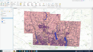
Another important factor of GIS is layering. This chapter gave some good information on how overlaps can make tags for pieces of information which can then be used for layering. 

Towards the end of the chapter, categories, ranks, counts, and ratios show up. These are all attribute values that are important factors in GIS. Categories are values with a common aspect. Ranks are orders assigned to categories. Counts are total numbers. Ratios show the relationship between two or more categories. Categories and ranks are noncontinuous values because there can be the same value while counts and ratios are continuous values because they are completely unique. 


GIS ch2 


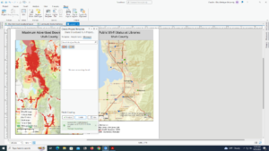
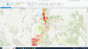
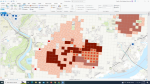
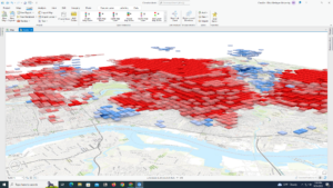
In this chapter, more of the mapping mechanics were thrown out there. Things such as category classifications, scales, and vector and raster models were revisited along with the addition of the use of subsets, grouping, zooming options, and colors or shapes of a map. From all of these other factors, chapter two explains the change of patterns. Patterns can be much more recognizable when you use a distribution of data instead of more individual sizes for the map. Using subsets can bring more detail to certain categories which could also bring out some unseen patterns. Similarly, zooming in or out can show us new things based on the original map scale like discussed in chapter one. For the sake of clarity, many large scale maps don’t use shapes for location points because with so many points it may be hard to recognize the shapes in clusters. In smaller scale maps, more colors and related categories can be used because there is less area to focus on so it will add detail without subtracting clarity. For this reason it is suggested to use no more than seven categories on large scale maps but if there are more, there is the option of grouping. This sometimes jeopardizes important information for the sake of clarity but can even emphasize already existing patterns that were not as prominent. 

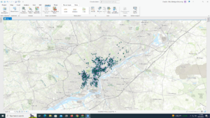
Chapter two made me excited to start thinking about ideas for my own GIS maps. With all of the examples being featured along with the first look into how we will be doing this unfamiliar task, my mind is stirring. A lot of these examples were crime based and from seeing all of them I feel like I have a pretty good basic understanding of crime patterns shown here. This gives me a sort of reference point for how I want anyone viewing maps that I may make to see them. Aiming for clarity along with detail and distinguishable patterns. 


GIS ch3


Chapter three is about being able to understand what you’re putting in a map and what purpose each feature has. This chapter also mentions these factors from an audience perspective along with an exploratory perspective. Either way, you start with determining certain types of quantities like the previously mentioned ranks, counts, and ratios. This time, there is an addition of averages, proportions, and densities used to present gathered data. Averages are used when there are not a lot of features in one area and a lot in another area and you need to find a connection between the two. Proportion is used to find part of a larger whole or break down a large scale into a smaller scale. Densities are used sizes in an area that have a lot of variety. Another important strand of terms is the ones used for creating classes. Natural breaks, quartile, equal intervals, and standard deviation. Natural breaks are classified by jumps in the raw data and are useful when data is not evenly distributed. Quartiles are classified by similarities in numbers of features (low to high) and are good for data that is evenly spread. Equal intervals are classified with even amounts of highs and lows. It is simple to understand and good for continuous data. Standard deviation is classified by distance from the mean which makes it good for comparing values to an average. 

Other useful pieces of information in this chapter were what to do with outliers depending on the type of map you use and the types of features. Also, the use of raw data is interesting because a lot of times raw data is good to look at for lots of detail, but it does get overwhelming if presented to the audience who may not have as much previous knowledge on the topic represented in the map as whoever collected or used the raw data. 

I found the section providing examples of all the map features and their advantages and disadvantages helpful because it pulled all of the beginning chapters together in a visual way. It also just summarizes a lot of the past chapters so I think I’ll be referring back to those pages later on in this course.

Mattox Week 1

  1. Hello! My name is Camille Mattox. I am a freshman planning to major in environmental science. I am also involved in music programs at own like percussion ensemble. I play marimba and its great fun. I glad I can continue that as an interest here ever though I don’t plan to major or minor in music. I have lived in Blacklick, Ohio for all of my life but my family does love to travel. we take trips about every summer to a different chance of the US so I have been to just about all of the states in the US. 
  2. Introducing the Identities of GIS

    GIS is extremely versatile and is often used behind the scenes. Being a growing topic, GIS lacks clear cut distinctions between how/where it is used, when it is used, what it should be classified as, and the differences between GIScience and GISystems. GIScience is treated as a theoretical baseline while the GISystems are treated as processes you can apply GIScience through. Arguments of how it should be used focus on GIS as the centerpoint while arguments of where it should be used see GIS as more of an additional appliance. Similarly, arguments of what it should be classified as (vehicle v. emergent power) abide by the distinctions between centerpoint and addition. From all of this, I have learned that GIS definitely did not have the smoothest and most accepted transition into common use. Many people didn’t want to accept it through the same lens that others saw, leading to an inconsistent use of GIS. Regardless, GIS still can show up in just about anything. In some of the other environmental science classes, the connection between human life/economy and nature is highlighted. In GIS I noticed this same relationship being explored. In things like PPGIS social justice is connected with science. I think it is helpful to be able to connect this newer and more independent class to a more familiar course. The method coming from layering was really interesting and gave me a good overall understanding of how people make GIS work. I have explored and learned about the history and origin of GIS as well as where it may be headed. It seems like not a lot of people know about this topic but since it is available and useful in just about everything, I can’t wait to learn more about this.

  3. I mentioned in my introduction that one of my  interests is marimba. A lot of marimbas are made of rosewood but with rosewood being close to over exploitation, more marimbas now are synthetic wood. This still led me to looking into GIS of rosewood for my first application:

Highly valuable Asian rosewood trees face a host of threats to survival |  Alliance Bioversity International - CIAT

https://alliancebioversityciat.org/stories/asian-rosewood-trees-face-threats

4.  My second application is just for fun. With being in a new place, I have been exploring a lot and transportation systems led me tunnel system

3630_parks-2