Author: mlcoleman
Coleman- Week 5
I also ran into issues with posting and copying images. I found it easier to write it on another document.
Coleman Week 4
This week unfortunately was very on and off since I have been sick. I feel like I got through chapters 1,2 and 3 very successful. Chapter 4 was a little more hard. I had a few more maps, but their pdf form wouldn’t open for me in the end.
Coleman-Week 3
Ch. 4
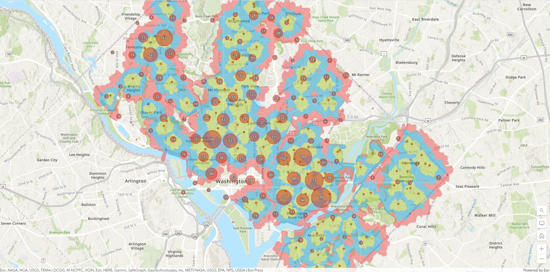
Mapping the density of your study will help allow you to better see patterns and other important ideas. Something you can do to map density is create areas of color with density value that can be demonstrated by creating a key. You can use GIS to map density points which are usually points of surface. GIS can allow you to map the density of features or of feature values.These two different approaches yield different results and info. There are ultimately two ways of mapping density according to the book. The first way is you can create a density map based on features summarized by defined areas(s). The second way is you can create a density map by creating a density surface.
For mapping density by defined arena it can be mapped geographically using a dot map or you can calculate a density value for each area. For mapping density by surface, you usually create in GIS a raster layer. Each cell in the layer gets a density value, such as number of businesses per square mile, based on the number of features within a radius of the cell. Comparing methods: you should map density by areas if you have data already summarized by area, or lines or points you can summarize by area(output, trade-offs). This method doesn’t pinpoint exact centers of density, especially for large areas. You should map density by surface if you have individual locations, sample points or lines. So it seems that by precision for small areas then pick surface to map density and large areas with less precision do area.
Must be able to calc density values per area: pop density=total pop/(area/?) Dots can help a lot with density.You can use GIS to summarize features or feature values.GIS uses two methods for calculating the cell values needed for mapping density:simple method/calc and weighted/calc method. You can display density using patterns or colors. I like how darker shades mean more dense and lighter means less dense.
Ch.5
People map what is inside an area in order to monitor what is happening inside it, or to compare several areas based on what’s inside each. By summarizing what’s inside these areas, allows people to compare areas to figure out more of an understanding for a feature. You can access a single area or find out what is inside each of the several areas in your map.
Single area: When you find what’s inside a single area, it will let you monitor activity or summarize info about the area. Ex:a service area around a central facility, such as a library district.
Multiple areas: This method would let you compare the areas that you look inside of. Ex: contiguous, such as zip codes or watersheds.
Discrete features: these are unique and identifiable features. Ex: crimes or streams
Continuous features: represent seamless geographic phenomena. Ex: classes or categories
After you get the info from the analysis, you must determine which method to use.
Ex: list, count or summary?
You can use GIS to select features that are either completely or partially inside the area or even not at all.
There are three different ways to calculate or find out what is inside your intended area.
- You can create a map showing the boundary of the area and the features, this is called drawing areas and features. Good for visual approach. Need a dataset containing the boundary of the area or areas and a dataset containing the features.
- You can specify the area and the layer containing features and GIS can select a subset of the features inside the area, this is called selecting the features inside the area. Good for getting a list or summary. It is also good for finding what’s within a given distance of a feature. Need the dataset with the features and any important attributes.
- Overlaying the areas and features allows GIS to combine the area and the features to create a new layer with the attributes of both or compare the two layers. Good for finding which features are in each of several areas.
There was another way, but these seemed like the most important and relevant. Overlaying areas and features is an important method. **Vector method and raster method
Ch.6
A map can help you find what is nearby. To find what’s nearby, you can measure straight-line distance, measure distance or cost over a network, or measure cost over a surface. What’s nearby can be based on a set distance you specify, or on travel to or from a feature.
Distance is one way to measure how close something is nearby. You can also measure what is nearby using cost. Time is one of the most common costs.Other costs include money. These are referred to as travel costs. You can specify a single range or several ranges when looking to map something nearby. For multiple ranges, you can create rings. Ex: sonar, but the book says inclusive rings. Other ways to help compare distances are distinct bands.
The main three ways to find what is nearby are:
- Straight-line distance
- Distance or cost over a network
- Cost over a surface
These methods all vary and have several pros and cons which are around page 467 for reference. You will have to choose which method based on your map and what you dataset is as well as what you are trying to find. Once you have the info, you can make a map either including the stuff nearby or if it is separated.
Coleman Week 2
Ch.1
Not everyone can just go into GIS, but you need to understand the proper tools and structure for your intended analysis. I think it is interesting how a lot of GIS users become advanced analysts, so that is another possible career path.
GIS Analysis: a process for observing geographic patterns in a set of data and at relationships between different features.
It is important that you understand your data and be able to find the proper way to develop it.
Important Steps to GIS Analysis
Frame the question > Understand your data > Choose a method > Process the data > Look at the results > Understanding geographic features
Geographic features are discrete, continuous phenomena, or summarized areas.
Discrete features: are discrete locations and lines, the actual location can be pinpointed. At any given spot, the feature is either present or not.
Continuous Phenomena: examples are precipitation or temperature and can be found or measured anywhere. You can determine a value at any given location.
It is important to note that continuous data often starts out as a series of sample points, either regularly spaced or irregularly spaced.
Example of regular spaced: sampled elevation data
Example of irregularly spaced: weather stations
Interpolation: Where GIS can use sample points to assign values to the area between points.
Sometimes non continuous data can be treated as continuous in order to create maps showing how a quantity varies across the place. Continuous data can also be represented by areas enclosed by boundaries-if everything inside the boundary is the same type- such as a type of soil or vegetation.
Important Note: “If the features aren’t tagged with the codes for the areas by which you want to summarize them, the GIS lets you overlay the areas with the features to identify which ones lie within each area and to tag them with the appropriate code”.
Vector and raster are the two ways geographic features can be shown in GIS. It is important to use the right size when dealing with these models. Continuous categories are represented by vector or raster models. Continuous numeric values use raster models only.
Geographic features have specific attributes that go with them.
Examples: categories, ranks, counts, amounts, ratios
Categories are groups of similar things. (not continuous)
Ranks put features in order, from high to low. (not continuous)
Counts and amounts show you total numbers. (are continuous)
Ratios show you the relationship between two quantities and are created by dividing one quantity by another for each feature. (are continuous)
Important: working with tables that contain the attribute values and summary stats is a vital part of GIS analysis. Three common operations you perform on features and values within tables are SELECTING, CALCULATING, and SUMMARIZING.
Select attribute= value
Select Landuse= com
Select Landuse= com and acres > 2
CH.2
A lot of people use maps, use them to see where, or what, an individual feature is. Patterns are often seen. Individual features vs distribution of features.
GIS can tell police officers where to assign patrols based on crimes that occur.
Step 1: Need to decide what to map
- Decide what features to display
Step 2: What info do you need from the analysis?
- Might need to know where features are or are not? The question. Patterns.
Step 3: How will you use the map?
- Appropriate audience
- Make sure issue is being addressed
- Make sure to add just the right amount of info(no unnecessary details)
Step 4: Preparing your data
- Make sure the features you’re mapping have geographic coordinates assigned and, optionally, have a category attribute with a value for each feature before mapping
Step 5: Assigning geographic coordinates
- Each feature needs a location in geographic coordinates
Step 6: Assigning category values
- Each feature must have a code that identifies its type, when your map FEATURES BY TYPE, example is whether a crime is burglary or assault
- In some cases, a single code indicates both the major type and subtype
Step 7: Making your map(finally!)
- Tell GIS which features you want to display and what symbols to use to draw them
- You can do this by creating a layer for either single type or categories
Mapping a single type
- Must draw all features using the same symbol
You can map all features in a data layer or a subset you’ve selected based on a category value.
Using a subset could reveal patterns that aren’t always apparent.
Step 8: Mapping by category
- You can understand how a place functions when mapping by a category(roads like freeway and highway)
How many categories? Want to display no more than seven categories and grouping them could make it easier to understand/distinguish. Example: 18 categories grouped into 5
Just know that GIS is very complicated, complex and delicate
You can group categories in several different ways.
- Assign a general code to each record in the database
- Create a linked table to match detailed codes with general codes
- Assign categories on the fly by specifying symbols
Choosing symbols: make sure the symbols you choose are chosen carefully(combination of color and shape)
The map you create will be more understandable if you display recognizable symbols. Include a map reference if you think there is a chance that people won’t get it.
Step 9: Analyzing geographic patterns
- Pretty self explanatory(look for patterns)
CH.3
Why map the most and least?
- Lets you compare places based on quantities, so you can see which places meet your criteria
In order to do this… your map features must be based on quantity associated with each.
Mapping features based on quantities adds an additional level of info beyond simply mapping the locations of features.
To map?
- Need to know the type of feature
- Know the purpose of your map
You can map quantities associated with discrete features, continuous phenomena, or data summarized by the area.
Locations can be dotes
Lines can be rivers
You might want to present your map in a specific way, but must explore the data first.
Knowing quantities(counts and amounts), will be important or could be when presenting your map. You can map counts and amounts for discrete figures.
- Might need to summarize by area’
Might need to show ratios to get your point across…averages are good and so are proportions.
Proportions are often presented ias percentages. Densities show you where features are concentrated.
Ranks: poor-fair-good-excellent or 1-8
Once you’ve determined the type of quantities, need to decide how to best represent them on the map.
Might need to make trade-offs when doing this.
Mapping individual values could be very important in order to present a more accurate picture.
You will need to keep in mind classes and how to create them manually.
The four most common schemes are natural breaks, quantile, equal interval, and standard deviation. GIS can compare these different classification schemes.
Good: mapping data values that are not evenly distributed
Bad: difficult to compare the map with other maps.
There are pros and cons to each different common scheme.
You might need to deal with outliers in your data, so know how to deal with them.
Note: might have to decide how many classes to include and make them easier to read using GIS
Towards the end of chapter 3. Talks more into detail about features and details about maps.
Might need to use charts, contour lines to map data.
GIS can create 3D perspective views! How awesome!
Coleman-Week 1

Introduction
Hi! My name is Maddie Coleman and I use they/she pronouns. I am a senior at OWU and I am double majoring in General Zoology and Environmental Science with minors in Botany and History. I was part of SSRP last summer and worked with plant genomics in Dr. Wolverton’s lab. I am still ongoing with his research as well as working on my own. I am a 2nd year RA in Welch Hall this year and am very passionate about building a sense of belonging on my floor. I am an advocate for pollinators especially honey bees and up until recently, I kept an apiary of my own for six years. I love to work out and read a good book when I have time apart from my classes. Currently, I am planning on taking a gap year after I graduate and then wish to pursue a graduate program in Entomology. I hope to restart my beekeeping business and learn about sustainable agricultural pest management.
Schuurman Ch.1 Reading Notes
I didn’t realize how GIS is used for a lot of different things including mapping out where to build corporation buildings like Starbucks. I think it is cool how GIS can mean and act in so many different ways based on the applications and purposes for using it. It seems like a useful tool for many different fields and not just science.I didn’t know the ideas of GIS go back to the 1960’s because it just seems like a fairly advanced technological development. I think it makes sense that the first guy responsible for helping to further GIS was in architecture since I feel like everytime I think of GIS I think of “mapping” and “lay out”. I love how Canada was responsible for one of the first GIS models and systems too. I won’t lie, I feel like the majority of the text gets confusing when it talks about some of its history and definitions in extensive detail, but some are interesting like how technology and social movements contributed to the foundation of GIS. It does make lots of sense that there was a vast amount of quantitative research and info that went into the development of GIS. Okay so two main groups used GIS in the beginning; one for extensions of mapping and one for spatial analysis. It seems like what the author is getting at was that the ending image as a result of GIS was more valued than all the input and methodology that went into it. I think this is because images can help people especially who are non-scientists to understand the outcomes better. I started getting confused again for GISsystems and GIScience, so many definitions and complexes lol. There is G-commerce that is crazy, so much new info. Now it’s got me thinking about what I use that is based on GIS everyday, GPS, weather(possibly), banking etc. Even research to compute diagrams and images is part of GIS which is something that I hope will be a part of my career.
GIS Applications
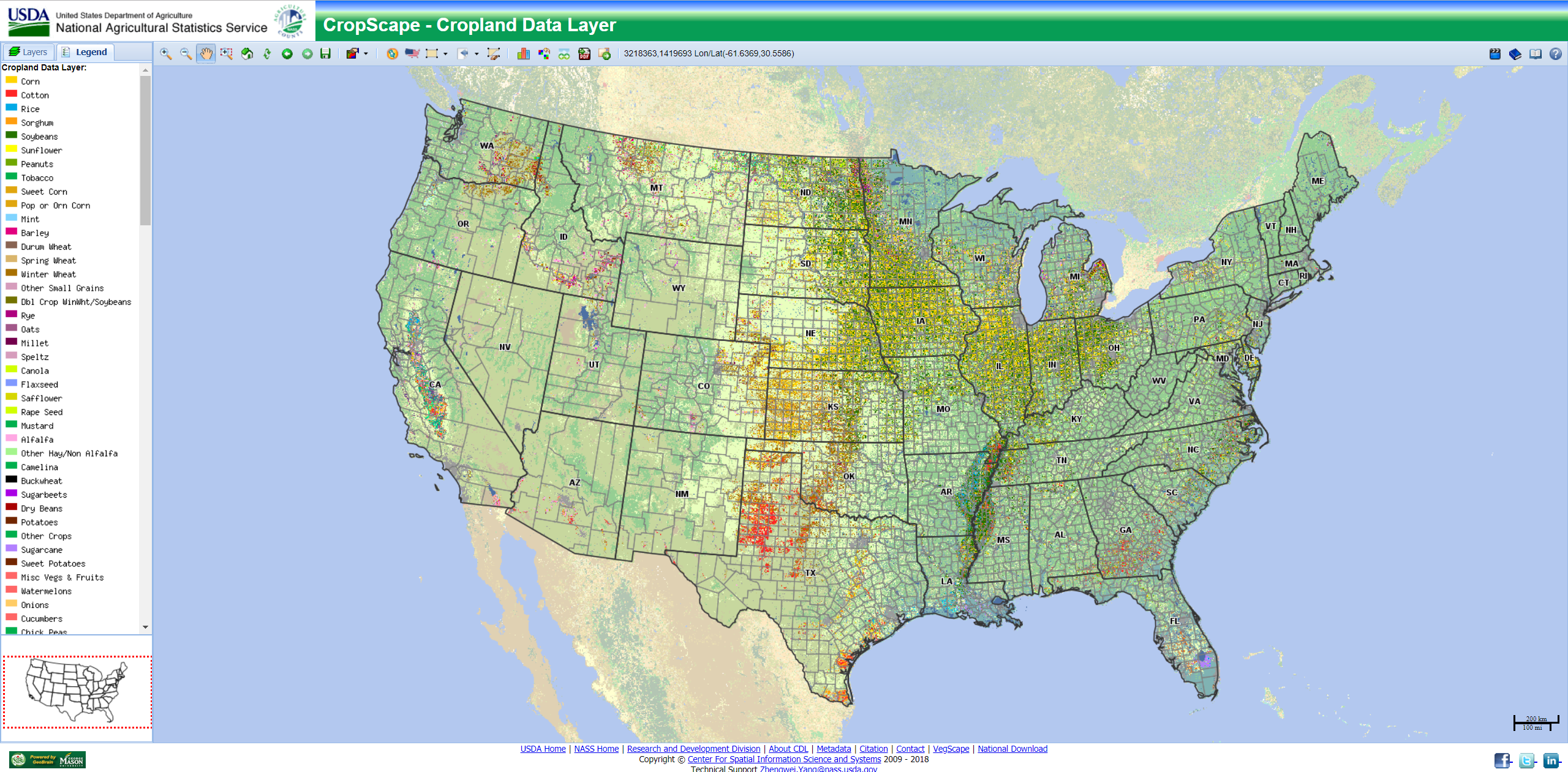
When I searched “GIS Applications” so many uses came up, but important ones pertaining to my interests are agricultural mapping. GIS can help farmers to figure out areas best for planting and managing land resources in order to become successful.
https://www.integratesustainability.com.au/wp-content/uploads/2018/11/GIS-pic-2-CropScope.png
Fig.1: Here is an image that shows crop data and what and where crops are being planted based on land availability.
GIS can see honey bee populations and help find areas to raise and locate bees.

Figure 1: Land map showing the potential suitability to beekeeping activity estimated by the approach described in the research [8]
References:
Geospatial World. (2018). How GIS is enabling the agricultural sector. Retrieved from https://www.geospatialworld.net/blogs/gis-in-agriculture/
Stork, N. E., McBroom, J., Gely, C., & Hamilton, A. J. (2015). New approaches narrow global species estimates for beetles, insects, and terrestrial arthropods. Proceedings of the National Academy of Sciences, 112(24), 7519-7523.