Gullatte week 6

Zip Code: The data set has all zip codes in the Delaware County area. The data set is updated as needed. Zip codes are also cross referenced with the Census Bureau’’s zip code. 

Recorded Document: The data set are points that represent recorded documents. Recorded documents include vacations, subdivisions, centerline surveys. Surveys. Annexation, and miscellaneous documents in Delaware county. It was created to create some kind of order to help locate miscellaneous documents. 

School District: The data set has all School districts in Delaware county. This is updated as needed. 

Map Sheet: The dataset consists of all map sheets in Delaware County

Farm Lot: Data set has all the farm lots in the US Military and the Virginia Military survey districts in Delaware County. This set was made to facilitate identifying all farm lots and their boundaries 

Township: The data set has 19 different townships that make up Delaware County. Updated on a as needed basis. Created to help identify geographic boundaries of each township. 

Street Centerline: Ohio Location based response system depicts center of pavement on streets within Delaware County. This was created from field observations. 

Annexation: Dataset has Delaware county’s annexations and boundaries from 1853 till now. Updated as needed. 

Condo: Data set has all condominium polygons in Delaware County. 

Subdivision: This dataset has all subdivisions and condos within Delaware County. Is updated daily. 

Survey: Points in this dataset represent surveys of land in Delaware County. Dataset updated daily 

Dedicated Row: Data consists of all lines that are right-of-way within Delaware County. Was created through updates through the county’s parcel data. 

Tax district: Dataset consists of all tax districts within Delaware County. Updated as needed. 

GPS: Data shows all GPS monuments that were established in 1991 and 1997. Updated as needed. 

Original Township: Data shows the original boundaries of townships in Delaware county before the boundary shapes were changed. 

Address Points: The Ohio location based response system data gives an accurate placement of addresses in Delaware County. 

Precinct: Data consists of voting precincts in Delaware county. Updated as needed and maintained by the Delaware County Auditor’s GIS Office. 

Hydrology: Set contains all of Delaware County’s major waterways and updated on a as needed basis. 

Building Outline 2021: Set has all building outlines of structures in Delaware County. 

Parcel: Consists of all cadastral parcel lines in Delaware County. 

PLSS: Set contains all Public land surveys systems in the US Military and the Virginia Military Surveys Districts of Delaware county. 

2022 Leaf-On-Imagery: 2022 Imagery 12 in Resolution??

Delaware County Contours: 2018 Two Foot contours. 

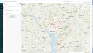
Delaware County E911 data: Ohio’s location based response system data set is an accurate representation of all certified addresses in Delaware county. Intended to support mapping, 911 emergency response, accident reporting. Geocoding, and disaster management. 


Gullatte week 5

These chapters were fairly self explanatory, I only got stuck a few times but was able to skip and navigate the rest of the chapters easily. My problem is that I am inpatient and I don’t like to read everything on the screen so I miss things. The most interesting thing in these chapters for me was doing the South Sudan coding. I think it was cool to input South Suden is equal to the years or whatever the directions said. It was cool that the map and software could do that. Again, I took definitions because some of the words in the chapters were hard to understand without knowing the definitions. 

Defintions:

Task: [software] A set of preconfigured steps that guide users through a sequential workflow in ArcGIS software. 

Definition query:[ESRI software] In ArcMap, a request that examines feature or tabular attributes based on user-selected criteria and displays only those features or records that satisfy the criteria.

Query expression: [programming] A type of expression that evaluates to a Boolean (true or false) value, that is typically used to select those rows in a table in which the expression evaluates to true.

ModelBuilder:[ESRI software] The interface used to build and edit geoprocessing models in ArcGIS.

Model:[data models] An abstraction of reality used to represent objects, processes, or events.

Script: [ESRI software] In ArcView 3.x, one of the five types of documents that can be contained within a project file

Command line:[computing] A string of text that acts as a command, typed at an interface prompt.

Geocoding:[geocoding] A GIS operation that converts a street address or other location information into spatial data that can be displayed as a feature on a map.

Adress Locator: [geocoding] A dataset in ArcGIS software that stores the address attributes, associated indexes, and rules that define the process for translating nonspatial descriptions of places, such as street addresses, into spatial data that can be displayed as features on a map.

Overlay: [analysis/geoprocessing] A spatial operation in which two or more maps or layers registered to a common coordinate system are superimposed, either digitally or on a transparent material, for the purpose of showing the relationships between features that occupy the same geographic space.

Buffer:[spatial analysis] A specified zone around a map feature or features, measured in units of distance or time. 

Dissolve: [ESRI software] A geoprocessing command that removes boundaries between adjacent polygons that have the same value for a specified attribute.

Clip: [ESRI software] A command that extracts features from one feature class that reside entirely within a boundary defined by features in another feature class.

Temporal Data: [data structures] Data that specifically refers to times or dates. 

Operator: [mathematics] The symbolic representation of a process or operation performed against one or more operands in an expression, such as “+” (plus, or addition) and “>” (greater than). When evaluated, operators return a value as their result. 

Cell:[graphics (computing)] The smallest unit of information in raster data, usually square in shape

Discrete data: [data models] Data that represents phenomena with distinct boundaries.

Continuous Data: [data models] Data such as elevation or temperature that varies without discrete steps

Map algebra: [data analysis] A language that defines a syntax for combining map themes by applying mathematical operations and analytical functions to create new map themes. 

Aspect: [analysis/geoprocessing] The compass direction that a topographic slope faces, usually measured in degrees from north

Hillshade:[map design] Shadows drawn on a map to simulate the effect of the sun’s rays over the varied terrain of the land.

Azimuth: [analysis/geoprocessing] A compass direction. 

Altitude: [coordinate systems] The height or vertical elevation of a point above a reference surface

Layout: [ESRI software] In ArcGIS software, a presentation document incorporating maps, charts, tables, text, and images.

Label: ESRI software] In ArcGIS, descriptive text, usually based on one or more feature attributes

Label class:[ESRI software] In ArcGIS software, a category of labels that represents features with the same labeling properties.

Map extent: [cartography] The limit of the geographic area shown on a map, usually defined by a rectangle.

Scale bar: [symbology] A map element used to graphically represent the scale of a map.


Gullatte week 4

These chapters and guided tutorials were generally pretty easy to follow. I got stuck a few times, but rereading the instructions and playing around with all the tabs in the software made it very doable. I thought it was neat seeing all the different features that the software offers and even went off on my own to find maps of my hometown. There’s so many different maps that people upload, at least to my hometown and it was just cool to explore the different maps people made. After each chapter, they had keywords so I’m just going to define some of them below. These pictures are from 3 of the four chapters the guided tutorials we went over. There’s a lot of information in each chapter but its all very useful and enlightening. 

Basemap- A map that is the basis of GIS visual and geographic context. It may include information such as landforms, administrative boundaries, landmarks, and roads

Vector- A coordinate-based data model that represents geographic features as points, lines, and polygons. Each point feature is represented as a single coordinate pair, while line and polygon features are represented as ordered lists of vertices. 

Layer- [data structures] The visual representation of a geographic dataset in any digital map environment

Raster[data models] In imagery and elevation, a spatial data model organized into a matrix of equally sized cells, or pixels, and arranged in rows and columns, composed of single or multiple bands. 

Geoprocessing[analysis/geoprocessing] A GIS operation that is used to manipulate data from an input dataset and return the result as an output dataset. 

Extrusionthe process of projecting features in a two-dimensional data source into a three-dimensional representation: points become vertical lines, lines become planes, and polygons become three-dimensional blocks.

Attribute query a request for records of features in a table based on their attribute values 

Layer file[data structures] In ArcGIS, a file with a .lyr extension that stores the path to a source dataset and other layer properties, including symbology.

Layer package[Internet] A special file (layer_name.lpk) that contains a layer, a copy of the data, and an XML file that has a brief description of the layer.

Spatial join[spatial analysis] A type of table join operation in which fields from one layer’s attribute table are appended to another layer’s attribute table based on the relative locations of the features in the two layers.

Shapefile[ESRI software] A vector data storage format for storing the location, shape, and attributes of geographic features

Geodatabase[ESRI software] A database or file structure used primarily to store, query, and manipulate spatial data.

Feature class[ESRI software] In ArcGIS, a collection of geographic features with the same geometry type (such as point, line, or polygon), the same attributes, and the same spatial reference

Feature dataset[ESRI software] Data that represents geographic features as geometric shapes.

SpheroidA three-dimensional shape obtained by rotating an ellipse about its minor axis, resulting in an oblate spheroid, or about its major axis, resulting in a prolate spheroid.

On-the-fly projection Assembled, created, presented, or calculated dynamically during a transaction such as a Web page search or data display query.

Metadata[data transfer] Information associated with data that provides contextual details. Metadata can include date/time, origin, standards, and other relevant properties.

Attribute domain[data structures] In a geodatabase, a mechanism for enforcing data integrity.

Edit sketch[ESRI software] In ArcGIS software, a temporary, underlying representation that is used to create or edit feature geometry.

Feature template[ESRI software] A collection of default settings for creating a feature, including the layer where the feature will be stored, the attributes it will have, and the default tool used to create it.


Gullatte Week 3

Chapter 4: Mapping Density

      This chapter first starts out with saying why mapping density is important. It’s important because it shows where the highest concentration of things is. This makes it easier to find areas that need help or just to see where a lot of buildings or places are in that area. Mapping density is useful especially for censuses or counties. Like every other thing being mapped, you have to decide what features you want to map and then get into even more detail by mapping feature values.  You can also create a density surface from locations or singular things like a street. It says density surfaces are created in GIS as raster layers. A raster layer in one definition is described as a background layer for other layers. 

Mapping density for defined areas:

      You can map it in two ways: by a dot density map or by calculating density value for each area and shade each by value. The maps are usually two colors and shaded in. For density for defined areas, it’s treated and mapped like a ratio. Dot density maps are represented for a certain quantity. For example, one dot could equal 200 people. I think both types of maps are somewhat common and very easy to understand. In GIS terms of how all of this works when creating a density surface, GIS will find a neighborhood and add up all of its features. It then divides that by the area of the neighborhood. The value is then given to that neighborhood area. The GIS is essentially creating an average for every neighborhood and its area. The search radius can change. The cell size also matters. The smaller the cell, the smoother it is and the bigger it is the rougher or more coarse it will be. 

Chapter 5: Finding What’s Inside

     Mapping what is inside an area is really important for several reasons. For one, it lets people compare areas to see what there’s more of and what there’s less of. For example, mapping burglaries and where they occur may help police where to spend more time. Or, if you want to know where to put a police station, you will be able to map inside areas and see where police presence is needed. To do this you draw a boundary circle around a place. In this example, a circle is drawn around a fire station with all incidents including gas leaks, fire, medical and more. This makes it a layered map. Features here can be discrete (features you  can count or list) or continuous (features like elevation). GIS can tell you if a singular feature is inside an area, list all the features, the number of features, and more. As I am learning, Geographic information systems can do a lot of things that we do not know about. This system is very intricate and useful in many different ways that I probably can’t comprehend. This article is super helpful because it gives plenty of examples and plenty of pictures or maps explaining. They also answer every question a person would have when learning about this technology. For example, when a feature falls out of a boundary line or area, it gives you the option to pick what you want to include or not. You can choose to exclude a feature but I think the best feature is choosing to keep a feature even if it runs outside of the boundary line. Three ways of finding what’s inside. The three are drawing areas and features, picking the features, and finally overlaying the areas and its features. Every method has its own advantages and disadvantages so it’s probably a preference. I think I would draw the areas and its features because it seems the easiest to understand and complete. 

Chapter 6: Finding what’s Nearby:

     The point of mapping what’s nearby is because you can find out what’s happening within a set distance of a feature affected by an event, store, or something else. The example they gave for this is that a city planner would have to let the residents around it know that they were building a beverage store. This identifies the area and the features. Also you can find out what’s in the traveling range. Finding this out can help define an area served by a facility or place. The example they gave for this is that a fire chief would want to know which streets are reachable in 3 minutes. Nearby is a word that everybody describes differently which makes this a little trickier than others. Depending on how you define it, it’ll tell you what method is most useful for you. The three main methods used are straight-line distance, distance or cost over a network, and cost over a surface. Just like for mapping what’s inside, every method has its own advantages and disadvantages. Straight line is used if you’re defining an area of influence or a quick estimate of travel range.You can create a buffer, you do this by specifying the source feature and buffer the distance. You pick features to find features within a given distance.  With travel range or distance you have to factor in cost. Use distance or cost when you are measuring travel over a fixed infrastructure. Finally, use cost over surface if measuring overland travel. This chapter is word heavy so I know I had to reread some parts several times and I know I will probably have to go back and reread again! Like mentioned earlier, with travel, a cost will have to be calculated. For this, GIS creates a raster layer in which the value of each cell is the total cost from the nearest cell source. This seems easy enough seeing as if it was explained in the earlier chapter. 

Gullatte week 2

  1.      GIS Analysis can be defined as looking for geographic patterns in data that is found and is also used at looking at patterns in relationships between features. The process can be described in a few short steps. First, frame the question, understand the data, choose a method for how you will get said data, process the data, and finally look at the results. There’s different types of geographic features and it’s important to understand when dealing with mapping. 
  • Discrete features- I think they gave an unclear definition for this but I got another definition from Esri. It’s defined as discontinuous but has very defined features. 
  • Continuous Phenomena- An example of this is precipitation and it can be measured anywhere
  • Summarized by area- Represents the density of singular features within a certain boundary or area. 

When learning how to map, it’s important to understand the geographic features and their attributes. 

  • Categories- Groups of things that are alike. Example, categorize roads as highways, alleys, or etc. 
  • Ranks- Puts things in order specifically from high to low. To put this into context of geographical measures, it may be hard to find a direct measure. An example they gave is assigning soil as all the same suitability for a plant. 
  • Counts and Amounts are grouped into the same category and are both defined as it shows you total numbers. They are then specifically defined. A count can be defined as the actual number of features on a map. An amount is any measurable quantity that is associated with a feature. 
  • Ratios- the relationship between two quantities and are created by division. One quantity is divided by another for each feature. It’s like taking an average. 

You also have to work with date tables when learning GIS. There’s a lot to GIS. Using data tables you have to learn selecting, calculating, and summarizing. 

2.       Chapter two is all about mapping. You have to decide what to map, obviously, before you start going crazy. Much like writing a book or article, your focus has to be right and you have to make sure you’re reaching your target audience. The mapping also has to be well organized and relatively easy to follow just like a book, it has to make sense. Kind of off topic but I’ve seen people on TikTok trace a pile of Rice to make a country and they make different features on the map and I thought that was really cool. Anyway, to make a proper map you need to make sure the features you map have geographic coordinates assigned. This means including the latitude and longitude of each mark. To make the map easier to read, you need symbols for different attributes. This makes it easier to see patterns. GIS does the work for you when trying to map something out. Its job is to use the coordinates to draw the attributes or features using the symbol of your choice. You can layer data and then select a specific thing you want to see by itself instead of seeing every feature together. This is very useful when you want to find specific patterns. This can be used in Apple Maps when you’re looking for close attractions but only want to see restaurants. GIS is widely used around the world, but I think not everybody knows the proper name for geographic information systems. When mapping categories, they suggest limiting it to 7. This is because the map could potentially become hard and confusing to look at. The scale matters when mapping these categories because the said features are spread out, then you would be able to map more categories without making it hard to understand. 

3.      This chapter is called the “Most and Least”. They phrase it as mapping the most and the least places lets us compare things based on the quantity. I thought this was a bit weird at first because I think mapping everything would be the most accurate. Maybe it would be the most accurate but mapping everything makes it harder to understand and could make the map convoluted. This chapter talks about how you have to keep one focus on your map and keep the intended audience in mind. I already stated this in the above chapter and said how making a map is kind of like writing an article. You have to keep the map purpose from drifting off. This chapter seems like a review. Quantities can be counts or amounts and knowing the difference will help you best pick which one to use for a map.  

     A new idea they introduce is density. When densities show in a map it shows where those features are most concentrated. The chapter starts going into data like statistics. I know this is important to GIS but I hate math. Matter of fact, I took stats during COVID so I actually learned nothing. What I know about stats is that I hate everything about it including standard deviation. The easy thing to understand about stats is that some data may have outliers. This means that there will be points that lie way outside of the average points. This could then skew the data either left or right. There’s different ways to label and create a map including graduate symbols, colors, contours, charts, and 3D viewing. Graduated symbols show a range of values. Charts show categories and quantities. These are for discrete areas. You can use pie charts and bar graphs to show data as well but I think we all know that. 

Gullatte – Week One

Hi, my name is Rheigna (Ray-Na) Gullatte and I am from Cleveland, Ohio. I am double majoring in environmental studies and geography with a sociology minor. I put a picture of Apollo, my cat, because I miss him…a lot. I hope to get an internship in the future that supports my major 🙂 I don’t know much about GIS, but that is why I’m here. 


Chp. 1

     This was a really interesting read because I am majoring in geography and environmental studies and Dr. Rowley said it would be a very beneficial skill to learn. I’m very obsessed with social justice issues so GIS would only help me in research and mapping things out. Early GIS development happened in the 1960s which is fairly recent but I haven’t heard a whole lot about it. Canada is credited with one of the first cartography systems. I thought spatial analysis was interchangeable with mapping but the article says that spatial analysis generates more information from maps or data. There’s also something called spatial mapping that I looked up. This essentially combines spatial analysis and mapping so that’s cool. 

     This article was kind of a hard read with all new information being presented to me but there’s many outcomes of GIS. There is GIScience and GISystems which were all created for their own purposes. GISystems includes processes like spatial analysis and encoding into software while GIScience uses theory and justification for the way GISystems work. The way these definitions are worded are kind of tricky so I know I will have to do a little bit extra research and reading to understand. The chapter 2 title piqued my interest because I am taking Human Geography with Toenjes and having classes that help each other flow makes me really happy. It just reassures me that the classes I’m taking are all going to help me in the long run.

     My favorite part of the entire article is when it talks about who uses GIS and why. I think it’s interesting how GIS is incorporated into our everyday lives and many people do not realize that. The example they gave to put this into perspective is that GIS is used in the process of where we eat, where our food comes from, and how it gets to the grocery store. Google and Apple maps are very popular GIS systems but a lot of people do not know that. 


  1. GIS keywords- My keywords were “gentrification” and “poverty” 

The map above is a simple map showing that gentrification happens at a greater scale in major cities than any other rural city. The major cities where it is happening the most include Washington, D.C., Philadelphia, New York, and San Diego. 

The article is called, “Shifting neighborhoods: Gentrification and cultural displacement in American cities”

  • This article explains what gentrification is and why it is so problematic. GIS comes into play because it allows us to map out where gentrification is the biggest problem and why. Like stated, gentrification happens the most in major cities. It disproportionately displaces black and hispanic residents. Gentrification is essentially raising property values, tearing old buildings down to build new and modern buildings. Although this may help the economy, it causes cultural displacement for families who are forced to move because the rent is too high.

Richardson, Jason, et al. “Shifting Neighborhoods: Gentrification and Cultural Displacement in  

      American Cities ” NCRC.” NCRC, 2 Nov. 2022, ncrc.org/gentrification/.  

_______________________________


2. I used the same keywords with an additional one, “GIS” “Gentrification” “Washington D.C.”

The pictures above shows the same corner about 40 years apart and you can clearly see how much has changed. 

  • This article basically discusses one of the biggest cities and their problem with identification. I’m sure a lot of people have been to D.C. but they might write off gentrification as a good thing. I’ve been to D.C. in 2018 and it was running rampant in the hotel where I stayed. A street down from the four star hotel where I stayed would be considered the “hood”. Families’ houses were not up to code, windows broken, and other things that they could not really control. They were watching their neighborhood turn into a tourist attraction. 

Person. “Mapping Gentrification in Washington D.C.” ArcGIS StoryMaps, Esri, 16 Oct. 2022, 

        storymaps.arcgis.com/stories/009773cc5c224421a66d1ce9ff089849.