Brokaw Week 6

Zip Code – All zip codes within Delaware, OH however roads with no zip codes were manually populated by their location.

Recorded Document – datasets contain points that are recorded documents in Delaware County. It was made to help find missing documents in the County.

School District – This set contains all school districts in Delaware County and was created for the Auditor’s parcel records.

Map Sheet – Contains the map sheet of Delaware County. 

Farm Lot – All farm lots in the Virginia Military and US military for the Survey Districts. 

Township – To identify the geographic boundaries of each township. 

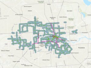
Street Centerline – The center of private and public roads. Used for 911 emergency response, appraisal mapping, accident reports, disaster management. 

Annexation – All Delaware County annexations and conforming boundaries from 1853.

Condo – Dataset consists of condominiums polygons in Delaware County. 

Subdivision – All subdivisions and condoms recorded in Delaware County Recorder’s office.

Survey – The survey points are a shapefile of a point coverage that represents all surveys of land. All surveys were scanned and saved as a pdf file.

Dedicated ROW – all dedicated road right of way polygons in Delaware County. 

Tax Districts – Data set has all tax districts in Delaware County, Ohio.

GPS – identifies all GPS monuments set between 1991 and 1997 the Coordinates are in Universal Transverse Mercator Northing and Easting. 

Original Township – all original boundaries of the townships before the tax district changed . 

Address Points (DXF) – The State of Ohio Location Based Response Systems (LBRS) address points show a spatially accurate placement of address in a parcel. 

Precinct – Polygons that determine each voting boundary. 

Hydrology – all major waterways in Delaware County. 

Building Outline 2021 – all building outlines of structures. 

Parcel – all parcels in Delaware County.

PLSS – all polygons depicting the boundaries of 2 public military  land survey districts.

Street Centerlines (DXF) – The State of Ohio LBRS street centerlines are the center [pavement of all private and public roads. 

Address Point – The State of Ohio LBRS address points data are spatially accurate representation of all certified addresses. 

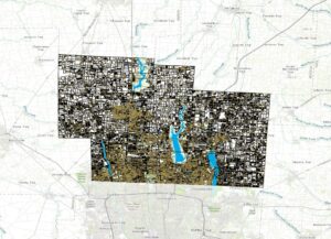
2022 Leaf-On Imagery (SID file) – includes 2021 Imagery (SID file), Township, Original Township, and Recorded Document. 

Delaware County Contours – 2018 2ft contours for the county is a geodatabase format. 

Delaware County E911 Data – The layer can reverse geocode a set of coordinates to determine the closest valid address for 911 agencies. 

Address Points – layer is intended to support appraisal mapping, and 911 Emergency Response. 

Street Centerlines –  layer is intended to support appraisal mapping, and 911 Emergency Response. 

2021 Imagery (SID File) – contains 2022 Leaf-On-Imagery (SID file), zip code, recorded document, dedicated ROW.

Brokaw week 5

Chapter 5: went smooth for the most part. Making the ModelBuilder ribbon was cool. I think I did the Python coding correctly.  

In chapter 6 I ran into an issue with publishing features and preparing the map for collection. My content did not have the TreeInventory feature layer. 

Chapter 7: I made some mistakes in the Geocoding process. I could not add the files to the map. I think there was also some confusion with me and labeling that I had messed up in the last section. 

Chapter 8: Was a cool way to make 3D maps. However, I think I made some errors while browsing and couldn’t find the correct file. I’m not sure which chapter but I did have an issue with an error coming back after running a tool. It said the function couldn’t be performed because it was already added. 


Chapter 10: I had a slight issue but just skipped the steps and moved on. In exercise 10b step 10 it wanted us to go to the position tab however there was no placement drop down or in the next step there was no stack drop down. Also in exercise 10c I could not figure out how to insert the Max Advertised Broadband speed map frame into the layout tab. It kept making another separate tab. 

Brokaw week 4

In ArcGIS pro we will be completing projects that have maps, layouts, layers, tables, tasks, tools, and connect to servers, databases, folders, and different styles. ArcGIS Online is public content that if connected to an organization you can share projects and information. Geoprocessing tools will perform spatial analysis and manage GIS data. Cluster → aggregating. 

I ran into an issue that there was not a purple school symbol so I substituted a blue school symbol. There must’ve been an update with symbols. The ToBreak attribute helps to show how many minutes walking a distance is. I got stuck on chapter 1, step 9 “Under Try a drawing style, select Types (unique symbols). I could not find “Try a drawing style”. I ended up stopping for the day and came back and found it. After just starting exercise 2B I ran into a labeling issue. The appearance tab is now labeled as “feature layer”. It was cool to transform my map into a 3D form and use the explore tool to navigate around. When trying to export their selection to a new dataset I ran into issues at #3 in the Geoprocessing pane. All of exercise B was messed up and I had questions about a step that was very important because it carried over into exercise 3B. Stopped at page 91 on Import layer symbology. I ended up completing chapter 4 but could not save any progress because of a computer issue. 

Brokaw Week 3


In chapter 4 I learned a lot of interesting facts about mapping density and how to read maps. The main purpose of a density map is so we can compare higher concentrations of features over many locations. We measure the features and their concentrations with a uniform areal unit.  These maps are super helpful when looking for correlations over a large area. Why would environmentalists want to know where things are concentrated? How do these density maps record changing conditions? Are we talking about migration or influxes of animals changing weather patterns or growing seasons? What are some of the steps that go into planning what needs to be mapped? The most important things to know before starting are all of your features and the area you want to focus on. Geographical Information Systems will map the density using a density surface. When first making a map it is important to plot the locations of interest and then find the density surface per a measurable unit like a square mile. All maps should have 2 steps first the black and white with only the targeted locations then the second map that has a color gradient showing higher and lower densities. What is the difference between features or feature values? Mapping density of features would be like the location of houses and the feature value documents many people living in the house. These maps are useful for planning roads or development efforts. A dot map is used to show density values when the map already has cluster features. This type of map makes it easier to read because they are distributed randomly. They show density geographically. To find density you divide mass (number of features) by volume (area of the polygon). Geographical Information systems will help you find density surfaces with a raster layer. It is a very detailed way to show data but also takes a lot more time. 

Chapter 5 was about learning what’s inside of a map, analysis, drawing features, and creating overlay areas. The method you choose depends solely on the data you are presenting. There are a couple of different areas you could graph. A single area for example would be a town and the features would be buildings, emergency teams, or hazards reported. These maps make it easier to convey information to the community rather than using numbers and coordinates. We use GIS to predict future climate changes and how people will be affected in years to come. Discrete features are countable locations that are unique to their place of origin like roads, buildings, lakes, and home addresses.  A location would be crimes and linear features are roads in a protected area like a state park. Continuous features are more complicated they are broad areas summarized there are subgroups of continuous features. Spatially continuous will tell how much of each type is in the area. Continuous values are always numeric like elevation, precipitation, road density, habitat suitability, and temperature. Will we need to make a note if we include either the whole or part of a feature if it lands partially inside a boundary?  An example of a scenario when you would want to include a feature that lands partially inside a zone would be a house having a zone change. When labeling discrete features a light translucent color is ideal to show the configuration of the selected area. To distinguish areas the use of different colors is recommended to show the difference. This is all to make the map easier to see and understand. Using thick and thin lines will be helpful when making boundaries. Using GIS to select an area to be summarized first to choose the location, locations of boundaries, and distance, and the GIS will do the rest. 

In Chapter 6 I learned why it’s important to map what is in range and capable of being recorded and monitored. Trying to map an area too large will only result in inaccurate data where a large section of the population is left out. A note for my future self is that traveling range is measured by cost, distance, and time. Knowing what the preferred traveling use is also helpful if it driving or walking. Areas of influence are measured using a straight-line distance of travel movement. What information will be helpful to me in the future? The count will be numerical or by type. A summary statistic is a total amount or amount by category number of acres with variable other characteristics. A statistical summary is a minimum, average, maximum, or standard deviation for example the average household size within a boundary of the local school. To get more information on distance use inclusive rings which are used to find the total amount of increases as the distance increases. Distinct bands can compare characteristics with distances. To get a more accurate measure, measuring distance over cost will be helpful. Using a ready-to-use network like ArcGIS will save time when needing to know a segment of the network and an attribute specifying its length and cost value. The cons of using a straight-line distance are it only gives an approximation of the travel distance while it is good at measuring distance quickly and easily.  Distance or cost over a network is good at giving precise distance and cost but it requires a perfect network layer. To make a buffer, the line can either be temporary or permanent so that the sources can be counted. GIS will make the buffer based on either the street size or type. If you want information on the feature to feature GIS will do the calculations and find the exact distance to the source.


Brokaw Week 2

Chapter 1: Introducing GIS Analysis

Some comments, notes, and questions I had while reading this chapter were plentiful. It was interesting to find out that spatial analysis is working to bring attention to real-world problems and issues people face. GIS is growing rapidly and we are finding more and more uses for its capabilities. GIS analysis is using models of the real world and looking at the geographical patterns. There are 3 types of geographical features: discrete, continuous phenomena, or summarized by area. Discrete locations and lines are actual spots found and can be easily read line buildings or bodies of water. Continuous phenomena are going to span the whole map you make because it shows weather patterns like rainfall or temperature. Interpolation is when GIS gives values to points irregularly or regularly spaced on a map. Geographical features summarized by area could be the number of households in each county, or business zip code. Reading about the two types of GIS models vector and raster I am a little confused. A vector model is a map that shows a point and is labeled using x and y coordinates mainly used to show small details. The raster model is for larger spaces that need to be analyzed and is not good if looking for precise measurements. I thought it was interesting to find out that map projects get distorted because of the curvature of the earth. So when looking at a large section of Earth it will relatively not be 100% accurate. After reading about ranks and counts and amounts for features that are mapped it gives me an idea why different levels are color-coded and categorized for their particular purpose. How will summarizing the values of a large population help us to find an average? Will data tables help to sort out ranks for a map that needs to be created? 


Chapter 2: Mapping Where Things Are

Why map where things are? To see patterns that may need another perspective besides being in a table or literature. What is the difference between distribution features and individual features? Distribution features are patterns and many professionals use GIS to target areas they are in need of their assistance. Deciding what to map? Is a process since you want a map to be easily read and understood and to correctly convey information to readers. Learning how to create features to be layered over other features to display different years or a pattern of change. Being detailed on either category or doing a broad overview to minimize distractions for the intended audience. Preparing data needs to be organized before starting a map and to have all features with a location. How will geographic coordinates be assigned to the GIS database? Will we be learning how to code features or will the software we use already be coded? It was neat to find out that we just told the GIS what features and symbols we wanted to be shown. Mapping a single type may or may not be able to show patterns but for a single type, all the same symbols will be used. What is the main idea behind GIS? It has many capabilities for setting coordinate pairs and storing the locations, symbols, and streets. Using a subset of features to layer data was neat to show the relationship between two completely different categories. 


Chapter 3: Mapping the most and least

To find a place to map you should look for areas with equal quantities of an abundance of species and, or a place with a decline or decrease in species. It’s all about finding information that will be helpful to us in the future. What we need to map is finding patterns with similar values with quantities that should be studied. The features we will be focusing on mapping will be centered around discrete and linear features. The continuous phenomena are areas that cover. When looking at a map or creating one the dark areas will be greater in value from lighter shades. All ranks will be coded in this way so that the more pigmented areas will be darker or have more than light colors. A map that shows the longest salmon runs were categorized and coded on a map and from the pattern it was determined that the counties will longer runs have watersheds. The difference between presenting or doing research with a map will be set up in two separate ways. If presenting a map it will need to be simple to show a pattern and a more generalized view. If doing research on a map it can be detailed and have lots of different features.  Business can be mapped by the number of employees and the size of circles will be used to show employment numbers. For a larger area say the whole state of Ohio using counts and amounts would be the most beneficial and it will be rounded numbers. Block groups vary in size so a rough guess would be sufficient.  Using ratios to show the distribution of features with averages, proportions, and densities. 


Brokaw Week 1

Hello everyone my name is Riley Brokaw, I’m a sophomore majoring in Environmental Science. In my free time, I love to go skiing at a ski resort not far from my house where I also am a children’s ski instructor. I grew up on a small family farm not far outside of Mansfield, OH that my great grandpa bought and started raising sheep, and since then we have about a dozen beef cattle we will raise and slaughter every year. I feel this is where my passion for the environment really came room and how important it is to preserve what we have around us and understand where our food comes from. In the summers we plant a pretty large garden with probably everything you could think of and just this past summer we used sunflowers as a cover crop for one of our fields which attracted so many bees. While I’m at school I enjoy getting ice cream with my 2 best friends and watching their field hockey games. I am also on the women’s tennis team here at OWU!

I thought the first chapter of Schuurman was very interesting although somewhat confusing. He really went into depth on GIS and how many purposes it has for humans and how we use it to map out where a disease originated from or how a certain species is decreasing. I liked reading how we use maps to show the path our food originated from around the world and how it got to our grocery stores. I had learned that as a business strategy, farmers use GIS to strategically send their produce to areas with the local interest of course but also purchase pricing and its associated transportation cost and if the community would spend that on the produce. It was also very interesting to read how Amazon tracks and uses information collected digitally to make a rough map of every person on their interests and likes, so Amazon can promote products tailored to what information they have. From what I understood the main similarity between GIScience and GISsystems is that they both share common kinds of literature and ideals and use spatial data. When looking at just GIS systems I learned it is heavily focused on facts, classification, and outputting data into the software. While GIS science is focused on theoretical ideas and justifying the reasons for GIS systems, a GIS scientist would look at the cause and effect and ask questions associated with why and how something would react in a situation. The history of GIS comes from a very practical area of pre-planning infrastructure and looking at the landscape for what the easiest and most cost-efficient path would be. Still to this day, we as humans try to look for those characteristics in everything we do to cause the least disruption to our environment.

I took a search into GIS on vineyards and how water erosion from farming and harvesting practices is affecting the landscape. The dotted circles show where the whole terrace has slid down from an influx of heavy rain.    https://doi.org/10.1016/j.catena.2020.104604

The second source I looked into was a watershed and after sediment loss was reported a system was constructed to combat the soil erosion called the GIS-based Sediment Assessment Tool for Effective Erosion Control (SATEEC). https://doi.org/10.1016/j.catena.2005.06.013